Rotonda House

Introduction
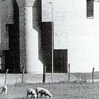
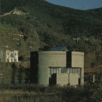
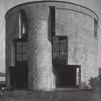
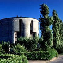
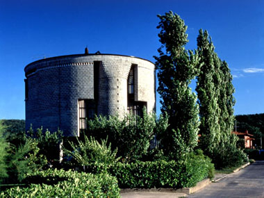
Usually when an architect is entrusted a project, it begins with the study of the environment, analyze the site and try to meet the needs of your customer. Mario Botta uses a different method, instead of making that first investigation begins with the affirmation of a simple geometric shape. In this case, the house made for Liliana and Ovid Medici, is a resounding cylinder and solid gray concrete. This action does not mean that the architect has ignored the environment or not taken into account the shape of the plot, on the contrary it is a studied response to the topography and surrounding buildings. With a hill in the background, on the west side, on which numerous chalets all shapes and styles were built, stands elegantly House Rotunda.
Situation
The house a small plot of land, 750 m2 located on the northern edge of a residential neighborhood on the outskirts of Stabio, Via Pietane 12 canton of Ticino, was built Switzerland
Context
The context to consider was: the situation dictated by building codes, development project near the old town, communication through roads that become passable roads and pattern of fields and hills covered with vineyards.
Concept

“I imagined a circular building, crossed in its north-south axis by a fissure from which descends daylight. A volume organized on three levels, a tower, or rather, an object designed and cut himself. The intention was to avoid any comparison and / or contrast with the surrounding buildings, but looking a spatial relationship with the distant landscape and horizon. Using a cylindrical volume wanted to avoid elevations, necessarily, be compared with the facades of the around existing homes.
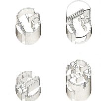
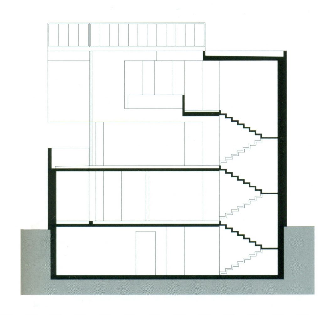
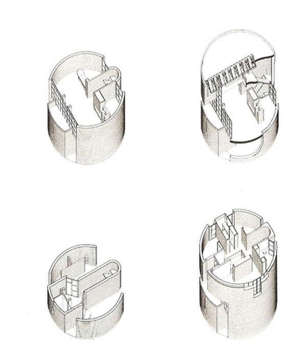
A well articulated building justifies its existence in the space between the earth, which is fixed by its perimeter, and the sky, whom the roof opens vertically through the skylight. Around this vertical space I organized different functions of life, with the ground floor conceived as a transitional space between inside and outside, the first floor as a catalyst of different activities, day area and the second floor is a area of greatest intimacy, bedroom area.
The search for form and spatial and constructive organization, as these intentions, motivated my work on the project. I held the conviction that he should propose a different, able to encompass primary and constant necessities of life and adapt to new sensibilities and aspirations determined by the current culture environmental condition. Regarding the Rotonda house, less important than others, this condition has been expressed in my work as an architect in a steady start over from the beginning, an ongoing review of the codes and matured “certainties” and acquired in previous projects “(Mario Botta)
The architecture of Mario Botta in the Villa Rotonda is an implicit criticism of capitalism architecture, unscrupulous and undisciplined creative products. Botta proposes a return to good manners and dignity of traditional European city, with a stern and solemn construction but does not resort to the use of columns, capitals and entablature, it is pretty close to the latter in the enclosure of the stairs, shows he is the son of the classical tradition, with some reminiscences of Palladio
Description
Form
- Cylinder
Once chosen the cylinder as a form, is just develop it and make it habitable, a task that is complicated because any added spoil the pure form. The output that appealed Botta was the abduction, emptying space and openings to illuminate it.
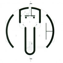
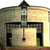
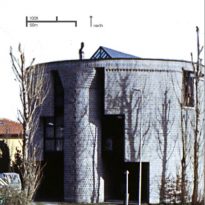
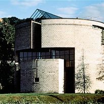
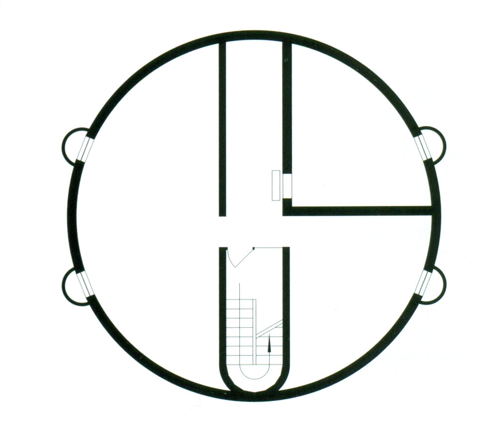
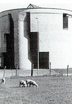
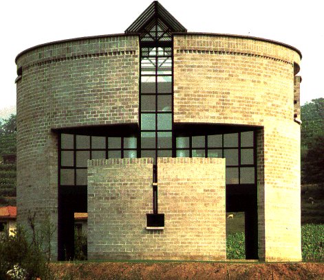
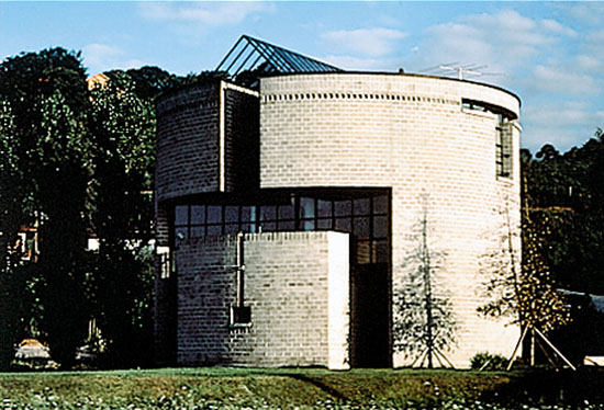
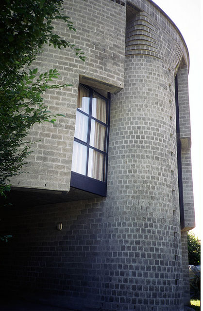
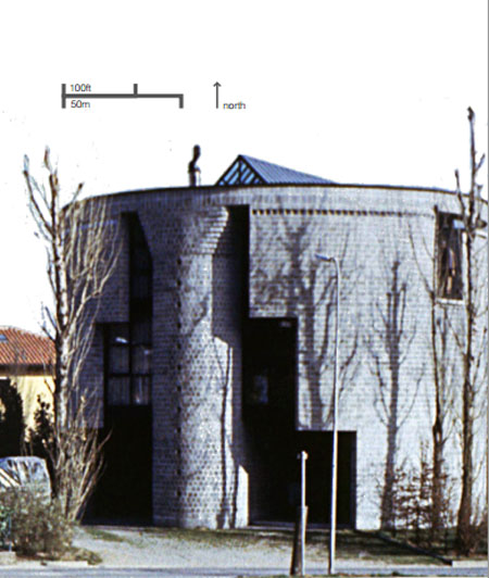
The first cut longitudinally divides the cylinder into two, opening a slot in the cover and on the second floor that lets in natural light. On the south side, this cut, it branches on either side to make room for a large window that gives light to the living room and dining room on the first floor. On the north side, the apse of the staircase rises like a column from the ground to the top, leaving windows on both sides. This kind of column is a classic touch in construction, on top of the apse blocks will acartelando of spun spun to form a capital.
- Lighting
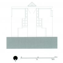
A skylight, which occupies three quarters of the length of the north-south axis, provides a constant stream of natural light following the movement of the sun. The rows of windows from floor to ceiling located along the north and south facades maximize light and let the landscape into space, connecting with the outside. During the afternoon, strategically placed sconces on the walls and hanging lamps illuminate the house
- Facade
In some respects the Rotunda House is more like a temple than a family home. The pure geometric shapes that can be deducted from the cylindrical facade can be associated more with a place of worship and contemplation that a family home. Botta relates both places, home is a place of protection and reflection where we can grow human and psychological resources necessary to meet tomorrow. Questions the historical form of residences and consequently creates a local heterogeneity that challenges surrounding buildings.
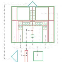
The three storey cylindrical shape with a triangular top and bold square cuts defies the typical rectangular houses surrounding plants, rising like a modern medieval tower. The use of a Roman frieze at the top of the cylinder or the triangle glass top reminiscent of a classical pediment, reinforce the subtle eclecticism of the work.
Spaces
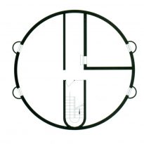
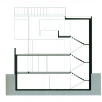
The staircase serves as a gesture of consistent design, cutting across four floors, including the basement, and setting a cap on the top like a Doric column. The central axis below the skylight, also constant, maximizes light in all areas. As users upload plants, are experiencing different levels of privacy, although the organization remains the same.
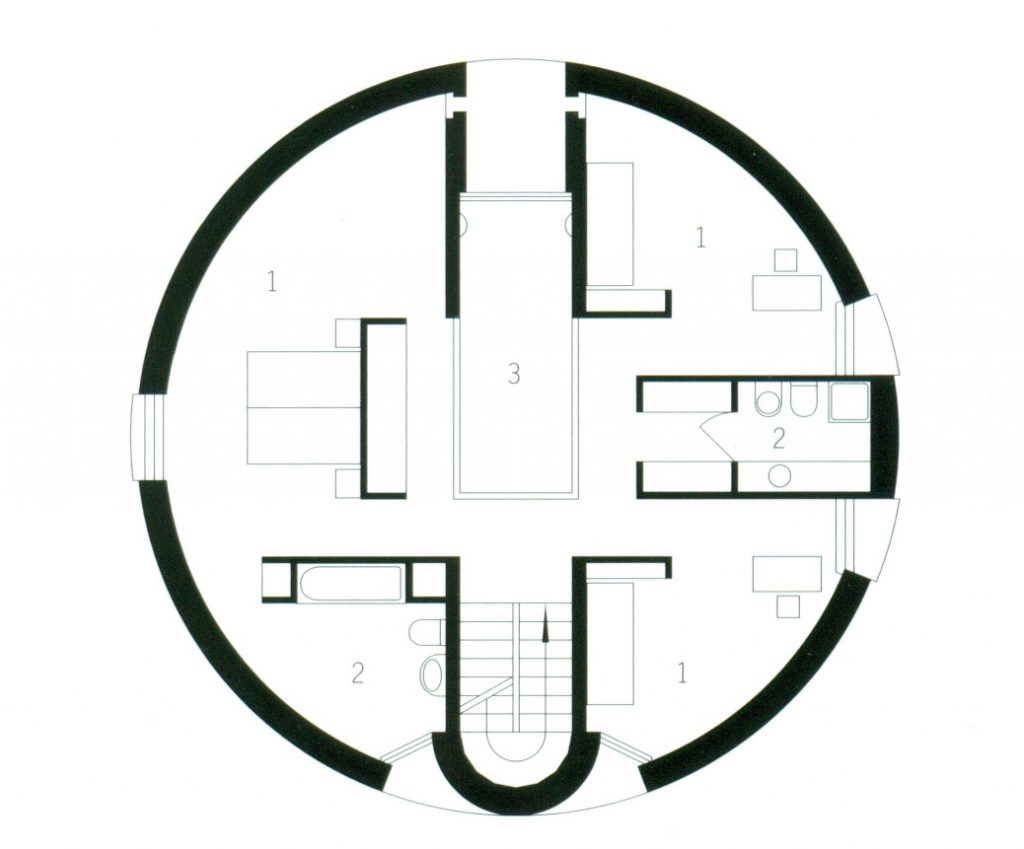
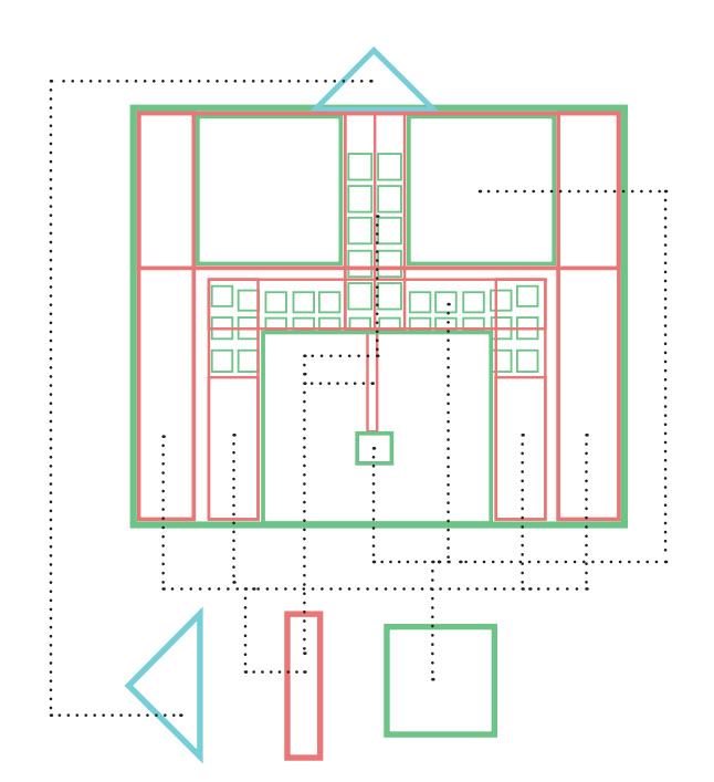
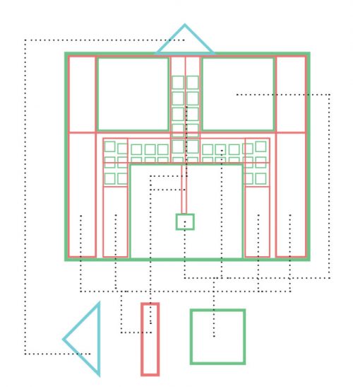
The contrast of the outer circumferential wall and the inner organization orthogonal illustrates how the two elements can be joined successfully. The rectilinear inside provide a sense of direction and subdivision. Simultaneously, the outer circumferential unit suggests all spaces within the plant, and between plants. The two elements together to create a space of parts within a unified whole.
- Ground floor
The ground floor is designed as a filter between interior and exterior space. It is virtually occupied by a huge open porch and garage flanking the entrance hall and staircase. There is also a small toilet.
- First floor
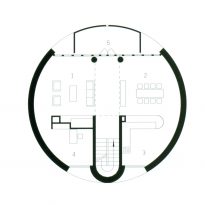
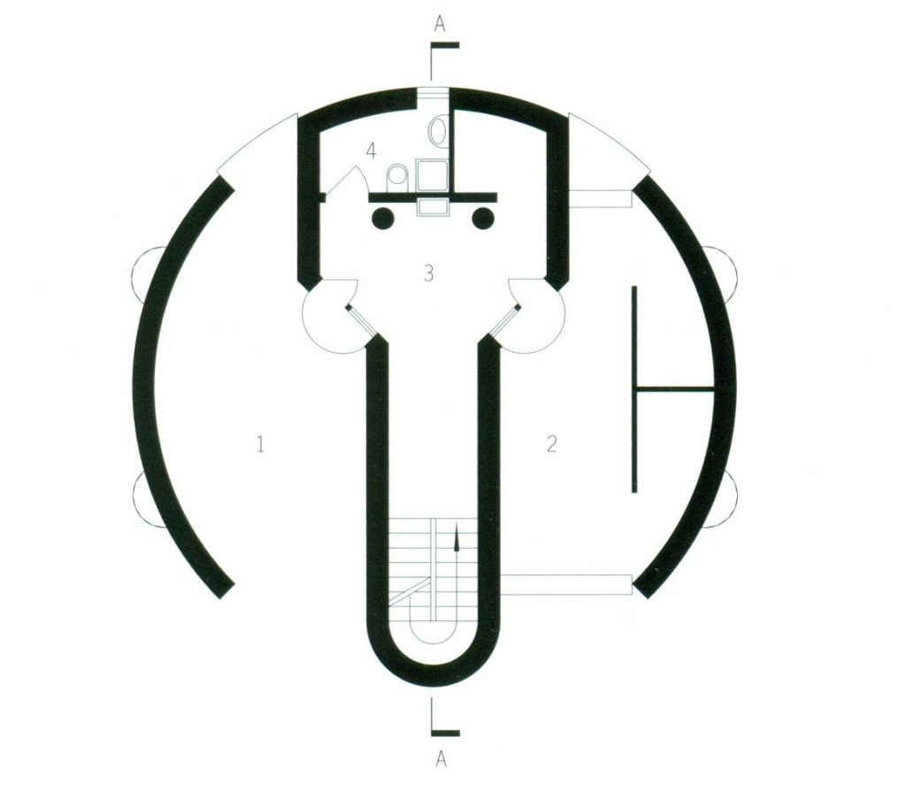
In this first level activities take place during the day. This plant is generously lit by a large window facing south and the skylight in the vacuum created on the second floor. Although there is an open plan, functional spaces are well defined both by light and by the partition.
The living room and study are located on one side of the opening and the dining room and kitchen to the other. The dining room and living room have access to the same balcony that continues cylinder shape.
- Second floor
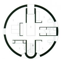
The private area of the house is located on this floor and comprises three bedrooms to which is accessed from two runners on both sides of the opening in the floor. The master bedroom occupies the entire side of the building with bathroom, the other two on the opposite side with a bathroom between them. On this floor slab slot is open, creating a vacuum that allows observing downstairs from brokers.
The building has a basement
Structure and materials
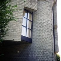
The bearing wall made of bricks, has been undermined and fractured. To help withstand voltages difficult Botta ripping the same with almost imperceptible joints help of armed and angular brackets metal that keeps the balance concrete, achieving the effect of “tension” on a wall to be incomplete tends to close. This composition helps you invested stepped wall that overlooks the vacuum. Loads diverted to the sides of the central hole is spread below the static and visual reaching equilibrium.
The main materials used were cement, brick across the front, steel and glass. The floors inside are wood
Video
