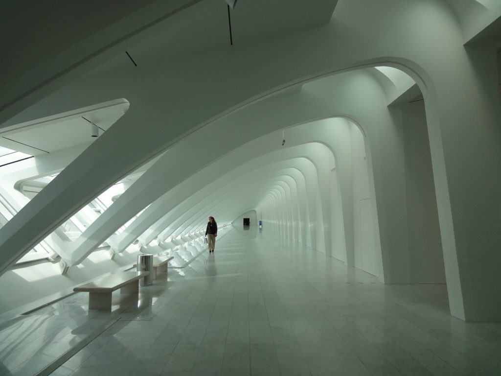
Quadracci Pavilion – Milwaukee Art Museum

Introduction
In 1994, the architect, artist and engineer Santiago Calatrava was chosen to design an addition to the Milwaukee Art Museum, his first construction in the United States. The Quadracci Pavilion opened in October 2001, combining the latest technology with the strong craft tradition of Milwaukee.
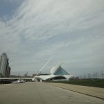
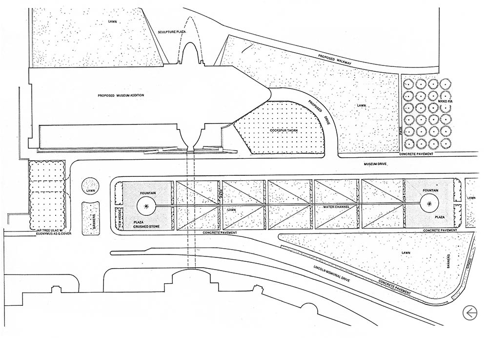
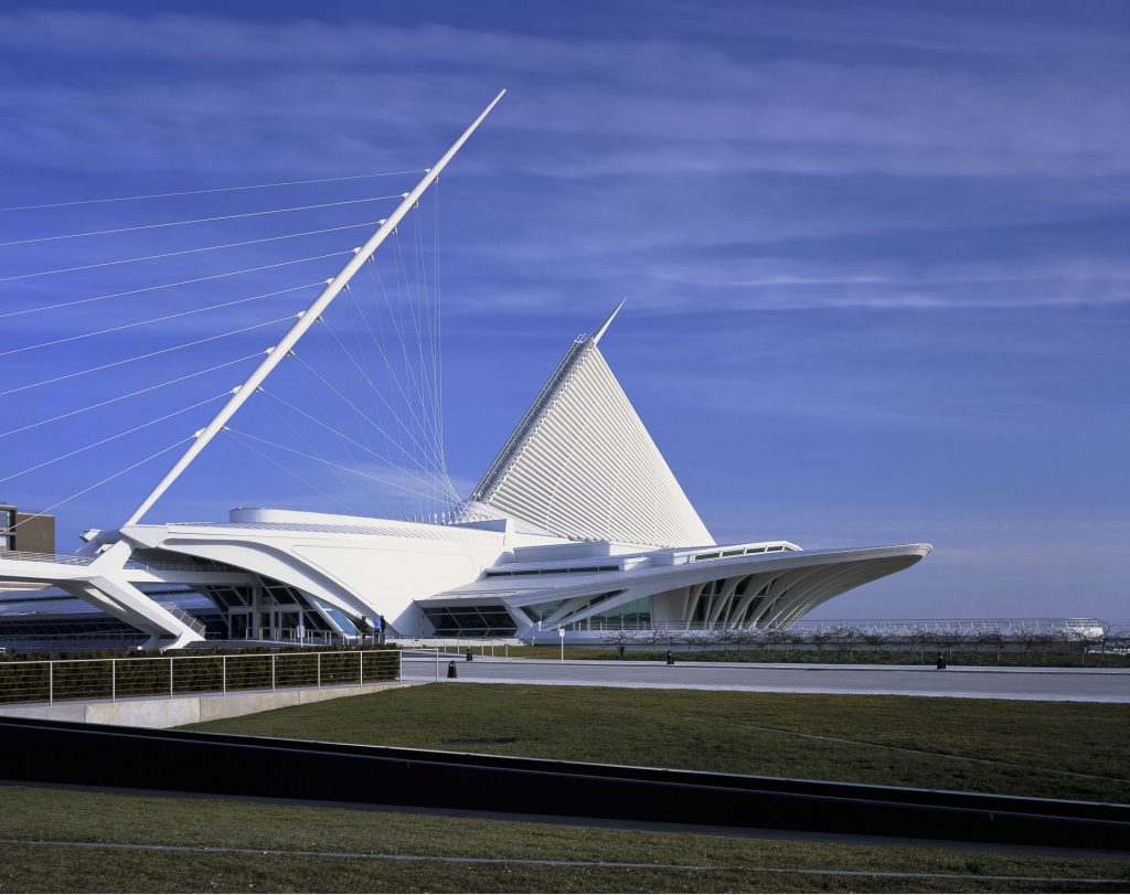
Calatrava proposed a pavilion-type construction on the axis with Wisconsin Avenue, the main street of the city center. Conceived as an independent entity, the pavilion contrasts with the existing set in both geometry and materials, a white form of steel and concrete reminiscent of a ship.
The expansion of the Museum was made possible by the generosity of donors, with significant funds provided by Betty and Harry Quadracci.
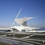
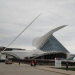
The building with its iconic sunscreen in the form of wings and bow and canopy sweeping elements, is a remarkable achievement of engineering and architectural vision. Reinforced concrete design is a study on how Calatrava, in collaboration with other structural engineers and project team members, faced the challenge of implementing their idea of a showcase project that portrays a sense of movement and change.
The Milwaukee-based GRAEF engineering firm joined the project in 1996. The GRAEF team, led by John Kissinger, served as a structural registry engineer, civil engineer and landscape architect, in conjunction with Daniel’s office. Kiley
Location
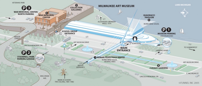
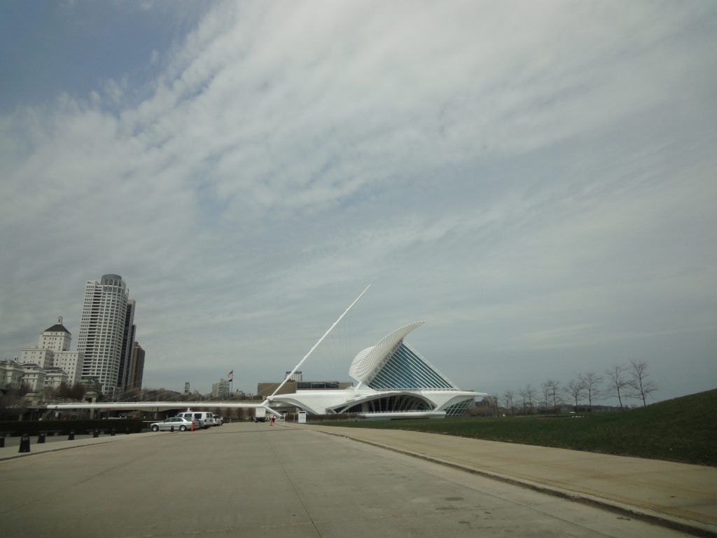
Calatrava proposed the construction of the pavilion on the axis with Wisconsin Avenue, the main street of downtown Milwaukee, 700 N. Art Museum Drive, Wisconsin, United States, within the Cudahy Gardens of the City’s Art Museum.
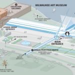
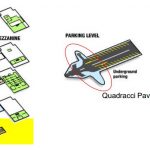
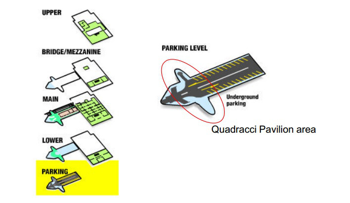
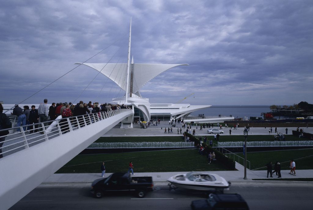
Being connected directly to Wisconsin Avenue through a cable walkway, pedestrians can cross Lincoln Memorial Drive on the bridge and continue to the pavilion. Drivers enter through a vaulted underground parking lot where pairs of concrete columns extend towards the center of the garage, forming a series of skeleton elements shaped like a letter “V”.
Concept
To design the sculptural Quadracci Pavilion the architect Santiago Calatrava took into account the original building of Eeron Saarinen, the topography of the city and the Prairie style of Frank Lloyd Wright.
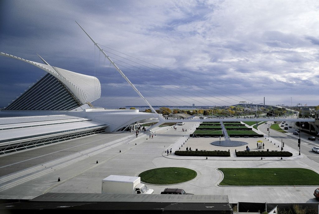
Calatrava’s designs are often inspired by nature and present a combination of organic forms and technological innovation. The expansion of the Milwaukee Art Museum incorporates multiple elements inspired by its location facing the lake. Among the many maritime elements in the design are: mobile steel blinds inspired by the wings of a bird, a wired pedestrian bridge with a raised mast inspired by the shape of a sailboat and a curved gallery of a single floor reminiscent of a wave.
According to Santiago Calatrava, the design of the Quadracci Pavilion “responds to the culture of the lake: the sailboats, the weather, the sensation of movement and change”. And “in the coronation element of the brise soleil,” he said, “the shape of the building is both formal, completing the composition; functional, controlling the level of light; symbolic, opening to receive visitors, and iconic, creating a memorable image for the Museum and the city. ”
“… Instead of just adding something to existing buildings, I also wanted to add something to the front of the lake. Therefore, I have worked to infuse the building with a certain sensitivity to the culture of the lake: ships, sails and ever changing landscape … “(Santiago Calatrava)
Spaces
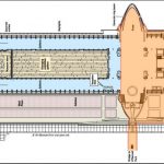
The 13,197m2 structure was completed in 2001. At the coast level, the expansion houses the large reception hall, the Windhover Hall, the gallery space for temporary exhibitions (1,500m2), an educational center with a conference room , the Lubar Auditorium with 300 seats, meeting spaces such as the Northwestern Mutual Meeting Room or the Quadracci Suite, the Baumgartner Terrace and a gift shop. The restaurant located at the focal point of the pavilion, offers panoramic views towards the lake.
Windhover Hall
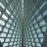
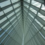
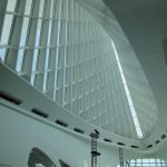
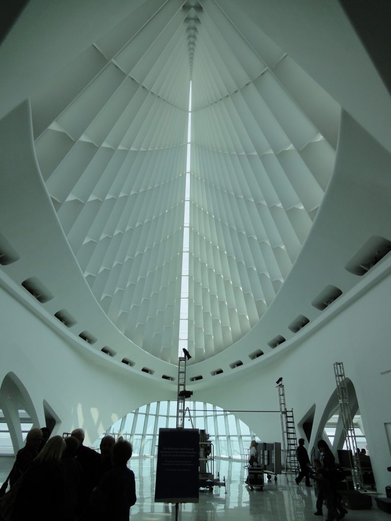
The large reception hall Windhover Hall is one of the many architectural elements that stand out in the pavilion, among swarms, propped arches, ribbed vaults, and a central nave covered by a 27.43m high glass roof, which obeys Calatrava‘s interpretation of a gothic cathedral.
According to Calatrava, “in the coronation element of the brise soleil, the shape of the building is both formal (completing the composition), functional (controlling the level of light), symbolic (opening to receive visitors) and iconic (creating a memorable image for the Museum and the city) “. The wings open daily, although the schedule is subject to change due to weather, special events or maintenance.
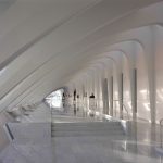
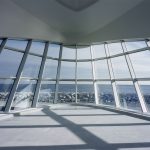
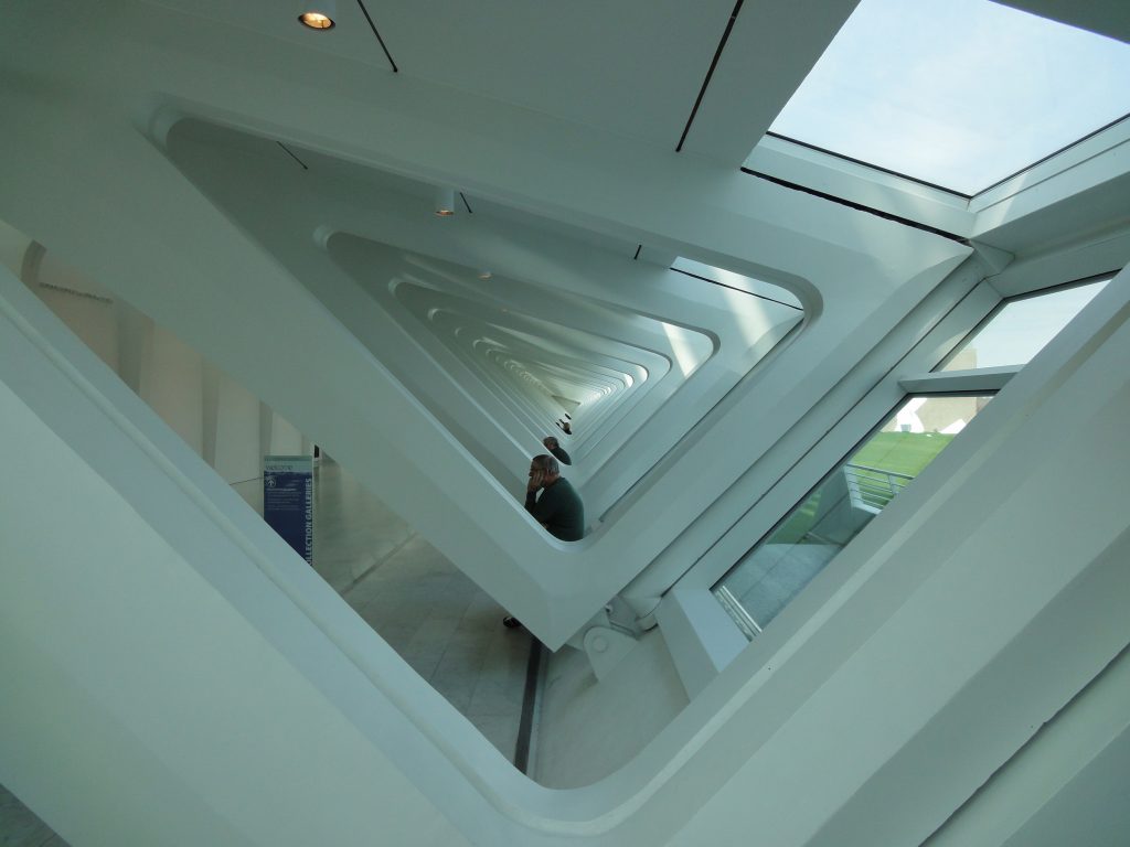
The presbytery of the hall is shaped like a ship’s bow, with floor-to-ceiling windows that overlook Lake Michigan. Next to the central corridor are two walks with tow arches, the Baumgartner Galleria and the Schroeder Galleria, with sweeping views of the lake and the city center.
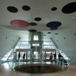
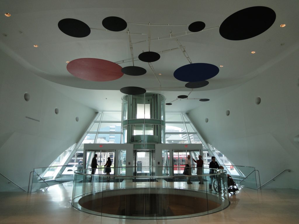
At the entrance of the Pavilion and echoing the cylindrical glass elevator and the circular opening of the floor below, also with glass railing, is the mobile sculpture “Red, Black and Blue” by Alexander Calder.
Baumgartner Gallery and Schroeder Foundation Gallery
The Baumgartner and Schroeder Galleries extend almost along the Quadracci Pavilion, extending north from Windhover Hall to the Museum Collection galleries. They are parallel esplanades that flank the Lubar Auditorium, the Museum Store and the Baker / Rowland Galleries.
The Baumgartner Gallery offers sweeping views of Lake Michigan on the east side, while the Schroeder Gallery faces west, to Cudahy Gardens and the city that extends beyond.
Restaurant Cafe
Located below Windhover Hall with easy access to the Museum’s underground parking lot, the Café has sweeping views of the lake shore and can accommodate up to 125 people.
Baumgartner Terrace
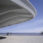
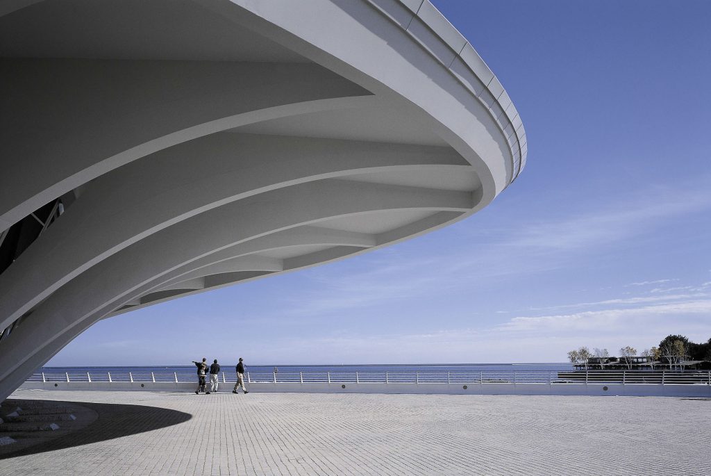
The Baumgartner Terrace is an exterior brick patio that extends south from the Quadracci Pavilion. From here, guests enjoy the best architectural appreciation of the museum, the Cudahy Gardens, the views of Lake Michigan and the nighttime of the illuminated wings of the Burke Brise Soleil.
Cudahy Gardens
At the time of the accession of the Quadricci Pavilion to the Milwaukee Art Museum, Daniel Kiley of JJR Landscape Architecture designed a 579-meter linear walkway and a breakwater on the shore of Lake Michigan. With the expansion of the museum designed by Santiago Calatrava, the challenge was to keep the site in front of the lake protected from the severe effects of the waves and the flooding of the lake, while allowing continuous public access along it.
JJR’s comprehensive solution combines art and engineering. It combines the technology of protection against waves in the water and on the ground by means of a low-profile “eyebrow” breakwater, to maintain the views, with concepts of terrestrial drainage of trenches to resist the severe environment of wind, waves and ice of the Lake , Through a full range of water level changes. The latest generation thermal protection and heat tracing technology provides protection against freezing of trench discharge and discharge pools.
The design combines well with the surrounding architectural forms allowing the public to walk around the site without impediments and ignoring this vast coastal protection system. The project also incorporates a regional system of bicycle paths in the design of the promenade, which provides links to numerous cultural and recreational facilities and is used by more than one million people annually.
Structure
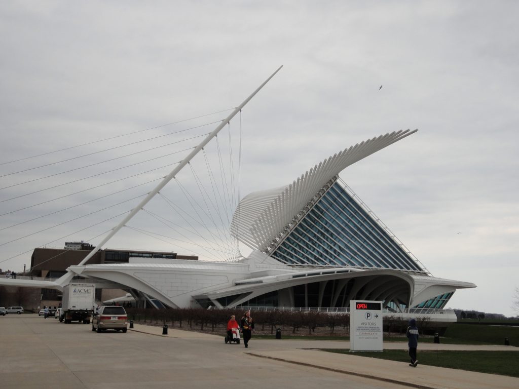
The pavilion has a spectacular kinetic structure: a bris-soleil with grilles that open and close like the wings of a large bird. When it is open, the form also becomes a sign, against the bottom of the lake, to announce the inauguration of new exhibitions. Both cutting-edge technology and old-world crafts were dedicated to creating the structure of the elegant building, which was mainly built by pouring concrete into wood shapes as a mold and combining it with steel and glass.
The creation of a structure that would control visual prominence on the Milwaukee city skyline was one of the main reasons taken into account when making decisions about the building design. The construction site was an abandoned landfill along the lake shore. However, below the filling level and below the lake there was a stratum that could support the future construction.
The team designed a base slab to extend the load and allow the installation of a more robust waterproofing system, important in a facility used to store and display valuable works of art. A thick concrete slab, raft type, was extended without pillars where moisture could seep. Due to the complex structure, it was necessary that the foundation slab, the pavilion, the frames, the security beams and the Brise Soleil be designed through a detailed analysis of three-dimensional models.
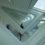
Concrete arch elements transfer structural loads to the foundation wall and to the central beam. Structural and mechanical engineers worked together to determine the size and position of openings in concrete beams. Finally, the team managed to place a series of oval openings to meet mechanical needs without compromising structural strength or visual impact.The unique trapezoidal shapes of the arched support structure create a focal point as they move from a slender base to a deep beam carved in the upper sections. The arches vary in subtle ways from the main hall to the south canopy that stands out. Multiple arcs join here in a complex juxtaposition of angles, curves and connections. The use of a physical model helped the construction team to execute the formwork and place the arches to meet the aesthetic requirements.
Burke Brise Soleil
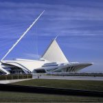
Unprecedented in American architecture, the Burke Sunbreaker is a movable sunscreen, similar to a wing, that rests on the domed and glazed upper part of Windhover Hall.
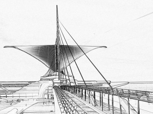
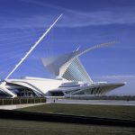
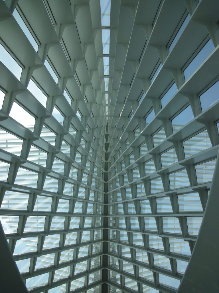
The characteristic wings of the museum, the Burke Brise Soleil, form a mobile sunscreen with a wingspan of 66.14m that rises and falls during the day to provide shade inside the museum, while creating a kind of urban kinetic sculpture. With a wingspan comparable to that of a Boeing 747-400, it consists of 72 steel fins, which vary in length from 7.92 to 32 meters and weigh 90 tons.
The pivot line for the slats is based on the axis of a linear mast, inclined at 48 ° degrees, parallel to the mast of the adjacent bridge. The whole structure weighs 90 tons. It takes 3.5 minutes for the wings to open or close. The fin sensors continuously control the speed and direction of the wind, so when the winds exceed 23 mph for more than 3 seconds, the wings close automatically.
Cable-stayed bridge
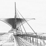
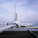
The Calatrava project includes a cable-stayed pedestrian bridge 85.34m long, 4.87m wide with a 58.52m pylon that supports 10 main sections through 9 cables with closed bovine and 18 backup cables. This bridge, with a 73m span that leads to a main street, connects downtown Milwaukee with the museum and the lake shore.
The pylon of the cable-stayed bridge and the backbone of the Quadracci Pavilion building are aligned on the same axis and are tilted 48 degrees to the pavilion.
Materials
According to the engineers, the sculptural form of the structure lent itself to the use of reinforced concrete, a material characterized by its fluid and moldable qualities.
The other primary materials are metal and glass, evident in areas such as mobile sunscreen steel and the glass roof that rises 27.43m above a central hall. The floors are Carrara marble.
Concrete siding
Inside the exposed concrete walls were painted to give them a smooth finish, the imperfections were previously covered with drywall.
Ensuring the smooth finish of the concrete panels began with the shapes. The contractor made them on the site with solid wooden boards, many of which showed a craft whose quality is typical of the furniture. The shapes were formed with the exact curves specified for each arc and then coated with a fiberglass material. Subsequently, the construction team developed a concrete mix with a smaller than usual aggregate, which allowed the material to flow evenly around and around the heavy steel reinforcement. The particle size of the aggregates used in the mix design was 9.5 mm instead of the 19.13 mm standard.
Due to the large amount of reinforcing steel required, an aggregate with standard-sized particles in the concrete used for the Pavilion could not fill the interstices between the reinforcements. Finally the air bubbles were removed by applying an external vibration. The result gives the cured concrete surfaces a distinctive elegance that contrasts with the other raw materials.
On the Calatrava pedestrian bridge he used Wisconsin granite pavers, winking at the Eero Saarinen War Memorial, whose base is the same material.
