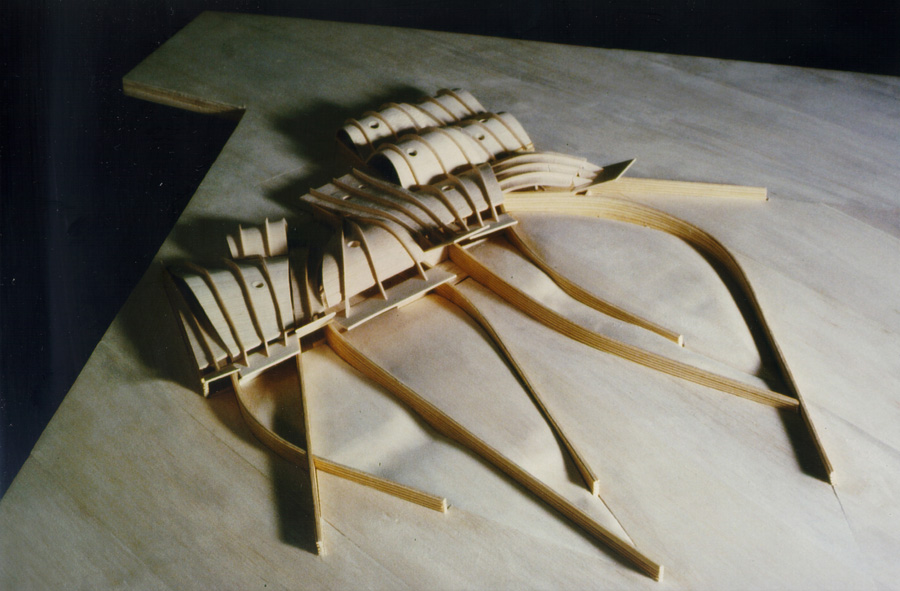
Public Library in Palafolls

Introduction
Palafolls City Council held a contest for a library at the periphery of the town itself. The municipality showed unusual concern when choosing your architecture, which is why the Japanese architect Arata Isozaki, creator of Palafolls Palauet, among other works, he recommended the mayor of this town that Enric Miralles to design the new Municipal Library.
Location
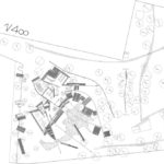
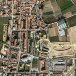
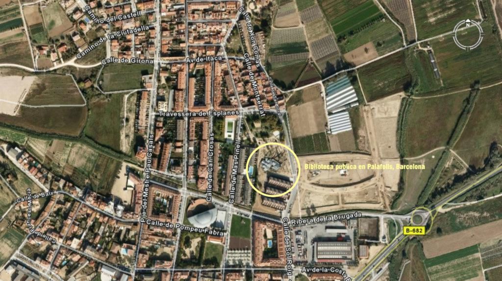
The library is situated in the Park Esplanes. It occupies an area of 623 square meters, distributed on one floor. It was designed for a population of 8,000 inhabitants.
Concept
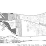
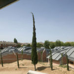
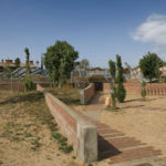
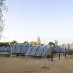
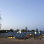
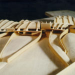
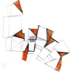
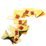
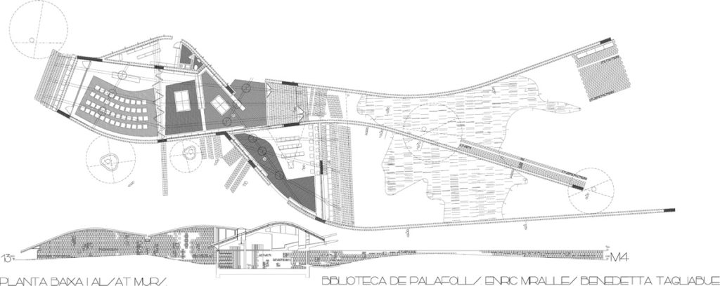
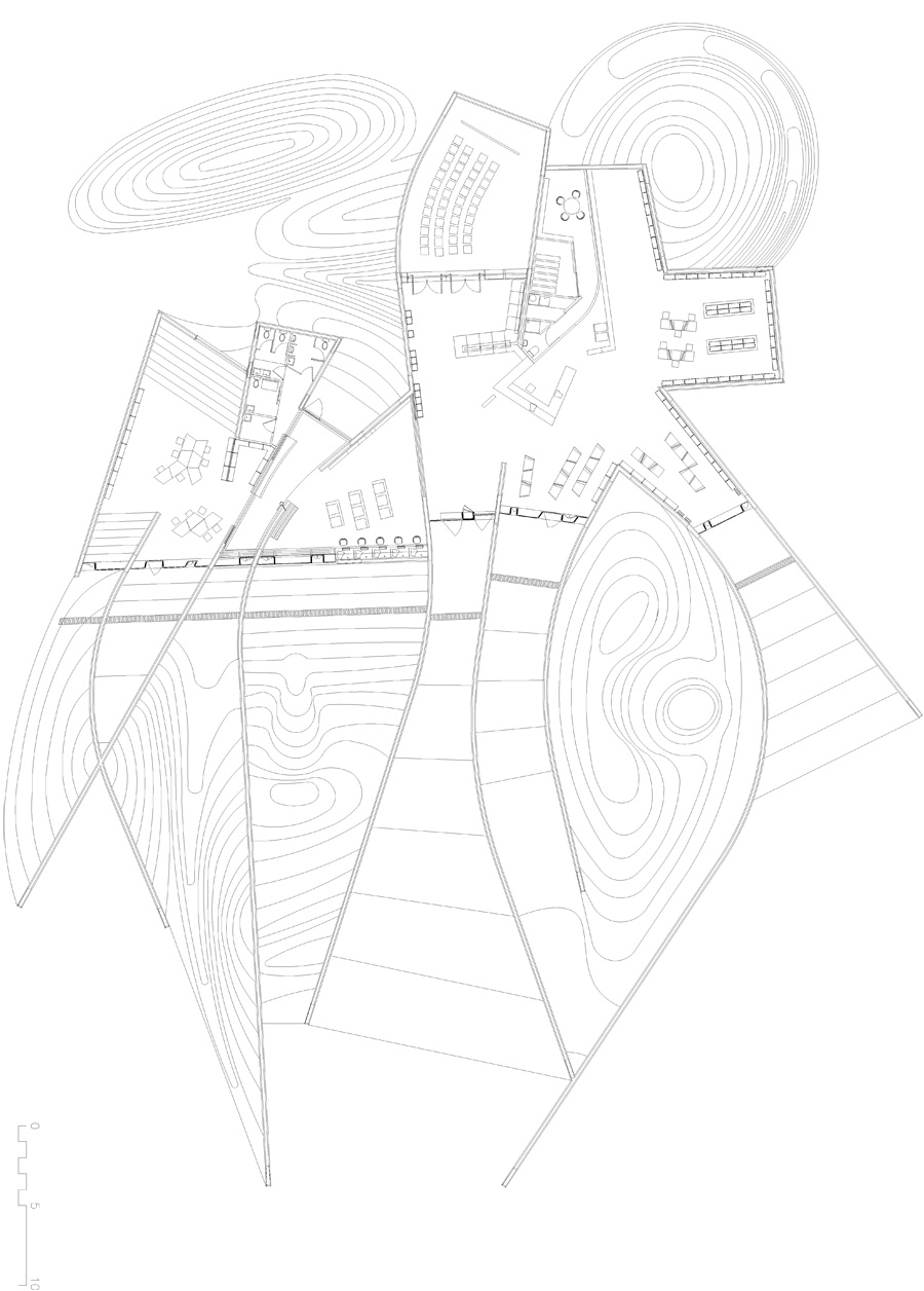
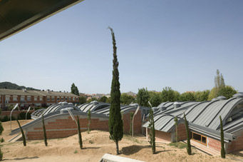
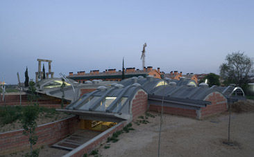
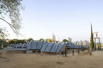
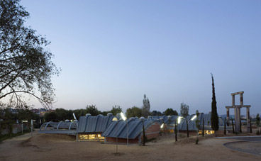
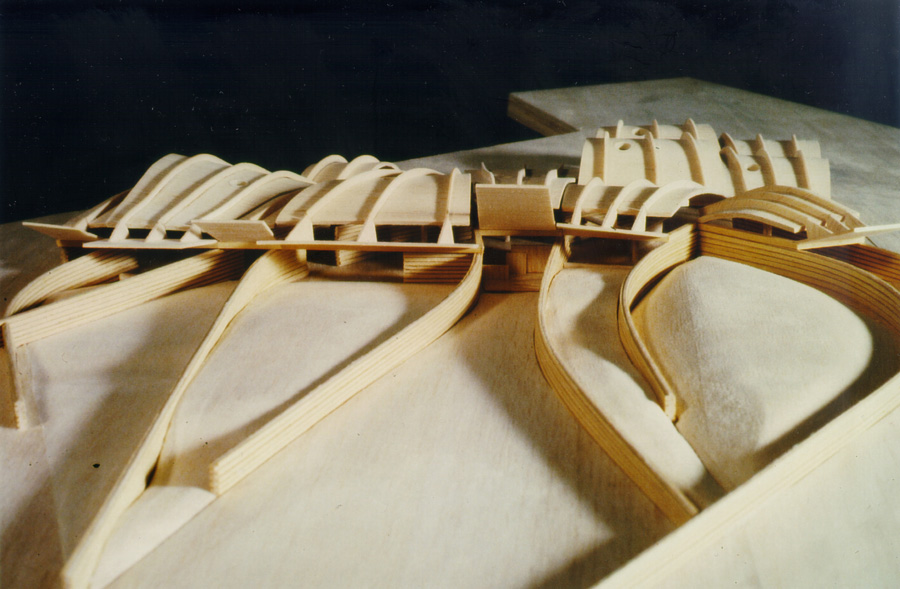
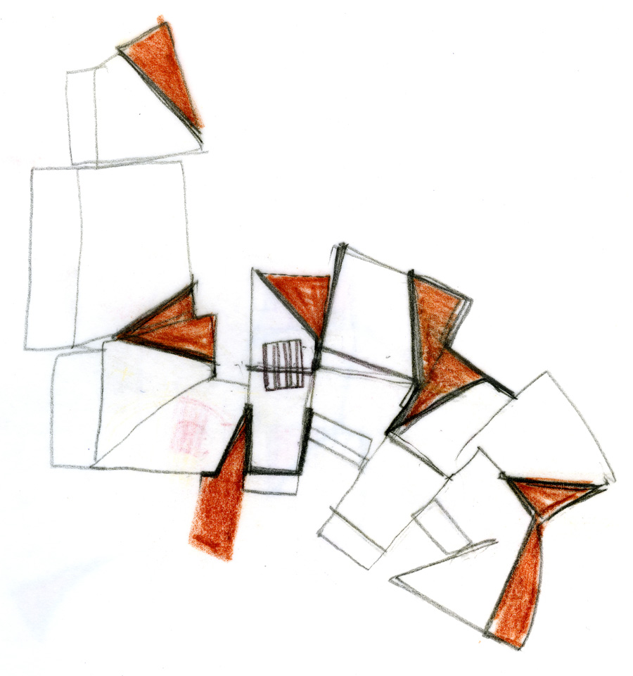
The building was designed sinking one meters underground to assimilate the profile of the mountains which are on the horizon. The proposal opening look into a small park and fragment “as cut sliced bread.” Thus, the remains of the fractured area is reaching out through lines that open the library to the park in a controlled manner. The great concern about how to interact with the outside world is perceived in the way the external wall (composed of folds and openings), is represented more as a generator of ambiguous spaces than a simple border.
Spaces
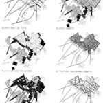
The project Palafolls library had many changes from its competition through a process of fragmentation of the initial volume compact. The objective was to insert the library on the ground and fuse with it, is why is buried a meter. Solid lines of vertical planes, which organize the space, taking a variety of levels, starting and ending at zero. This strategy was also adopted in the Scottish Parliament.
Garden
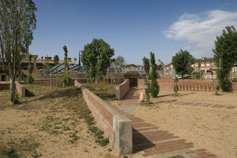
It is also fragmented by the walls. Oscillating motion is formed by land.
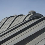
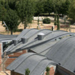
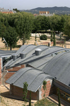
The roof of the library are determined and repeats naturally. It is conceived as a continuum in the articulation of the volume of the Library.
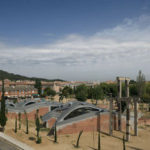
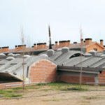
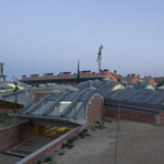
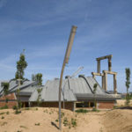
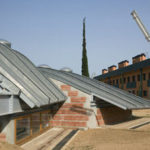
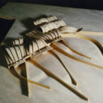
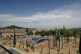
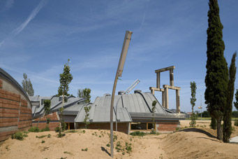
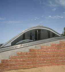
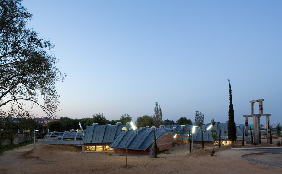
With the decision to semi-underground building, always gets a front garden. Thus the facades almost disappear as such, and the undulating deck becomes the authentic urban facade, creating a dune metal. This present here an inclusive idea of architecture and nature can be read also in Gaudí or Alvar Aalto.
Building
- The exterior
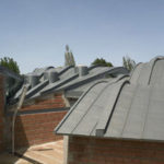
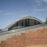
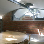
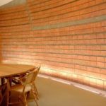
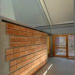
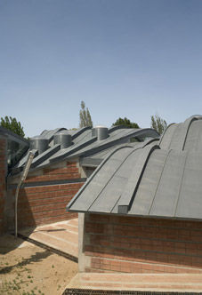
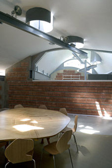
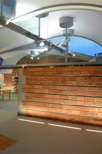
The brick wallsinviteaccess, ordered space with sinuous lines.
There are no hierarchies in the building’s exterior since no volume is greater than another.
- The inside
From here,perceivedvariety of spaces formed by the continuity of the walls: dialing the access road in some sections intercepted or forming a courtyard.
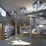
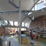
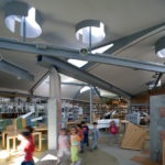
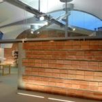
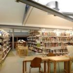
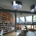
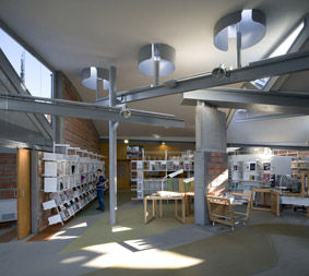
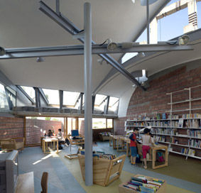
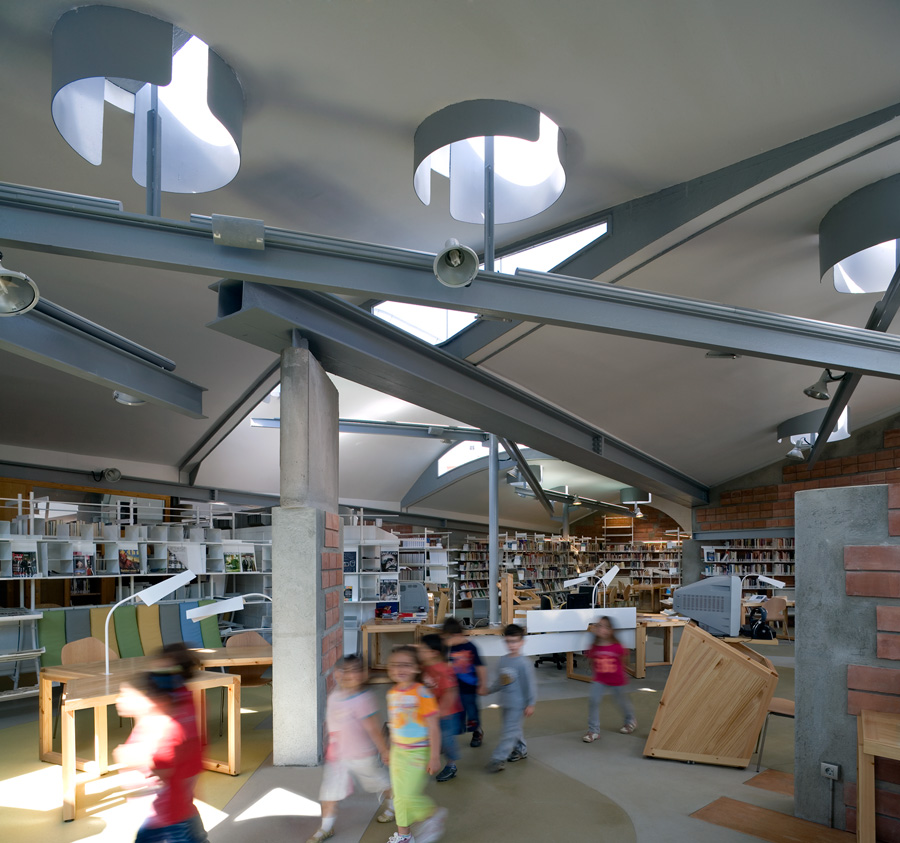
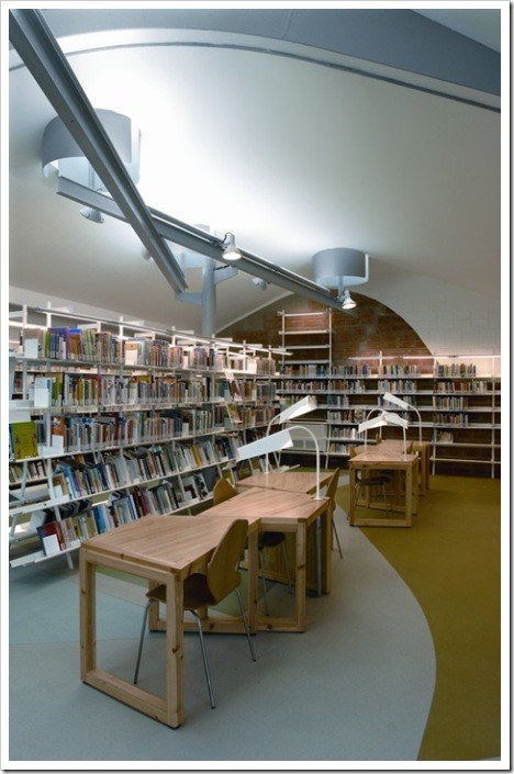
The whole hierarchy is defined by the setting of internal space, and by the way you acquire each site. One of its main features is the visual permeability. It is almost possible to master the entire space, since from the most extreme you can see more distant areas.
From access and reception spaceflows in all directions,as a radial structure, although there is a linear sequence that invites us to travel from the central space to reach the children’s reading area.
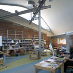
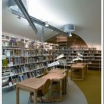
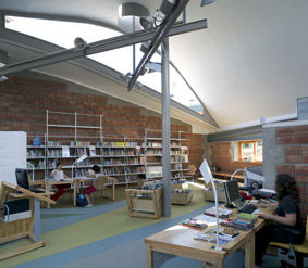
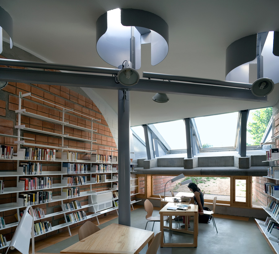
The furniturealso organizes the different areas, books and reading places, with tables linked to the proportion of spaces.
The space with light-colored chairs, is intended toreading newspapers and magazines,it is a most comfortable and intimate space, or more directly with the movement of users, since the chairs provide both spaces.
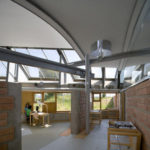
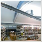
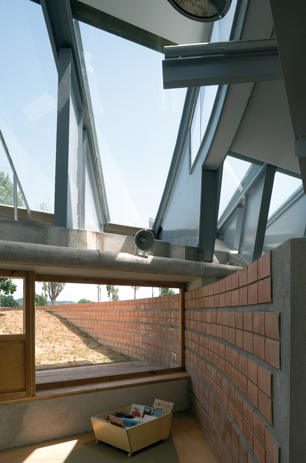
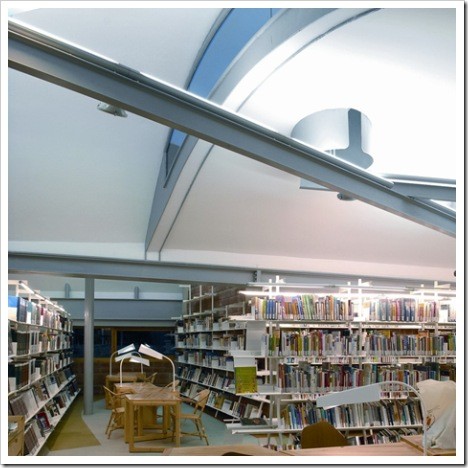
The natural light,on the sides of the roof generate a play of reflections and transparencies overlap. It enriches the sequence of three modules circular top lighting and diagonal beams whose goal is to help revitalize the area.
Structure
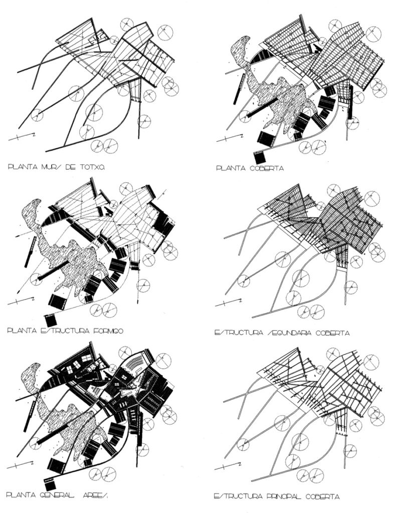
The structure of the library has a system of columns that function independently of the envelope.
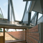
The roof consists of corrugated arches differentiated and steel beams are oriented to the north.
The awnings on the facade of access to the library, various panels of reinforced concrete, creating a new rhythm through tipping. They are also responsible for receiving the metal beams of the roof structure.
Materials
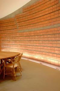
Quite clear there is an order regarding the use of materials: brick walls articulate the exterior and interior space. In the planes perpendicular to the brick wall panels with modulations are used in wood and glass, creating zones with some visual permeability and large glazed openings.
