Preston Bus Station

Introduction
The Preston Bus Station was built between 1968 and 1969, its brutalist design was made by the architects Keith Ingham and Charles Wilson of Building Design Partnership.
In 2013 it was classified as Grade II, which means that the building is of special architectural interest and guarantees all efforts to preserve it, after in 2012 it was threatened with demolition by the Preston City Council, claiming it would cost £ 23m renew it and more than £ 5m to keep it standing. After much speculation in 2013 and thanks to local investor Simon Rigby the building was saved from demolition and was preparing for a remodel.
When it was built, the station replaced four smaller bus interchange terminals, as part of a future vision to transform Preston into a “Supercity” that could accommodate a rapidly expanding population. This never happened, leaving a bus station much larger than required.
On the eve of World War II, the nearby city of Blackpool had advanced the general concept of the station, building a bus station with integrated multi-storey parking. Like Preston in the postwar period, before the contest Blackpool was at the forefront of English cities seeking innovative solutions to increase traffic levels.
Location
Preston Station is the central bus terminal of the district, in Lancashire, England. It is surrounded by concrete aprons and is located in an island structure, with a size and operation similar to an airport, placed in the center of a rural city in the north of England, with 140,000 inhabitants, and priority of land access for buses .
Concept
As a “mega structure” of the 60s that combined several functions, it was designed to recreate the sense of the monumental within the scene of the British city and as a center of traffic for the region. At the time of its construction, architect Keith Ingham said that his goal was to offer ordinary people some of the luxury that air travel offered, something that few people of that time could afford.
Architecture critic Tom Dyckhoff refers to the station with these words ”… the Preston Bus Station summarizes that rare period in the recent but far away past in which as a nation we take pride in laundering time and money to create collective spaces of quality and equality throughout the country, even for the most mundane activities, such as taking a bus or eating a cake at the station cafe… ”
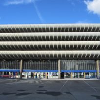
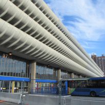
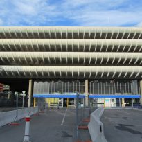
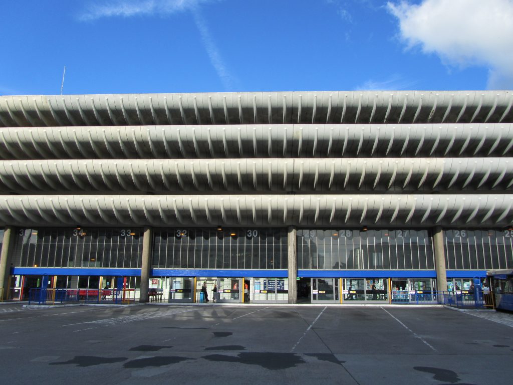
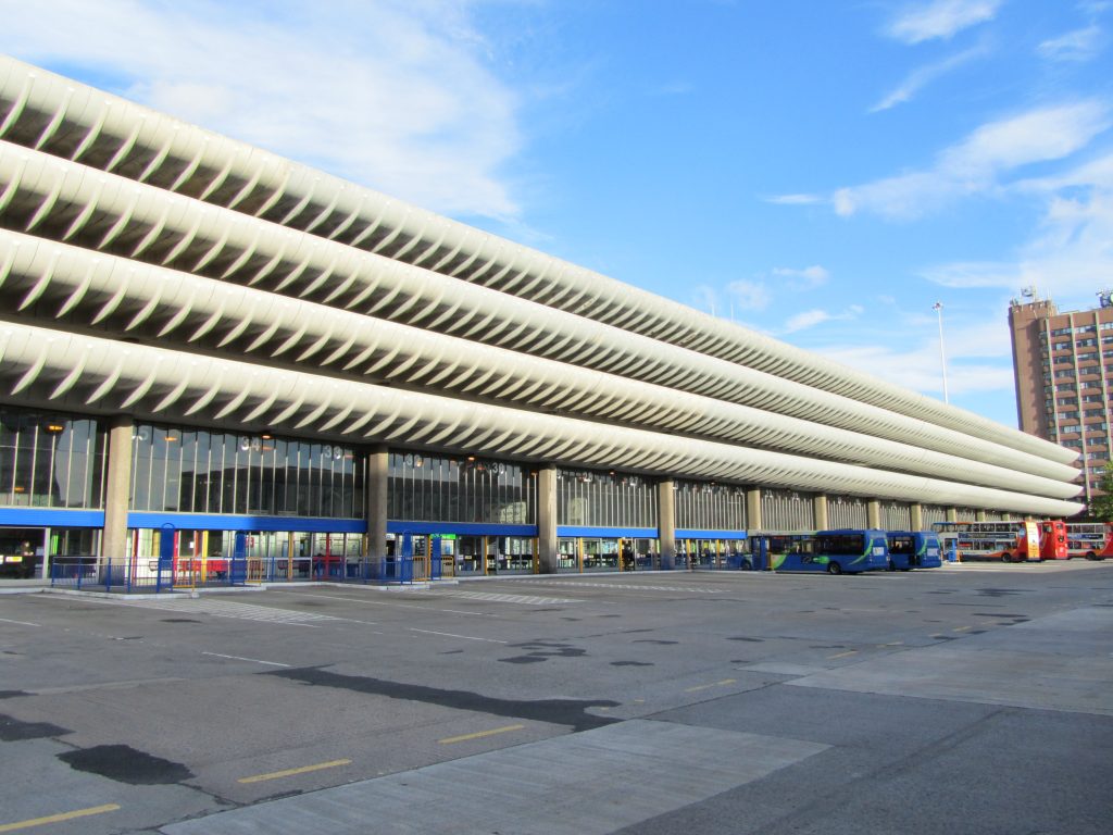
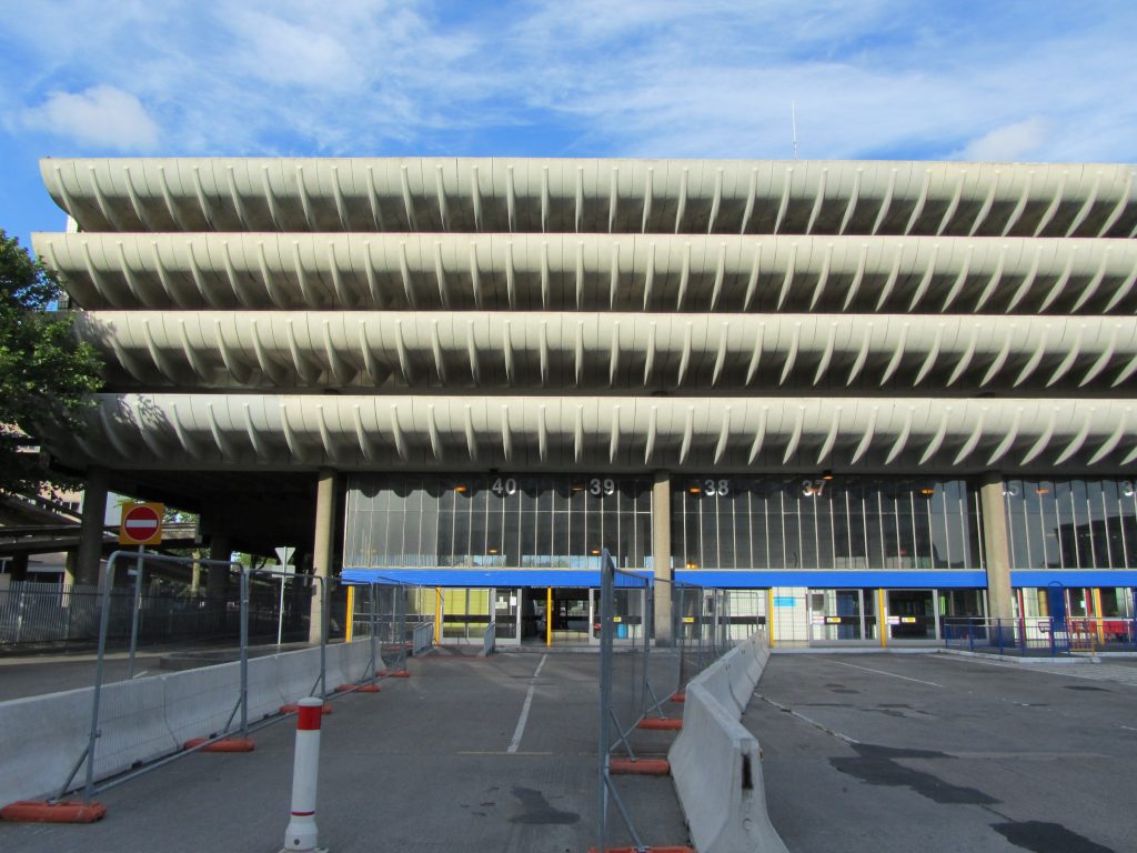
The curved concrete front of the parking lot is the main architectural feature of the design and focuses attention on the great length of the building while creating an elegant light-dark horizontal ring effect along the main east and west elevations.
The building shows an unusual mix of the new brutalist architecture, influenced by a late Le Corbusier, softened by an application of curves towards the main elevations, wide parking ramps and the curvatures at the ends, where the old taxi rank is located.
Spaces
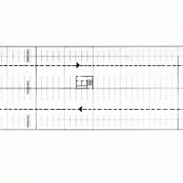
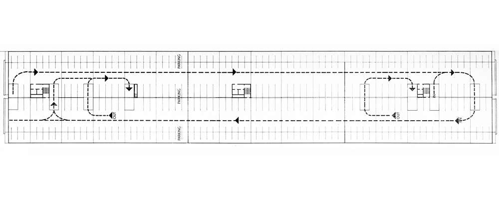
The bus terminal combines its capacity for 80 double-decker buses, 40 on each side of the building, with a four-story parking lot for 1,100 cars.
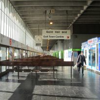
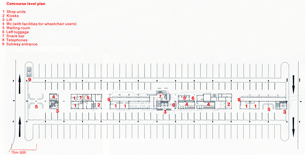
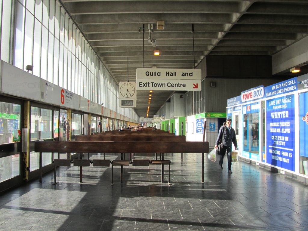
Pedestrian access to the station is through a walkway and three pedestrian underpasses, one of which connects directly to the adjacent Guild Hall, at the southern end. By the north it connects with the Ringway. Curved ramps and elevators connect to the parking floors.
At the southern end of the station there is an old taxi stand, a round waiting platform with a round concrete roof and an illuminated portico 24.38m high.
Ground floor
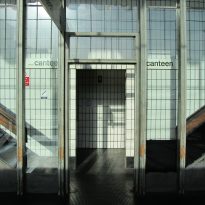
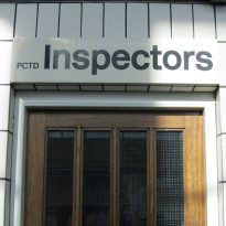
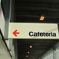
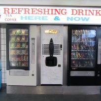
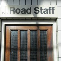
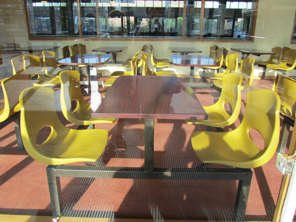
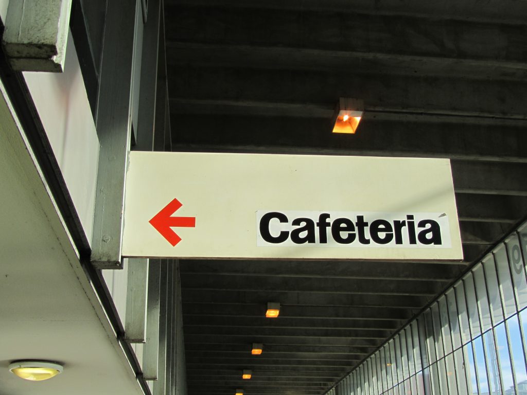
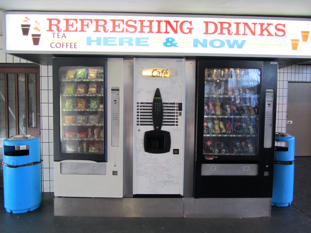
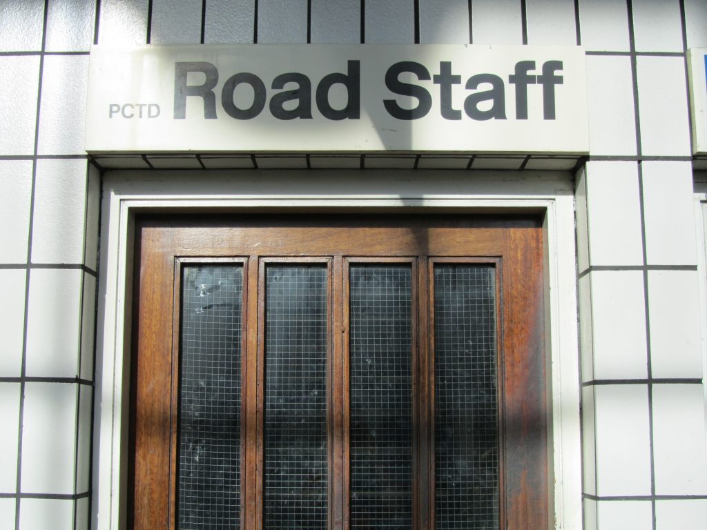
The ground floor has a central column of two-storey buildings that contain passenger facilities such as kiosks, cafeteria, information and reservation offices, and staff offices and rest facilities on the top level.
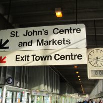
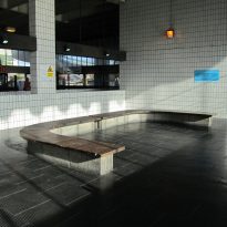
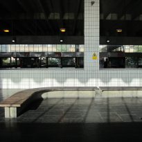
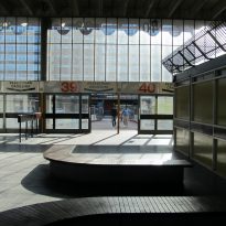
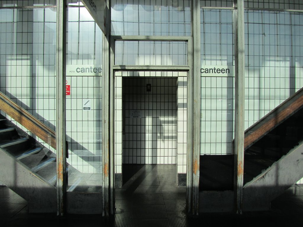
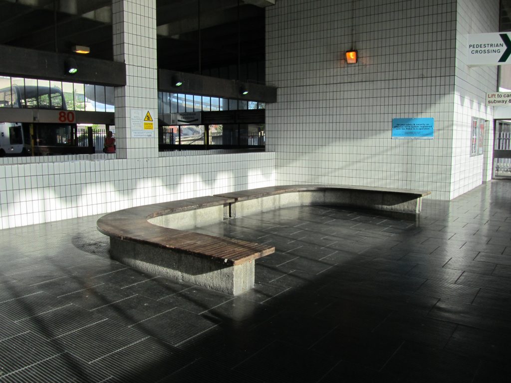
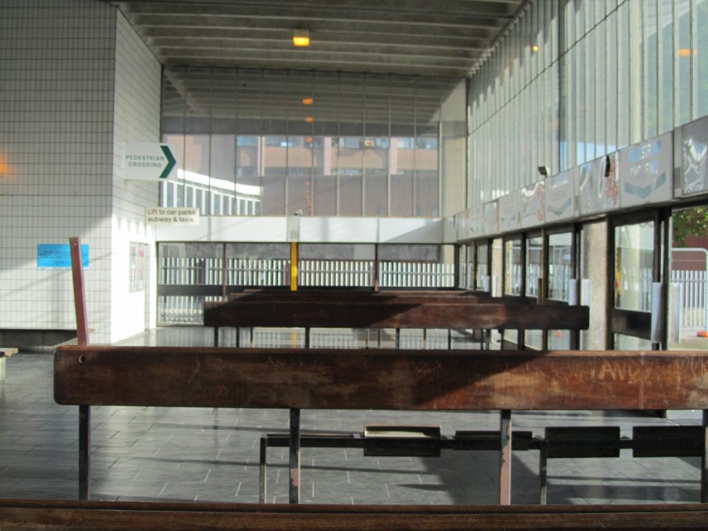
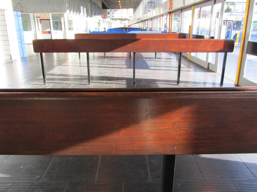
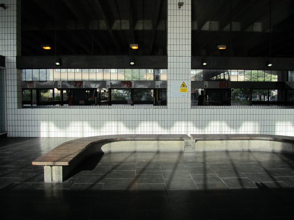
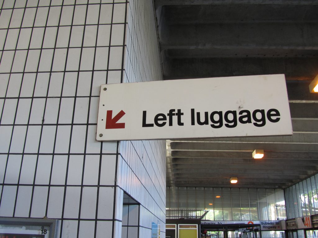
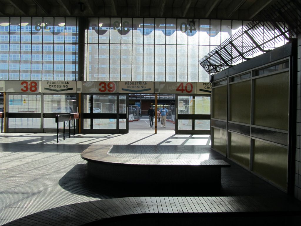
On each side there are waiting areas adjacent to the bus stops, each divided by metal and wood barriers. The passenger lobby is fully glazed and the lower half of the main facades is surrounded by a sliding door system, two doors for each bus stop. Above the doors, a board indicates the original numbers and destinations of the bus stop. The access ramps show the walls with white tile walls and black rubber floors. There are three public elevators and stairs that connect with upstairs parking.
Upper floors
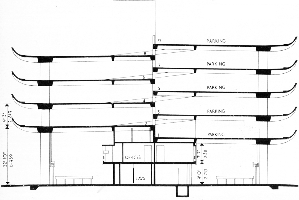
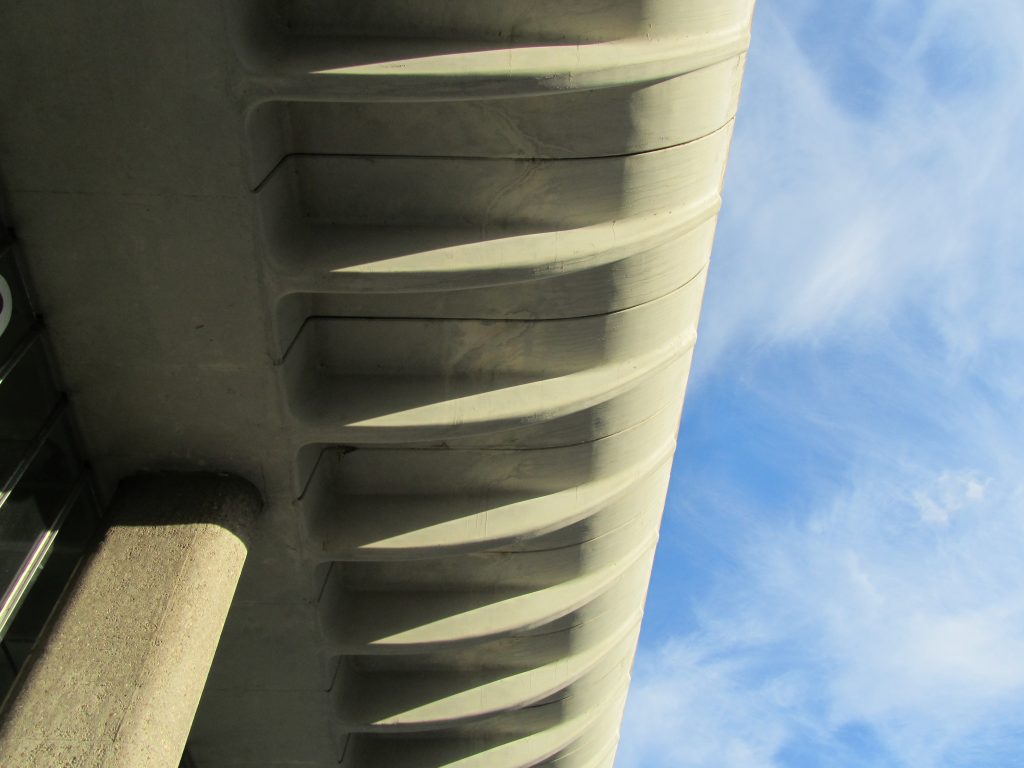
The upper 4 levels of the building provide parking spaces that can be accessed by ramps. The parking is notable for the curved structure of the cantilever concrete barriers. The balustrade on the first floor of the parking lot protects passengers from the weather by allowing buses to penetrate below. The engineers of the firm Ove Arup and Partners, designed the distinctive curve created by the parking balconies and give the building an organic and sculptural appearance. The edges of the car park are also functional preventing bumpers from hitting a vertical wall.
The north and south ends of the building are clad in white tiles placed vertically with wide joints and breaks in the grid pattern on each level.
Structure
Through the use of industrial techniques such as the precast molding of concrete slabs, it was possible to create a design that served the function of the building and at the same time contributed to its aesthetic power.
The building is rectangular, approximately 170 m long and 40 m wide, and is located within a wide platform that extends on both sides to allow bus movements. There are curvilinear ramps for parking at the north and south ends of the building.
The support columns have an aggregate of beach pebbles that are exposed by shot blasting. Four rectangular lifting axes, each covered with white tiles, protrude above the upper parking deck.
Materials
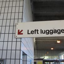
In its construction, reinforced concrete, steel and prefabricated slabs with partial white tile cladding and glazing were used. The original signage was made of glass reinforced polyester, material that was also used in telephone booths and timetable boards.
At the time of its construction, a factory was established on site to carry out the necessary elements to give the building its unique profile. Using glass reinforced polyester molds, the 2,800 pieces used were produced in just under a year. The versatility and flexibility of polyester made it possible to cope with compound curves of the required shapes and provide a smooth surface finish.
To reduce the weight of the concrete barriers of the parking lot, its thickness was reduced to a minimum, with the unfortunate result of the shedding of the material and the oxidation of the internal steel reinforcement.
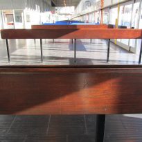
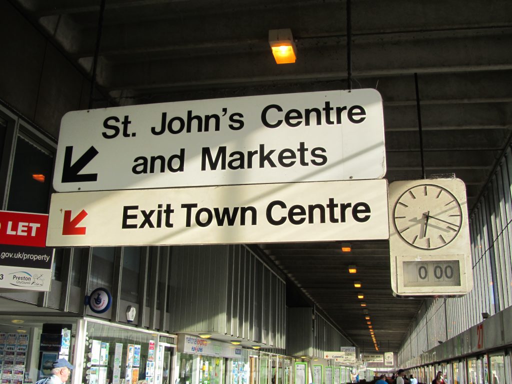
Both high quality materials, such as white tiles from Shaws of Darwen, were used both inside and outside. The architects designed custom accessories for the station, including greased iroko wood seats, sliding doors and steel rails, greased wooden handrails, signage and unique clocks.
The floor of the bus station is made of black rubber tiles, while the central column is covered with white tiles placed vertically on the ground floor with glazing towards the offices above. The ceiling of the passenger room shows the exposed soffits of precast concrete.

