Portuguese Pavilion Expo ’98

Introduction
To achieve the Lisbon Expo 98, Portugal Siza entrusted to the realization (without a competition) to the main pavilion at the expo and to represent Portugal, which would explain the history, commitment and importance of the Portuguese in the seas.
The building should be thought of as a permanent building and that after the expo would be given a utility, but this was previously undefined. The flag should be implemented in the context of an outline and subject to change and among other buildings which were undefined and in its early stages.
There was a lack of solid reference guide with which to solve the project.
Location
The area allocated for the expo was an area environmentally damaged and been abandoned on the shores of the Tagus river, which was located in a channel, a compactor, a weapons factory, an oil refinery and service station, between other buildings with highly polluting functions.
The purpose of the organizers was not only regain this area of the city, but also develop it and give it momentum, so it was thought useful to give all this infrastructure beyond the expo, so it created the new district Olivais which would connect to the city through a new subway line, the Basque da Gama bridge and a multimodal station designed by Santiago Calatrava.
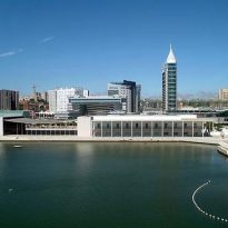
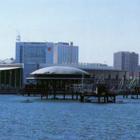
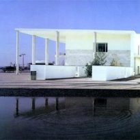
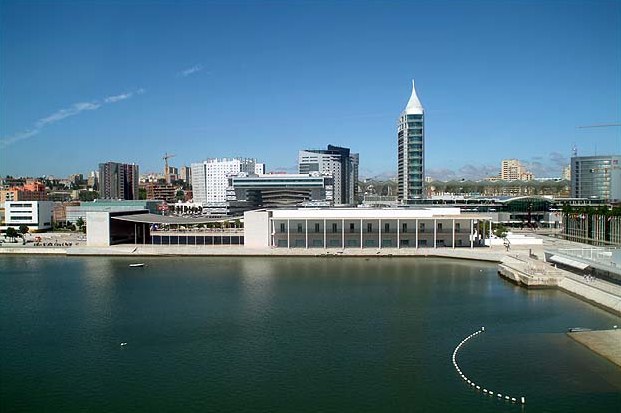
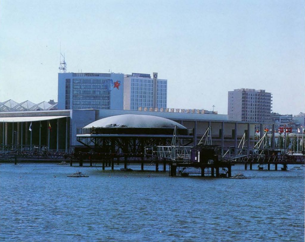
The original flag had a location on the other end of the park, this was changed at the request of Siza to dump the building on the river (originally it was far from him), to be ready at the northwestern corner of the pier.
Concept
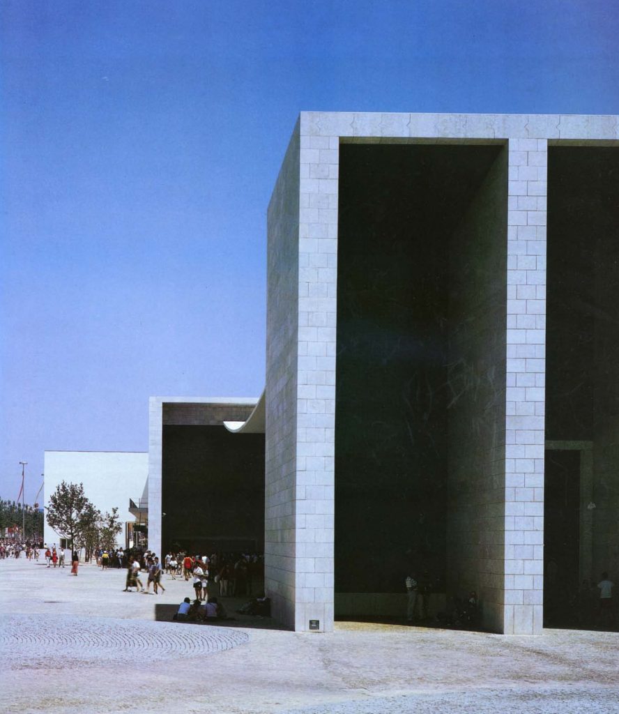
Was proposed for the building and festive an emblematic image that stands out for its simplicity and forcefulness, worked in a pure rationalist language.
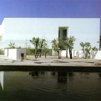
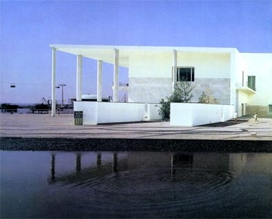
According to the architects (interior was designed by Souto de Moura) the flag can transmit an unmistakable legacy: “Portugal is a small country tucked in a corner of Europe, but a nation that contributed to the progress of civilization,” the development of This project was Siza remind some of the Most Serene Venetian buildings and their relationship to the water, trying to Lisbon through the building to bring the city to the river since according to this the city is disconnected from the water due to high activity port that is made in the bank.
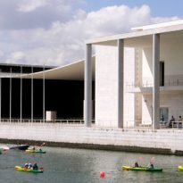
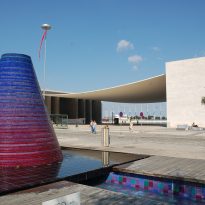
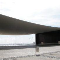
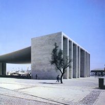
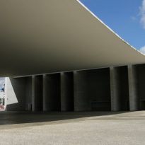
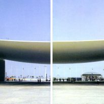
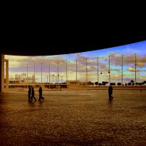
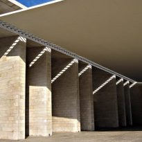
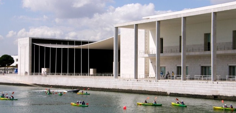
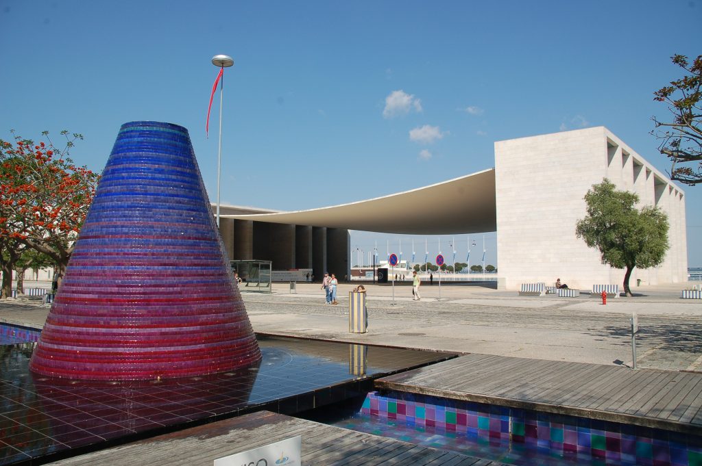
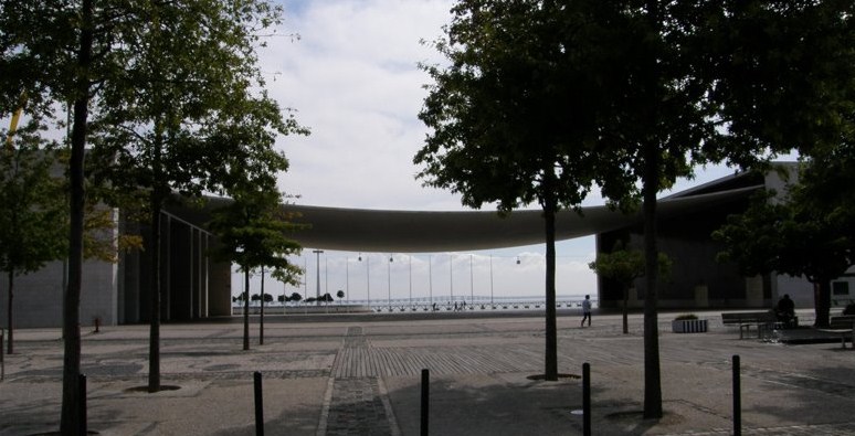
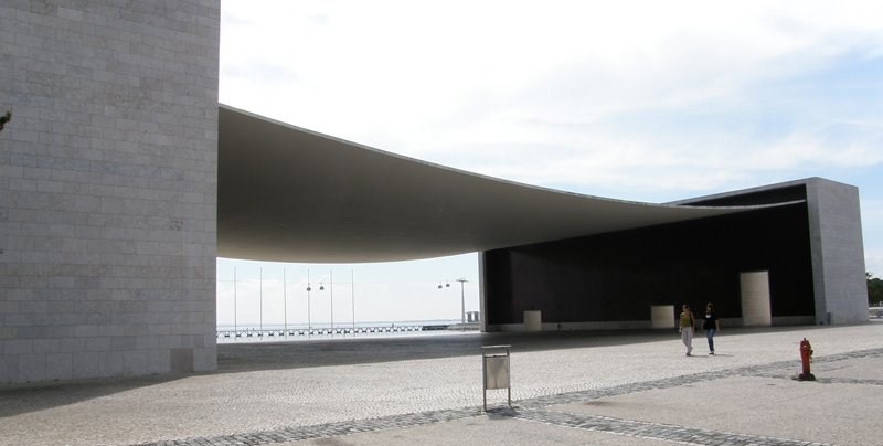
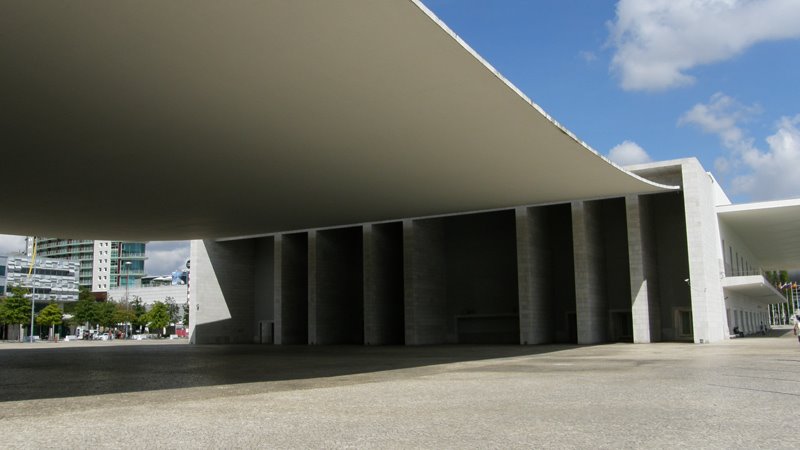
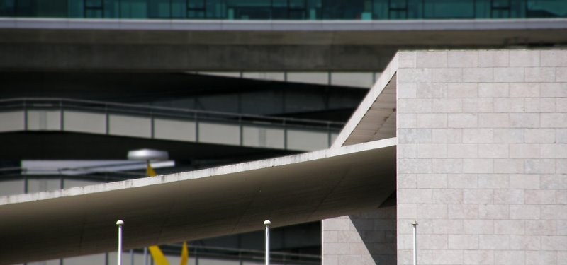
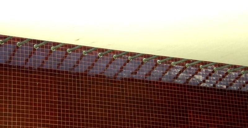
As further shown metaphorically in the building features a large pergola catenary shaped curve representing the sails of the Portuguese ships and light entering the large space that behaves like a large window to the sea.
Spaces
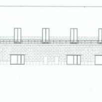
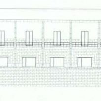
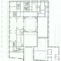
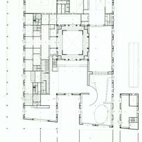
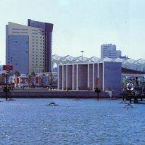
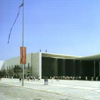
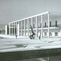
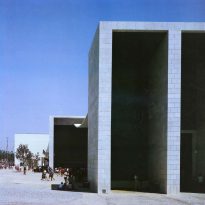
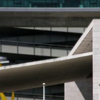
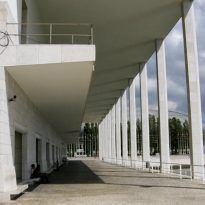
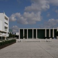
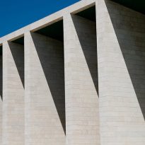
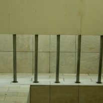
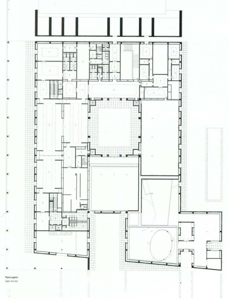
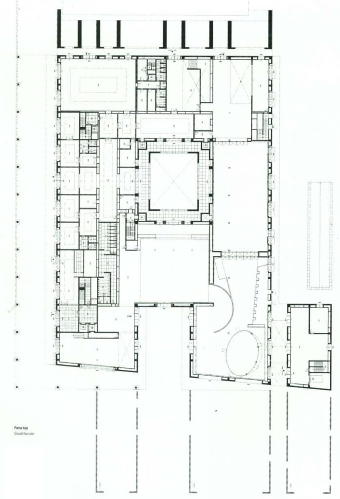
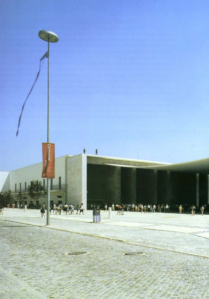
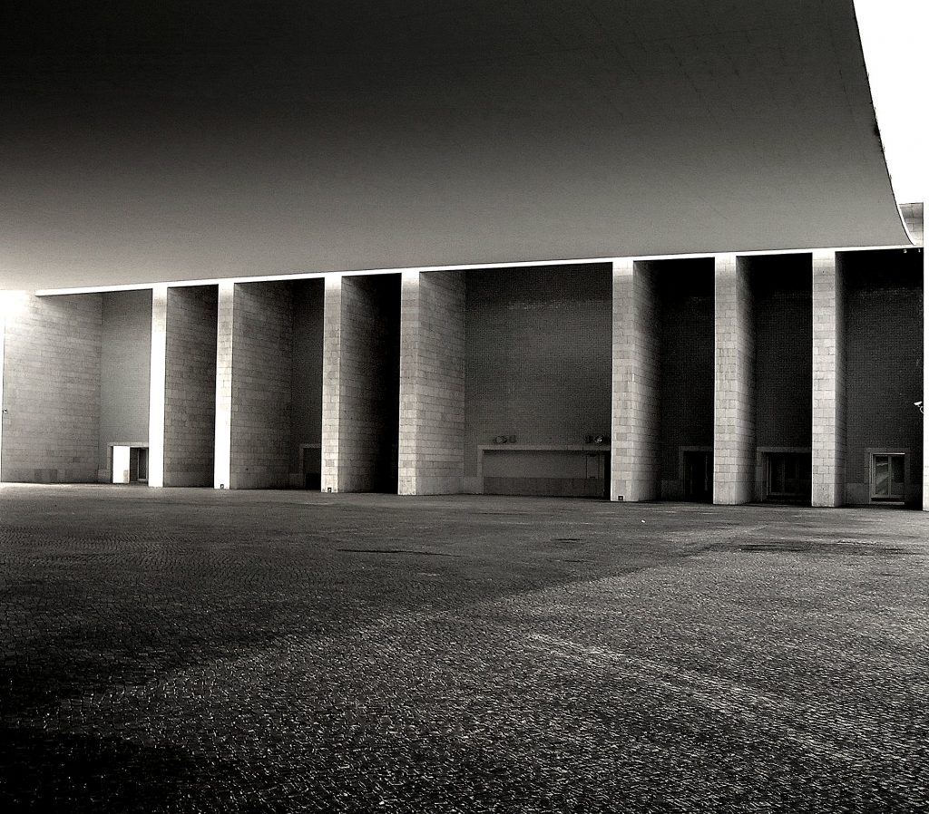
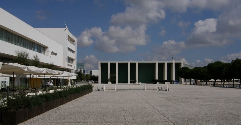
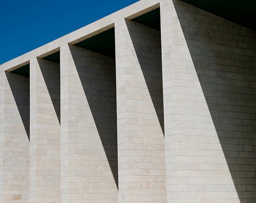
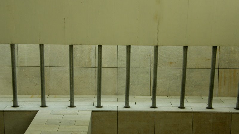
The building consists of two distinct parts which are linked through the large gazebo, a covered area of 3,900 square meters facing the ceremonial square, a rectangle of 65 x 58 meters defined by a suspended slab which defines a catenary curve with minimum height of 10 meters and two holes monumental gates consist of a series of vertical boards with a game winning deep shadows, and a building of nearly 14,000 square meters exhibition area includes (2,600 m2), reception area and restaurants (11,200 m2).
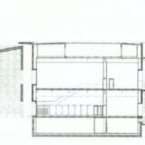
In the basement is located the service area (4,500 m2).
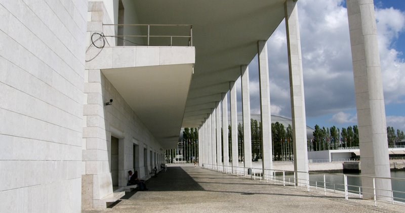
The building occupies a modulated structure about 70 x 90 meters approximately, in the basement and two floors with a courtyard around which it organizes the building, an outdoor patio open to the north and parallel to the dock a porch faces east. This even distribution of space, combined with the strategic location of the vertical movement, allow great flexibility for subdivision, and natural lighting is ensured by the peripheral location of space and openness to the courts.
Structure and Materials
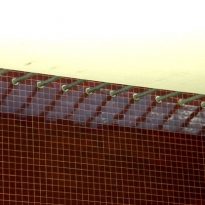
The structure is reinforced concrete, the space covered pergola is a thin reinforced concrete slab about 20 cm thick, painted white, which is supported by steel cables (which act in armor) at two large blocks which are separated allowing light to enter between the slab and the porch.
The Portico is reinforced concrete covered with colorful tiles. The use of concrete refers to a preference for this material that has the architect, colored tiles give a little more joy to the building and take away frivolity.

