Phillips Exeter Academy Library
Introduction
In 1965, Louis Kahn was called on to design a library and dining area for the high school community in the Phillips Exeter Academy.
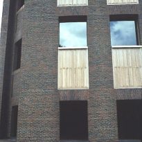
This library is one of the most important and visually austere buildings Kahn built for an American university.
The architect was chosen based on the results achieved in the projects of new buildings at the existing campuses of Yale University, the University of Pennsylvania and Bryn Mawr College, as well as his proposals that were not built for Rice University and schools of fine arts of Maryland and Philadelphia. Kahn became one of the most prominent and requested architects for such orders.
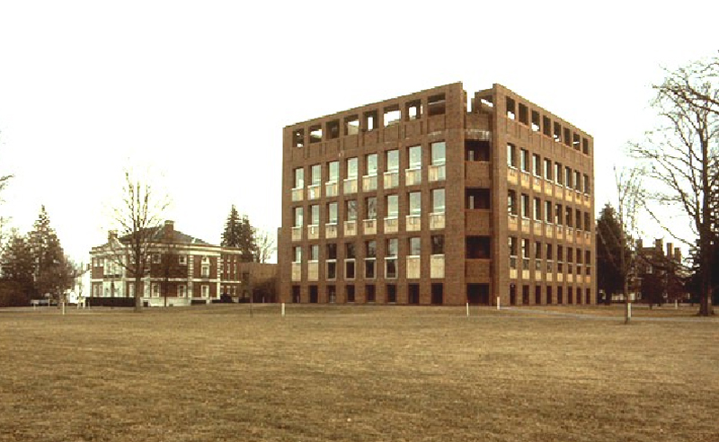
The building is located in an environment in which neo-Georgian buildings dominated and in which the then new rector Richard W. Day wanted a modern project that outweighed the historic character of other buildings on campus, thus achieving a significant contribution to the architectural landscape.
The projected cost for the construction of Kahn’s design exceeded the initial budget of $2.5 million, so it was necessary to substantially alter the design, and eliminate the top floor. After numerous meetings with the committee and letters in which the architect persuaded its members that a change of this magnitude would alter significantly the global scale of the design, the committee agreed to raise more funds, and in the last round of changes to the working drawings, the top floor was restored.
Situation
The library is in the town of Exeter, New Hampshire, on West Elm street, occupying the site of the old main house on the property.
Concept
The plan required the library accommodate 250,000 volumes of the general collection, magazines, rare books, classrooms for seminars and work places for 400 students and requested that it be “far from being a mere repository of books and periodicals, the library becomes a modern laboratory for research and experimentation, a serene haven for study, reading and reflection, the intellectual center of the community.”
All three versions developed by Kahn
There are no major changes in three versions that Kahn developed between 1966 and 1968.
The first was developed in October 1966 through July 1967, the second and third, through November 1968.
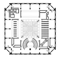
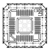
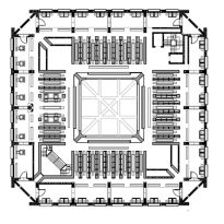
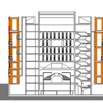
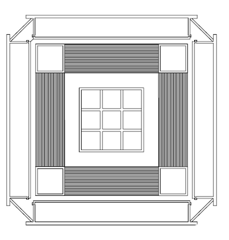
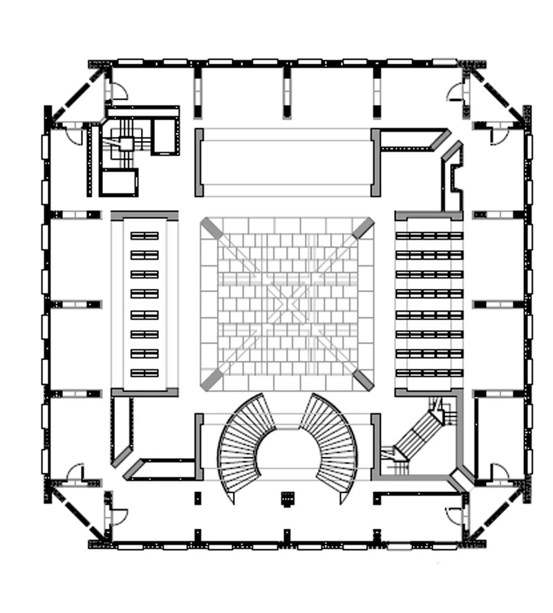
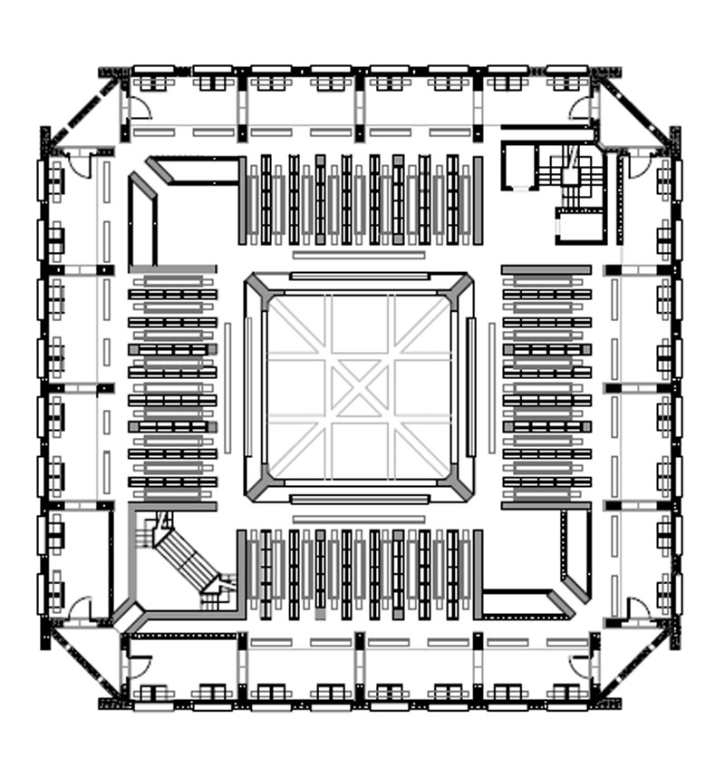
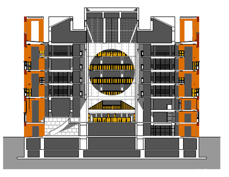
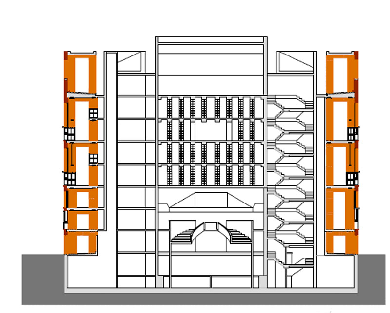
The first shows a building divided into three parts encompassed in a square: an inner zone of three stories of concrete topped by a pyramidal roof, an intermediate zone with a mezzanine dominated by wood for storage of books, and an outer zone containing spaces for working and reading, expressed by a brick facade.
This structural morphology, differentiating the form and use of the space remains unchanged throughout the three stages mentioned.
Variations and adjustments, sometimes as a result of restrictions imposed by the customer, took place primarily in different aspects of what Kahn called the design of the building: the walls, corners, the section and the resolution of the central lighting zenith.
• The Facades
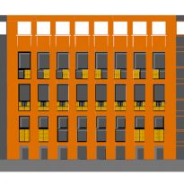
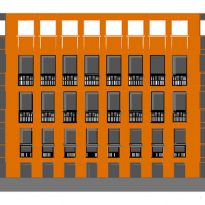
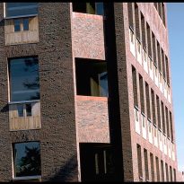
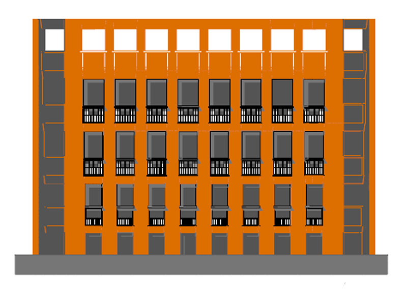
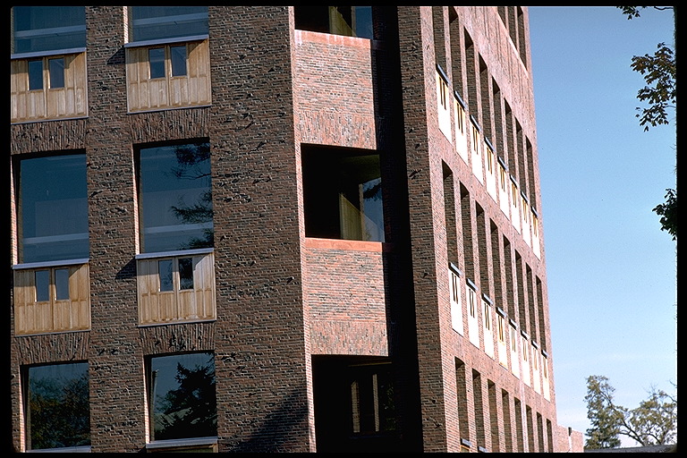
The facades of the first version were composed up of sequences of arcs of half-point bricks which in the final version will be transformed into a subtle flat arches resting on narrow, inside those spaces is communicated, “a kind of space discovered in the folds of the construction,” according to Kahn.
• Corners
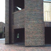
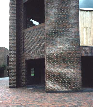
The corners are losing, since the second version, which articulated a triangular towers of the changes to appear as a flat plane recedidos respect of the facades with two major consequences: the more formal independence from the facade and the removal of access from the towers to the axis of the building and closer to the main hall.
• Section
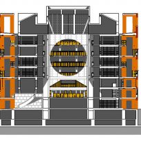
The second plan eliminated the mexxanine, which ruptured the plan’s symmetry expressed in the facade.
• Lighting Zenith
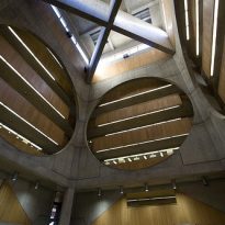
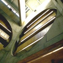
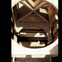
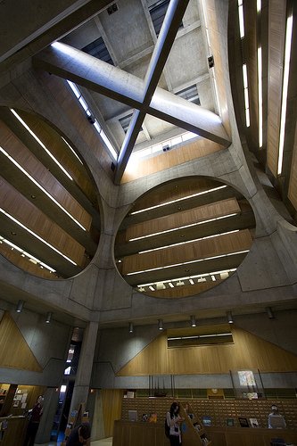
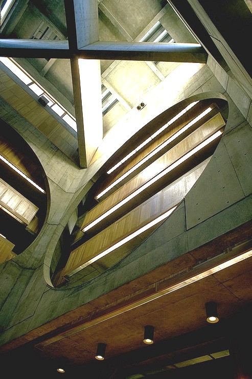
Finally, the lighting evolves downward from the pyramid to take the form of two large concrete cross blades and rotated diagonally with respect to the floor.
“The way that element conforms implies, to a large extent, the awareness of the potential for light. Media that make up a space and allow the light that penetrates it, and the selection of the structure itself is also the selection of the type of light you desire” (Louis Kahn).
The resulting design, elegant and precise proportions and character intemporal, making the library one of the most beautiful buildings on the campus of the academy.
Spaces
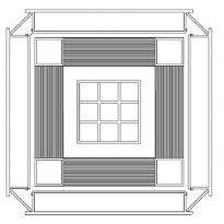
The Library, the project architect for an ideal, according Boullée, it is more rigidly classic that the earlier work of Kahn, a square divided into nine smaller squares, with a free square in the center, or a large bucket of 34 x 34 x 24, With a bucket central vacuum, or returning to Boulée, a spherical vacuum.
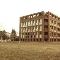
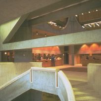
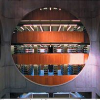
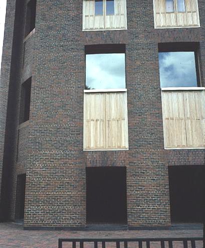
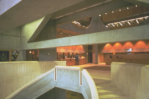
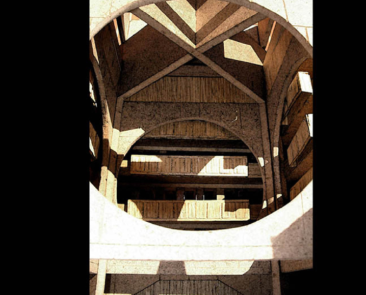
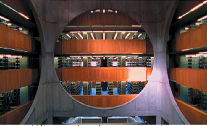
From the outside looks like a cube of brick, upon entering, between the plates that make up the cube was discovered recently concluded that access to almost any time of day is under the shadows, evokes a cave. Such access leads to a central area of the height of the building defined by a series of Euclidean shapes (circles, triangles and squares) and the expressivity of their material, coated by an apparent indirect light, which evokes the emotion of what elementary. The seriousness of this mystery whose interior is accentuated by the transition from darkness to light that suggests their access, gives life to the building and assumed his role, the pursuit of knowledge as a spiritual project.
Although the facades have an almost elemental, the interior volumes, the massif and the geometries reveal the influence of the overall design of Kahn for the National Assembly building in Dhaka, Bangladesh, commissioned in 1962 and completed after his death.
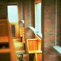
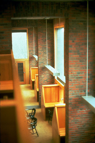
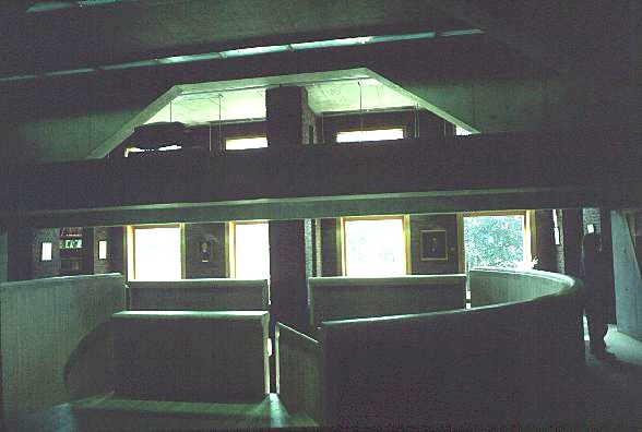
In the second, third and fourth floor are cubicles for private reading, arranged around the perimeter of the building, which are located in the spaces between the pillars of brick and which are articulated in the facade as a reference line with a horizontal window Each cubicle.
Structure
The library of the Phillips Exeter Academy has one of the most extraordinary of all created by Kahn in the United States, a large empty volume.
While at the plant and the section of this empty space offers cavernosal one point, in fact, the complexity of this interior space, which extends from the circular openings of the four areas of wall to the ceiling, ending with large concrete cross beams arranged in diagonal, recalled previous designs for libraries with large central space, like the draft Etienne-Louis Boullée for a real library in 1785, or the public library Eric Gunnar Asplund Stockholm in 1927.
Materials
The exterior walls of brick as a bulkhead, which visually demarcate this seemingly simple construction, consisting of brick pillars also touring all plants.
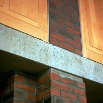
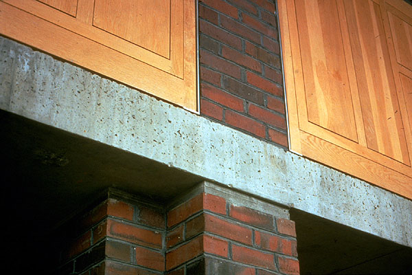
On the facade of a horizontal line intermediate wood panels demarcate the cubicles of reading which in turn are also manufactured in wood.
Beams of concrete is its structure.
