Oslo Opera House

Introduction
In 2002 the National Assembly called the competition for this important undertaking, which took more than five full years to complete, opening its doors in April 2008.
The project was carried to term by the architects Snohetta, who in 2009 was awarded the Prize for Contemporary Architecture European Union Mies van der Rohe for that work. The European Commissioner for Education, Training, Culture and Youth, Ján Figel said: “The architecture is a highly visible showcase for creativity and innovation, and the winners are the benefits of investing in architectural talent, creativity and European innovation. This is especially important this year because they encourage new ideas and entrepreneurs to commend the efforts are also an essential part of the European Year of Creativity and Innovation 2009. ”
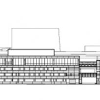
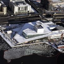
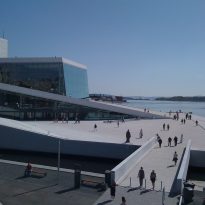
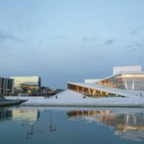
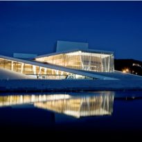
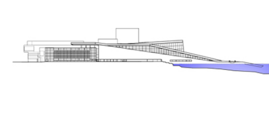
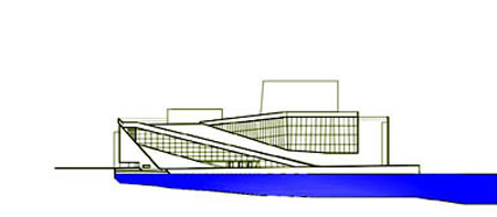
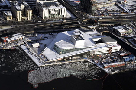
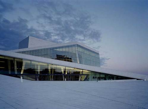
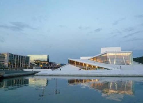
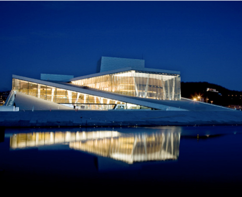
The new project connects the city and fjord, urbanity and landscape. To the east the ‘factory’ is articulated and varied, you can see the activities taking place within the building, its public face looks to the west and north, while the whole profile of the building can be seen from great distance, south of the fjord.
Location
The construction of the new building of the Opera and Ballet in Oslo is the first step in the transformation and development of opera houses, industrial area of the Norwegian capital situated on the shore of the fjord and the intention to communicate the city with its waterfront.
This area of the city was so far associated with industrial uses of the port, being historically considered the meeting point of Norway to the rest of the world. The dividing line between the ground “here” and water “there” is both real and a symbolic threshold.
The diversion of heavy traffic through a tunnel built under the fjord and the future connection with life and animation of the new part of the city soon will give a greater sense of urbanity.
Concept
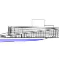
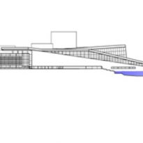
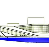
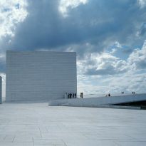
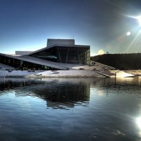
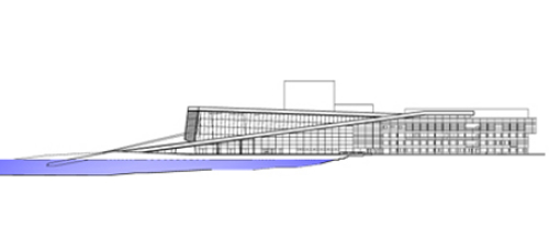
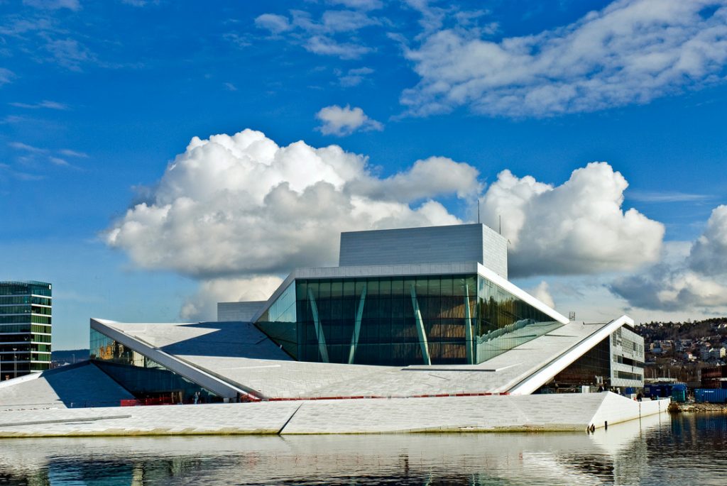
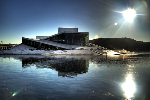
The requirements of the site and program, as well as monumental public building required to give rise to a passable iceberg that emerges from the sea, stranded at the bottom of a Norwegian fjord.
The building is designed from three basic ideas:
- Wall wave
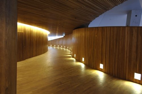
Due to its location in the port, a traditional place of exchange between Norway and the world, Opera is presented as the threshold between land and sea, between art and everyday life.
This concept is embodied in a curved wall, a “wave wall” that contains the music rooms.
- The factory
It is proposed that the building is a great plant for the production and artistic and technical development, while providing all the necessary building blocks to carry out this purpose.
It has created a “factory” with a rational and flexible scheme, both in its planning phase and in later use. This flexibility has proven to be very important during the planning phase, the design of many of the rooms has worked in collaboration with the end user which has improved the same functionality without affecting the architecture.
- Carpet

The contest rules stipulated that the space opera should be of high quality architectural and monumental in its expression. One idea was noted as a legitimation of this monumentality, the concept of unity, jointly owned, easy and free access for everyone.
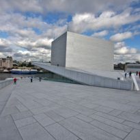
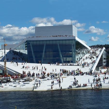
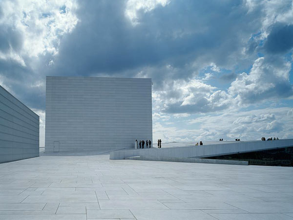
To provide the public access and use has been made and set a “carpet” at the top of the building. It has created a horizontal volume-based plans and passable outstanding to tour the decks of the building in its entirety. The concept of monumentality was not achieved in a vertical, but horizontal.
The conceptual basis of the competition and final construction is a combination of these three elements, the wave wall, the factory and housing.
Spaces
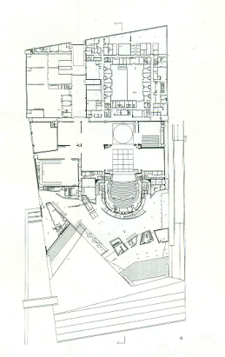
The total project area is 37500 square meters, of which 11 200 are for public areas, 8300 and 18000 to the stage area to the deck passable.
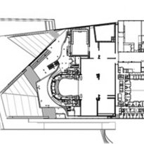
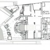
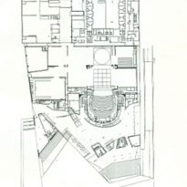
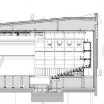
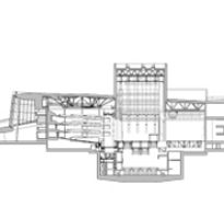
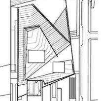
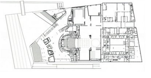
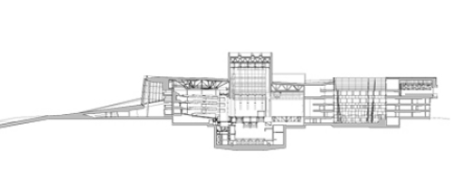
The building has been divided into two parts with an interior street that crosses it from north to south. The floor of the west has set a public and monumental, while to the east the manufacturing volume shows the character of the organization of its spaces. It consists of 3-4 floors above ground, a basement beneath the basements and three others in the performance space.
Exterior
- Access
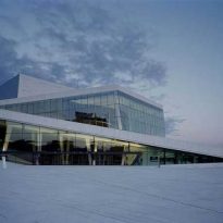
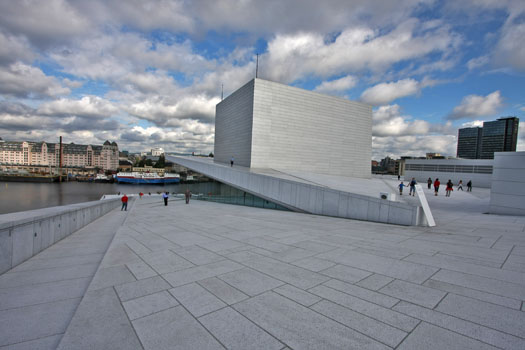
Access to recite faces the sea and get to it by a large white stone ramp and a number of textures that make it an important element of the building while giving it identity and dynamism.
- Ramp
For the same ramp access to the terrace of the building without entering the opera. Construction can go through this strip that rises to the ceiling and generates an interaction between space, the building and the public. The accessible area of the “carpet” is approximately 18,000 m2.
Interior
The interior is made up of a number of different areas that are characterized by carefully chosen materials and the integration of the works of several artists. In it are located numerous works of art intertwined with the structural fabric, including a wardrobe made in collaboration with Olafur Eliasson, one of the directors of the Serpentine Pavilion, 2007.
On the west side lie to the public areas: the foyer, cafe and restaurant. The wardrobe is also on this side, as well as service spaces, rehearsal rooms and two auditoriums.
- Auditoriums
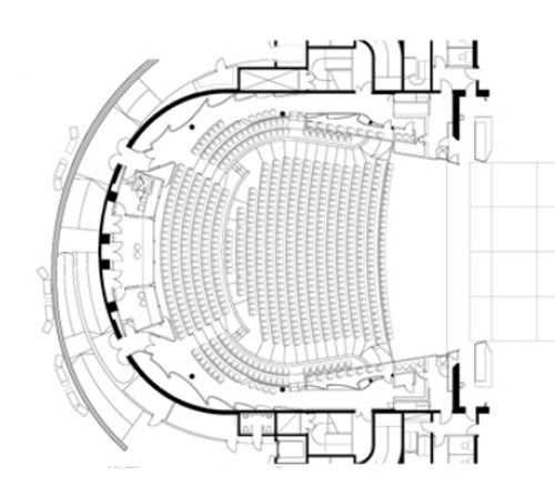
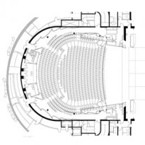
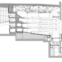
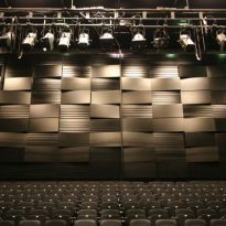
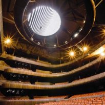
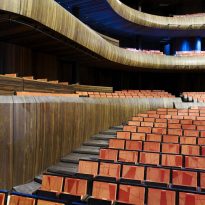
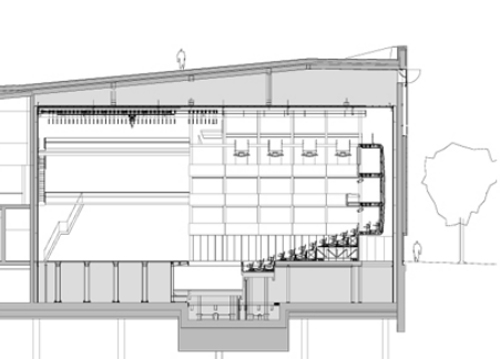
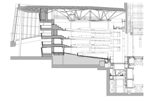
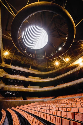
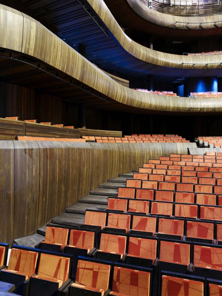
One of the auditoriums, the smallest, has 400 seats while the main room is 1360 divided between the stalls and four stands in a horseshoe, with a high ceiling that creates a natural sound.
In the east stands the loading and unloading dock and around a garden courtyard, the areas of administration and production, with about a thousand units of different size and function for almost six hundred employees over fifty different professions.
Materials
Snohetta architecture is narrative, materials with specific gravity, color, and temperature terxtura have been vital to the design of spaces. It is the gathering of materials which articulates the architecture through varied detail and precision.
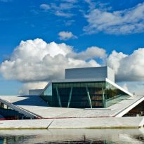
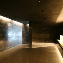
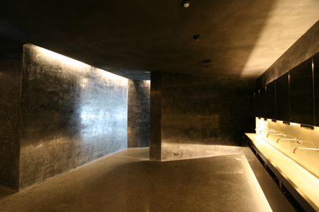
From the beginning there were three main materials that would shape the development of space, the white stone for carpet, wood for the wave and the metal wall to the plant. As the project progressed joined fourth material, glass.
Wood
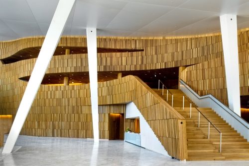
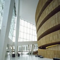
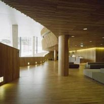
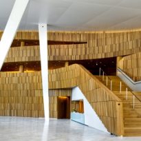
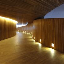
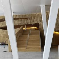
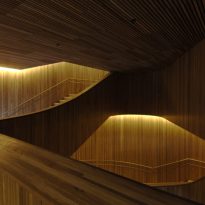
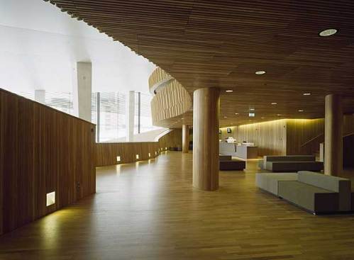
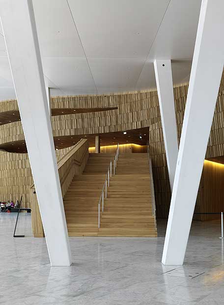
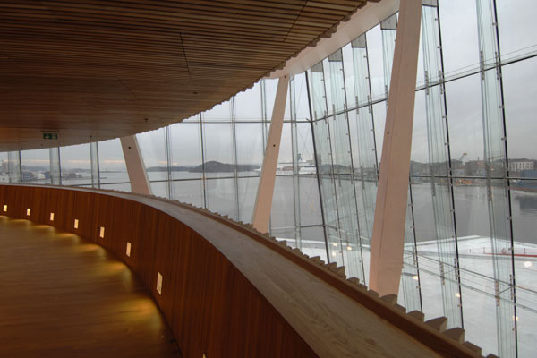
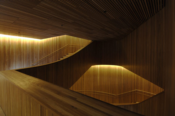
The oak was chosen as the dominant material for both the “wave wall” to the main auditorium. It is also used on floors, walls and ceilings.
The wall surface wave has a complex composed of organic and attached cone shapes that besides being one of the identifying features of the foyer, serves as acoustic attenuator for space in the lobby.
Inside the center is covered with fine woodwork, using traditional systems of Norwegian boat builders, such as ammonia treatment has been applied to the oak that covers the main auditorium. Here is also used oak for floors, walls and ceilings and balcony fronts and acoustic reflectors.
Stone

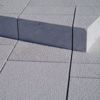
It has used the Facciata Italian marble, stone that has the necessary technical quality in terms of stability, density and longevity while maintaining its shine and even on the color when wet. The sloping stone roof is composed of 36 000 pieces embedded
Metal

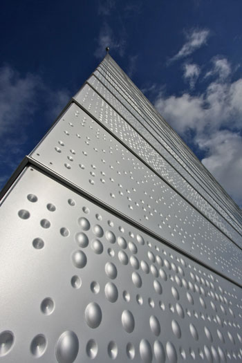
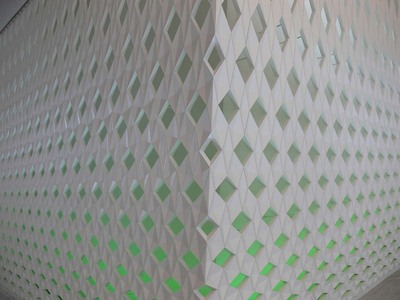
After analyzing the aesthetics, durability, workability and possibility of flat panels as possible, the architects opted for the use of aluminum.
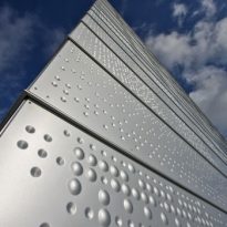
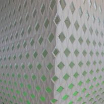
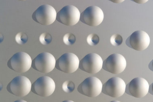
According to the rules governing the development of public works in Norway, the committee for the integration of the arts commissioned artists Astrid Lovaas and Kirsten Wagle collaboration with the study for the design of aluminum siding on the outside of the stage box.
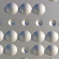
You can give visual quality panels were drilled with segments of spherical and conical shapes based on ancient textile techniques. In total eight different panels are designed to give the effect of constantly changing depending on the angle, intensity or color of the light plays on them.
Glass
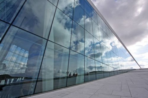
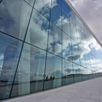
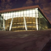
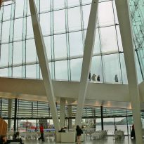
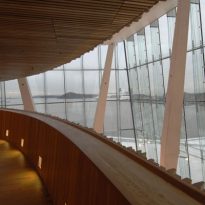
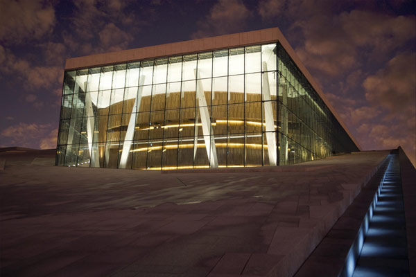
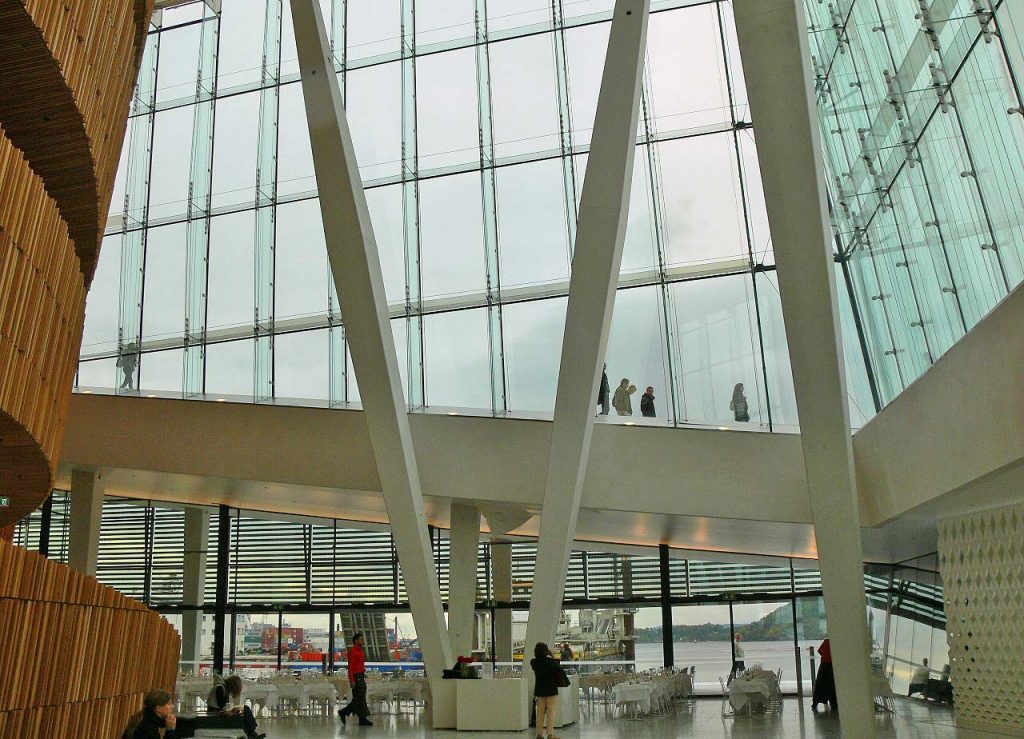
The glass façade, with 15 meters high, the hall has a key role from the south, west and north, while serving as a lamp that illuminates the outer surfaces during the night.
The intention of the architects was to design a glass building with a minimum of columns and frames. The solution was to use glass fins, where the steel fasteners are minimized to be interspersed within the laminated glass. To avoid the tendency of these crystals reinforced green hue, losing the desired transparency, glass was used with a low percentage of iron.
