Orient Station to Expo’98

Introduction
Calatrava comes with this complex to another of his most extensive since winning the first prize of the competition called for development of this entire area along the river Tagus, to be prepared for the Universal Exhibition of 1998.
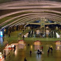
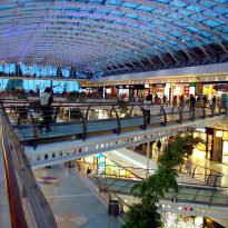
The main building is a station that is intended to be the focus for all of Lisbon, near the airport, with its bus and subway station. This is supplemented with services galleries and shops.
Today all has been well Expo’98 recycled with great success as a popular recreational park and shopping together.
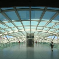
The station is a hub of trade, at various levels, different means of transportation: train, bus, subway and taxi. Access, both east and west, make the building an important hinge in the urban fabric, capable of uniting the two sides separated by the city before the train tracks and connects the metropolitan area and the suburbs.
Meaning and Space
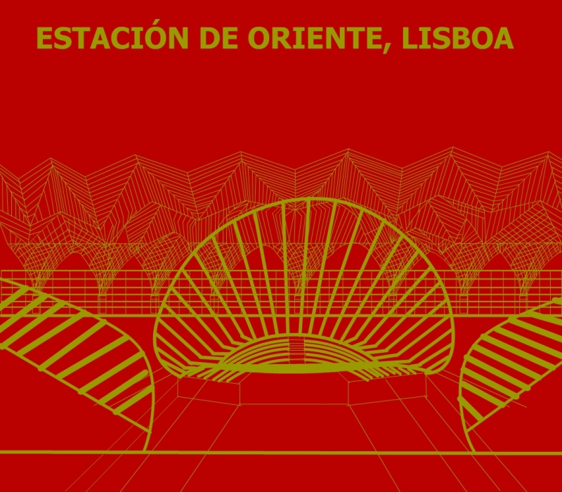
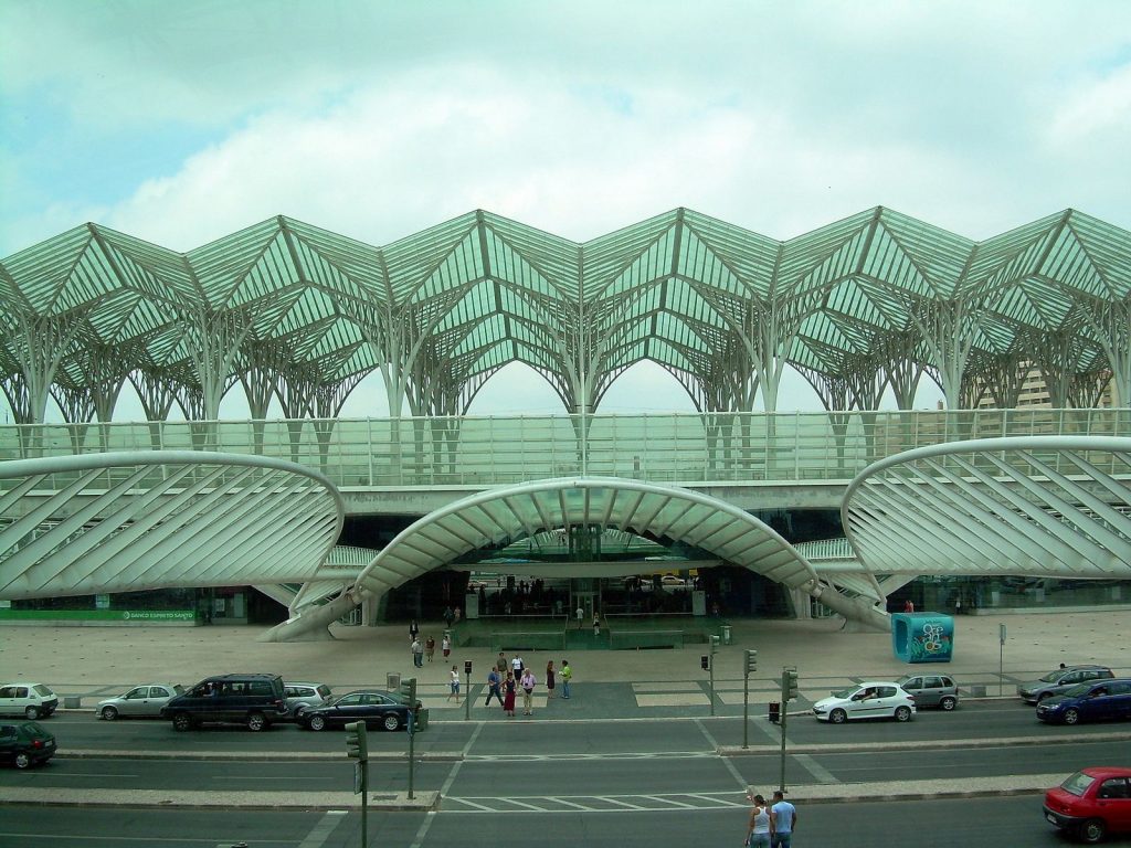
The composition is a strong symmetry with an axis that passes across the line of the railroad, “sewing” the bus up his connection with a large shopping mall, and outside the building, across a road.
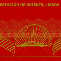
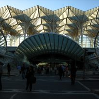
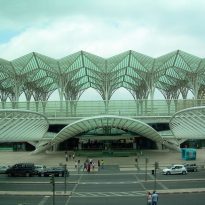
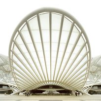
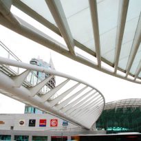
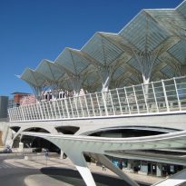
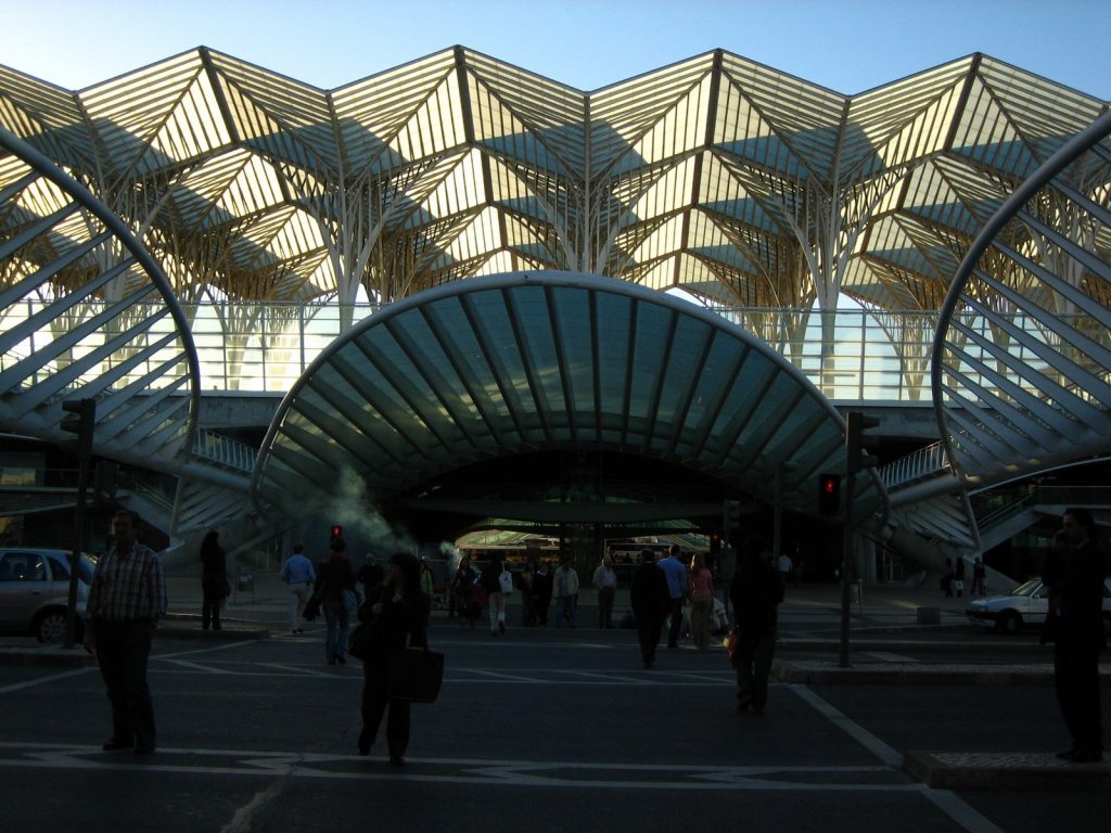
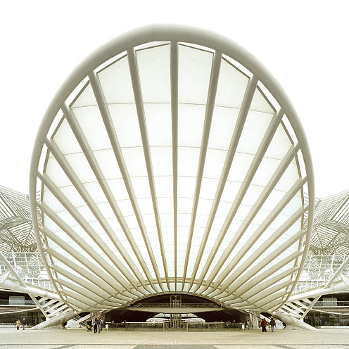
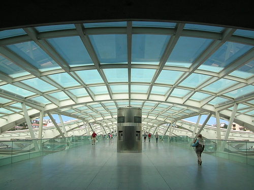
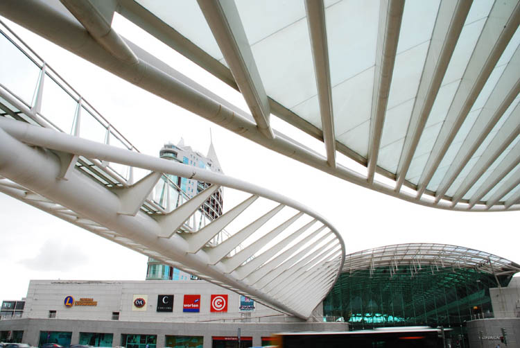
Until he reaches the performance of Santiago Calatrava, linking from the attic floor by two pedestrian bridges arc inclined glass and soil. That gives it one of the two facades, with a huge overhang of parabolic metal and glass. Element that is just repeated at the other end of the center line, according to the facade, which, however, is lost to a side alley, without finding the expected correspondence of their environment.
It stands as a gate for access to the area on buses, sorted through long languages spoken overhang in bus shelters, all over again in white metal and glass.
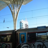
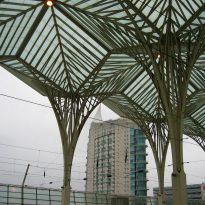
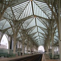
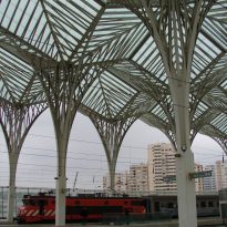
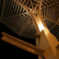
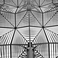
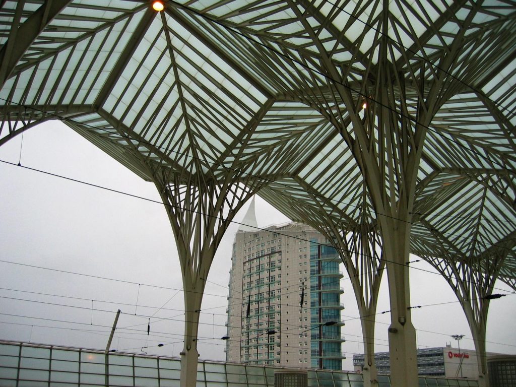
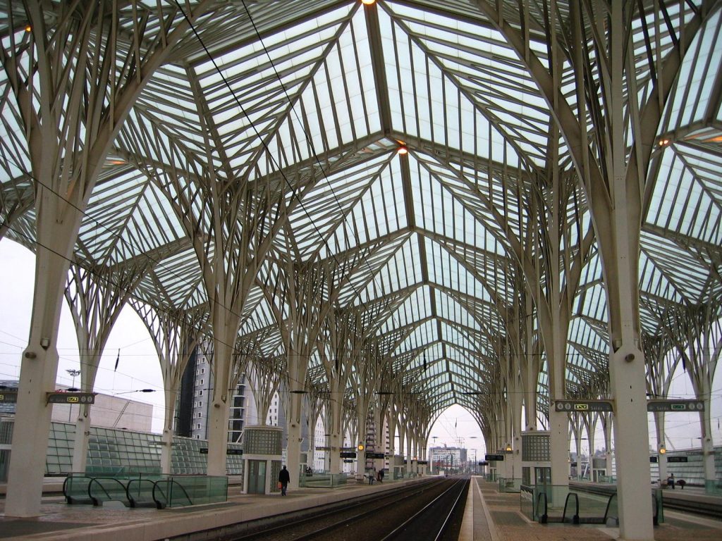
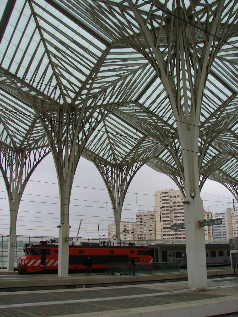
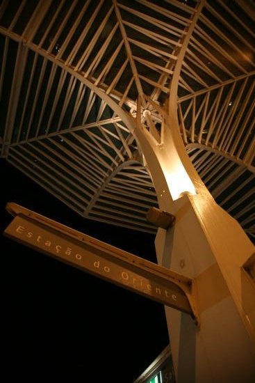
And the most spectacular finishes being the cover and light steel white slender trees, above the platforms, on the top floor of the main building.
This type of structure gets built at last become a reality, then that would have included many other projects without success yet. The closest thing is the train station in Spandau, Berlin (1991), with a very similar pattern typology. Although some pieces of glass, and self-bearing trees, and was tested in the project for the restaurant Bauschánzli, Zurich (1988).
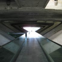
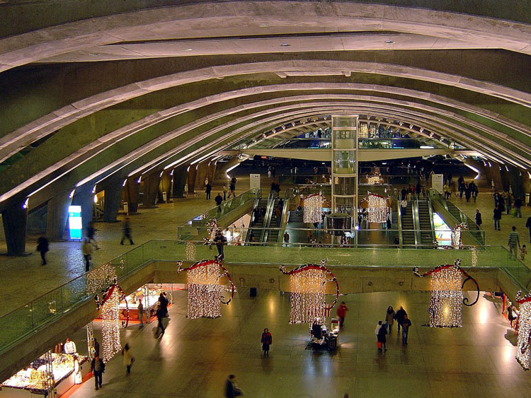
In the end, what is most strange in this work is concrete gray, darkening just too much space and contrasting with the white metal, while demand appears to be covered in white.
Structure
This tree covers the platforms of the season, crowning the whole above the built in reinforced concrete appearance slightly less. It is, therefore, as a top outdoor pergola, as in the Kuwait Pavilion for Expo’92.
Thus we discover that this is no different to the strategy and repeated view on the bridges with a concrete bottom and a top steel, which ultimately returns to match the idea of climbing and flying in all his work.
Materials
The materials used in this project are already common in the works of Santiago Calatrava. Are present throughout the work on concrete, steel and glass.
