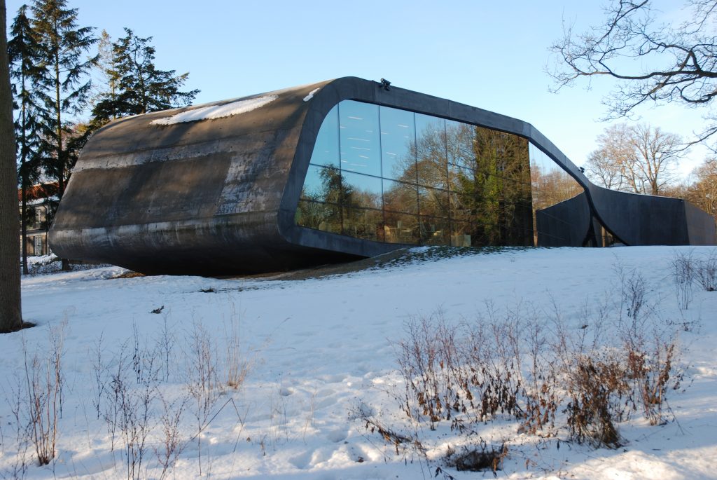
Ordrupgaard Museum Extension

Introduction
The Ordrupgaard Museum was built in 1918 as a country house and venue for the remarkable collection of Impressionist paintings and French and Danish Fauves magnate who owned the Wilhelm Hansen. The building has been a public museum since 1953. With the expansion carried out in 2005 by architect Zaha Hadid and Finn Juhl’s house in 2008, the museum has acquired a strong architectural profile.
Extension
The extension by Zaha Hadid in Ordrupgaard redefined the relationship between the gardens of the building, creating a new landscape itself in harmony with its environment, while allowing visitors an unfragmented between the construction route, collections and gardens in a smooth and continuous interaction between the different elements and aspects of the place.
The proposal submitted by the architect won a competition organized by the Ministry of Culture of Denmark in 2001.
House of Finn Juhl
Finn Juhl was a Danish architect, interior designer both as an industrial, best known for his furniture design. It was one of the main figures in the creation of “Danish Design” in the 1940s.
Your own home is an example of the intention of Juhl as an architect and designer. He built the house in Ordrup Kratvænget 15 in 1942 on a 1,700 sqm property, next to Park Ordrupgaard. Thanks to a private donation Lyngbye Birgit Pedersen, the house is now a permanent part of Ordrupgaard. The doors opened to the public on April 3, 2008.
Location
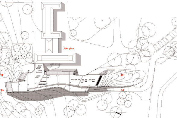
Ordrupgaard Art Museum is located near Jægersborg Dyrehave in Charlottenlund, 110 Vilvordevej street, a suburban area north of Copenhagen, Denmark. The museum houses one of the most important collections of Danish and French art of the nineteenth and early twentieth century in northern Europe.
Concept
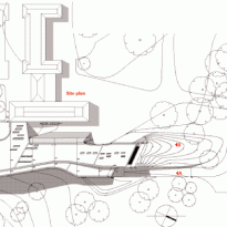
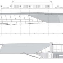
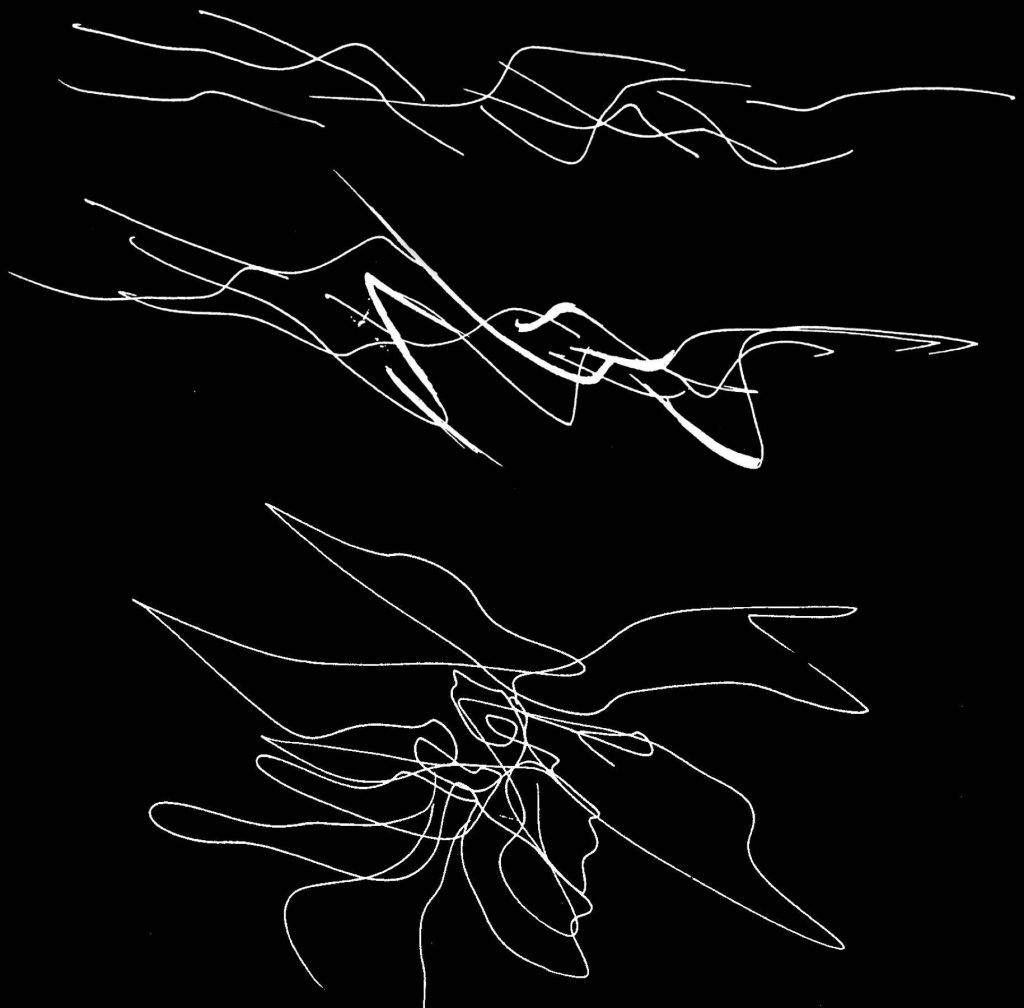
The design is based on personal interpretation of Zaha Hadid relative to the surrounding landscape and the relationship with the original building, both in size and proportions, and the space for new galleries. The realization of this interpretation has doubled the space available for exhibition and for the public.
“… The extension of the Ordrupgaard presented an opportunity to explore new formal relations between the components of the museum and the garden that frames, to the extent that the set is a kind of topography itself…” (Zaha Hadid)
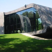
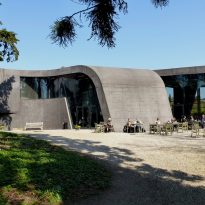
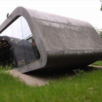
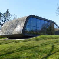
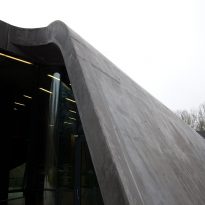
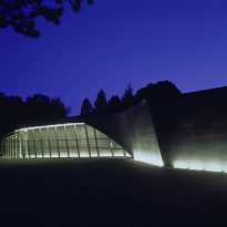
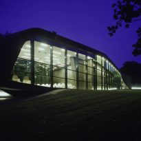
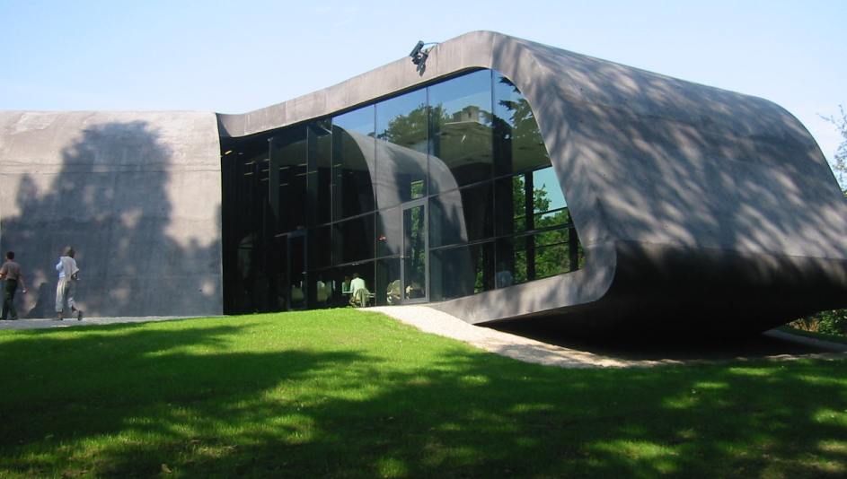
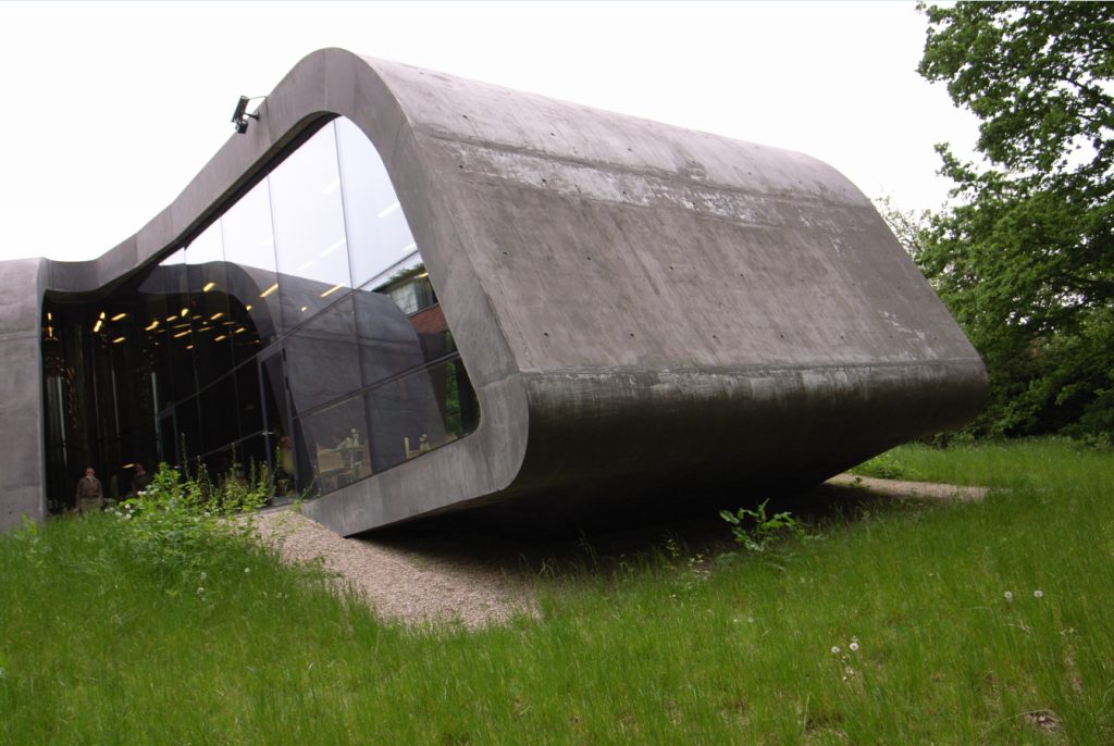
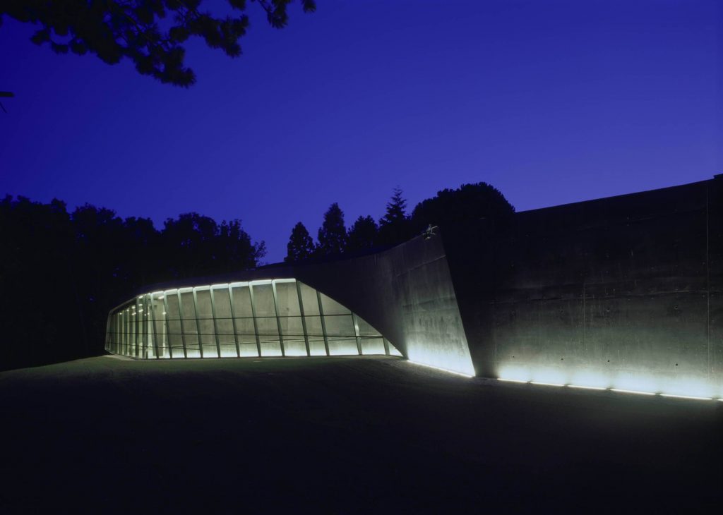
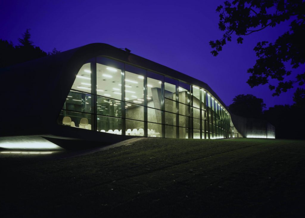
As in many other projects designed by Hadid, the architect has worked to decode and interpret the environment. Before beginning made field studies in the Park Ordrupgaard, the result has resulted in a sophisticated molded figure almost “hanging” in the undulating terrain. It has been said that the extent resembles a beached whale and a spaceship. Regardless of the associations, is a building that folds neatly to the topography of the landscape.
Spaces
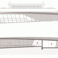
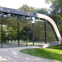
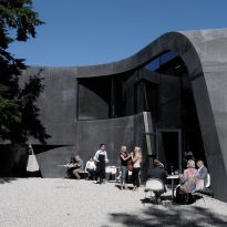
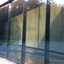
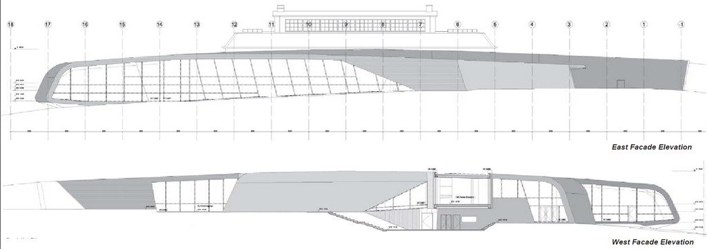
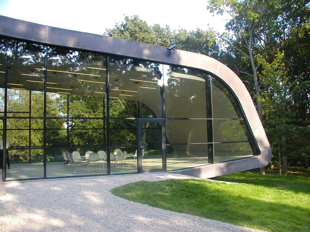
The new building with a glass facade which reflects the surrounding landscape and glimpses inside, gets its counterpoint opacity by a black leather made in situ concrete that surrounds, complemented by various excavations and embankments completing your disposal on the ground.
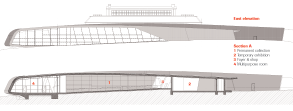
The experience of space is the main point of the extension, which is both in harmony and in contrast to the old manor house. The extension has doubled the space Ordrupgaard, which now stands at more than 3,300 sqm, creating room for new exhibition facilities, multipurpose room, a hall and a cafeteria.
Inside
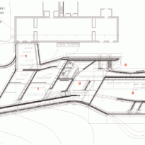
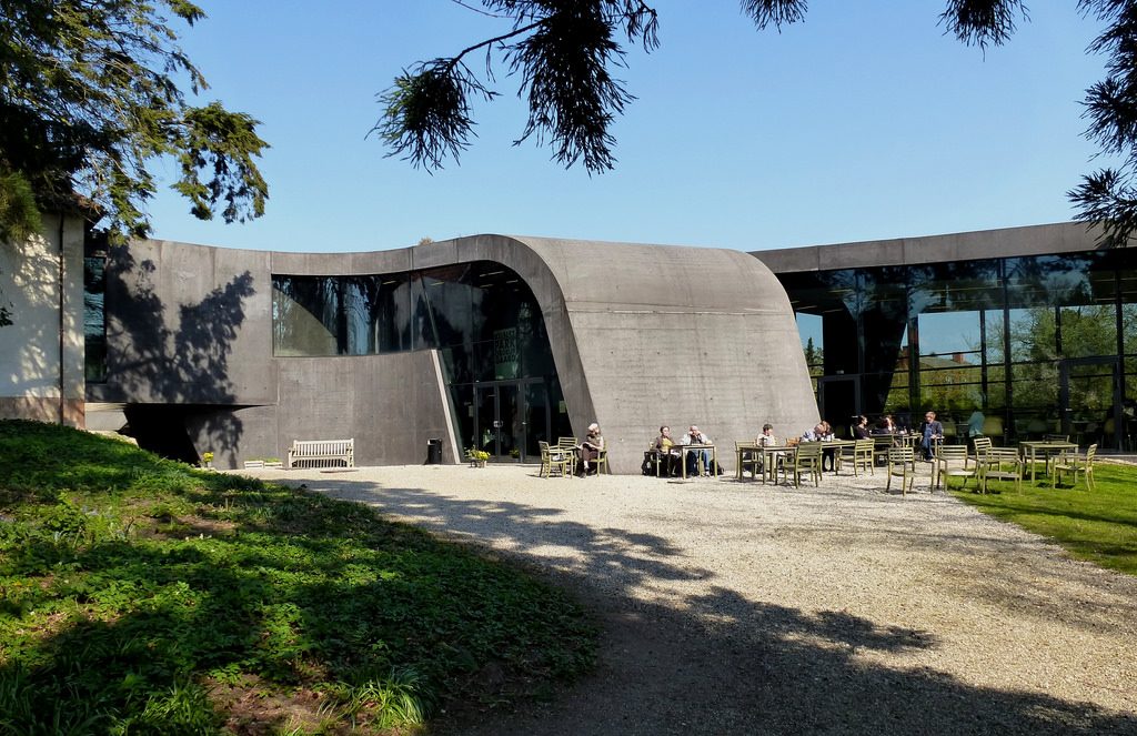
The new access is from a courtyard that physically separates the new building of the old building of the French Gallery.
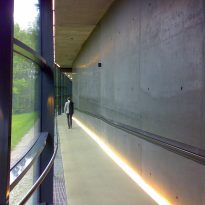
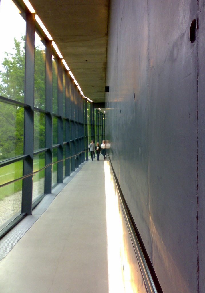
The Foyer runs parallel to the yard, pointing visitors the direction of the 5 new galleries, illuminated slits act as orientation devices.
Inside, the building was opened as a “fluid space”, which is difficult to detect the transition between galleries and corridors between floors and ceilings.
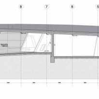
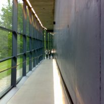
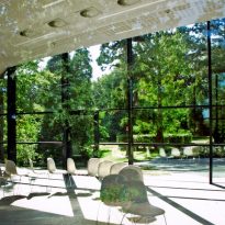
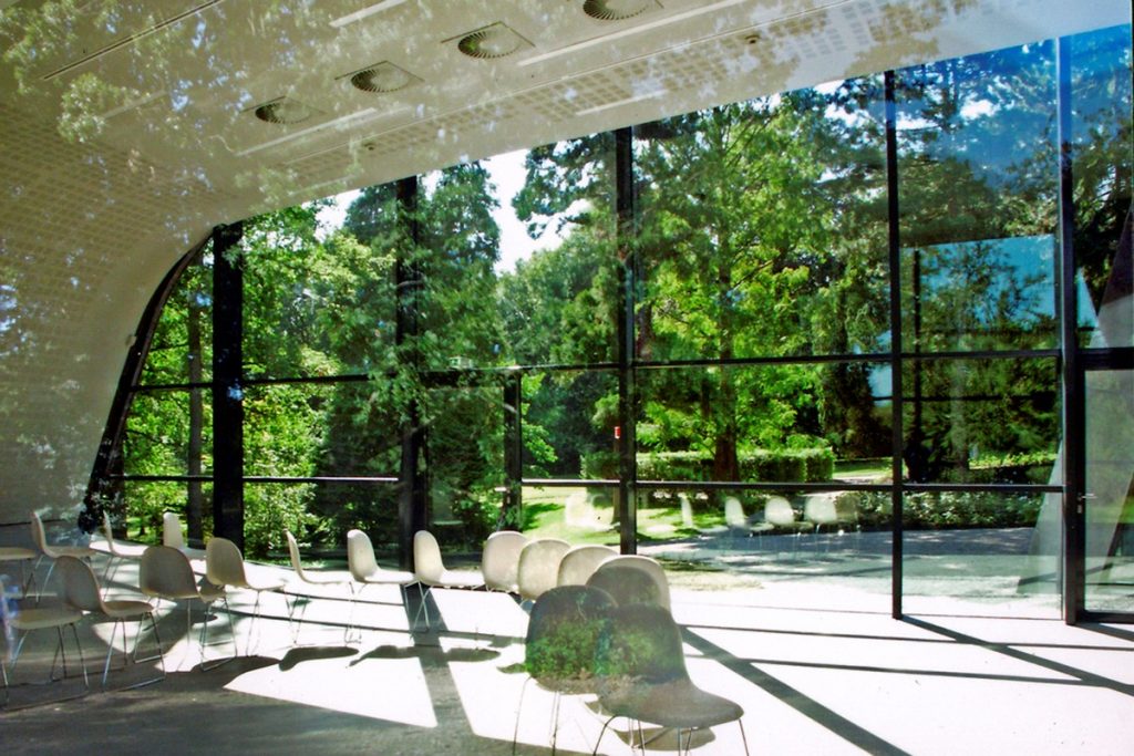
The rooms constantly engage the curves of the land with the roof up and down as it progresses. Large glass surfaces and the surrounding landscape approach let in daylight reinforcing the integration of the building.
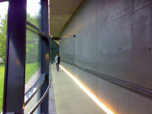
A long sloping ramp divides temporary and permanent galleries and spaces leads to the Multipurpose Room and Café facing the garden. Coffee bright white at one end of the curved building, right in the garden, creates the feeling of some ultra-modern and elegant conservatory.
In many places, the walls are steep and irregular, exploring a variety of twisted angles.
Gallery
Natural light and moderates filtered as it passes through the building envelope, the ceiling. The concrete-washed dark shares the spotlight with glass, others with curved some extreme angles. But in the heart of the building, where art is, spaces are almost “pampered”. Here, the gray concrete ceiling cut with ramps light, always with the right intensity for display and conservation of the paintings.
Terrazas
The terraces are designed to connect with existing in the gardens of the Mansion, allowing visitors a new visual connection.
Structure
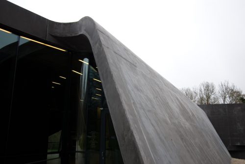
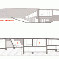
The western gallery is actually a cantilevered extension connects with the old building at the second floor. No visual markers of the transition, apart from a sliver of light on both sides of the wall, passed without problems the new to the old. This is a deliberate act, as the cantilever structurally does not benefit from the presence of the walls. Externally the union is recognized, forming a porch on the outside staircase takes visitors to the south garden and provides access to the spaces of the kitchen and other rooms on the floor.
This overhang that bridges issued thickness sandwich structure with 200mm insulation between the concrete outer skin 150mm 330mm to support the inner wall, also of reinforced concrete. These 680mm give an orientation of the structural logic, evident everywhere, from the appearance of acrylic stone bar to the curved walls that connect with old terrace, through the roof sailing on dark galleries and flows below ground, guiding visitors along the ramp to the temporary exhibition hall free of ties to that land rises and joins the landscape.
Materials
In the construction of the solid structure they are mainly used reinforced concrete, glass and insulation glazing.
In the smooth, fluid motion old Ordrupgaard extension transmits a graceful transition between landscape and architecture. Large glass facades draw light and nature into the building, turn the building was cast in black lava concrete. The tactile black color seems almost alive in its game of shades, sometimes other gray matte black shiny, depending on the light and time of day.
