Neviges Pilgrimage Church

Introduction
Pilgrims were heading to Neviges since the end of the 18th century, when the church of the time was the host of an Imacculata, a venerated copper engraving depicting the Immaculate Conception of the Virgin Mary. The popularity of the site proved to be too great for the existing baroque monastery, which led to the construction of an annexed structure in the early twentieth century. Even with this specially designed structure, an increase in pilgrimages after World War II once again exceeded its modest capacity. In 1960 it was decided to build a new pilgrimage church to deal with the influx of visitors.
In 1962 the Archdiocese of Cologne, under the initiative of Cardinal Archbishop Josef Frings, invited 17 architects to present projects to build a church where, in the eighteenth century, a friar left an image of the Virgin Mary in a small chapel.
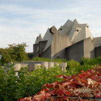
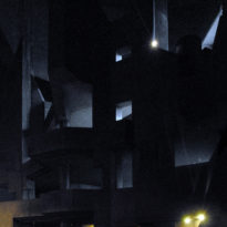
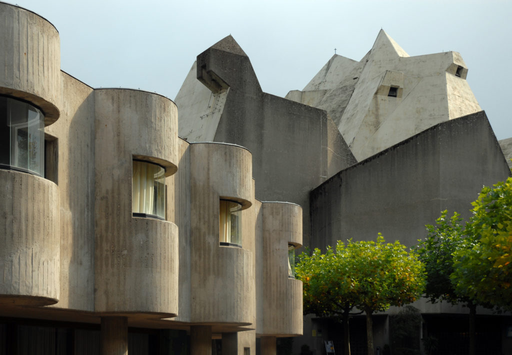
The Church of Mary Queen of Peace, better known as the Pilgrimage Church of Nevijes or Neviges Mariendom, is one of the most revered religious buildings of the brutalist period in which its architect Gottfried Böhm abandons the traditional Catholic architectural forms to build a colossal space limited by sharp angles and concrete seen that stands out among the rooftops of the German medieval city.
Location
The Church is located on top of one of the peaks of the small village of Neviges, Elberfelder Str. 12, 42553 Velbert, near Dusseldorf, Germany. Velbert is a municipality in Germany in the Mettmann District, administrative region of Düsseldorf, state of North Rhine-Westphalia.
Concept
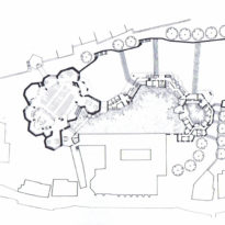
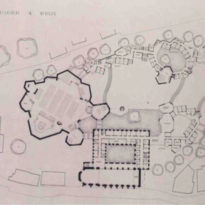
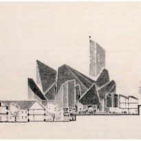
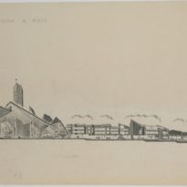
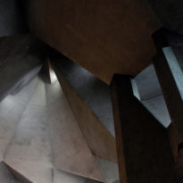
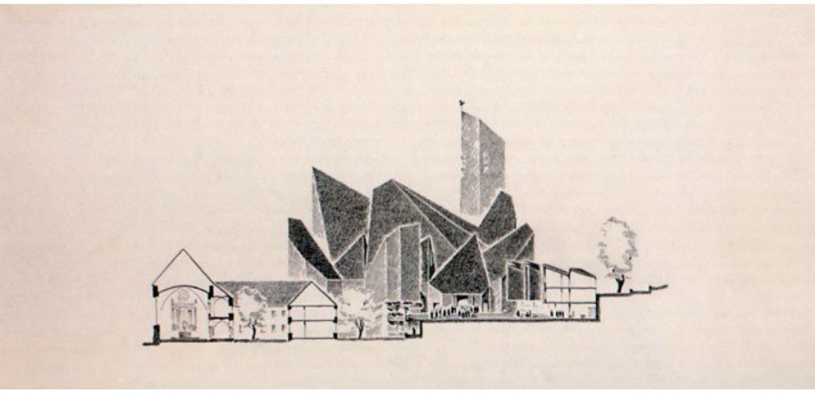
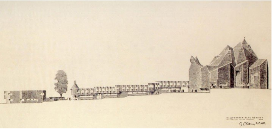
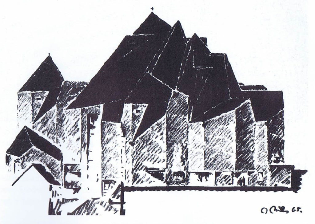
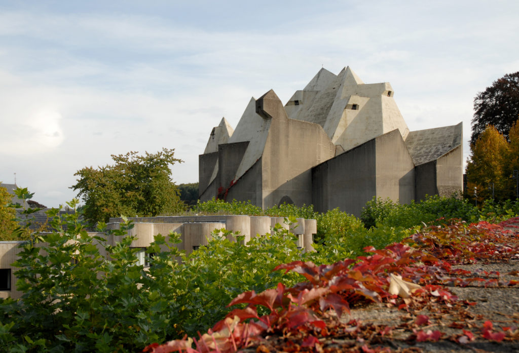
Unlike the other architects, the project presented by Böhm challenged the characteristic forms of a place dedicated to religious worship. The entrance was placed near the train station, avoiding the long processional journey of the pilgrims through the municipality, although its construction was carried out at the highest peak of the place having to climb to access the temple. It was the only project that did not propose to flatten the land before construction began. Its cover with sharp forms was compared on numerous occasions with tents, although it can also be interpreted as a concrete mountain with several layers.
Although at first the judges of the contest considered too exaggerated the project was finally selected since its forms could symbolize the wanderings of the pilgrims and consequently be suitable for a pilgrimage church.
In reference to his forms the critic Jonathan Meades commented: “… It is a building of exciting geometries whose exterior borrows from geological formations, hoods of penitents and forms that could be described as anthropomorphic, so that humanity is forced to be a little more chiselled … ”
Spaces
The project presented by Gottfried Böhm resulted in the second largest church north of the Alps, after the Gothic cathedral in Cologne, with a capacity for 800 people, although the number can be expanded to 2,200.
The stay has no traditional religious symbolism. Outwardly the only sign that this series of roofs so sharp and gray is a church is the metal cross placed at the highest peak.
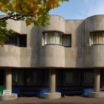
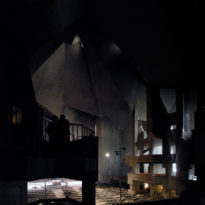
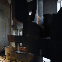
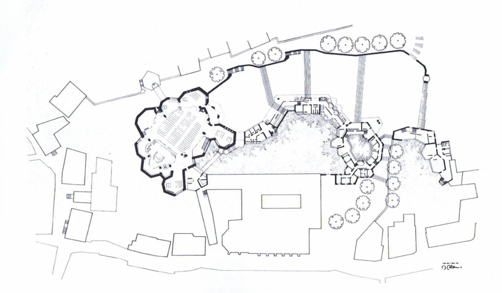
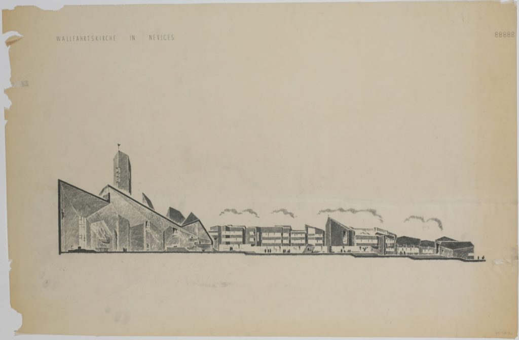
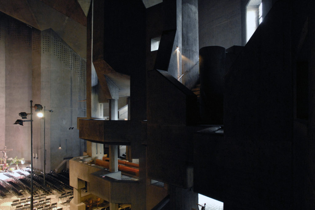
The ascent begins with a large staircase bordered on one side with a wall and on the other with a series of porticoes with offices and a first level with circular modules supported on round columns that create the convent and the spaces where some pilgrims stay during the night. At the end of the stairs a small patio leads to the entrance, a hall with a somewhat low ceiling that creates some visual confusion before moving on to the large main space. Böhm stressed the connection between “inside-outside” with the front courtyard and the interior of the church, through the formation of space, the choice of materials and decorative motifs. Already inside you have the feeling of being in a covered public square, feeling reinforced by the continuation of urban lanterns and the floor with large brick and concrete drawings. From the top some light rays are received through skylights and high windows. On the right side three floors of galleries allow the visitor views to the outside and proximity to the altar, on the other side you have access to two chapels, one of which, the Marienkapelle, houses the copper relics.
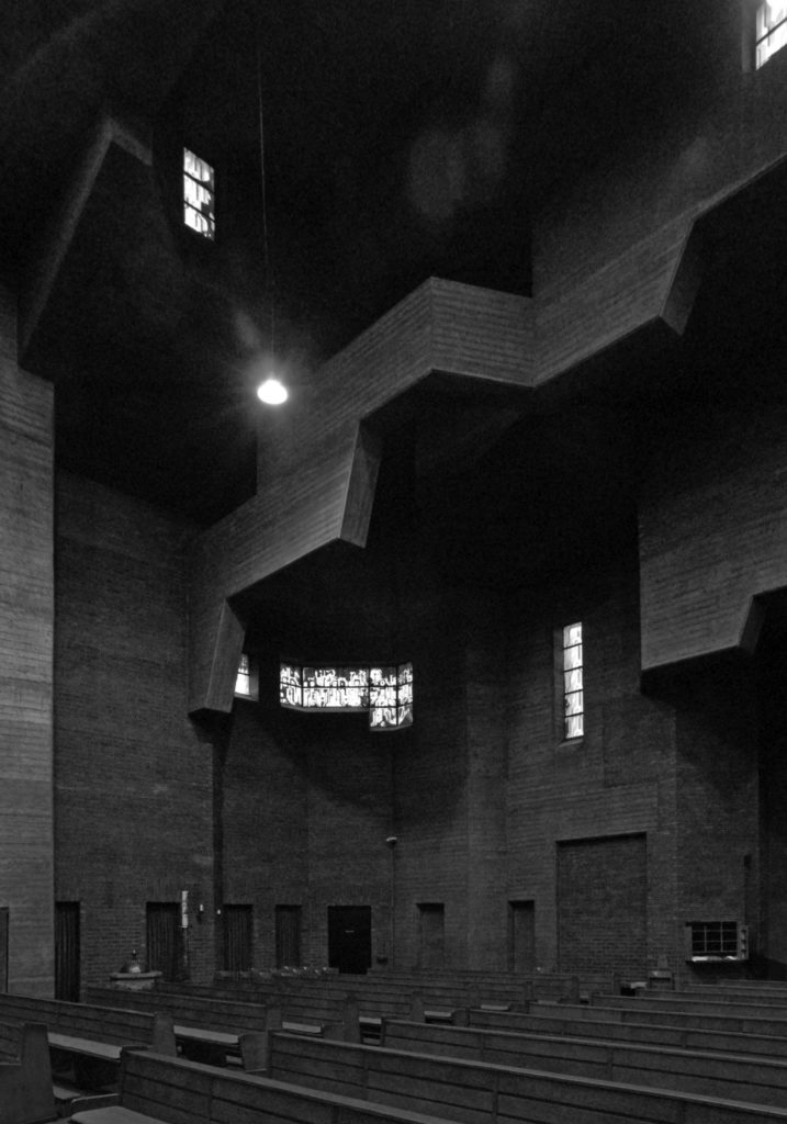
The interior is austere, following the line of a new less ornamental religious architecture. The main space is dominated by a small altar, climbing two steps, which although not aligned with the axis of the main entrance was placed in the center at the wish of Archbishop Frings. The walls in exposed concrete and without decorative elements, only some light sconces distributed in the large walls with brightly colored windows designed by Böhm, mainly red, blue and green. These stained glass windows represent a series of Marian themes, including a large red rose, a symbol of the Virgin Mary, whose large format, and under the influence of sunlight, emphasizes the consecration and dignity of the place, absorbing the hardness of the walls.
In addition to the colorful stained glass windows Böhm put his personal touch with the design of special chairs for the place, the knobs for the doors and a composition based on the Ichthys, a secret symbol used by the first Christians consisting of two arches that intersect forming the silhouette of a fish This composition was created for the Marienkapelle chapel. Sculptures by other artists such as Elmar Hillebrand are distributed throughout the church.
Structure
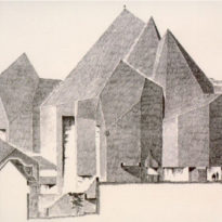
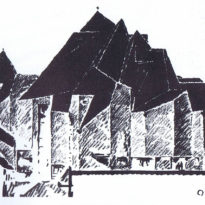
Its structure is composed of a series of cubes and pyramids of reinforced concrete with steel reinforcements on a cathedral scale.
The central aisle is defined by the altar in the front and a plane that extends to the chapels on the west side and three apses around the altar. The plant is covered by pyramid-shaped ceilings whose shapes are folded and tangled together placed directly on the ground floor areas they cover.
During the construction process a cardboard working model was used, on the scale of 1:50, which shows walls and ceilings. The latter could be separated to obtain a view of the interior of the church. The interior finishes were molded in plasticine and then placed in the model. The subsequent preparation of the construction documents and detailed drawings were carried out on site, according to the progress of the construction.
Galleries
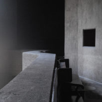
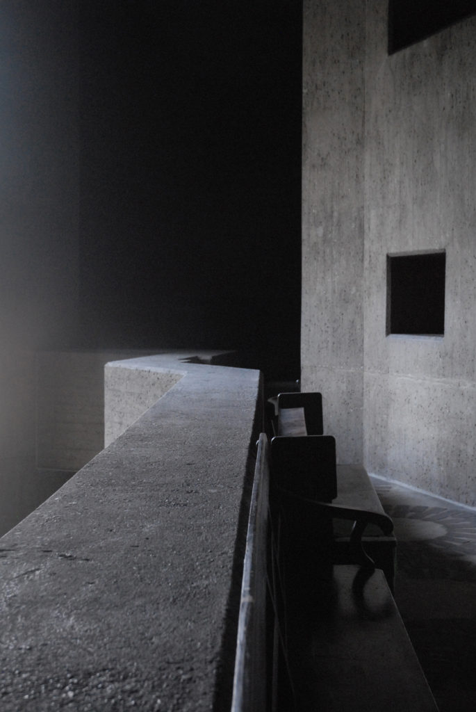
The galleries acquired their specific form during the planning and construction detail phase, so it was necessary to add auxiliary columns to each side of the main columns. At the same time, support beams were introduced into the parapet, between the side columns, so that the area around the columns looked like a tower into which the galleries had been inserted. Between the galleries and the roof, these two towers gradually receded to the core of the support column. The parapets of the gallery obtained numerous corners and the individual levels were staggered against each other. Finally, during the development of the design, a third level of smaller gallery was inserted, on the two towers mentioned above, whose facade received forms that looked a bit like balconies and windows. By joining the two columns an additional vertical element came into play. By joining and extending the two columns located between the aforementioned towers, an additional vertical element was created. This markedly plastic composition was intensified by the fall of light, which was attenuated by the arrangement of a relatively large window area behind the galleries.
Materials
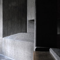
For the structure, 7,500m3 of concrete and 510tn of steel bars were used. The surfaces were fused with wooden boards to give them the rough texture typical of brutalist buildings. Some areas were then sandblasted, creating a grainy surface.
A marble column and one of the altars are the work of the artist Elmar Hillebrand. Markus Gottfried Böhm, son of the architect, was responsible for some of the paintings in the church.
The interior floors were made with concrete and bricks, forming large drawings more characteristic of a public square than of a religious temple.
Waterproofing
Like many post-war buildings, maintenance has become one of the building’s main faults. Originally designed for use in summer, the concrete structure did not have adequate insulation to keep warm during the winter months. Local residents introduced the heating and sealed the upper part of the structure. These modifications altered the thermal equilibrium of the church and created a visual separation between the upper part of the walls and the ceiling.
Originally the roof insulation should have been done with glass foam plates covered with an outer layer of protective concrete 8cm thick, but as the construction progressed and it was evident that the concrete walls that supported part of the sacristy endured the climatic conditions Gottfried Böhm decided to build the roofs without insulation or waterproofing, slightly increasing the concrete cladding in steel reinforcements, since the church would be used by pilgrims mostly in summer
Organ
In May 2010, the organ was inaugurated whose construction by Seifert Kevelaer was inspired by an organ built in 1976 by the organ builder Stockmann. This instrument is extended by an auxiliary with 6 stops, which can be registered independently in both manuals and pedal.
Video
