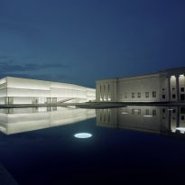
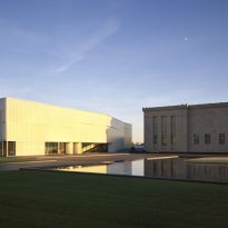
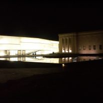
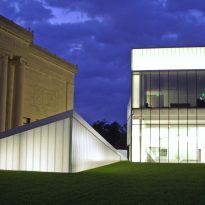
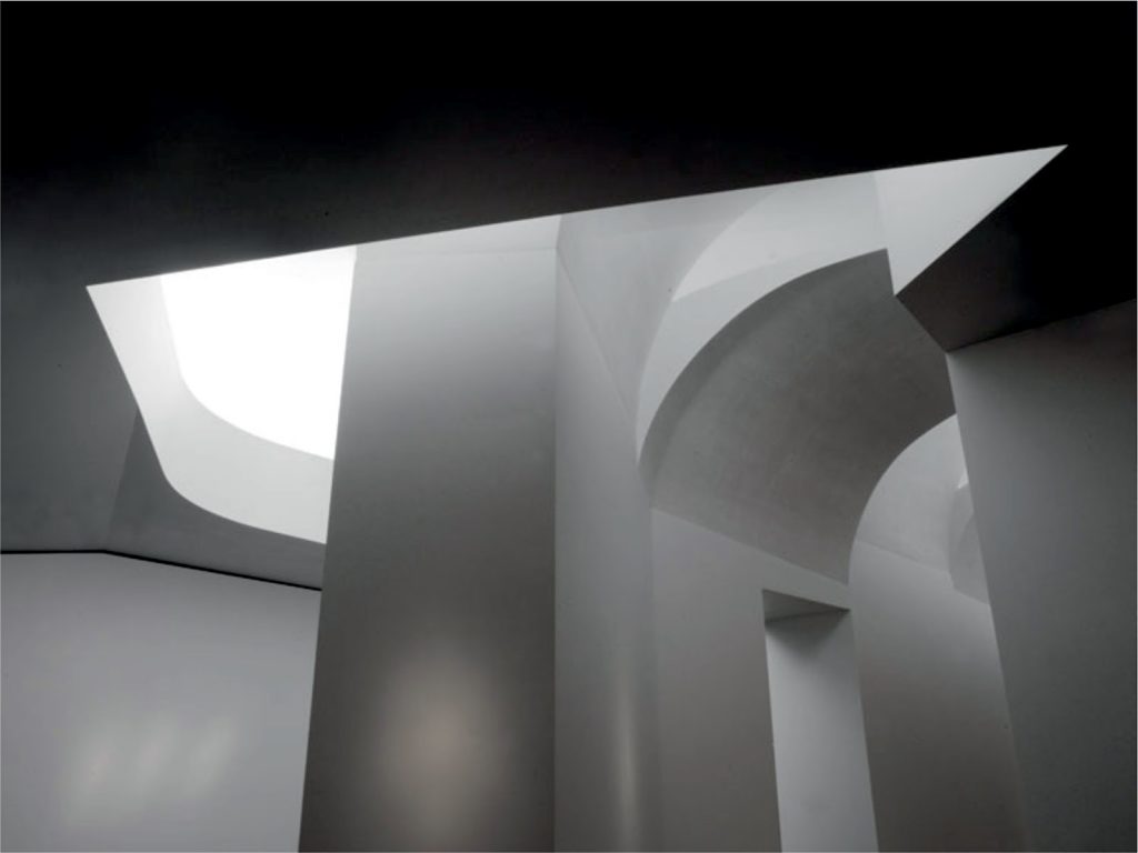
Nelson Atkins Museum of Art. Bloch Building

Introduction
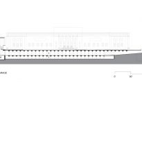
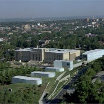
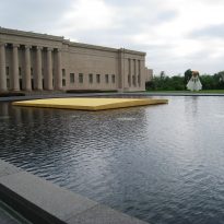
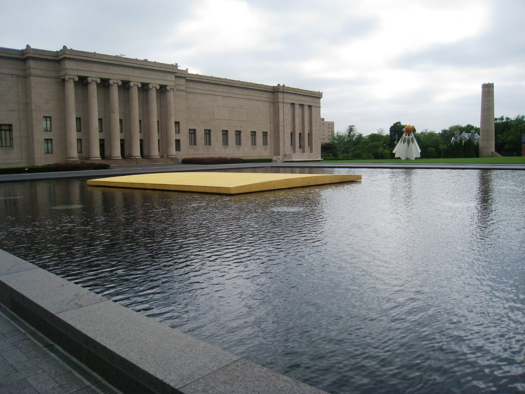
The original building of the Nelson-Atkins Museum is a work Beaux- Arts in the early ’30s designed by local studio Wight and Wight. The building is still in use and in perfect condition, however with the start of the new century increasingly close in 1993 the museum management saw the need to consider an expansion to upgrade the cultural museum and not be outdated.
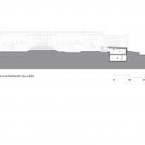
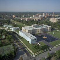
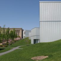
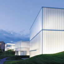
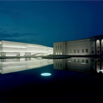
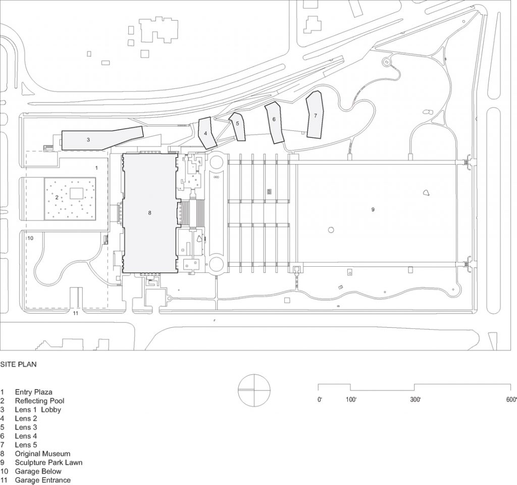
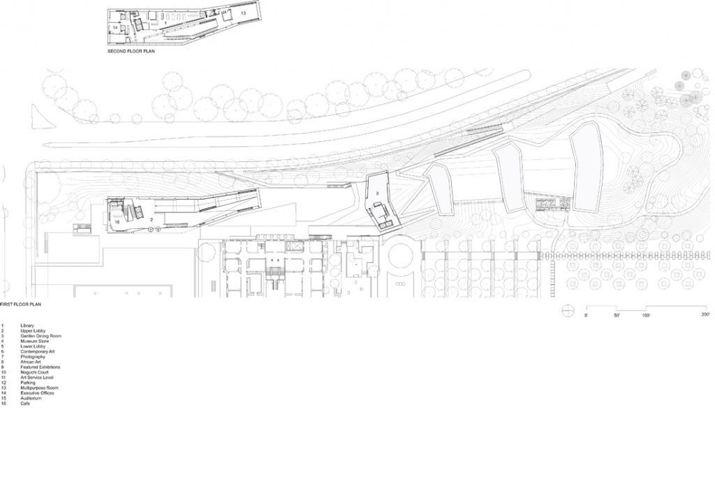
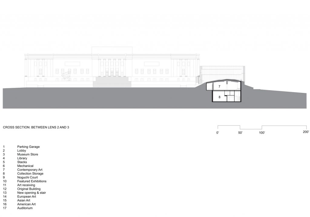
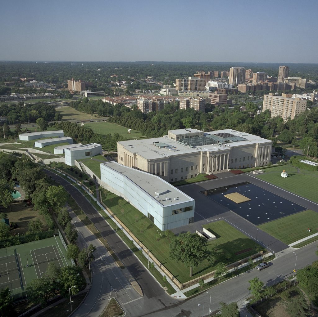
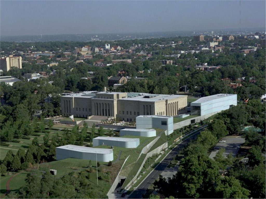
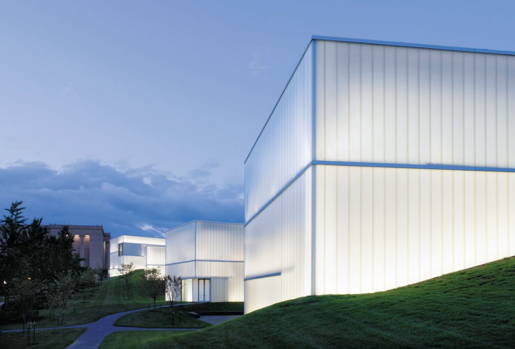
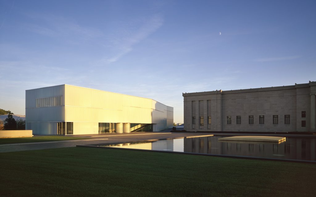
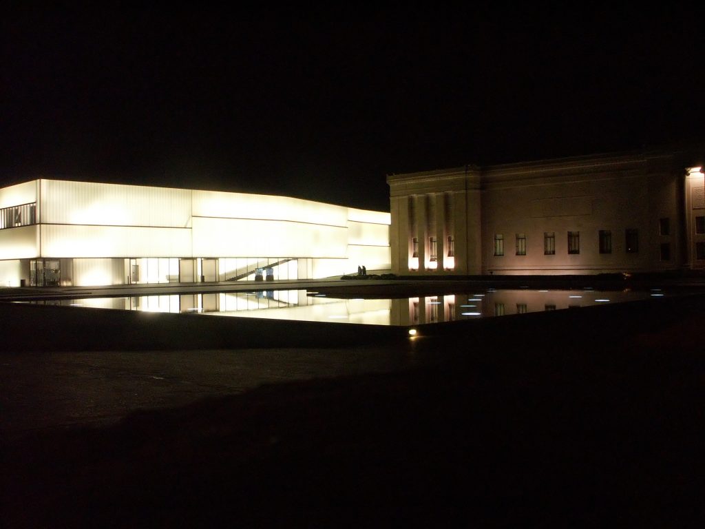
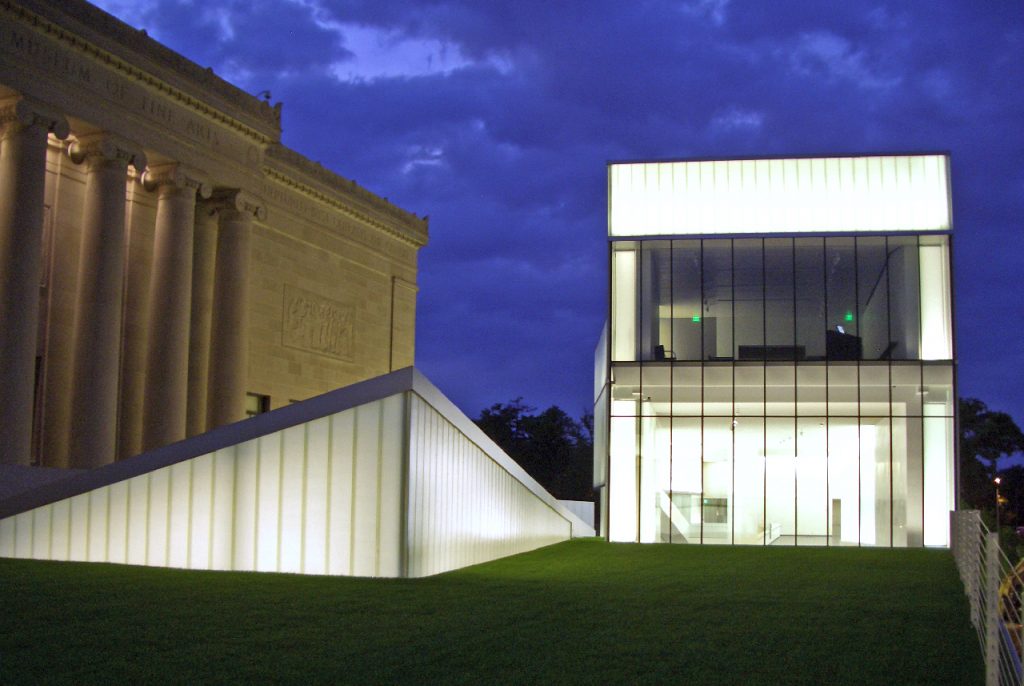
It was the result of this desire to modernize the museum organized a competition to expand existing facilities that eventually won the studio Steven Hall. The new building was to give modern image to the institution but being aware of the original building to achieve a harmonious integration between the two. In this sense the proposed Hall distanced himself from the rest of proposals proposed an annex on the north side of the existing building, which had held a great visual impact on the iconic image of the original building. The draft was the only Hall settled in a more subtle way, burying on the east side of the original building and the emerging field with five cubes of light provide a more disaggregated and respectful image abroad.
Dubbed Bloch Building in honor of Henry and his wife Marion W.Bolch the new building was opened on June 9, 2007.
Location
The exact address of the museum is 4525 Oak Street, Kansas City, MO 64111, about 5 km south of the city center.
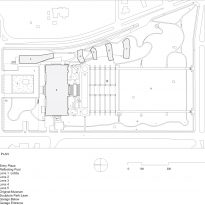
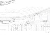
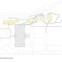
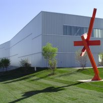
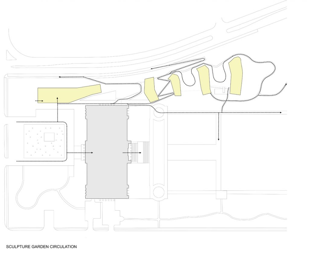
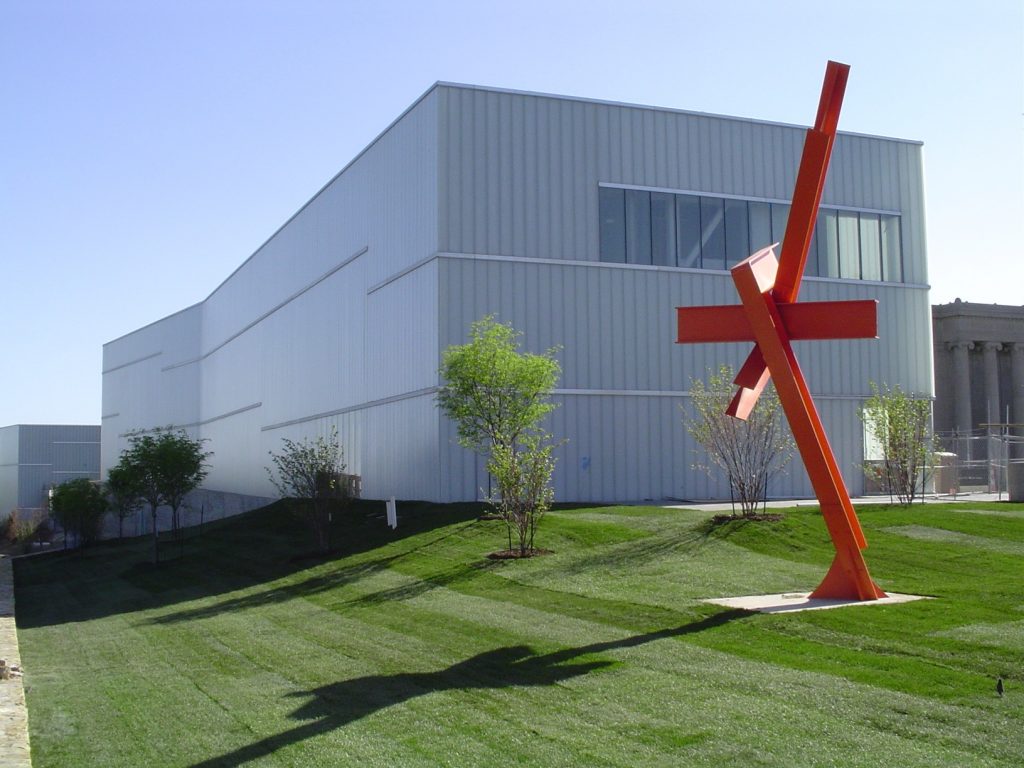
The museum is located on an area of approximately 450 x 200 meters with a large amount of public open space in parks treaty. The new building is situated along the eastern boundary of the land on an area known as Park statues because the sculptures are set on it.
Concept
The concept of the new museum focuses on two ideas, the first is related to the original building by contrast while the second is to integrate the building with the landscape and the works of the museum, making the architecture of the own visitor experience.
Contrast Ratio
Instead of trying to mimic the original building bet Hall studio for the new extension was to complement, offering opposing virtually all aspects of design solutions. Some of these contrasts can be summarized in the following combinations of terms:
- Opaque – Transparent
- Heavy – Lightweight
- Tight – Meshing
- Introvert – Extrovert
- Ranged – No limits
- Circulation imposed – Free flow
- Single Volume – Volumes scattered
Unique Experience
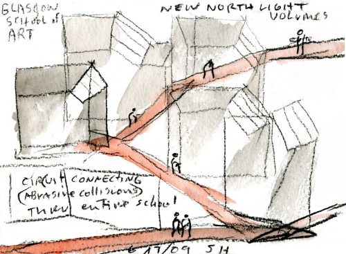
The new project proposes to merge with the landscape architecture and art, making the three protagonists of the elements that the user experience is the place. To achieve this goal without any of the disciplines entorpeciese the others in the project were directly involved both sightseeing and museum staff and artists.
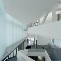
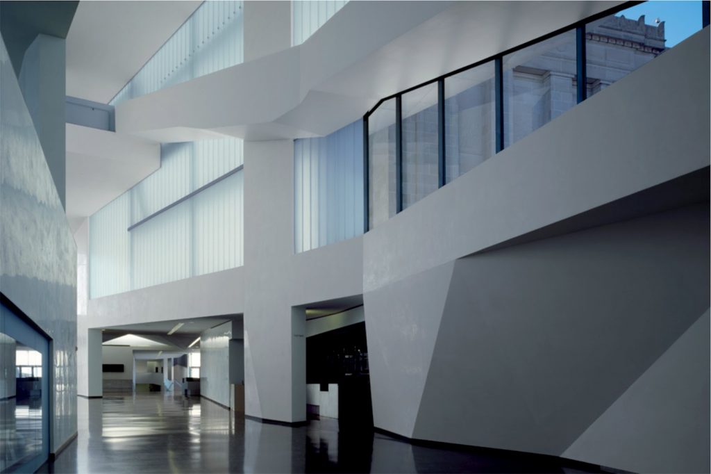
As a visitor to embark on the Bloch Building will be undergoing a series of transitions between light, art, architecture and landscape, with views both between indoor levels as between inside and outside.
Spaces

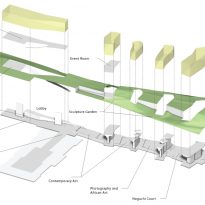
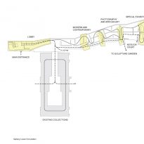
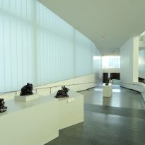
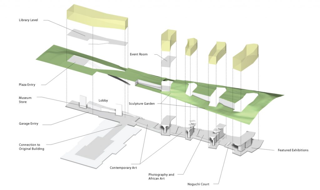
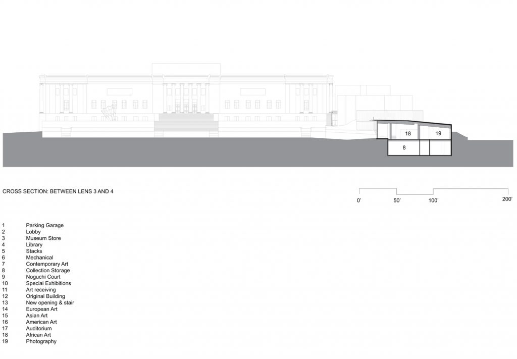
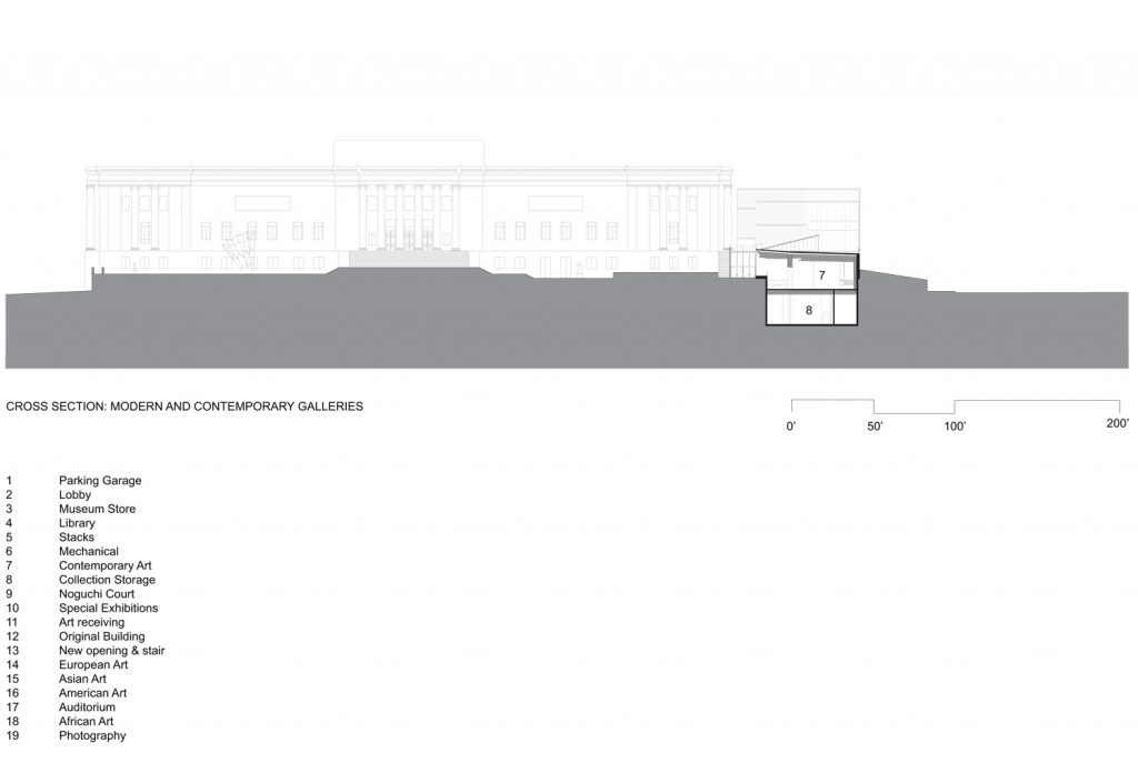
The new building houses the African collections, photography and special museum exhibitions, as well as a new entrance lobby, museum store, café, library and staff support spaces of the museum.
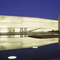
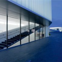
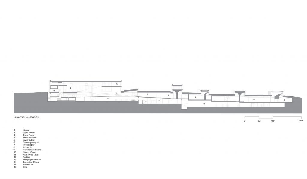
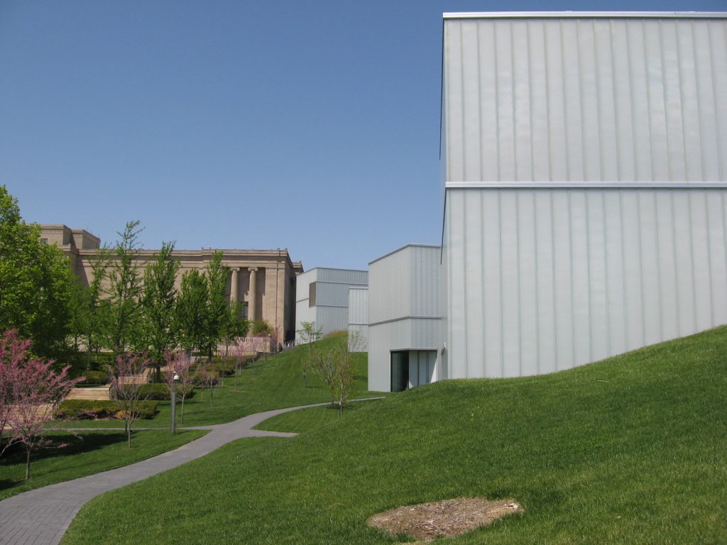
From the outside the five lanterns cristas emerging subdivided and give order to the sculpture park, allowing you to create distinct garden areas outside where people can stroll, admire sculptures or even picnics.
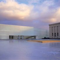
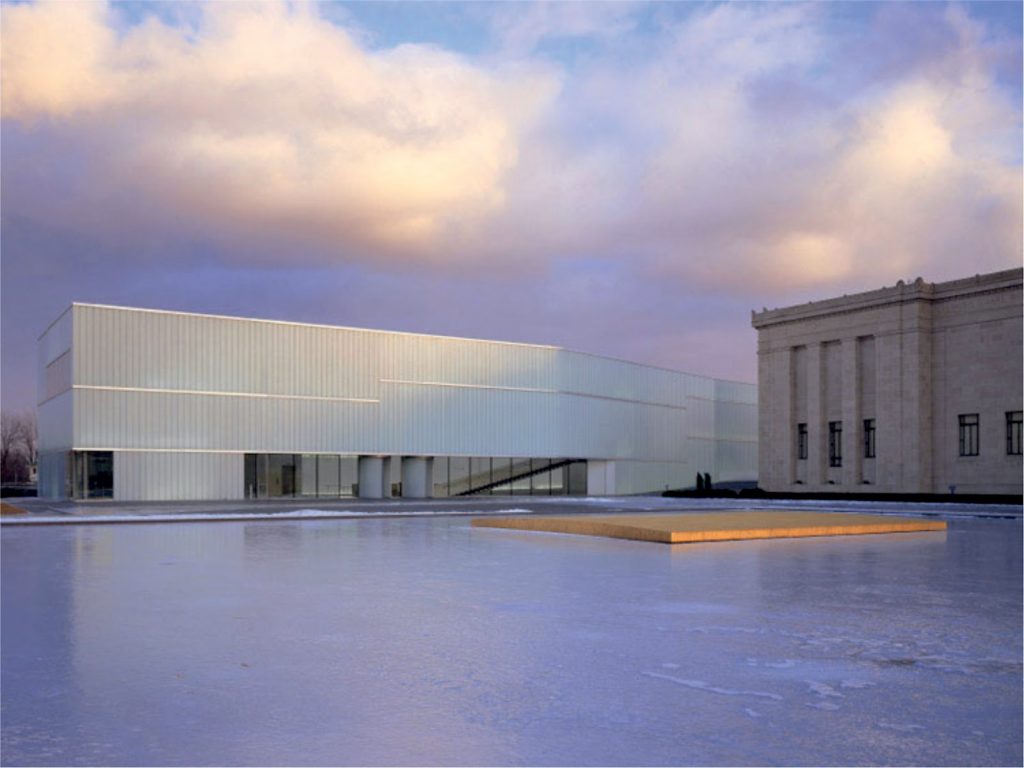
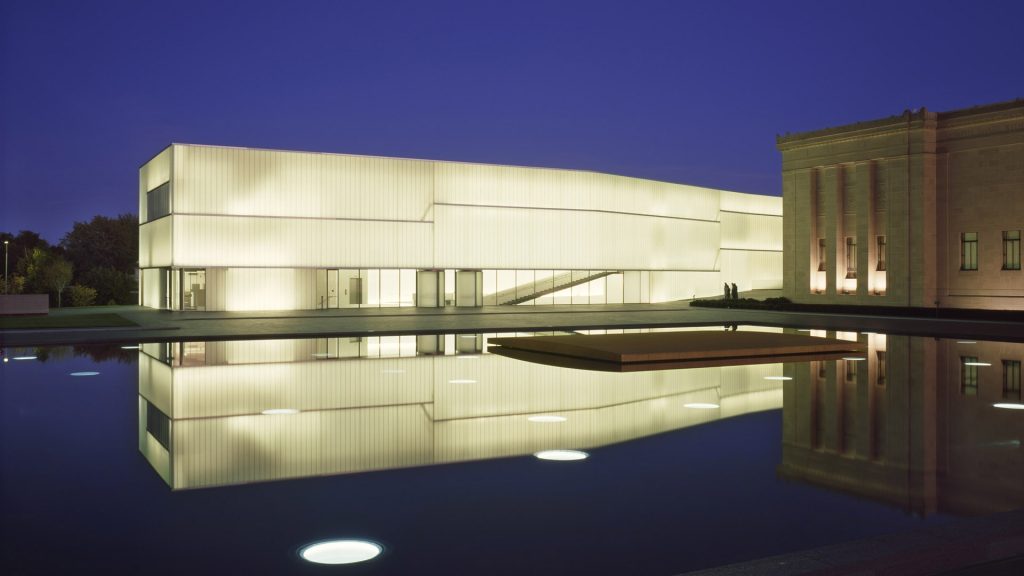
During the day these five volumes bring to light outdoor spaces, while at night the roles are reversed and it is the inner light that illuminates creating a landmark in the landscape.
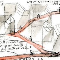
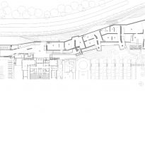
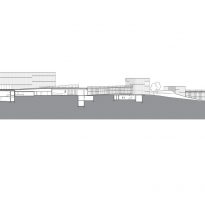
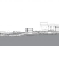
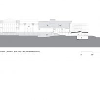
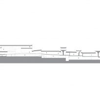
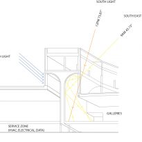
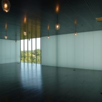
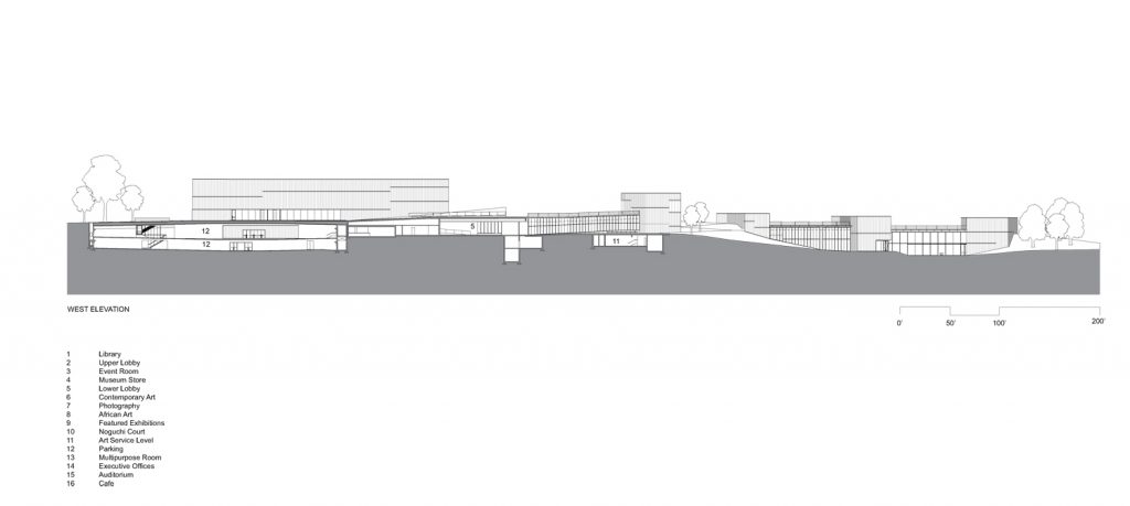
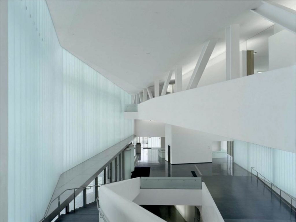
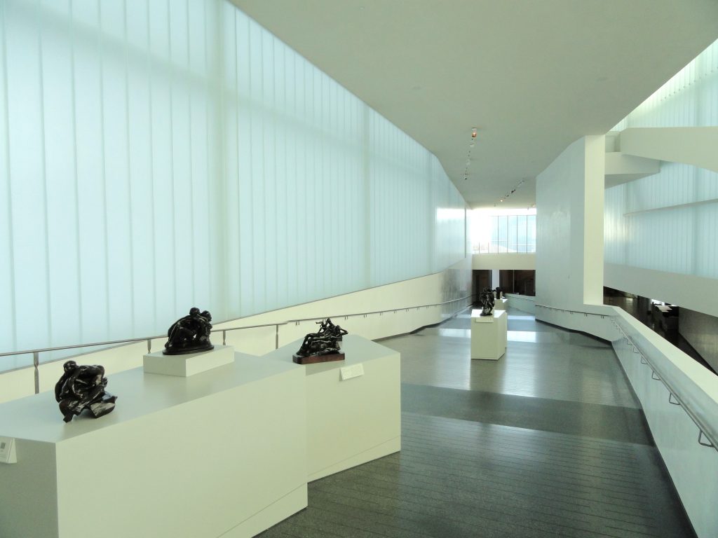
From inside the linear layout of the building suggests a progressive path inside a kind of promenade that guides the visitor through the five exposure levels and exposure. Each level is accompanied by a flashlight that bathes superior light and generates a relatively independent of the other space, although visually connected.
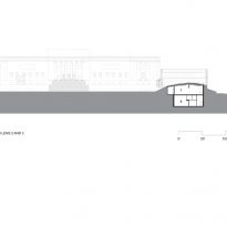
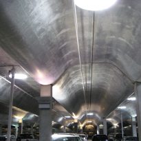
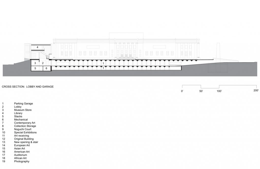
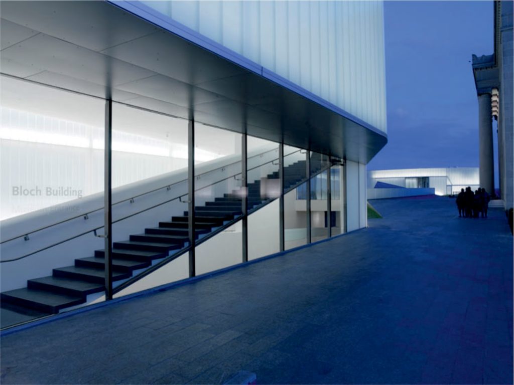
On the north side the project is extended in the form of square Arrival characterized by the work ” One Sun / 34 Moons ” by artist Walter De Maria. From this square leads to the first inner level and the start of the museum tour. Under the square located two levels of underground parking from which there is also direct access to the lobby entrance. The fountain sculpture by De Maria makes parking becomes a work of art in itself, as through water and a series of skylights ( moons ) sunlight reaches the lower space creating a unique effect.
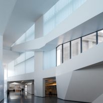
The first level, corresponding to the northernmost lantern houses the public spaces as the new entrance lobby, the cafeteria, shop, library and staff support spaces of the museum. This level is welcoming the visitor becoming a transitional space between the city and art.
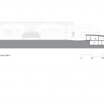
From here each reference level decreases in the previous creating a series of visual connections between the spaces that are not divided by any vertical enclosure.
The roof also decreases along with the different levels, but with a smaller slope, which implies that the roofs of all levels are increasingly high as the visitor moves on its way.
Lower level exhibit a level of continuous service that allows the storage and distribution of works throughout the gallery extends.
Structure

The project structure is directly linked to the concept of the skylights that emerge above ground.
First during the construction field was excavated and secured by a perimeter wall of reinforced concrete.
The floors are of concrete armed Obre a sheet of corrugated iron serves in turn to lower reinforcement and formwork.
Breading T’s
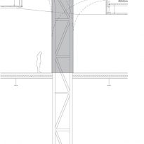
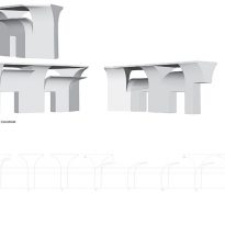
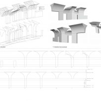
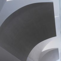
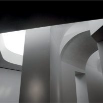
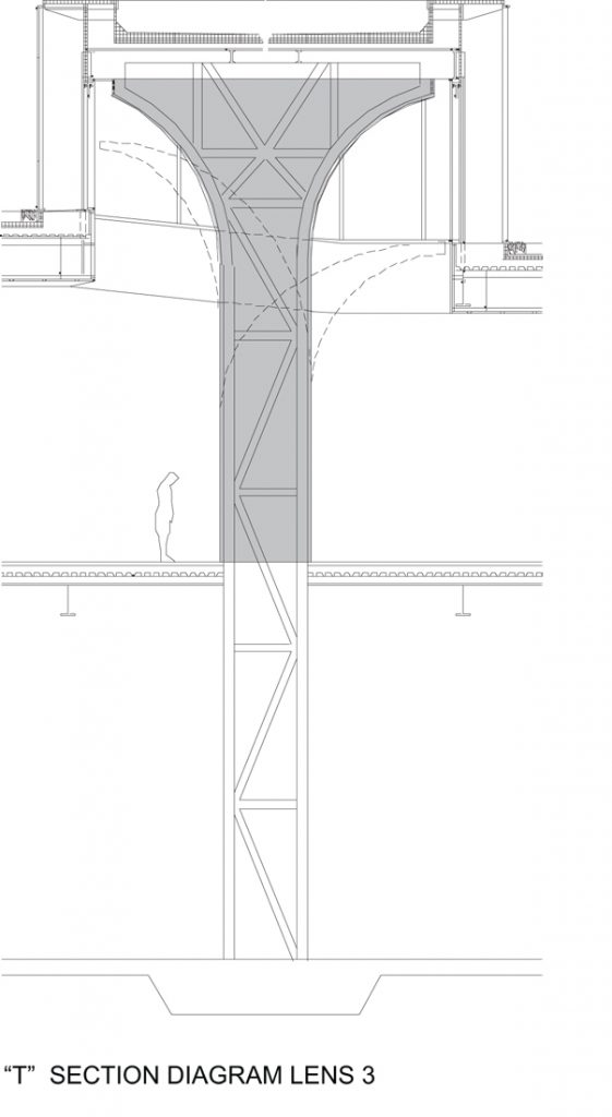
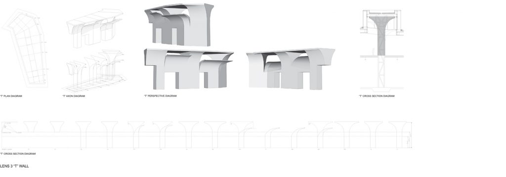
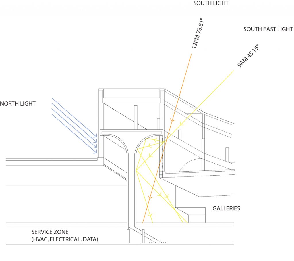
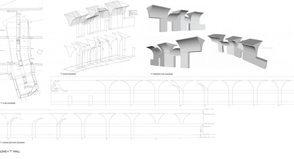
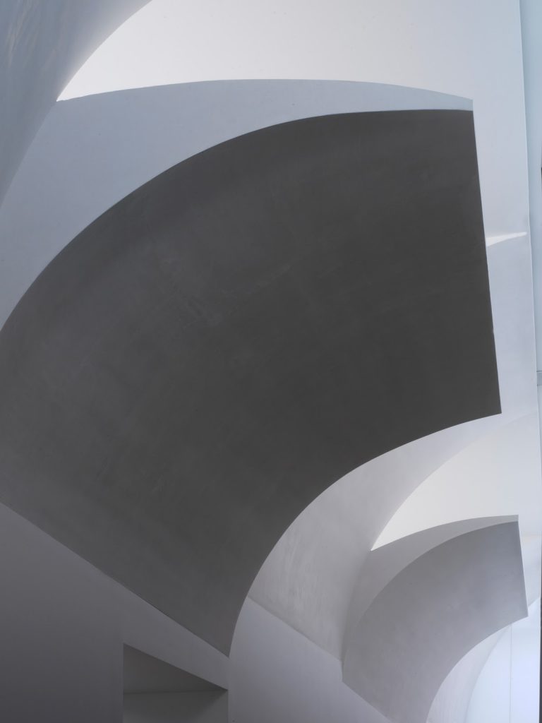
Along the center of each of the lanterns, and perpendicular to the north-south axis, a wall rose from the ground level up to a higher point in the park. This wall formed from steel sections extending on top creating a wall in a ” T” that Holl himself dubbed “Breathing T ” since it is not a purely structural element but serves its time to ensure proper circulation of light and air into the interior. The inner walls of the U have curved finished facilitating this movement.
It is from these T-shaped walls where they take support from the steel, forged and glass panels that end up giving final shape to the headlights.
Materials
The glass and steel certainly become the predominant materials of the project, although these are also complemented with white plaster finish on interior walls and smooth cement floors, wood and large rough stone pieces just in soils of different areas and reinforced concrete and steel structure.
Glass
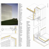
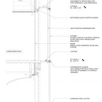
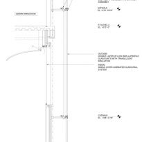
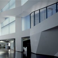
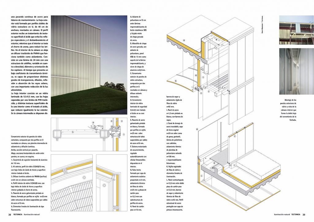
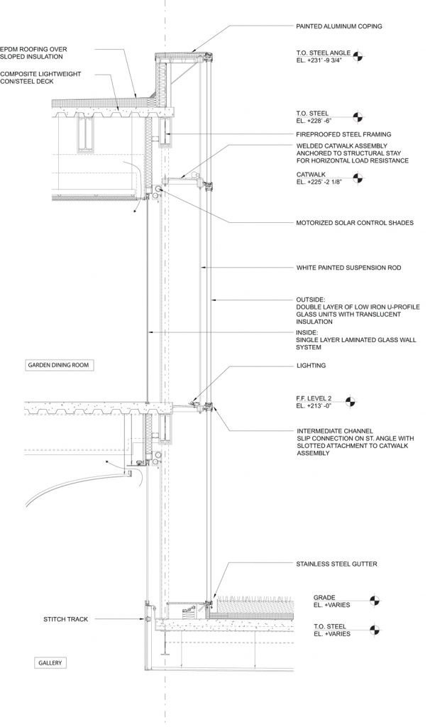
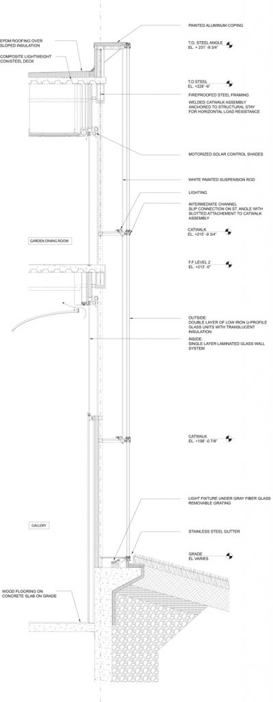
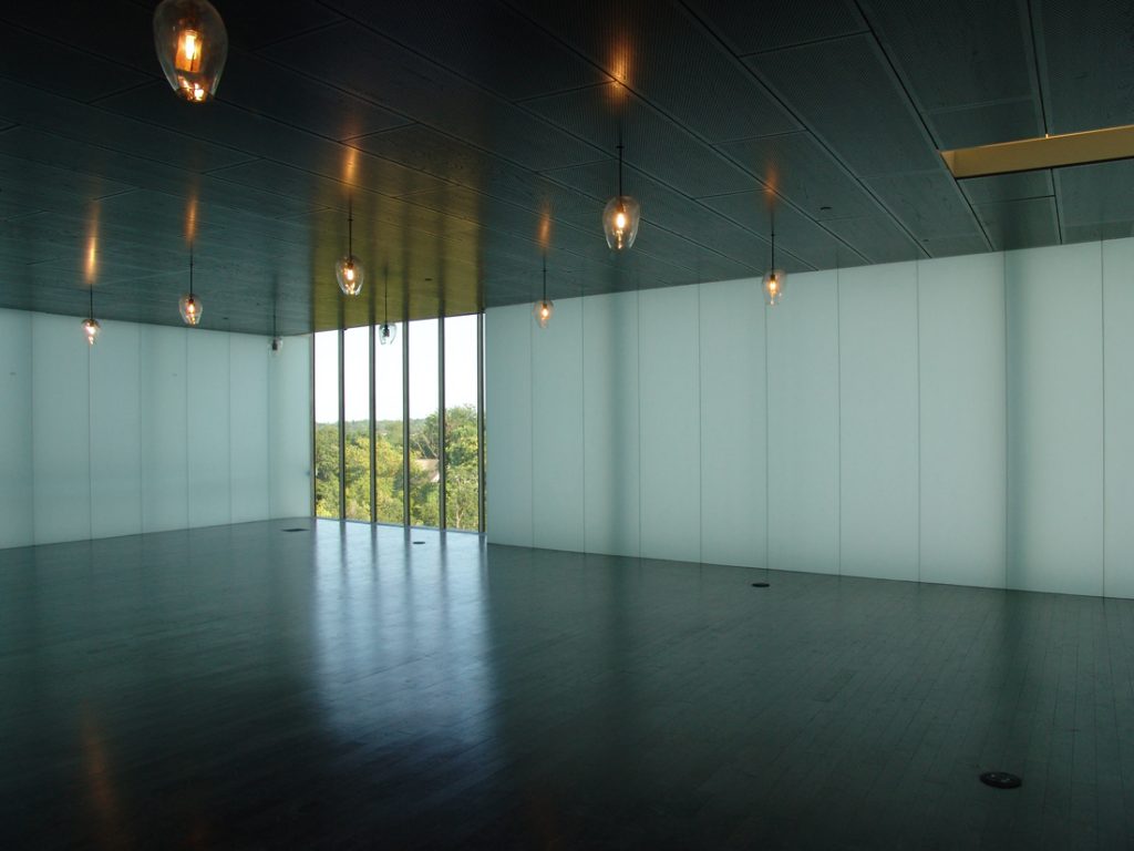
The glass walls confirming volumes lanterns are actually formed by two walls of different crystals with enough space between them to circulate an operator. The aim of such a space is double, allowing the installation of control systems permitentes light, a vital aspect in a place where works that could degrade in contact with natural light are exposed, and in turn serves as insulating chamber to ensure thermal stability of the interior space.
The outer skin of the headlights make two rows of glass parts the form of ” U” placed to fit each creating a second air chamber within the profiles themselves, which in turn have been treated to block most part of radiation that could be harmful to the artwork.
