Museum of Modern Art in Rio de Janeiro

Introduction
The scope of this museum is not just limited to art exhibitions and conferences. The intention was rather to develop an arts center that will include the museum itself, a school with lectures and work spaces, and a theater that seated 1,000 people for concerts, plays, classical ballets, film exhibitions and conferences.
Situation
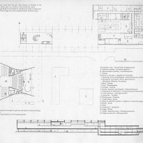
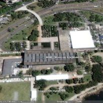
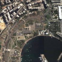
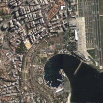
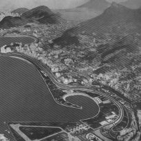
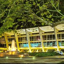
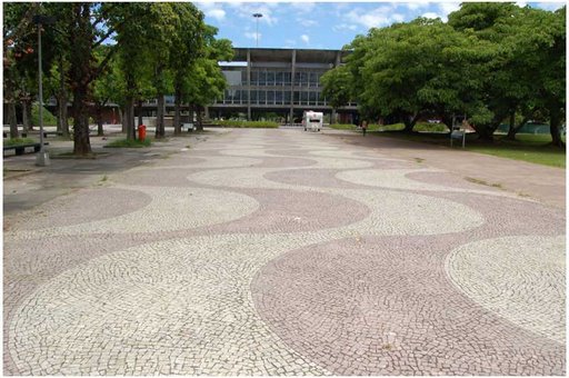
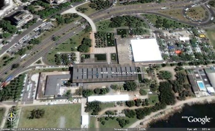
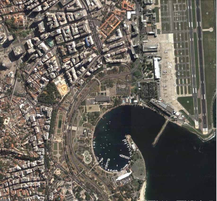
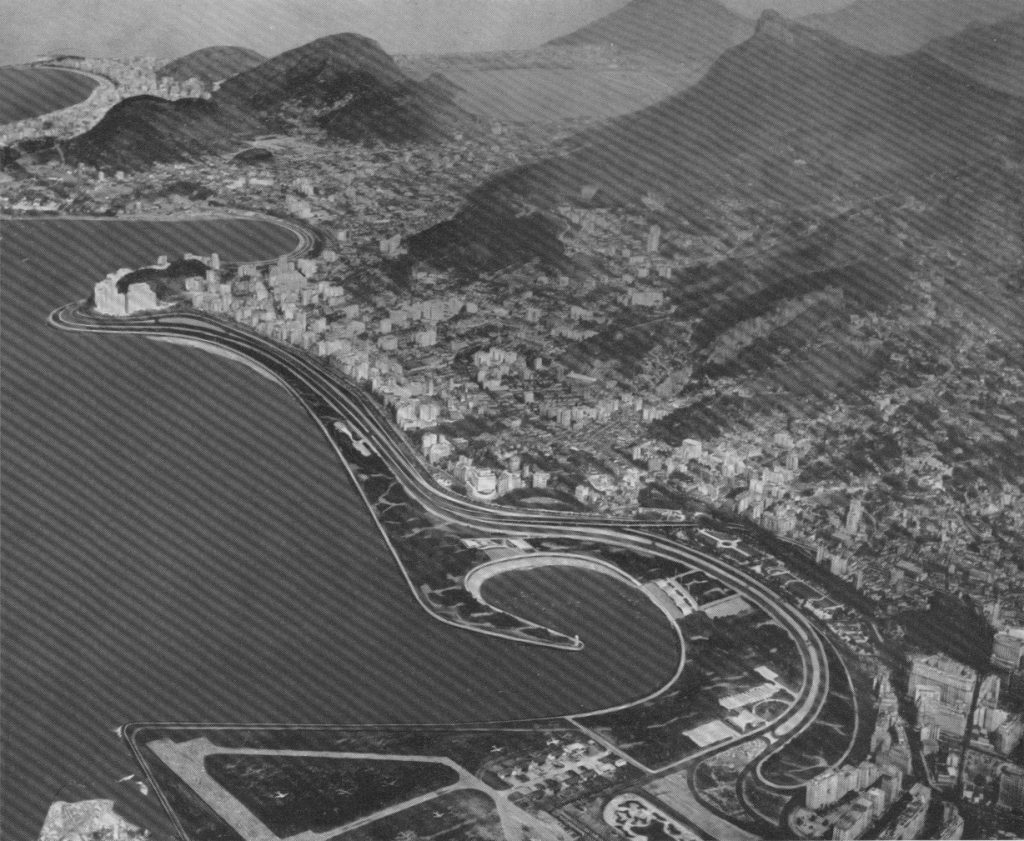
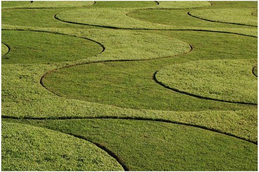
The building to house the Museum of Modern Art in Rio de Janeiro, was designed in 1955, but to date it is completed in its entirety. It is located in the bay of Rio de Janeiro, on land reclaimed from the sea with the devastation of the “hills”, as part of an urban planning on the coast of Rio that is carried out under the direction of Roberto Burle Marx.
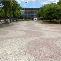
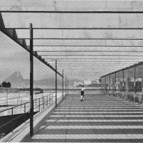
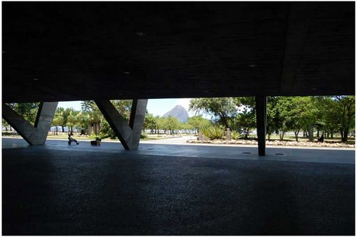
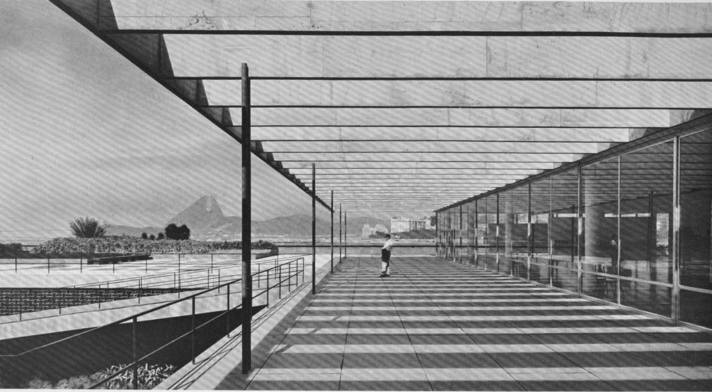
This new land must also be the site of a large public park surrounding the museum. Ordering a splendid view of Guanabara Bay and put in front of the city skyline, with the rebellion of mountains in the background, the position is of exceptional beauty and within easy reach of the city.
Meaning
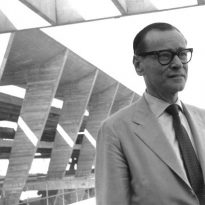
The following words were taken from an essay about their architect to create a museum: “the cultural influence of a modern art museum is not only drawn from the collection of works of art and of courses of study and conferences held there, but more particularly the creation of their own intellectual atmosphere in which the artist is to enrich their own work and ideas in which the public can absorb the artistic culture required by the mind of modern man. ”
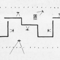
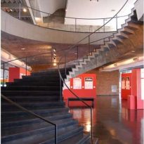
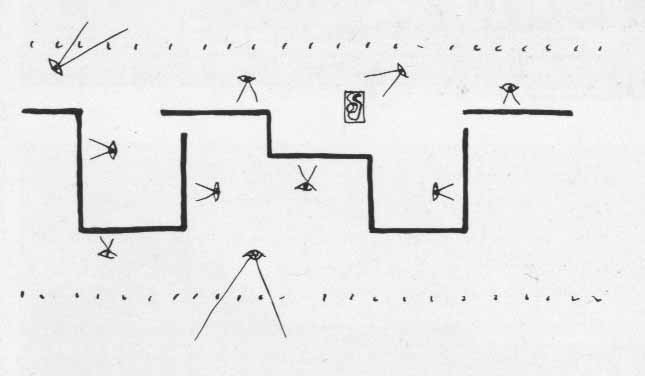
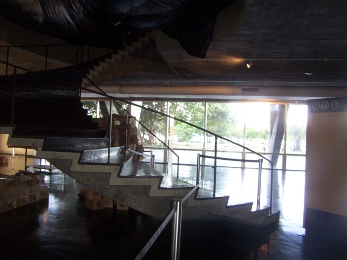
The journey is not rigid, there is generally more than one entry for each of the environments defined by the divisions. But the division of space travel as are induced by the shape of the building. The divisions generally taken in the exhibition creates environments that hide the light for a moment, and suddenly the show in this way at a time when the visitor is in the works and another rests in appreciating the view outside.
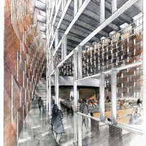
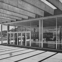
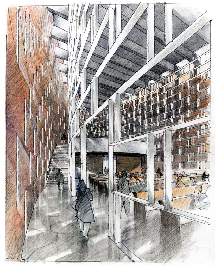
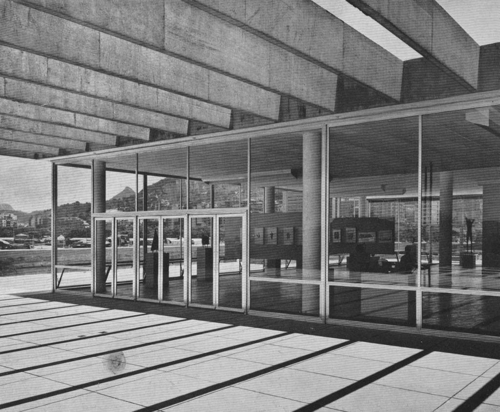
The project is a radical departure from the conventional idea that the exhibition galleries and exhibitions call closed. There are no walls or partitions large. The entire interior of the exhibition galleries is visible to the outside. The argument for this is that visitors can better concentrate on the works of art only if the gallery has been fully lowered, bringing the attention of a person confronted by a large number of works of art decreases rapidly unless there a chance to rest the eyes and refresh the mind.
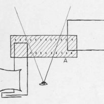
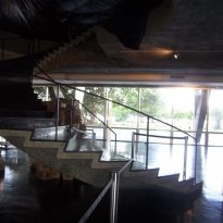
There is a variety in the organization of space, large windows that allow an uninterrupted view works of art. The requirements for the lighting of an art gallery are not just restricted to the optimum illumination of the objects shown, the light should also create a psychological atmosphere conducive to the contemplation of entertainment.
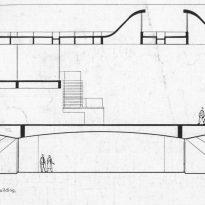
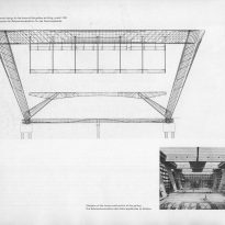
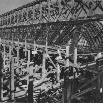
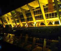
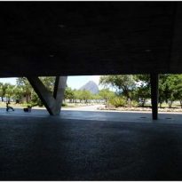
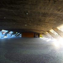
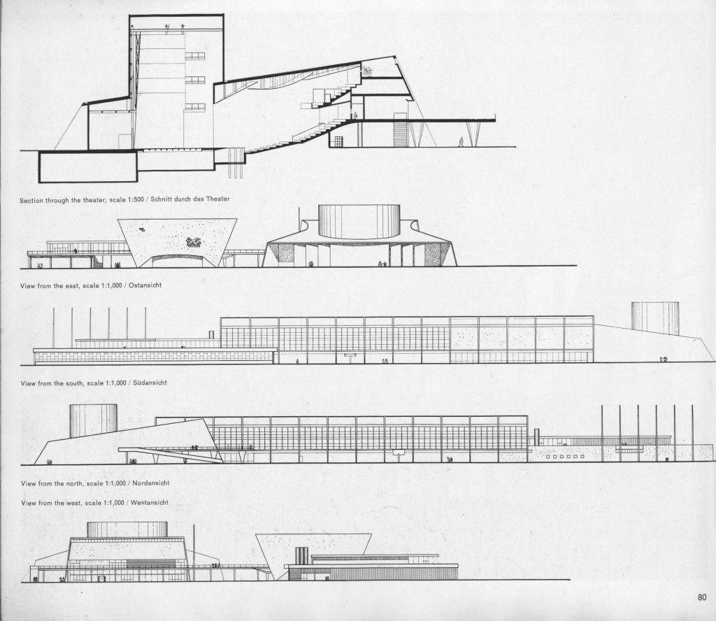
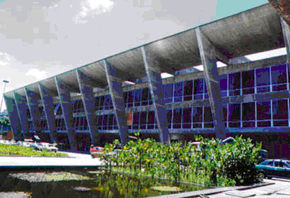
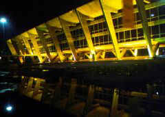
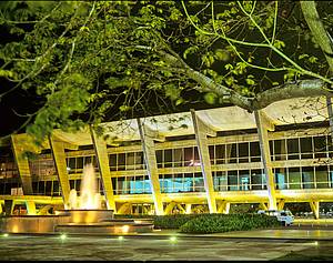
The project shows a tendency to harmonize with the architectural background, accentuating the contrast with the horizontal line of undulating mountains. A striking feature of the design of the main building is the series of external framework, joined by longitudinal beams, providing both the suspension of support for the floors. Apart from the lobby, the floor is completely free so that the view of the sea is virtually uninterrupted.
Spaces
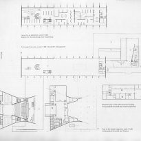
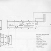
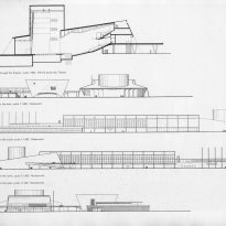
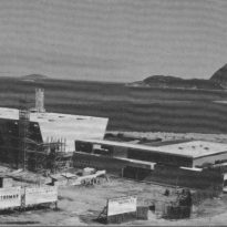
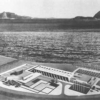
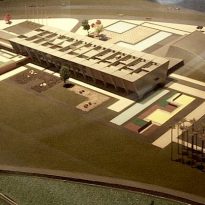
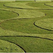
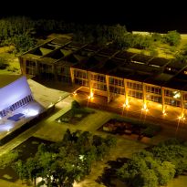
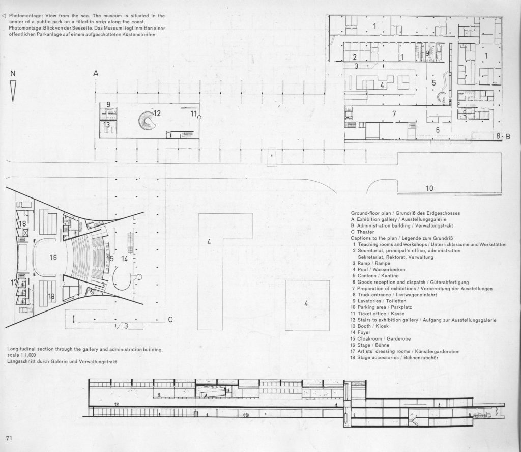
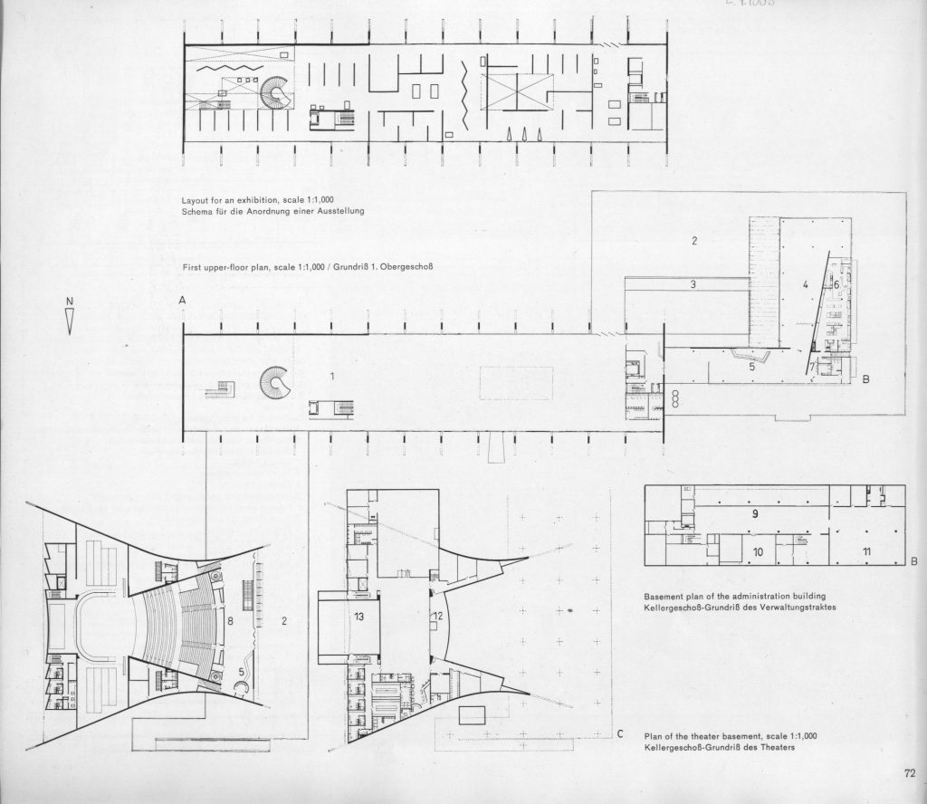
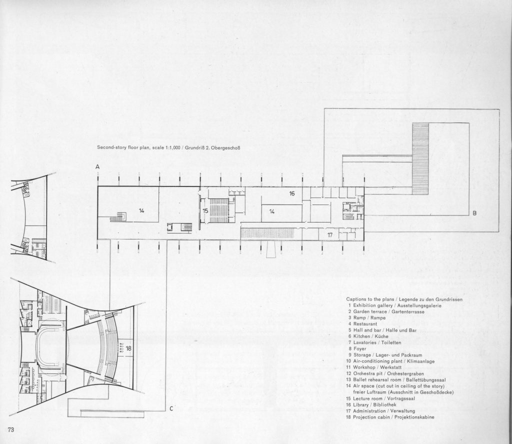
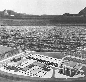
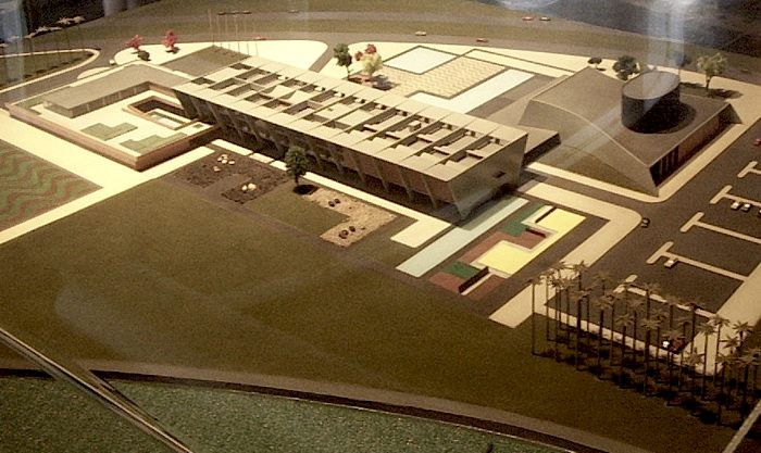
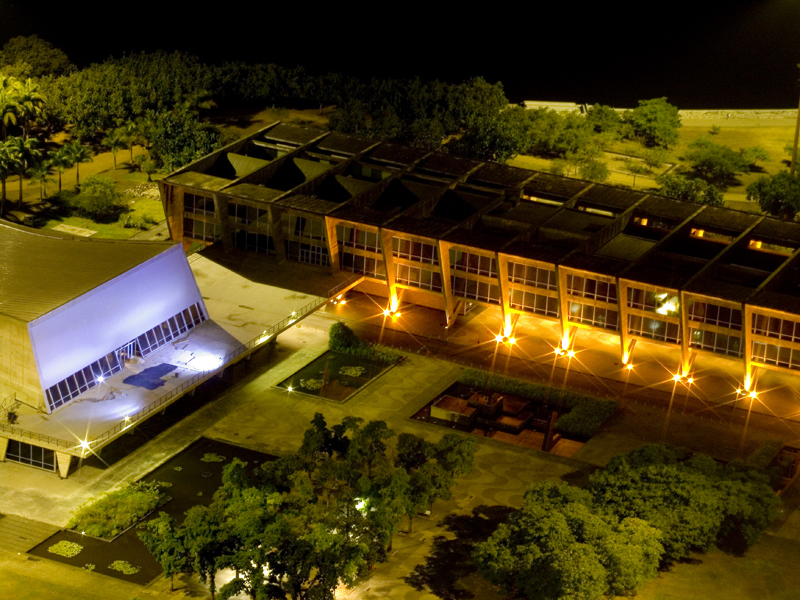
Articulated in this volume is another central U-shaped body, which can define an inner courtyard that was designed by Burle Marx. A broad ramp leads to a higher level, where are located the restaurant, bar, lounge and terrace overlooking the sea. Ground floor units are connected with the museum itself: warehouses, workshops, administration and school of art. This body has a very simple structural system is built with traditional materials: brick walls machine borders of concrete, ceramic floors and aluminum. Most of these two bodies are built and is currently in the process of termination.
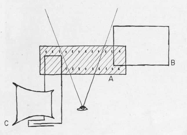
Complete all the building of the theater, whose implementation would define a place to access and complete articulation of the three bodies that make up the original draft.
The theater building is connected to the extension of the slab of the first level of exposure, which continues to form the terrace surrounding the front of the theater.
Building free and clear expression, is bordered by two curved walls which relies on a flat roof and leaning over which clearly highlights the cylinder of the housing scene.
Space Museum’s highly flexible, can be divided in different ways with each exposure. There are spaces with different heights (ranging from 3.60 meters to 8.00 meters), allowing the works are arranged in the room most suitable to their size.
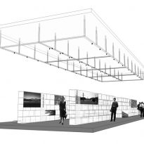
Gallery large measuring 130.15 m and 25.90 m is completely free of pillars, so that areas of land can be used without restriction for the demonstration of exhibits. Provide a section of a ceiling clearance of 7.93 m for large objects. The normal height of the space is 3.65 m. The lower section is illuminated by hand, while the highest is the light of a tooth from the roof of 50m in length which is glazed with glass thermolux and glass dome on the roof inastillable fitted with reflectors thermolux.
Structure
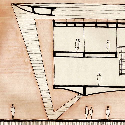
Building of modern design, with completely free, including being the pillars of support from the external side of the building.
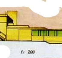
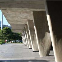
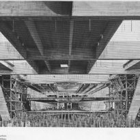
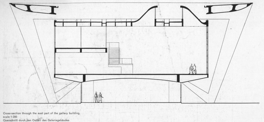
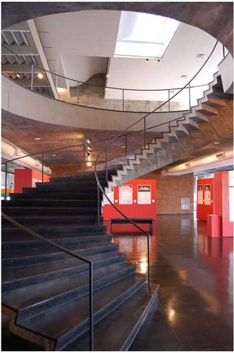
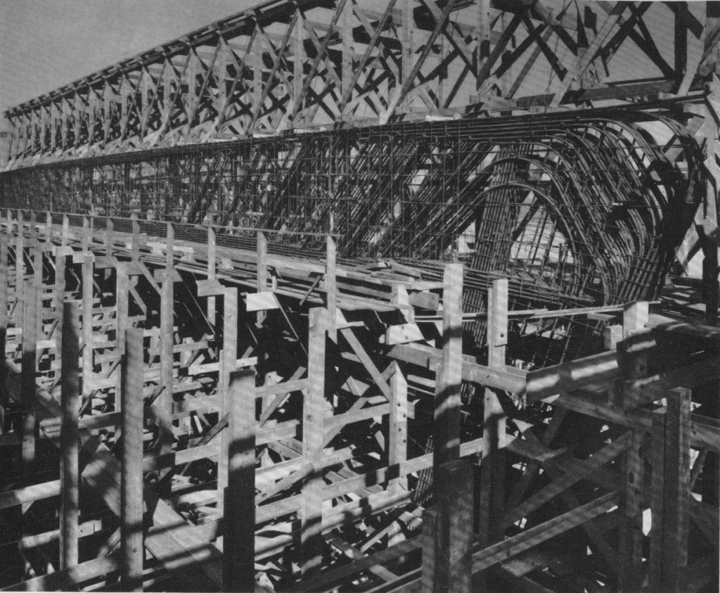
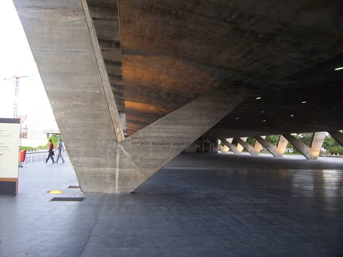
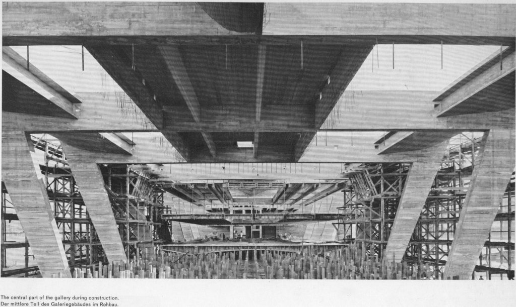
Basically the whole body is composed of three interconnected. The central body of 130m long and 40m wide, is known for its magnificent concrete structure in sight, and it is located in the exhibition halls, the auditorium, library, movie library and office management. The structure consists of a system whose feet cross porches rights consist of two branches.
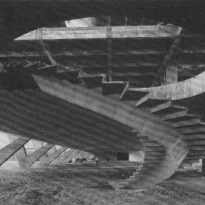
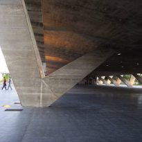
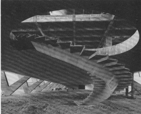
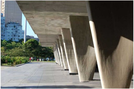
One holds the slab on the first floor for exhibits and the other joins the upper beams of which are suspended and the roof slab of the second floor. The system allows for total freedom in the development of plants and determines the absence of columns inside the showroom. Foundations are done with piloting 26 m. deep. The exterior trim is aluminum, with green glass to protect against the sun’s rays and excessive brightness.
The pillars supporting the building had to be sunk 20m deep into the soil due to soil foundation. Each rib of reinforced concrete forks in the ground level. Mainstay inside inclined take the load of the slab above, while the props appear inclined to take the transverse beams which the second slab and platforms on the roof bars are suspended by tension.
Materials
The windows of the gallery are oriented to the north and south. The selection of sun is less important on the south side because this side is exposed to direct sunlight only for a short period in the summer under the conditions that allow easy protection. The northern facade, however, is exposed to sunlight for most of the year. Adequate protection was needed to prevent high temperatures in the interior. Even a section of floor with air conditioning is still necessary for the economy. For this reason, large longitudinal rays were locked so that they rest on the outside corners of the ribs of reinforced concrete. However, there are periods during the winter solstice that such protection is not adequate. These windows are therefore thermolux with glass and protected with aluminum shutters to control the amount of light entering the space.
