Museum of Arts and Design in New York

Introduction
The museum has changed location and name throughout its history remain ever present in the range that offers the cultural city of New York.
With this new change of location the museum aims to achieve a permanent establishment which also becomes icon and image of the museum and its tasks ranging from exposure to the teaching works.
Project
For the refurbishment of the building was called a lollipop at the international competition in which more than a dozen of the most prestigious of the moment.
The contest finalists were:
- Smith-Miller + Hawkinson Architects (New York, NY)
- Toshiko Mori Architect and James Carpenter Design Associates (New York, NY)
- Zaha Hadid (London, England)
- Allied Works Architecture (Portland, OR and New York, New York)
All of them famous for their innovative methods of construction and ongoing experimentation with new materials.
After reviewing the works of the four finalists for the museum is responsible for the preference for the study led by Allied Woks Architecture Brad Cloepfil
Situation
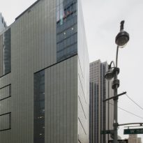
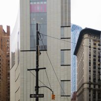
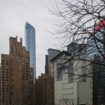
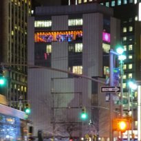
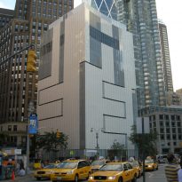
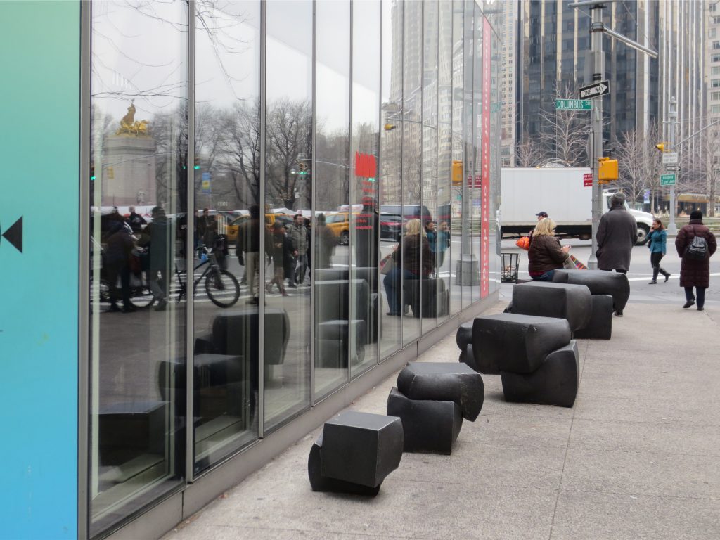
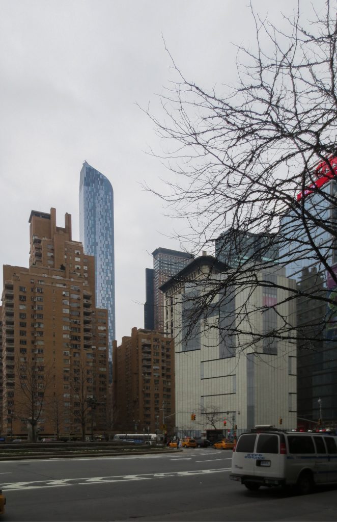
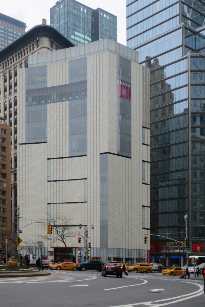
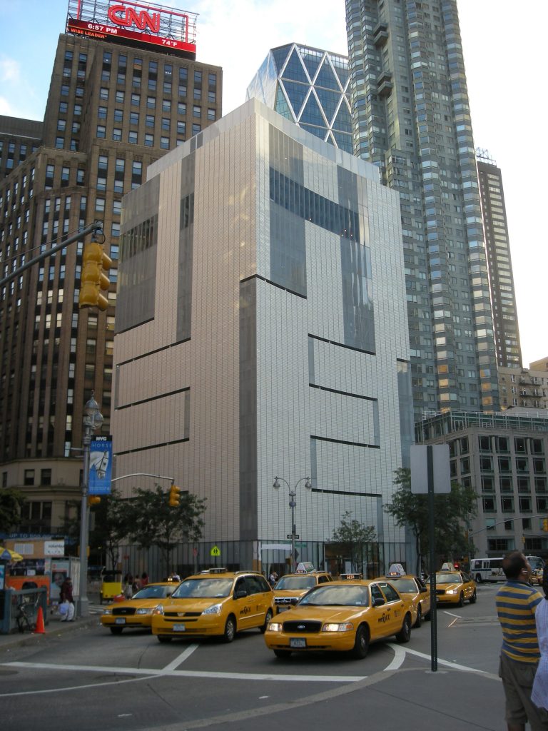
The project takes shape on the existing building in the crowded square lollipop Columbus Circle in New York.
Columbus Circle is located on the southwest corner of Central Park.
Meaning
The goal was also to serve the needs of the museum to create a building that became a icon of the city. The preferred location is suitable, however due from an existing building, known as the lollipop building, which limited their opportunities.
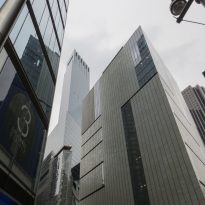
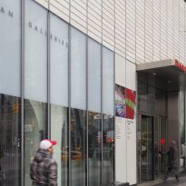
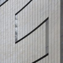
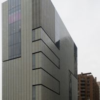
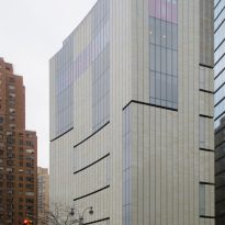
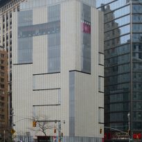
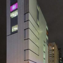
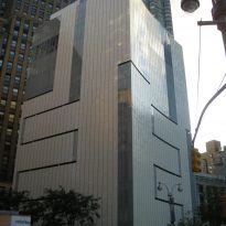
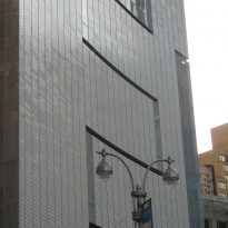
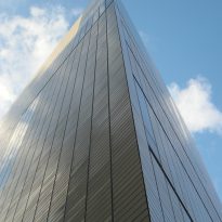
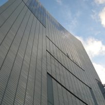
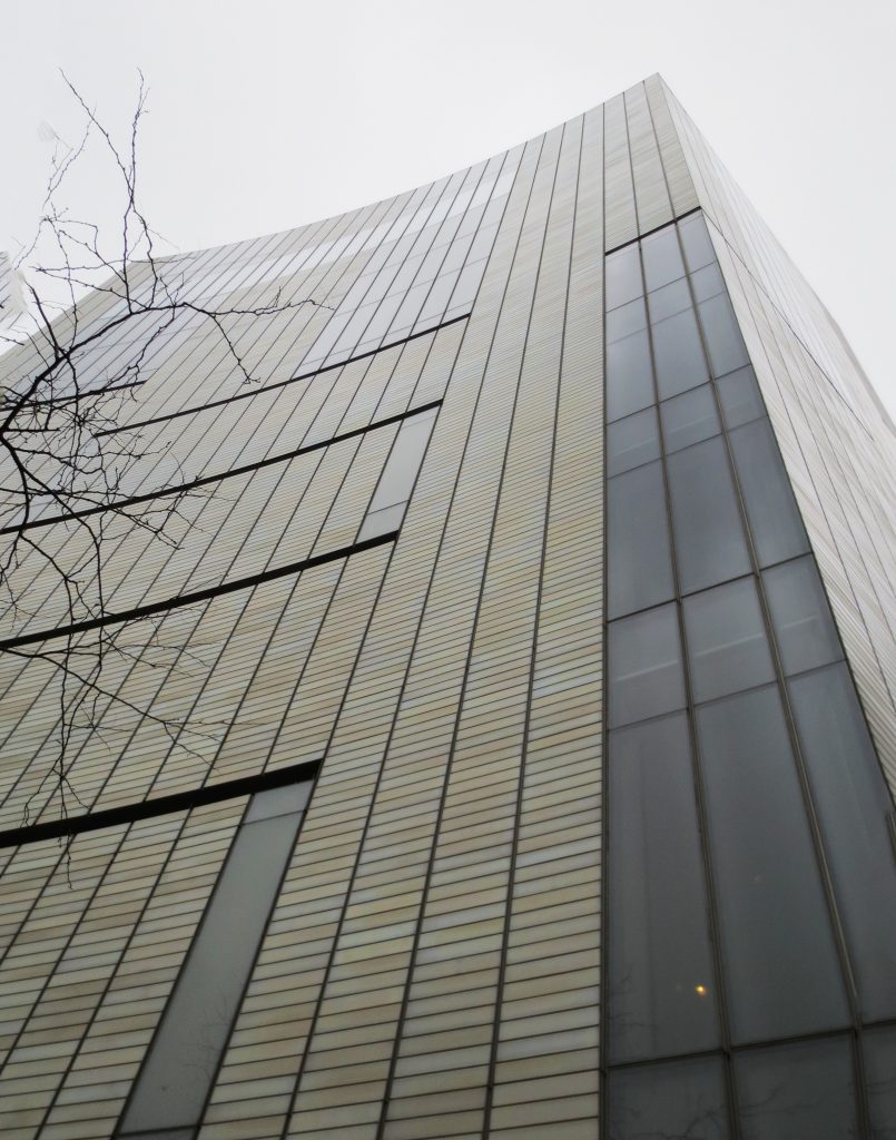
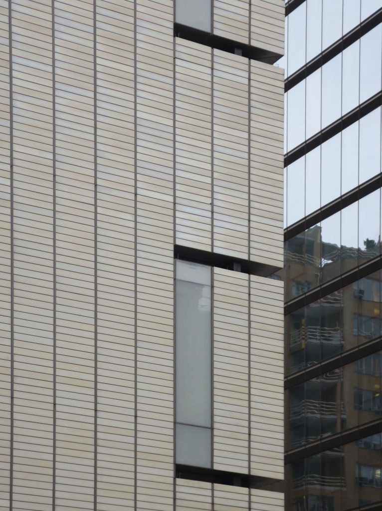
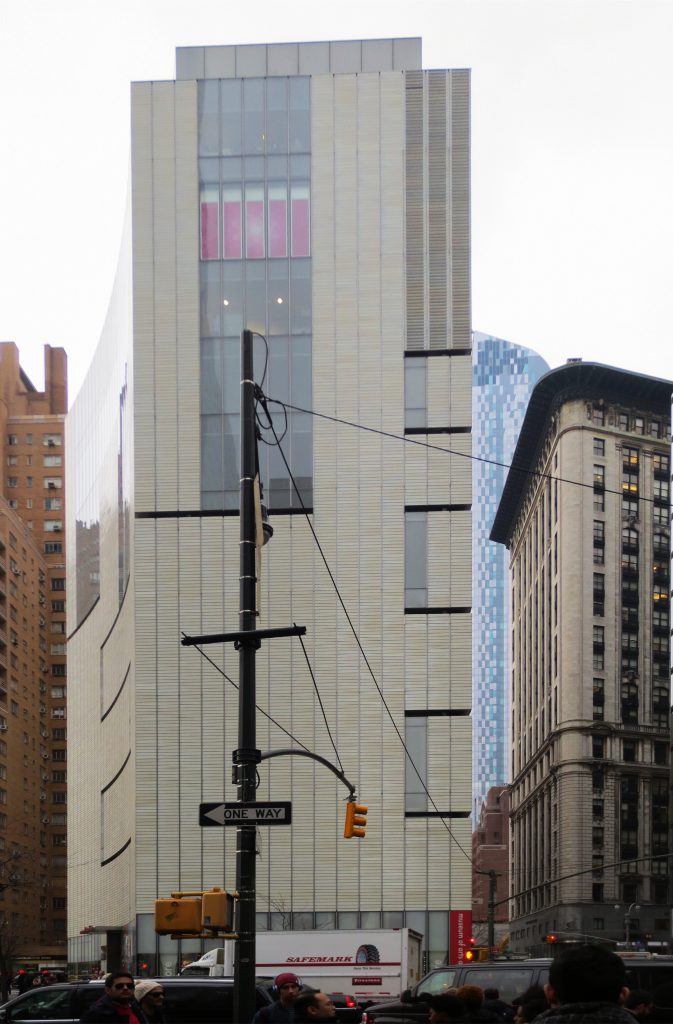
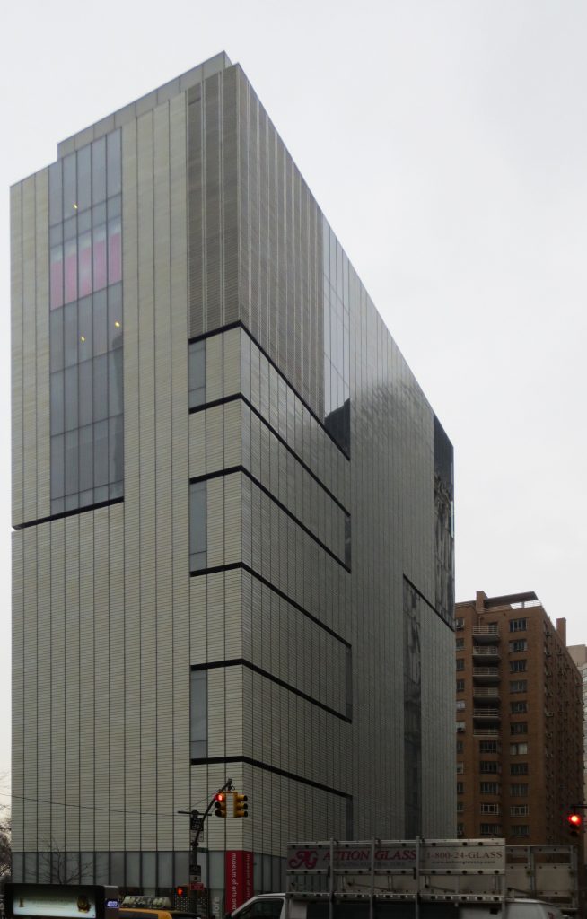
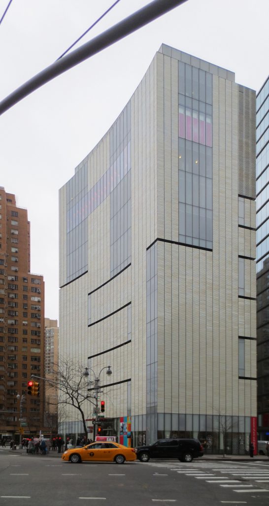
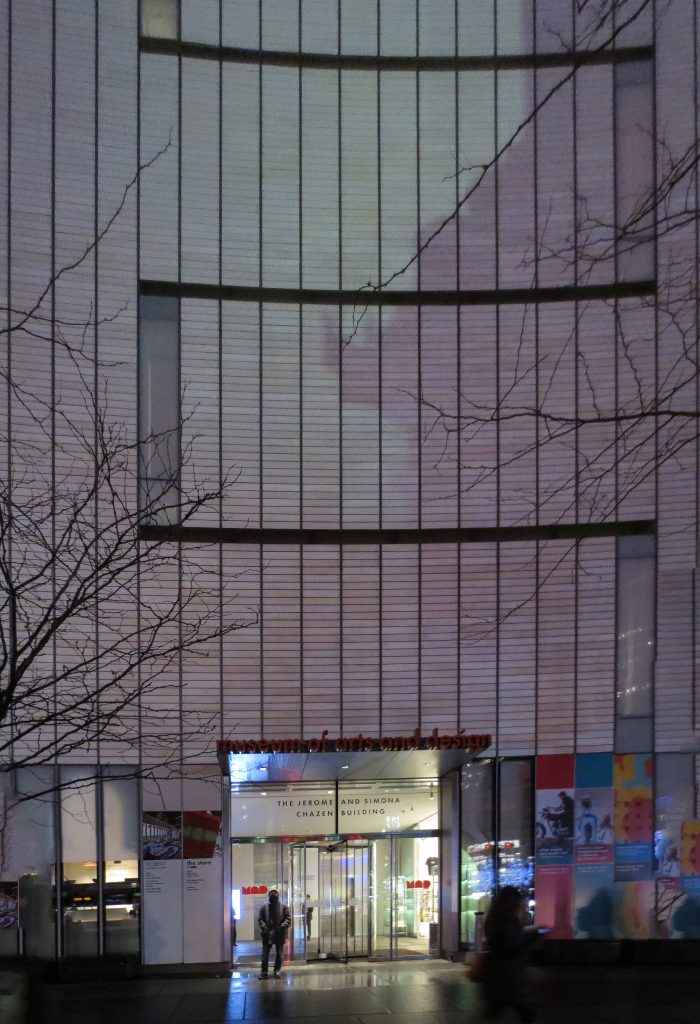
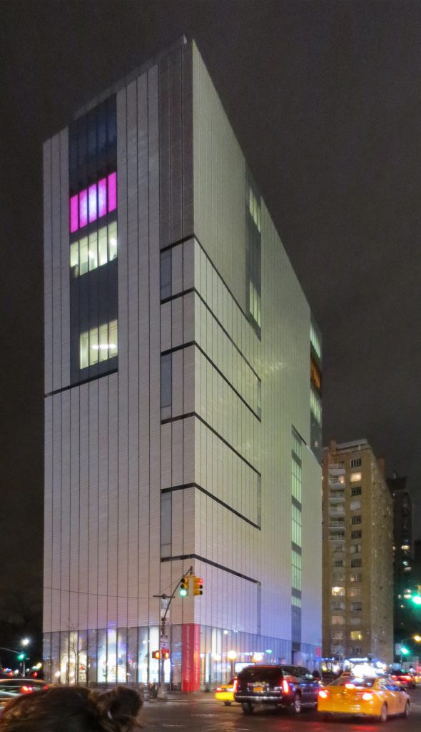
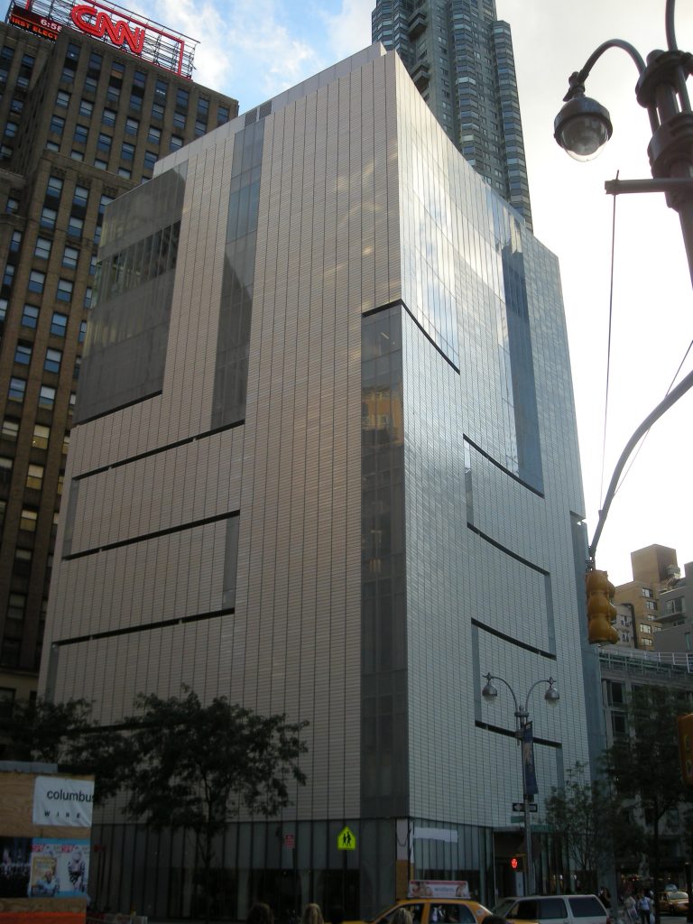
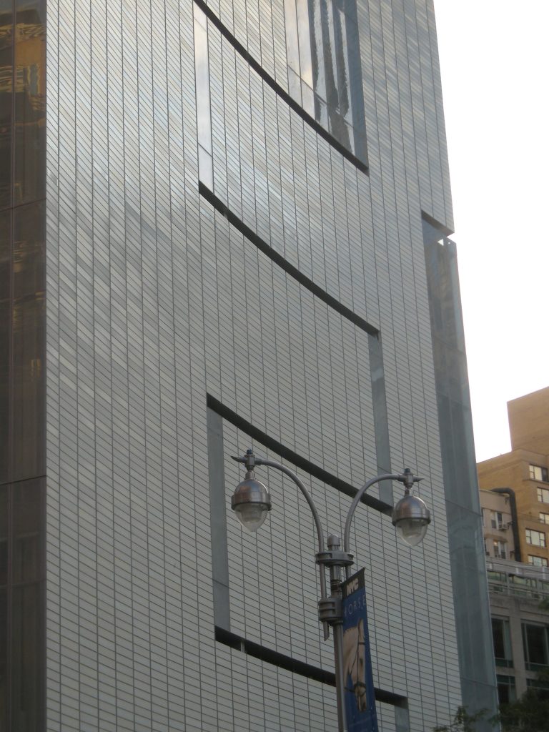
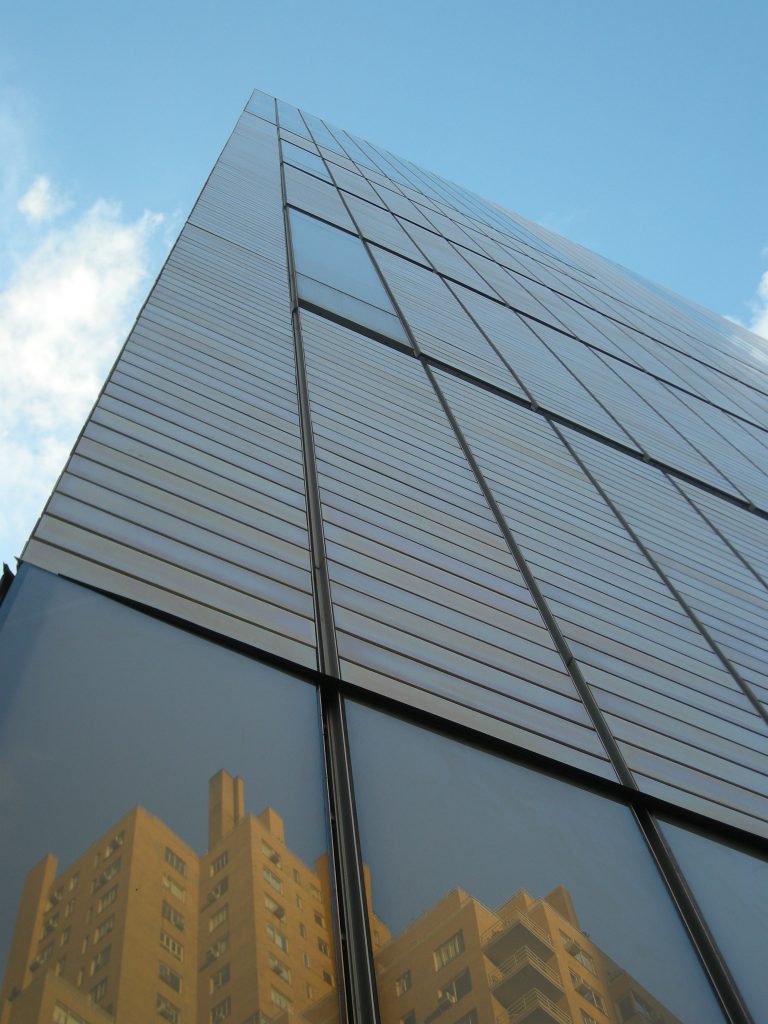
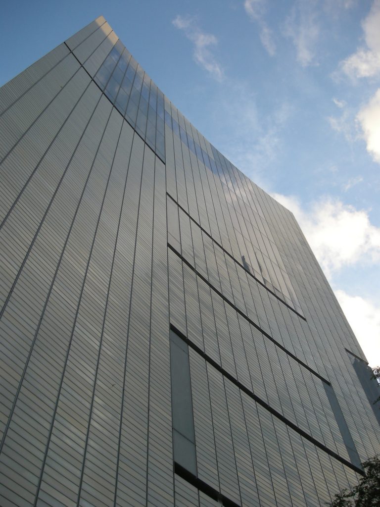
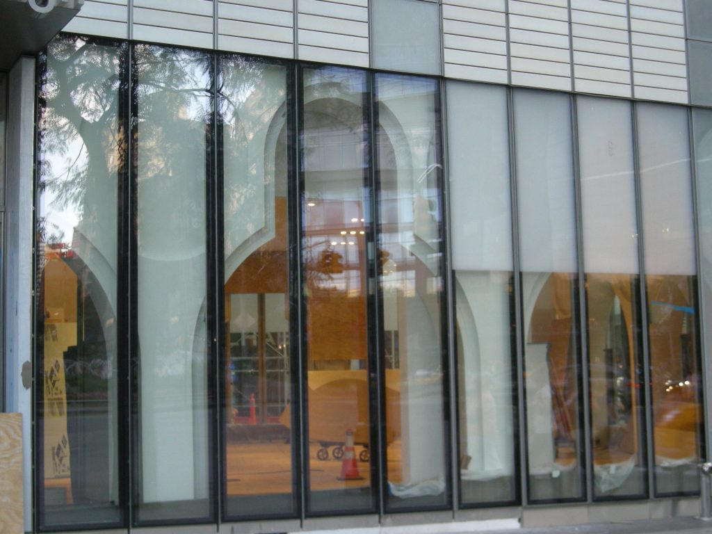
To achieve its purpose the architects chose to implement a series of cuts on the outer casing of concrete leading to a very unusual composition facade. The lollipop building practically devoid of any opening.
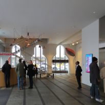
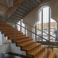
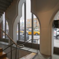
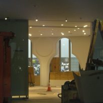
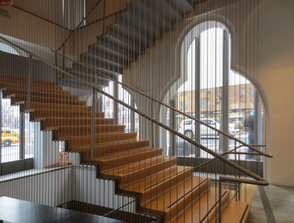
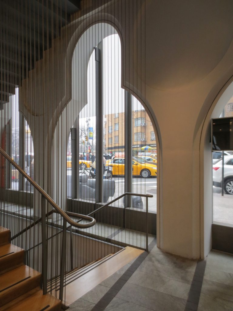
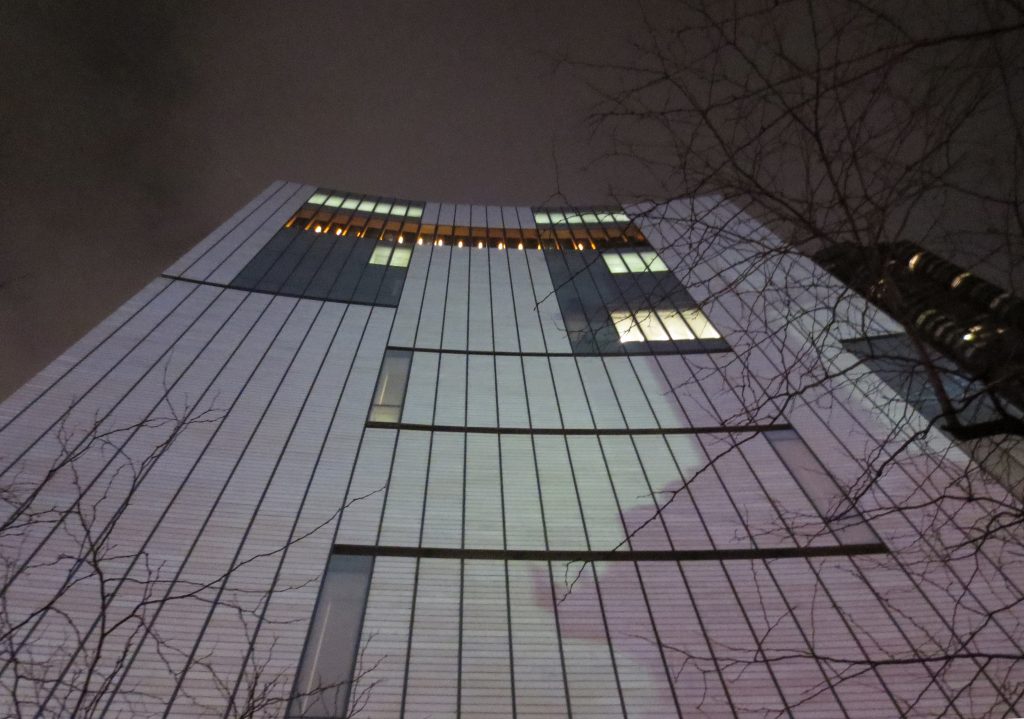
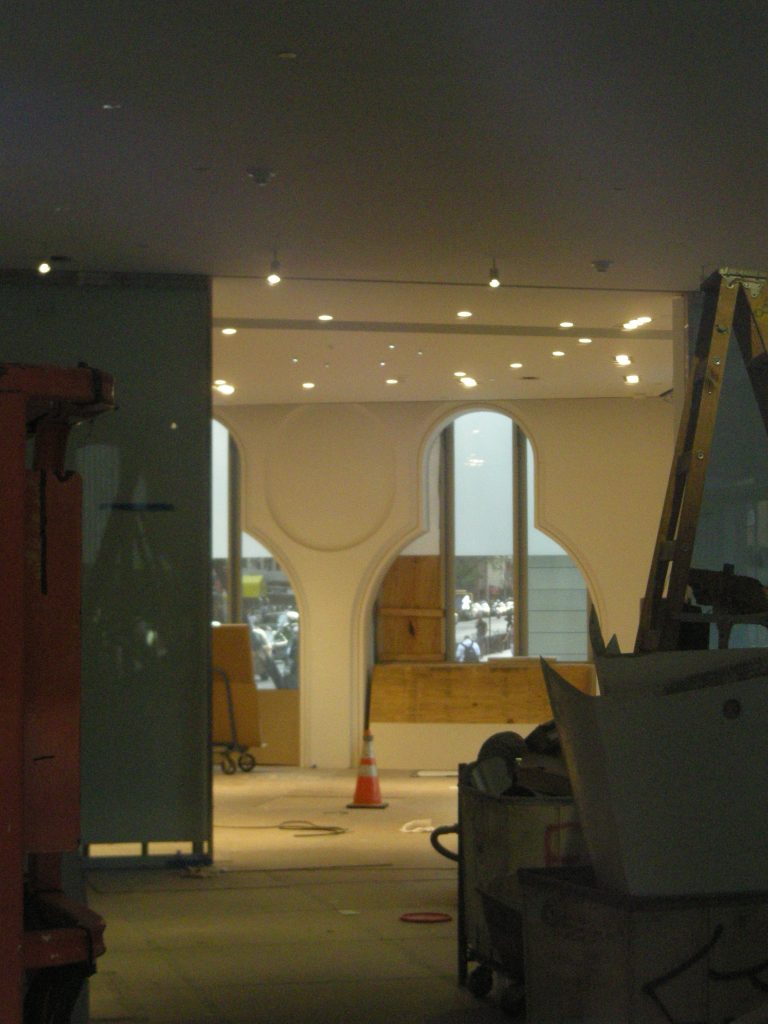
The cuts in the facade has also continued into the building through floors, ceilings and walls giving the space a unit not only internal but with the environment and a great view of Central Park.
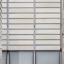
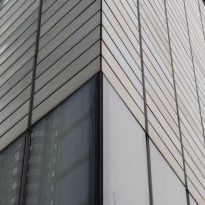
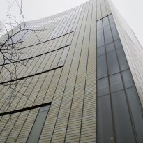
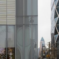
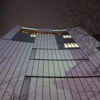
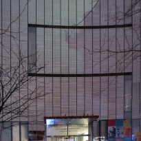
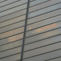
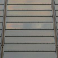
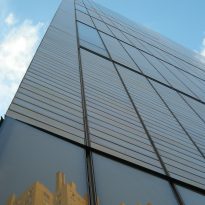
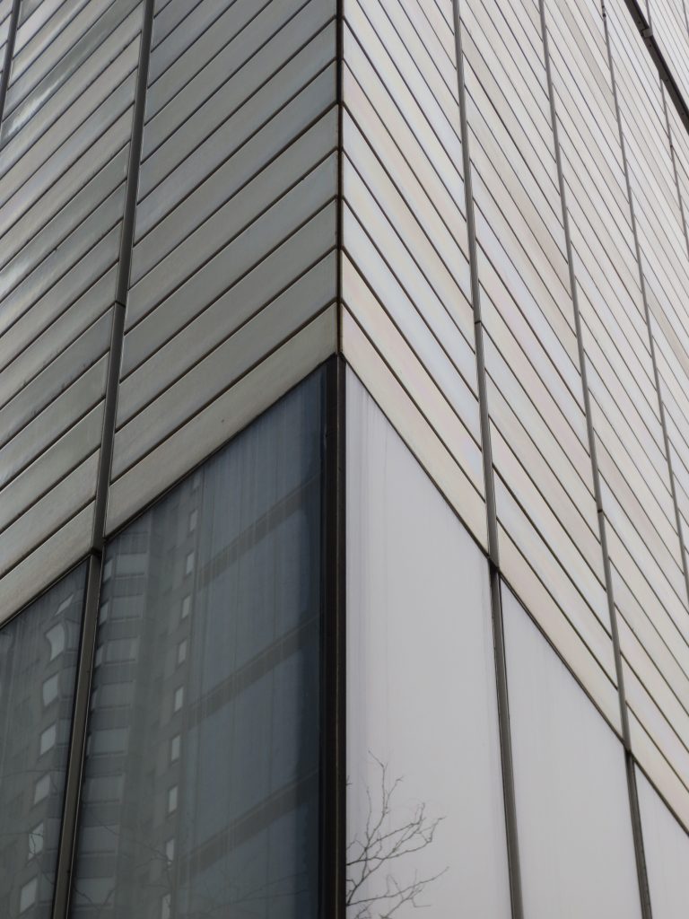
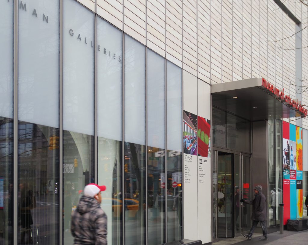
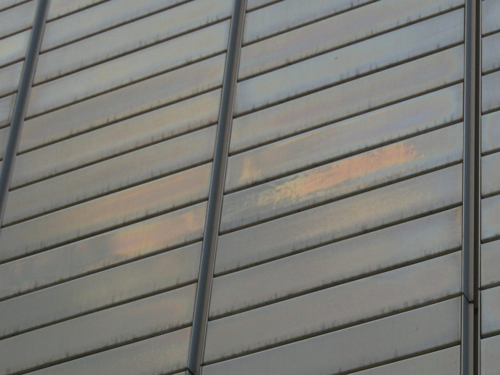
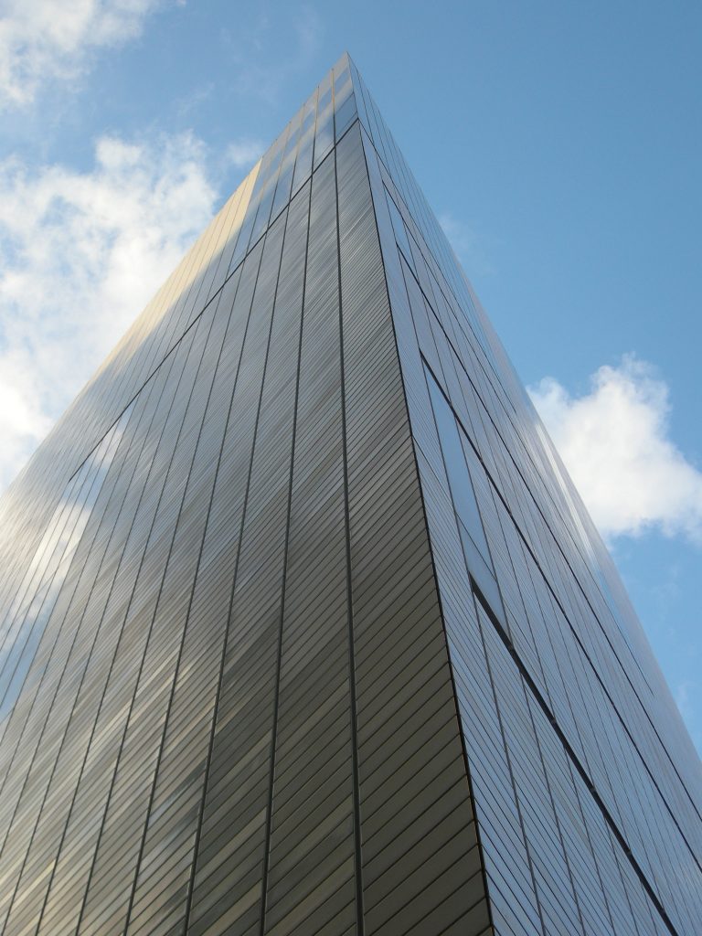
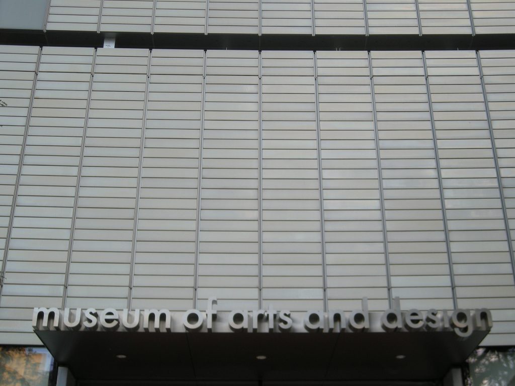
The surface of the slightly curved facade with little size ceramic ago that the building takes a different hue from every angle from which you look depending on the incidence of light and reflections.
Spaces
The new building will triple the area of the museum with a total of 5022 m2 of which 1302 will be devoted to galleries and exhibition spaces to 410 teachers.
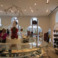
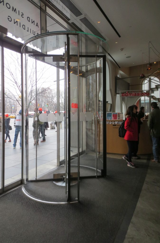
The remaining space will be occupied by 3 host open studios for artists in residence, an auditorium capable of accommodating 150 people seated, and the museum shop among others.
The museum will also feature a restaurant-lounge with spectacular views over Central Park.
Structure
For the project will be preserved the existing structure of the building built in 1964 with reinforced concrete insitu.
Materials
One of the main features of this remodeling are certainly materials, especially materials used in the facade:
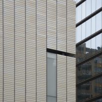
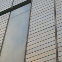
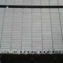
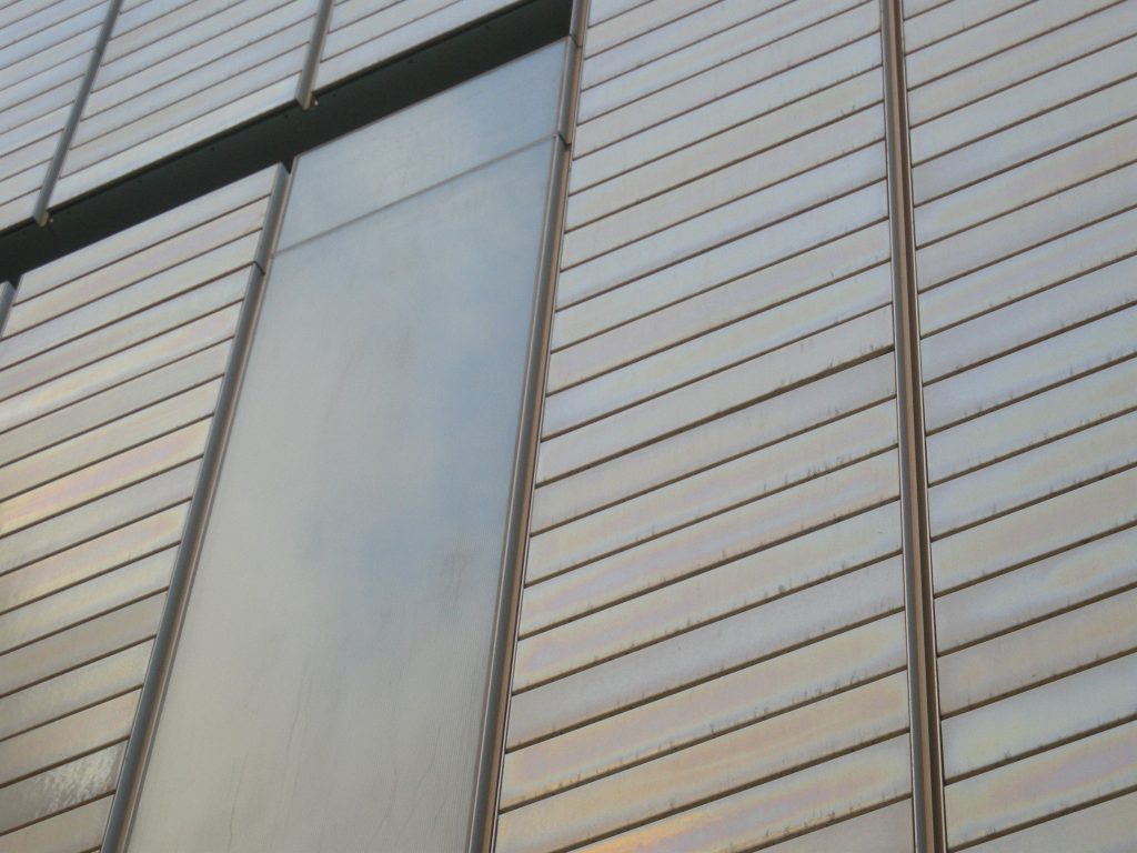
Most of the front surface is coated with white ceramic platelets 76 x 15 cm placed horizontally and manufactured specifically for the occasion. Finishing with platelets being placed on a slightly curved surface in the sense of place that makes its appearance is different when the observer changes the viewpoint or just throughout the day as the light that falls on them.
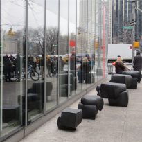
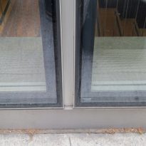
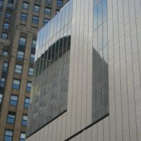
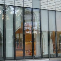
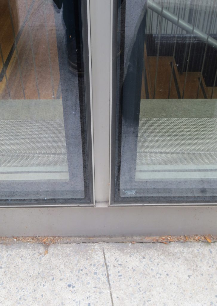
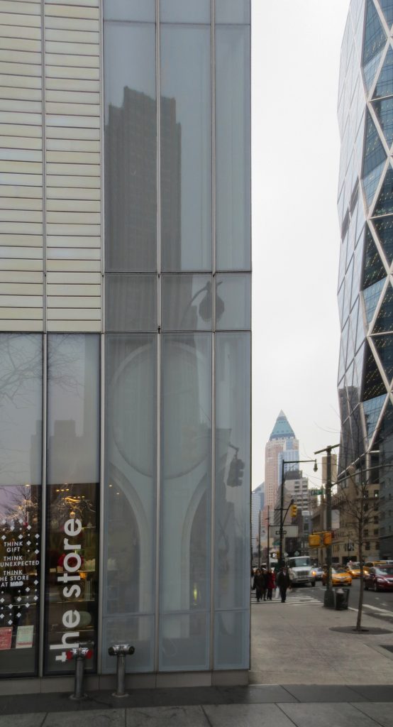
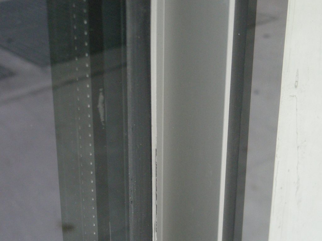
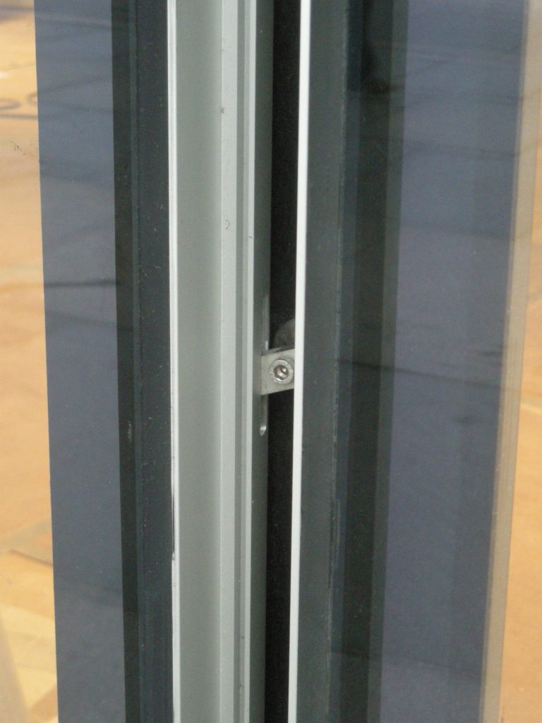
The other material used in the glass façade. The glass covers the cuts made on the concrete structure and allow the entry of light inside and the relationship between inside and outside.
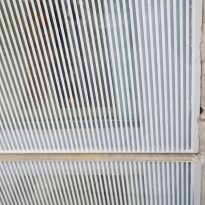
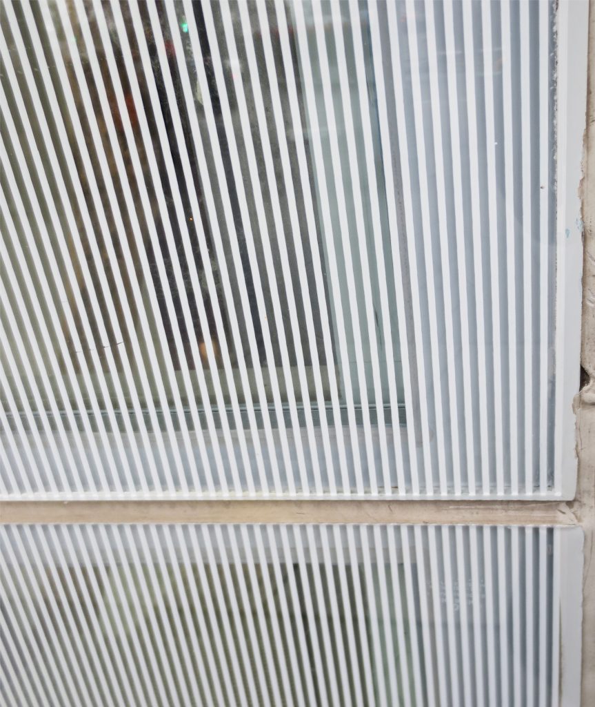
The glass is placed in strips of 76 cm in width in order not to break the module that makes the composition of the facade.
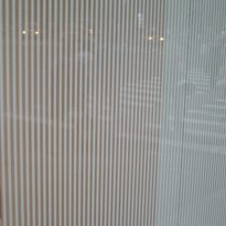
A white vinyl vertical 2 mm glass cover from a distance making cost distinguish whether it is a window and seeing what is inside the building with its lights and shadows or on the contrary it is just a curious light on the facade.
