Milam Residence
Introduction
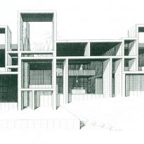
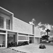
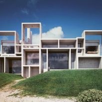
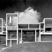
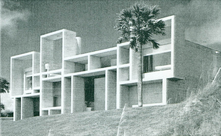
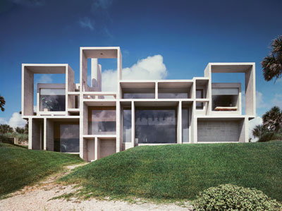
Paul Rudolph designed the Residence for young lawyer, Mr. Milam, following one of the basic rules of architecture: promote an initiative; develop an idea that has been thought out and executed in such a way that the rules of design and logic are plain for everyone to see, including those who know nothing about architecture. In the case of this house, the building can be read as how it was conceived, even at a distance, as with the example of its cement façade.
Designed after finishing his collaboration in Sarasota with Ralph Twitchell in 1957, it ended up being a fundamental/key work in the architect’s career.
Rudolph left behind the previous concepts of an organisation based on regular structures with freely placed subdivisions of space, and in this case the spacial layout, both vertical and horizontal, is clearly defined. The spatial organisation has replaced the merely structural.
Location
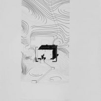
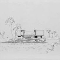
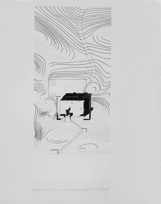
The Milam Residence, the last house built by Rudolph in Florida, is situated in Ponte Vedra Beach, Jacksonville, USA.
Concept
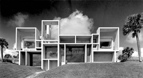
Although Rudolph rationalised the deep concrete frames which formed an unusual façade and constituted a control over the bright light and sun, as well as allowing him to eliminate the window frames and the mullions, the work presented an exercise in pure form: a virtual or symbolic composition of three-dimensional depth which followed the principals of proportion and general scale.
The Milam Residence sits halfway between the deep frames of Sarasota High School and the much more harmonious framework of the Orange County Court building.
Planning and Description
Planning
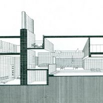
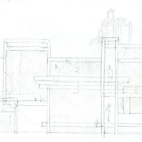
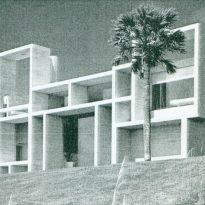
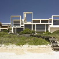
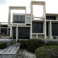
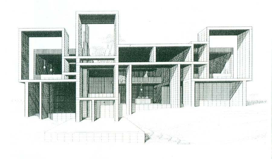
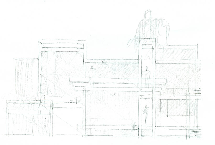
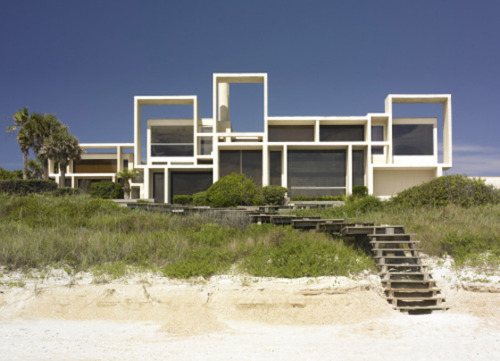
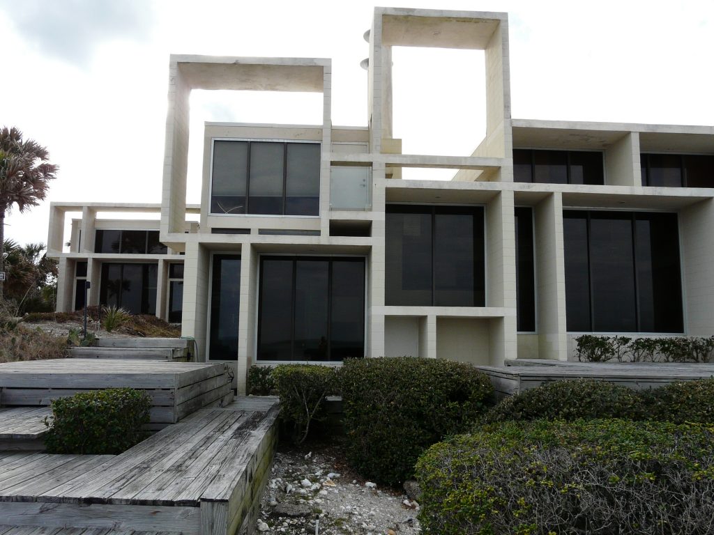
Rudolph explored the distance between interior and exterior spaces through an exposed frame, the façade, which is independent of the structure behind it. Although separated from the body of the house, the rectangles and squares of the orthogonal façade correspond with each of the interior rooms on different levels, forming sun screens and making the design visually stimulating and also functional. This distribution of the façade establishes one of the formal elements of Rudolph’s design: the rhythmic repetition of modular openings.
The architect is known for his intensity and for his use of complex floor plans, which is evident in this residence and in many other of his works. The planning of the Milam Residence heralded the arrival of a new design methodology for Rudolph; a planning based on a rigid system of a modular organisation system.
The spatial variety and the sensation of vertical and horizontal spaces are differentiated by structures which delineate them; walls and floors which extend to create volumes which vary according to the plan. The spatial organisation, in this case, has dominated the structural, and the design was carefully realised considering the use of each space.
Description
The walls and floors are elongated, to create elaborate forms which extend toward the South, and toward the views of the Atlantic Ocean.
One of the few practical uses of the structural patterns of the façade is to block the strong rays of the Florida sun. These brises-soleil also act as mullions for the glass of the windows, converting the exterior wall into a complex of deep openings which are filled only with glass.
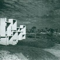
On the East and West façades, the sculptural extrusions were designed as a counterpart to reinforce the sectional design and strategy which define the characteristics of the Milam Residence. Despite the strong angles which jut out the grass slope and flat beaches surrounding the property, the juxtaposition of the surfaces does not appear as an unattractive or ill-considered mass.
Spaces
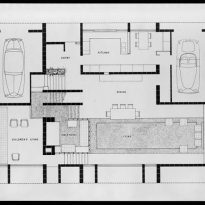
Ground floor
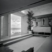
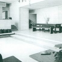
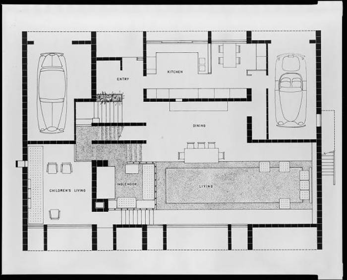
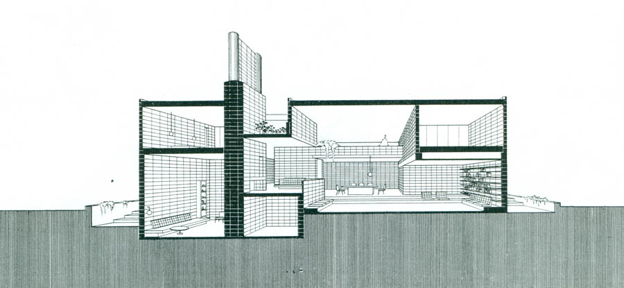
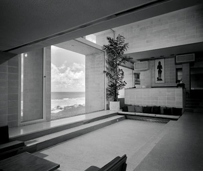
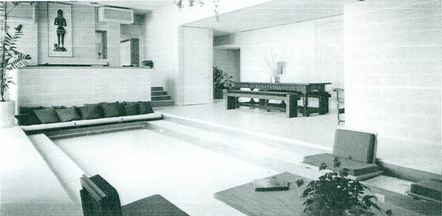
The floor is designed around a vast, double height living room, which is two steps below an open dining room on one side and a study on the other. These steps are translated into functional seating. The displacement of the level of the floor and the changes of floor height are adjusted to the specific characteristics of the space.
Rudolph’s objective was to create a variety of “states of mind” in the planning of the spaces, according to the needs of the occupants. These include a reading area with low ceilings and bookcases built into the walls; a high ceiling in the main room with its inbuilt seats; and the cosy “nest-like inglenook” located in a corner of the living room in front of the fireplace. The kitchen-diner has views of the beach and sea through a large, framed window.
On this floor, you also have the entrance hall, the kitchen, a breakfast area and a fireplace at one extreme of the living room which separates this environment into a play area for children.
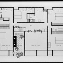
Upper floor
The floor-plan of the upper level is continuous but interrupted to allow that more than half of the living space below can see the roof.
On this floor are located the private rooms, four bedrooms with en-suite, a dressing room, a terrace, a gallery and a large empty space which overlooks the living room.
Extension
During the 1970’s, Rudolph extended the house, adding two auxiliary structures on either side of the main building: one for a garage with space for three cars and the other as a studio for guests. Rudolph used the same materials and design vocabulary for these new wings.
Structure and materials
As in the majority of Rudolph’s designs, the residence was built with slabs and blocks of reinforced concrete, finished with terrazzo and undulating, acoustic tiles. In this house, the architect adopted a more robust design focus, using fewer steel or wooden structures.
The deep cubicles which are formed by the structure on the main façade incorporate large, fixed glass panels, using air conditioning in place of operable windows. The inclusion of segments of sky in the rises and dips of the roof’s profile deny any rigid relationship between the internal divisions of space; rather they formalise an irregular structure of abutments and supporting walls.
In spite of the corrosion by the salty sea air which has made several restorations of the Residence a necessity, it’s clear it still has a “heap o’ livin’” ahead of it.
