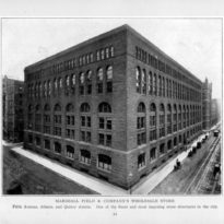
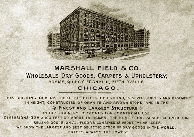
Marshall Field’s Wholesale Store
Introduction
In the summer of 1885, H.H. Richardson sat not only at the pinnacle of his career, but also at the top of the list of American architects. On May 2, 1885, Chicago’s Real Estate and Building Journal announced that John J. Glessner, a Chicago partner in a large farm equipment company that would eventually be merged to create International Harvester, had asked Richardson to design a house. Then on June 8, Richardson had been named the winner of the design competition for the Cincinnati Chamber of Commerce, beating out John Wellborn Root. Six days later, the June 14th issue of American Architect published a list of ten buildings considered by American architects in the A.I.A. to be the best-designed buildings in the United States. Not only did Richardson’s Trinity Church in Boston top the list, but four other buildings also designed by Richardson rounded out the list of ten.
Meanwhile, Marshall Field’s mood was just the opposite. His former business partner, Levi Leiter had just legally out-maneuvered his plan to build Chicago’s tallest skyscraper in 1885, for which he had hired S. S. Beman. With the skyscraper’s construction stopped by Leiter’s injunction, Field had a great sum of capital doing nothing and decided to move up the date for the construction of his new store for his wholesale division. If his former partner was going to succeed in stopping his plan to erect Chicago’s tallest building, Field would attempt to overcome this public relations nightmare by proceeding to build one of Chicago’s bigger buildings. There was no American architect more fashionable in June 1885 for Field to invite to Chicago than H. H. Richardson to generate some positive publicity.
Location
Chicago: the south side of the block along Adams Street between Wells and Franklin Streets.
Concept
Although Richardson had wanted to design a hollow doughnut-plan store with a central, seven-story atrium, Field’s wholesale division was based on keeping its prices as low as possible, and all Field wanted Richardson for, in addition to the publicity, was to design a stone facade for a no-thrills warehouse. And even then, given the meager resources Field was willing to furnish, Richardson would be forced, during the duration of the design of the project, to abandon all attempts to incorporate any carved ornament (except in the cornice) in favor of a very stark (less expensive), plain stone wall surface.
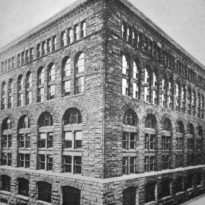
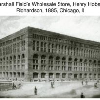
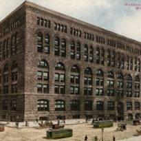
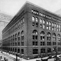
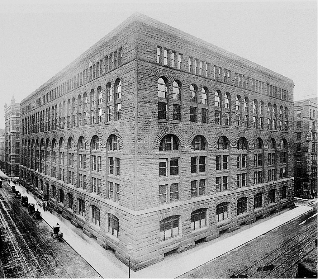
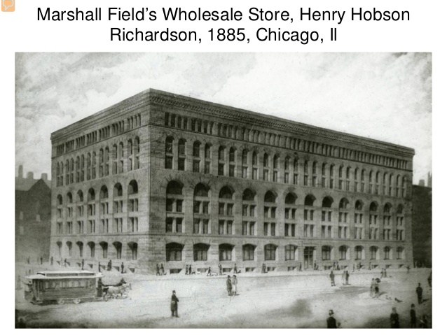
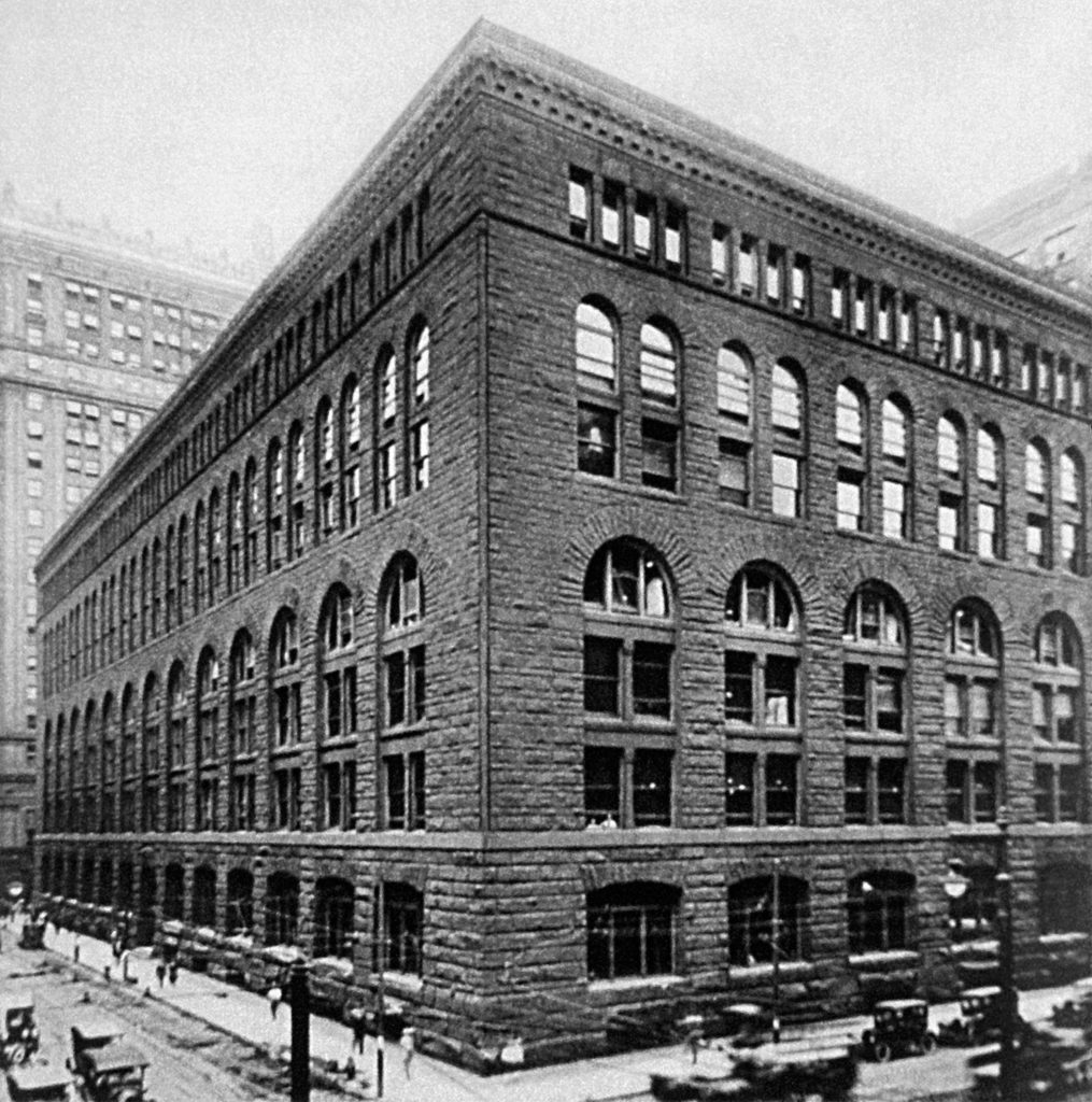
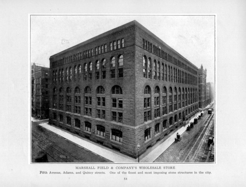
Historians have often cited the Field Store has having brought the commercial “box” to Chicago as well as the elevational motif of layered arcades in a mathematical progression. In reality, when one looks at Richardson’s designs that immediately preceded the Field Store, he always expressed the roof and typically accented this with projected dormers. Prior to the Field Store, Richardson had not designed a building with a “box” form. In reality, he chose to do a “box” because his site was across the street from one of John Wellborn Root’s better “box” designs, the Chicago, Burlington, and Quincy Railroad building (that also had a six-story interior atrium) designed in 1881. In addition, immediately to the east of his site sat two more of Root’s boxes, the Insurance Exchange (1884) and the Rookery, then under construction. The fact that Richardson’s original designs were for a brick, and not stone, box reveals that Richardson wanted to compete directly with Root’s adjacent buildings. However, Field wanted a stone elevation, for which he was willing to pay for, but because of this, the rest of the building had to be done “on the cheap.” There would be no spacious atrium in the interior. Without an atrium, Richardson was forced to configure the building into a shallow U-shaped plan where the exterior wall of the inset lightcourt consisted of stacked brick (cheaper) arcades that flooded the interior with daylight.
Materials
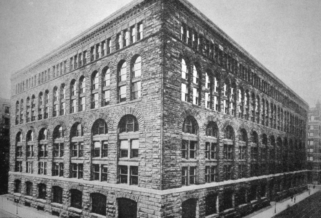
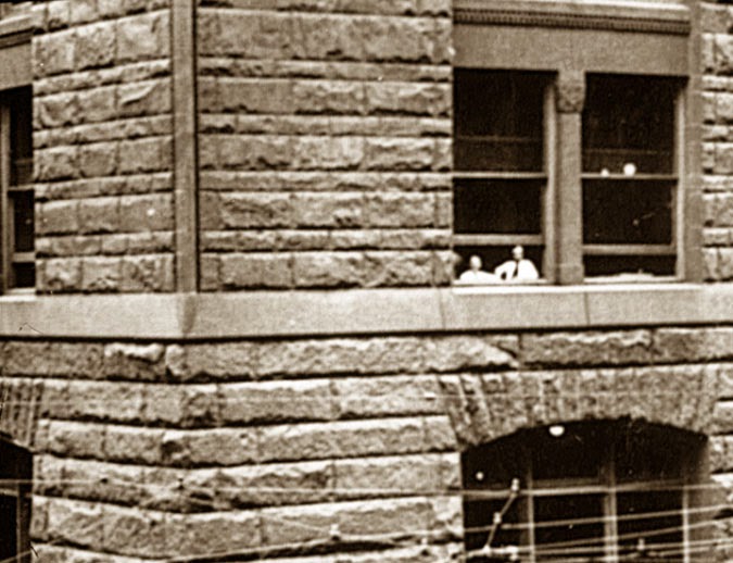
The building is duly famous for Richardson’s design of the exterior stone walls in which he articulated these into a tripartite elevational scheme of a granite base with the ground floor and basement, while East Longmeadow (Massachusetts) red sandstone was used in both the middle of five stories, and a one story top. He employed the by then conventional design of a progression of stacked arcades, in which the largest span at the bottom supported two arches above, that then supported four windows in the top floor, creating a 1:2:4 progression in the windows. He also used a progression in the number of floors in each range of arches: one in the top layer, two in the second, and three in the lowest, resulting in a 1:2:3 ratio. This motif can be traced back to Roman construction of aqueducts as well as the interior elevation of Gothic naves, and while artistic and somewhat (in reality, the loads are increasing in the lower floors) appropriate for bearing wall structures, which this building was, it was wholly inappropriate for the skyscraper that was about to become framed with an exterior skeleton of iron.
Spaces
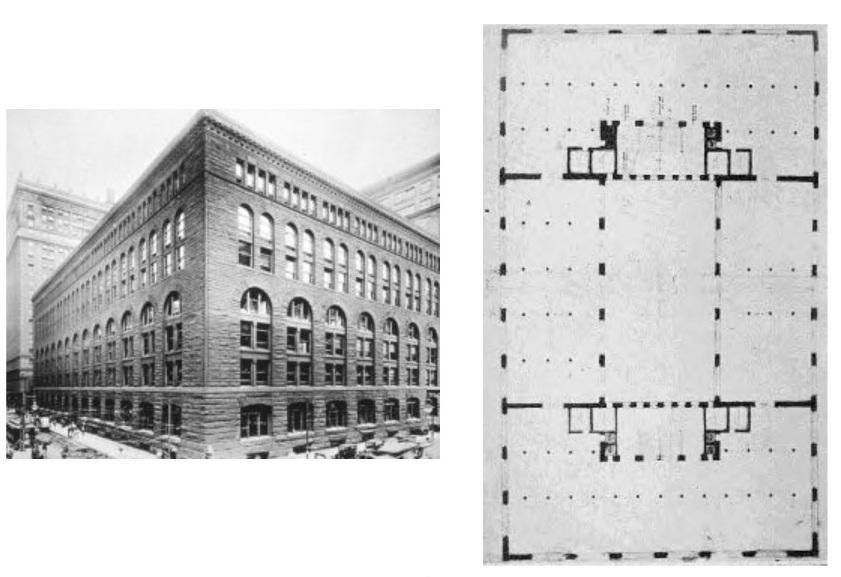
The spatial sequence of the store’s final plan was simply seven repetitive floors, stacked one on top of the next, linked by a central staircase located at the back of the store located in the building’s center. Its spaces were further simplified by two continuous, full-height walls that extended from the indentation of the loading dock, breaking the building into three vertical zones. Within the huge floor area, the walls provided firebreaks that would compartmentalize the building to help to contain the spread of fire. In addition, every window was provided with an iron fire shutter, which was located on the interior side of each window.
Structure
Exterior brick bearing walls with stone veneer. The interior structure consisted of terra cotta fireproofed cast iron columns and beams. Even though there is evidence that Richardson had consulted Root over the design of foundations for Chicago’s weak soil, he chose not use Frederick Baumann’s recent developed theory of uniformly-stressed foundations, but designed the footings in the traditional Eastern practice. His apparent error was the common Eastern practice of proportioning the size of each footing using the combined dead and live loads on each pier or column. Chicago’s experience had shown that only the dead load should be used, for when both were used, the exterior footings inevitably settled more than the interior footings in Chicago’s weak soil. This occurred because the interior footings’ loads contained a greater proportion of the temporary live loads than did the exterior footings. The differential settlement between the heavy stone exterior and the lighter-loaded interior frame, didn’t manifest itself until the building was completed.
Eventually the heavier masonry exterior settled at a much greater rate than the lightweight framed interior, forcing the interior to rise relative to the exterior, resulting in sloping floors. The Field Store was demolished after only 43 years of service in May and June 1930.

