Manufacturers Trust Company Building
Introduction
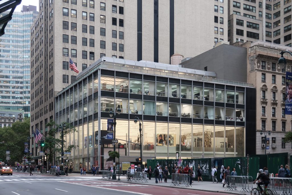
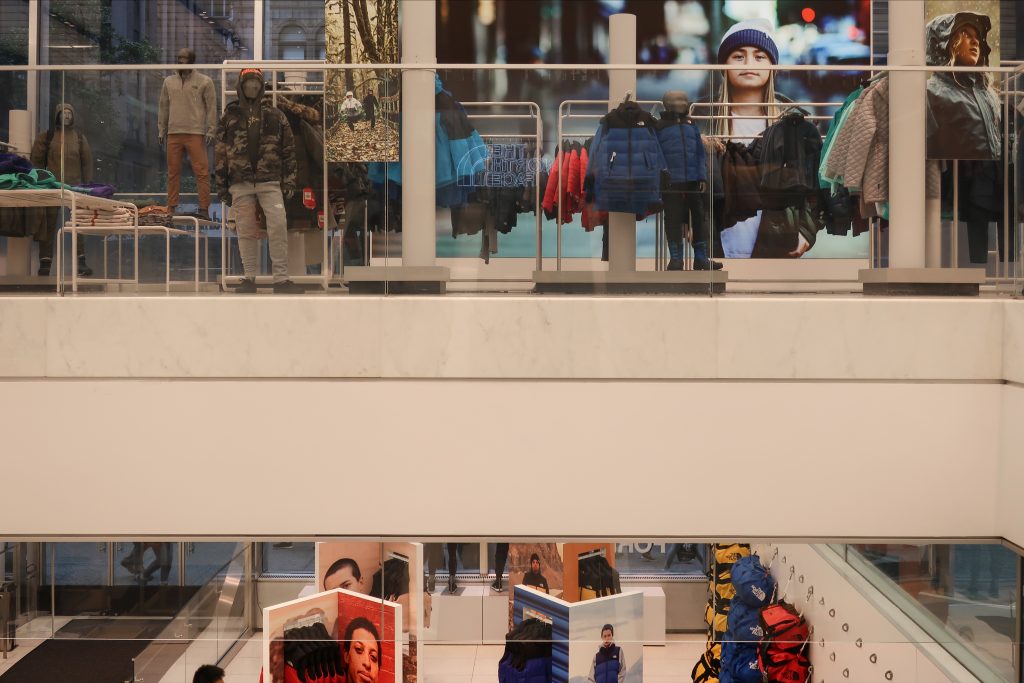
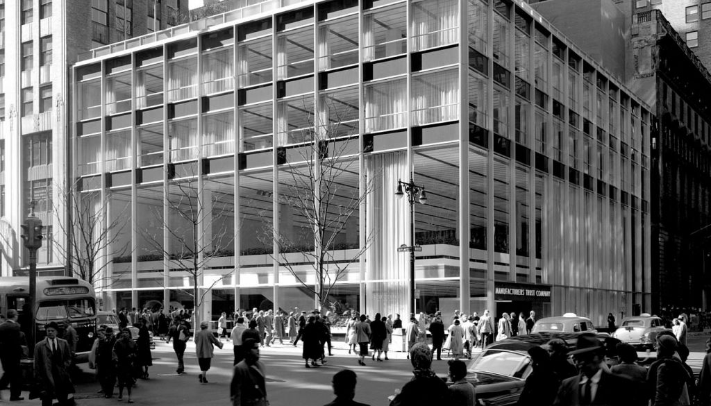
The former Manufacturers Trust Company Building, erected in 1953-54 on the southwest corner of Fifth Avenue and West 43rd Street, was one of the first buildings in the United States to introduce International Style modernism to bank design. Planned by Skidmore, Owings & Merrill, with Gordon Bunshaft serving as chief designer, the building is an important early work by one of the country’s leading architectural firms, best known for its pioneering International Style business buildings that provided a potent symbol of corporate America in the post-World War II period.
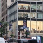
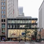
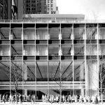
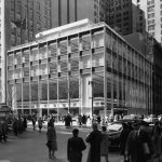
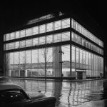
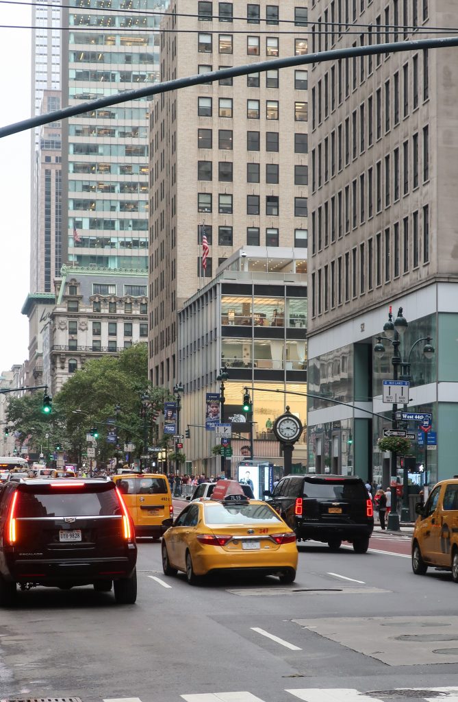
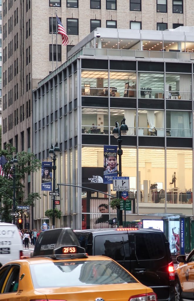
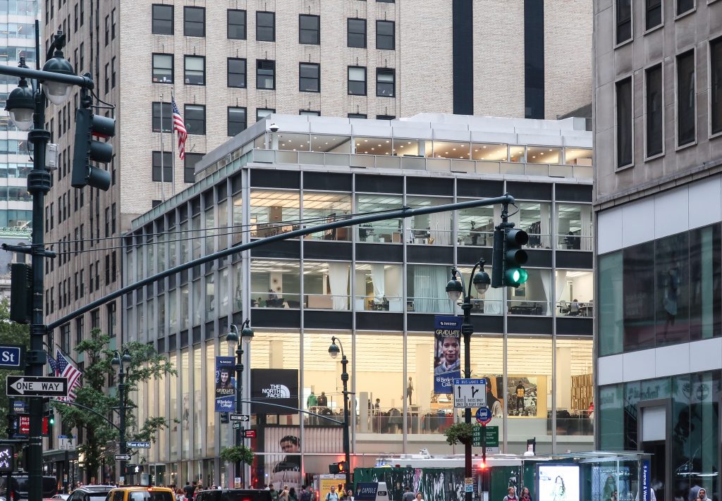
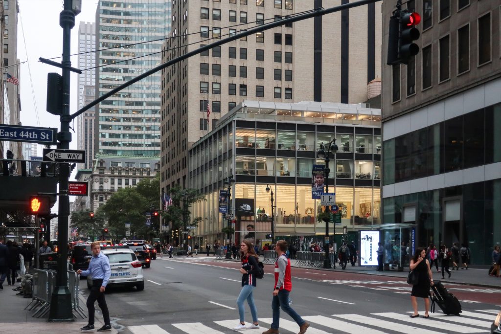
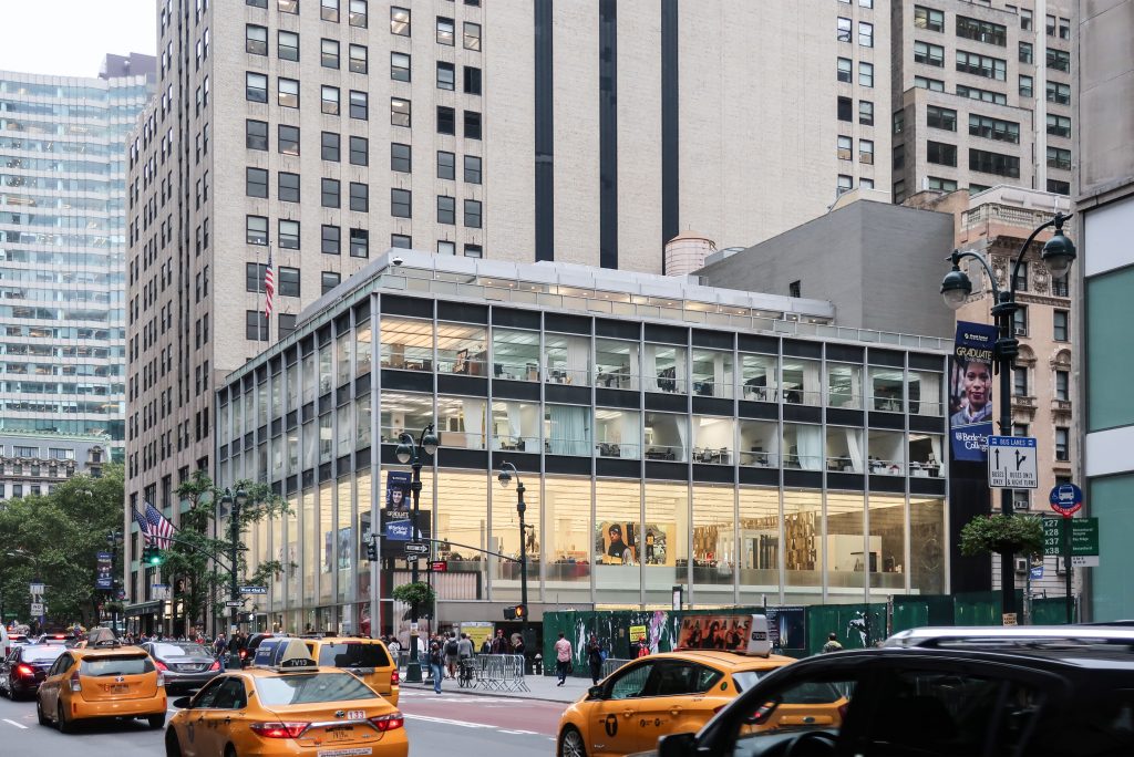
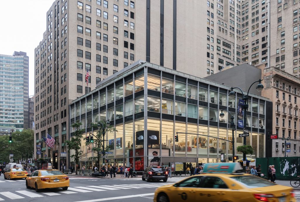
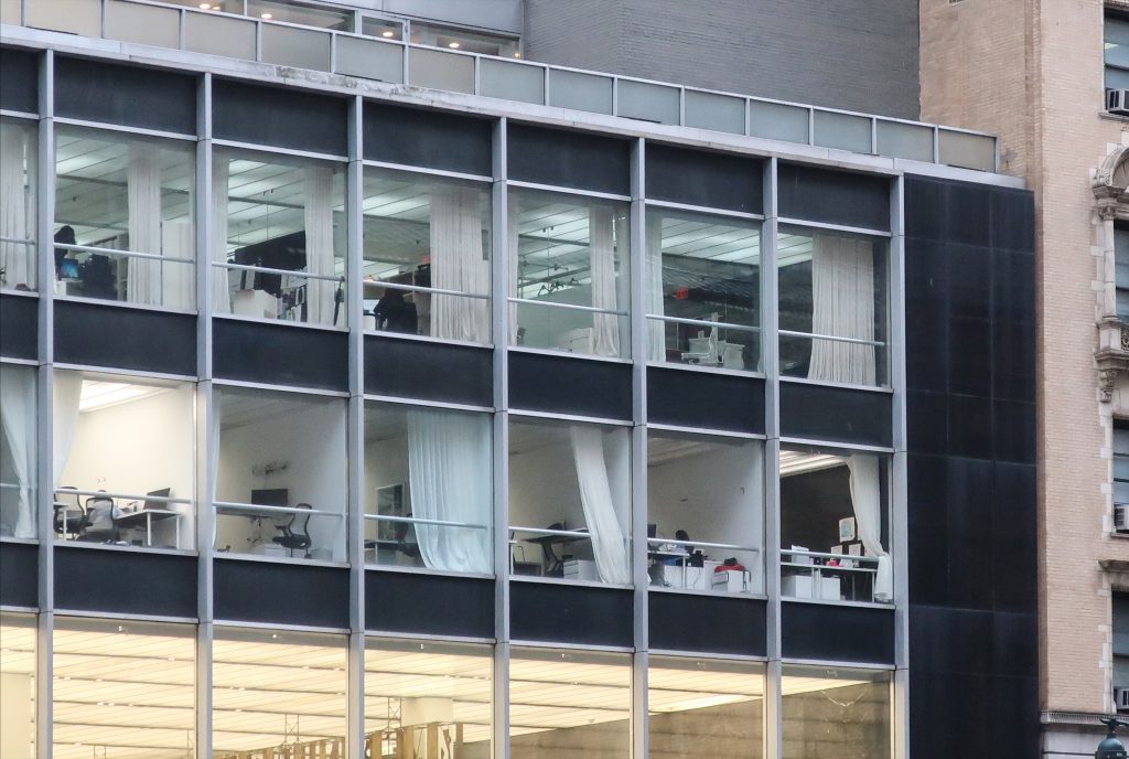
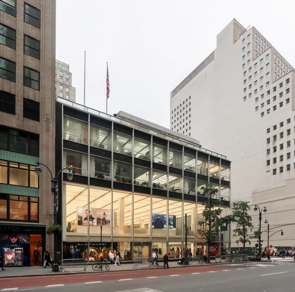
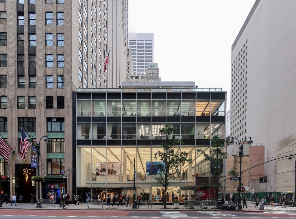
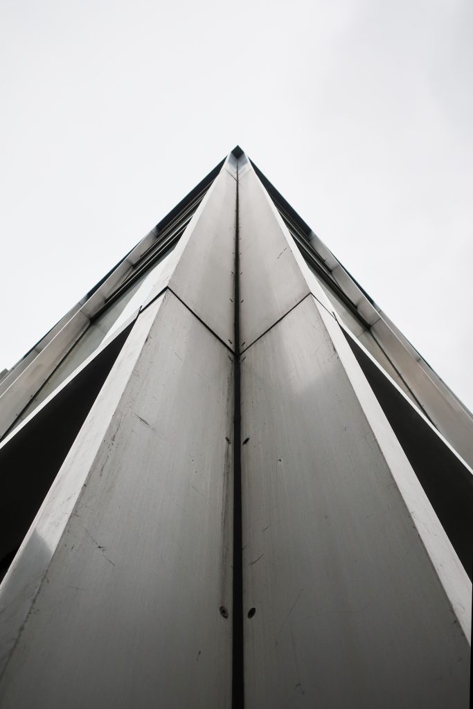
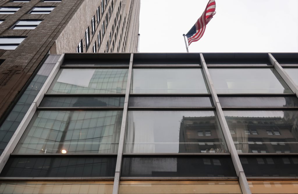
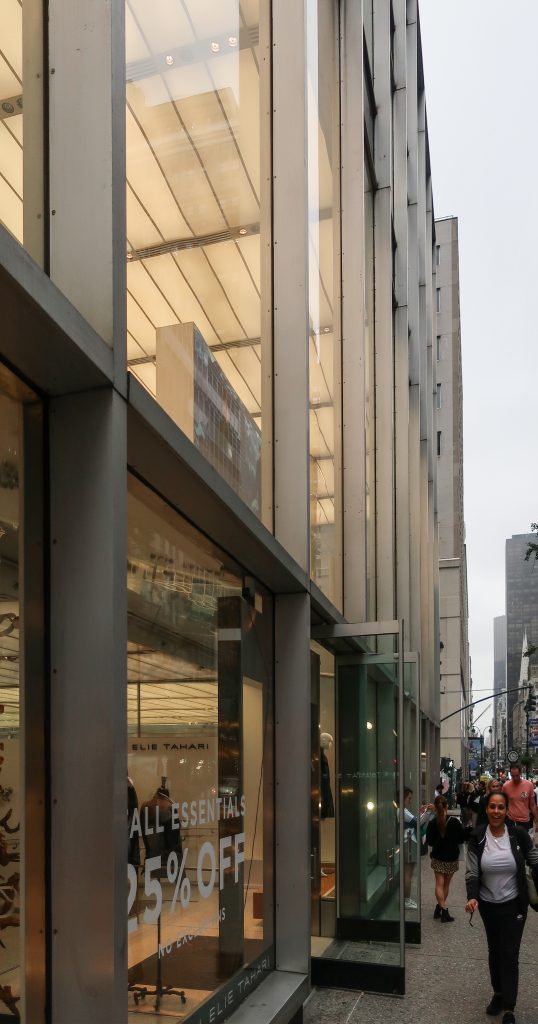
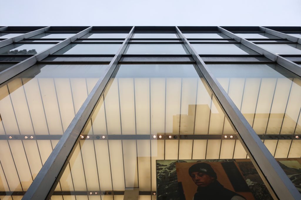
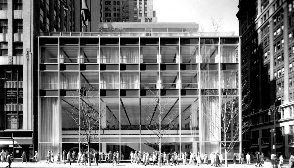
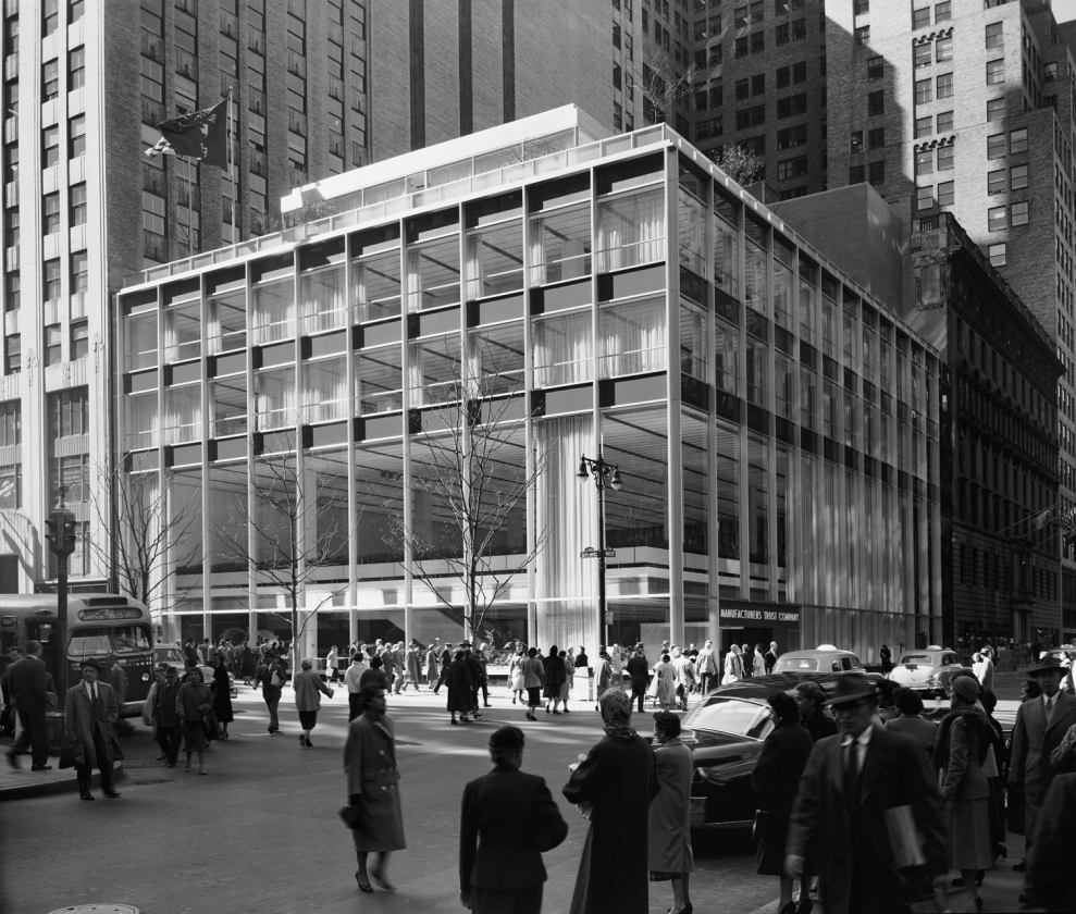
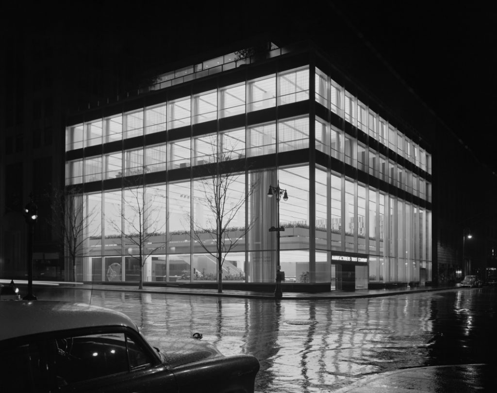
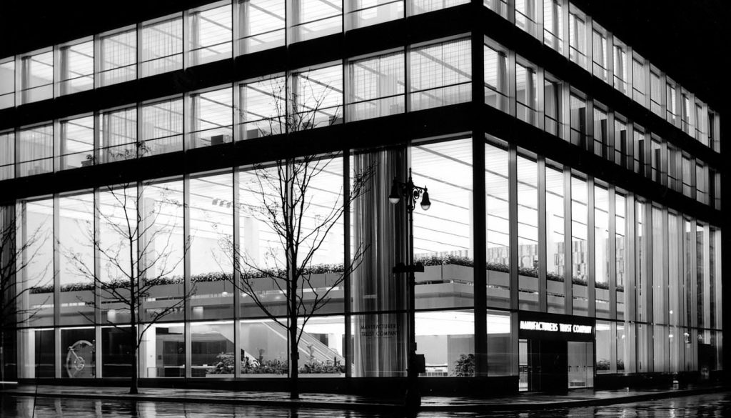
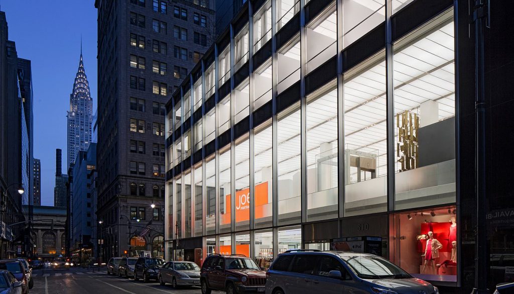
A five-story glass box, featuring clear glass window-walls, thin polished aluminum mullions, and dark gray facings, the monochromatic building is notable for the spare elegance and refinement of its design. The design’s transparency and the articulation of the underlying skeletal structure of the building led the Architectural Forum to praise it as “the first big building truly to fulfill architects’ immaculate drafting board idea of glass as an invisible material.” The modernity and openness of the design reflect the concerns of Manufacturers Trust president Horace C. Flanigan who had wanted this prominently sited branch building to present a modern image and an “inviting look” in keeping with contemporary trends in the banking industry that emphasized customer service. The novel aspects of the design elicited extensive press coverage and attracted 15,000 visitors to the bank in its first week of operation. By proving that good modern design was a lure to customers, the Manufacturers Trust Company Building led many other New York City banks to create similar glass-walled banks in the 1950s, and by the 1960s such banks were found throughout the country.
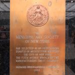
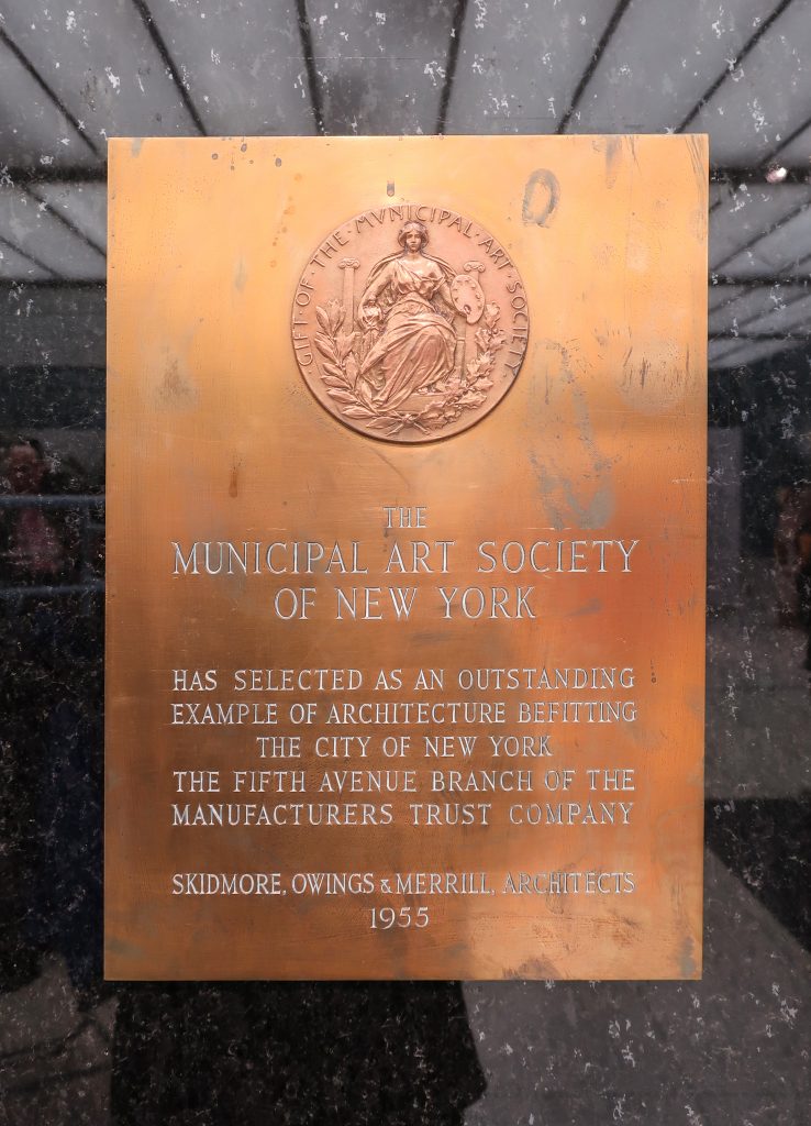
The Manufacturers Trust Company Building was awarded the Architectural League’s Gold Medal for Architecture and the Municipal Art Society’s Plaque of Commendation in 1955, and the Fifth Avenue Association’s Award for Excellence in 1956.
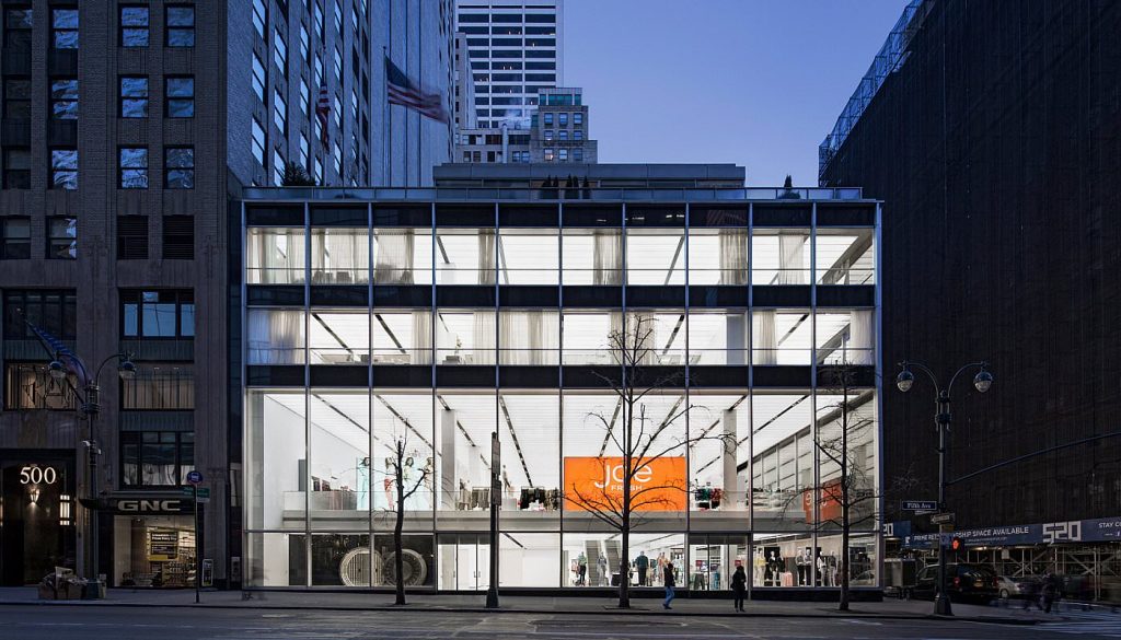
Today, the building’s exterior remains intact except for the changes in signage, alterations to the West 43rd Street entrances, the replacement in kind of several clear glass panels, and the replacement of many of the dark gray glass spandrel panels on the Fifth Avenue facade with dark, non-reflective panels.
In February 1992, Manufacturers Hanover acquired full ownership of the land beneath the building from Mutual Life Insurance Company of New York. Manufacturers Hanover Trust later merged with Chemical Bank, which subsequently merged with Chase Manhattan Bank, which was renamed Chase Bank in 1996. The building remains in banking use, with the addition of retail use on West 43rd Street.
Delays and change of architect
In December 1944, the architectural firm of Walker & Gillette filed plans with the Department of Buildings for a four-story building “in what has been called the Federal Classic style of architecture.” Construction was delayed due to government restrictions on building materials and rent control provisions which prevented Mutual Life from dispossessing the commercial tenants from the existing buildings on the site.
In 1948, the bank announced it had cancelled its plans for the new Fifth Avenue branch, but after considerable negotiation the project was revived in July 1950. Walker & Poor, the successor firm to Walker & Gillette, was retained to revise the plans and in January 1951 the insurance company delivered the Ziegler Building free of tenants to Manufacturers Trust. The day after the last of the office tenants vacated the building, new federal restrictions were imposed on the use of steel and other critical materials in response to the Korean War effort. Faced with the prospect of paying rent on an empty eight-story building, Manufacturers Trust leased the Ziegler Building to several government agencies.
Finally, in July 1952, after eight years of delay, the government released the steel needed for the new building. New plans were filed with the Department of Buildings in April 1953. However, the new designs were not by Walker & Poor, which had been dismissed by the bank in 1951 after a dispute over an unusually high bill for professional services, but by Skidmore, Owings & Merrill, a firm that had just established a place for itself at the forefront of modernist design with its revolutionary Lever House building.
In an interview with architectural historian Carol Krinsky, Gordon Bunshaft indicated that Manufacturers Trust Company first consulted SOM about plans for a new Fifth Avenue branch in 1953 on the recommendation of Lou Crandall, a member of the Board of Directors at Manufacturers Trust, who headed the Fuller Construction Company which had built Lever House. It should be noted, however, that Manufacturers Trust had already established a relationship with Louis Skidmore (head of the New York branch of SOM) who had been serving on the advisory board of the bank’s 57th Street branch since 1950.
Skidmore’s longstanding friendship with Horace C. (“Hap”) Flanigan, who had been elected president and chief executive officer of Manufacturers Trust Company in September 1951, may well have been a factor in securing the commission for SOM. Initially, the bank requested that SOM review Walker & Poor’s plans to see if the design could be improved while retaining the structural drawings. According to Krinsky, only an hour after their initial meeting, “Bunshaft called to convince Crandall that it would be unwise to try to save a small amount of money on engineering fees when a better building might result from a fresh start.”
New York Landmark
On September 16, 1997, the Landmarks Preservation Commission held a public hearing on the proposed designation as a Landmark of the Manufacturers Trust Company Building and the proposed designation of the related Landmark Site. The hearing had been duly advertised in accordance with the provisions of law. Five witnesses spoke in favor of designation. A representative of Chase Bank also spoke. There were no speakers in opposition to designation. The Commission has received a number of letters and other expressions of support in favor of this designation, including a resolution from Manhattan Community Board No. 5.
Location
History of the site
In the late nineteenth century, Fifth Avenue between 34th Street and 59th Street was the most fashionable residential street in New York. The blockfront on the west side of the avenue between West 42nd and West 43rd Streets was occupied by the Hotel Bristol and the homes of several wealthy businessmen, among them financier Russell Sage who lived at No. 506 in the 1880s and 1890s. West 43rd Street and vicinity contained a number of private clubs and associations: the Columbia Club at No. 4 (Clarence S. Luce, 1890-91); the Century Association3 at No. 7 (McKim, Mead & White, 1889-90); the Racquet & Tennis Club at No. 27 (Cyrus L.W. Eidlitz, 1891); and the Academy of Medicine at No. 17 (R.H. Robertson, 1889).
By 1900, the character of the neighborhood on the blocks north of 42nd Street began to change with the construction of, or the conversion of private residences to, exclusive retail shops, restaurants, and office buildings. The eight-story Hotel Bristol at 500 Fifth Avenue became the Bristol Building in 1902 with offices in its upper stories and stores at street level. A few blocks to the east, the construction of the present Grand Central Terminal and the electrification and submergence of the railroad tracks along Park Avenue in 1903-13 spurred the development of an important hotel and business district. By 1923, so many banks and trust companies had established uptown branches in the Grand Central vicinity and on the blocks of Fifth Avenue north of 42nd Street, that Rider’s New York City guide reported the area was popularly known as “Little Wall Street. Forty-second Street, which linked this business district to Times Square, became one of the busiest thoroughfares in New York while Fifth Avenue remained the most fashionable shopping street in the city, leading the Real Estate Record & Guide to declare the Bristol Building parcel at 500 Fifth Avenue, at the northwest corner of 42nd Street, as “the most valuable building site on Manhattan Island north of Wall Street.”
The demolition of the Bristol Building and subsequent construction of the office building at 500 Fifth Avenue had a significant impact on the eventual development of the adjacent Manufacturers Trust Company, because its planning affected the zoning of the entire Fifth Avenue blockfront.
In 1922, Gerry Estates, Inc. entered into an agreement with Walter J. Salmon, one of the most successful real estate developers in the midtown business district, to redevelop the site at 500 Fifth Avenue. With other projects in the works, including the adjacent Salmon Tower at 11-27 West 42nd Street, Salmon delayed beginning work on the corner site until the summer of 1929. At that time he announced plans for a fifty-eight-story building with frontages of 100 feet on Fifth Avenue and 208 feet on 42nd Street to be built to the design of Shreve, Lamb & Harmon. The zoning code permitted a taller building on 42nd Street than on Fifth Avenue, so Salmon acquired a long-term lease on the adjacent four-story converted dwelling at 508 Fifth Avenue in 1927; by merging the zoning lots of this twenty-five by 102-foot building and that of 500 Fifth Avenue he was able to build a higher tower than would have otherwise been possible.
No. 508 Fifth continued to be subleased to various concerns, including the Gotham Silk Hosiery Company and Huyler’s confectionery store. The adjacent eight-story Ziegler Building, at 510-514 Fifth Avenue, constructed c. 1900, housed the tobacconist Alfred Dunhill of London, as well as numerous lawyers, accountants, and insurance brokers in the 1920s and 1930s. Both properties were owned by the Mutual Insurance Company in 1941 when Manufacturers Trust Company — then occupying a branch at 513 Fifth Avenue — began negotiations to lease them as a site for a new bank building. Wartime restrictions on building supplies kept the project from going forward immediately, but in October 1944 the two institutions entered into a lease in which Mutual Life agreed to construct a new bank building to the specifications of Manufacturers Trust. A corollary agreement with Walter Salmon permitted Manufacturers Trust Company to sublease (and ultimately redevelop) 508 Fifth Avenue, provided that during the time Salmon’s lease remained in effect (1944-65) any building erected on the portion of the lot at No. 508 would not exceed the height of the then-existing building (sixty-three feet) or otherwise interfere with 500 Fifth Avenue. Thus, the height of the new bank building was effectively limited to four or five stories.
Concept
In creating a new design for the bank, SOM had to take into account certain programmatic restrictions that were written into the 1953 agreement between the Mutual Life Insurance Company and Manufacturers Trust, amending the lease of 1944. This agreement required Manufacturers to erect a new building that would have “no less than 25,000 and no more than 70,000 square feet of floor space at or above street level,” would “occupy the entire legally permissible street frontage on Fifth Avenue and 43rd Street” at street level, and would “be planned as to make available for banking purposes the major portion of the street floor.” In contrast to the original agreement of 1944, the entire cost of the building was to be borne by Manufacturers Trust, though Mutual Life agreed to loan the bank $1,000,000 toward demolition and construction. The covenants regarding 508 Fifth Avenue remained in effect, limiting the height of the building on at least one quarter of the site. In addition, Horace Flanigan expressed several major requirements for the design.
- First, the design had to be adaptable for some other type of business, since as a banker during the Depression he had come to realize how difficult it was to sell or lease a traditional bank building when a branch closed.
- Second, the building had to be capable of serving a high volume of retail and commercial customers, and have offices and a conference room where the bank president and officers could meet with clients who found it inconvenient to travel downtown.
- Most of all, the building had to present a modern image and “an inviting look” in keeping with the bank’s emphasis on customer service, as epitomized in its advertising slogans “Everybody’s Bank Just Around the Corner” and “Come and See Us, You’ll Be Very Welcome.”‘
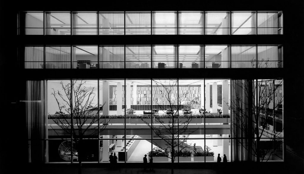
“Sensing the opportunity for a masterpiece” Louis Skidmore followed a procedure he had initiated for the firm’s World’s Fair projects, sponsoring an informal, weekend competition among the young designers in the firm to produce conceptual sketches. According to Nathaniel Owings, “they were encouraged to come up with whatever popped into their heads, and the history and tradition of banking be damned.” Designer Charles Evans Hughes III placed first with a sketch that contained several elements which were eventually incorporated into the executed bank building. Hughes envisioned a glass-walled building of four stories, with two principal floors given over to customer services and a penthouse story surrounded by a roof garden for the executive offices. A principal feature of the design was a massive bank vault that could be viewed easily from the street through the bank’s clear glass walls. Hughes’s design underwent many modifications as the firm’s experts in design, materials, and construction developed the project, but his basic concept remained. Responsibility for this prestigious project was given to the firm’s senior designer Gordon Bunshaft and to William S. Brown, an expert on modern pre-fabricated materials, who served as project coordinator.
The resulting building is a transparent, luminous clear glass box which architectural critic Louis Mumford likened to a lantern.
The modernism exemplified by the Manufacturers Trust Building is that of the second wave of the International Style which flourished in this country in the post-World War II period. This style was given its name in 1932 when architect Philip Johnson and historian Henry-Russell Hitchcock organized a momentous exhibition at the Museum of Modern Art in New York in which they presented a body of avant-garde modernist architecture that they argued represented a new “International Style” within the modernist movement.
In addition to its aesthetic appeal, the design of the Manufacturers Trust Company Building also created just the “inviting” impression Horace Flanigan had requested from the architects. The striking difference between this modern clear glass-walled bank and “the ponderous stone piles which banks have traditionally inhabited” was viewed by Manufacturers Trust as being symbolic of the institution’s commitment to modern banking service. This was acknowledged by Flanigan in a news release published by Manufacturers in conjunction with the bank’s opening in September 1954:
These walls give the bank a wide-open, inviting look and turn it, day and night, into a giant showcase… The building will be its own best salesman, a merchandising concept new in banking and one that we believe pioneers the way to better customer service.”
Gordon Bunshaft conceived of his building in terms of a department store:
This is a store type of operation, open, departmentalized, efficient. Downstairs on street level we put the special checking division where the main volume of business is handled – the 10 cents-a-check department where you go in, cash a check, and get out fast. On paydays the traffic is terrific.
Manufacturers Trust’s new Fifth Avenue branch building was an immediate success. The modern style, then so novel for banks, the transparent walls so at odds with traditional bank imagery, and such remarkable features as the 1,000 ton Mosler safe “ten feet from the sidewalk” and “the largest plates of glass ever made in this country” evoked vast press coverage and public response. The New York Times, New Yorker, Life, Saturday Evening Post, and Fortune were among the publications that covered the opening of the building, which attracted 15,000 visitors. Buildings, Lighting, Office Management, and Management Methods also covered novel aspects of the building design for their specialized audiences and the Architectural Forum, Architectural Record, and Progressive Architecture were united in their praise for the design.
For the bank, the greatest praise came from the depositors – nine months after the new branch opened the Times reported that the branch’s savings accounts had tripled and special checking accounts and commercial accounts had doubled since moving across the street from its old location. Harold Miner, the vice-president in charge of the branch, credited “it all to the sparkling, nearly all-glass building that has caught the eyes of bankers, business men, and architects the world over.”
With such strong evidence “that modern banking premises are a strong attraction for new accounts,” Manufacturers Trust stepped up its program of modernizing and redecorating its branch offices in the modern style. Within a few years, many New York City banks opened similar glass-walled banks employing International Style design. By the 1960s such banks were found throughout the country.
Spaces
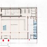
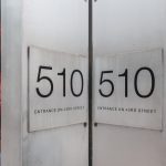
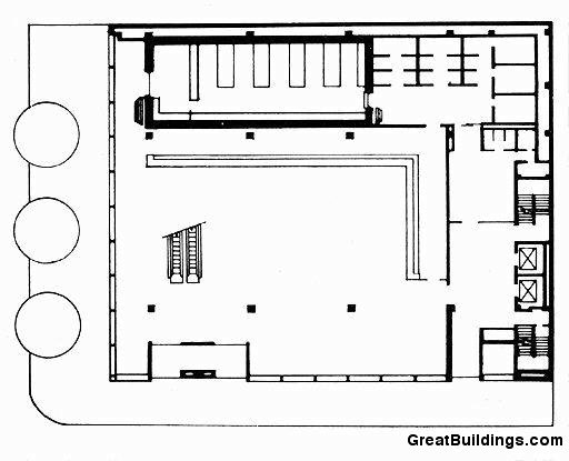
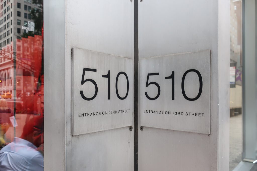
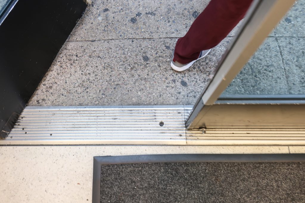
The entrance to the banking space is on West 43rd Street; it originally was marked only by a discrete aluminum sign with white lettering. A second entrance at the west end of the 43rd Street facade provides access to the elevator corridor at the rear of the building.
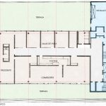
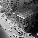
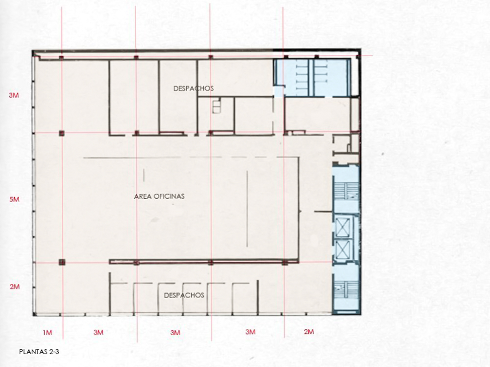
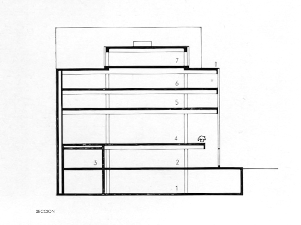
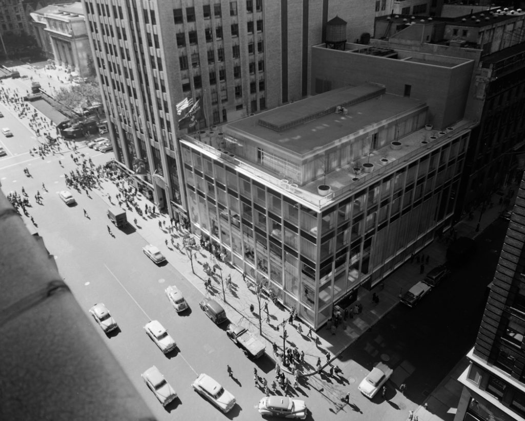
Five stories high, including a setback penthouse for executive offices and mechanical equipment, the Manufacturers Trust Company Building has frontages of 100 feet on Fifth Avenue and 125 feet on West 43rd Street.
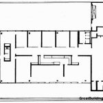
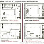
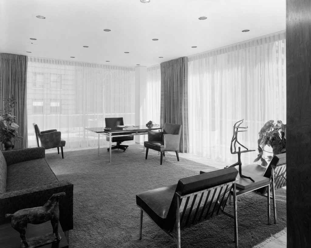
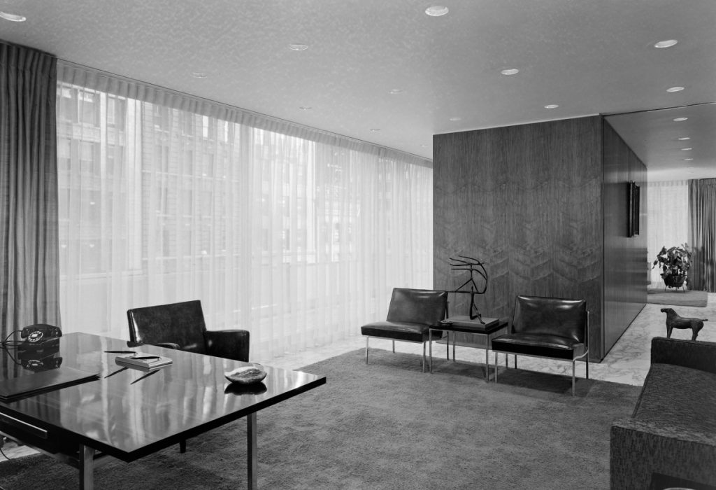
First and second floor were open to the public as was were most of the client business took place, while the third and fifth floors were reserved to more private office and were usually only accessed by bank personal.
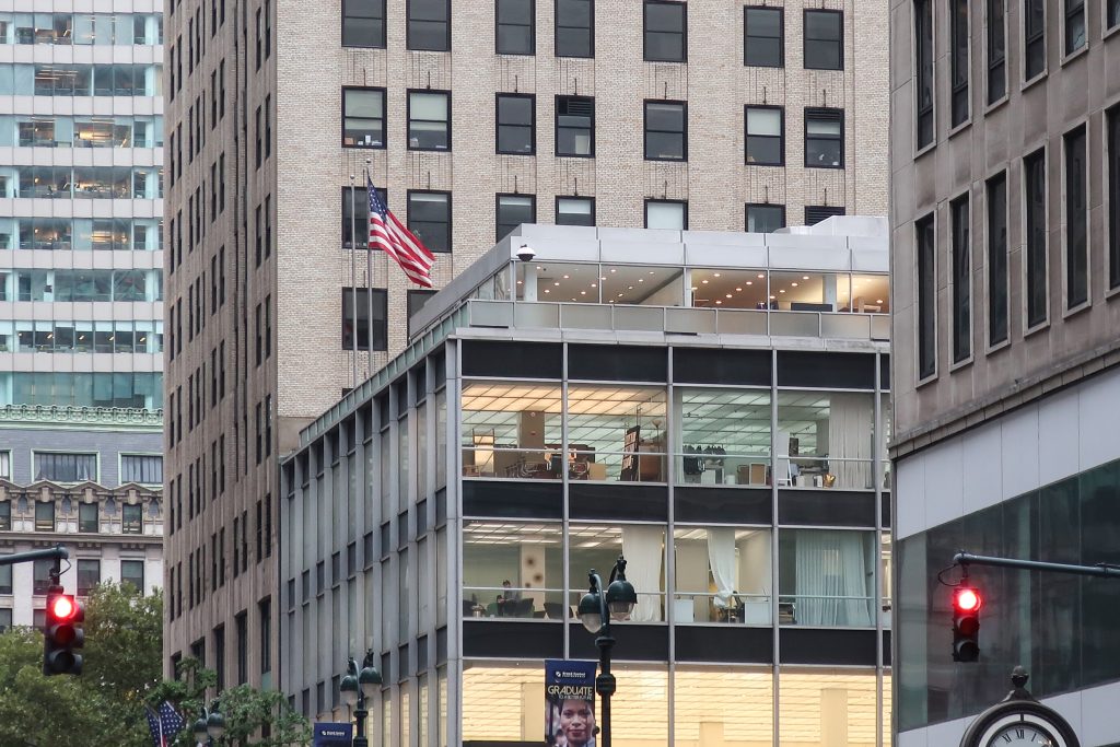
At the fifth story, the T-shaped penthouse is divided into office and mechanical sections. Located in the eastern portion of the penthouse, the office suite has an overhanging roof which is trimmed with a wide cast-stone and aluminum coping that provides a strong horizontal accent to crown the building. The mechanical section at the west end of the penthouse abuts the eastern side wall of the adjacent building. This penthouse is partially screened from view by an aluminum and translucent glass parapet which is set back from the edge of the fourth-story roofline. As with its design for Lever House, Skidmore, Owings & Merrill provided a special window cleaning gondola that was lowered from the fourth-story roof. Small movable brackets are used to suspend the gondola. A pair of flagpoles projects from the roof at the south end of the Fifth Avenue facade.
Interior Plan
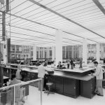
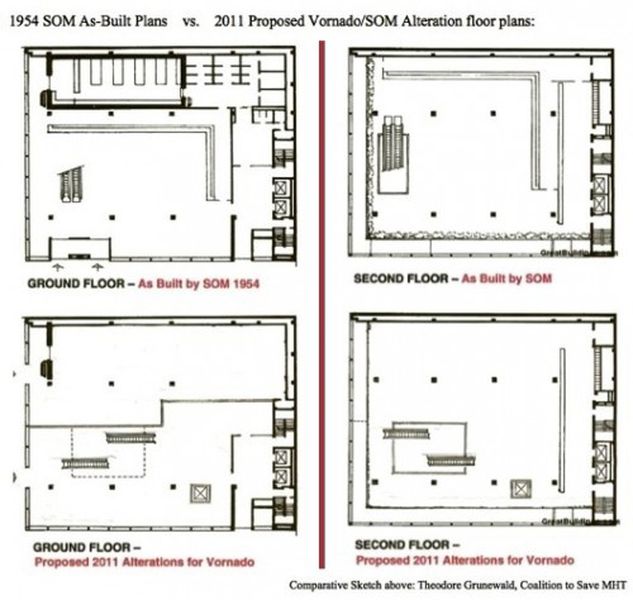
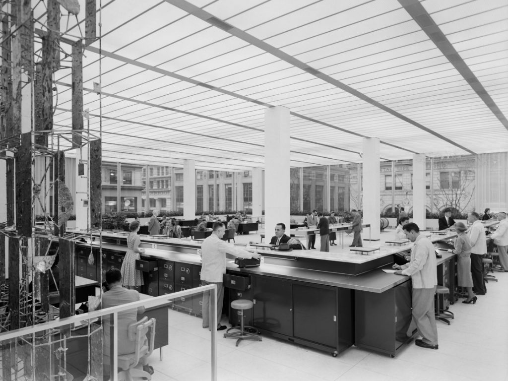
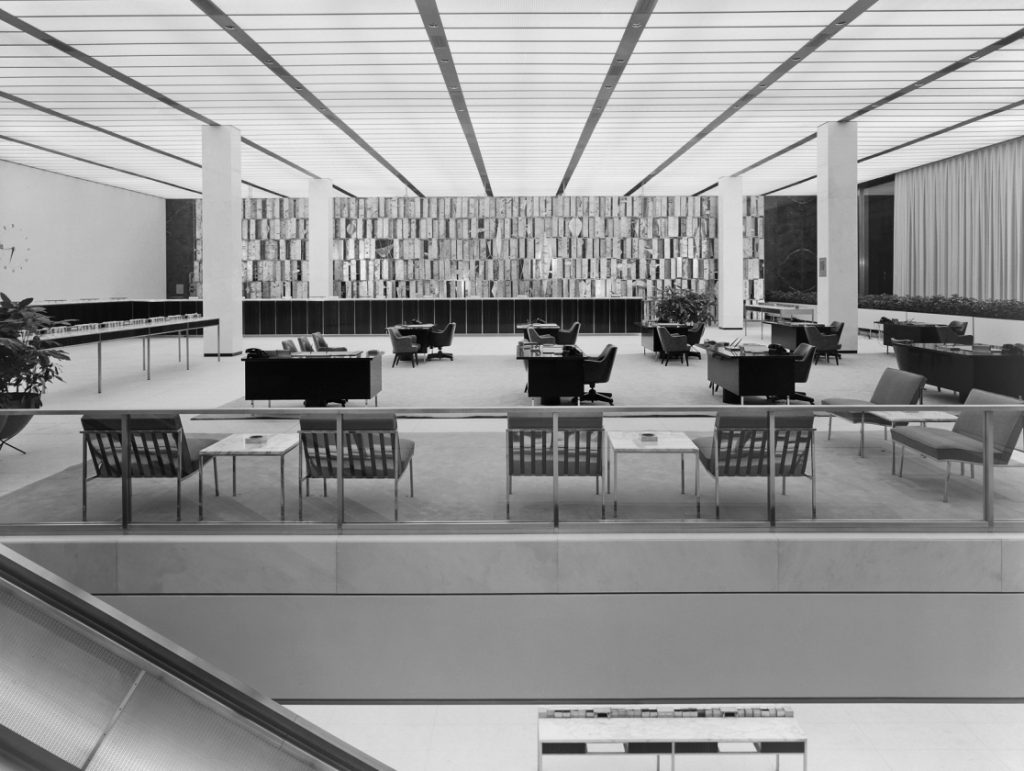
In early photographs, both banking floors were open and uncluttered. Passing through the glazed vestibule, customers experienced an uninterrupted view of the first floor, with 11-foot tall ceilings, free-standing writing desks, and an L-shaped counter along the south and west walls where tellers performed such routine transactions as check cashing. There was little else to break up the view and the walls behind the counters were clearly visible.
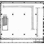
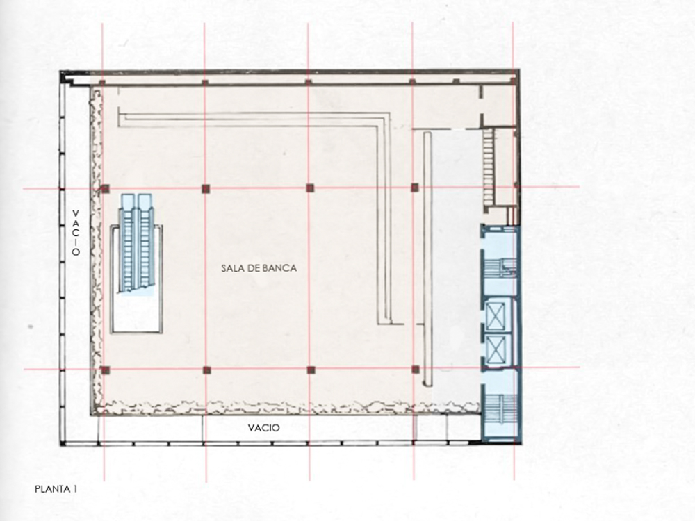
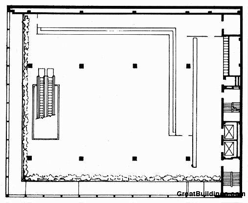
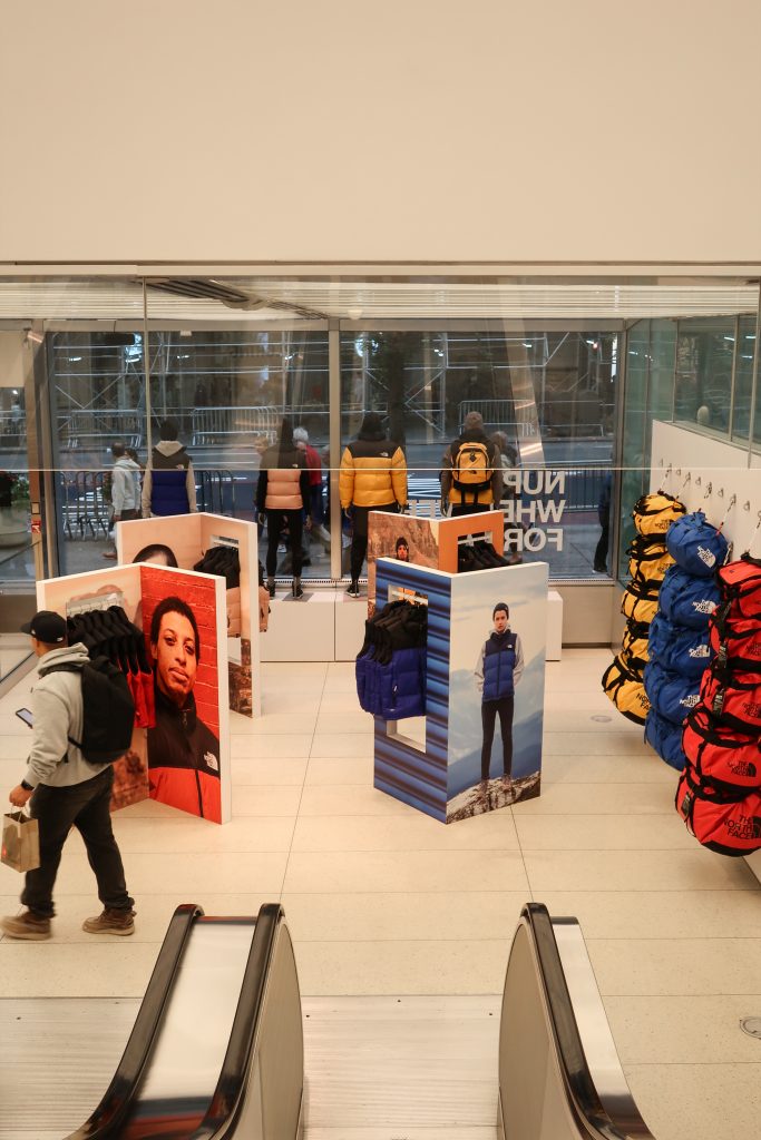
Immediately inside the entrance closest to Fifth Avenue are the escalators to the second floor, sometimes described as the main banking floor or mezzanine. Because this level is recessed from the east and north walls, it creates the impression that both floors occupy a single volume of space. With approximately 7,000 square feet of space, the second floor recalls, without imitating, the grandly-scaled halls of earlier banks. The Architectural Record described it as having an “almost classic serenity… dignified yet lively; ordered but not forbidding.”
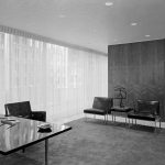
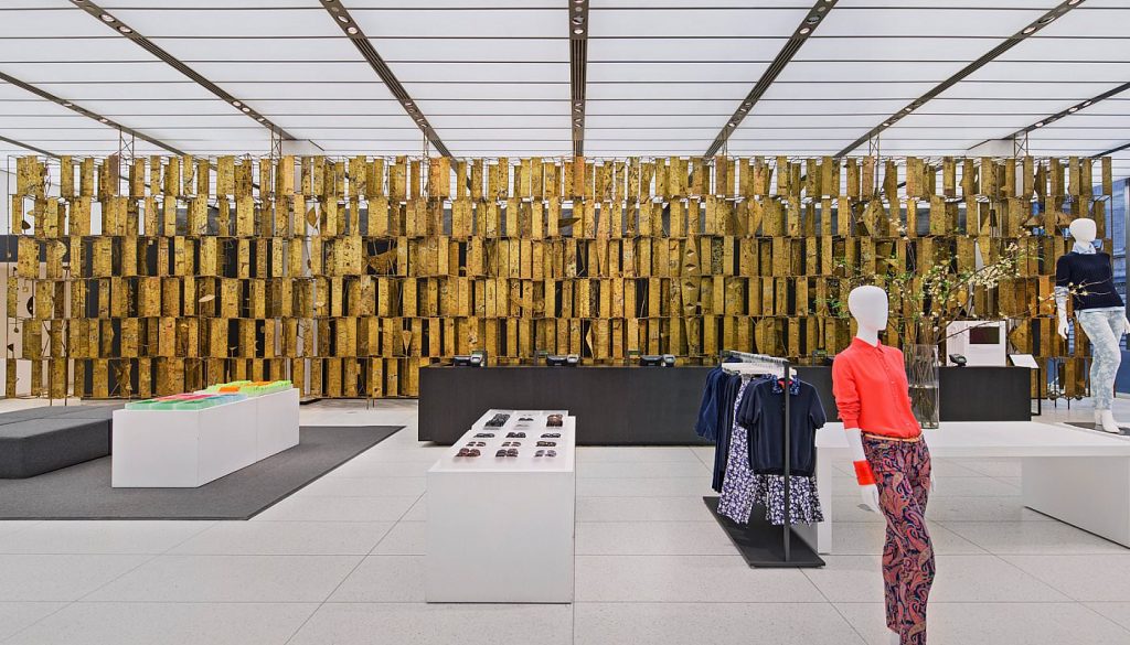
Devoted to commercial accounts, the second floor had a similar asymmetrical configuration to the first floor, but with groups of senior officers desks arranged at center. Behind the counter, near the west end of the south wall, was originally a large clock with metal numerals. This wall was painted white and incorporated much of the building’s mechanical system, including electricity, air conditioning ducts, and water pipes. In contrast, the west wall was faced with polished gray German marble that was possibly chosen to create a strong background for the 70- foot-long screen by sculptor Harry Bertoia. Weighing about five tons, it featured more than 800 enameled steel plates supported by a framework of steel rods and braces. Ada Louise Huxtable commented that the screen added a note of “Byzantine splendor in an otherwise austerely elegant interior… the perfect accent for the polished surroundings.” Removed by the prior tenant (and owner of the artwork) in 2010, this glittery abstract artwork was not only colorful but it disguised a row of desks, as well as service doors and elevators, from public view. The banking floors were also originally enlivened by rectangular flower boxes, placed in rows along the perimeter of the second floor, and near Fifth Avenue, on the first floor.
The Escalators
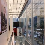
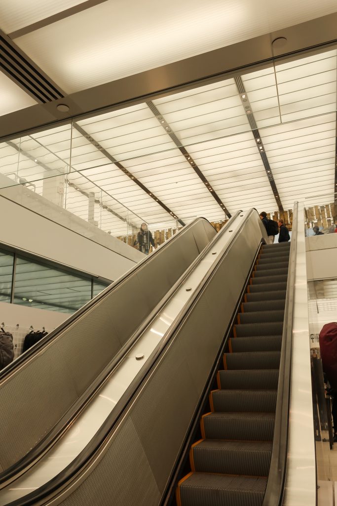
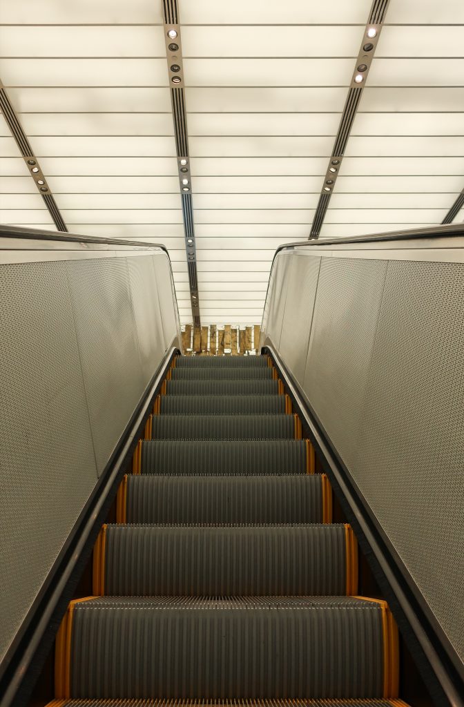
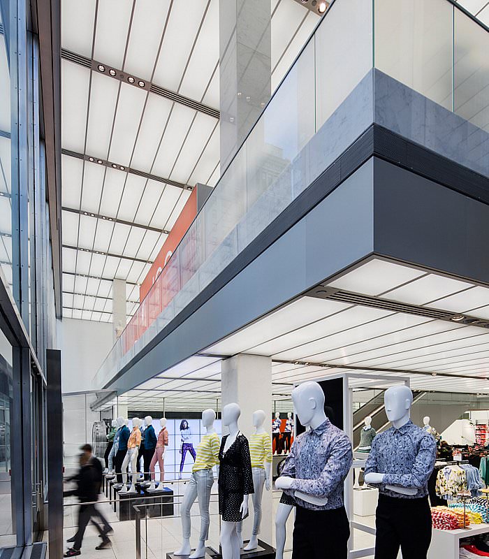
The former banking floors are linked by escalators. Located on the east side of the building, they were convenient for customers entering from 43rd Street and were positioned to maximize visibility from Fifth Avenue. Rising on a diagonal in open space, without any apparent means of support, passing pedestrians could easily observe the constant the flow of customers, while inside, riders could enjoy changing views of the interiors.
Following the Second World War, architects paid greater attention to the aesthetics of circulation, using spiral stairs, curving ramps, and with increasing frequency, escalators, to move people through buildings. Le Maire designed the anodized aluminum interior side panels of the escalators, which were finished in a “straw gold color.” This color was probably chosen to harmonize with the 33- foot-high gold-tinted curtains,31 the gilt Bertoia screen, or possibly Bertoia’s untitled wire “cloud” construction that was originally suspended above the escalators. Each escalator panel contained numerous small holes, allowing light from “cold cathode continuous tubes” to shine onto the moving treads. She “pioneered” this idea for the Otis Company in 1946 and it was later used in a Dayton, Ohio, department store.32 The bank’s newsletter described the effect: “The escalators gives a friendly glow to the room and strengthens the feeling of unity between the first and second floors.” In addition, a grid of nine evenly-spaced recessed lighting fixtures was installed above the east end of the teller’s counters on the first floor, close to where the escalators meet the ceiling.
Lighting
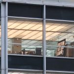
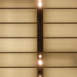
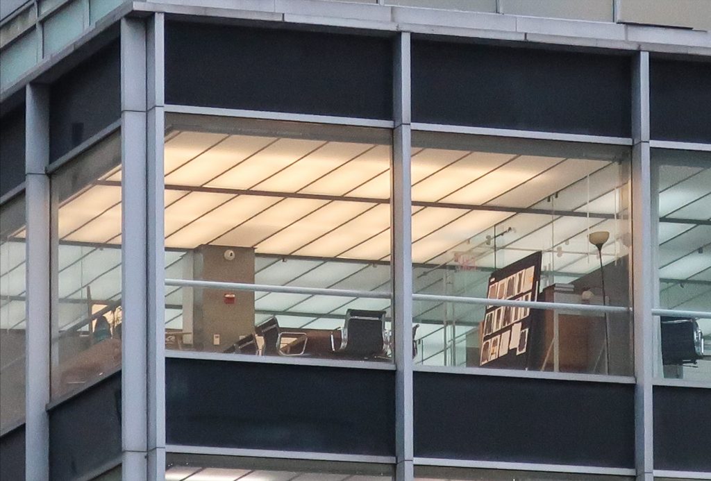
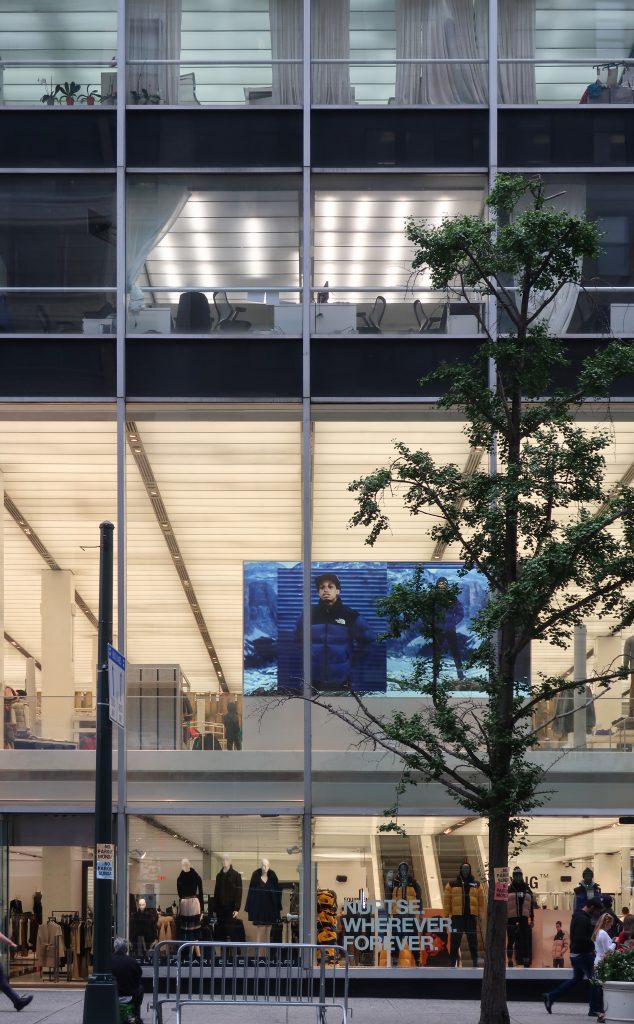
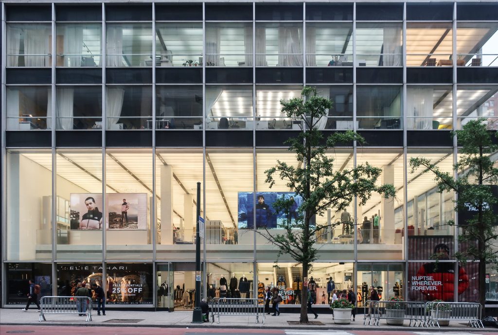
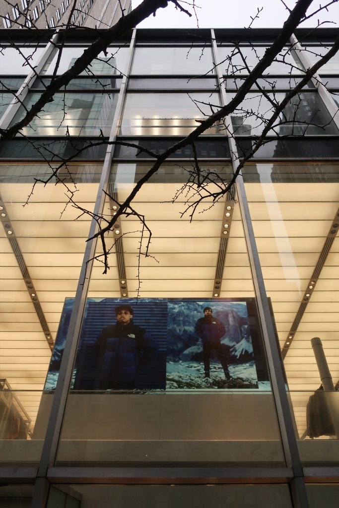
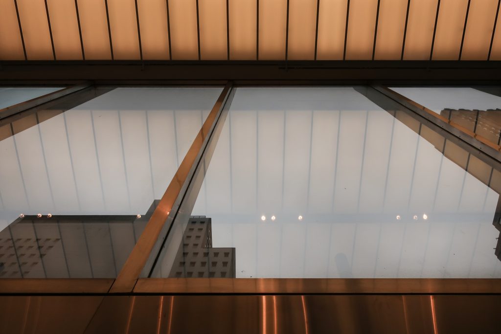
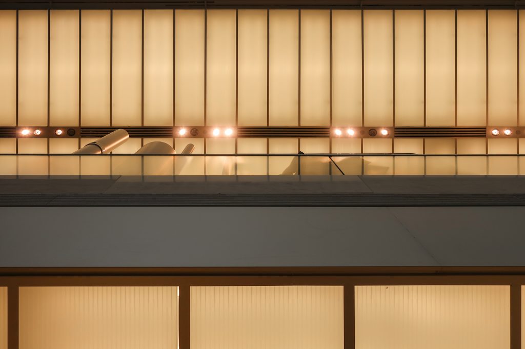
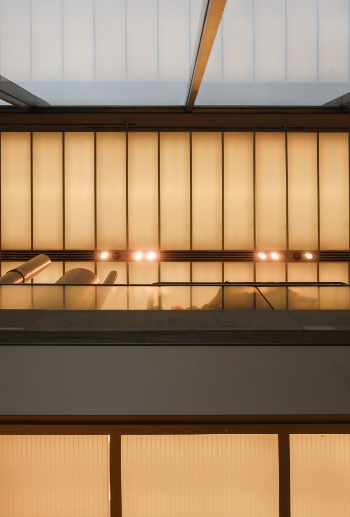
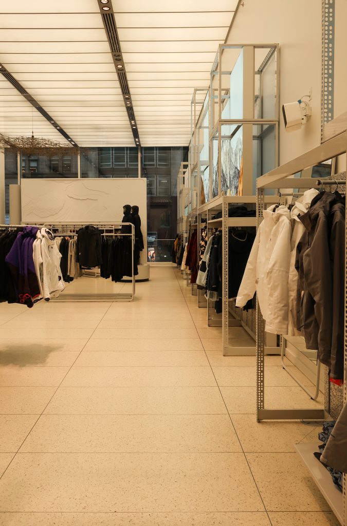
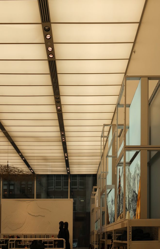
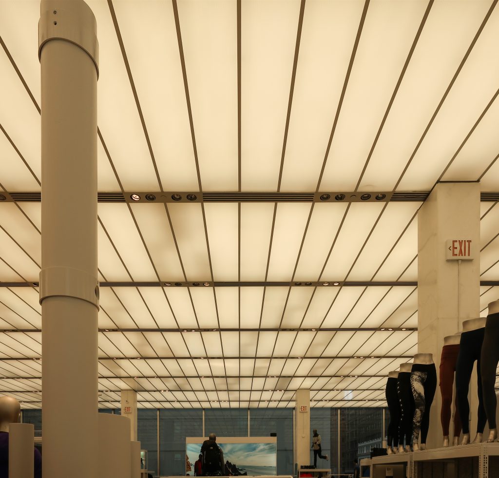
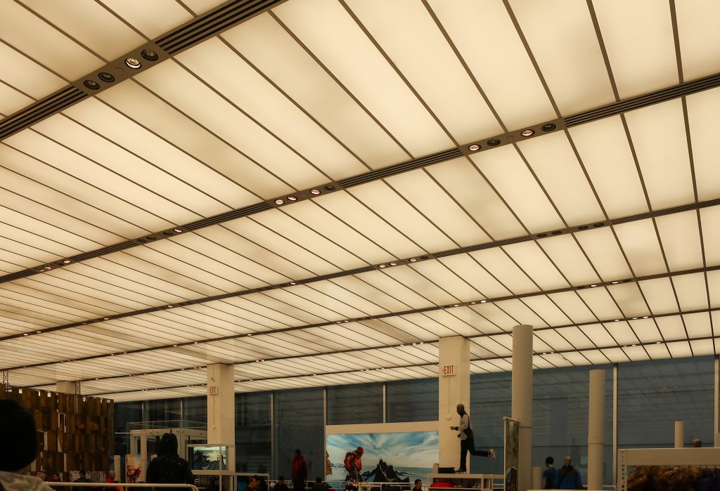
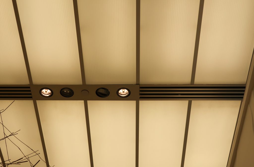
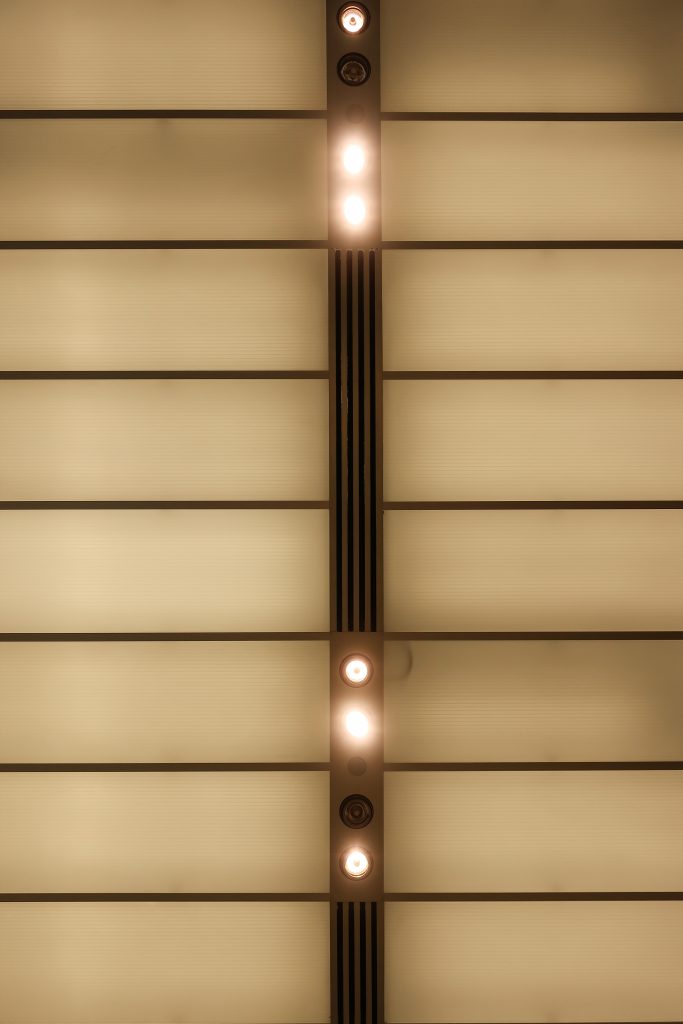
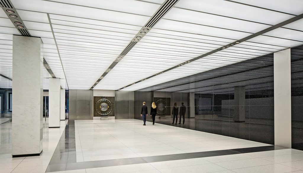
Vast “luminous ceilings” hover above both floors, as well as the third and fourth floor offices. Corrugated “paper thin vinyl sheeting,” hung from Tshaped metal channels, gave the ceilings an uncluttered directional character. With none of the lighting fixtures visible, it could easily be seen from both streets and reads as a floating, illuminated grid. On the second floor, the thicker metal channels direct the eye toward the west end of the room where the Bertoia screen was located, today revealing a gray marble wall. The original luminous ceiling has been altered so that a grid of three panels is now located where there was originally a single panel.
Luminous ceilings were relatively new in the early 1950s. Developed by the electrical engineer Parry Moon and Domina Eberle Spencer for use in offices, this technique produced “an even glow of illumination, without glare or shadow.” They collaborated with the Marlux Corporation, of Somerville, Massachusetts, who manufactured the panels.
Interiors magazine reported:
Light from the tubes reflects again and again between the plastic panels and the brightly painted structure ceiling until nearly all the light passes through the plastic. This makes the light seem to come from an unbroken plane of light rather than rows of tubes.
It was the first of many SOM interiors to incorporate this type of ceiling and is a defining feature of these interiors. Even from the outside, the interiors constitute the major sensation of the building, because they are under luminous ceilings, providing light so brilliant that the interior space is entirely and perfectly revealed …
Because the banking floors emitted an even glow, reflections were significantly reduced on the exterior and the glass seemed to vanish during daylight hours. Architectural Forum interpreted this as a shrewd retailing: It is an old merchandizing trick, if you have a store window and you want the contents seen from the outside, you have to put more foot candles inside the glass than there are foot candles of natural light outside the glass… It makes a glass wall into something it has not been before, an invisible control instead of a mysterious barrier. Luminous ceilings also enhanced each floor’s minimalist character. Not only did the panels diffuse and disguise the lighting source but they hid such necessary elements as public address systems, air diffusers, and acoustical materials. Though Huxtable criticized the “pale yellow” color in her 1954 review, saying it would never seem pleasant or flattering, this system did produce a powerful and consistent glow that helped publicize the new branch.
With electric rates relatively low, management was initially instructed to keep the building “fully lighted” throughout the day and until one o’clock in the morning. Mumford was especially impressed, writing:
“Viewed from outside, this building is essentially a glass lantern, and, like a lantern, is even more striking by dark than daylight.”
Vault Door
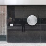
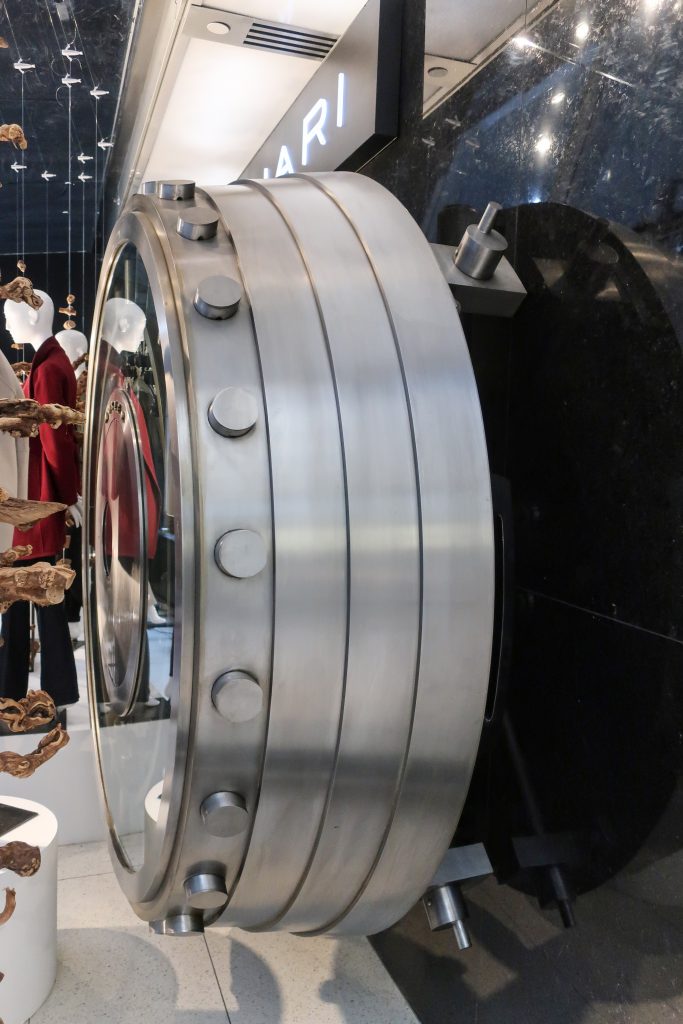
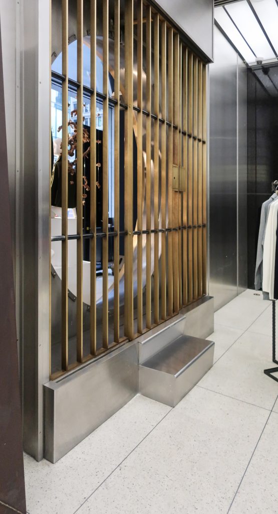
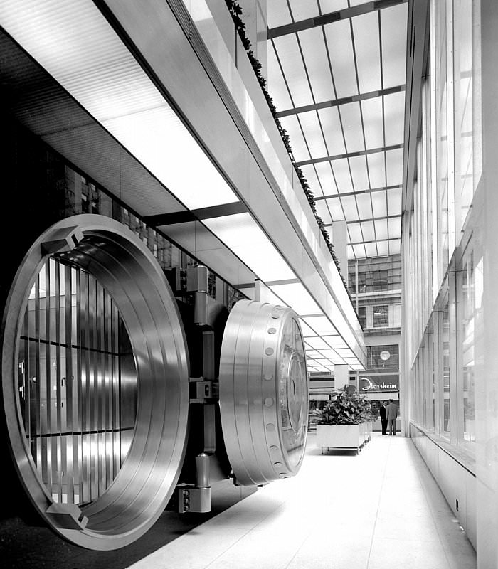
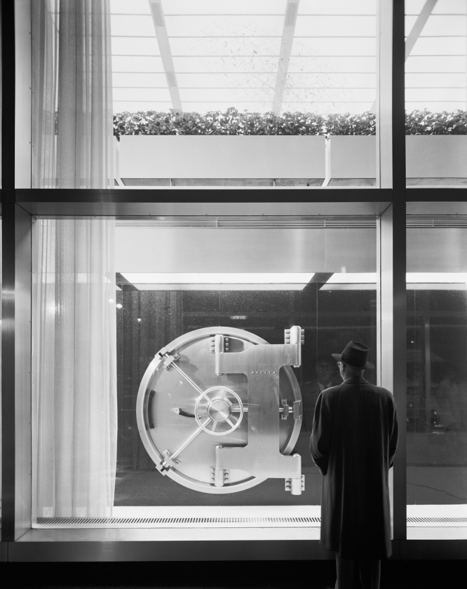
For people strolling Fifth Avenue, the most prominent feature was the circular door to the main vault – open and plainly visible from the street. Traditionally, vaults were placed below ground or at the rear of the banking floor. Instead, this vault was placed in full view, just ten feet from the sidewalk. During banking hours, people could see the door’s locking mechanism and circular frame, as well as the gate to the vault and its interior. Though safes had occasionally appeared on banking floors to comfort “wary depositors,” it did not become a widely-accepted practice until the opening of this branch. Various reasons were given to explain the location. According to the architects, aesthetics played an important role: It’s like sailors and boats. While we were designing the building, the bankers kept taking us down into bank cellars and showing us vault doors; then they would stand around looking at them, and say to each other reverently, ‘Isn’t it beautiful!” After a while we began to agree. Flanigan thought the placement would benefit the bank’s clients. He told the New York Times, that “with our vault at street level, safe deposit customers can use their boxes… with maximum convenience.” Some writers contended that security was the main motivation and by giving the vault greater visibility, robberies could be deterred. Though this suggestion was dismissed by the bank.
Mumford observed: By raising the most dramatic physical element in the bank from the cellar to the ground floor, the architects have made the most of a natural advertisement… This use of the bank’s vault as an expressive and visible feature was truly an inspiration. Huxtable expressed a similar view in Art Digest, calling it “spectacular merchandising this, and good visual drama.”
The noted industrial designer Henry Dreyfuss (1904-1971) collaborated on the door’s design, which Industrial Design magazine included in its annual review of 1954. The unidentified author remarked how the door was “to the bank what a beautiful broach is to a dress.” Conceived as a showpiece, the 30-ton, 7-foot diameter, 16-inch thick door was made of “flange quality carbon steel, stainless steel, and chrome laminated steel,” as well as architectural bronze. Especially prominent was the bolt wheel and the I-shaped hinge, which was “so delicately balanced it can be swung with one finger.” The exterior of the vault was faced with Canadian black granite. This polished stone provided an elegant backdrop for the shiny door, as well as for the luminous ceiling and white marble columns in the first floor banking hall. As one of the branch’s best-known and mostpublicized features, the Dreyfuss door was lit throughout the night, providing Mosler with a “twenty-four hour advertisement.” Furthermore, the company took such great pride in this commission that each week an employee was sent to polish it. In a 1997 New York Times editorial, the door was called out as “an icon of security, immensely technical, deeply forbidding, almost ironic in its seriousness.”
Structure and Materials
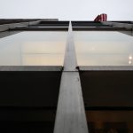
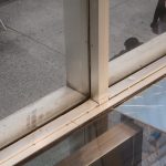
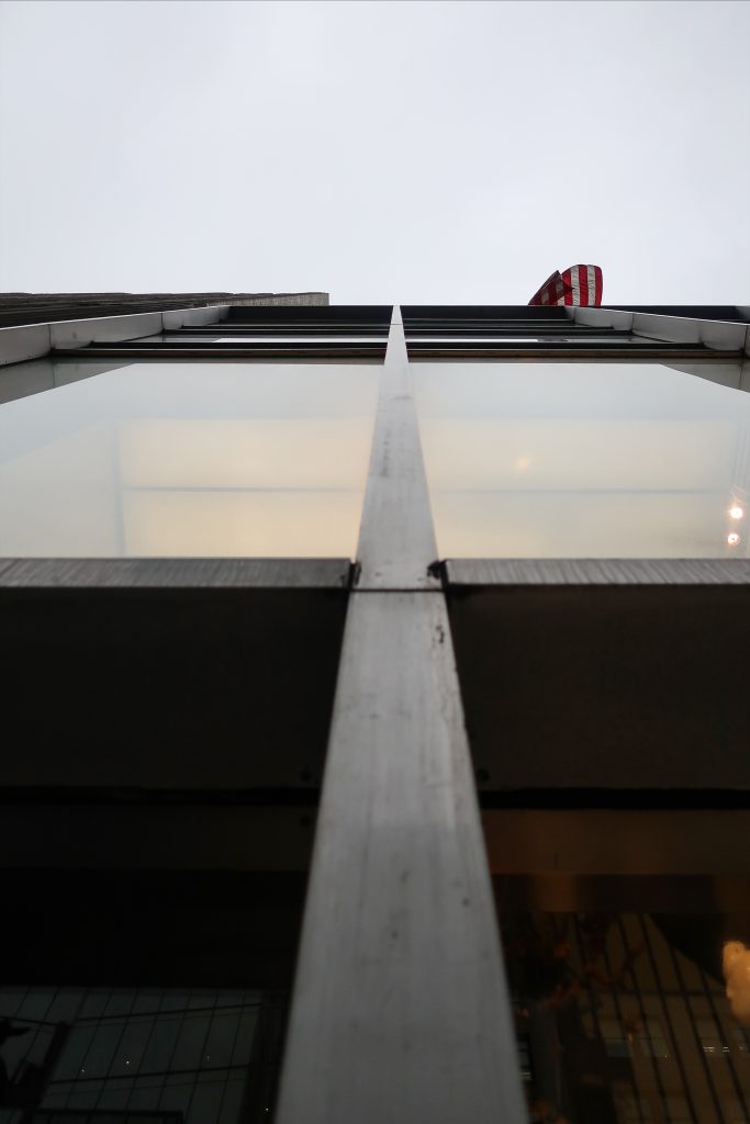
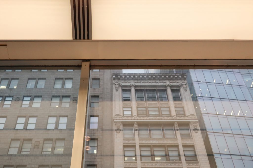
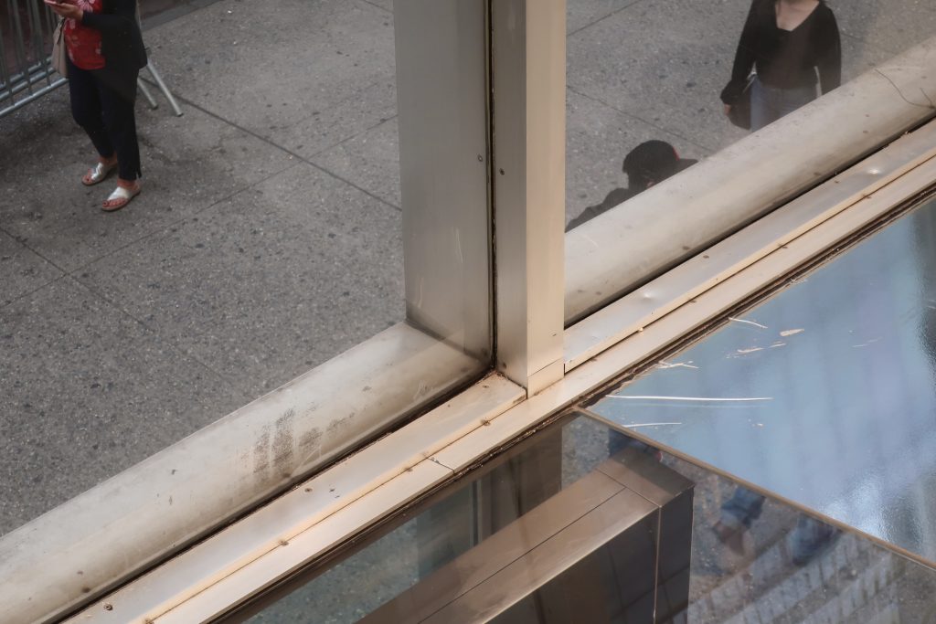
Occupying the entirety of its 100 by 125-foot site, it has curtain walls of clear glass on both Fifth Avenue and West 43rd Street. Thin, polished aluminum mullions and horizontal rails hold the glass in place (the panes on the second story, measuring 9 feet-8 inches x 22 feet and weighing 1,500 pounds, were the largest ever installed in a building at the time). Dark gray spandrel panels of polished opaque wire-glass conceal the floor slabs. Treated as an uninterrupted expanse of clear glass, the Fifth Avenue facade originally was designed with no entrance or signage, but rather the building’s use was to be indicated solely by the gleaming polished steel vault visible through the plate glass window.
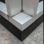
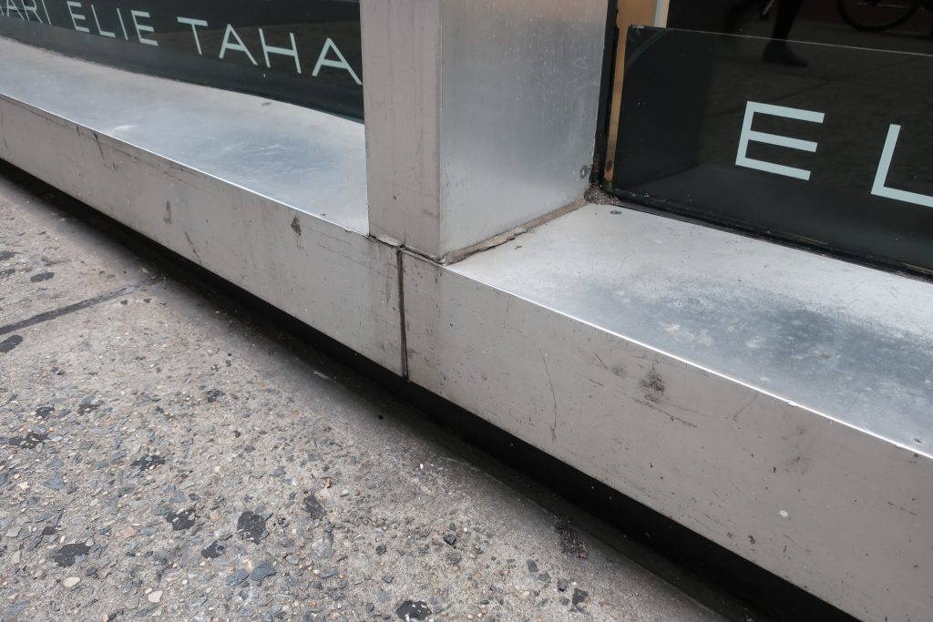
Black granite is also employed for the plinth that runs along the base of the building. Above this plinth is a polished aluminum sill that supports the slender polished aluminum mullions and horizontal rails that hold the panes of clear glass in place. Dark gray spandrel panels of polished opaque wire-glass conceal the floor slabs and provide horizontal accents to counter the strong vertical rhythm established by the mullions (these panels survive intact on the West 43rd Street facade; many have been replaced on Fifth Avenue with dark, non-reflective panels). The clear glass window panes are extremely large for the period, those at the double-height second story measuring 9 feet-8 inches x 22 feet.
Supporting the building are eight interior columns set eleven feet from the Fifth Avenue building line and twenty feet from the West 43rd Street building line. Concrete floor slabs are cantilevered over the relatively short spans from the columns to the clear glass walls. At the second story, the cantilevered floor is pulled back from the exterior wall, so that the main banking areas appear to be contained within one forty-foot-high space. The concrete slabs were deliberately kept thin both to meet the building height limitation and to create an impression of extreme lightness. This aesthetic of lightness is enhanced by the thinness of the external metal skeleton which the construction superintendent for the project described “as more like jewelry than building!” At the same time, the illumination produced by thousands of cathode tubes concealed behind thin plastic panels dematerializes the surface of the ceiling, contributing to the sense that the slabs are weightless and floating. This high level of illumination was intended to counteract the natural reflectivity of the clear glass walls. As the Architectural Forum noted it is “an old merchandizing trick” to put more illumination inside a store window than outside the clear glass to ensure that the contents can be seen, but doing this to a five-story building is new and surprising, a true landmark in the delineation of space. It makes a glass wall into something it has not been before, an invisible control instead of a mysterious barrier.”
Bibliography / Credits
This article was edited by the WikiArquitectura team based on the following reports:
- Gale Harris from the Research Deparment of the city of New York in 1997. The author wishes to acknowledge the contribution of Courty Andrews, whose “Manufacturers Hanover Trust, 510 Fifth Avenue” seminar paper, written at Columbia University in Fall, 1987, was an invaluable resource.
- Matthew A. Postal from the Research Department of the city of New York in 2011.
