Los Terrenos
Introduction
Los Terrenos, a house that mimics its surrounding flora and fauna, is the ultimate example of a house that blends into its natural surroundings, combining contemporary design with minimalism in a refined way. Discreetly hidden among its natural surroundings, Los Terrenos is a private holiday retreat that stands out by blending itself with its wooded site. The residence comprises three structures, each intentionally built to reflect the design concept.
Designed by Mexican architect Tatiana Bilbao of Mexico City-based Tatiana Bilbao Estudio. Tatiana Bilbao is a Mexican architect whose work expresses her concern for sustainable construction through the use of natural materials and traditional techniques. From her studio numerous projects have been born with a strong social and landscape involvement, some of them awarded different recognitions.
The project that we show in this article is a clear sample of the delicacy with which this architect faces the natural environment in which she has to act; Thus, Los Terrenos was born as a small construction that blends in with the tree mass of this wooded area in the highlands.
Location
Located in San Pedro Garza García, Mexico, the forested sloping site of Los Terrenos is near Casa Ventura, which is located in a residential zone adjacent to the southwest side of Monterrey, a highland forested zone. The residence, with a total floor area of 480m² (5,167ft²), inconspicuously blends into the verdant scenery through a combination of spatial fragmentation and material ingenuity. The landscape strategy aimed to respond to and mimic the existing flora and fauna of the site so that the natural landscape becomes part of the architecture of Los Terrenos.
Concept
The secret architecture of Los Terrenos, a project by The Mexican architect Tatiana Bilbao designs this set of pavilions, as a vacation home that blends with the surrounding landscape of the forests of Monterrey. The main determining factors of the project are the abundant vegetation, the slope of the land, and the action plot (irregular in shape but of great extension), as well as the program requirements consisting of a vacation home.
The client, who lives in Mexico City, is the daughter of a couple who purchased the large tract and divided it into 60 lots for their heirs, who can build houses on the lot under the condition that they hire architects to design them. Bilbao insists that clients be closely involved in the process. “We don’t build for people,” she explains. “We build with people.”
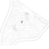
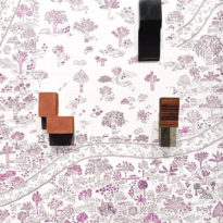
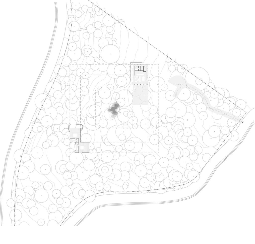
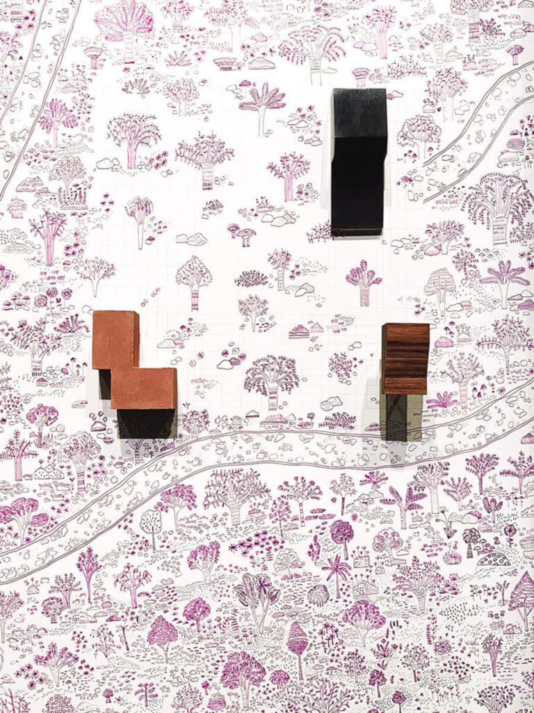
The strategy to follow responds to the idea that the construction imitates the flora and fauna existing in the place, in such a way that its presence would go practically unnoticed. Thus, the first project decision consists of establishing an imaginary base square in the corners of which each of the buildings will be located, which is why they are conceived as independent elements, from a functional and visual point of view.
The design of the three buildings is presented as a conceptual deconstruction of what a house is. Each volume accommodates different functions according to each component’s function and role within the site. The program is disassembled and reassembled separately, enhancing the entities that still behave as a whole. “The housing program is fragmented according to each component’s function and role within the site, but they are all enclosed in a perfect square in the general plan,” said Bilbao. This house seeks to reevaluate the concept of living in nature. It shows that through separations of a typical house program new dynamics of privacy, public gatherings, and harmony with the surrounding landscape can be achieved.
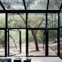
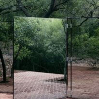
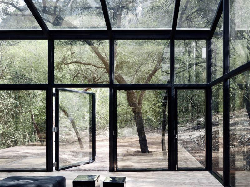
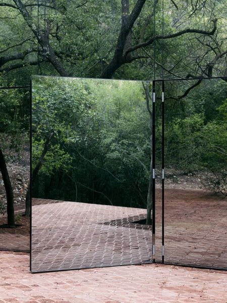
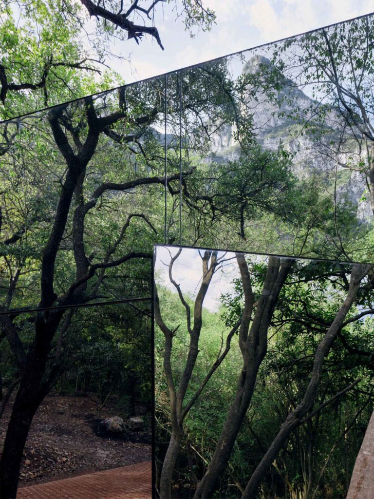
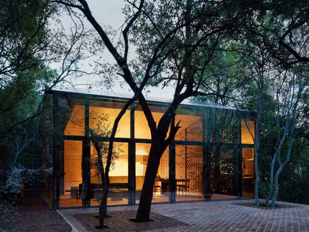
Bilbao conceived the new house, Los Terrenos, as a trio of small buildings, underlying the conceptual underpinnings of the project, the largest of the three buildings, which accommodates the public functions of the residence, takes the archetypal form of a house: think rectangular plan, gable roof. Yet at the same time, this quintessential form is undermined by the extensive use of one-way mirrors that reflect the forest around it making the structure practically invisible.
Each building also emphasizes one of the three main materials in the project’s palette. Tatiana Bilbao has used mirrored glass, along with rammed earth and clay bricks, to create a vacation home that blends with its wooded site in Monterrey. Using just three materials might seem downright monastic to many, but it was a cornucopia to Bilbao. “We usually use just one material,” she explains, alluding to the strict budgets of many of her projects. “We typically don’t get to do that much experimentation.” Still, she and her colleagues made a little go a long way.
Spaces
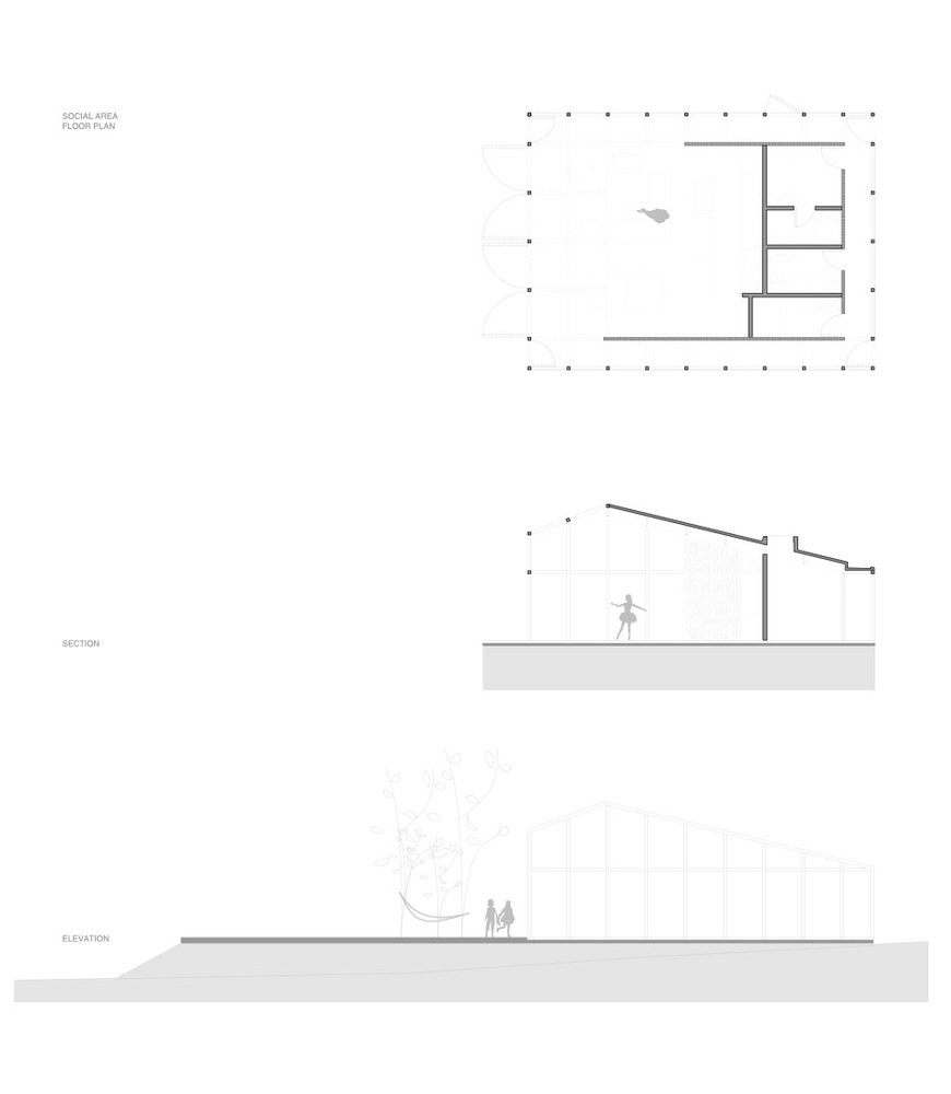
Today there are two pavilions that house different uses. The largest one, linked to the main access to the plot and the road, welcomes the most public part of the program consisting of the work area, living room and kitchen. From a morphological point of view, we can distinguish two main components in plan: a central core that comprises the different rooms, and a continuous envelope, transparent from the inside, which allows free movement within the building, as well as the permanent vision of the exuberant vegetation that surrounds the house.
The housing program is fragmented according to each component’s function and role within the site, but the dwelling, composed of two completed volumes and a third structure still unbuilt, is all enclosed in a perfect square in the general plan. Residing inside a notional square area in the middle of which sits a curvilinear pool, the design of the three buildings is a conceptual deconstruction of what a house is, its programmatic components disassembled and reassembled as separate, distinct entities that nevertheless coalesce into a coherent whole. The house consists of three separate rectilinear volumes, each built in a different material—glass, earth or wood—which accommodates different functions.
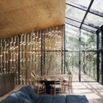
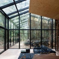
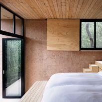
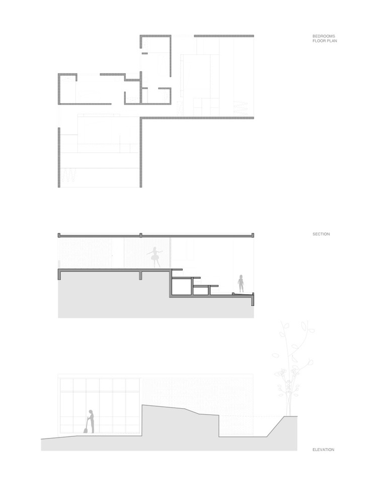
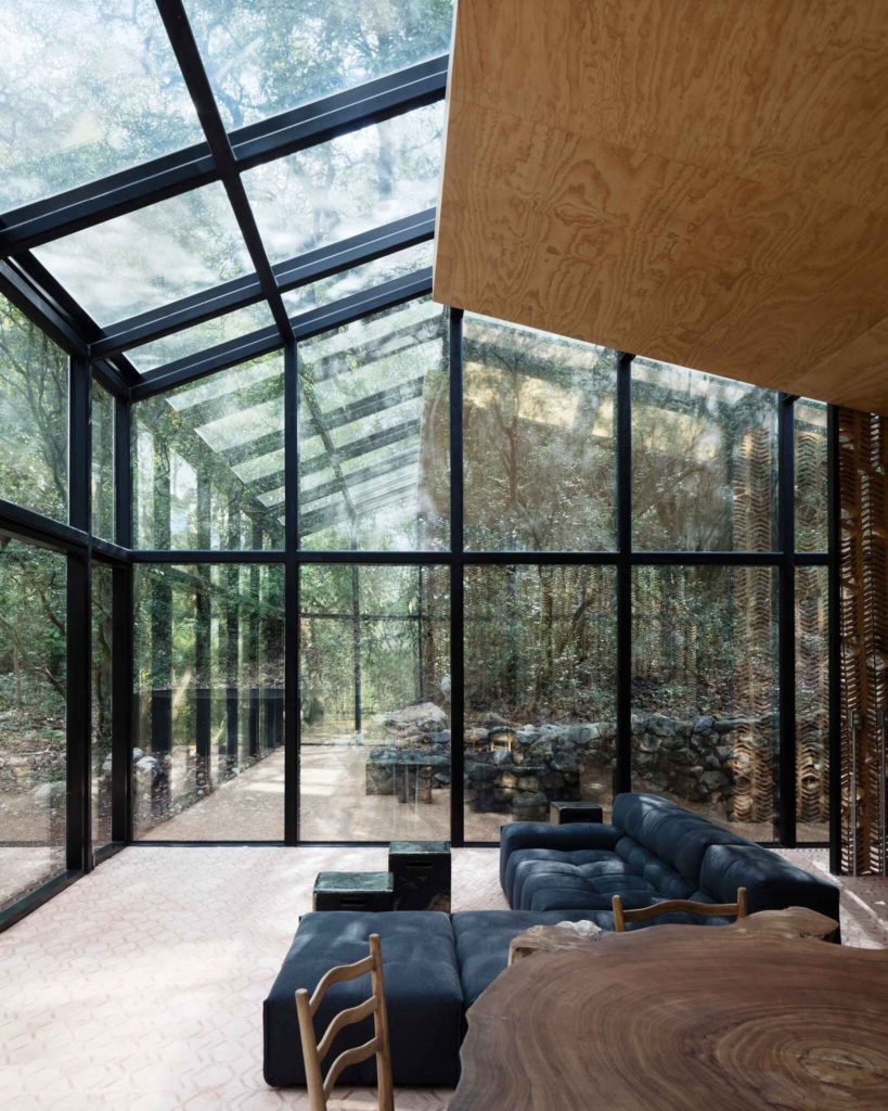
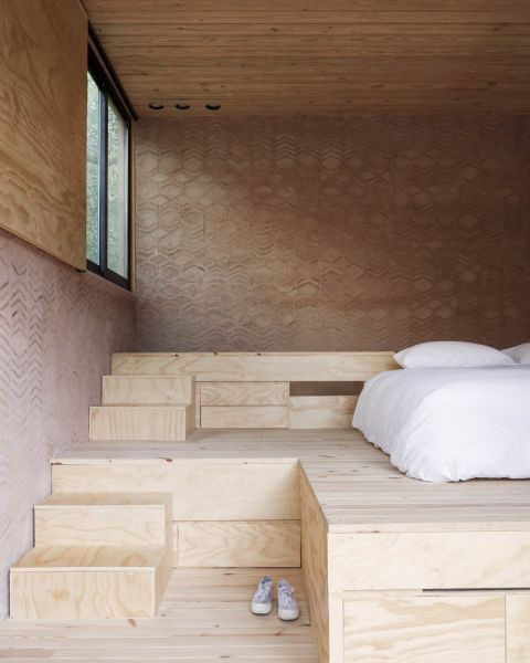
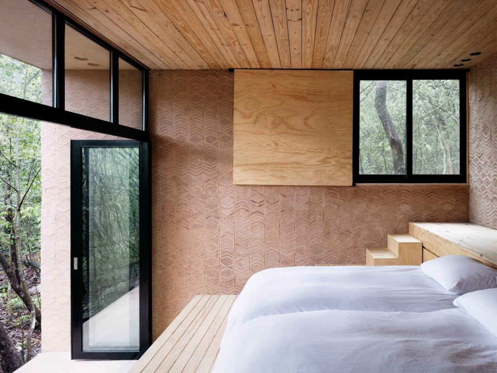
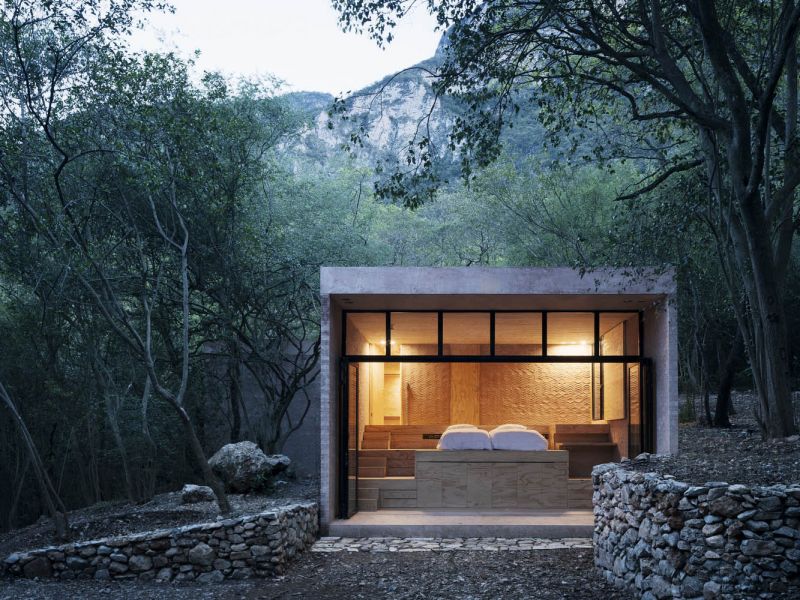
The social zone, and the larger of the two completed buildings houses an open-plan living room, dining area, and kitchen in a double-height space. From the living lounge, massive hinged doors swing open to connect the interior with the shady terrace. Here, diagonally opposite are the private areas within the smaller L-shaped building which houses the two bedrooms and bathrooms that are oriented in different directions so that each room frames a different view. The two rooms feature a stepped configuration through the use of wooden platforms and a retractable glass facade that allows them to be opened up to the outdoors.
The third building, which has yet to be constructed, will house the master bedroom in a wooden house-shaped hut erected on stilts thus providing its occupants with sweeping views above the treetops. Similarly to the other two structures, this too is designed using a formalistic architectural language of quintessential forms which the architect inconspicuously subverts in response to the natural surroundings and the occupants’ experience.
The three areas have a screen that was designed to adapt according to different spatial connections and structural possibilities: floor, permeable floor, screen wall, and structural wall, and as a semi-open wall that allows ventilation and sunlight bathing the interior spaces.
Structure
Structural System
Steel frame for the social volume.
Threaded masonry elements filled with concrete.
Exterior Cladding
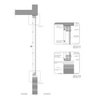
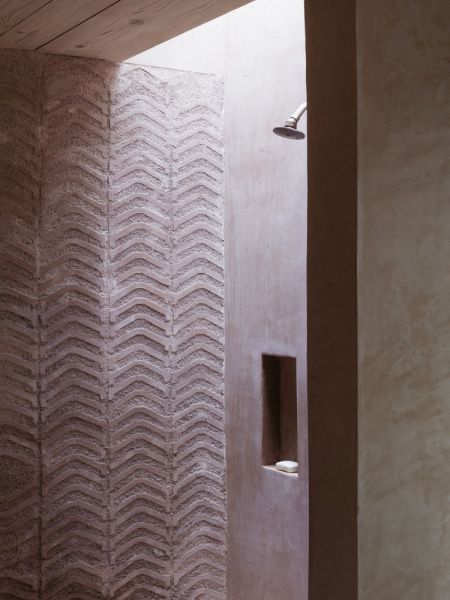
- Masonry: The masonry tile was an element that was integral to the project. A clay unit (in the shape of a Chevron with outward-facing tips) was incorporated into many elements of the house. For example, the paths around the compound use this element as a paver. In the social volume of the compound these were mounted with different orientations screen partitions that let in light. Each piece contains a hole where a steel bar runs through and secures the unit together. In the residential module masonry tile element was filled with a mixture of cement and mortar to match the colors of the element and infill.
- Wood: Woodwork is internal
Glazing
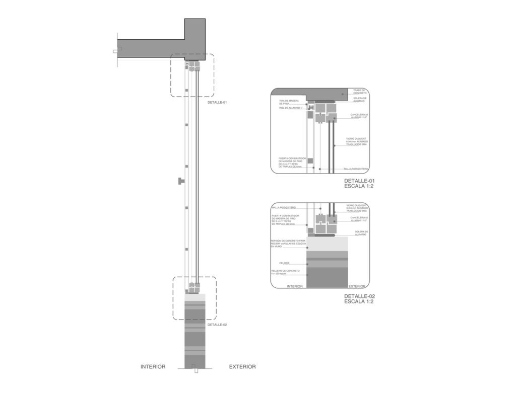
- Glass: Reflective glass was used to cover the facade of the public/communal volume.
- Skylights: Skylights were used in both buildings.
- Doors
- Entrances: In the public volume doors are seamlessly integrated with the rest of the facade, using the same, reflective glass paneling.
- Sliding doors: In the private volume a collapsible partition system was employed which allows the rooms to be constantly connected to their beautiful natural environment.
Energy
Other unique products that contribute to sustainability: For the construction of exterior and terrace zones, the house respected the existing trees and opted to carve out space for them rather than cut these down. Tree roots are allowed to grow unscathed because the clay-tile masonry element was placed atop a platform and in a configuration that allows water to seep through.
Volumes
The larger of the two volumes is rectangular in plan, has a peaked roof, and a mirrored facade, allowing the home to hide among the surrounding forest. Facades are clad in mirrored glass, enabling the dwelling to blend with the verdant terrain that’s also transparent when viewed from within which creates what Bilbao calls an “outside reflection” of the interior—a mirror image of the space that you can see outside the building when you’re sitting in it. The facade of this Mexican forest retreat reflects the color, light, and movements of its natural surroundings. The roof, gabled but asymmetrical, emphasizes the distinction between the two bodies as each one of the skirts forms part of a different element; or in other words, While the smaller sheet of the roof is equally transparent as the perimeter skin, the other is opaque, like the rest of the walls. These blind walls are made up of a ceramic or “lattice” structure, a latticework that allows different degrees of opacity when filling or not filling its intermediate holes with earth.
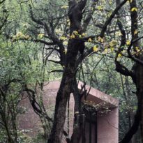
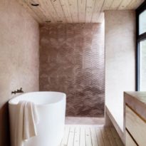
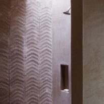
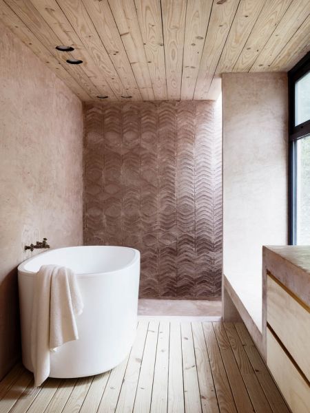
The second volume houses an L-shaped floor plan and has been constructed of clay, rammed earth, brick, and wood to give the bedroom a rustic, minimalist look. Each bedroom has a retractable glass partition fitted on one of the walls, allowing the interiors to be open to take in the stunning tree views. The chevron-shaped clay-brick walls of the bedroom building reflect Bilbao’s idea that where you sleep should feel enclosed rather than exposed. But the architects use the basic form of the brick as a flexible language that also translates into the floors and the openwork screens in the living structure. Rather than keeping the floor level, the team inserted wooden platforms and stairs to create a stepped topography within the rooms. The insertions also serve as storage areas. The terracotta latticework structure is used for the walls of the bathroom. A raised platform allows for storage underneath the stairs.
Stretching from the floor to the ceiling there is a ceramic screen. It features a chevron-like pattern, which the team has defined as a lattice, and was used in different ways throughout the project. “The lattice was designed to adapt according to different spatial connections and structural possibilities,” said the studio. “It works as a solid and permeable floor, a screen partition, a structural wall, and as a semi-open wall that allows ventilation and sunlight to bathe the interior spaces.”
Materials
Interior Finishes
- Demountable partitions: The masonry element was threaded through steel bars (like the construction employed for the private volume but without a mortar infill) creating semi-permeable screens that let light in but still demarcated space.
- Cabinetwork and custom woodwork: The woodwork in the house is pine and was obtained from local providers.
- Paneling: The woodwork in the house is pine and was obtained from local providers. And local carpenters worked the material into the various panels, cabinets, etc.
- Floor and wall tile: The floor tile is the same masonry element used throughout the rest of the project.
- Furnishings
- Chairs: The furniture was selected by the client with the help of Tatiana Bilbao Estudio.
- Tables: The furniture was selected by the client with the help of Tatiana Bilbao Estudio.
- Upholstery: The furniture was selected by the client with the help of Tatiana Bilbao Estudio.
Materials are used to sensual, elegant effect in both buildings, but are never precious; the smaller windows in the bedrooms, for instance, have shutters made of plywood. Inside, the sensation is as peculiar as the open-plan space feels both sheltered and exposed. Minimally furnished with a corner sofa, a dining table in the form of a tree trunk slab and a kitchen island, the room has all the hallmarks of domesticity and yet the immediacy of nature, both visibly through the building’s transparency and tactually though the use of natural materials like wood and clay bricks, upends it in favor of more extroverted and adventurous sensibility that perfectly suits this vacation retreat. The user’s sensation, at all times, will be that of being only in the middle of the forest thanks to the arrangement of each of the volumes, the rooms open onto the forest that seems to never end.
