Lloyd’s Building

Introduction
In the economic heart of the “London City”, lifting the Lloyd’s tower, designed for one of the largest insurance companies in the world.
The project was left in the hands of Richard Rogers after a first selection between forty and studies, to commission a preliminary three of them.
Designed to last 50 years, the fundamental requirement of the building was his versatility in time: it had to adaptares measures and needs at different times.
The first building in which functioned Lloyd’s of London, the vast marine insurance company, was built on the same site in 1928, a few steps from the Royal Exchange.
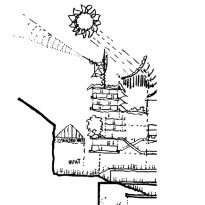
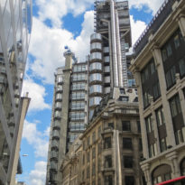
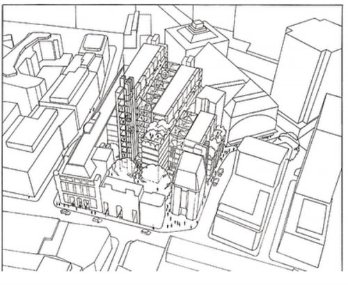
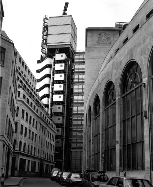
Part of the facade of this building has remained standing in the design of Rogers. In this first building will be joined by another built in 1958 just across the street Leadenhall Street.
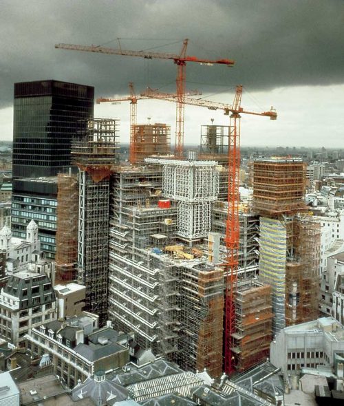
In 1978 due to the growth of the company, it was decided to commission Richard Rogers to design the new building, which was built between 1978 and 1986. Was complemented by a second building located on Wood Street (just around the corner from the main building) and a third for the maritime registry, all of whom also designed by Rogers.
Situation
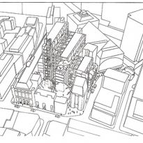
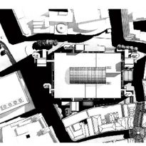
This tower is located in the financial district of the city. 51 Lime Street, London, UK
Concept
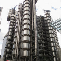
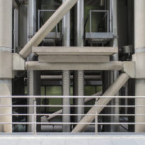
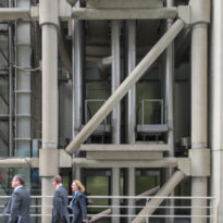
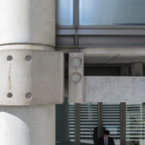
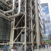
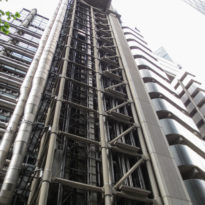
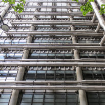
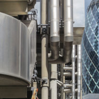
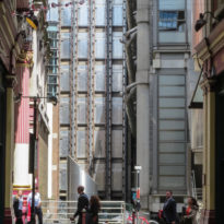
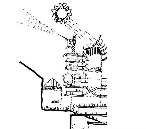
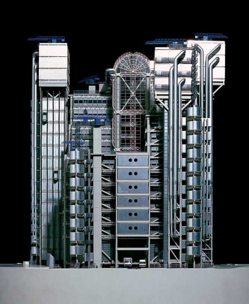
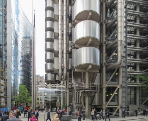
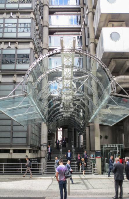
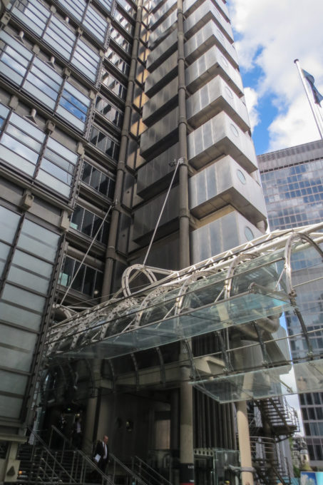
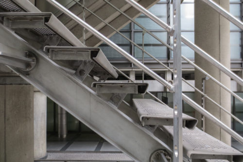
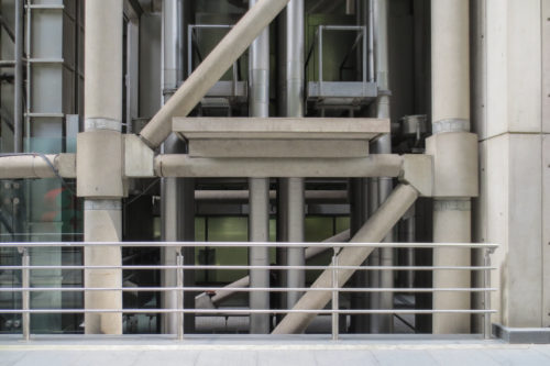
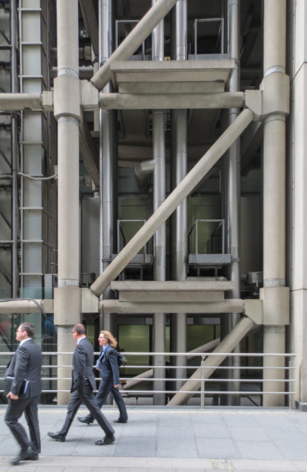
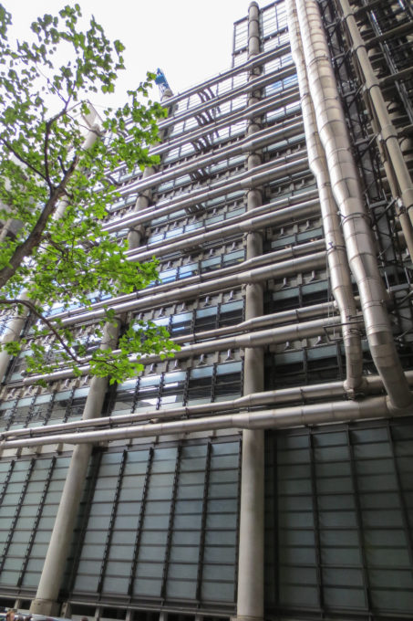
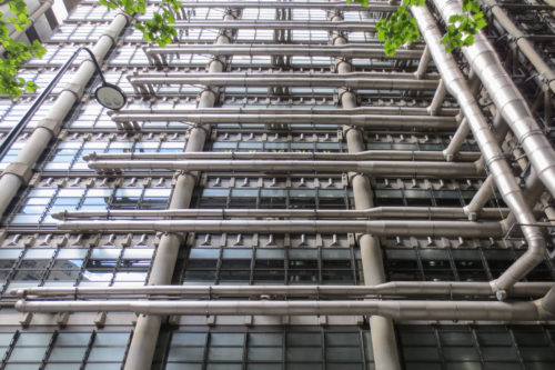
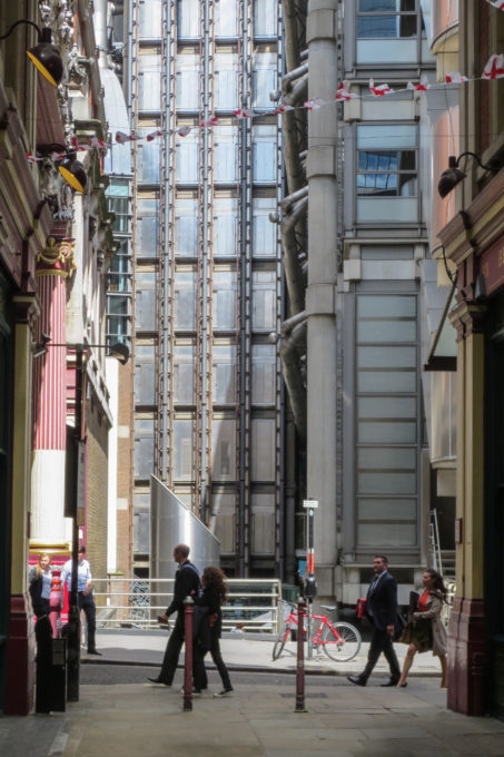
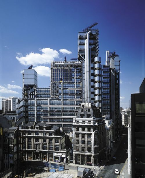
The unusual configuration is a result of its location within the irregular pattern of medieval streets and philosophy of the architect in that the building should appear to be mounted on a “kit of parts.” All the structural details are fully on display, giving the viewer a little understanding of how to support the building.
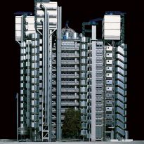
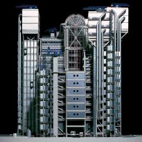
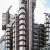
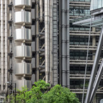
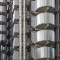
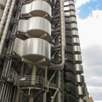
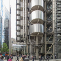
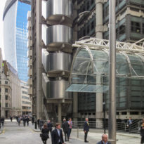
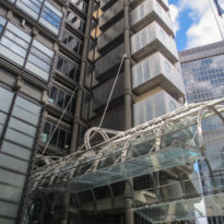
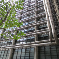
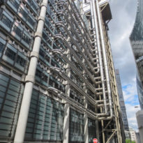
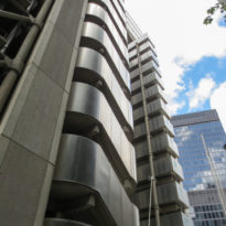
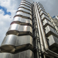
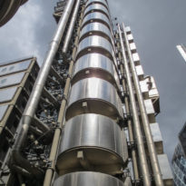
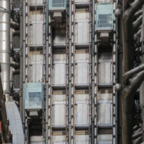
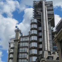
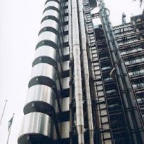
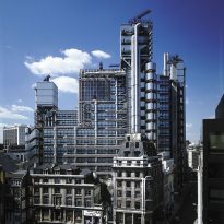
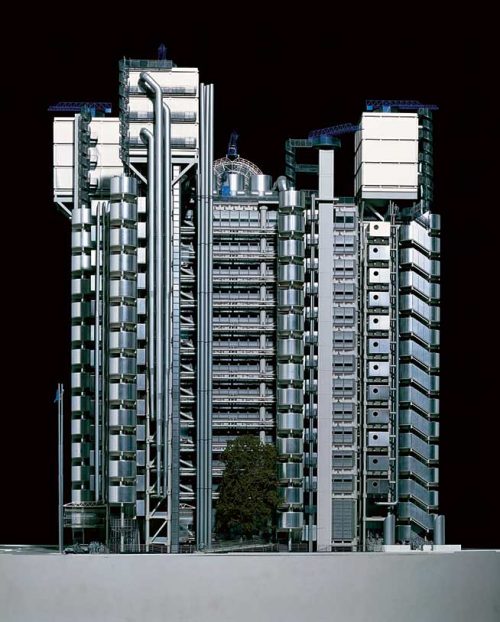
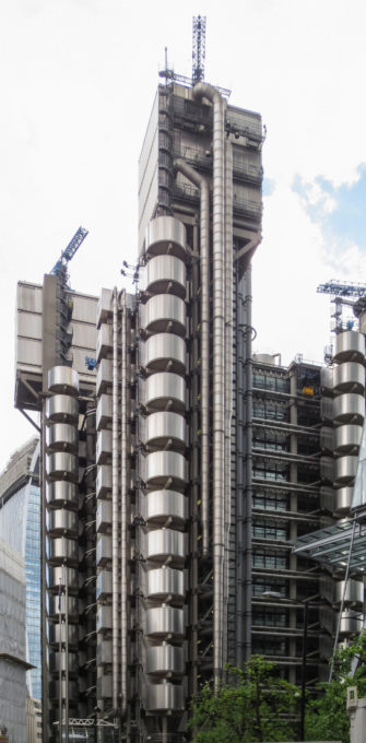
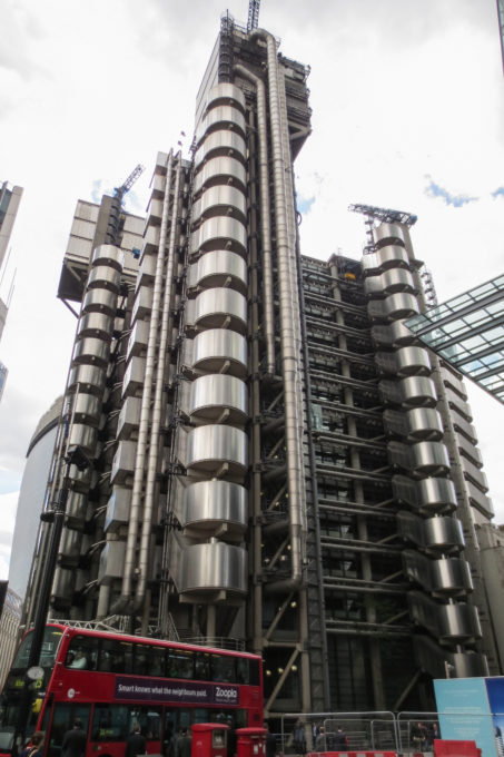
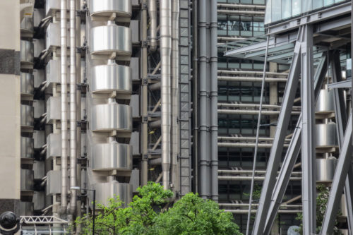
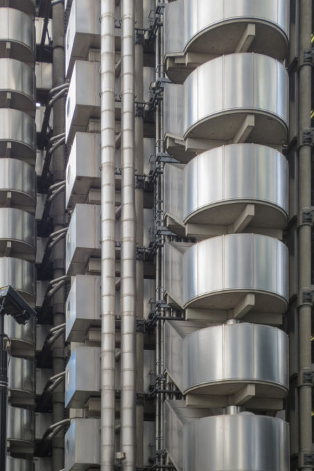
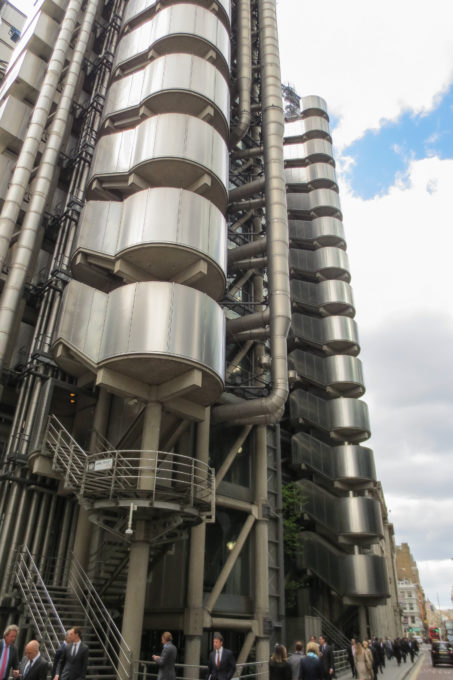
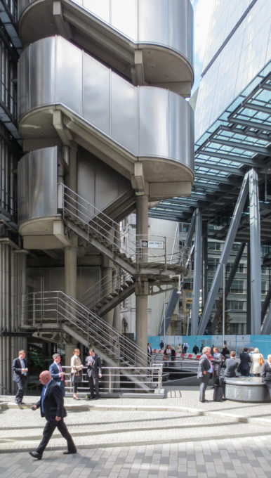
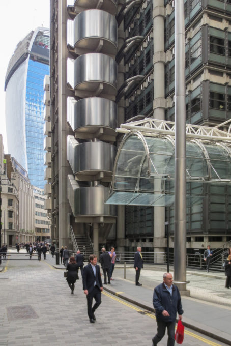
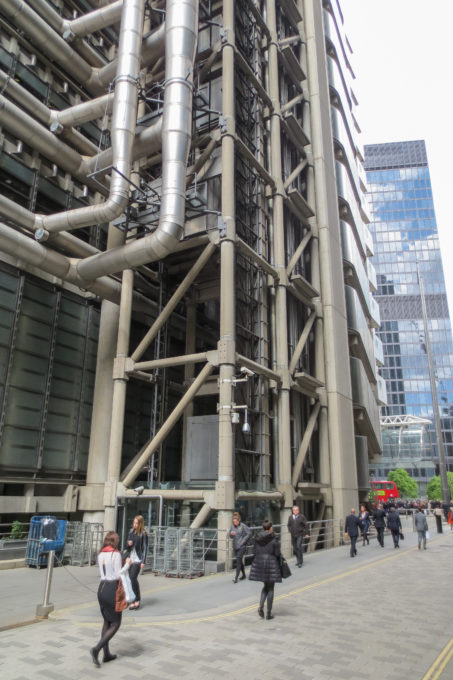
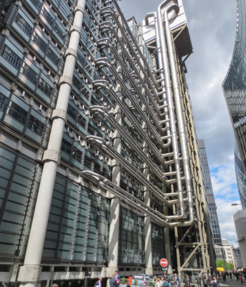
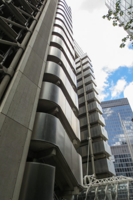
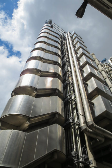
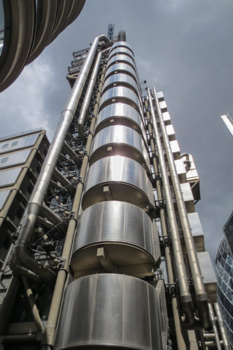
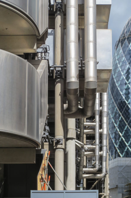
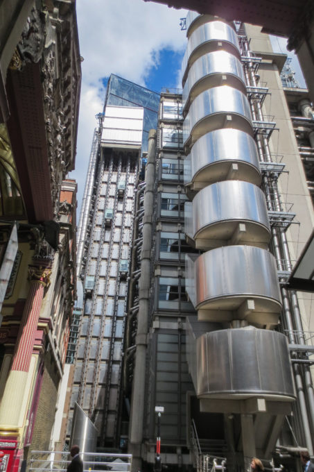
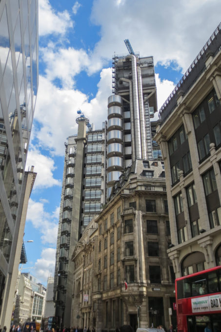
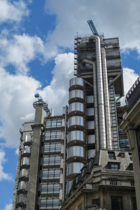
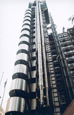
It is one of the most futuristic raised in London, with its wrapping of polished metal and elevators in its outer part.
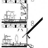
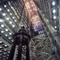
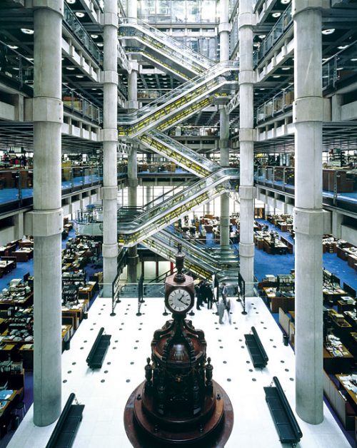
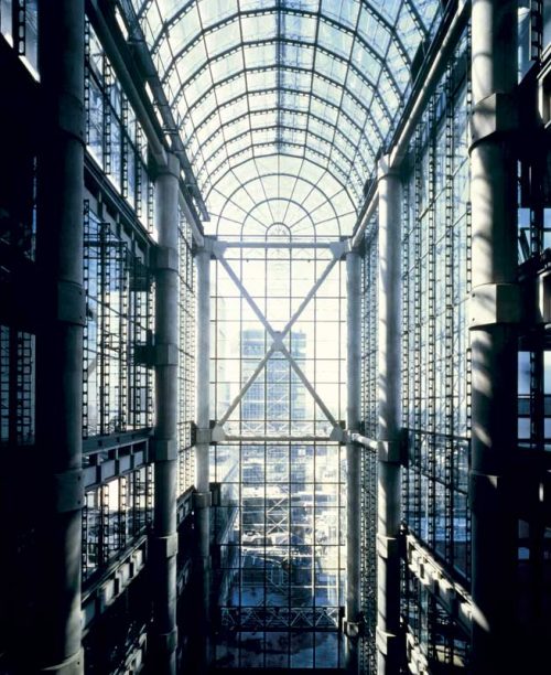
Within the atmosphere of this stunning cathedral light poured down and additional lighting comes from the large garrisons, which also act as air extractors, fixed on the ceiling.
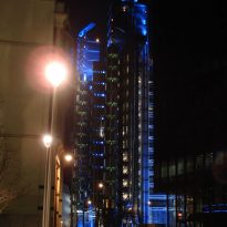
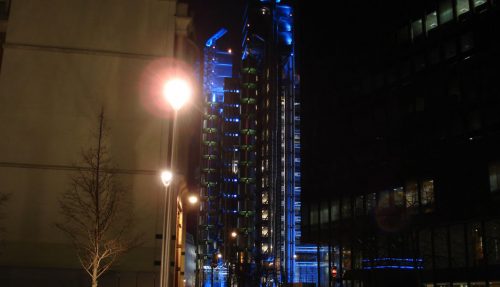
The gleam of stainless steel pieces that flicker, or the electric-blue light at night, sober stresses on the landscape of the city.
Somewhere between the “deco” and “Blade Runner” as headquarters for the company Lloyd’s of London is a surprising and risky design for an insurance company.
Rogers repeats in its draft principles used in the Pompidou Center in Paris, designed in partnership with Renzo Piano in 1978. Among the main concepts that handles Rogers for the Lloyd’s (and in his own words) are as follows:
The flexibility
Flexibility was a key element in the design, as it was necessary to create an uninterrupted space to house the activities of the bag safe. From this concept emerges the shape of the building, accommodating all the elements renewable abroad, so the maintenance and repair, would not disrupt the work and giving a characteristic of readability and scale to the facade.
Spaces “services and”
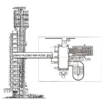
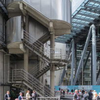
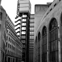
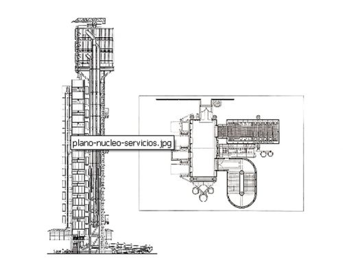
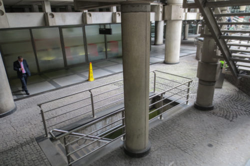
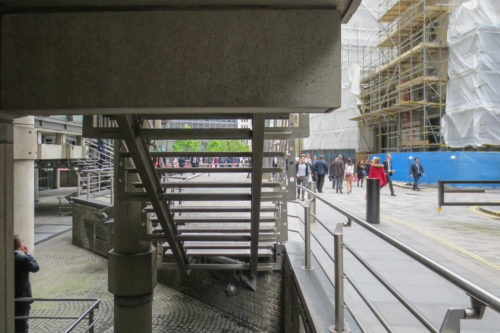
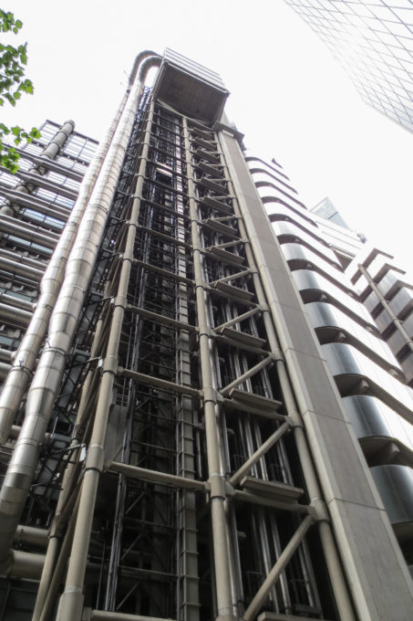
This concept implies that all spaces and service elements, such as elevators, stairs, bathrooms, cellars and machinery rooms are grouped into service towers located outside the mass of the building.
Structure legible and expressive
The layout of the spaces creates a very readable and expressive. Moreover, this concept design, allowed to make maximum use of the irregularity of the site, besides offering a system that allows changes in the building itself to reflect future needs. ”
This has made him be listed as architecture “Tech” by critics, even when Rogers adjetivación vehemently rejects this.
Spaces
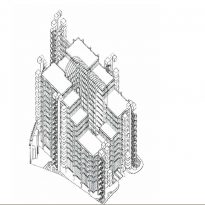
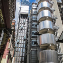
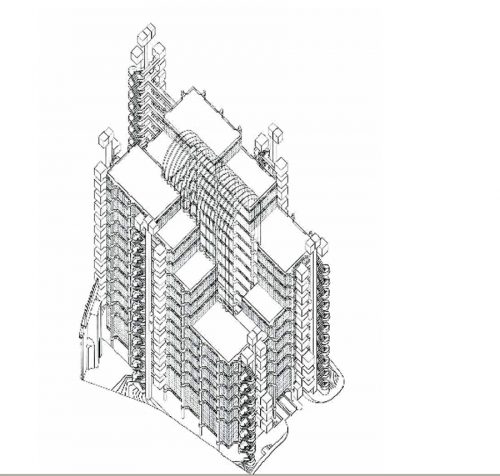
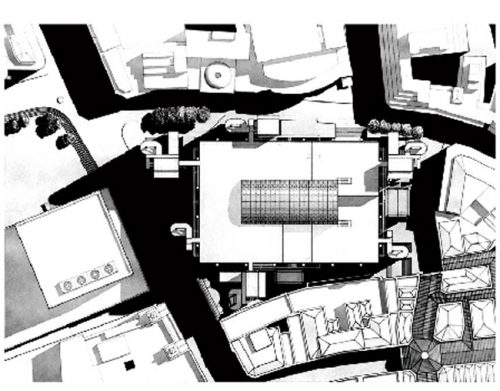
The Lloyd’s Tower, with its rectangular main body, was born in a trapezoidal plot, the remaining space between the margins of the plot and the plant’s central building are occupied by six towers. The highest tower is twelve floors and adjacent buildings are higher, the tower is six lower floors and adjacent buildings are lower.
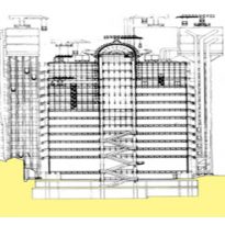
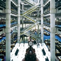
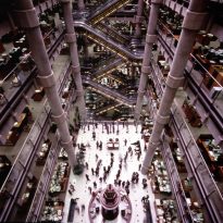
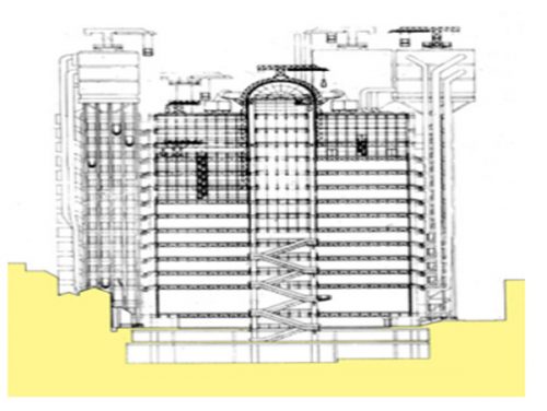
The building has three towers and three main services, grouped around a central rectangular space, which forms the focal point of design. In this vast and central atrium space, the entire height of the building, is located on the first floor of the huge room are responsible for assessing financial risks (Underwriters).
60m high and has 14 floors which are located in the administrative offices and those of insurance brokers (Brokers) are looming in this central space.
The first four floors are open to balconies and the rest are closed with glass overlooking the central chamber.
Internal Atrium
While the six towers are the most susceptible, the main focus of the building is at work inside, the internal atrium.
This is the hub around which all activity revolves in a series of galleries.
Floor
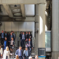
The ground floor houses public spaces: restaurant, cafe, shops, library, etc.
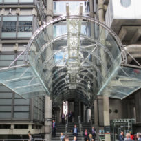
At the entrance there is a distributor for the six blocks.
Its focal point is the great assurance rooms on the ground floor, which houses the room where is placed the famous Lutine Bell. Campana caught in battle during the eighteenth century to the ship La Lutine. It is rung to announce general news, bad news for a tañido, twice for good. Tanires was formerly a boat when the company arrived at the port
The great hall of the negotiations, the Room, located in a share +2.50, is connected directly with the various plants by moving stairs.
Facilities
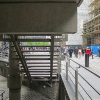
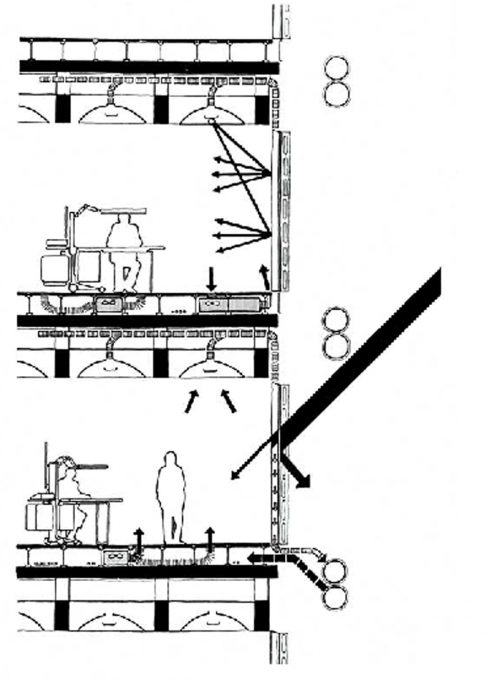
The facilities of the building as bathrooms, kitchens, elevators, etc are located on the exterior of the building where they do not interfere with the work of business. More importantly, they are easily accessible from the outside and means that can be augmented or be replaced with minimum hassle and without affecting the space used for offices.
Vertical Connections
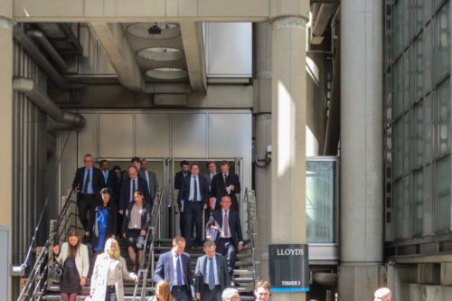
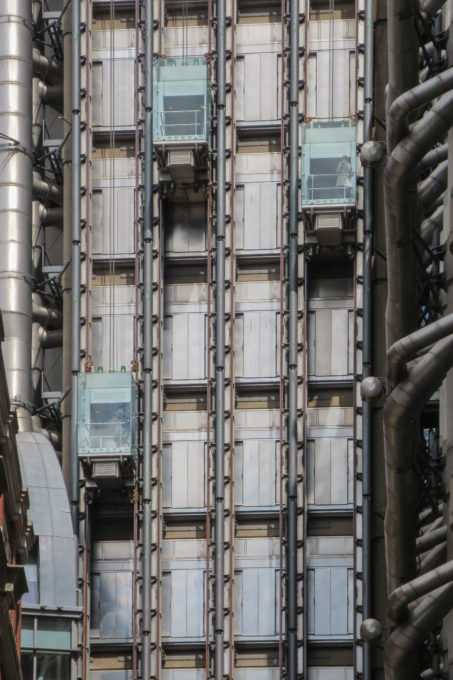
The functions of the complex vertical connections are made primarily with twelve completely external glass elevators, from which one can admire a panoramic view of the city.
Structure
Structure Portante
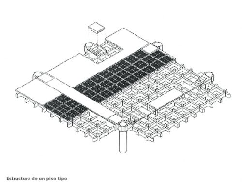
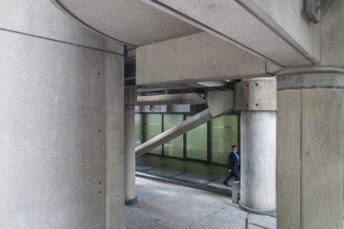
Main structure is made of reinforced concrete cast in situ cool, main pillars of reinforced concrete, other steel structures.
It was designed with the possibility of vertical expansion..
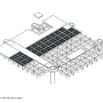
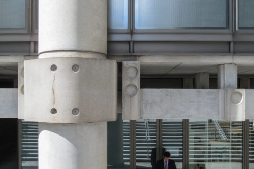
The structure of the towers is made up of pillars, beams and slabs, all prefabricated elements.
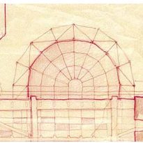
The important technological component of the work places it among one of the monuments of the British high tech, despite the fact that if you look carefully throughout the facility, the central barrel vault is shown as a clear reference classic
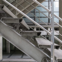
Placed a system of mechanical scales that connect the first four floors starting from the central chamber. To the rest of the floors are accessed by 12 lifts located on the outer surface of the building.
Materials
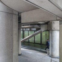
The core and perimeter towers are made of reinforced concrete
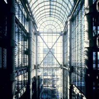
The body of the central building has a few pillars modulated mesh 10.80×18 m, and is encompassed within a system of independent coating stage, represented by three layers of special glass with a layer ventilated.
The triple-glazed outer skin of the coating acts as a tube of air from the ceiling to the floor.
The coating has sandwich panels of stainless steel flame retardants.
The building needs continuing operations and maintenance of equipment that uses technology that has to be replaced is hardly outdated.
Lloyds is one of the finest examples of architecture of high-tech British and has been described as “La Catedral mechanics”
Hidden between the glass and steel appears unexpected quarter, at the plant 11, the fourth Wooden Classic-coffered “Italianate Adam.” Used by the council of Lloyd, was designed by Robert Adam in 1763 and was originally the dining room of the home until Bowood that Lloyd was brought piece by piece.
