Lipstick Building
Introduction
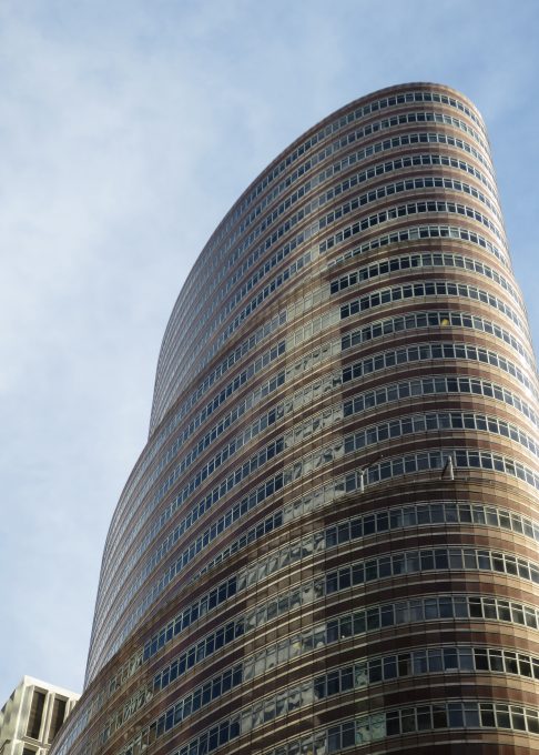
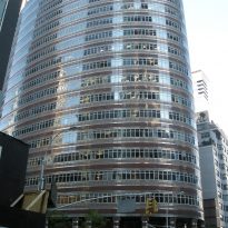
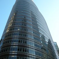
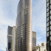
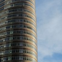
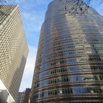
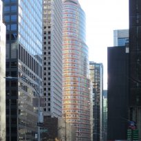
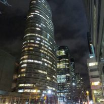
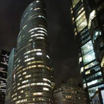
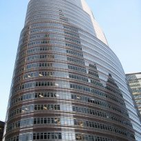
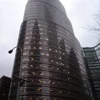
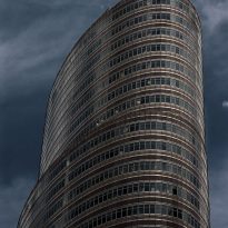
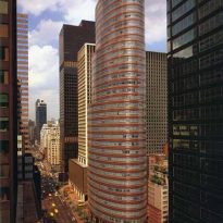
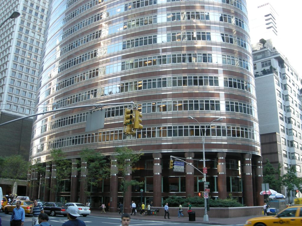
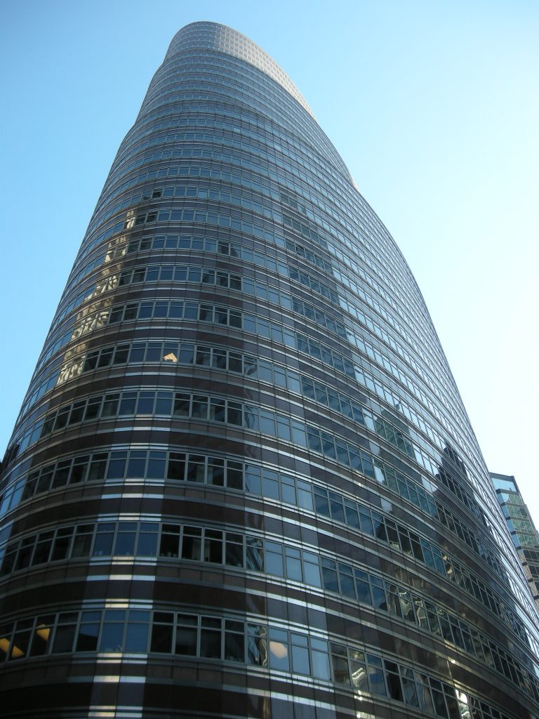
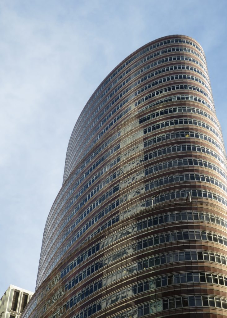
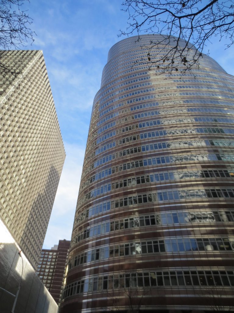
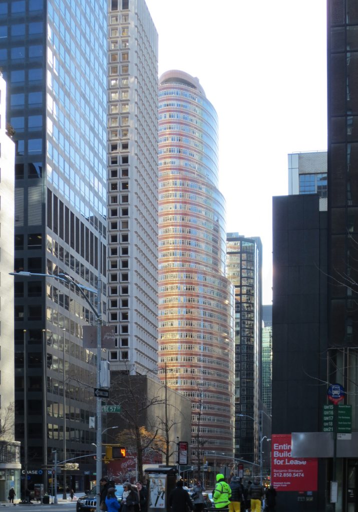
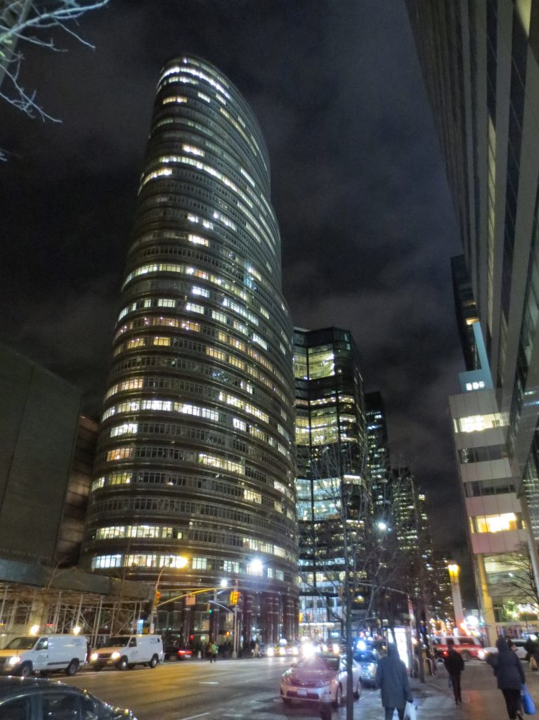
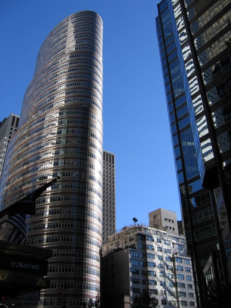
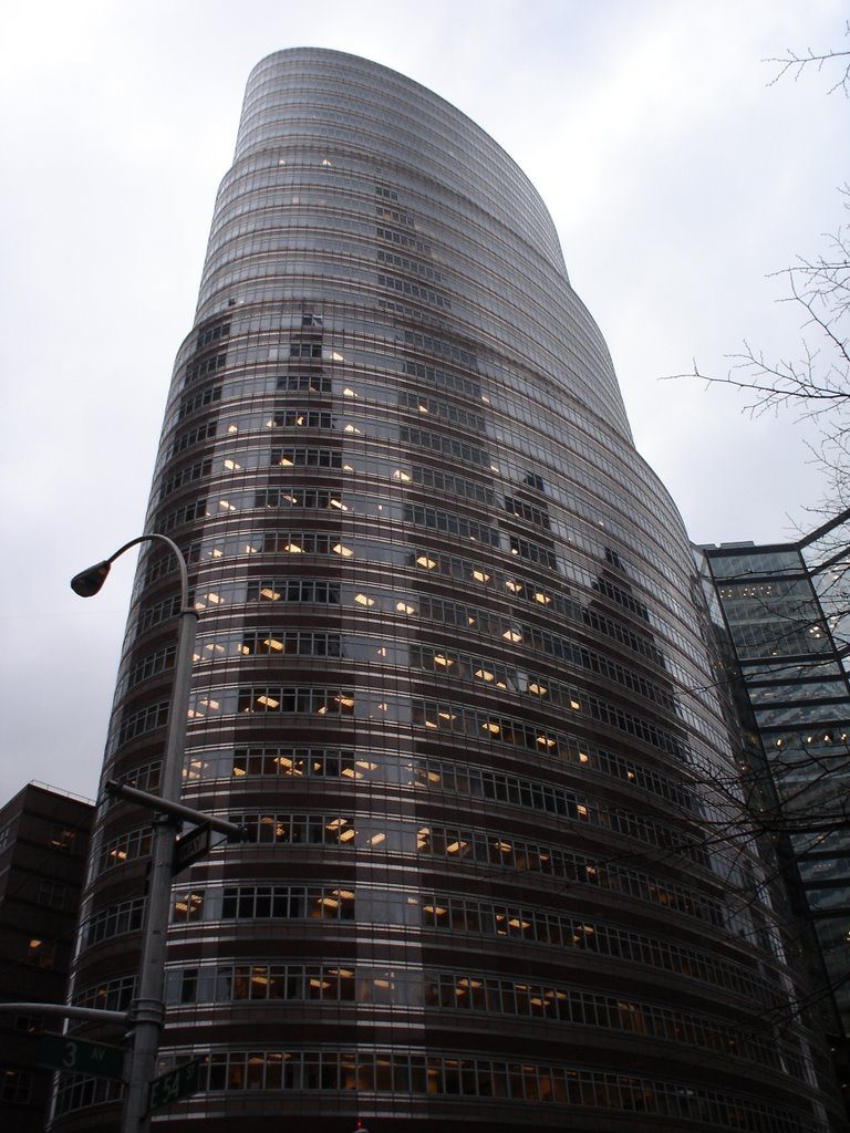
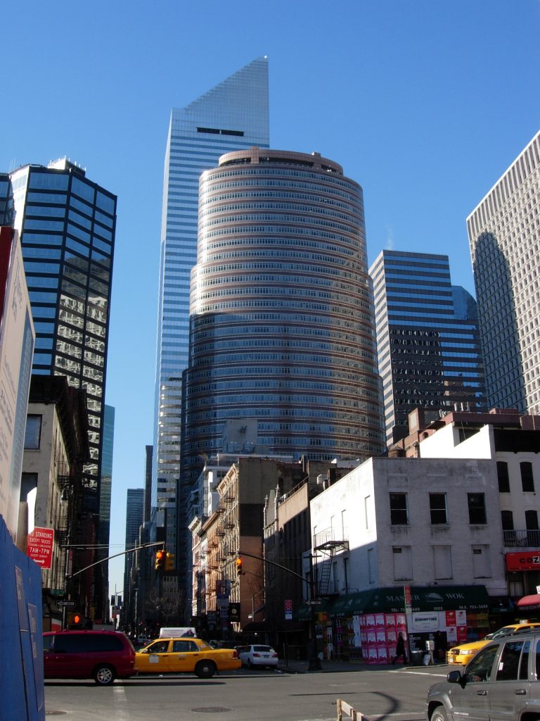
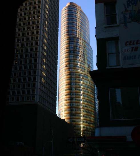
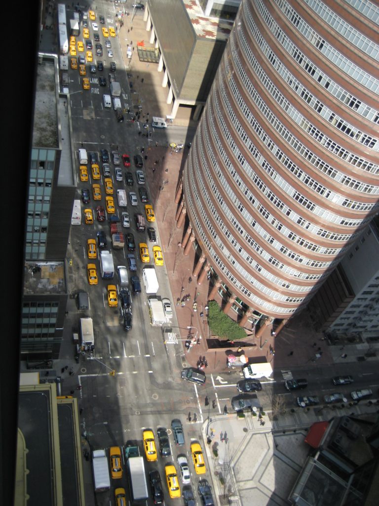
Designed by Philip Johnson and John Burgee, this building, officially named “53rd at Third”, is popularly known as The Lipstick Building due to its elegant elliptical shape that sets it apart from neighboring structures.
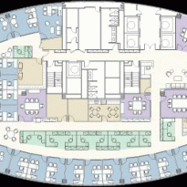
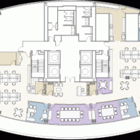
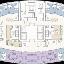
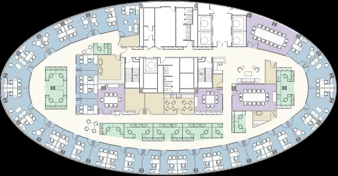
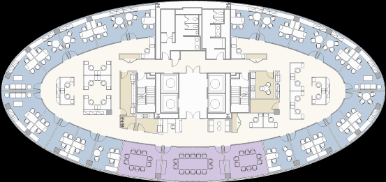
This represents architect Philip Johnson‘s second post-modern contribution to the Manhattan skyline, following the AT&T building completed only two years earlier. The unusual shape, which has since given the building its nickname, was a requirement from the property owner to make the building appear to lean outwards, offsetting the then less-fashionable location on Third Avenue. The elliptical shape also means that all offices located on the perimeter of the floor are “corner offices,” one of the most coveted placements in any office building.
Location
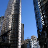
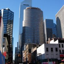
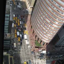
The Lipstick Building is nestled among the rectangular blocks of Midtown. Its exact address is 885 Third Avenue, between East 53rd Street and 54th Street in New York, United States.
Concept
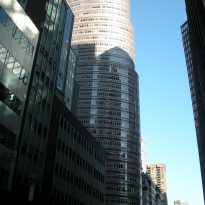
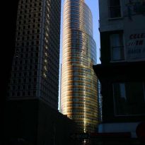
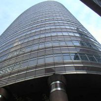
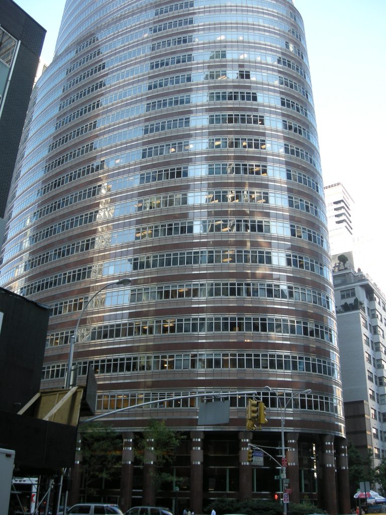
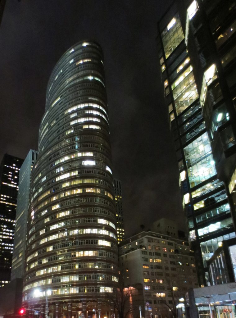
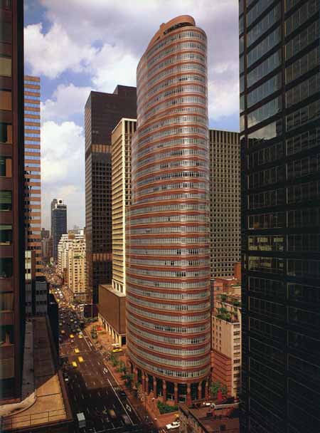
The 138-meter tall building is made up of three oval cylinders stacked upon one another, decreasing in size from bottom to top. This design creates a building that appears to lean away from the bustling Third Avenue as it ascends, thus adhering to the city’s urban regulations concerning volume, street light occupation, and space for pedestrian circulation. Its oval base also covers less ground area than a conventional square-footprint skyscraper.
According to the architect, the building’s elliptical columnar perimeter is reminiscent of the Baroque era when this shape was in vogue. Yet, this might not be the first observation of a casual visitor.
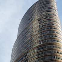
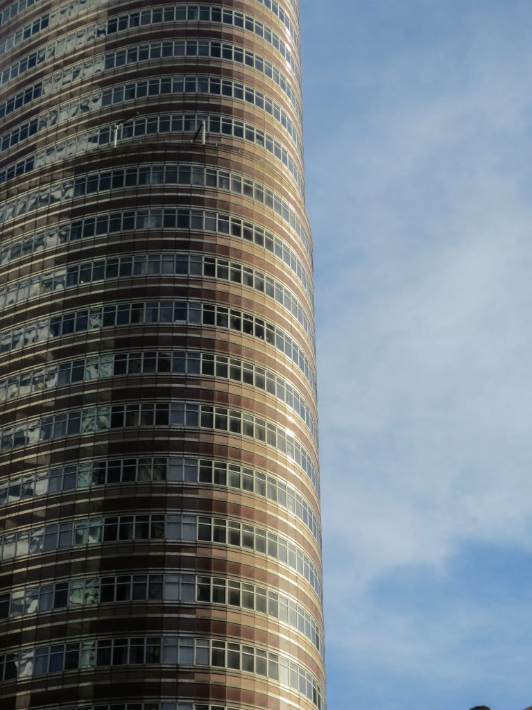
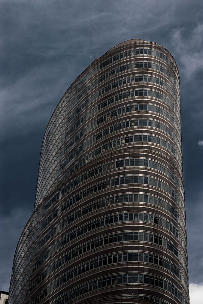
The elliptical shape of the floor also ensures that there’s no distinction between offices located on the perimeter, as, by definition, an ellipse, belonging to the circle family, has no vertices and thus, no corners. This shape, combined with the building’s diminishing floor size as it ascends and its reddish hue from the granite coating, led New Yorkers to dub it the “Lipstick Building”, a notion not originally intended by the architects.
Spaces
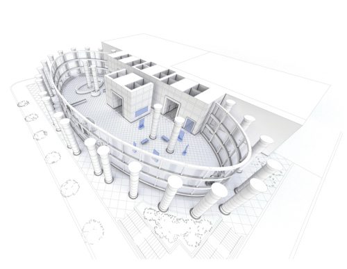
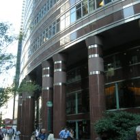
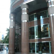
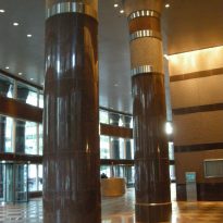
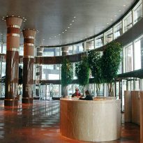
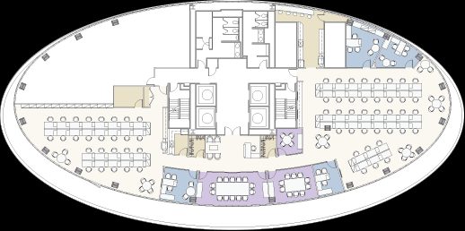
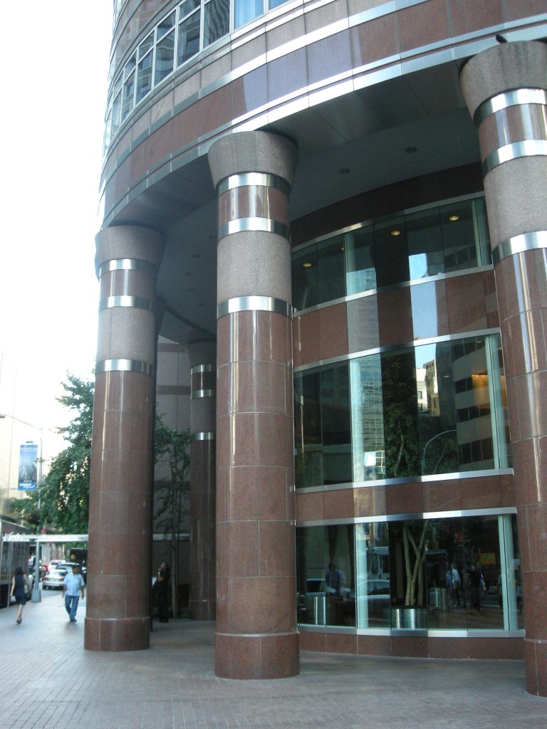
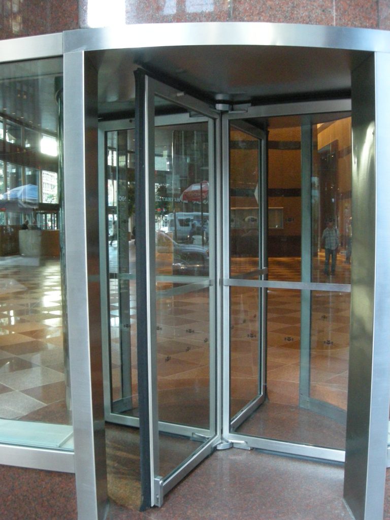
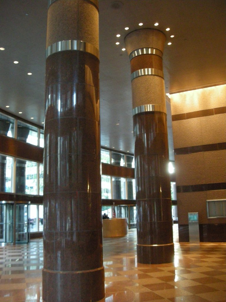
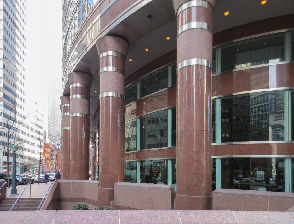
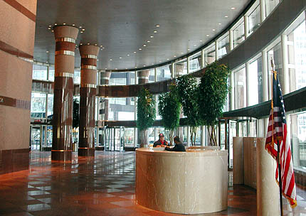
Upon entering the building, visitors are greeted by a vast, strikingly hollow, 9-meter high lobby, surrounded by columns. This design is possible because the elevators and emergency stairs are located at the back rather than the typical central position.
The lobby, aside from welcoming guests, houses several kiosks and a café officially named the “Lipstick Café”. The remainder of the building is entirely used to accommodate a variety of company offices.
Structure
Given the building’s height and unique shape, a steel framework was chosen to bear and distribute loads down to the foundation.
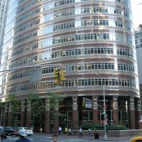
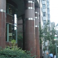
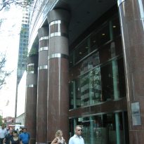
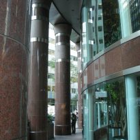
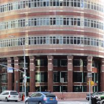
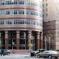
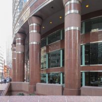
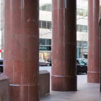
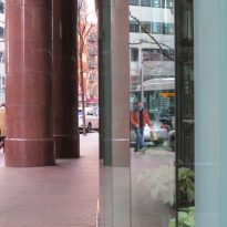
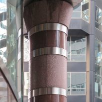
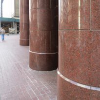
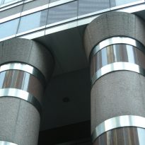
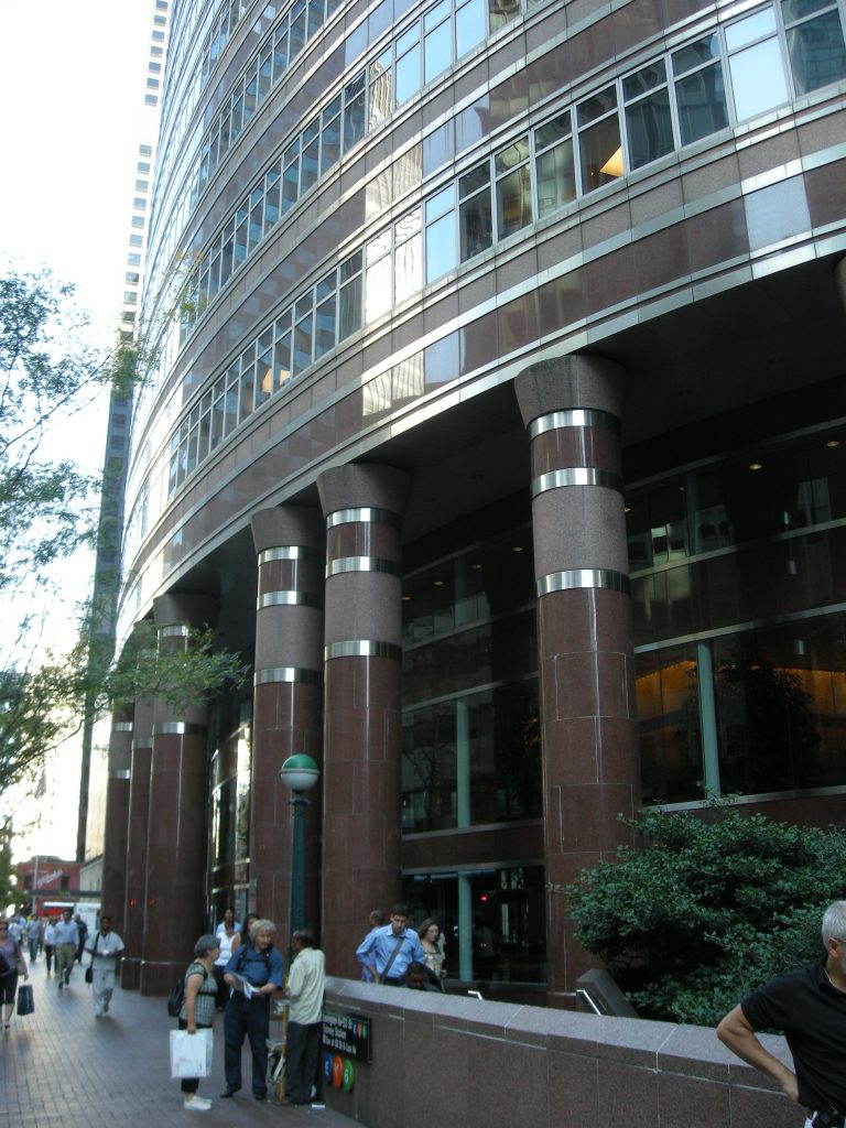
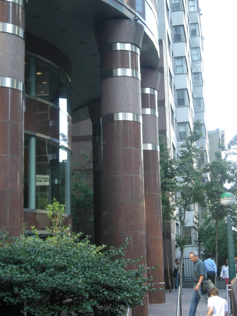
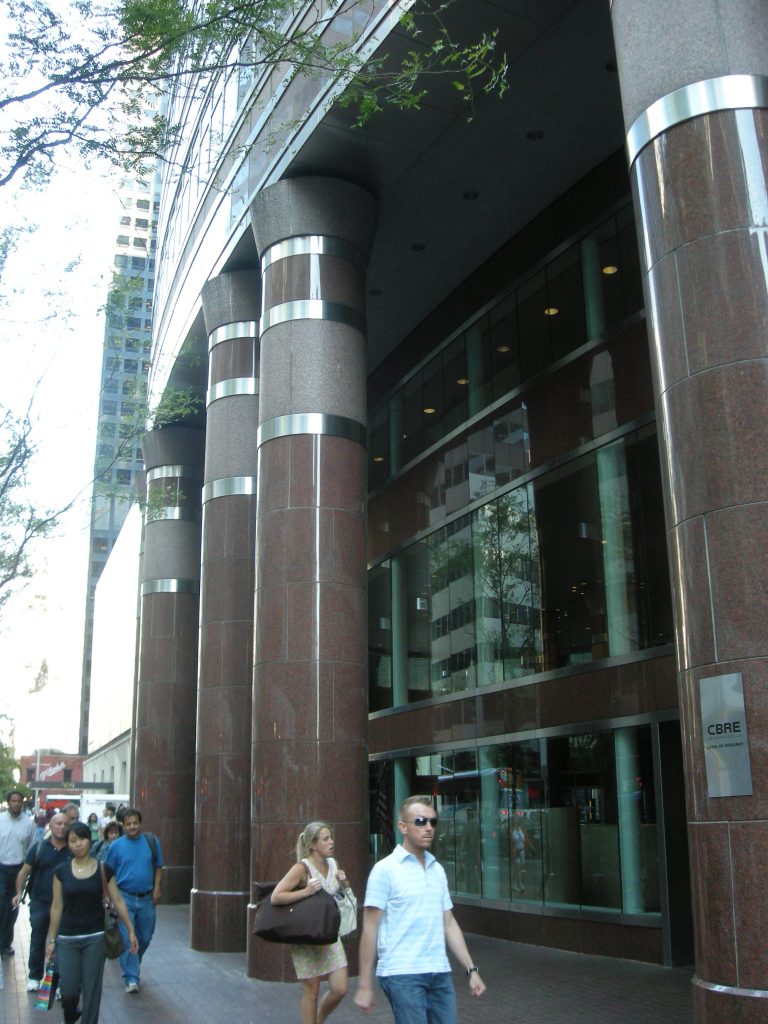
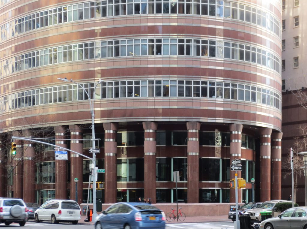
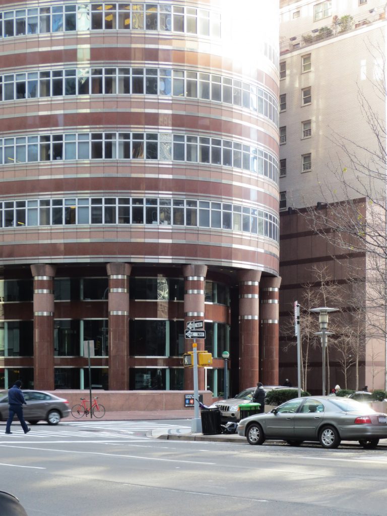
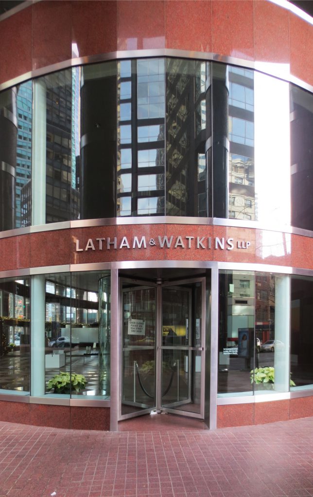
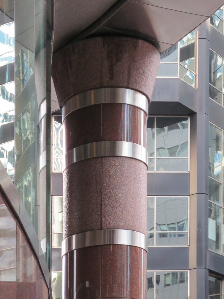
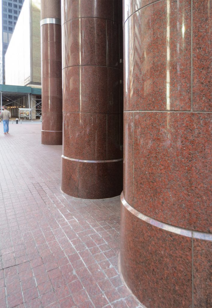
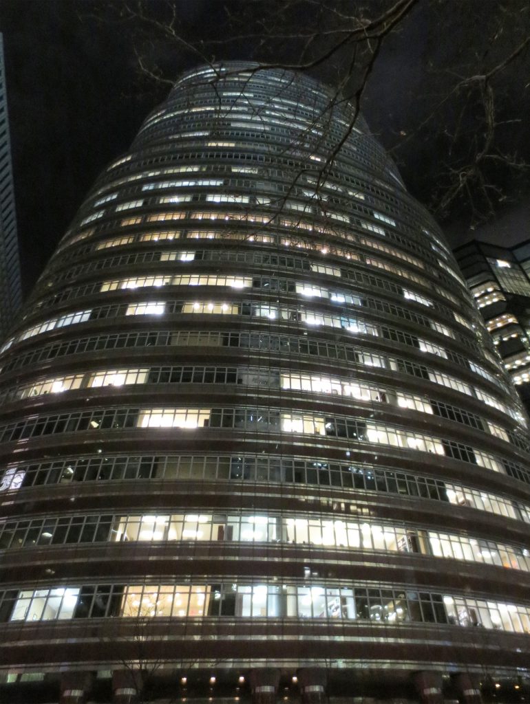
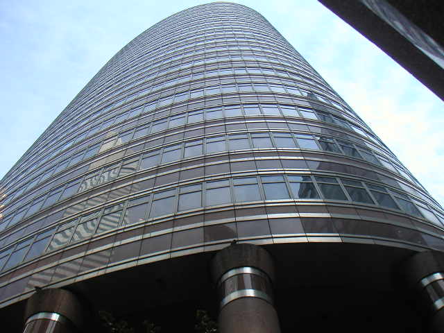
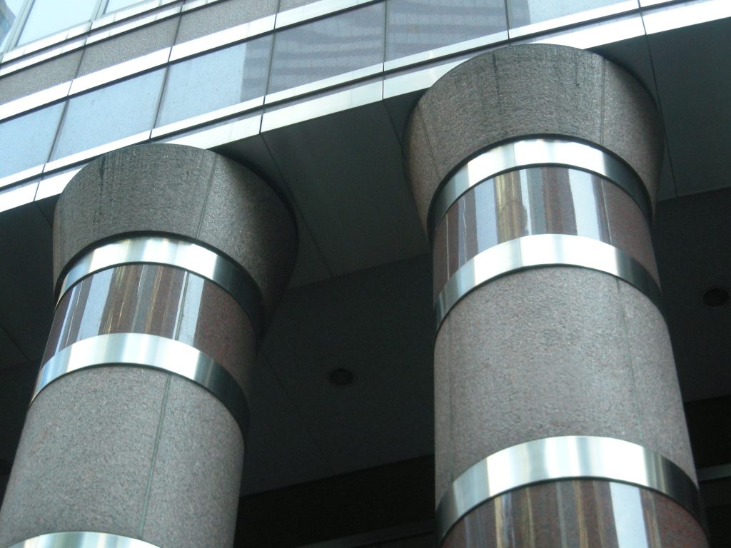
Positioned among rectangular blocks, its oval outline rises in three stacked sections, resembling an extended lipstick tube. The building rests on a series of elliptical columns clad in red granite. These columns are paired along the ellipse’s major axis and singularly spaced along its minor axis.
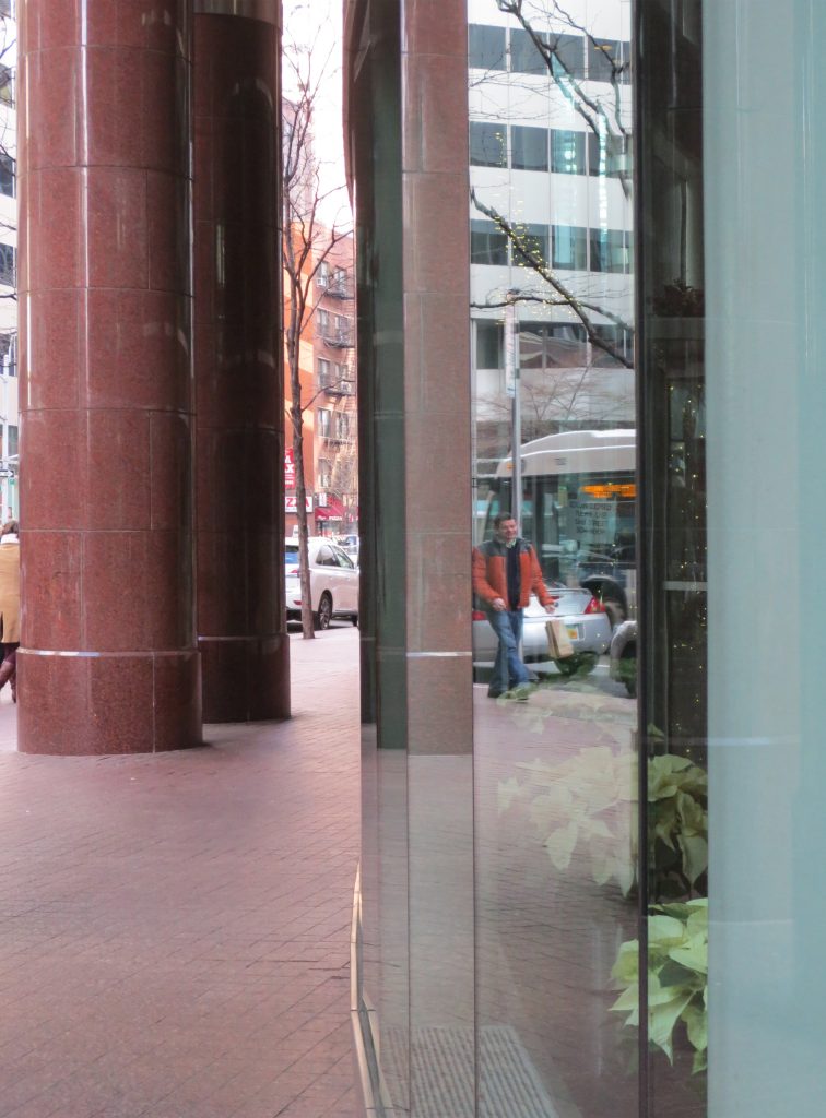
The building’s base floor is slightly smaller than the others, leaving a gap between the street-level facade and the columns that sustain the building, creating a perimetral gallery space for pedestrians.
Materials
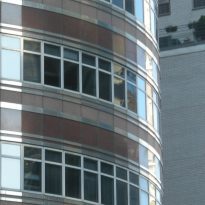
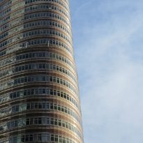
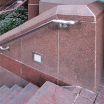
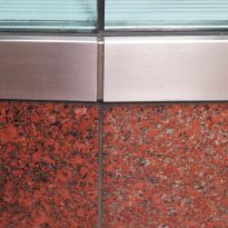
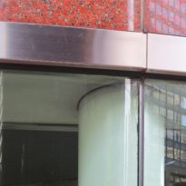
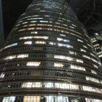
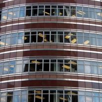
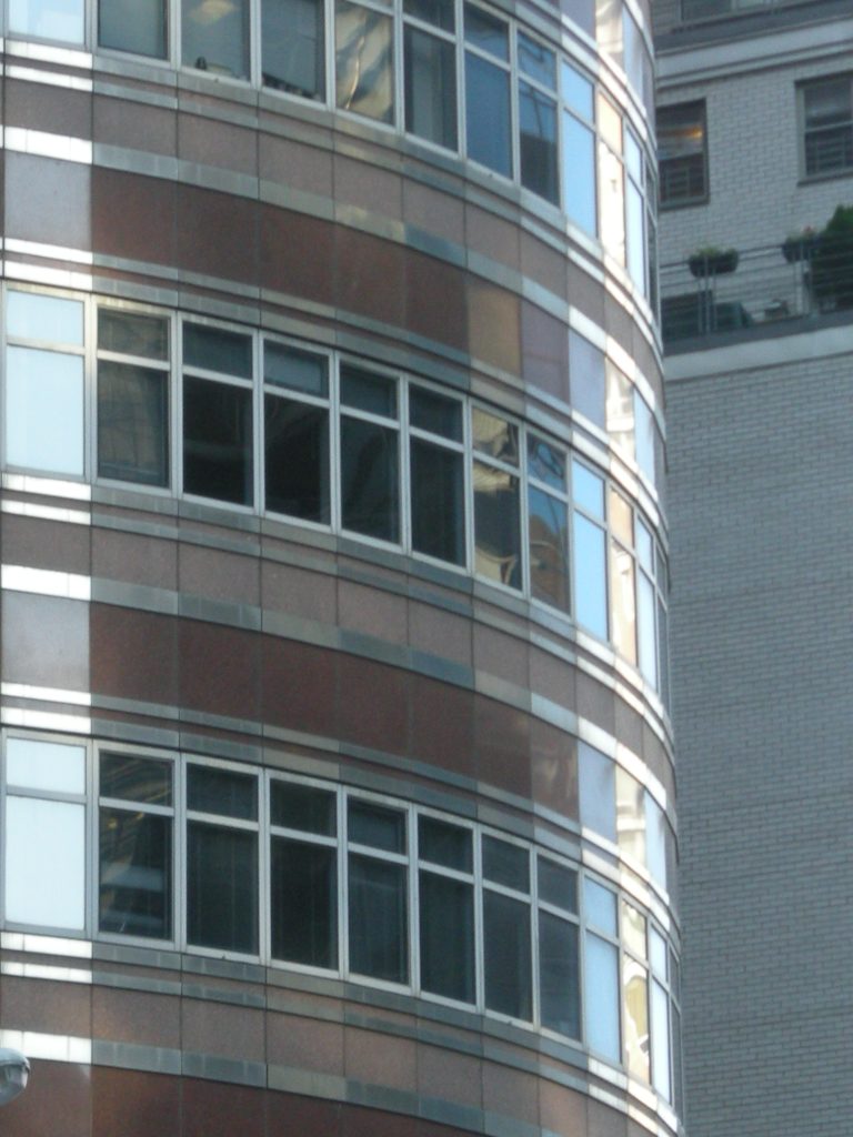
The facade of this 34-story building alternates between red granite and horizontal bands of windows, framed in aluminum and steel. The structure itself is made of steel and concrete.
