Lippo Centre in Hong Kong

Introduction
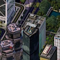
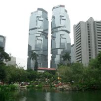
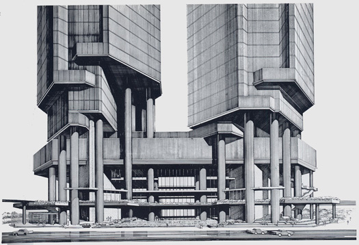
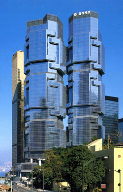
Lippo Center, originally known as the Bond Center (until 1988), was designed by architect Paul Rudolph in the port of Hong Kong.
In 1987, while still under construction, the building was purchased by an Australian businessman, Aland Bond, whose financial empire collapsed soon after being sold the building to the Lippo Group after the collapse of the Bond Corporation.
Description
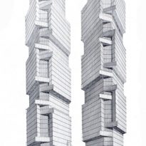
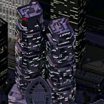
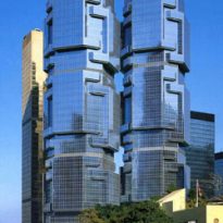
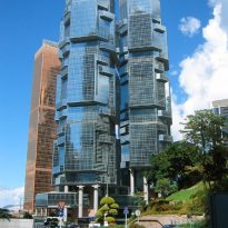
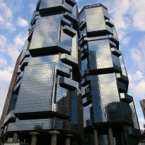
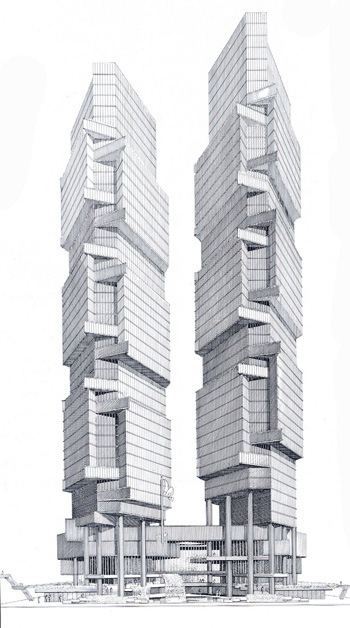
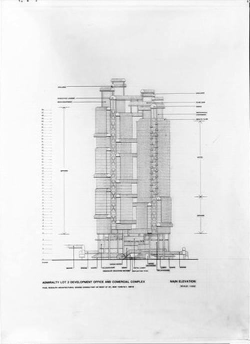
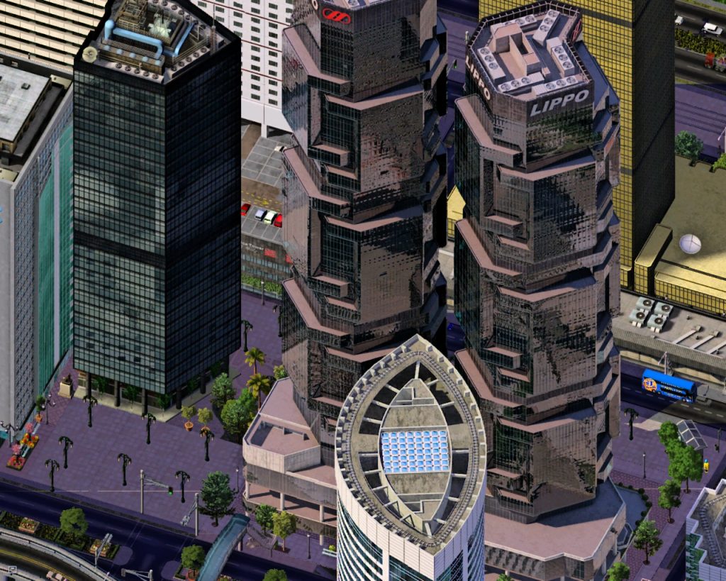
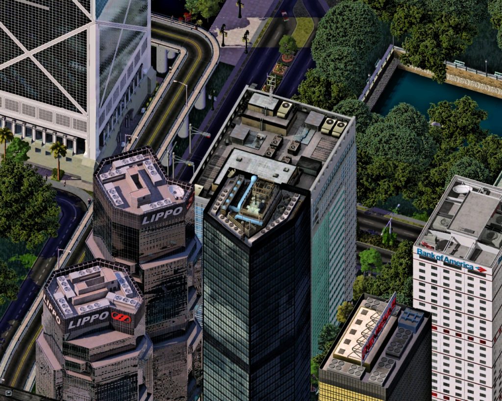
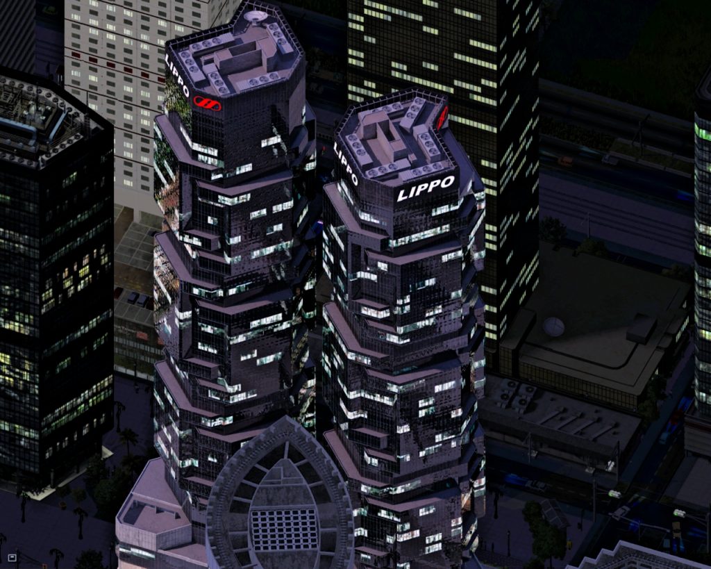
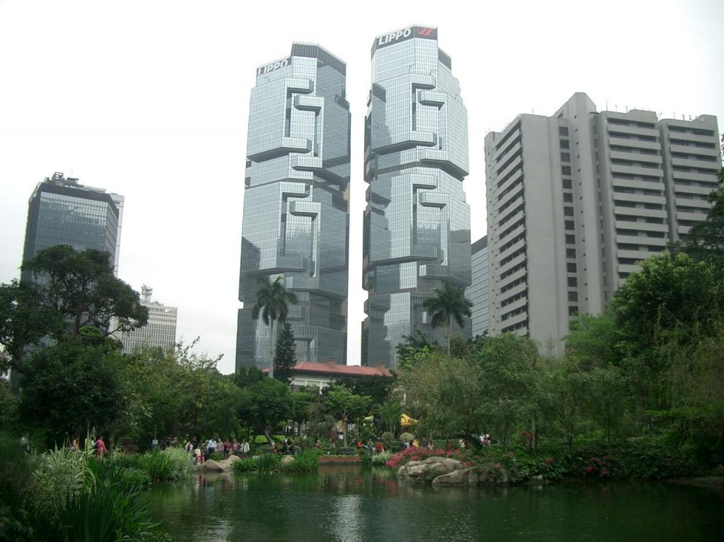
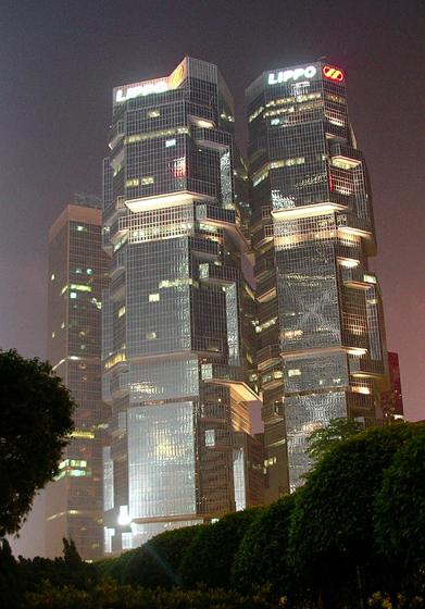
The Center consists of two similar towers but with different heights, following the likes of Rudolph who was not in favor of symmetries. One of the towers is 42 storeys high and the other 46.
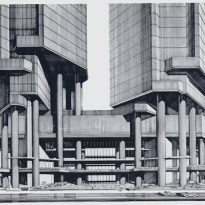
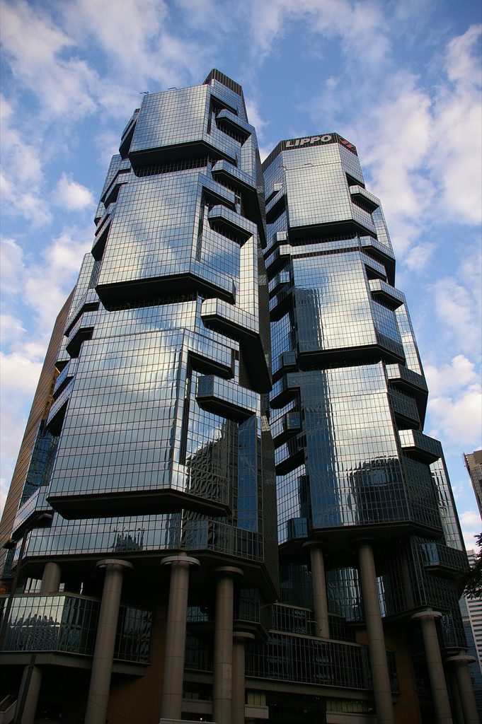
As in many of his designs, the base of the building consists of a complicated series of bridges and mezzanines, uniting the building and the city by elevated walkways. Rudolph comparing exposed columns of said base, raised to different heights, with hydraulic pumps that push the building skyward.
- High-level Walkways
Rudolph The project envisaged the two towers connected by a series of walkways in height, but one of the original owners opposed the project because it reminded him of his former factories in Indonesia. The basis of the complex were connected with bridges to the road, but in the case of Hong Kong, then the bridges connected the base of the towers with other surrounding buildings and a subway station, MTR, close.
- Podium
The Lippo Centre, as in most of the urban work of the architect, the building opens directly onto the street, allowing the driver or pedestrian gaze penetrates straight to the heart of the structure. The podium can be considered as a kind of urban exchange between vehicles and pedestrians, where the horizontal and vertical flow of traffic, from the streets, bridges, the subway station, towers, cross and re-align.
- Glass facade
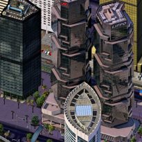
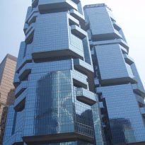
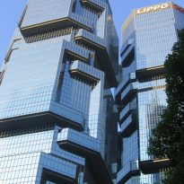
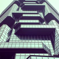
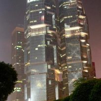
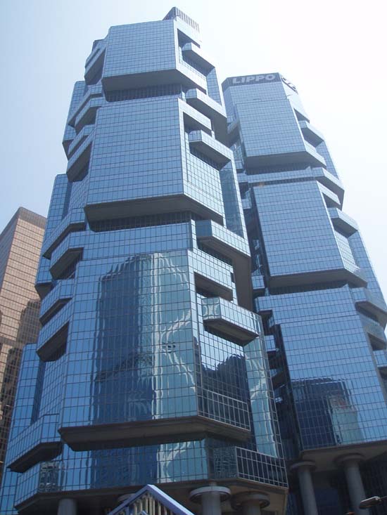
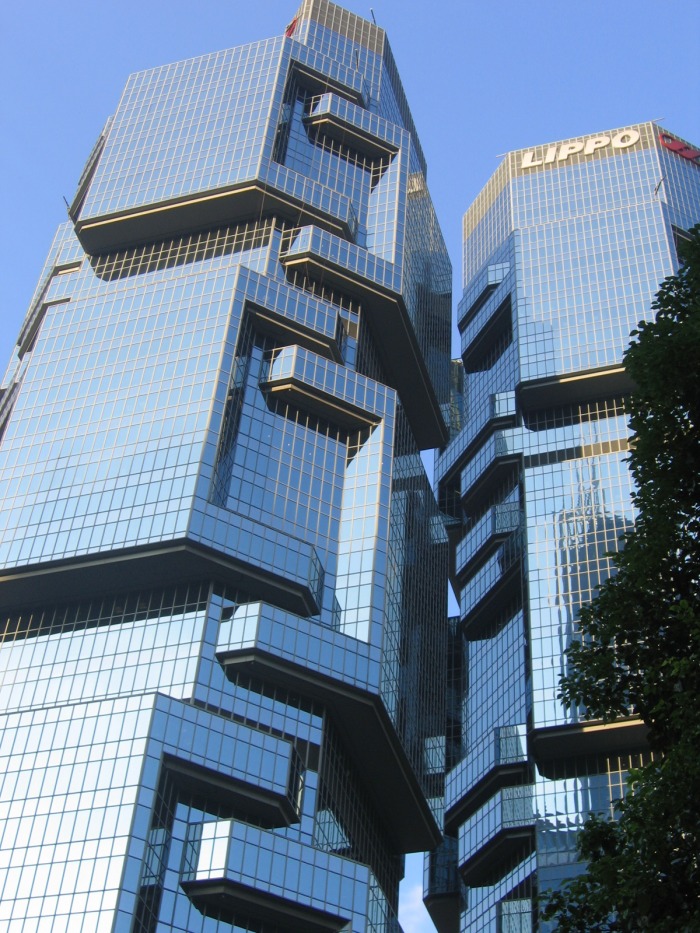
The towers are clad refractive glass dark blue and bright, a clear indication that Rudolph became interested in integrating within the local context, and that his works usually avoid bright color or any details that hide and conceal the structural elements gridlines plant, all elements that give a sense of scale buildings.
Status
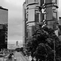
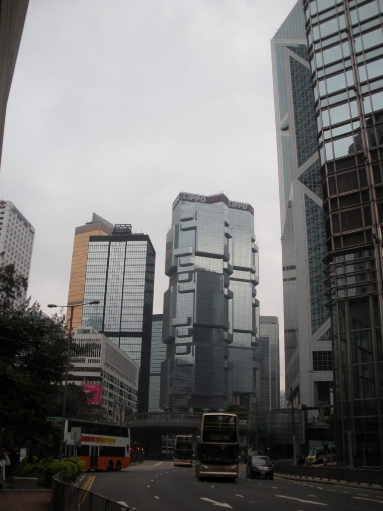
Lippo Center has a difficult access for pedestrians because of its location on a narrow plot surrounded by busy roads of the island, yet enjoys a prime location in the Central district, with excellent views of the nearby Hong Kong Park.
The buildings are located on Queensway Avenue, the main artery connecting the central business district with the emerging business district of Wanchai eastward in Admiralty Island Hong Kong, China.
Construction details
Plant
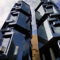
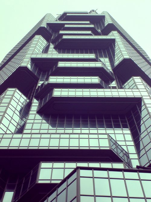
Both towers are octagonal, with four long sides and four shorter. In order to develop the axis scale that would support the glass curtain façade of the towers, the architect created projected plants, located alternately and buildings that give the appearance of hands holding each of the towers. These projections articular create best views in the corner offices do, “Breakfast in Heaven”, and made the building were locally known as the “building koala” (Koala Tree Building), and recalling the position adopted these friendly animals to climb trees.
Lippo Center is based on a plane which is largely symmetrical along an axis that crosses the north-south complex between the two towers. The main entrance is along this axis, in a four-storey podium.
Pattern
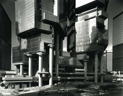
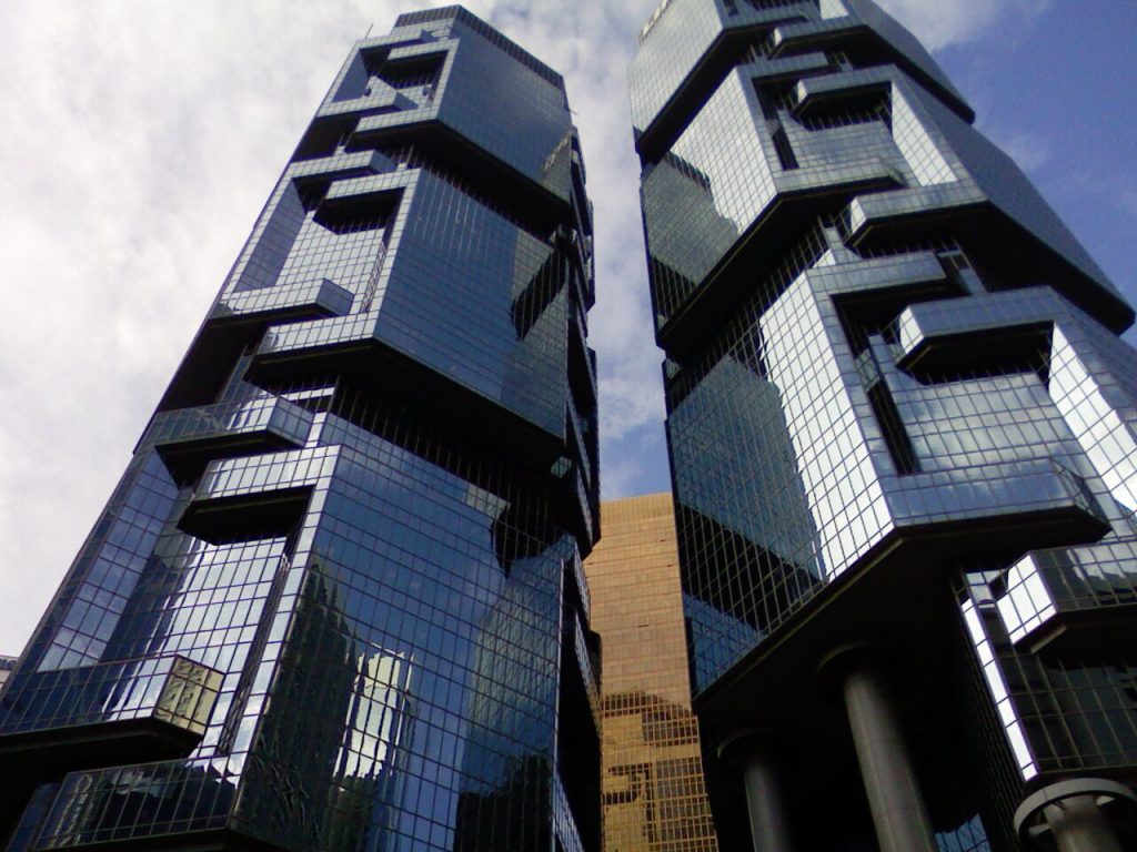
On the podium, to each side of the axis and two of the eight sides of the bases, rise almost symmetrically in columns. As rise towers, a number of floor plates extend slightly beyond the building structural columns projecting ahead of them.
This pattern, though similar in each tower, starting at different heights in each of them, creating a complex pattern on the outside where the projected elements are coupled to each other like a Chinese puzzle that goes up by the towers and make moving composition.
In the first design schemes, this movement is reduced by limiting the elements on top of the structure, the conference room and mechanical equipment covered thereby towers have a constructive aspect just slightly truncated due to the elimination of these parts at the beginning of its construction.
Spaces
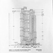
The approximately 121,000 meters square Lippo Centre, are divided into two office towers. The tallest tower, known as Lippo Center 2 to 172 meters, has 46 floors and the lowest, Lippo Center 1 to 166 meters, 42.
At the base of the two towers down a four-storey podium that houses a large atrium and a shopping area.
In the base complex, also built a car park for 35 vehicles loading and unloading
- Main entrance
The pedestrian entrance is made up a generous staircase leading to a three-level lobby between the two towers. In the second level of the podium elevated route allows pedestrians walking by oak of the traffic on the road below.
In the center of the horizontal volume that makes up the podium are vertical circulation elements, stairs and elevator cores of both towers, plus a battery of roads and ramps that allow vehicle access. The result is a wide range of public and semi-public spaces, whose shapes and lighting lead the visitor through the passages tablets and low light of the periphery of the building until you reach a large carrying space and light in the center.
- Bridges
A bridge connects every corner of the podium with aerial steps adjacent buildings. These footbridges, very fashionable in the 1960s and early 70s, have lost over the years, popular with many American architects and planners, for allegedly remaining life activity and sidewalks traditional view with Paul Rudolph who disagreed. In his opinion, these steps represent another layer air in cities and enclosed the potential to become powerful tools with which to develop cities in a much more three-dimensional.
Structure
Although the structure is necessarily speculative obvious repetitive and common in any modern office building, at the base and creates a fascinating complexity atrium compensates the simplicity of the rest of the plants
At first glance the structure developed seems very complex, but Rudolph preliminary sketches clearly reveal his passion for the work done by complicated three-dimensional patterns, in a way never arbitrary, always based on a limited number of different movements, with simple geometric forms underlying. With this system the architect has tackled a problem that has puzzled many of the designers of the twin towers that populate many Hong Kong.
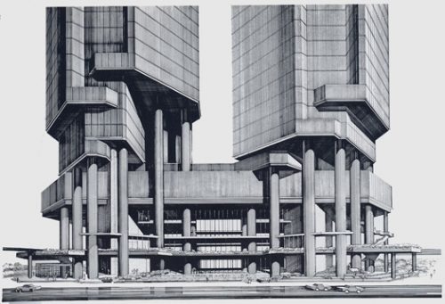
The monotony of the same or completely towers and rising chaos accompanying the attempt to create different designs for each unit, the towers that form the Lippo Center are different but clearly from the same family, as twins.
Another dichotomy that occurs is the apparent difference in scale between the building seen from the sidewalk and towers seen on the horizon. Avoiding a brutal rupture between these two scales was an obsession of Rodolfo in all large urban buildings. Approaching the Lippo Center along the Queensway, the visitor immediately senses the interaction between the four-storey podium, whose scale is custom built cars and pedestrians on the street, and towers. Set back from the street wall, became diagonal, and became huge columns that rise beside the podium and cross it.
The transition from the podium at the street, and the towers, at the horizon, is done by the penetration of large circular columns of the towers on the foundations of them, crossing the podium. These columns, which resemble huge pistons, strongly suggest that the building that stands on the heights also consolidates under the street, to be held in the basement rocks, providing a firm mooring towers.
Materials
In the construction of Lippo Center, have been used mainly steel, concrete and glass.
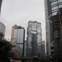
The choice of dark blue glass was not welcomed by his neighbors, who basically have used light blue glass, reflective black and even gold. This detail makes desataquen towers in the forest of skyscrapers in Hong Kong, despite being smaller than the towers that have grown up around it.
