Kunsthaus Bregenz

Introduction
A year after the completion of the Thermas Vals, the renowned minimalist architect, Peter Zumthor has completed the design of Kunsthaus Bregenz, Bregenz Art Museum.
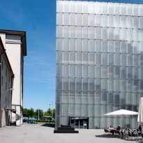
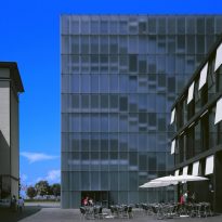
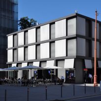
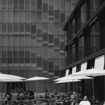
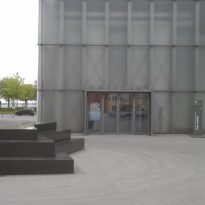
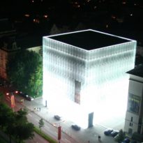
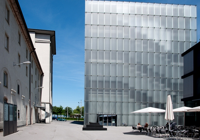
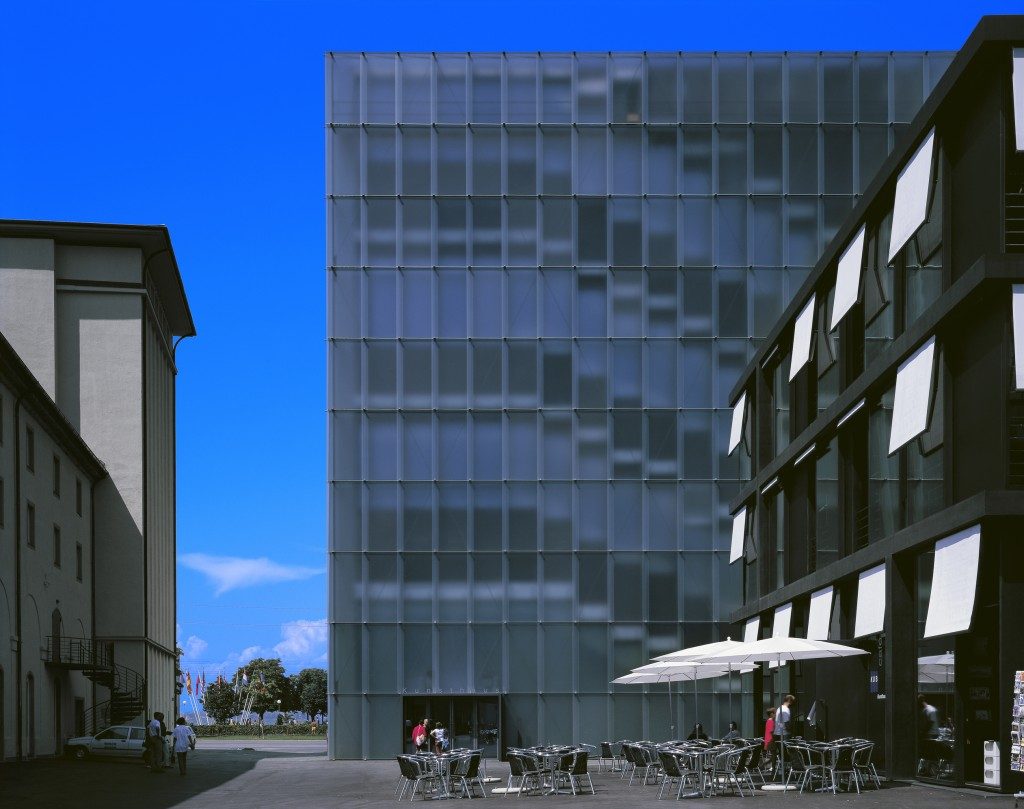
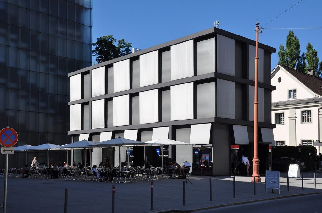
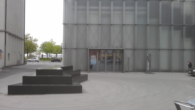
The contest held in 1989 asking for a conventional provincial gallery. Step by step, the special format for the Museum became a building of four floors and two underground areas. The exhibition building and the administration building framing an open square, which is closed to the south by the back wall of the exhibition hall, opens yet another side to the city. This square connects the Kunsthaus with the life of the city of Bregenz and is used in many ways. The cafe tables and chairs placed outdoors during the warmer seasons and often exhibits include outdoor events.
Peter Zumthor’s design stood out among others because it was the only design that proposed a square as an open urban space. All other work posed a densely built on the land available.
Together with the Spa, Art Museum Bregenz put Peter Zumthor at the forefront of architectural minimalism, as well as the dominant creative force in the discipline of architecture.
Location
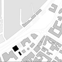
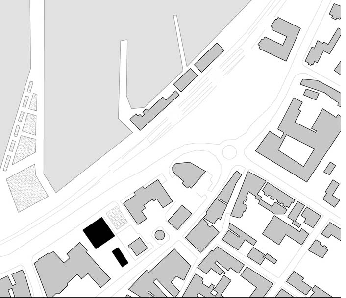
The building is located in Bregenz, in Karl- Tizian -Platz,on Lake Constance, the capital of Vorarlberg, the most western federal state of Austria, with Switzerland to the west and Germany in the northwest. The city is situated on a plateau with a series of terraces reaches the lake at the foot of the mountain Pfander.
Context
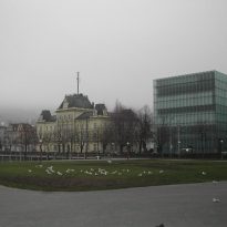
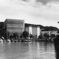
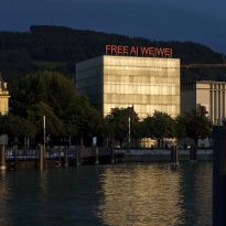
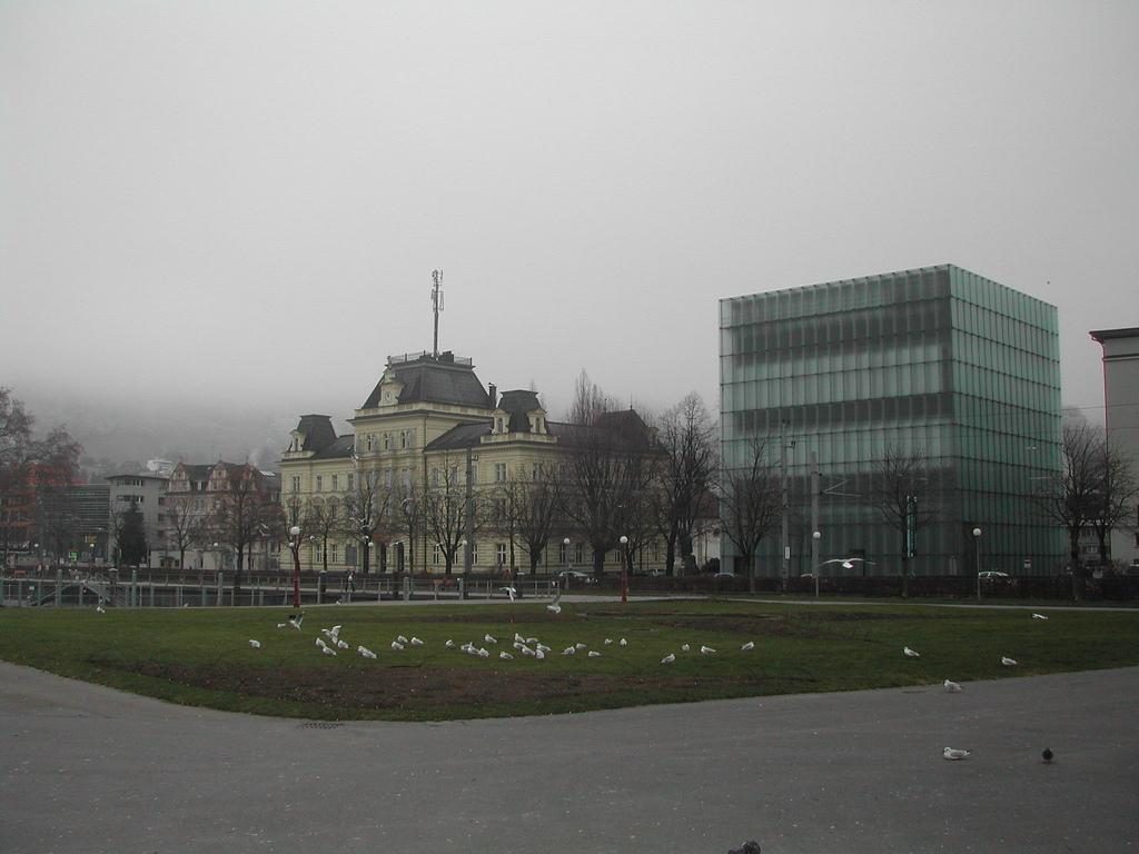
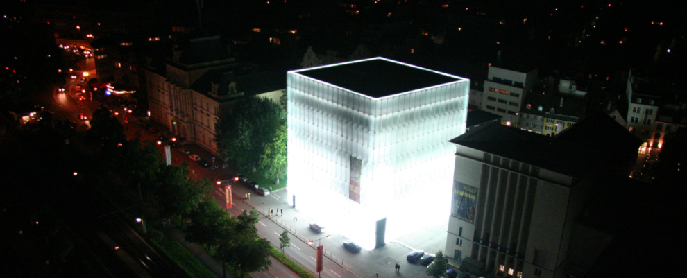
Within the urban context, the Kunsthaus Bregenz was conceived as a solitary building in a prominent location near the lake shore. Fill in the “Seestraße” between Vorarlberg Theatre and the main post office was empty for many years. The entrance is on the east side of the building facing the city. The administration building, located in front of the museum to the city center, acts as a transition structure in the face of smaller, low buildings in the old part of town.
Concept
The Art Museum Bregenz, is in a state of constant flux, changing its exhibition spaces to accommodate international contemporary art. Zumthor’s minimalist design adapts spaces for art on display in its exhibits creating a coexisting and redefining relationship between art and architecture.
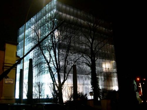
The Kunsthaus Bregenz has two main principles to their permanent collection: archives of art and architecture, a collection of contemporary art, which complements the changing exhibition spaces. The museum strives to be the intersection of art and architecture, culture and international influence is opened.
Description
- Spaces
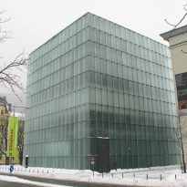
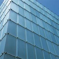
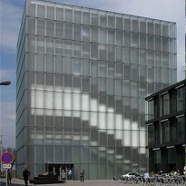
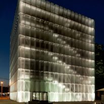
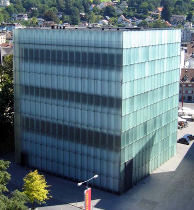
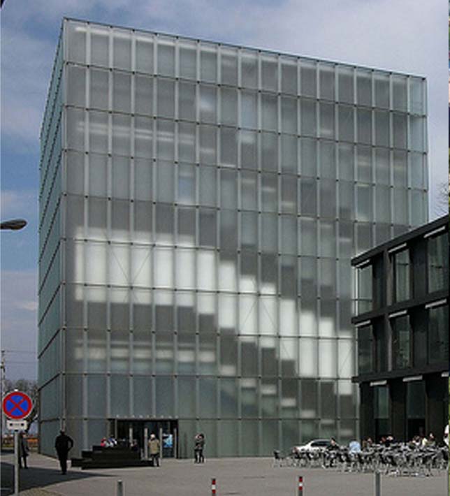
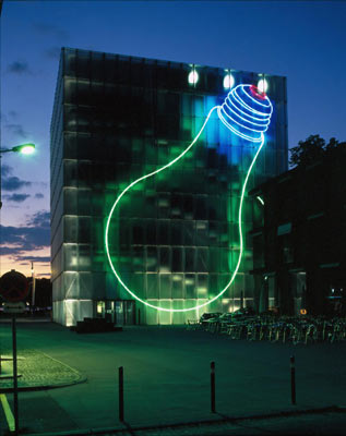
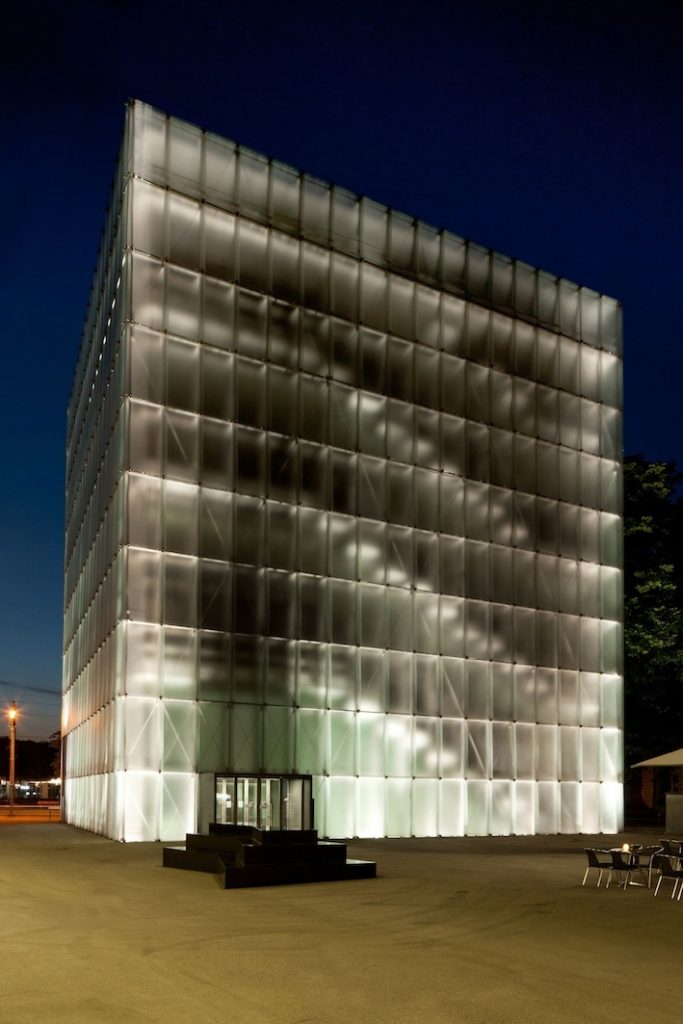
“… The building is made of steel, glass and a molded mass of stone cast concrete that gives the interior of the building with texture and spatial composition. From the outside, the building looks like a lamp. It absorbs the changing light of the sky or the foggy lake, it reflects light and color and gives an indication of its inner life according to the viewing angle, the light of day and time… ” Peter Zumthor
Zumthor has transformed the technical and rational solutions in sensual and poetic situations. The way the light shines against glass gives you a visual velvety texture. This softness continues inside, where the concrete surface is polished and smooth to the touch, and where accessory items such as frames and handrails are also fully polished or matte.
- Structure
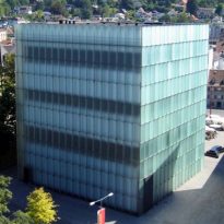
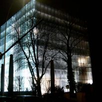
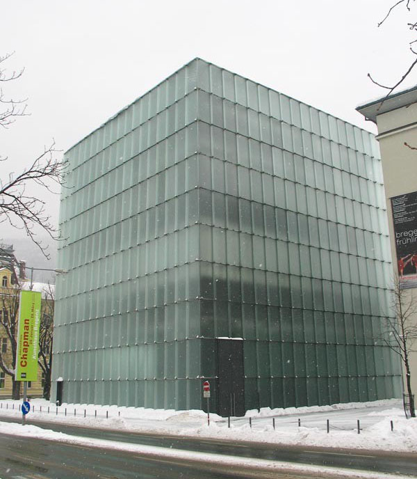
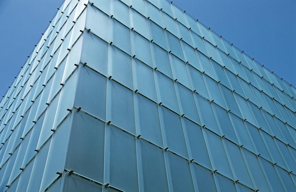
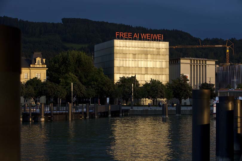
The minimalist structure stands as a light box that absorbs, reflects and filters light across the façade and throughout the building. Translucent glass and facades are illuminated externally by sunlight and inside by artificial light, becoming a dynamic part of the building as it reacts differently according to the light, time of day, the weather and the surrounding context. The light is captured by the glass facade filtered through a camera that captures and distributes through the gallery spaces. The camera creates atmospheric conditions within the gallery spaces that have a conditional relationship with the exterior, and vice versa.
Spaces
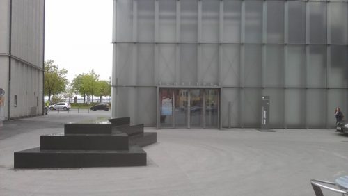
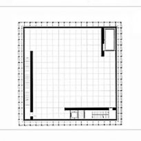
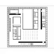
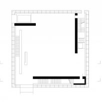
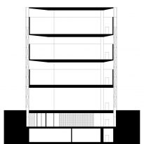
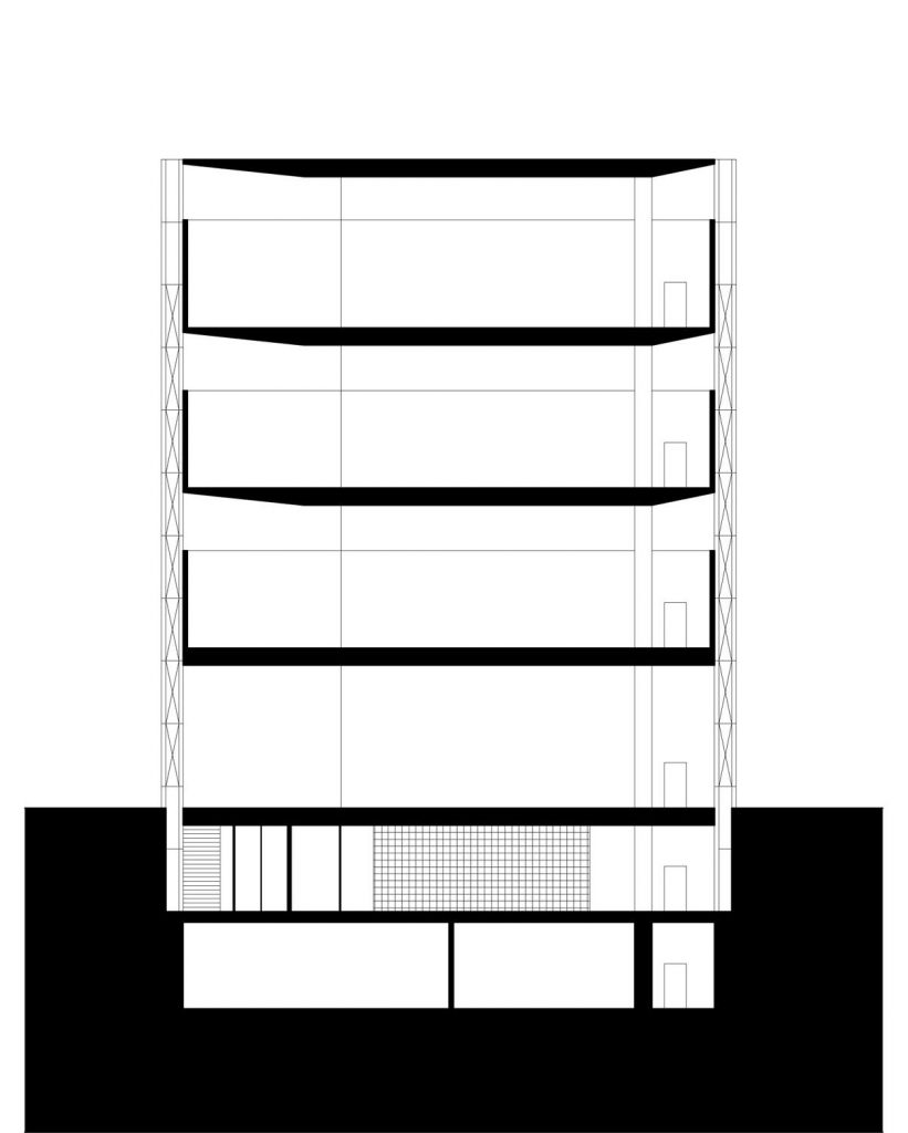
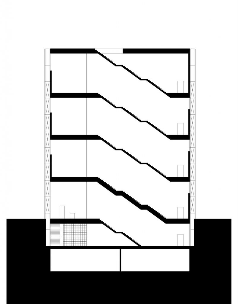
The project consists of two buildings, one housing the exhibition galleries with 6 floors, two underground and one of two floors, where the administrative activities, a cafe, bookstore and museum shop is located. The museum has 3,440 m2 of usable space, 26.57 x 26.57 x 30 m, the smallest building 540 m2, 8.35 x 21.57 x 11m.
Between the two buildings and an existing theater has created a new pedestrian square for the city. Located on the southeast side of the building exhibition, this square without vegetation opens onto a street of the old town of Bregenz, on the opposite coast is something. Sometimes exposures extend outside the building on the square and when the weather is good coffee also seizes this public space.
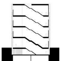
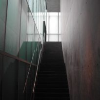
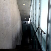
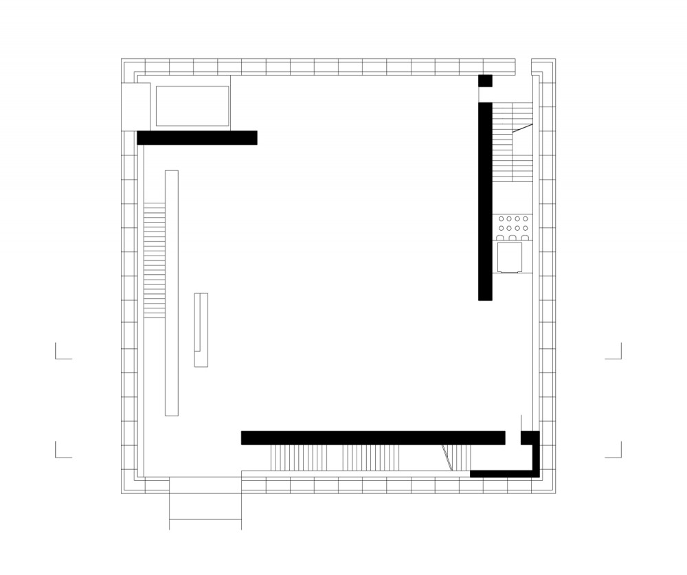
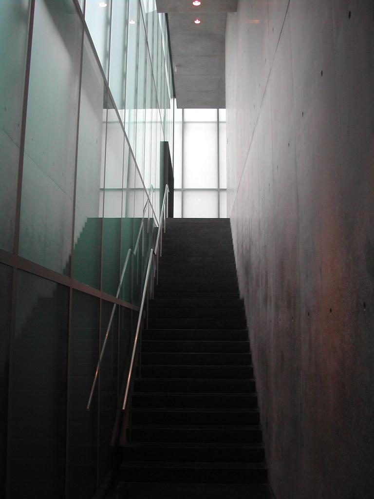
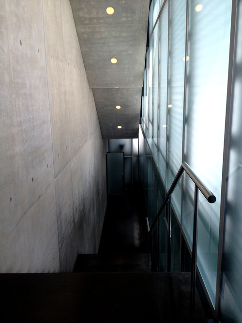
Inside the museum the visitor moves circularly or using the elevator to the top floor and then descending the stairs.
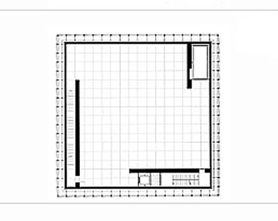
The circular pattern is the result of the structural configuration of the space. The floors are supported on three interior bearing walls located at the perimeters of the gallery. It is common for the curators of the museum exhibition divide each into three parts, following the organization of the building, while the formal neutrality of the spaces allows the institution to change the quality of each exhibition space.
Underground levels
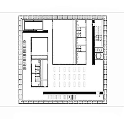
Due to daylight conditions, the first underground level accommodates spaces accessible to the public, such as a conference room and educational center of the museum, in addition to storage and maintenance rooms and sanitary facilities.
The second underground level, which is not accessible to the public, houses archives, workshops, cleaning room, also the electrical controls, heating and air conditioning.
Ground floor
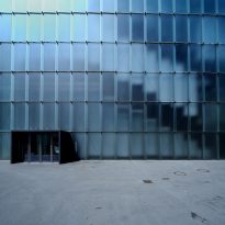
Beyond the entrance, we have a multipurpose room that is used as an entrance hall with wardrobe, table cashier location and various events. The exterior walls of the ground floor and the first underground level are etched glass from floor to ceiling.
The lobby offers a good view of the structural design of the Kunsthaus, was raised as a skeleton construction, ie no outer wall, the inner structural elements support the building. This special method of construction makes the free surface of the facade has a glass as complete as possible.
Higher plants
The top three floors of exhibition differ only in terms of ceiling height. The third floor, with the best daylight conditions, has a height of 4.70m, the second and the first 4.20m. The walls are concrete, trained with non-structural panels, to which, once dry, the frames were removed and cleaned gently with soap, were not polished. The floors are terrazzo and concrete cast polished.
Galleries

In the exhibition building there is no more openings than the front door and the emergency exit.
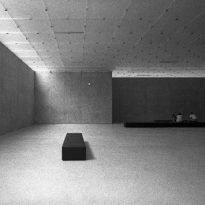
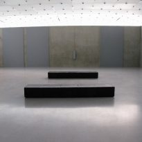
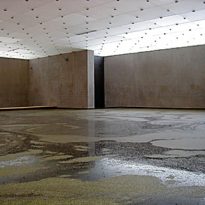
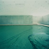
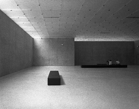
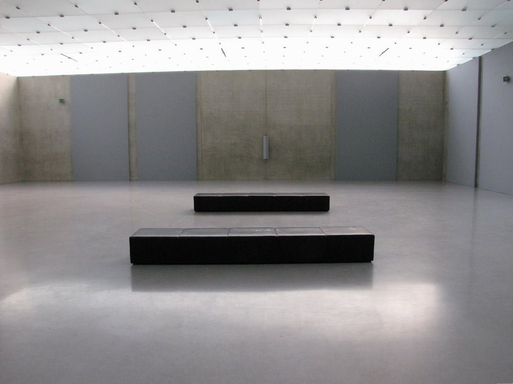
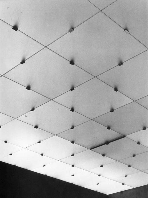
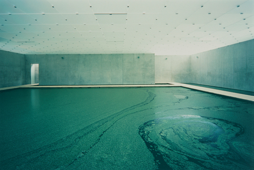
The interior of the museum complements the exterior simplicity and minimalist aesthetic. The gallery spaces are composed of materials with minimal designs, but very effective in the details and atmospheric conditions. The walls and floors are polished concrete and the roof, which filters the light from the camera’s ground glass.
The basic materials of the interior give the gallery spaces marked feeling of coldness, worked to accommodate and enhance the work of art in space. When light enters through the chamber, the polished concrete seems to dematerialize and diluted, allowing the closed galleries are flooded clarity.
The interior works as a fusion of art and architecture that although extremely different in materiality and composition by mixing and combination of diffused natural light and neutral palette of materials create a coherent union, a museum of contemporary art where neither art nor architecture overshadow each other.
Complementary building
The administration, cafeteria, library and museum shop were located in a separate structure built in front of the museum. This smaller building is made of black concrete and dark glass.
Structure
Zumthor designed the building for the museum a “double case” features, a concrete building with an open floor covered by a fully independent body freestanding concrete facade. The open floor plan allows for flexibility of space at the time to organize art exhibitions in galleries.
The structure of the museum is not only minimal, but also reductionist in the sense that only three walls support the building and all its plants slabs. Its structural skeleton is made of steel.
Ground floor
Three vertical concrete blocks support the floors and ceilings of the museum. These slabs-wall structure inside and divide the vertical development of the building. Behind them is the main stairs, emergency exits, elevators and visitor load. Because these functional utilities have been placed outside the main structure, the center has created a space for exhibitions. The Kunsthaus offers approximately 2,000 m² of exhibition space, 464 m² per floor more meters of concourse.
The three concrete walls enclose the gallery spaces and the outer section of the circulation spaces on the perimeter of the building, creating a building of seclusion and openness all in one.

Exterior
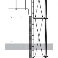
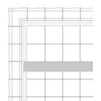
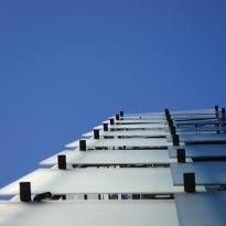
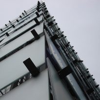
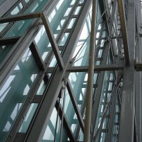
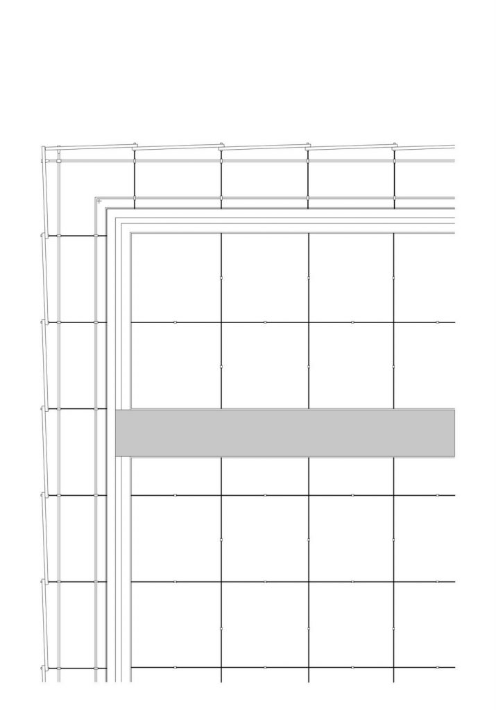
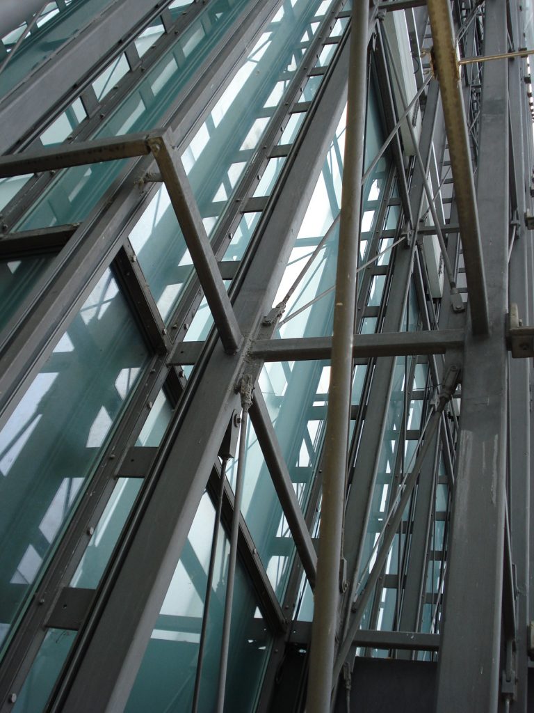
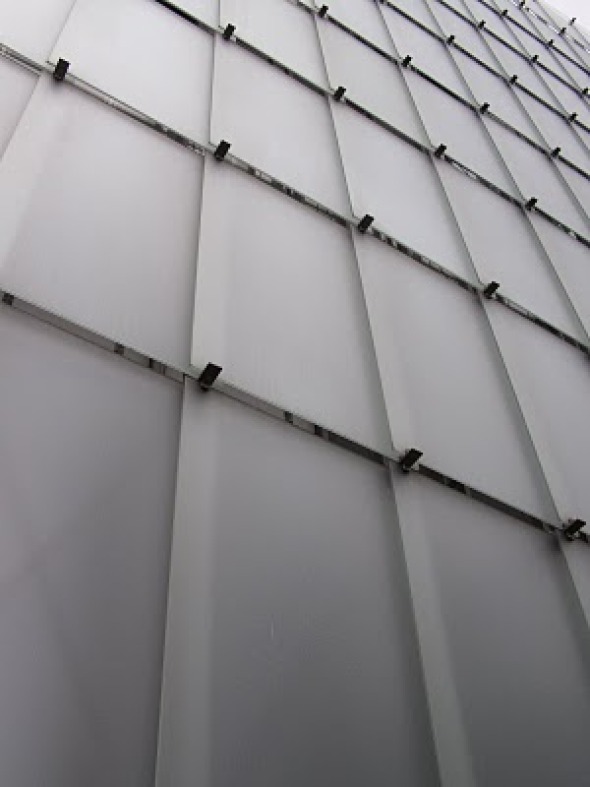
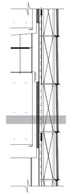
The organization of the facade is based on a strict rule that could be defined by their regularity, with a clear and steady pace, both horizontally and vertically. This is a steel structure supporting both external glass panels and interiors.
This extremely simple façade is interesting for its transparency which allows visible from outside the concrete structure. Between the outer façade and interior is a gap of 90cm, a light well that allowing this vision, depending on the light opens. This gap is equipped with cleaning lifts used for the maintenance and upkeep of the building. Also accommodates the night light installation of the museum.
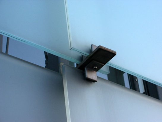
Brackets
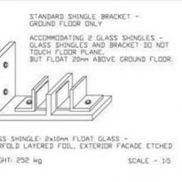
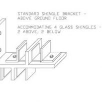
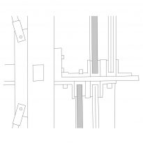
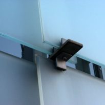
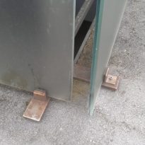
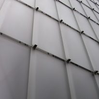
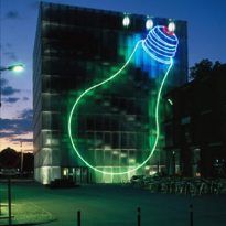
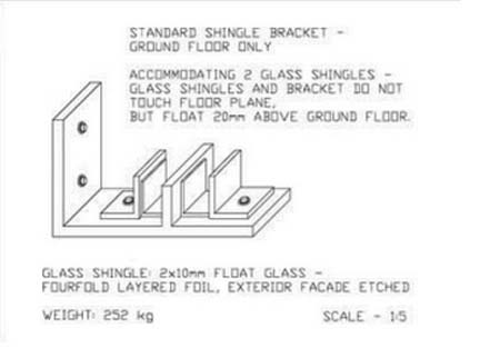
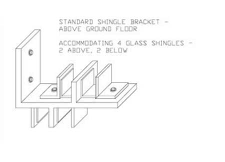
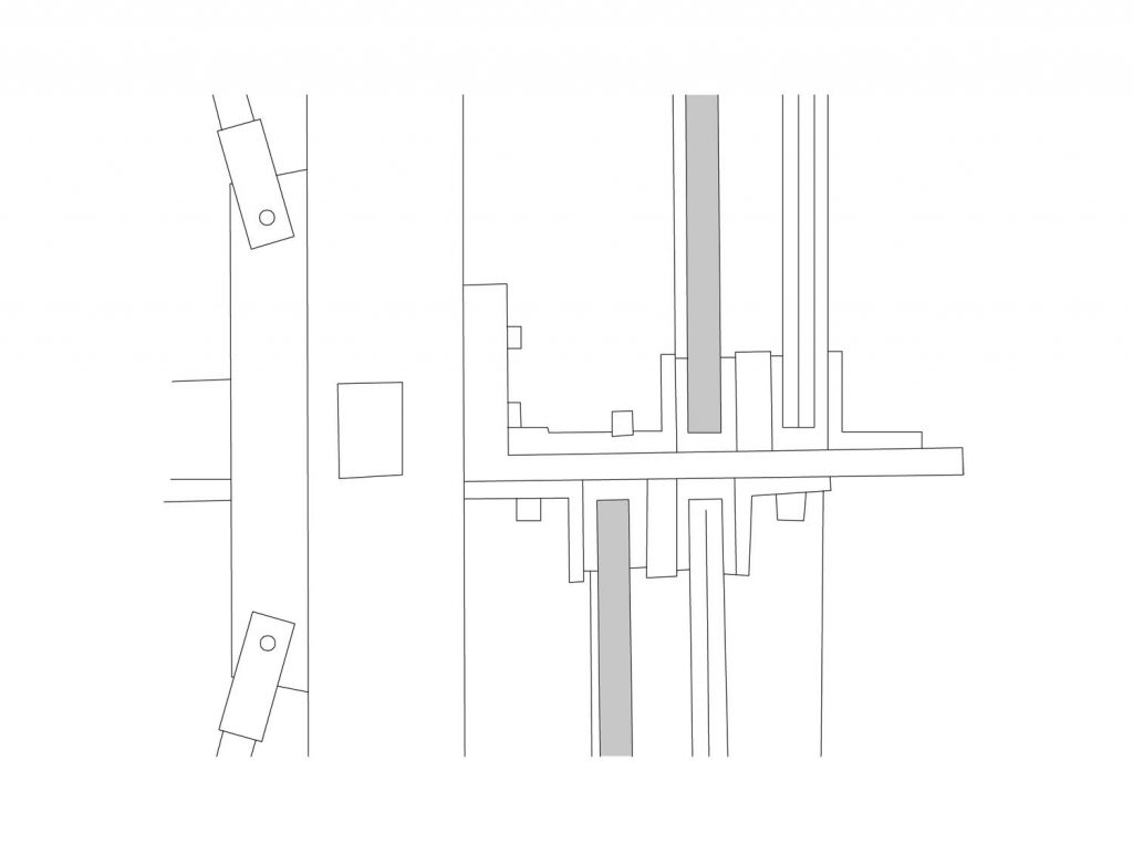
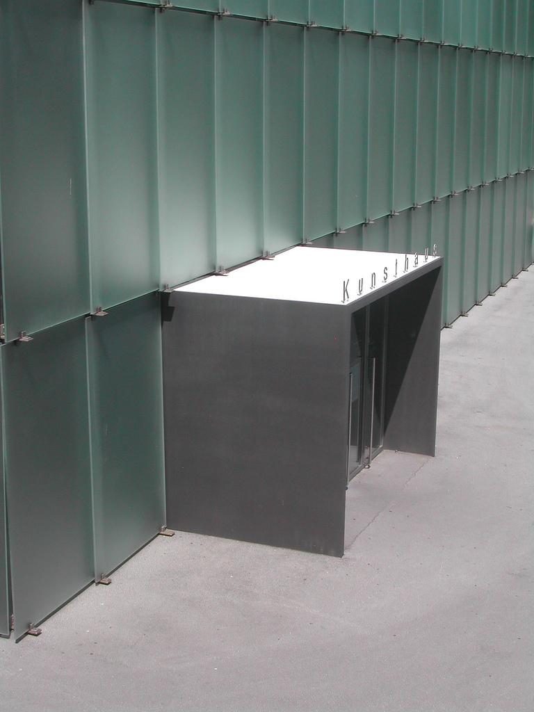
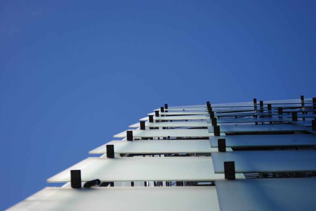
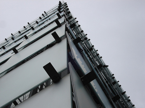
Brackets made to measure, designed to accommodate the visual overlay of glass tiles and frameless present a facade around the building, create a cube effect light that comes alive at dusk and acts like a beacon in the night face the lake.
Lighting
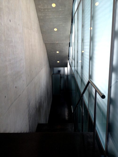
In the circulation spaces, stairs and walkways, lighting is lateral, diffuse, obtained through the glass panels of the facade prints
- Galleries
To encourage a special form of concentration on the four stacked exhibition floors, the galleries have no windows, but daylight is everywhere, scattered by etched glass facade. No matter which direction the light in, is always transmitted horizontally inside. Therefore cavities have been built over each plant to catch the light coming from all sides of the building and is deflected down into each exhibition hall.
Materials
The main materials used in the construction of these buildings are steel, glass and concrete.
Etched glass

Initially planned to direct daylight to enter the building through obliquely placed slats on the facade, but the tests made in different models this solution was not satisfactory. The best results were obtained by using etched glass shingles that refract the light before entering the building and always transmitted horizontally.
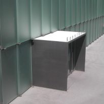
These glass plates are supported on a metal support also allows them, in some cases, some open for ventilation.
- Exterior Facade
Glass tiles 712, 1.72 x 2.93 m each, laminated safety glass made of 2x10mm VSG glass float – glass blank, with four etched foil layers outside. The weight of each sheet is 252kg.
Steel frames are composed of the prefabricated façade elements, a length of 27m, a width of 4.5m and a depth of 0.9m, with a total weight of 180tn.
Walls
The interior walls are lined with large slabs of polished concrete, which give the place a metallic character but both welcoming.
All piping electrical systems, heating and air conditioning were placed into the concrete during construction.
Floors
The floors are terrazzo, polished concrete cast that is stained dark gray on the first basement level and ground floor, while on the stairs and showrooms are light gray. Labor terrazzo is remarkable in such a large area, as no expansion joints are required. This has been achieved by inserting vents in exterior walls to absorb the tension on the ground.
Lighting
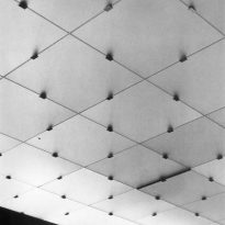
Bregenz Museum was conceived as a museum day. The facade made of glass tiles acts as a skin to spread the light of day that passes first through the rows of windows and then through the light ceilings in the hallways. Although the light has been refracted three times, glass facade, insulating windows and roofs illuminated, illuminates the halls differently depending on the time of day or year. Thus, an environment of natural lighting is created, although the building has no visible windows.
About the suspended ceiling lit lamps were placed pendulum specially designed to place controlled by an external light sensor located on the roof of the museum, supplementing daylight. Each lamp can be controlled individually or in groups, and can be continuously adjusted with a professional management system Luxmate light.
The pendulum lamps hang in pairs at an angle of 90° to each other, and are equipped with 58-watt fluorescent lamps and diffusion attachments.
Climate
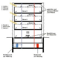
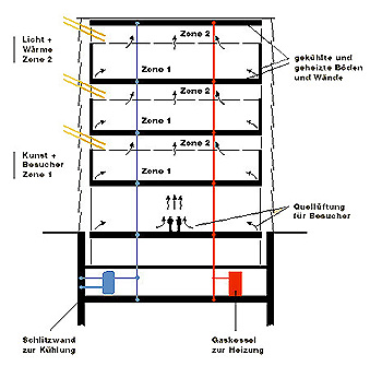
The climate control system of the building can be neither seen nor heard, as it has been designed as a structural unit cooling or heating. A total of 28 kilometers of pipes filled with circulating water have been installed in the ceilings and walls, creating an active engagement of the room climate in the substance of the building.
The Kunsthaus is also taking the surrounding land, the groundwater temperature is used as a coolant in the summer, while in winter the water is heated with gas. Plastic pipes within the construct of the slotted wall, from a depth of 27 meters carry water to the piping on the ceilings and walls allowing a good air, without resorting to conventional devices.
Video
