Knights of Columbus Headquarters

Introduction
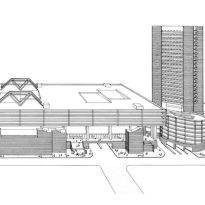
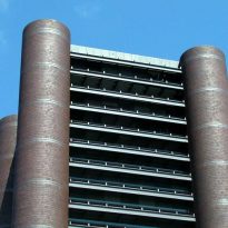
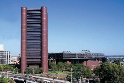
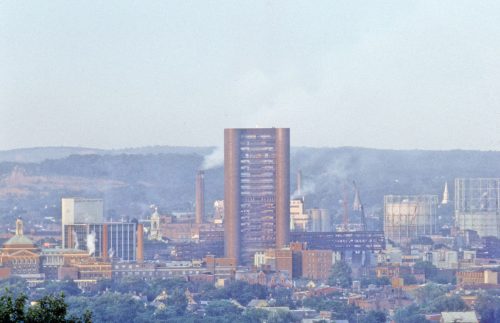
Knights of Columbus, is a Roman Catholic philanthropic organization that also has a great activity in the insurance business. The organization commissioned the study of architects Kevin Roche and John Dinkeloo to design and build the building that would be their headquarters in New Haven. The result was a tower of almost 98m of height with only 23 plants whose form resembles a fortress.
The Roche-Dinkeloo and Associates studio is known for performing some of the most significant and influential civic and corporate architectural works of the contemporary era. The two architects studied and took into account the new social conditions in the postindustrial era giving particular importance to the individual and his changing relationship with public space. Together they would study all the opportunities and limitations of a place, as well as its surrounding environment, to design the building more appropriate to its context.
Situation
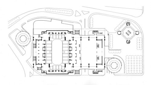
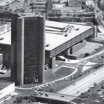
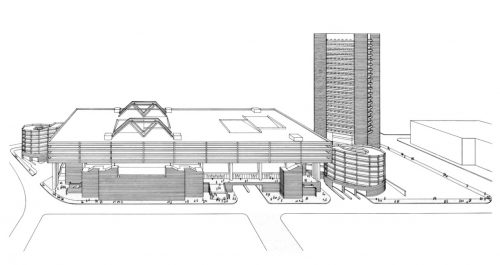
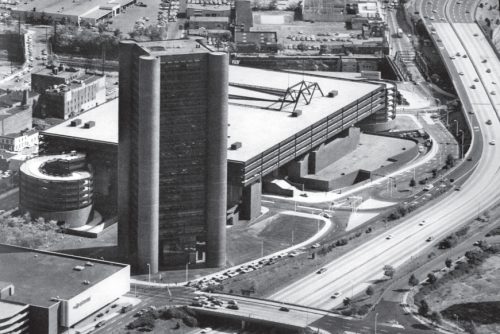
The new tower rises on its four oak shafts at the Oak Street Connector, adjacent to the “New Haven Coliseum” ice hockey stadium demolished in 2007 at One Columbus Plaza in New Haven, Connecticut, United States.
Often modern buildings have been criticized for their lack of context, but in the case of New Haven the construction of large structures related to different activities whose movement and necessities led to the 1956 Registry of the city to inform that the road is It would incorporate 6 main lanes and four roads of service of two lanes, becoming one of the ampler systems of the world.
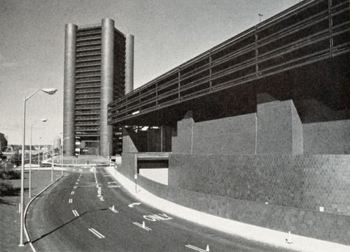
The demolition of the old urban landscape and the size of the new road required structures that could compete. The large buildings also seemed to satisfy the craving for grandeur. The main consideration was not that he would see every building from its windows or sidewalks, but as the building would see the cars passing by the highway.
“… Our is a large-scale, large-scale society. It may seem out of scale with other structures in the city, but you can not put a small building near a super highway …” said Kevin Roche, referring to The 97.84m tower designed to be lifted at the North Frontage Road Connector.
Concept
It may seem out of scale with other structures in the city, but you can not put a small building near a super highway(Kevin Roche)
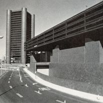
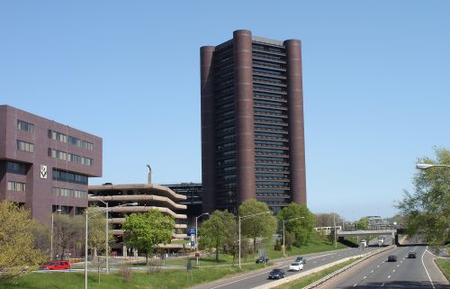
Located next to Oak Street Connector, the architects designed a structure that has a scale compatible with the highway, a great change of scale for the architects of the time.
The intent of the design was to make a strong vertical presence at the entrance from the freeway to New Haven. In fact, it has become a symbolic gateway to the city that is oriented diagonally as a gesture to relate the highway with the diagonal plot of the streets of the city.
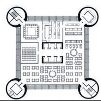
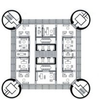
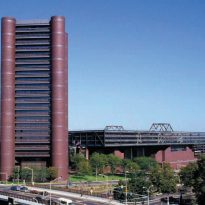
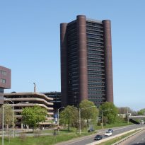
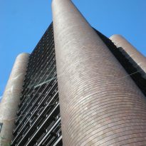
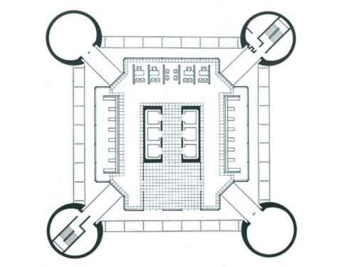
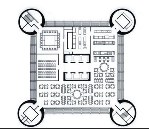
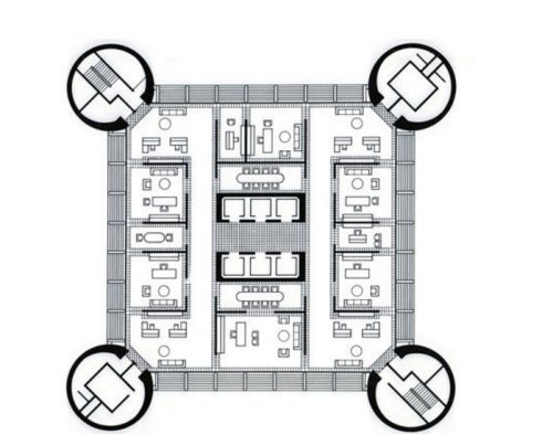
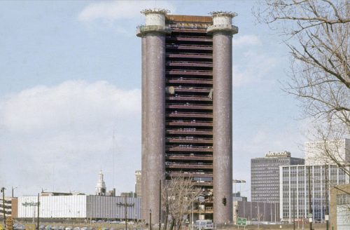
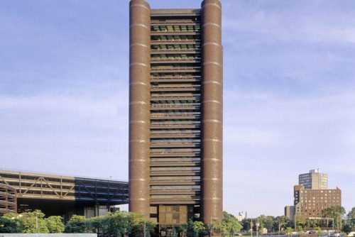
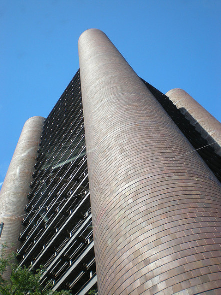
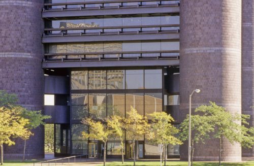
The cylindrical towers of the corners give the structure a simple geometric form and represent the four central principles of the Order: Charity, Unity, Fraternity and Patriotism and in its 23 floors the 700 employees of the entity worked.
Spaces and Structure
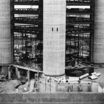
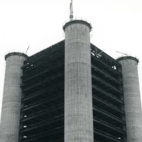
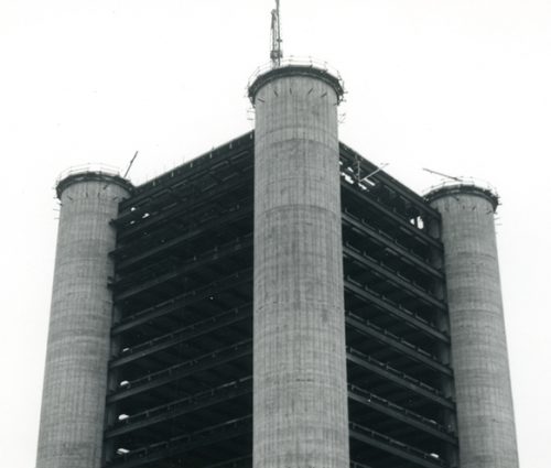
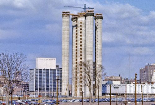
The shape of the 23-story building stems in part from the construction method in which the axles were first lifted over their entire height and then filled with a continuous cast of concrete.
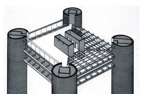
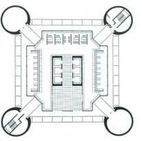
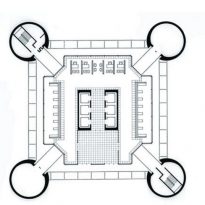
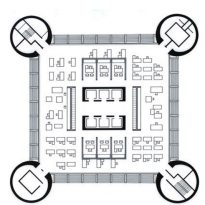
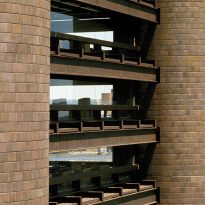
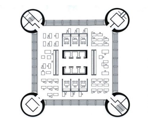
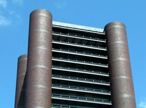
The building has five towers, four exteriors, one on each corner of the square floor and an interior tower for the elevator, all made of concrete with steel bays. The four cylinders that form the supporting towers of the corners are concrete and brick pipes within which are located escape stairs and sanitary facilities. The lifts operate within a central core.
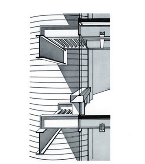
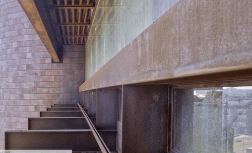
The towers are made of reinforced concrete and provide the main structural support for the building. Steel beams extending between the towers carry the loads of the floor slabs but not the building structure, so the steel did not have to be fireproof and allowed to get a more authentic shape.
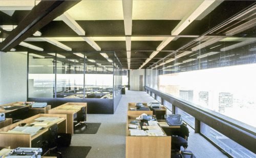
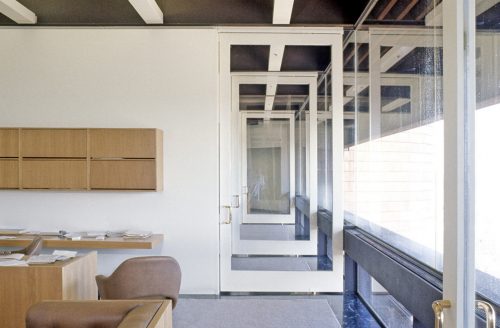
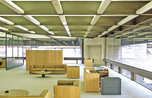
The outer beams of 27.43m are placed outside the building, which, after a strong discussion with the fire chief, were installed without protection against fire. Attached to the core were a series of secondary beams which are exposed inside the surfaces. As mechanical and lighting systems are integrated into the structure, false ceilings do not exist in the building.
With a height of 3.96m between floor and floor the ceiling height in each unit is approximately 3.66m, this height attached to the layout of open spaces, used as offices mainly of the activity in the field of insurance, gives a feeling Open and airy.
Materials
The main materials used in its construction were steel, reinforced concrete, brick and silo tiles.
Towers
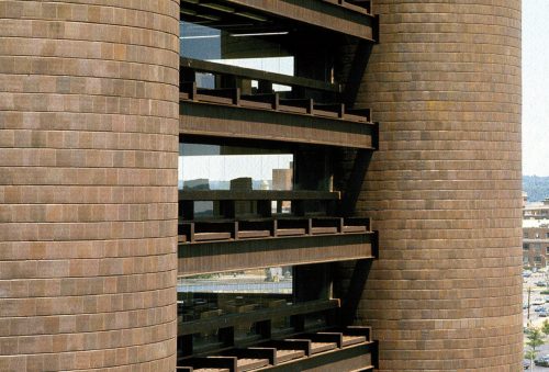
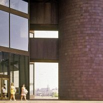
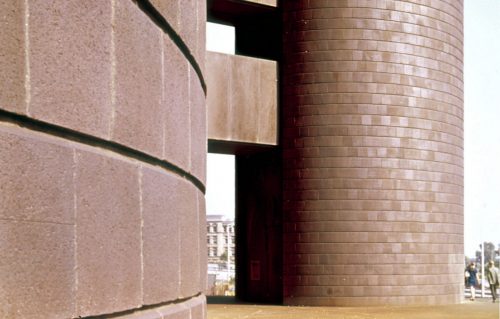
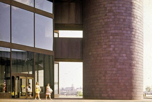
The towers located on each of the corners of the square floor and lined with “silo tiles” contain stairs and sinks. They were lifted using a continuous sliding technique based on the construction of silos to save grain in the Midwest and support the weight of 35,000 tons of the building with balanced loads, allowing to achieve the powerful symmetry that the architects wanted.
The ceiling joists were painted brown.
The facade windows are shaded by massive weather-resistant steel overhangs, except for the first three floors where the lobby is located on the ground floor and two mezzanines.
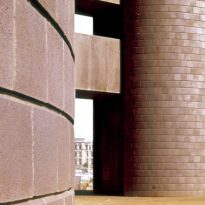
Silo tile
This square clay tile, normally used for silos in the Midwest, is approximately 30/33 cm and is chamfered at the top to throw a strong horizontal shadow, balancing the vertical thrust of the towers. The tiles are dark plum color, obtained through an oxidation process, to match the color of the weathered steel and reduce the problem of early staining of the steel in the open.
Aware of the size and visual effect of the tower, the builders added a finishing touch, a night illumination for the motorists to enjoy the motorway and also to warn the airplanes.
