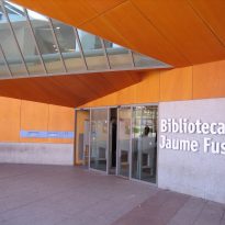
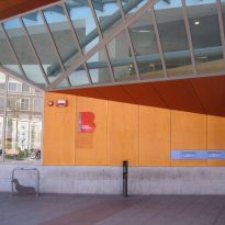
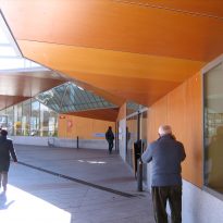
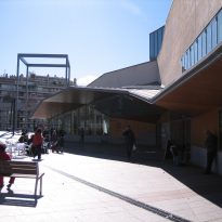
Jaume Fuster Library


Introduction
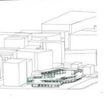
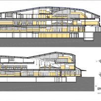
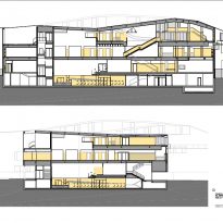
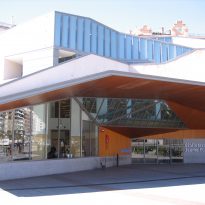
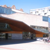
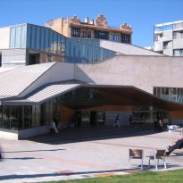
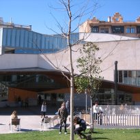
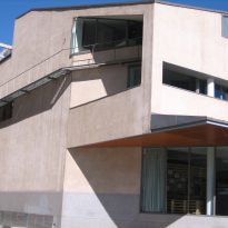
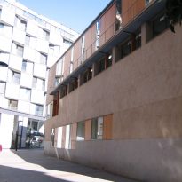
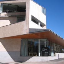
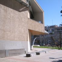
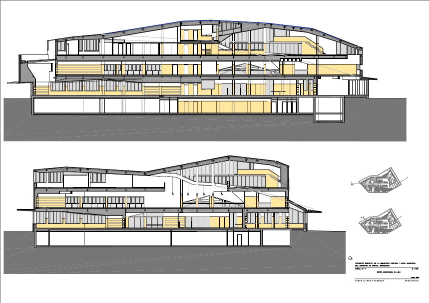
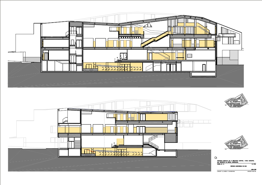
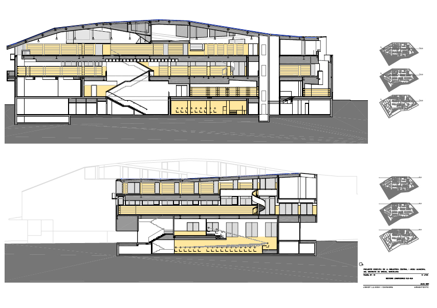
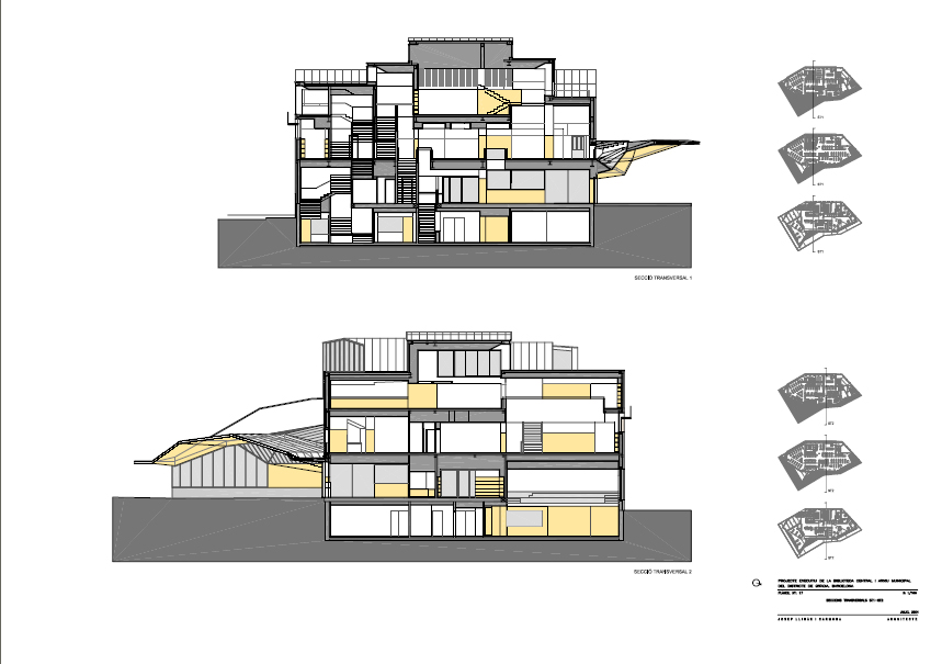
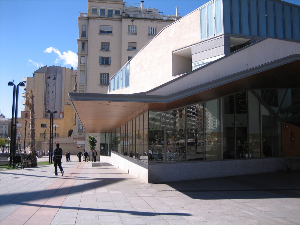
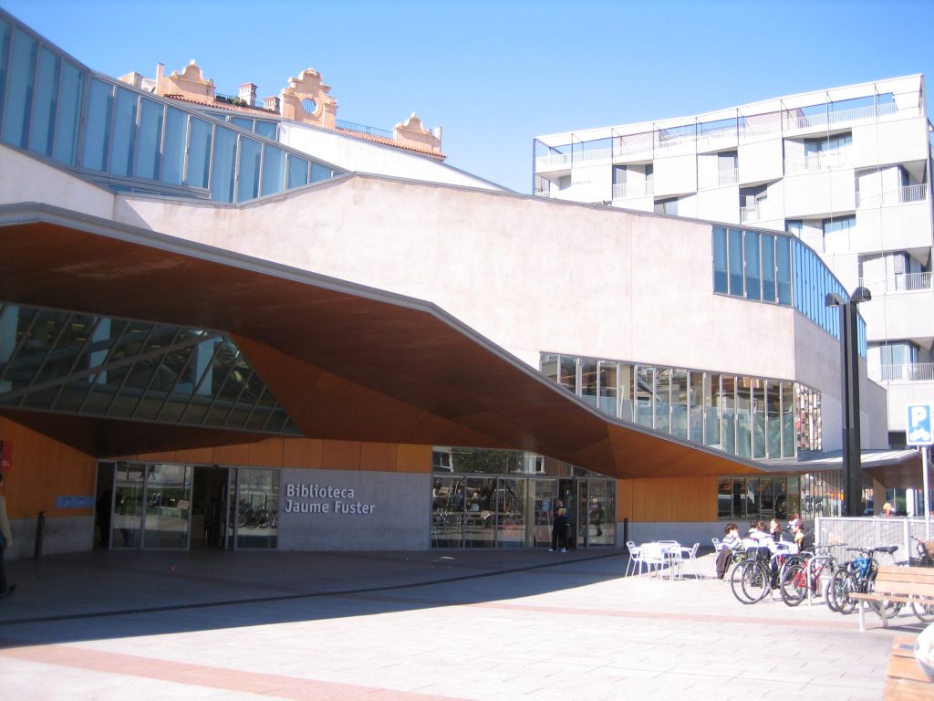
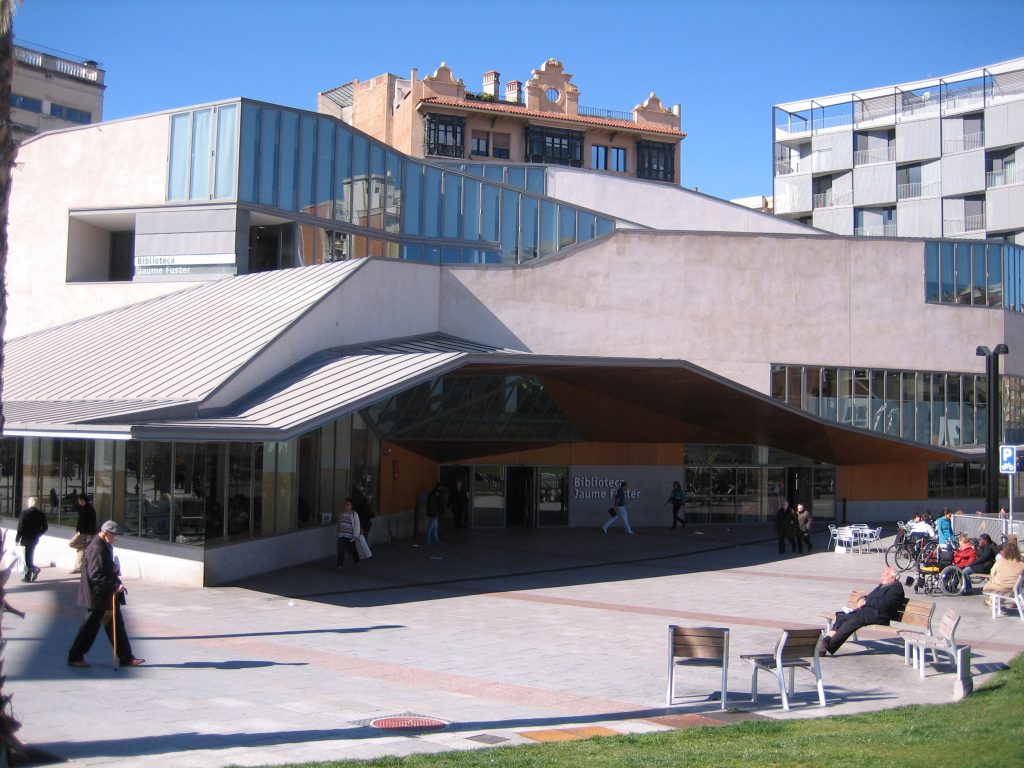
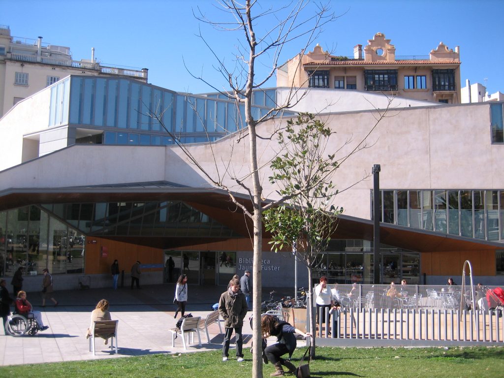
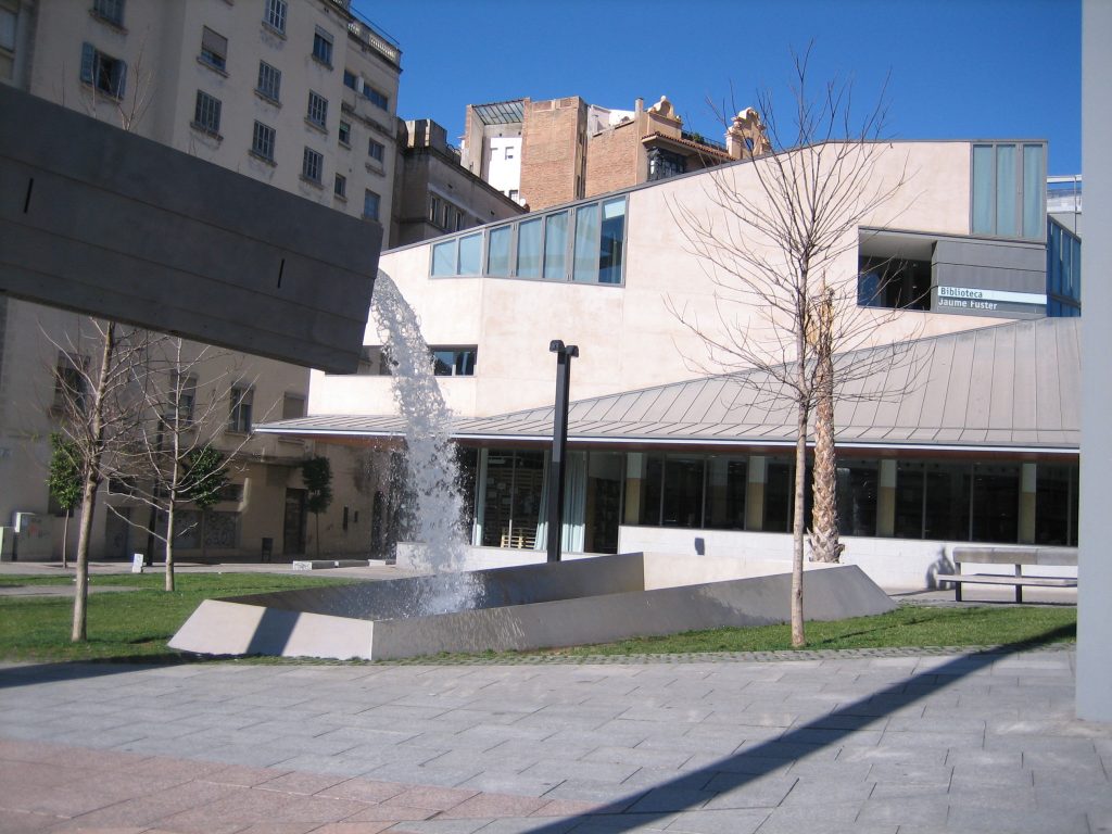
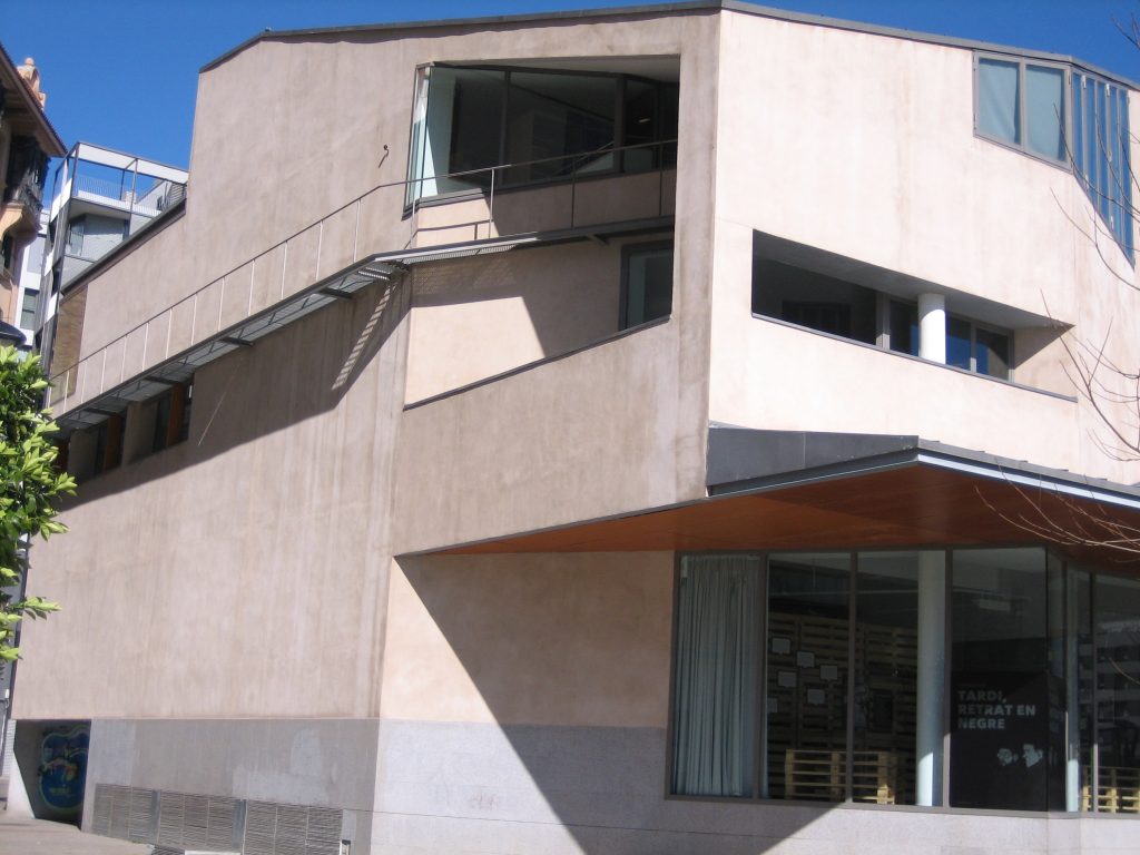
Jaume Fuster Library, with 5026 meters square and designed by the architect Josep Llinas Carmona i is one of the largest and most modern city of Barcelona.
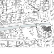
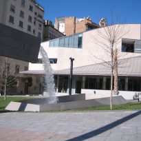
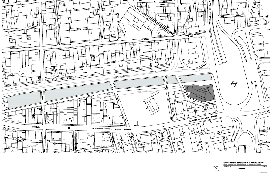
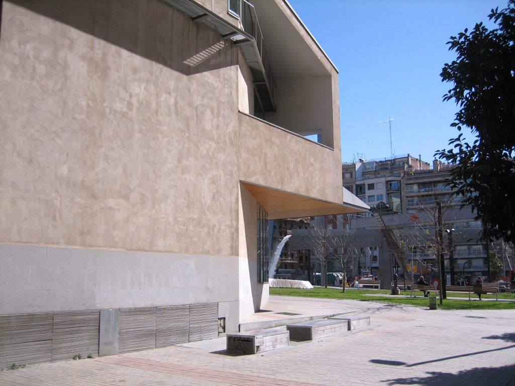
In a vacant lot several years after the demolition of a garage unused, the new building rearranges much of the northern front of the Plaza Lesseps with the recovery of the geometric structure that can be identified from the “green channel” that descends from the foothills Collserola and affects the northern front of the place, rejoining again in the urban structure.
This building was winner of the FAD architecture 2006, one of the most prestigious awards in architecture awarded in Spain.
Location
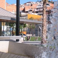
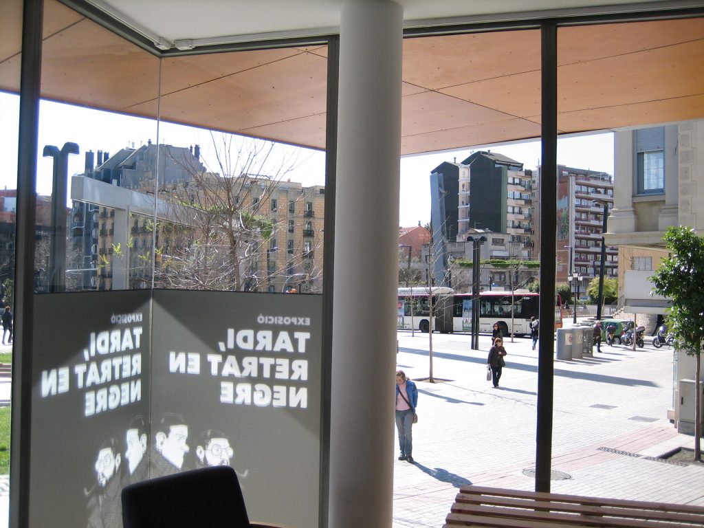
It is situated in the Plaza Lesseps, in the north end of Barcelona’s Gracia district, in the places of the city whose landscape has suffered more attacks and more serious offenses over their recent history. Plaza Lesseps to number 20, 08023 Barcelona, Catalunya, Spain.
Concept
The proposal stems from two considerations:
- Understand the importance, as backdrop to the site of the library, is the facade, the sum of large-size rear facades of buildings with access from the Avenida República Argentina.
- Collect the radical change in the use and understanding of this part of town, have a direct connection “green corridor” (limited Avenue between Military Hospital c / Bolivar) to the plaza Lesseps.
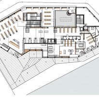
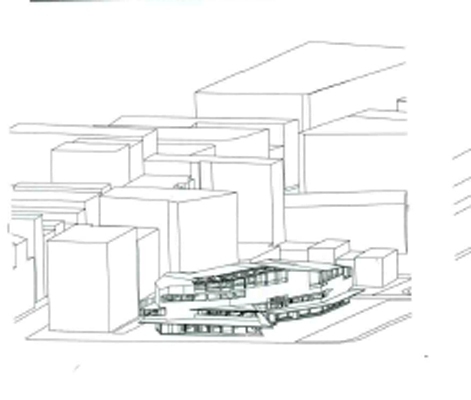
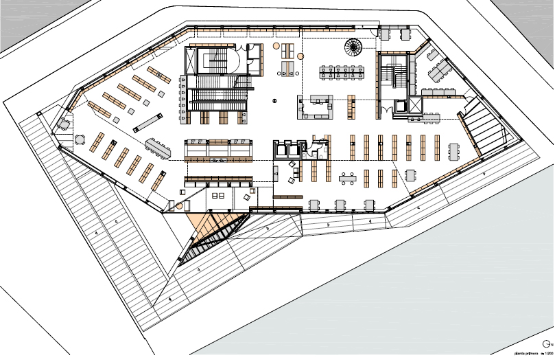
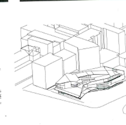
In the first case, we try to melt the sheer size of the library with that of the later buildings. This goal translates into the plant to define its limits with a rhomboid geometry supplementing the volume initiated by these buildings.
With this operation, the library faces the large open area which means Square Lesseps from the scale and protection that gives the volume formed by the buildings already mentioned.
In the second case, it is understood the opening of this green corridor, north of the Plaza Lesseps, as a public axis expresses and reflects the unique topography that sits on this part of town (hillside, mixed green with construction), which is precisely the square is presented as final or as home. You could say that the mountains (Collserola) reach Lesseps and from here the city has a different consistency, more linked to the layout of the streets that no topography or slope.
Spaces
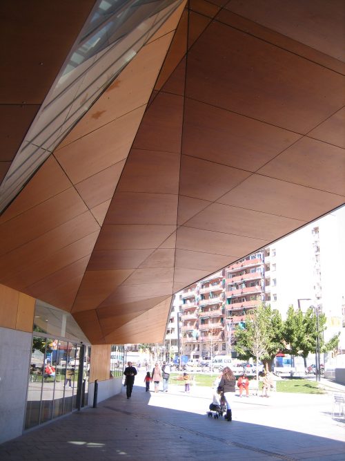
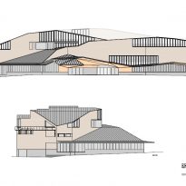
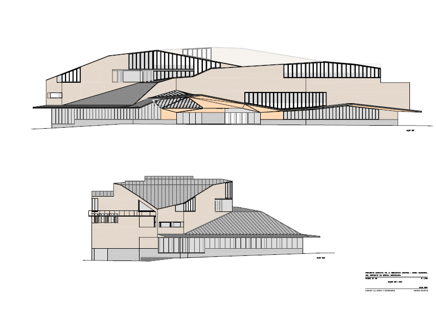
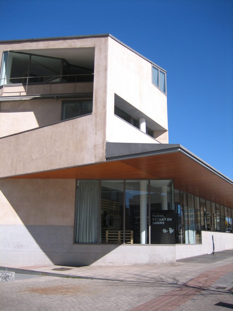
To express the boundary condition of mountain-town of the plaza Lesseps has been set volumetrically the library, from the decks. This element is used himself as a constant reference by the user throughout the interior of the library.
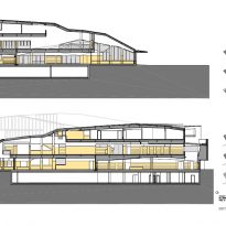
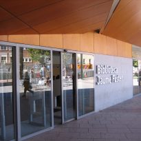
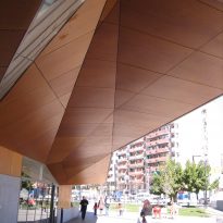
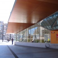
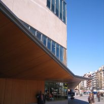
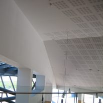
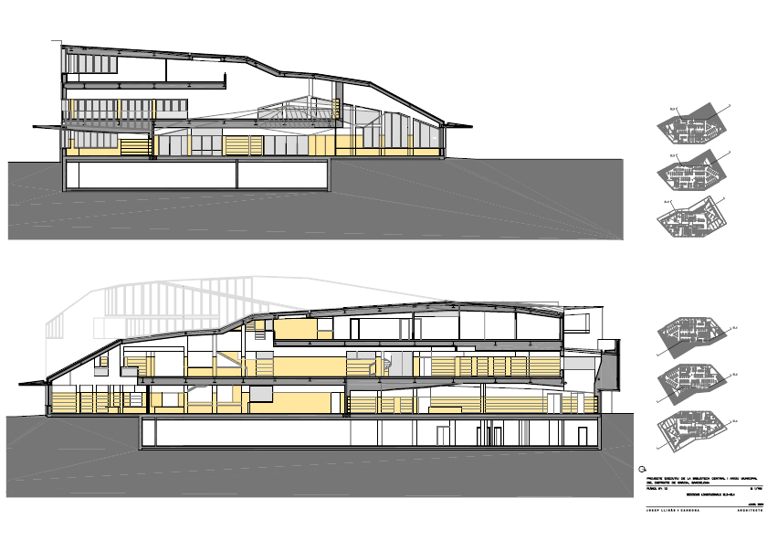
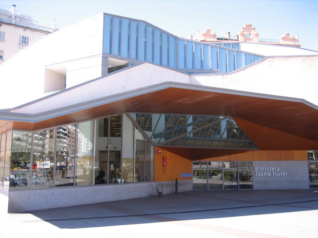
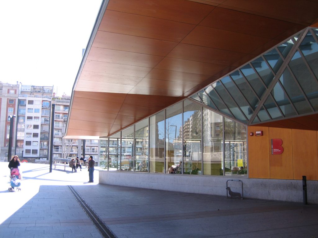
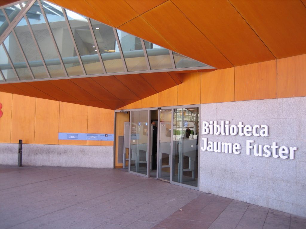
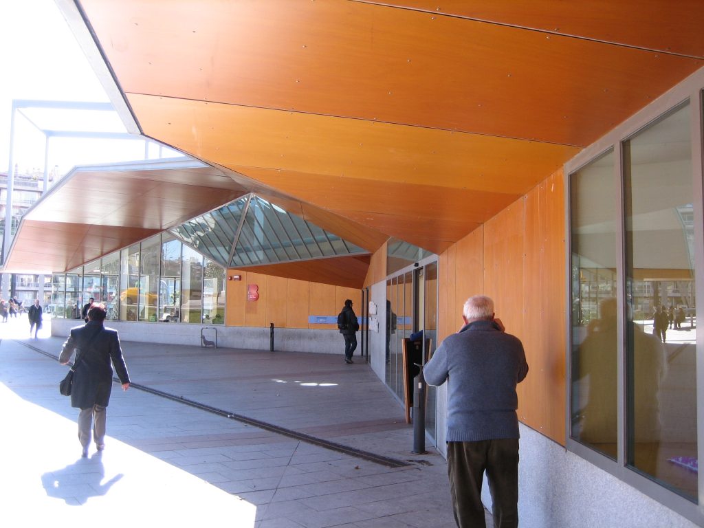
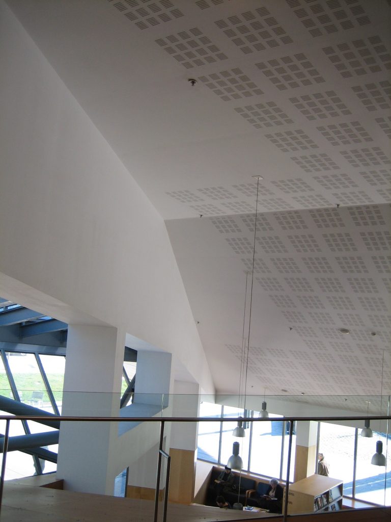
The concept of “cover” is already reflected in the entrance canopy has been extended to the entire interior of the building without difficulty on the second floor, introducing double spaces that allow visibility of the deck from the ground floor and first floor.
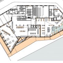
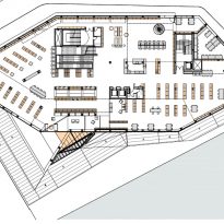
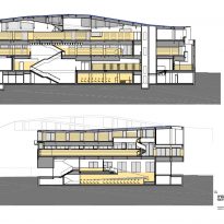
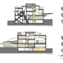
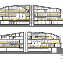
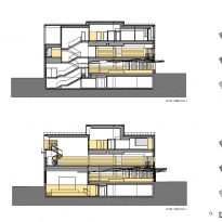
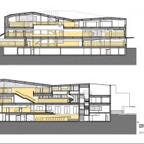
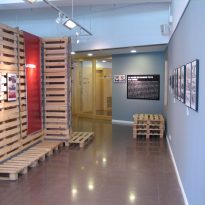
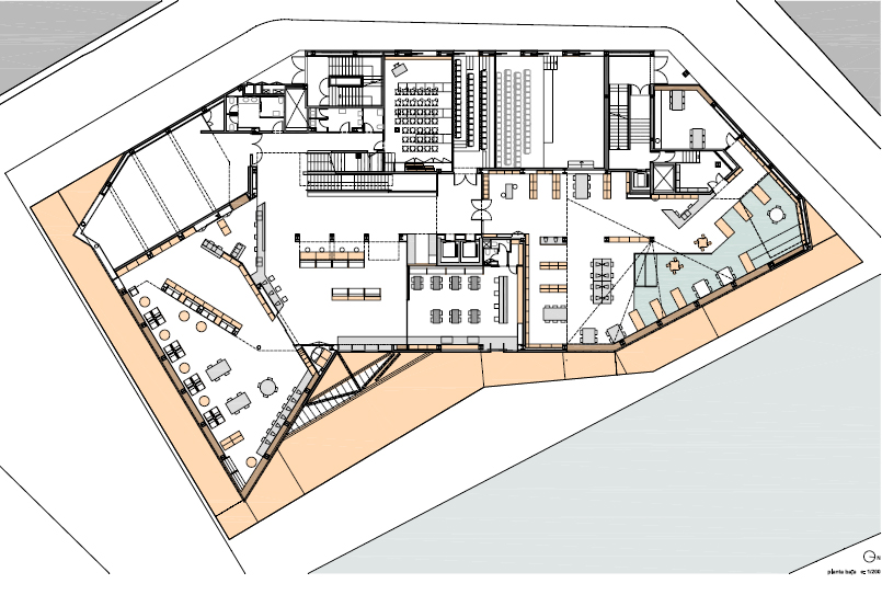
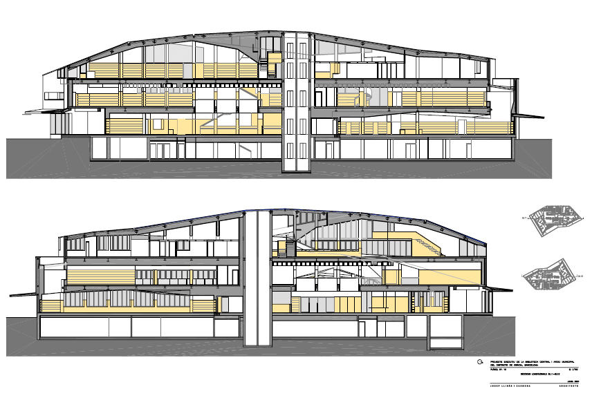
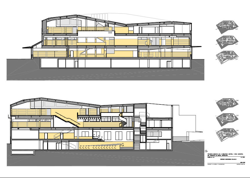
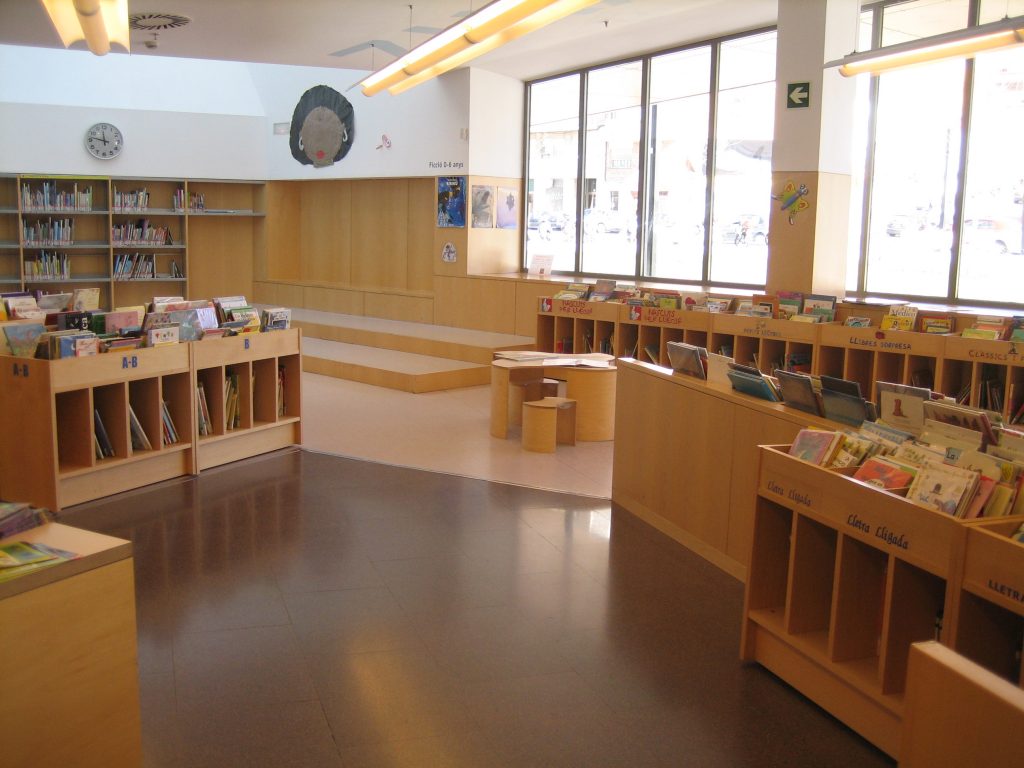
Its surface distributed on four floors has an auditorium, a multipurpose hall, an amphitheater, an exhibition hall, a cafeteria, a children’s multimedia area and a music room and cinema.
GROUND FLOOR
On this floor you have access from the street, meeting with a central hall that provides access to the various units of the plant, inspection and acceptance services readership, newspaper reading rooms, a small meeting room and one with greater capacity, whose audience is moved to reach the lower basement level.
- Higher plants
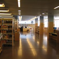
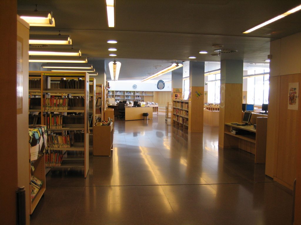
In the upper two floors of space is considered mainly as free, in which the areas of reading, consultation and file only be differentiated and classified by the arrangement of furniture.
Details
- Internal Element
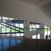
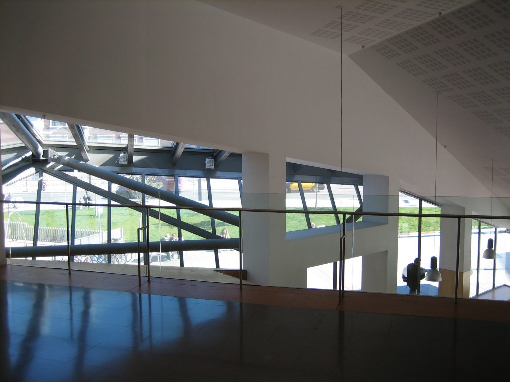
The volumetric overall library from their upper decks and that highlights one of the important purposes of the project, as is to highlight the boundary between mountain and city that takes the place Lesseps, generates an element that is repeated throughout the inside the building.
In the library resulted in staggering the cross section is accompanied by a tilt of the decks in the longitudinal direction. The covers of the successive strips are bonded in a seesaw motion, which turns on itself and attaches to the new building unique status.

- Windows
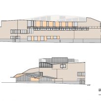
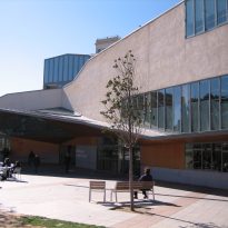
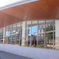
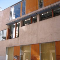
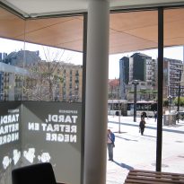
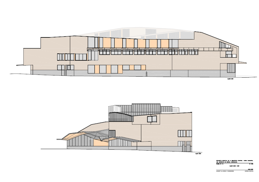
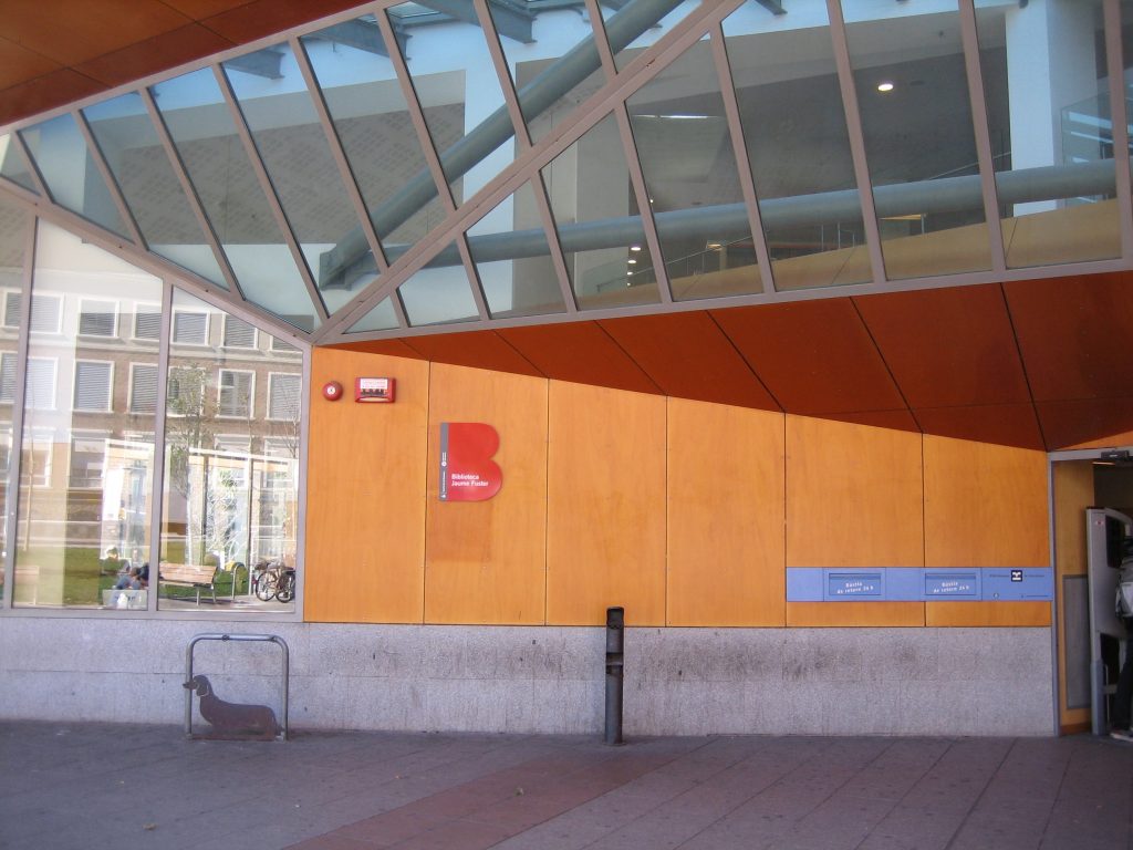
The windows of the Biblioteca Jaume Fuster largely complies with the essential requirements for a stay that is comfortable to users once they are part of the design of the building, without neglecting the required compliance.
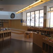
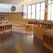
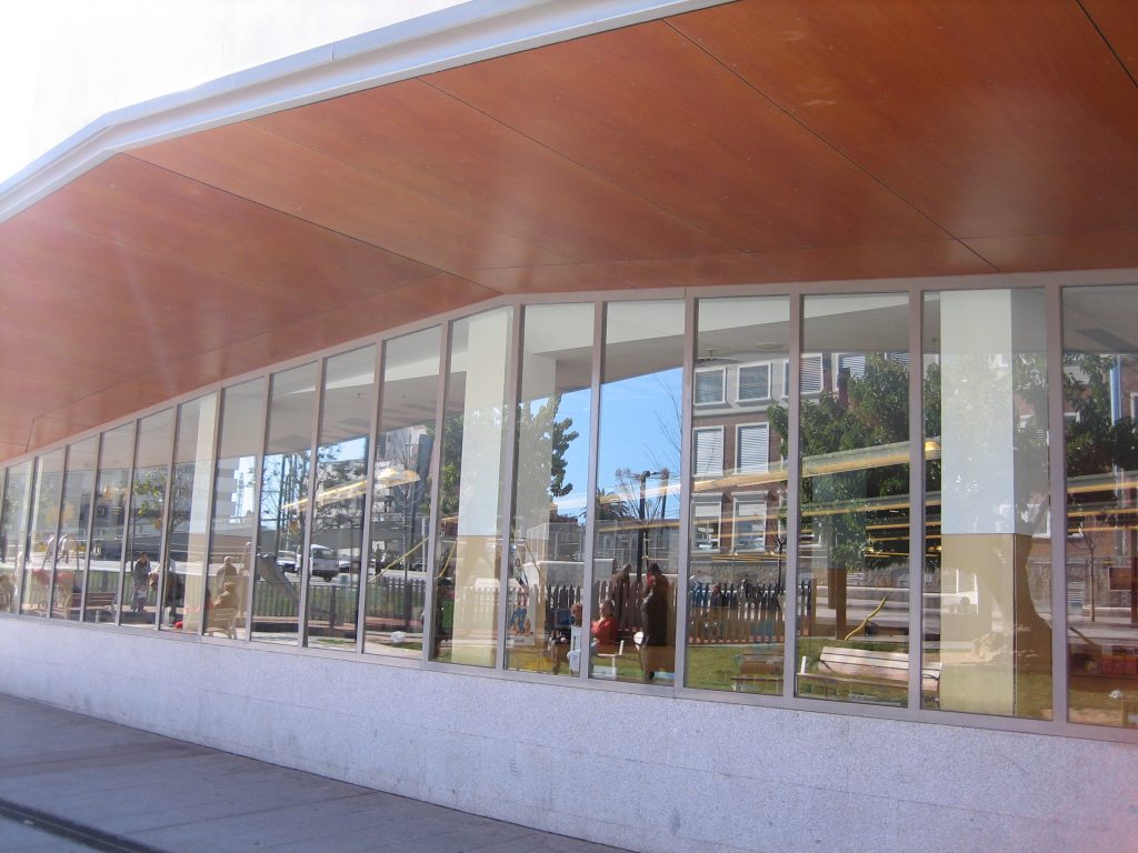
They overlook meaning both to the outside and inside, shelter with his noisy environment protection from the Plaza Lesseps while providing natural light to the reader, design, forming a prominent part of the design of the facade and reasonable durability due to material chosen for them.
Materials
- Timber
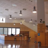
The interior walls are painted white and covered half way up with panels veneered in American maple, a combination that highlights the brightness of the environment.
Both these panels such as those lining the columns or the sills are straight and smooth panels chipboard and fire-plated and finished with a gloss varnish.
The doors are smooth and resistant to fire for 60 minutes and maple wood panels. The handrails of the stairs, vents, interior furnishings and screens for the windows also are of this wood.
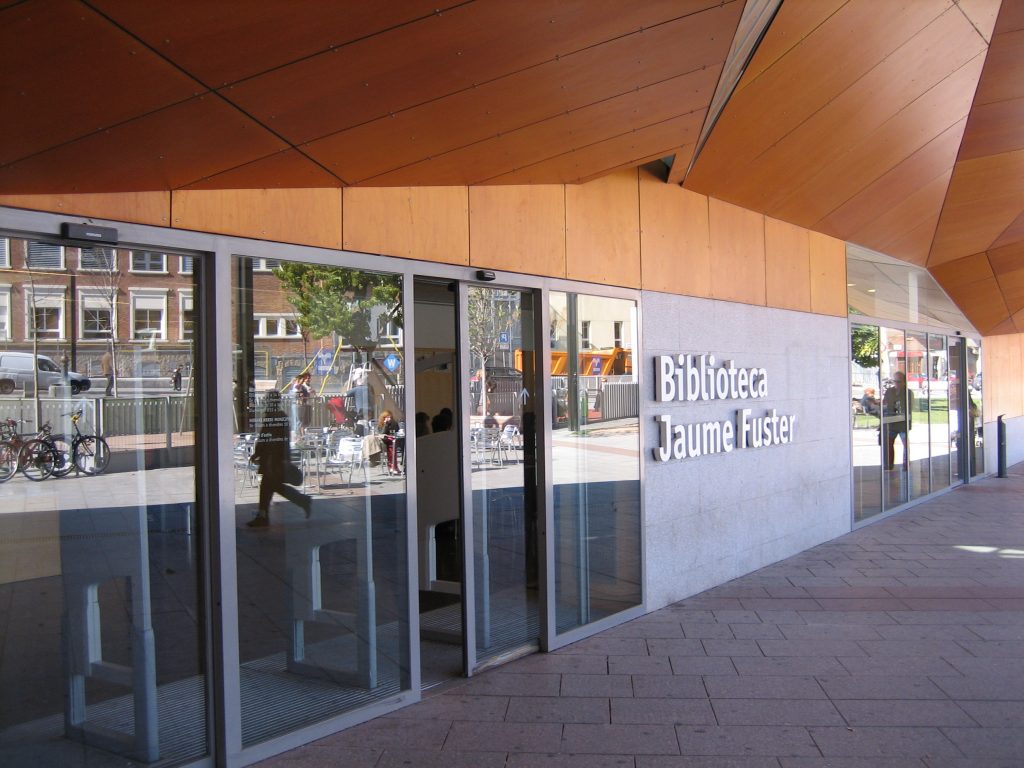
Other woods were used as jatoba, solid steps for the spiral staircase or natural wood veneer covering ayous boards used in the entry canopy.
- Soil
In the auditorium floor has been placed American hard maple solid whose base is a rubber ground to absorb the noise. Tables of 22 mm in thickness by 58 mm wide, have been placed on board lost held together by tongue and groove joints.
- Windows
The height of the windows of up to four meters without intermediate studs, forced to use profiles especially hard to prevent their deformation by the wind.
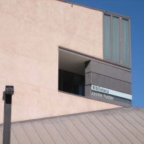
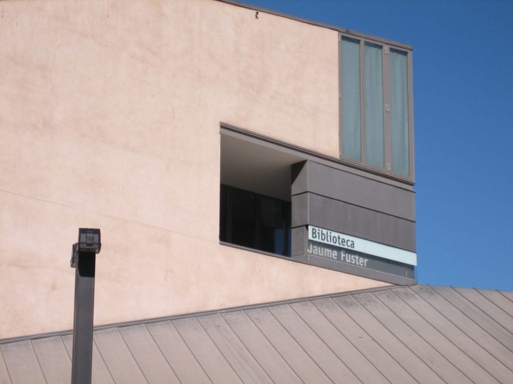
The cover of the same is done with a zinc plate laminated with copper-titanium alloy of 0.80 cm thick. The openings are finished with ceramic maó 4cm thick.
- Crystals
Steel profiles crystals with thermal break hot zinc with a layer of 20 microns and finished bio-acrylic powder coating paint.
- Solar Screens
Sunscreen roller screens fixed and fiberglass, the latter with electric drive.
