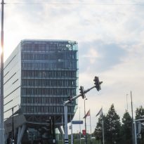
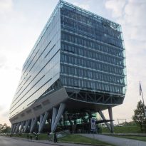
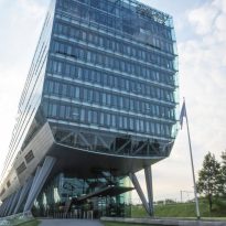
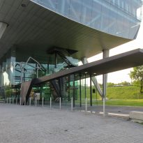
ING Headquarters in Amstedam

Introduction
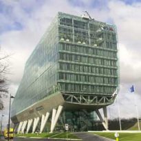
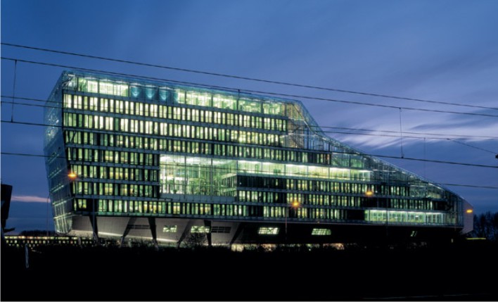
The headquarters of the financial group ING was designed by architect Robert Meyer Colombia and the Dutch architect Jeroen van Schooten, forming one of the largest studies of reputation in Holland.
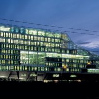
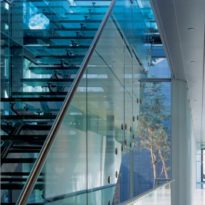
The design was inspired by the landscape where it is implanted. Concepts such as transparency, innovation, openness and friendliness to the environment, were patterns of design for the designers. Moreover, in this building tested several technological resources to achieve maximum efficiency in energy use.
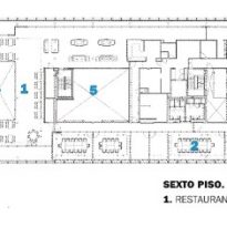
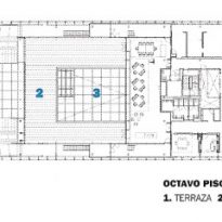
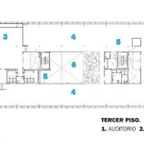
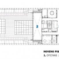
The program includes offices, a restaurant, cafeteria, auditorium, reception, meeting rooms, waiting rooms, foyers, gardens, underground parking and vehicular bicycle shed.
The building has won numerous awards, including the National Staalprijs and Nederlandse Glas Award in 2002, awarded by the professional associations of the steel and glass in the Netherlands and the Dutch and Aluminim Construction Award Architecture Prize in 2003. In addition, he was nominated for the Mies van der Rohe Award 2003 and won a special mention in Tecnhology & Architecture Award 2002.
Situation
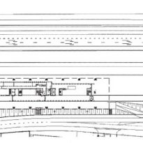
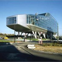
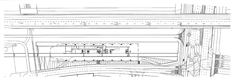
It is located on the outskirts of Amsterdam, on a long and narrow field, surrounded by a lake and a highway near the airport. Its location is at the confluence of two areas of the Dutch capital are very different: the skyscrapers Zuidas and extensive green areas of De NieuweMeer.
Concept
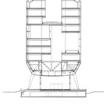
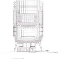
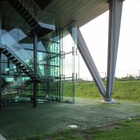
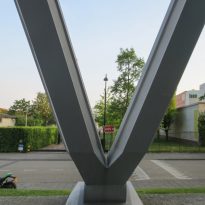
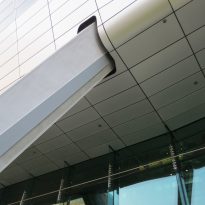
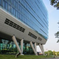
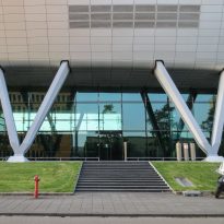
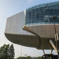
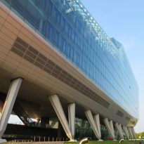
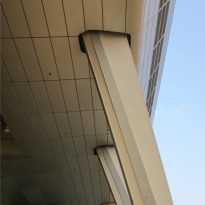
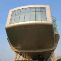
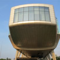
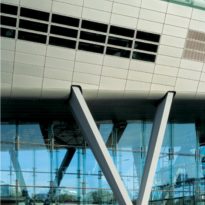
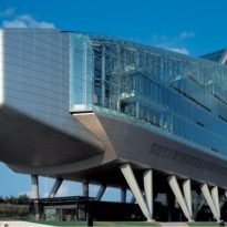
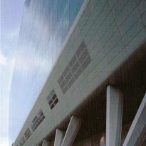
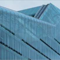
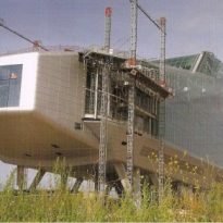
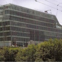
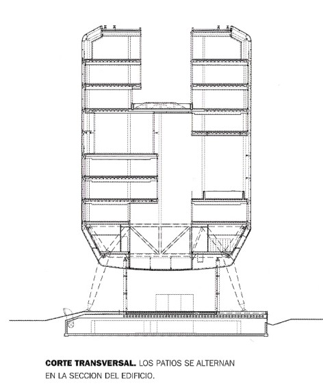
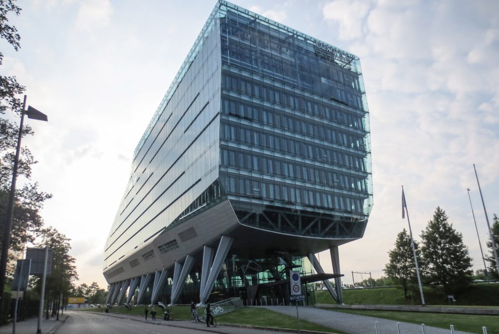
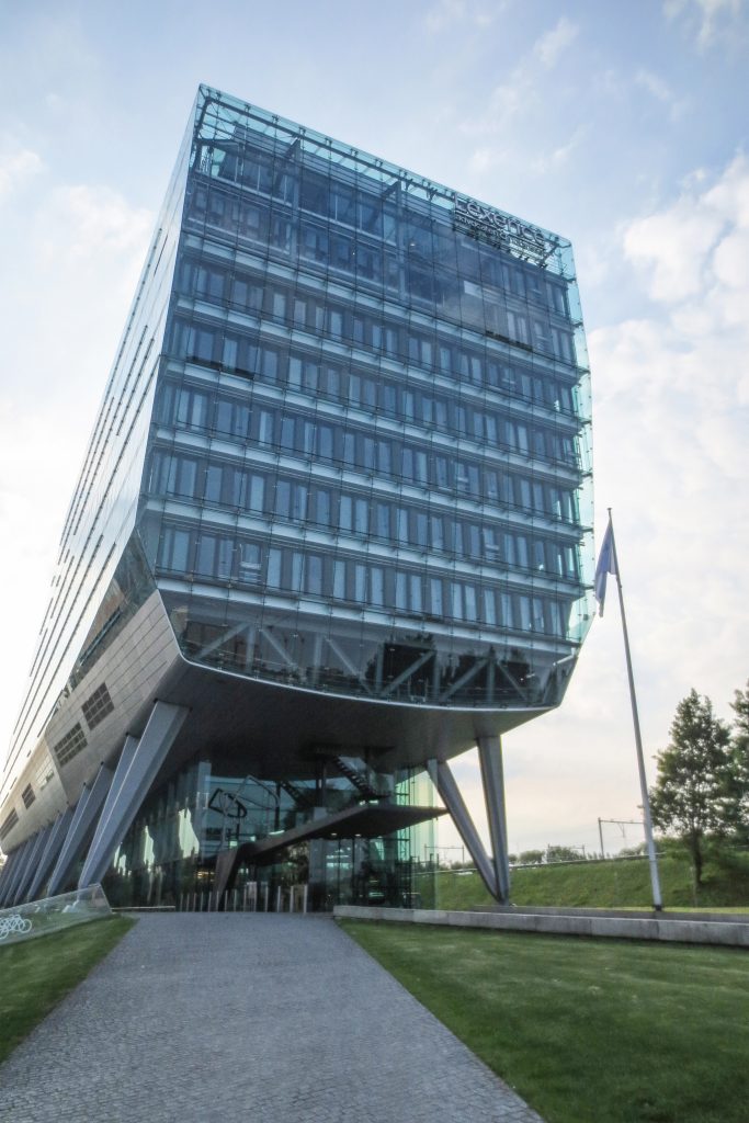
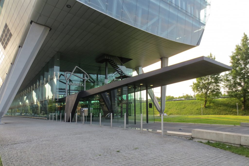
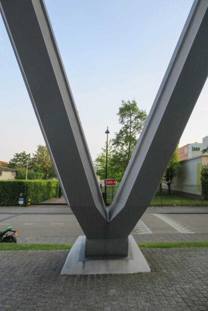
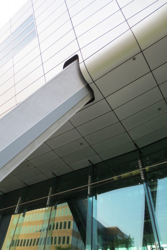
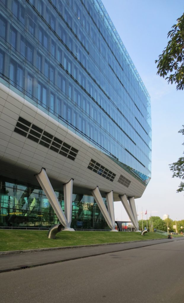
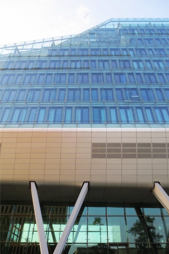
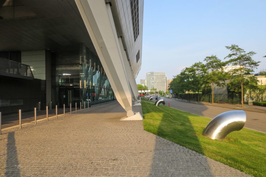
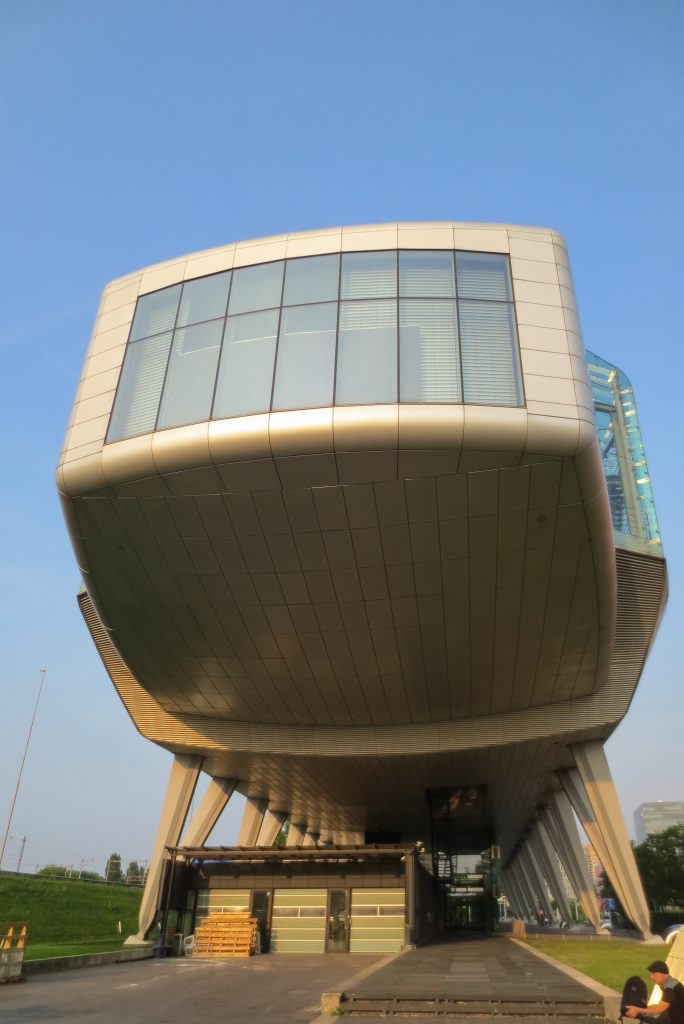
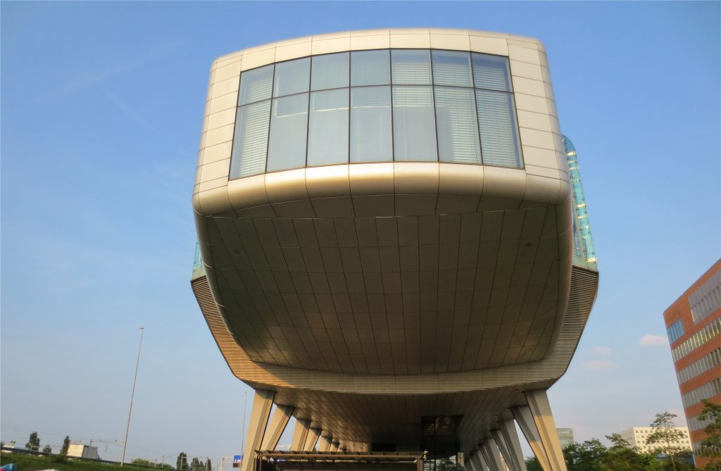
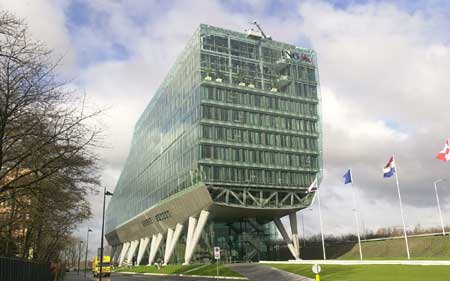
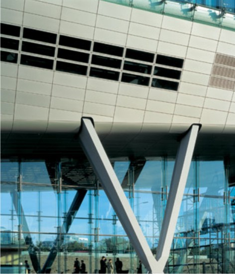
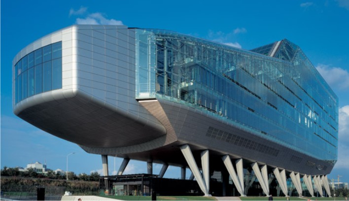
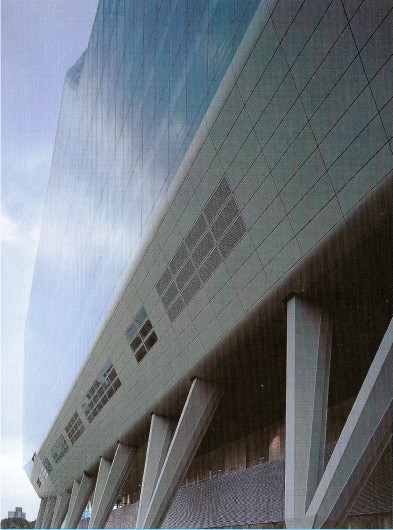
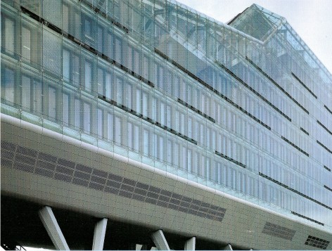
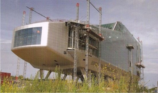
The building is presented as a compact volume that rises from the ground and rests on eight pairs of stilts stilts as between 9 and 12.5 meters high.
The building is inspired by the constraints of the landscape. The facility allows users to open the highway continue to maintain the views of the lake, while building permits high views of the city’s traffic decontaminated.
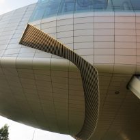
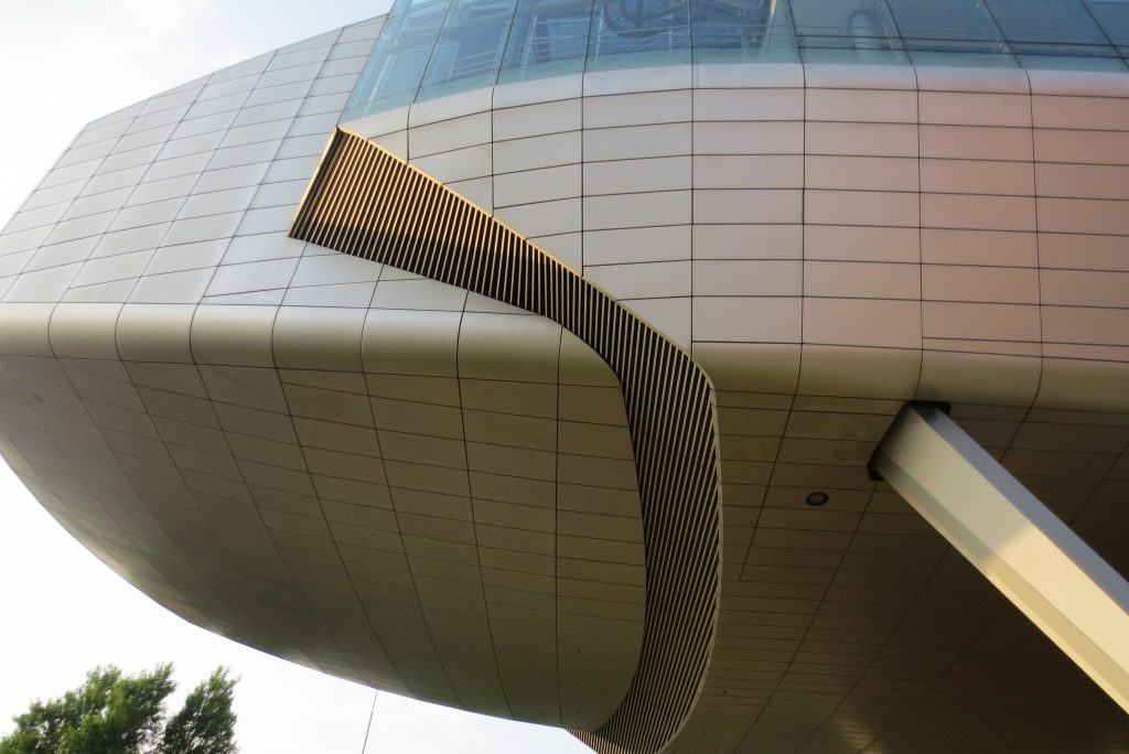
In the green volume remains low, while the side where the city stands the building with the audience as a cantilever proyectante.
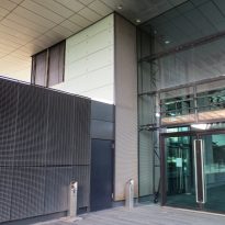
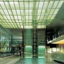
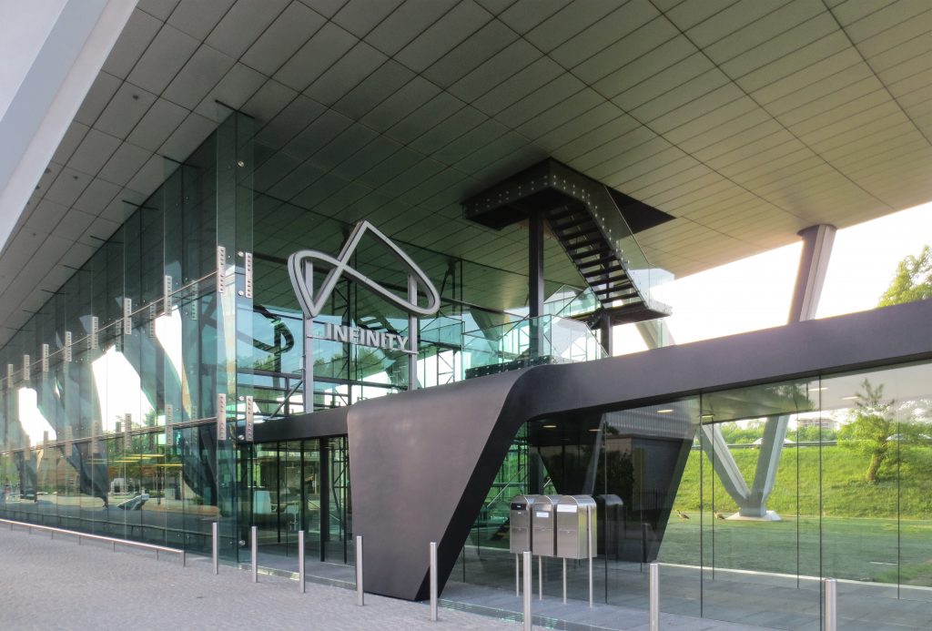
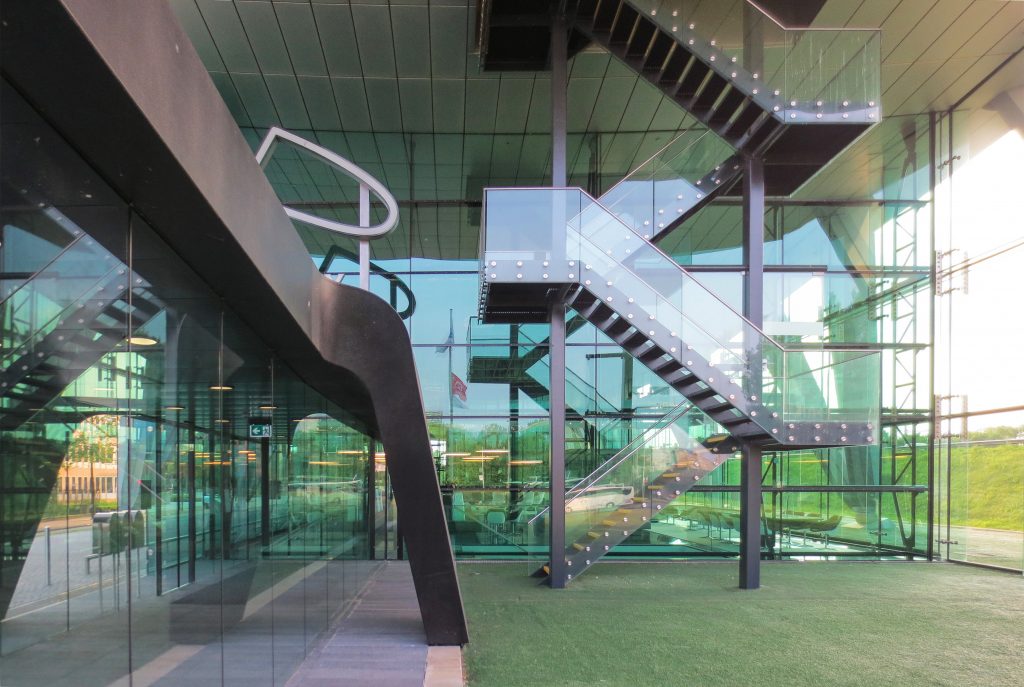
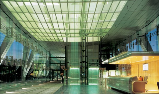
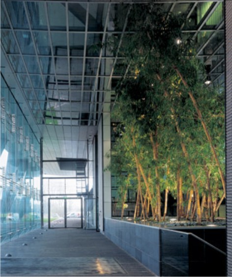
With the floor open to only a zero prism glass entrance and lobby serves as the core of vertical movement, leading to the heart of the building.
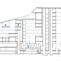
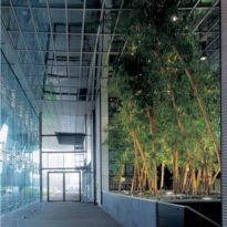
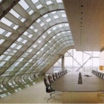
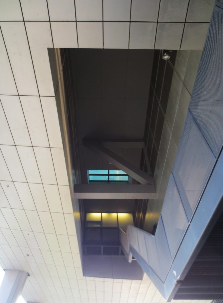
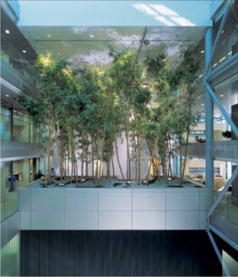
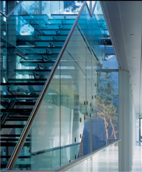
On the inside, cut a variety reflects the wealth space, alternating open and closed areas, with courtyards and gaps that multiply the view.
Spaces
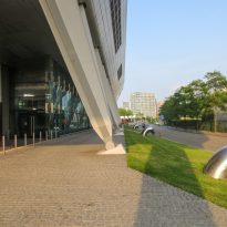
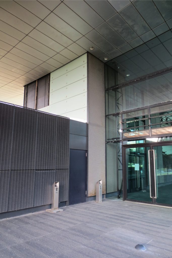
The main entrance is hidden among the “stilts” to maintain the building.
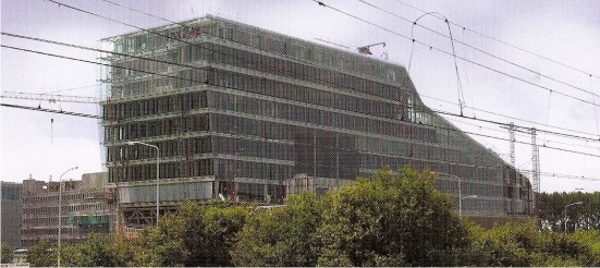
At its highest point, the building has eight levels. The drop in volume is reflected in the interior, where there are flats in the form of balconies, free plants that allow a diverse set of offices.
The overhang on the lake is home to the auditorium. Between this and the center of the building is four floors, some of the excess of double height.
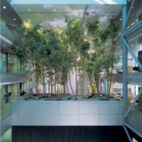
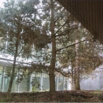
The gaps created flexibility and the broad view to improve the working environment. The inner courtyards and gardens blend with the jobs.
The volume covers 20,000 square meters covered, apart from the parking area.
Energy saving
Supporters of sustainable architecture, the designers used a number of resources to achieve an efficient building energy use.
We used a climate control system, based on a combination of pumping and mechanical ventilation, natural hot and cold water from an aquifer located under the building. Thus, there is no air-conditioners that pollute the environment.
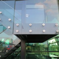
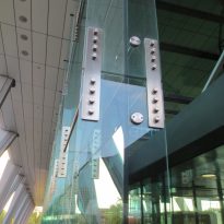
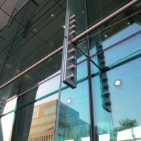
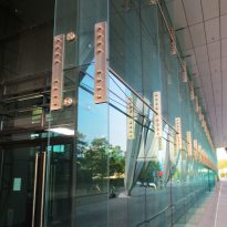
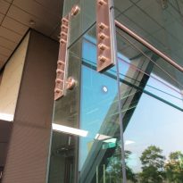
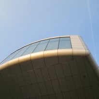
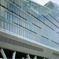
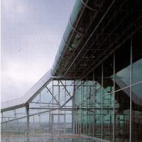
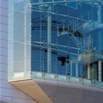
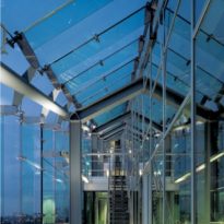
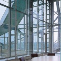
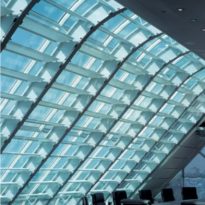
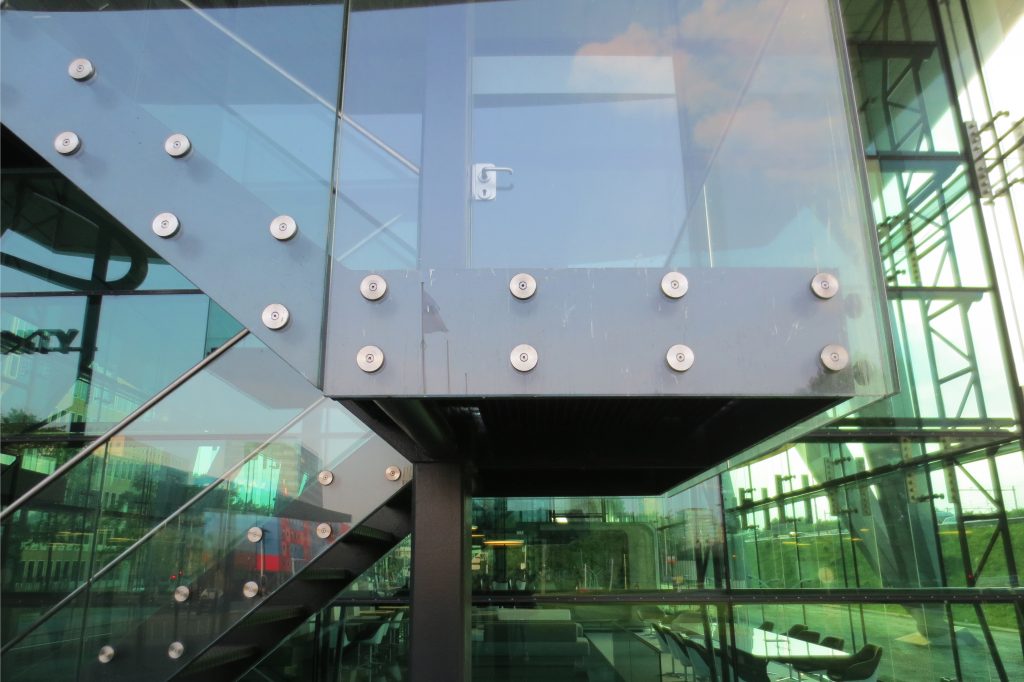
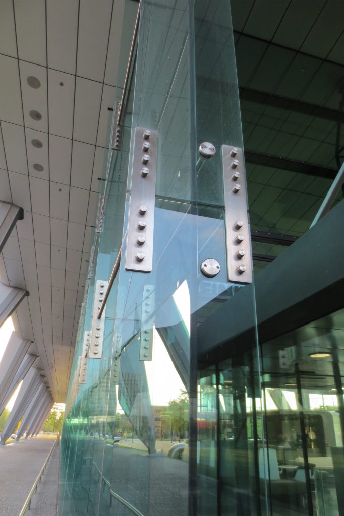
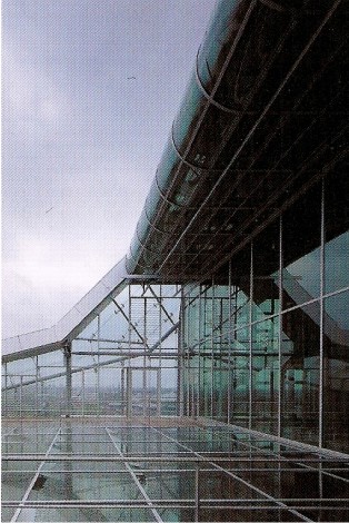
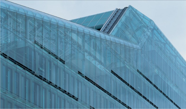
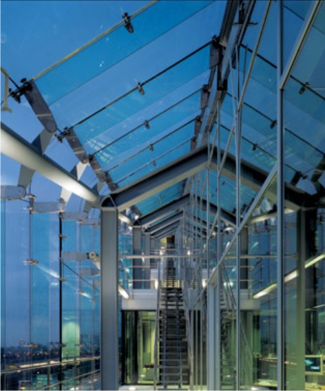
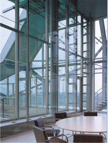
The double-skin facade of glass, with reticulated steel skeleton of the building allows air circulation and serves as sound insulation so that noise from cars to office ensordezca not. Between the two layers of glass visors that there will automatically be targeted at different times of day.
In addition, other factors contribute useful functional advantages, such as glass cleaning system based on robotic machinery and fire stairs, mechanical and concealed that only appear on the scene when needed.
