Independence Park Pavilions in Rosario
Introduction
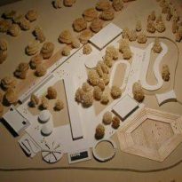
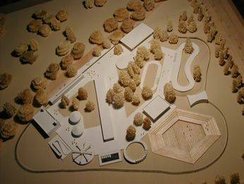
This work consisted of designing the infrastructure of an amusement park in Independence Park in the city of Rosario, Argentina. To this end, two buildings were designed and expanded, including an existing building that was remodeled with urban equipment and other campus facilities.
The buildings are pavilions. One for public toilets, offices and staff changing rooms; and one designed to house a ballroom, a local bar and a glaze for electronic games. The extension of the existing building was designed so that it could act as a reservoir of the park.
Situation
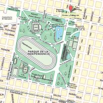
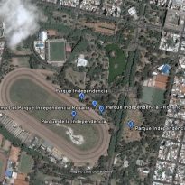
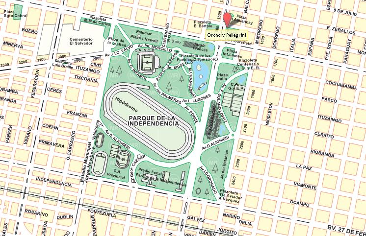
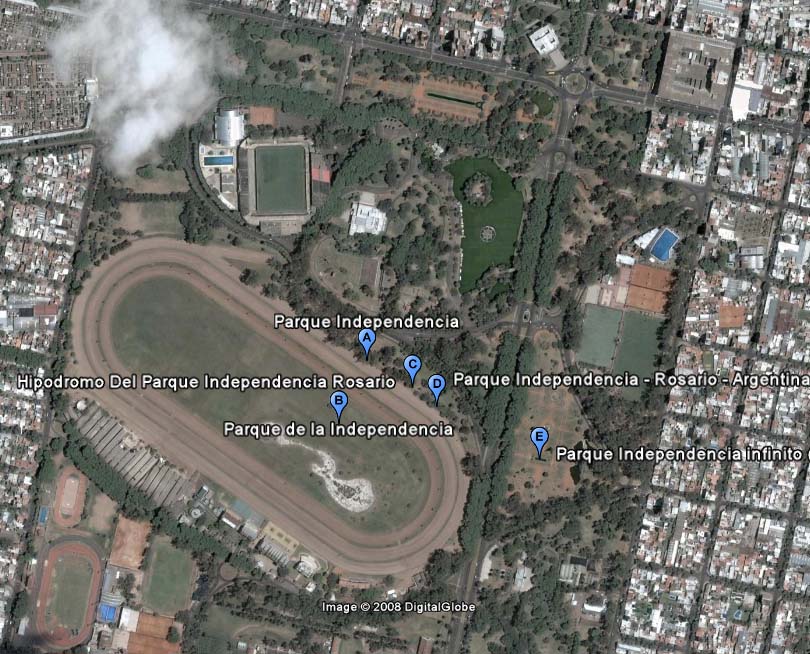
It was the first city park, the great lung of a territory where the population had tripled in just a few years. It is placed between the streets Bulevar Oroño and la Avenida Pellegrini, at the intersection of two formed four squares forming a large square, called Independence Square. The plaza would become the origin of the Independence Park.
- Clubs that are in the Park:
- Club Gimnasia y Esgrima (Gymnastics and Fencing Club)
- Club Atlético Newells Old Boys (Newells Old Boys Athletics Club)
- Club Atlético Provincial (Provincial Athletics Club)
- Spaces:
- Rose Garden
- Calendar
- Independence Park Fair Building
- “Independence” Racetrack of the Rosario Jockey Club
- City Museum
- “Jorge Newbery” Municipal Stadium
- “Juan B. Castagnino’ Museum of Fine Arts
- “Dr. Julio Marc” Provincial Historical Museum
- Garden of the Children
History
On August 24, 1900, Provincial Law No. 1035 authorized the Municipality of Rosario to expropriate land that would become Independence Park. The plan submitted was signed by architect Rafael Iglesia and landscaper Carlos Thays.
The estate of 100 hectares began being developed in 1901, with the building of interior roads, a lake and a little mountain, and approving the construction of the Garden City School.
The park was opened on January 1, 1902. Since then, multiple interventions have been conducted, extending it and providing it with new landscape works, technology, statuary, etc. Currently the, 126 acres consist of a magnificent grove that includes, among its species, chicks and eucalyptus, walnut, magnolia, willow and palm trees.
Spaces
The intervention consists of three parts, a pavilion intended for access and toilets, a pavilion for children’s parties and an extension of an existing building.
- Pavilion access and health:
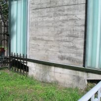
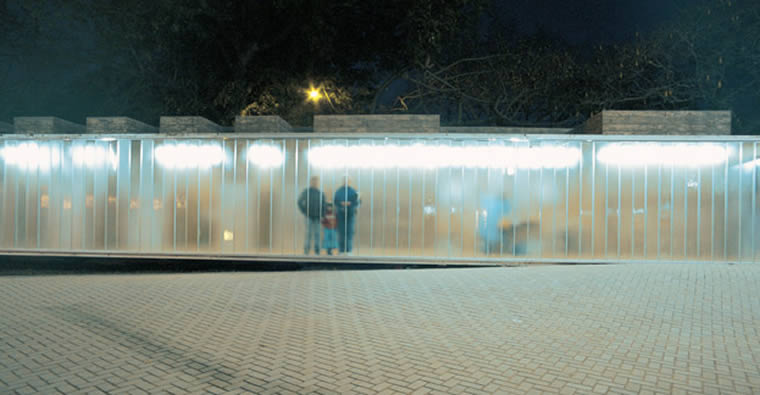
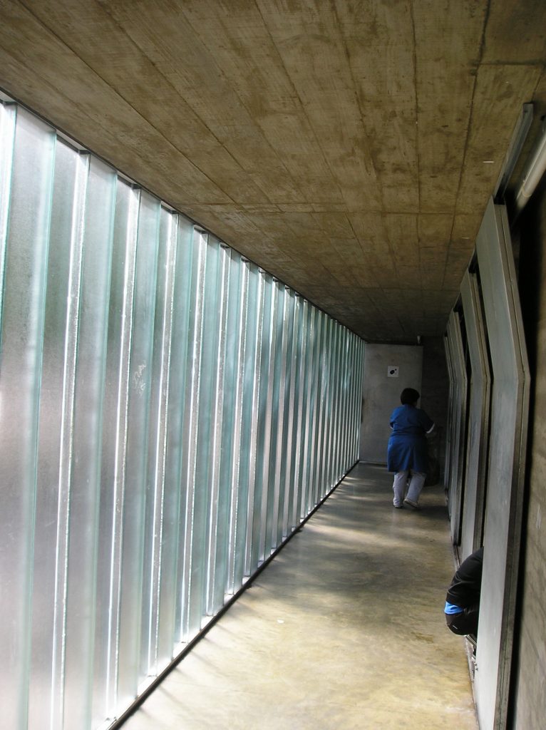
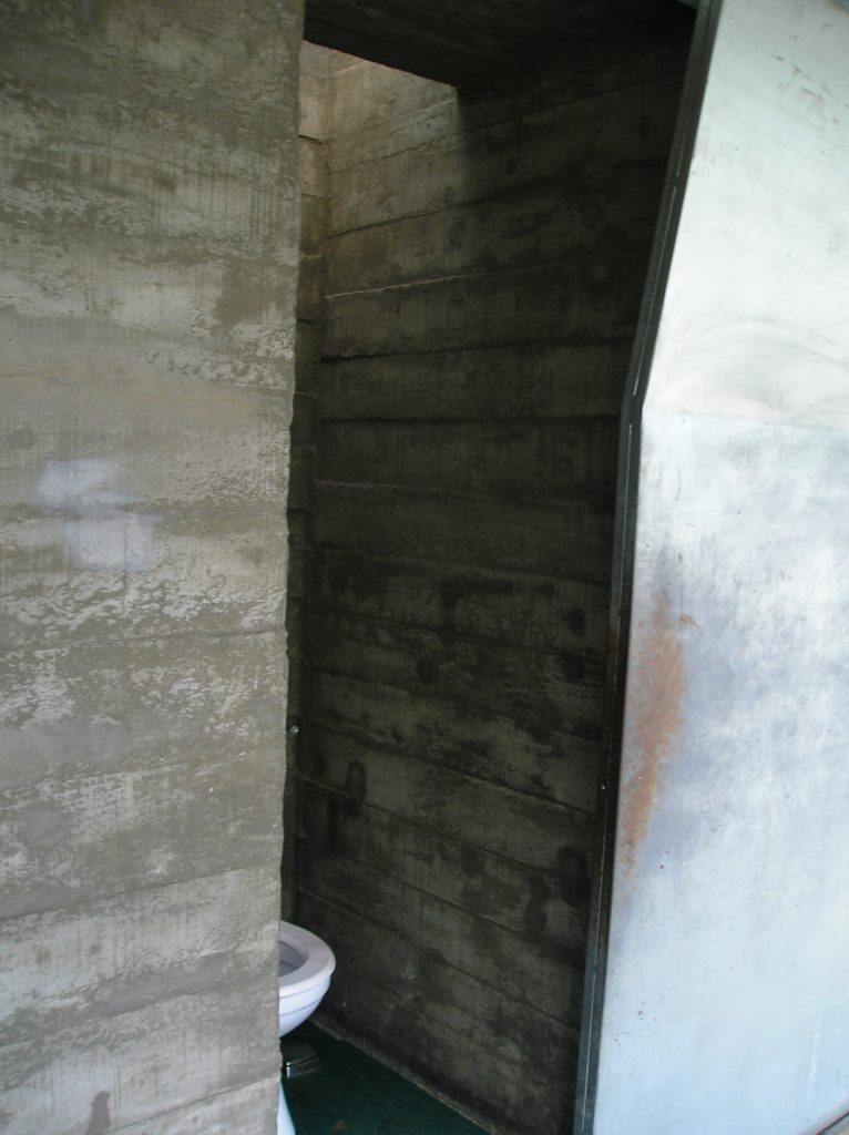
The first pavilion is located at the park entrance, and gave importance to spaces with functions not ranked very common. The new infrastructure (toilets) are located at the entrance to the park to mark the entrance and with the intention that, at night, the pavilion appears as a beacon of light to an area that is usually dark.
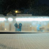
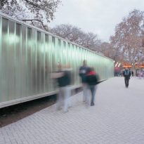
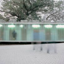
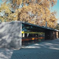
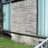
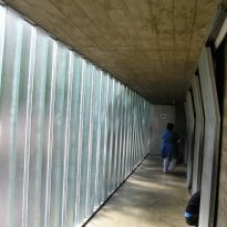
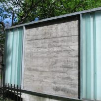
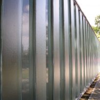
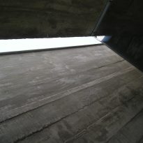
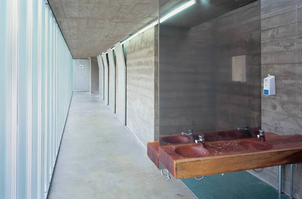
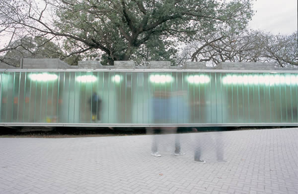
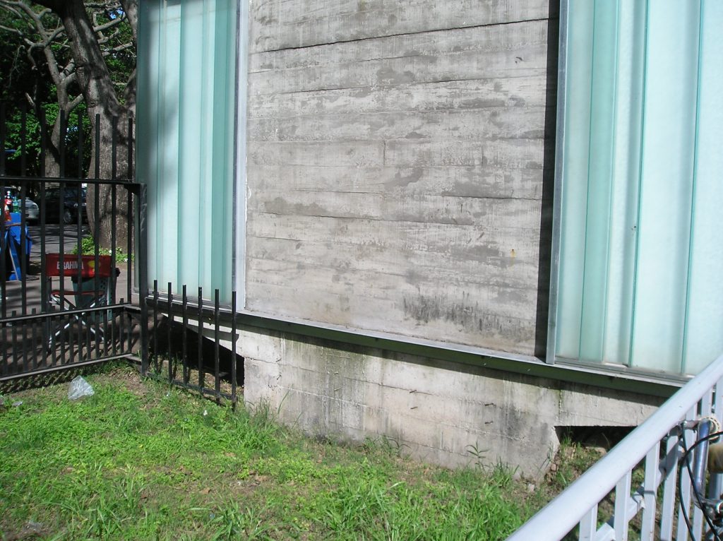
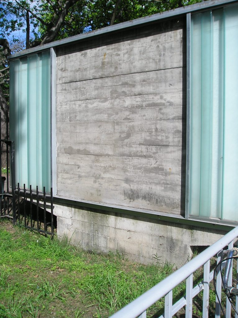
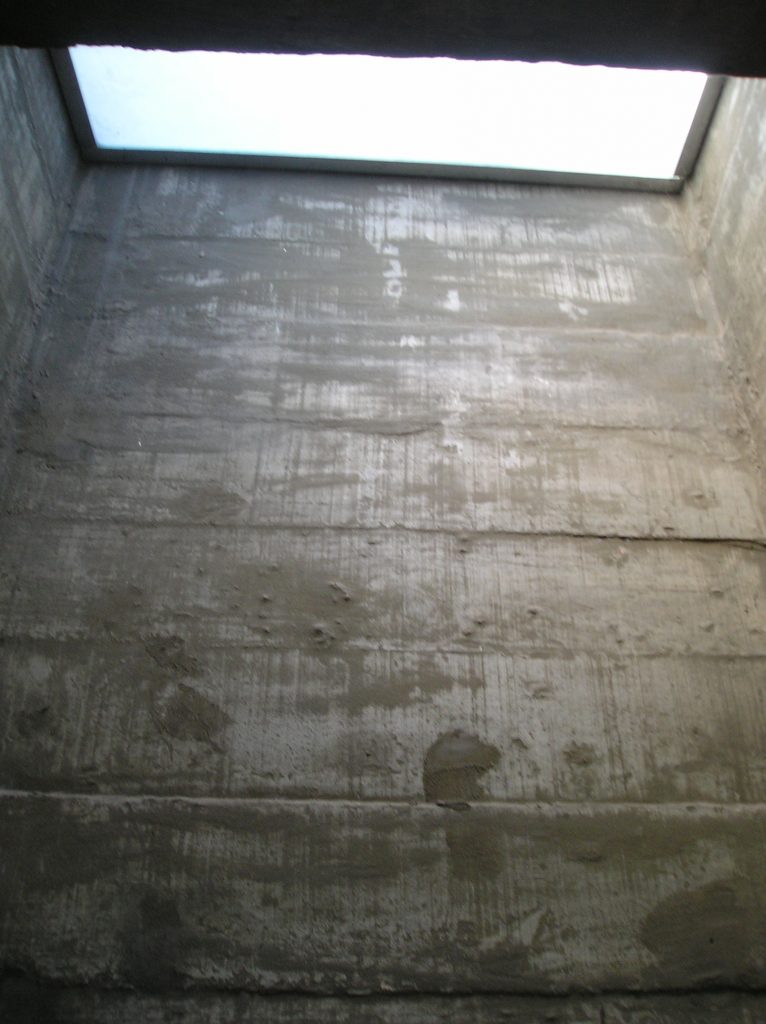
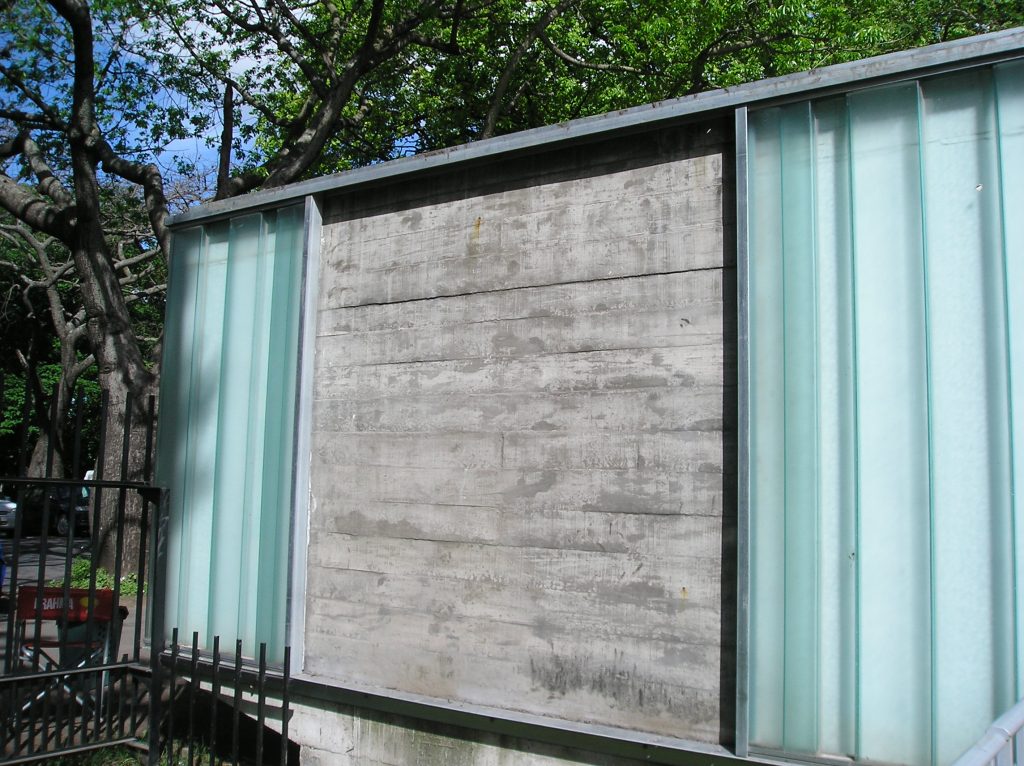
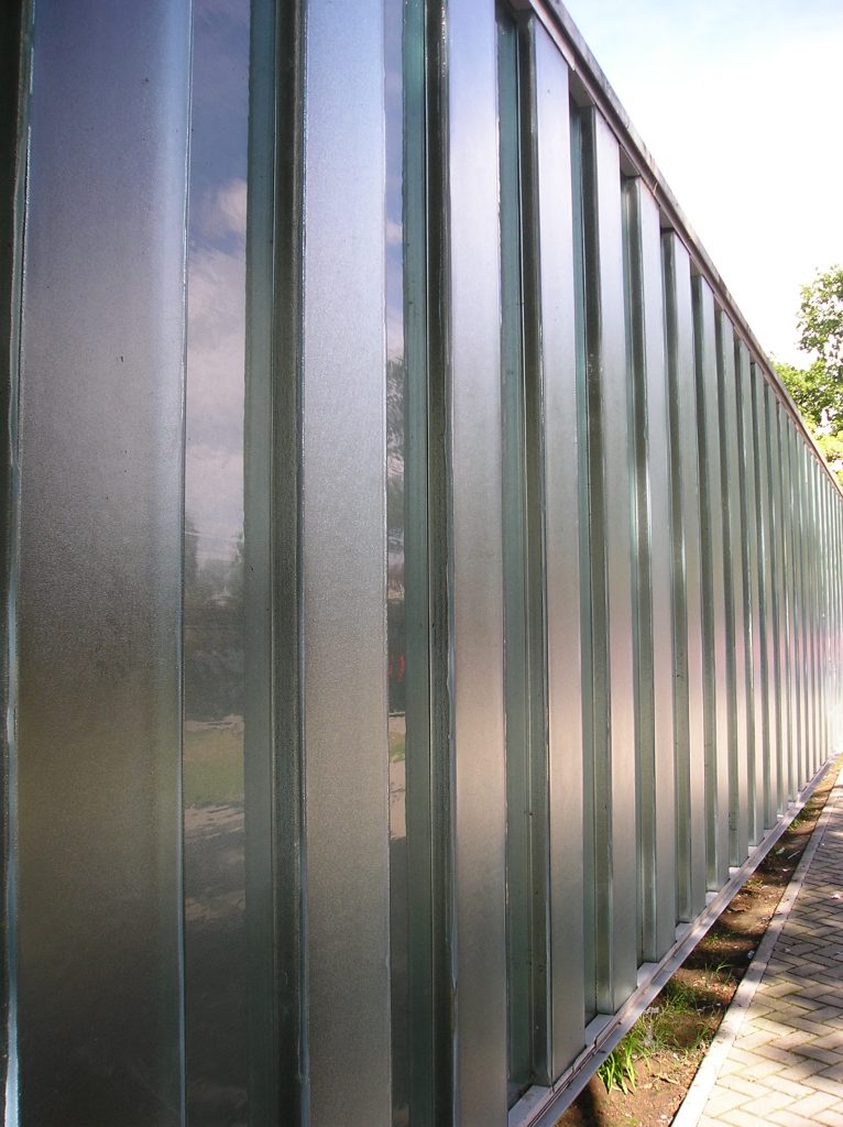
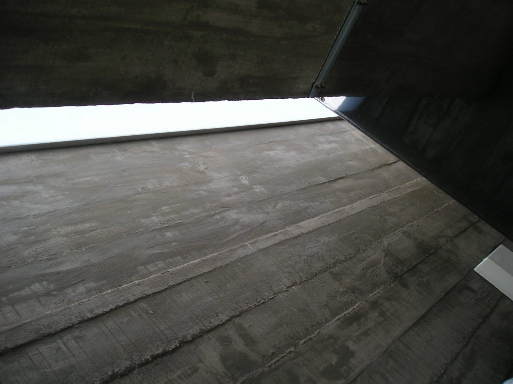
In the flat roof, skylights have been installed. The walls of the building facades are made to be translucent structural glass (U-glass), such that privacy and light in movement are achieved in the interior at the same time.
From outside, you can see if anyone is inside the premises, because the lighting cast cut-out silhouettes of the people inside on the walls.
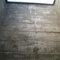
The flag of access and health is a closed reinforced concrete structure with structural glass (Profilit). At the same time, light and color printed glass is part of the facade.
- Pavilion for parties (or the flag of pre-cast logs ):
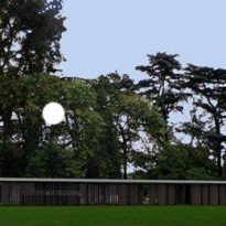
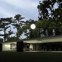
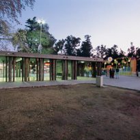
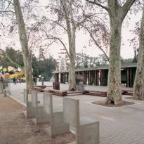
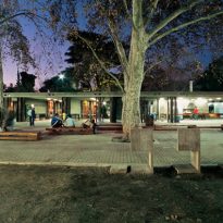
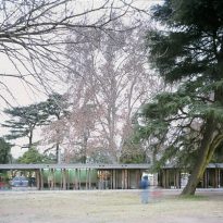
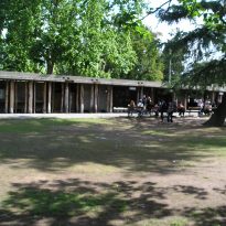
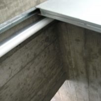
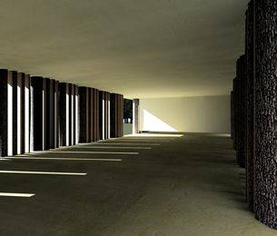
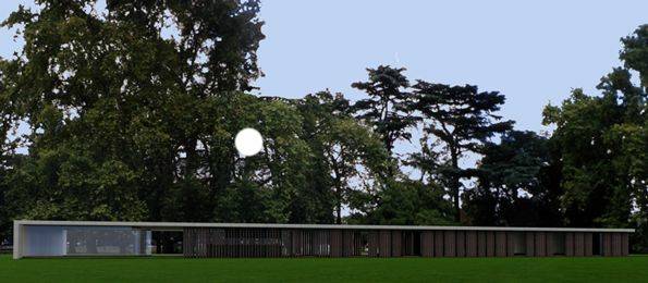
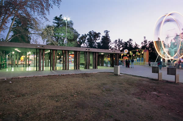
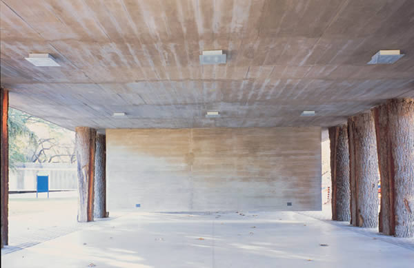
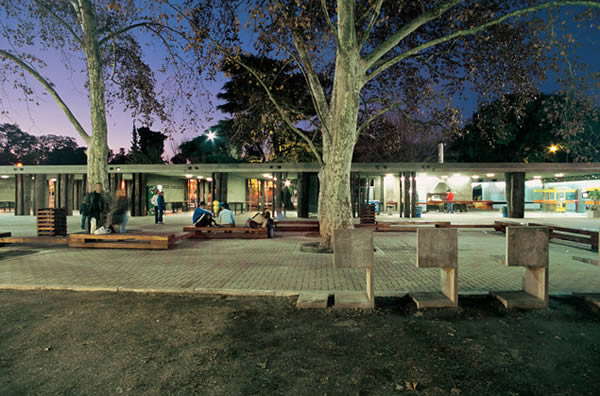
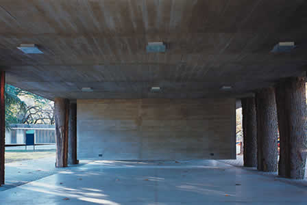
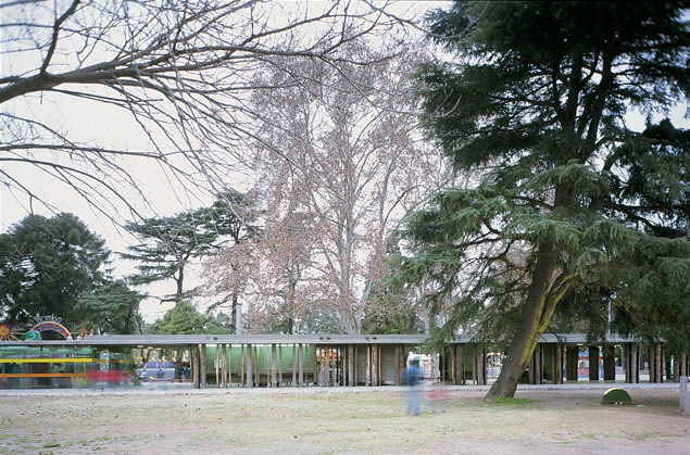
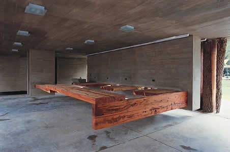
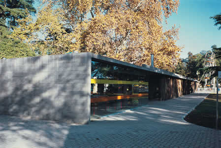
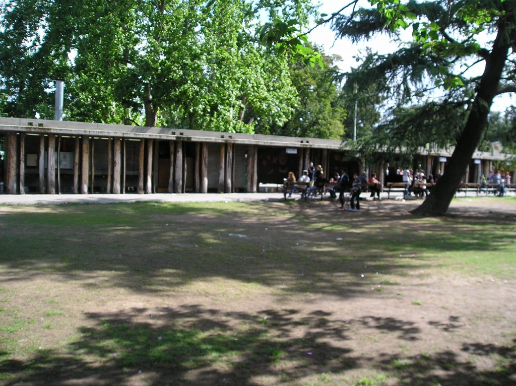
Like the other flag, this flag posed in the hall stands on a stone with red quebracho logs placed on the perimeter. Thanks to this structure, alternating dark and light from outside is achieved. The slab is simply supported and anchored to a wall at one end. In this structure, the partitions hang from the ceiling to give it more weight and more stability.
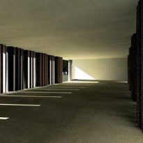
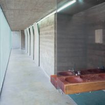
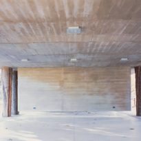
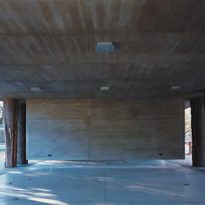
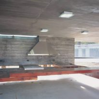
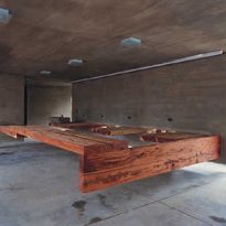
Inside, nothing reaches the floor. The tables, bars and floor of the tank are fixed to these rigid concrete curtains. Even in the facilities, the drainage basins stop a few inches before reaching the ground for water to drain freely. It is a real free plan.
The idea of this project is that the building disappears and the logs are merged with the trees in the park and only manifest the straight line of the slab weighing on the trees as the only sign of human intervention.
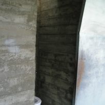
As part of the design, the logs are cut into three slices to facilitate their handling and in order to disrupt the spillover effect and show them the imprint of the human hand, without attempting to mimic nature. Despite their traditional appearance, the logs can be thought of as pre-shaped columns whose manufacture has been left to nature. However, the logs have eventually lost their bark to the red tannin of the skin, and through the years, acquired a silver color.
- The expansion of the existing building:
The existing building had modern lines typical of the 1960s, with curved walls. The intervention was then reduced to break the symmetry along these original lines.
Materials
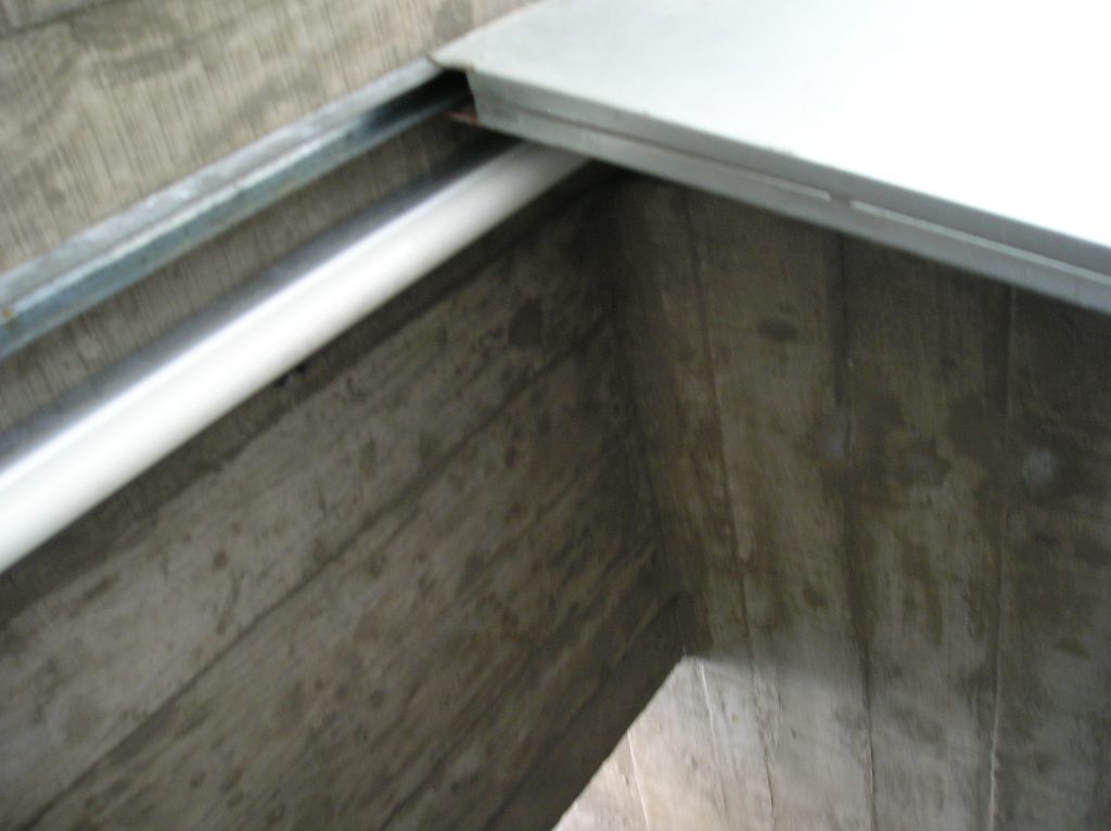
The materials used include reinforced concrete, wood (colored quebracho), countertops and shiny polished surfaces, glass: Pilkington Profilit® and stainless steel bathroom doors.
The contrast with rustic concrete surfaces that mirror officiate the worktops and stainless steel doors.
Equipment
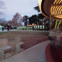
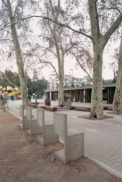
Following on from the pavilion hall and the banks, are some banded sleepers with packing tape placed between the trees and concrete chairs that are a reconceptualization of a model, made in Barcelona, in which the support has been shifted to make it more comfortable.
Signage
Usually, signs for the bathrooms show static figures that only differ by gender. Instead, in the bathrooms pavilion, the figures are shown doing what they need to do.
