Iberê Camargo Foundation

Introduction
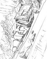
The museum foundation for Ibero Camargo was a contest won by Alvaro Siza to showcase the collection of the most important expressionist painter Brazil.
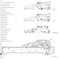
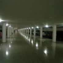
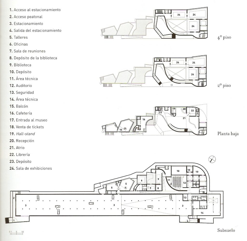
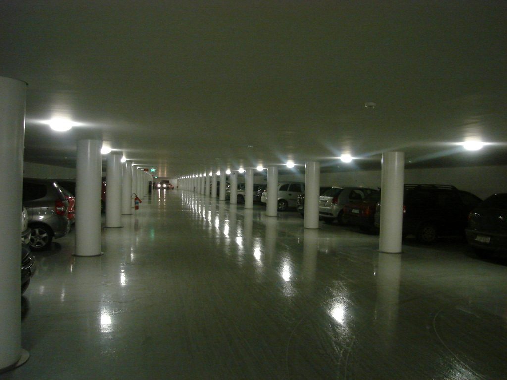
The five-storey building has spacious and flexible exhibition spaces, an auditorium for three hundred people, spaces for administration and workshop, parking for one hundred cars and a library financed corporate capital.
Location
Porto Alegre, with a population of 1.5 million inhabitants, is the state capital which is at the southern tip of Brazil. This state is part of the rest of the country not only by distance but also by the European immigration that was and the gaucho culture it shares with its neighbors, Argentina and Uruguay. As in many other Brazilian cities, the recent massive increase in residential buildings, built according to codes of modern planning, the urban landscape has changed. Many of the old buildings are preserved, in particular those representing the various institutions of the city, including the cathedral, museums and universities. Today, architects are very common but globalized Brazilian culture has been unwilling to receive them and has defended its market by promoting the identity of the country.
Concept
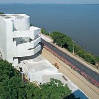
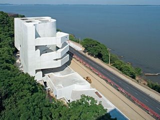
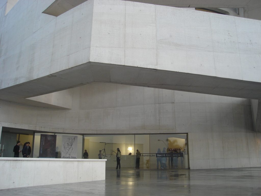
The museum is the first of Siza in Brazil and probably the most iconic. He has never stood out from the buildings and the landscape setting and would prefer to integrate it. The location of the work demanded a more powerful demonstration as seen from the distance across the road or water. It is an approach similar to that of the public buildings of Niemeyer in Brasilia.
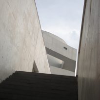
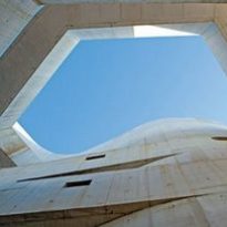
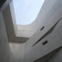
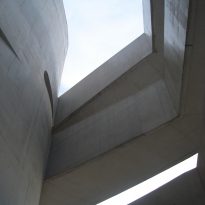
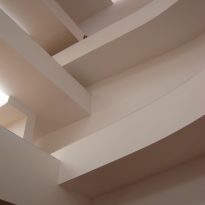
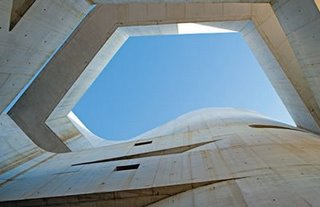
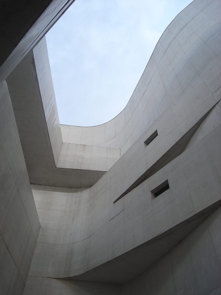
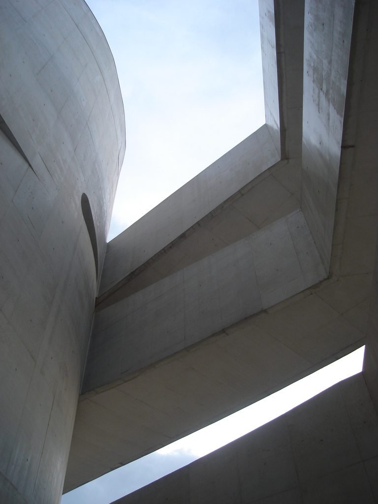
Siza Brazilian blends elements with the current European architectural aesthetics. Ramps and windows of the facade of monolithic concrete are similar to bridges and small, irregular windows of the cultural center Sesc Pompeia by Lina Bo Bardi. Precise and polished edges, irregular design of windows and extremely complex ramps that float freely and are intertwined with the walls of the portico are typical elements of the aesthetics of European foreign and complex geometry, in this case playing with the folds and interwoven.
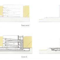
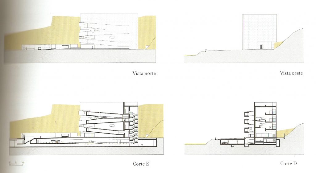
The building is located near the river Guaiba, west-facing one of the guidance characteristics of Porto Alegre, Brazil famous for its sunsets on the water its broad river port. The site was an abandoned quarry that the city surrendered to the Foundation, the building was constructed against the void of the quarry, but taking care not to increase the cut on the hill. Its lower level was built under the natural ground level: the parking is under the street nearby. As these decisions make the building below the level of the river, a canal, double wall, casing, surrounding the lower ground floor to evacuate in case of flood water.
The project raises the controlled opening of strategically arranged openings, one of the constants in the work of Siza. The windows are deliberately small in the sunny west facade, provided large glazed panels to the dark side behind the set and serves as the backdrop for a coffee, some galleries and workshops. The sight of the river, despite being beautiful, has been controlled so as not to turn the museum into a viewpoint, like the building Niemeyer in Niteroi.
Ecology
Another aspect that has been given great importance to the project is the care of the environment, both inside and outside the museum. Especially important is the reuse of rain water in toilets and other facilities, water, after being processed in a treatment of solid and liquid waste, is used to irrigate the vegetation in the surrounding area. Native vegetation will be preserved, and plans a path of 200 meters so that visitors can appreciate the nature of the place.
The museum is a kind of “smart home”, with ventilation and temperature and humidity control computer, for example the air conditioning system produces ice at night when energy is cheapest, to cool the rooms during the day.
Spaces
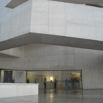
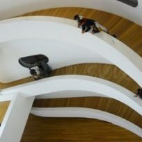
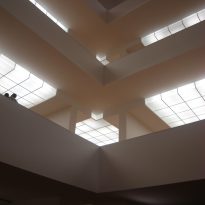
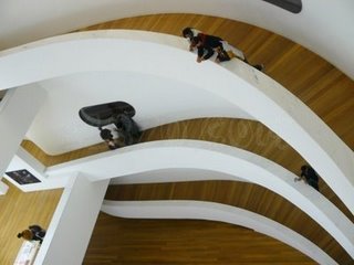
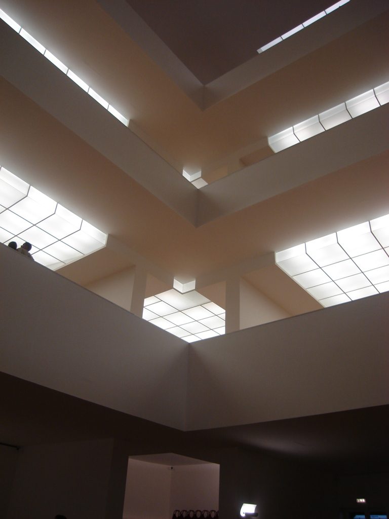
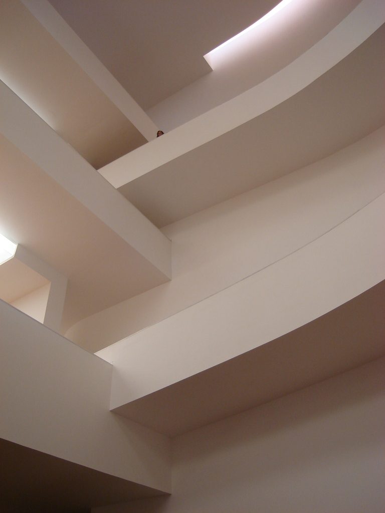
Despite the image of a museum with a great void in vertical circulations and immediately refer the Guggenheim ramp Lloyd Wright, Siza has separated the circulations and promenades of the exhibition spaces: the galleries are L-shaped floor and connect to ramps at the ends, and the circulation spaces are buffers between different floors or statements, completely separated from the container art. Upon entering the museum, passing under the magnificent bridges, the main route through the atrium to reach the top floor via an elevator, and then in turn passes the indoor galleries and slide decks, communicated with the outside by small shafts or openings providing views of the lake and the city center, in a cycle that is repeated four times to return to the level of access. This creates a rhythm between rooms, visually connected to the area of workshops to allow visitors to see the creative process of artists in residence
Structure
Structurally, the set is balanced with a great balance on the opposite side, where the body of the building itself, its counterweight. Visually, however, unbalanced perception of the ramp to start and reach the same point, offered hope for his right foot twice and Siza’s ideas, sensitive to the Brazilian culture.
The building is part of the slope of the mountain, on which is embedded rugosamente, solving the vacuum created by an ancient quarry.
Materials
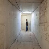
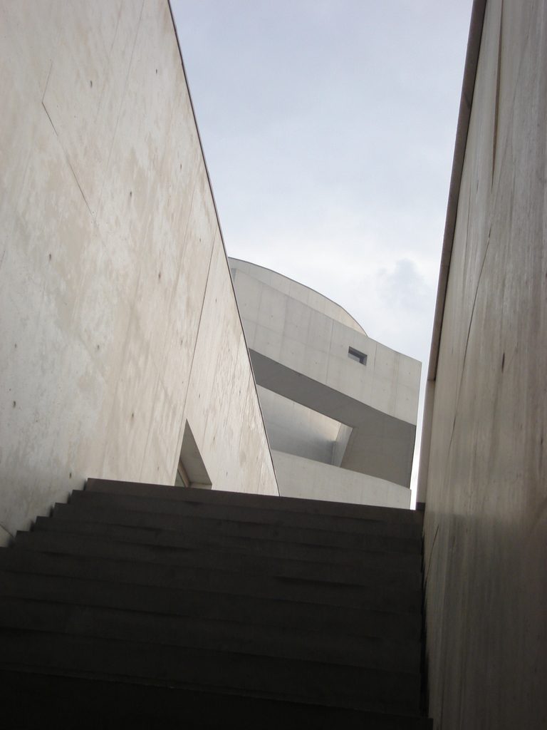
The white concrete used in construction is an unusual material in this context and has been interpreted in many ways by the media resulting from a mixture of cement and white marble dust was prepared in situ. Siza has functional qualities of the material used to explain some design decisions, emphasize the local physical properties, resulting in easy maintenance and suitable for a building oriented to the west in a very sunny, one of the concerns from the Brazilian. Has the makings of a white abstract surface while the thickness of its own material, detected in the modulation of the molding. Unusual for the local reality, all the walls were insulated. The light wood floors, white marble and white plaster walls, acoustic, all characteristic of the work of the Portuguese, are installed carefully.
