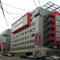
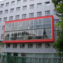
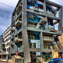
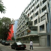
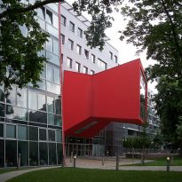
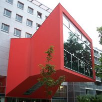
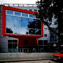
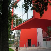
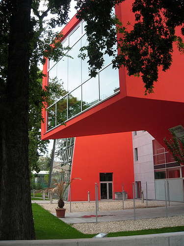
Homes and offices building at Schlachthausgasse

Introduction
From Children’s Hospital end of the third district of Vienna in 1998, municipal authorities sought alternatives for a new intervention in the area that would become vacant. For this reason, called an architectural competition, which was won by Coop Himmelb study (l) au.
In the contest should be noted that it is a very urban and architectural intervention that respects the surrounding formal language.
While this is not a common feature in the deconstructive work of the study, in this case raised a project according to the needs of the competition.
Location
The complex is located in Schlachthausgasse, the central third district of the city of Vienna, two kilometers from the historic center of Vienna.
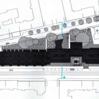
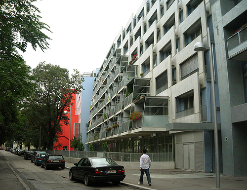
It is implemented in a block atypical, narrow, triangular and very sharp corner. On one side is a heavily traveled street vehicular and pedestrian, the Schlachthaus, and the other, the diagonal Klein, quiet, wooded area and its proximity to a park. Moreover, low Schlachthaus street slope to the river Danube.
On the street Schlachthaus are the entrances to the building.
Concept
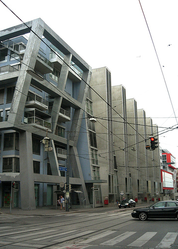
The set mimics an object emblematic of modernity as the first rail, through a linear succession of buildings and blocks. The style of electric trams and trolleys that run through the historic city of Vienna, the set is implemented as the formation of a train with locomotive, wagons and vans.
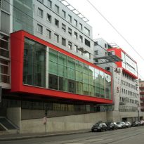
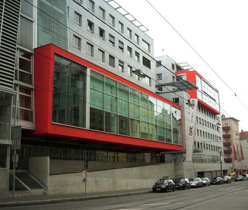
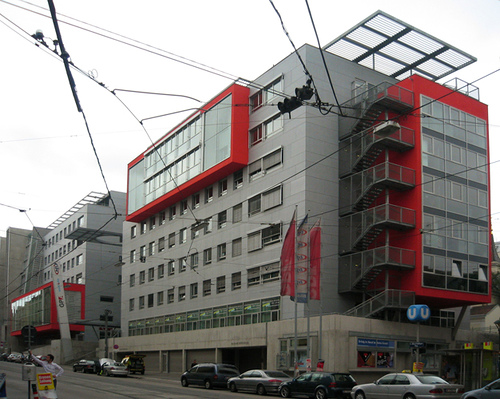
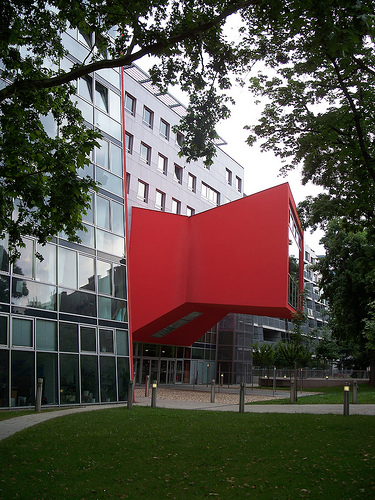
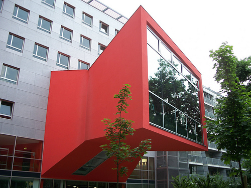
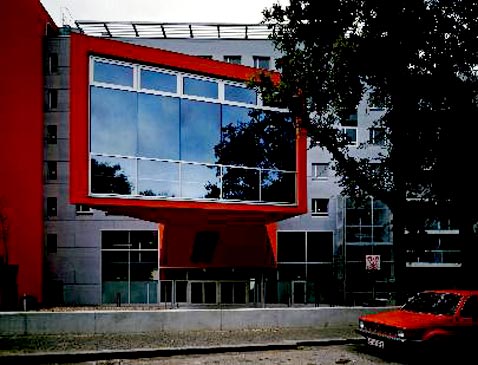
The sculptural projection of all these architectural pieces painted red confirms the main idea of the formation of an old train. Almost a mechanical toy, with its colorful chimneys and cheerful chirping of pistons, levers and gears, as the trams running on the Schlachthaus.
Spaces
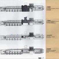
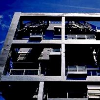
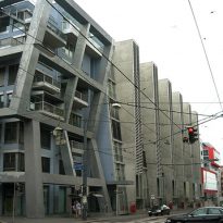
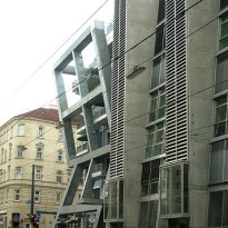
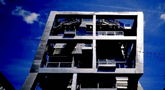
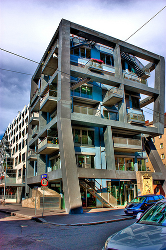
The reference to the rail assembly is made possible largely thanks to its implementation on an apple atypical. Acute at the apex is located a block of flats in a cage of concrete with slashes in different directions. These decorative elements seem to rest on the ground like the legs of a large insect or a lunar module. But in addition, the dynamism of this piece seems to pull the rest of the set as a locomotive to the cars. Behind, they line modules that house the functions of housing first, and offices, further back, in an alternation of inclined volumes and straight, concave and convex, projecting and cantilevered from the outside to identify the different activities and sectors the complex, in addition to optimizing the use of natural light.
This volume reminds diversity, in turn, a plurality of constructions of a normal block, as indeed are the two streets that define the work.
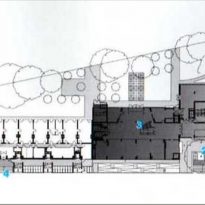
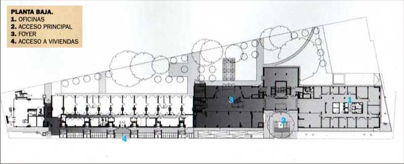
One of the priorities of the project was to preserve the existing old trees. For this reason, the volumes are arranged in parallel to the street Schlachthaus, respecting the building line of adjacent blocks and paving the green, which gradually widens, enclosed by the diagonal Klein, and is acoustically isolated from the bustle of another street by the construction itself.
The balconies of the houses and a large veranda in the office sector are oriented in contrafrente on the diagonal.
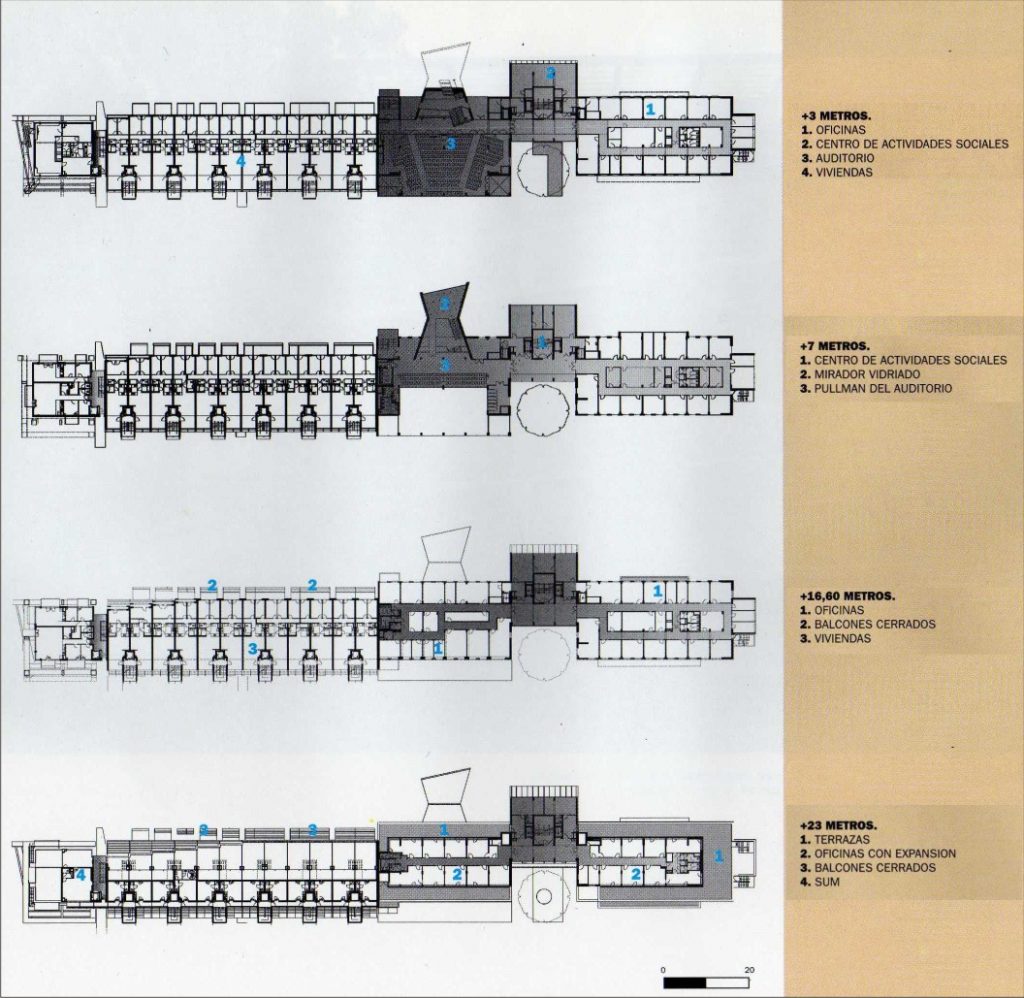
In the apartment blocks, totaling 82 units, available to respond to some volumes generate counterpoints Viennese tradition in a uniform volumetric group homes across large boxes containing vertical prismatic cores services and vertical circulation.
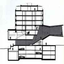
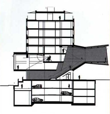
Modernist and deconstructionist attitude that characterizes the study is more visible in the office sector. This block is defined by a symmetrical plan organized around a large open foyer on which are erected an auditorium and a viewpoint. This element is cantilevered and is distinguished by its red color. Moreover, this block took advantage of the slope of the street towards the river Danube Schlachthaus, for driveways, underground in the residential sector, are at the same level of the carriageway in the area for offices.
The foyer serves as distributor of traffic. From it rises a wide staircase leading to the auditorium on the first floor, and from the viewpoint on the second floor, where the sector can also be accessed from the audience pullman. The large amplitude of these internal spaces, unexpected by the narrowness of the building complex and the block where it is built, creates one of the most striking contrasts of the work.
