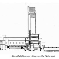
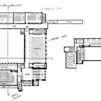
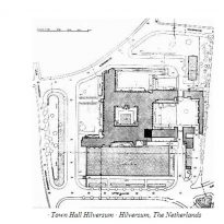
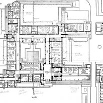
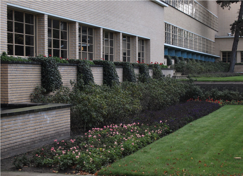
Hilversum Town Hall

Introduction
Background
Already in 1913 there were plans to build a new town hall in response to the growth of the municipality of Hilversum. When Dudok became Director of Public Works of the city, 1915, he abandoned the idea of common tender for these projects. During his first month in office the ambitious architect had designed a traditional council intended to downtown. Due to the Great War and the lack of funds, it was not until 1924 that Dudok presented its final design. All initial doubts as to its capabilities, particularly among fellow architects, disappeared quickly.
• Design
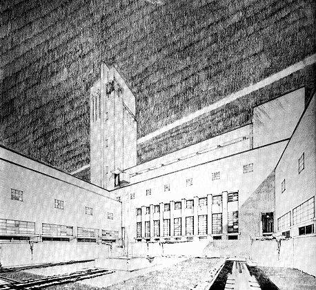
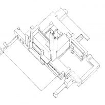
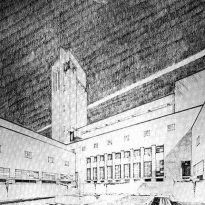
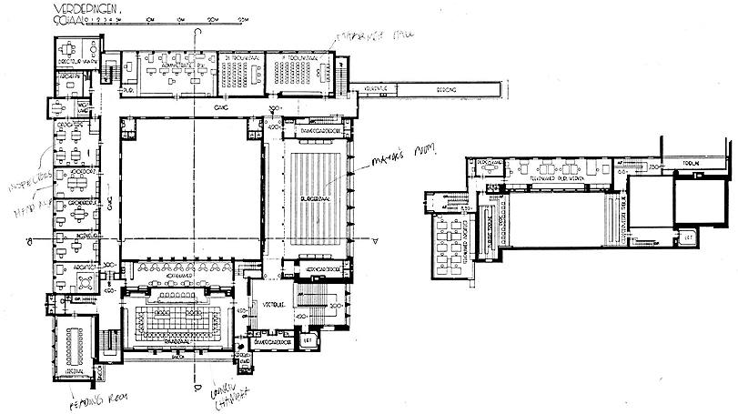
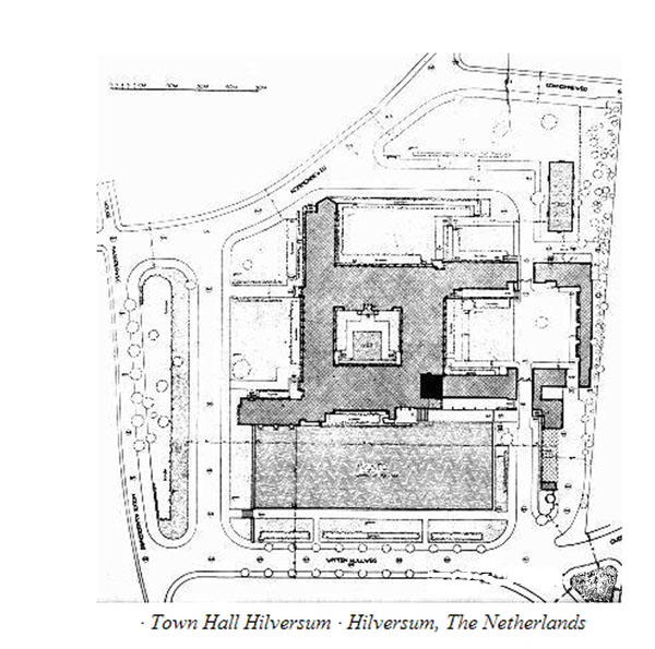
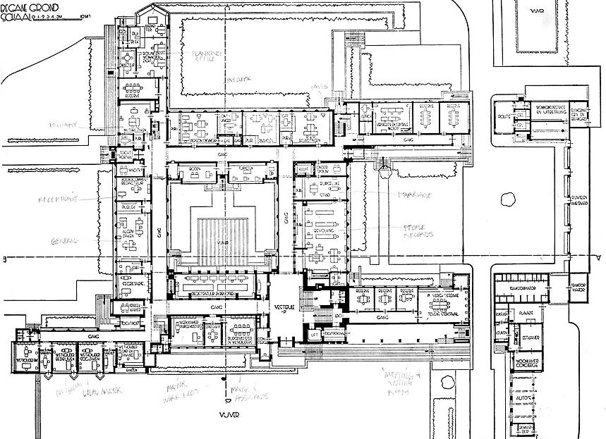
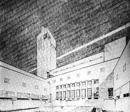
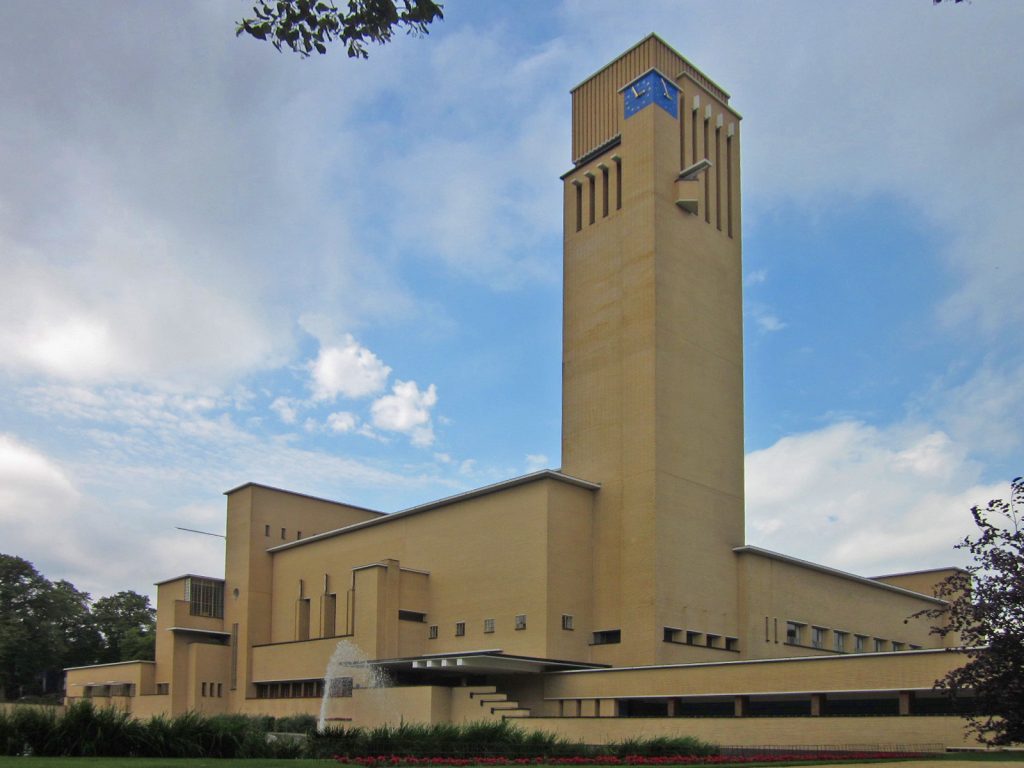
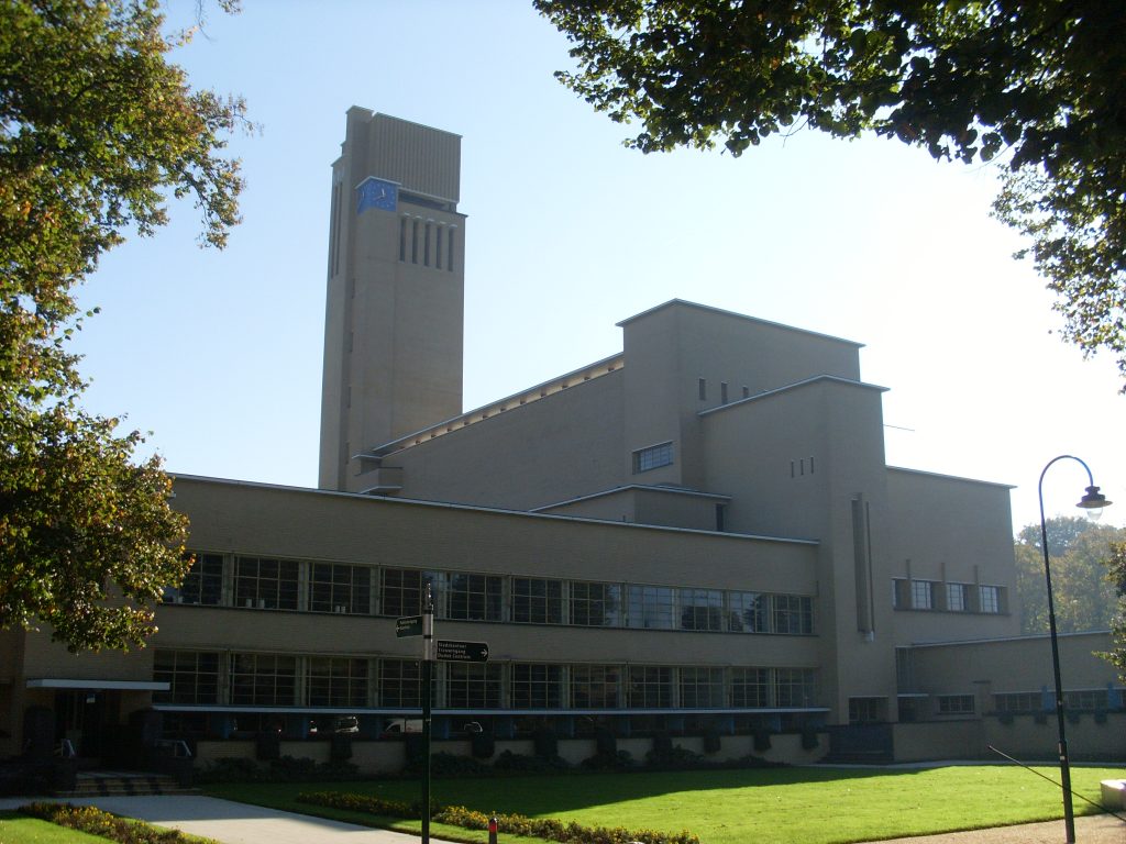
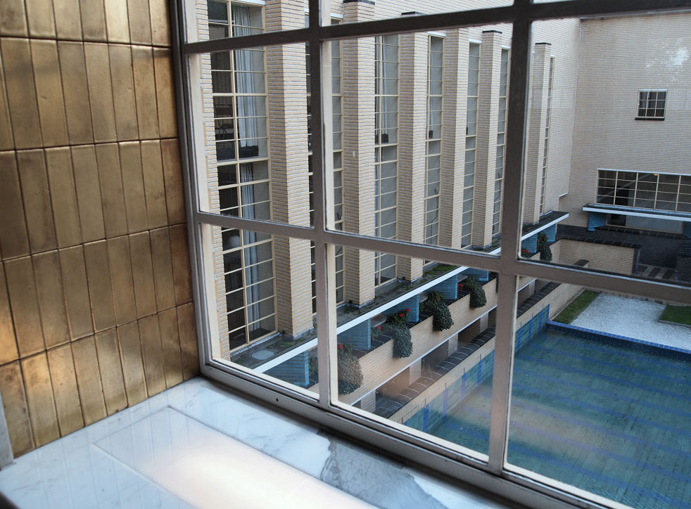
The final location in a place devoid of construction lines and without restrictions in the permitted height gave vent to draft Dudok. The building, which highlights its landscaped environment and culminates in a high tower, was designed from perspective drawings. It consists of two squares, one inner courtyard surrounded by offices and a second courtyard surrounded by low spaces for the operation and traversed by a service road.
Building
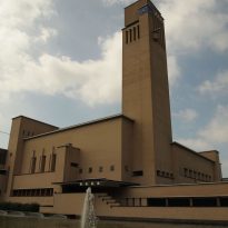
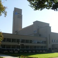
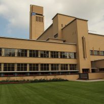
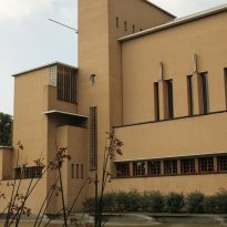
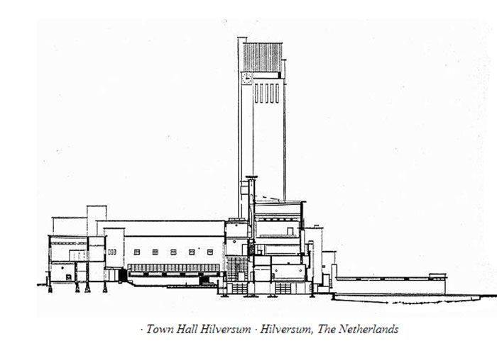
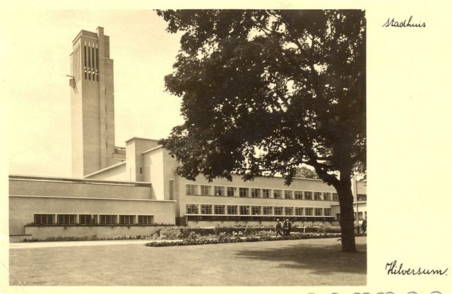
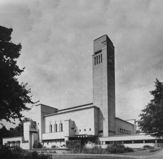
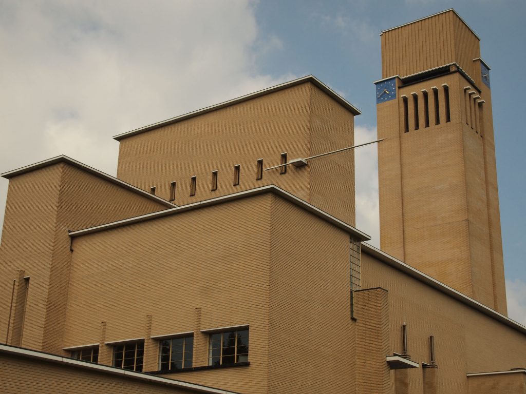
In the Town Hall of Hilversum, architect Dudok Willem language manages the vertical and horizontal volumes, the set of masses against hollow, flat roofs floating and monumentality. This remarkable and in many ways unique structure, whose first sketches were made in 1924, is considered the masterpiece of brilliant but anti avant-garde architect’s career.
When the building was completed in 1931, the public embraced this example of modern architecture, for its balance between form and function, and it seemed traditional in composition, fine craftsmen and high quality finishes and materials used. But above all, it was praised for its monumentality. Dudok commented: ” The monumental is the purest expression of the human sense of harmony and order.”
Some critics, however, felt that the building had an anti – structural arrangement, which was proportionally irresponsible in their ways and accused of diluting Dudok modernist designs or be halfway modernism, playing another contemporary, rather than create a formal language itself. By insisting that its architecture lacked a specific style, critics suggested that their designs were not fluent, thus limited to a strict formula for the entire architecture.
However, the end result becomes a sculptural expression of a subject composition. It is a testament to the consistent harmonic form, function, art and human need. Hilversum City Council is not only the magnum opus Dudok ‘s career, but also one of the most successful buildings in the history of the modern movement.
• During World War II the building was used as headquarters of the German Wehrmacht Dutch, for which it was necessary to camouflage the prominent tower.
• As Hilversum is the ” average city” of the Netherlands the sound of the bell was broadcast live every hour on public radio stations until the 1960s.
• The building was restored between 1989-1995 by Dutch Van Hoogevest Architects. Restoration costs caused some scandal, as it was at the time the proposal to sell a Mondrian painting from the collection of the city to pay for the restoration.
Location
City receiving much of the work of Dudok, the city of Hilversum, also commissioned architect your city.
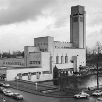
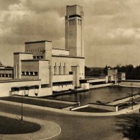
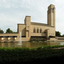
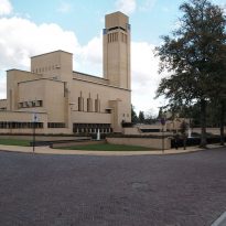
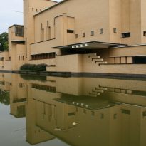
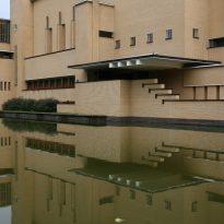
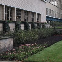
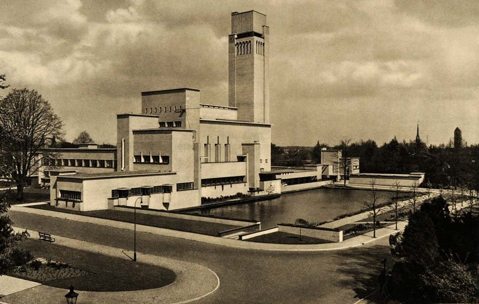
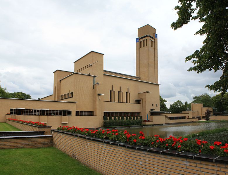
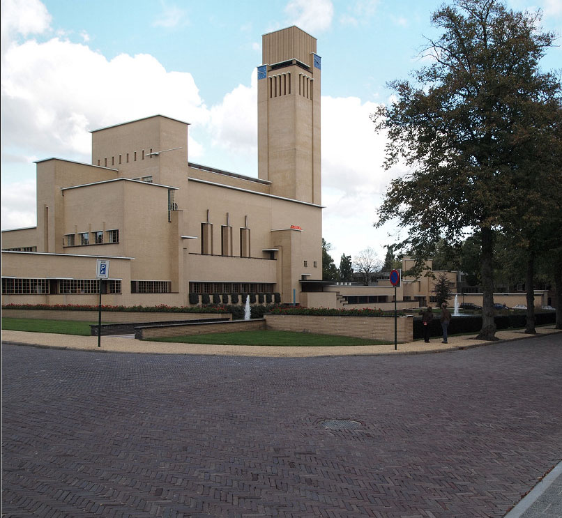
The town hall was built on the outskirts of the city center, an environment dense, dark brick homes made with stucco and on extensive grounds, so he could be surrounded by a park, the stunning light colored building rises from the water, in the midrange of open space and thus highlights the garden city character they wanted to achieve in Hilversum, located approximately 24 kilometers southeast of Amsterdam, Netherlands.
Concept
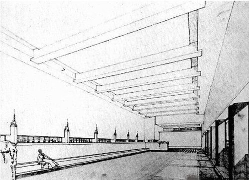
The immediate public acceptance of the building derives from the fact that it is one of the very few buildings of its period whose symbolic content suits their function and constructively.
Stylistically the work of Willem Marinus Dudok may be associated with the Amsterdam School, for its emphasis on individual expression, but also with the De Stijl group through use of the geometric shape. Like all his work, the building designed for the Dutch City Hall serves the public interest and not given to personal whims.
Internationally recognized as one of the most influential buildings of its time, the design is reminiscent of the early designs of Frank Lloyd Wright, specifically Larkin Building in Buffalo, or Midway Gardens in Illinois, United States.
Description
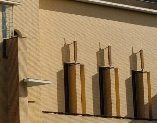
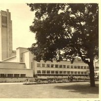
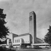
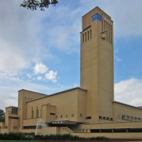
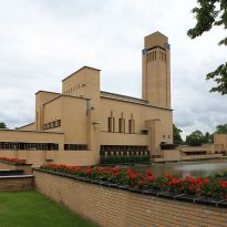
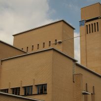
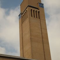
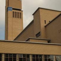
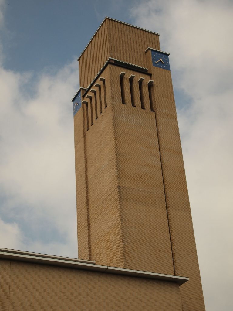
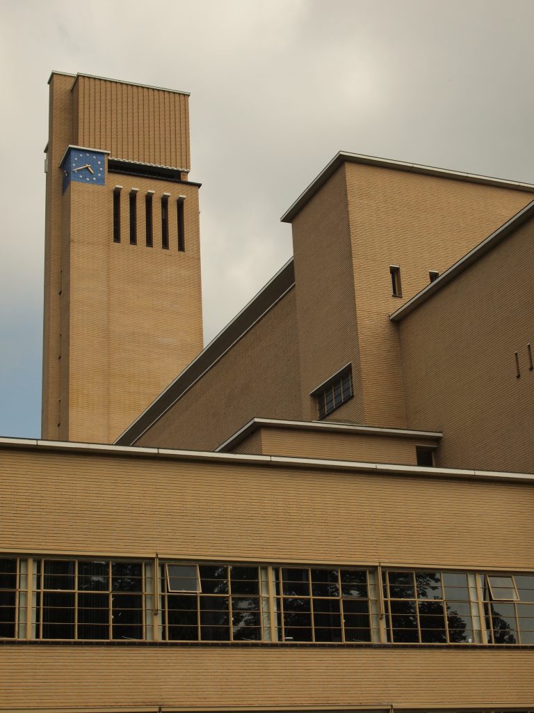
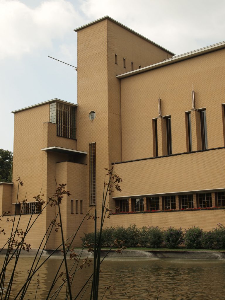
Despite its asymmetry, derived from neoplastic composition, the main representative elements are traditional yet monumental, like high clock tower over the entrance or the three symmetrical windows pointing the Council Chamber.
Hilversum City Council is, in any case, a composition of voids and volumetric elements, sometimes dramatically juxtaposed, other harmoniously blended. The building is at once monumental, without falling into pathos, romantic and very personal. All construction is quite closed, as evidenced by its hidden entrance.
Windows
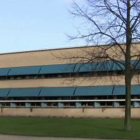
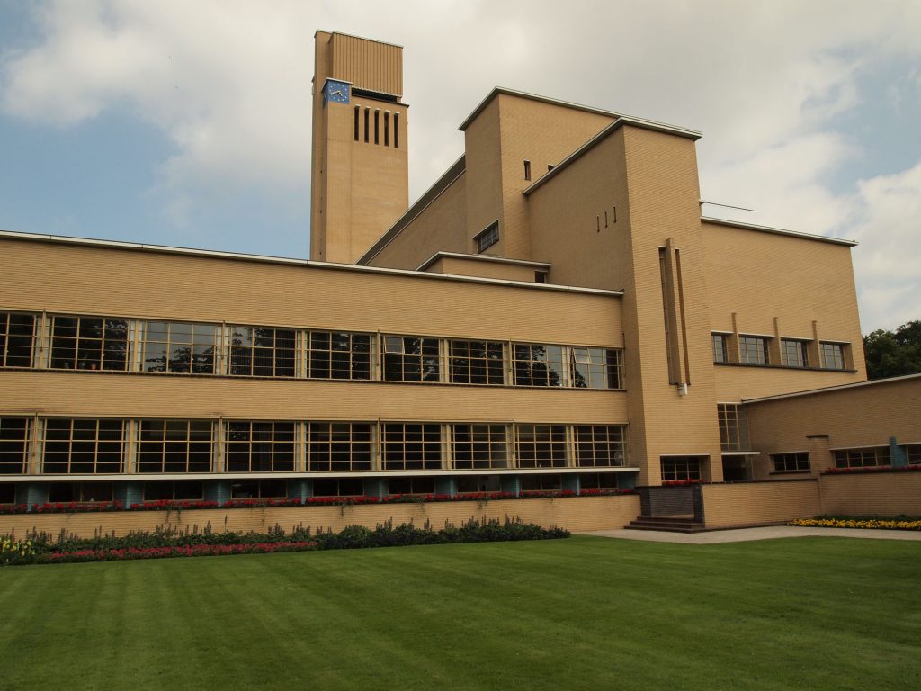
Bands glass, divided into small panels, which run parallel to the sharp and flat roof line and the horizontal plane of the ground, are juxtaposed with similar panels as a group rise from the entrance colonnade parallel to the mass of the clock tower and its elongated windows.
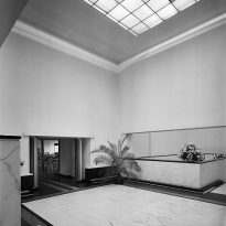
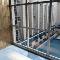
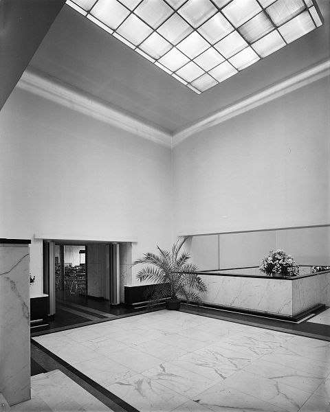
The indoor sequence produces an interlocking series of full and empty whose functional hierarchy increases as the fenestration. For example, the natural light coming through windows clerestory reflected on the ceiling, filtered through translucent glass panels set and then illuminated public stairs leading through the cover glass located above them.
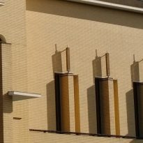
The Council Chamber, however, is naturally lit by only three tall narrow vertical openings that serve as windows.
The horizontal windows above the galleries accentuate its light bright color variations on the Round Hall lobby and reception area, combined with different styles of lighting.
Spaces
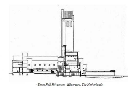
The building consists of several box-shaped wings and variable volume, with greater emphasis on the vertical part, broken by several horizontal structures that are assembled around a central courtyard.
Access
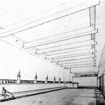
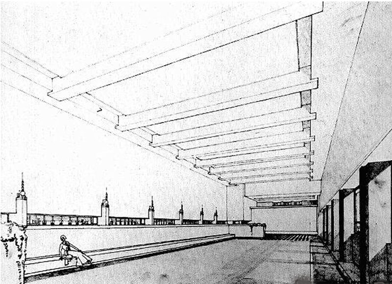
A path extending along the south facade with monumental expressive – window openings, awnings, balconies and the tower, leading to the main entrance, which is used only on official occasions. In bad weather we use a gallery parallel to the front door.
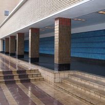
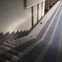
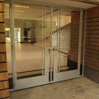
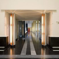
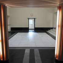
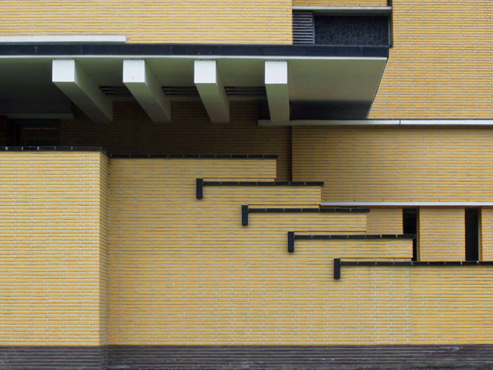
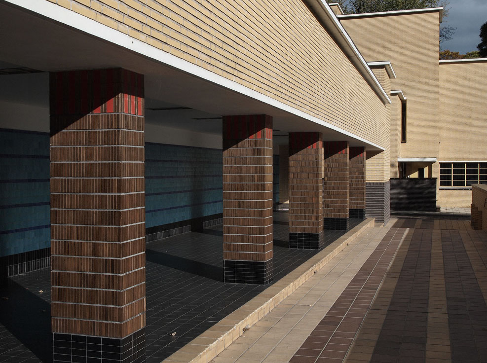
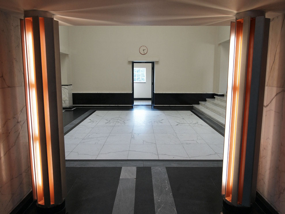
On one side of the tower, the main entrance is defined by a cover that extends into the lake. Instead of an axial approach, are accessed through a colonnade perpendicular to the entrance to a hall under a large and contrasting marble staircase leads to a space of more than 20m in height.
Tower and offices
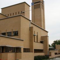
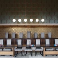
The tower contains a monumental staircase to the first floor where it is the Council Chamber, with its high, narrow windows adorned with lamps and a balcony. The characteristic vertical mass adjoining the Council Chamber contains a public gallery, a landing and files. Beside them stood Dudok office with its large window in the corner.
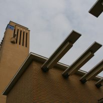
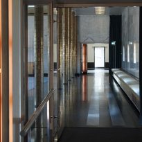
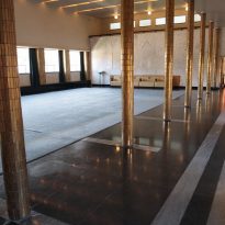
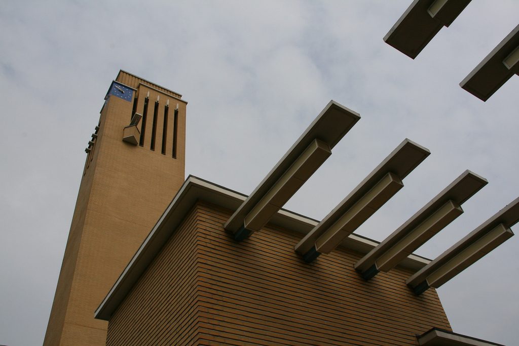
On the east side of the first floor is the Civic Hall, just separated from the hallway by a row of round columns. Besides these main attractions, the building contains many other details and accents of color and material, in particular rectangular storage volume on the north side, where the on roof, made of strips of glass, seems to float.
Structure

The structure consists of load-bearing walls, reinforced concrete floors and concrete lintels above the horizontal windows, while the roof structure in the council chamber is steel. Its balanced masses make a synthesis of functionality and romanticism. Has been criticized, however the arrangement and construction irresponsible proportions addition forms.
The use of overhanging eaves, an unusual feature to the Netherlands, and a simple tree -dimensional asymmetric geometry arranged around a square courtyard provide a modern structure while reflecting the medieval municipalities historicism by the presence of a large and a tower room.
Equilibration
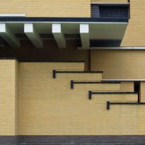
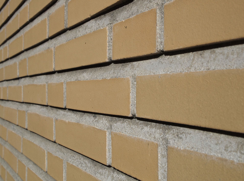
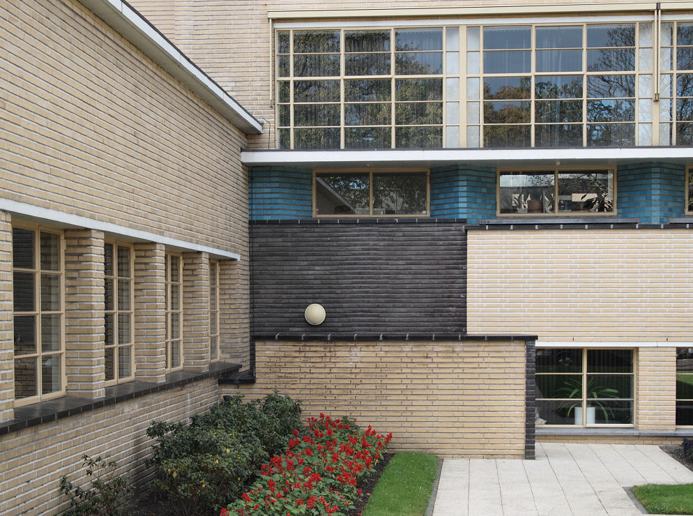
The verticality of the tower breaks the flatness of the set, producing a sense of balance and harmony between the two axles. Also, a hierarchical use of light through a varied aventanamiento adds another dimension of balance. The euphoric Dudok design seems reconcile discordant apparent use of full and empty spaces, of horizontality and verticality, of light and darkness. The advance and retreat of voids and solid set of all the density are linked by the skin of yellow brick, laid with wide joints, acting as a unifier, wrapping components into a single body, and only broken by some details colored tiles.
Materials
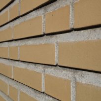
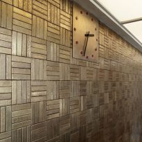
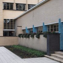
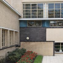
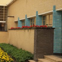
It is a masonry construction, using, in addition to reinforced concrete and steel beams, yellow bricks specially made for this project, including all facades. Dudok, who also designed the furniture and interior decoration, yellow bricks ordered in special sizes. Approximately 680,000 units were used.
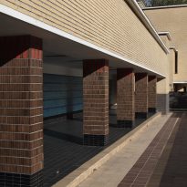
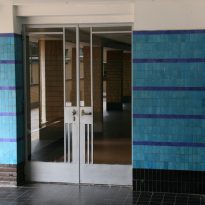
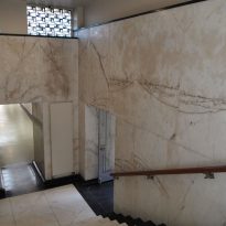
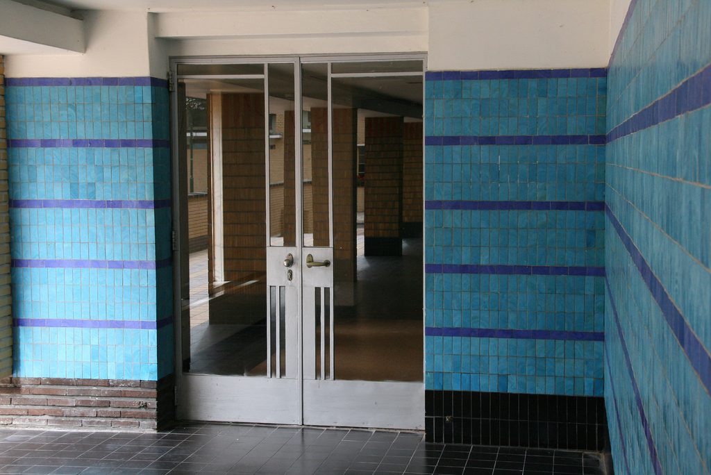
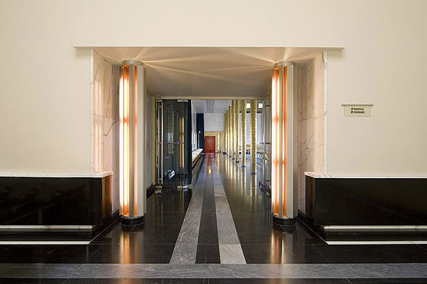
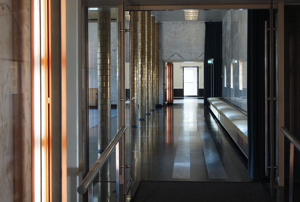
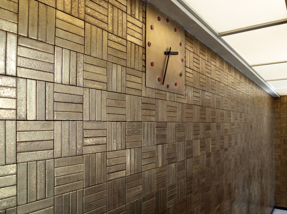
Some decorative touches were made with blue and green glazed tiles, red tiles strips, black and gold, as the wall facing the columns of the gallery entrance, covered with light blue tiles or dark details on the bases of columns and red in the upper parts. Blue was also used in other decorative details, particularly in the outer columns coating. In the thin elongated interior columns were used and refined golden tiles, highlighting the dark color of some soils, covered with marbles combinations, like some of the walls in the lobby or the stairwell.
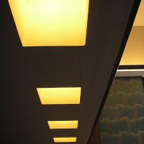
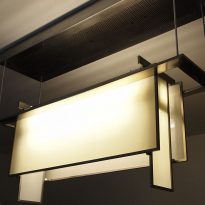
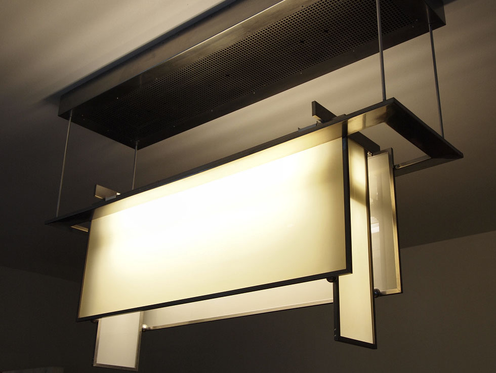
Glass is another recurring element in the sophisticated decoration, not only in window openings where clear glass was used, semitransparent, beveled and stained glass in some gaps, but also excels in the decorative lighting, also designed by the architect.
Video
