Hexenhaus
Introduction
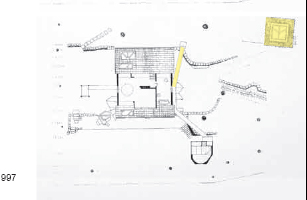
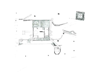
From the construction of Axel’s Porch in 1986 until the completion of the Lantern Pavilion in 2002, the Smithson marriage was closely associated with the transformation of this house which they found as just one block and converted into an articulated space, with annexes, pavilions and passageways.
In 1972, Axel Bruchhäuser and his father moved to Western Germany, after the furniture factory which they owned in the Eastern part of the country was nationalised. They settled in the Weser valley, in the federal state of Hessen, and purchased a working furniture factory in the village of Lauenförde, creating a new business with the name, TECTA.
In his new business, Axel Bruchhäuser intended to reproduce a series of famous chairs, employing modern techniques, favouring the designs of the masters of the Bauhaus: Gropius, Breuer and Mies van der Rohe, and their experiments with new materials. He moved in those artistic circles and participated in the activities of IBA, where he met the architect couple.
Location
The house is situated some distance from the TECTA furniture factory, close to the small baroque 17th century city of Bad Karlshafen, which like the factory grounds is on the banks of the Weser, after a bend in the river and within a dense forest, in the state of Hessen, Germany.
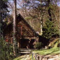
Axel’s house is known locally as the “Hexenhaus” (the “Witches’ House”); a common enough name in the area where the Brothers Grimm wrote their fairytales, based on popular local legends.
Concept
The renovation which the Smithsons undertook on the house occupied by furniture-maker, Axel Bruchhäuser, constituted an example of what the architect couple began to call “law of the conglomerate” in the 1980’s. They referred to a multidimensional sense of order which could not simply be reduced to a linguistic or figurative scheme. This type of order is solid enough to resist or catalyse temporal and spacial changes.
The domestic environment must offer a space for relaxation, where one can meditate on and look for critical answers to consumerist culture and urban development. It must provide an alternative space where one can retreat, be calm; a refuge. A place to contemplate and reconsider the relationship between means of communication, consumer society and lifestyle.
Spaces
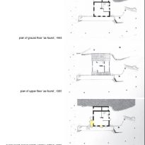
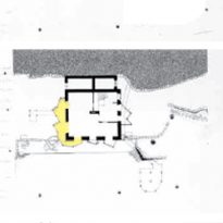
Appearance in 1985
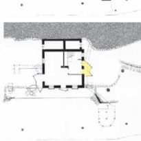
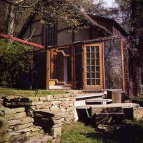
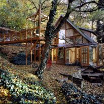
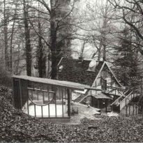
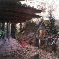
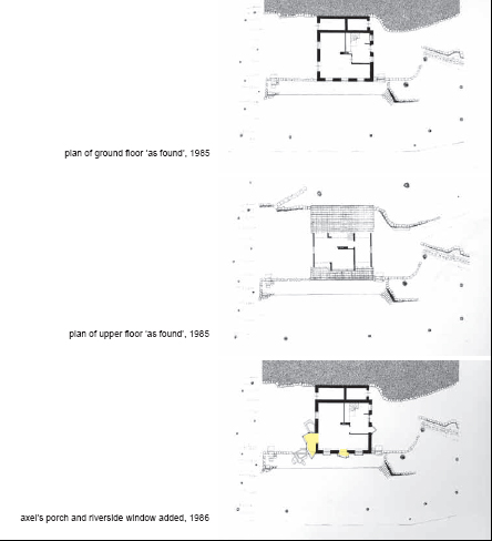
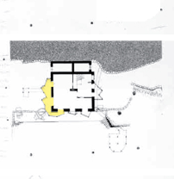
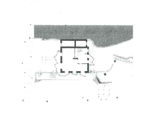
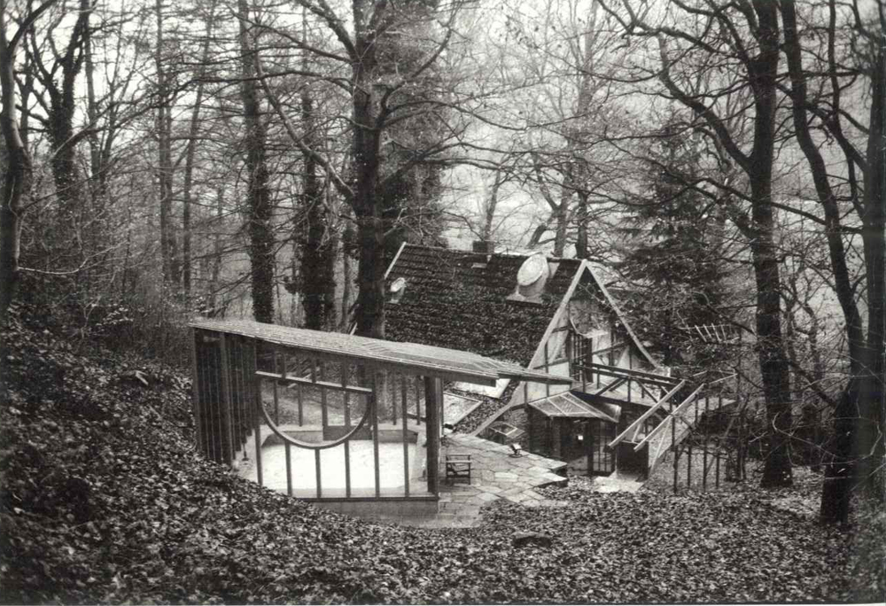
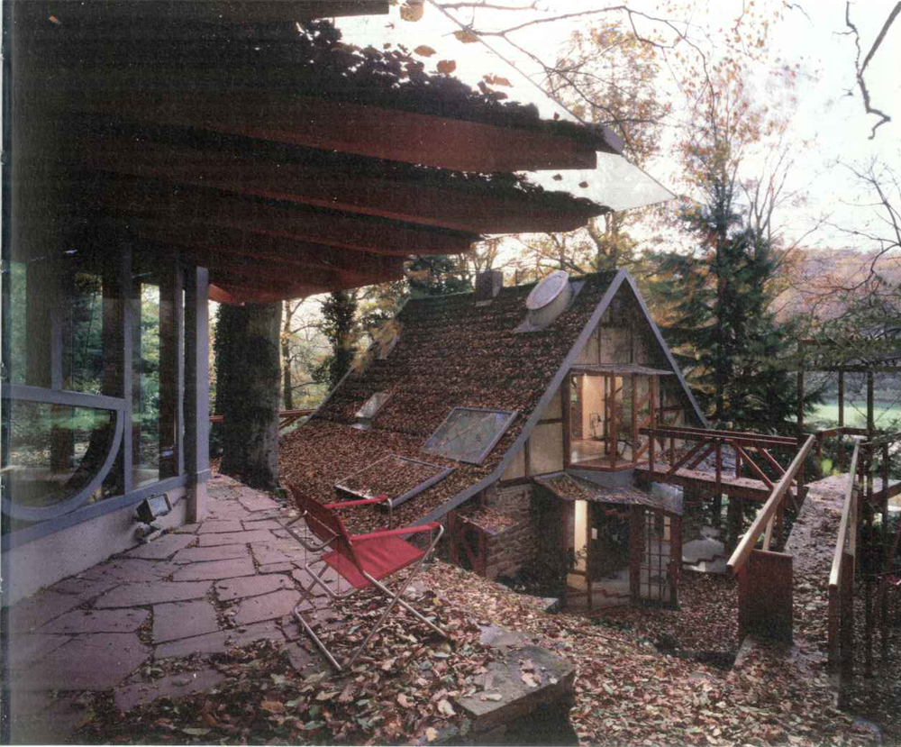
The Smithsons found themselves with a solid construction of one block with two floors, a stone base and topped with a gabled roof whose surfaces were covered with wood. The ground was levelled on the mountain side by low retaining walls on each side.
Changes around 1986
Retaining wall
The raising of the wall was the first work carried out and was done on the highest side toward the mountain in order to raise the height of the stone base of the house, which would be essential for the final coherence of the whole construction. It affirmed the house in its context, while creating a second level which later would be known as the “upper promenade”.
Near the wall, a series of stairs of different materials provided access to the lower ground level, the wildest part of the garden.
Axel’s Porch
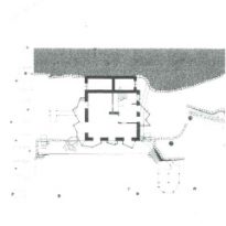
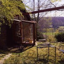
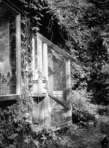
The adjustment made to the retaining wall allowed for a new façade to be added to the house. The inclination of the gabled roof was longer on the adjacent slope of the North side, which in turn satisfied one of the wishes of its owner: to be able to experience the surroundings and the different climatic conditions more intensely from the living room.
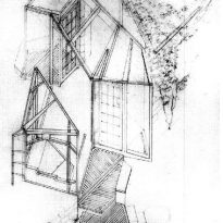
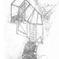
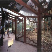
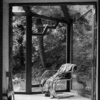
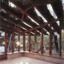
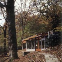
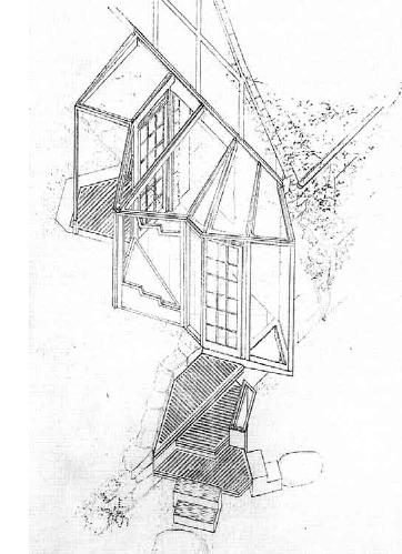
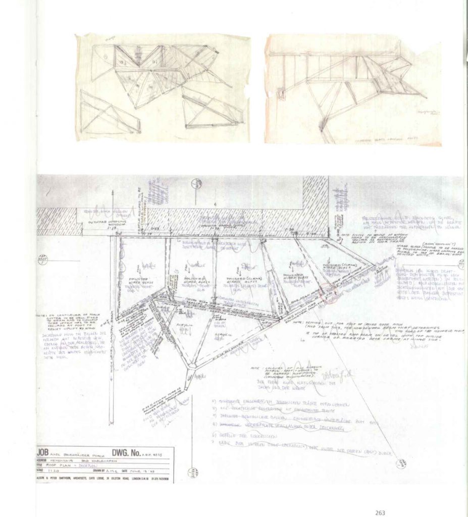
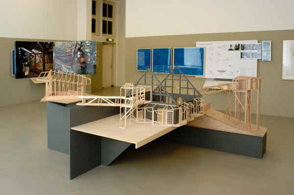
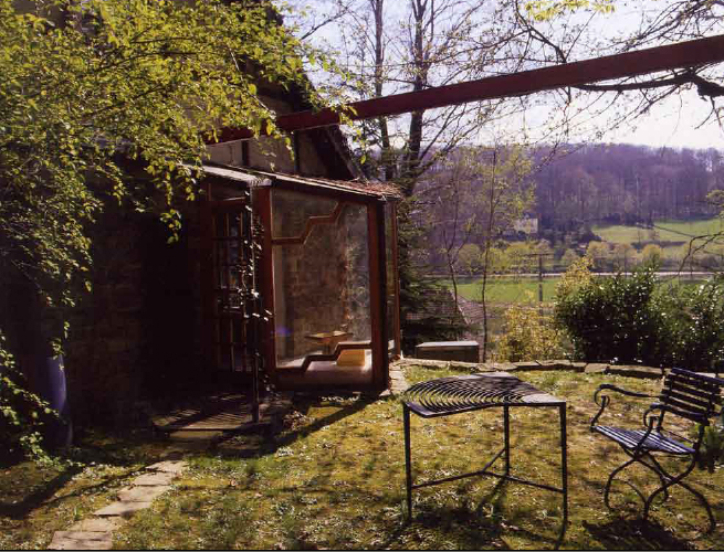
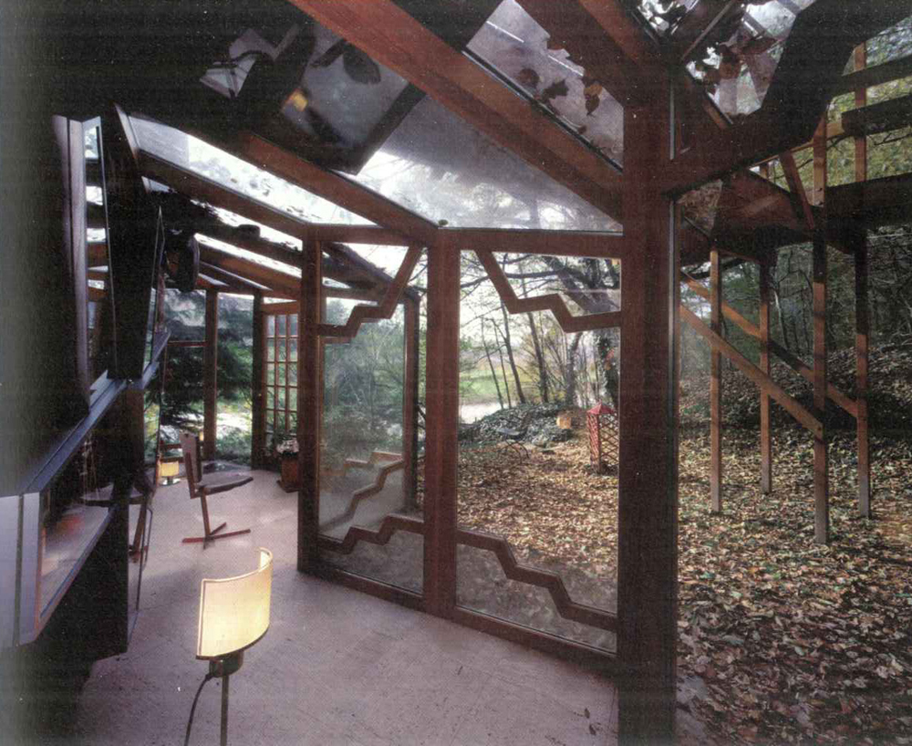
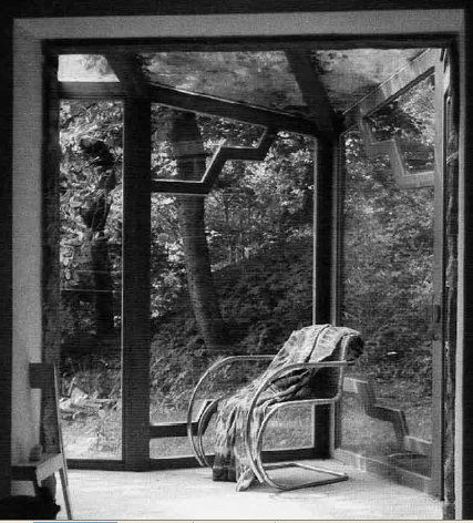
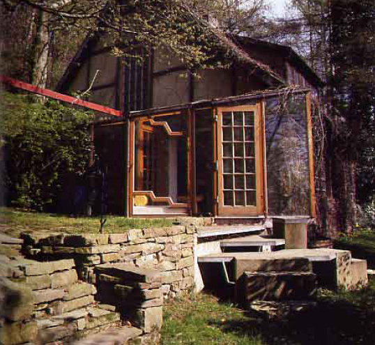
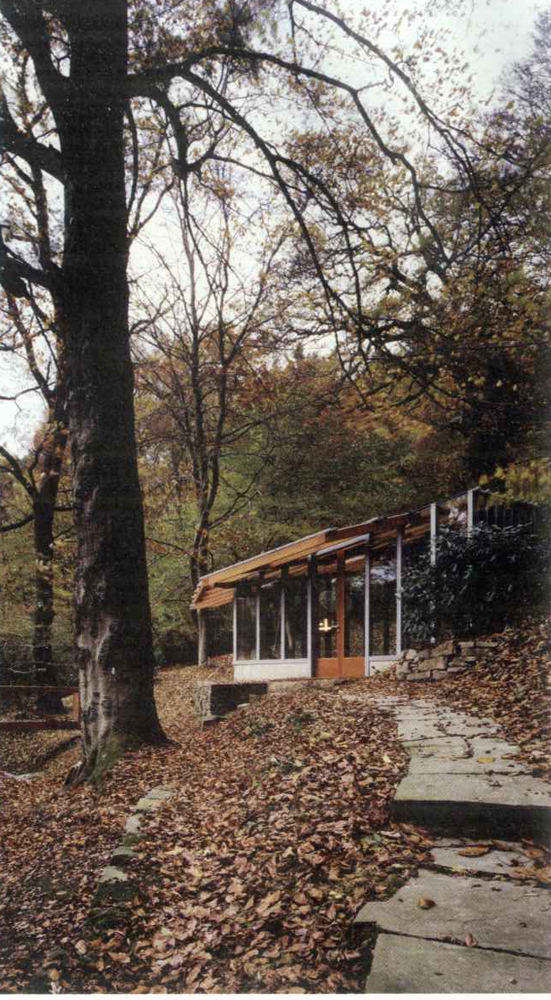
Alison Smithson designed a veranda on the South-East side of the house, which included the two original doors and allowed for two different exits. The large extension included a corner sofa or armchair and a smaller one round the corner. The floor of the smaller extension is glass and allows you to view the area of the lower terrace.
With this porch, Alison developed her own formal language which she applied in subsequent verandas and balconies.
1989
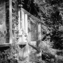
Eventually, almost all the gaps in the exterior which were originally opaque were replaced with a transitional elements, adapted in each case to their specific position between the interior and exterior.
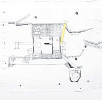
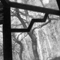
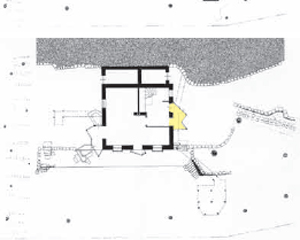
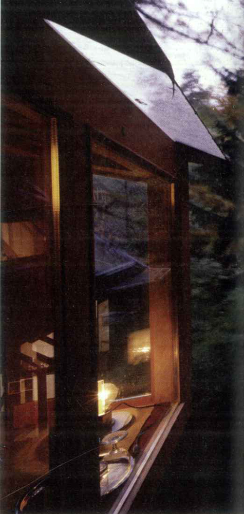
In 1989, the window overlooking the river bank was replaced. The design is a variation on the outgoing window and was made by filling the gap located in the centre of the South-facing wall.
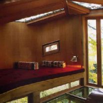
The floor of this space was raised and re-covered in glass. On each side, facing one another and at different height there are small seats for the inhabitants of the house, “a man and his cat”, in a way that their gazes meet at the same level. The oblique shapes of this cosy niche, at the limit of inside and outside, are partly due to this requirement.
1998
The porch is attached to the front door.
1999-2001
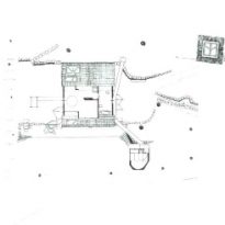
Between these years, they added an enclosed balcony onto Axel’s bedroom. Axel’s porch was enlarged on both sides, resulting in it covering three of the old gaps in the wall. The Lantern Pavilion was also built; the last of the transformations made to the house by the Smithsons.
Bedroom lookout
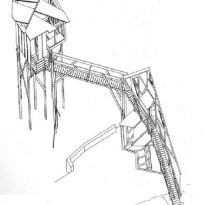
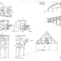
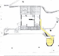
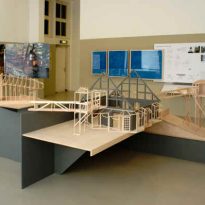
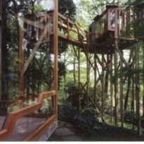
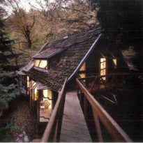
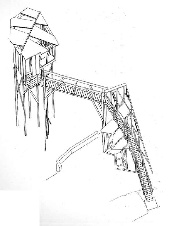
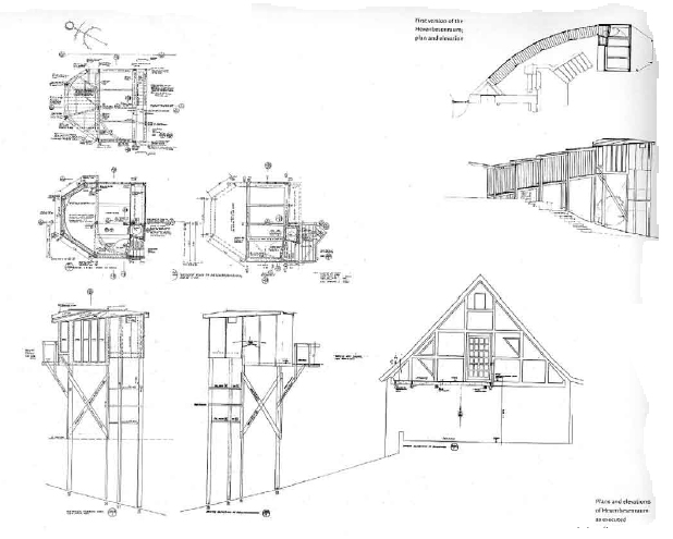
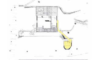
On the first floor, from the owner’s bedroom, a wooden walkway was built which arrived at a small observation deck. It was a pillar of the Hexenhaus, situated in the middle of an enclosed green space in the back garden. From the lookout point was built another walkway which led to the Lantern Pavilion.
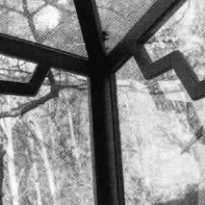
Onto the bedroom was added a transitional element: a traditional lookout, surrounded by glass from top to bottom.
The Lantern Pavilion
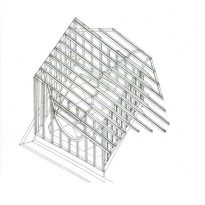
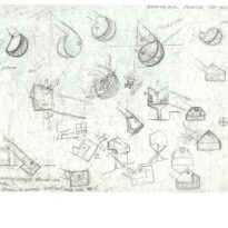
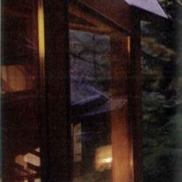
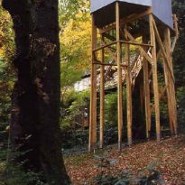
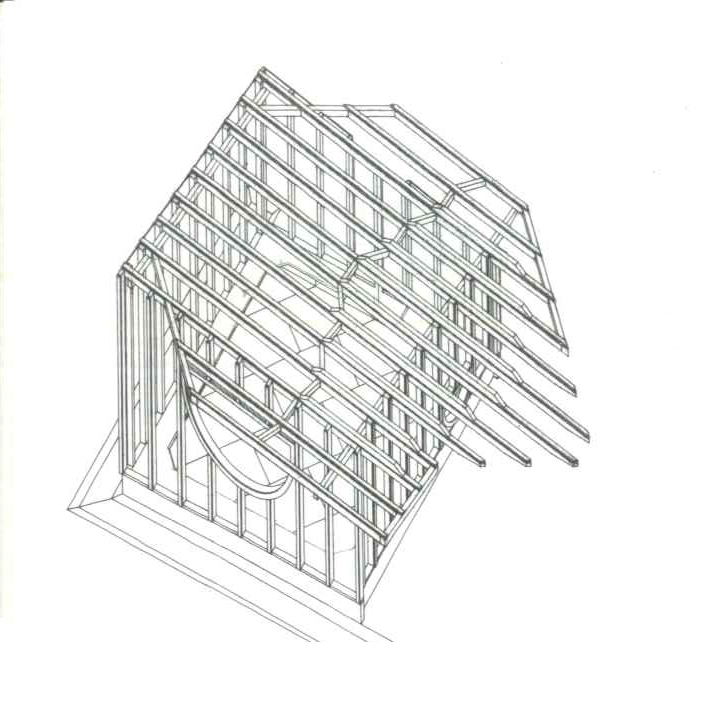
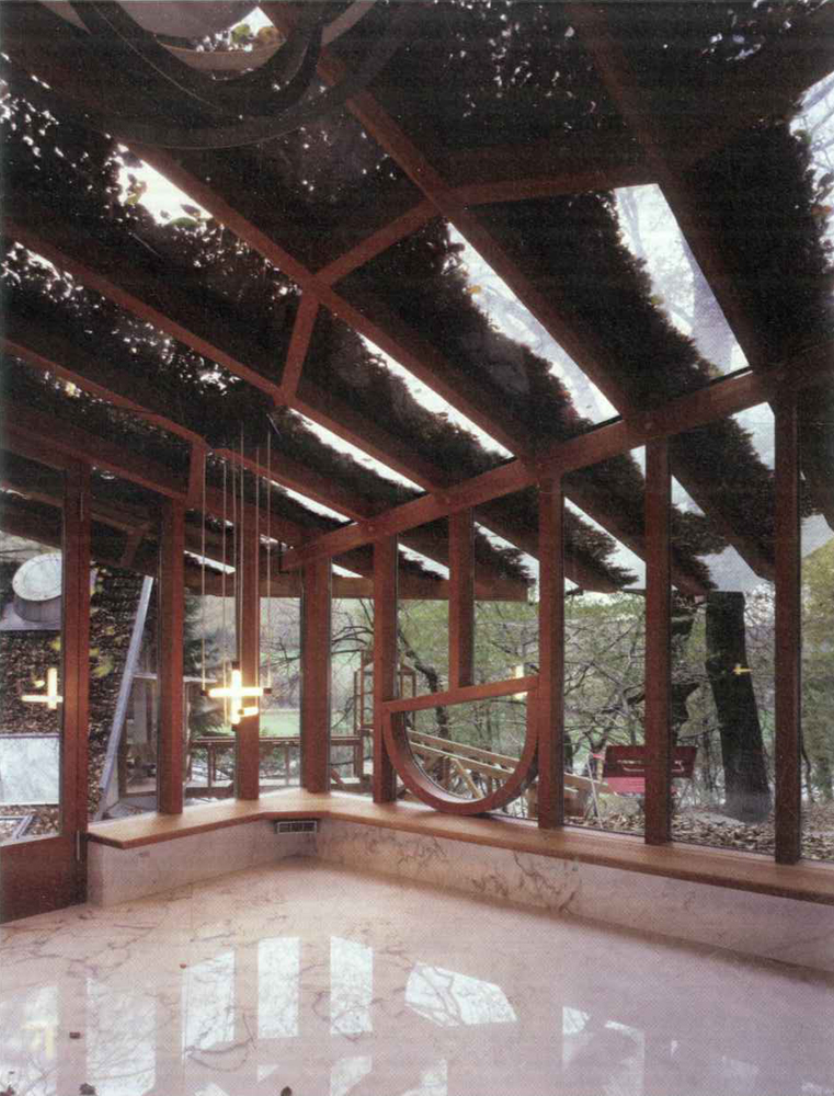
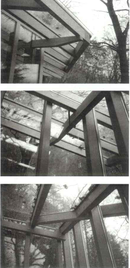
This pavilion is based on a rectangular floorplan with one of its corners supported on the slope of the mountain, while the walls and roof are built with posts and beams of equal width, located equidistant from one another. The inclination of the roof, which is 45° from the ground and seen on three of its sides, follows the inclination of the slope.
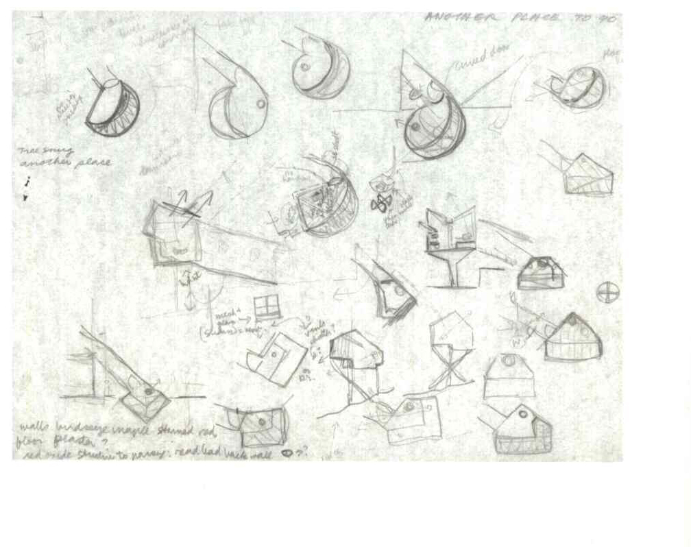
Within the framework of the walls are two opposing semicircular windows which make reference to the sun and the moon.
Other changes
The exterior is covered with numerous raised wooden walkways, paths and stone steps set into the ground, all of which have been made over the years at different time, joining together and uniting the whole house.
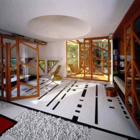
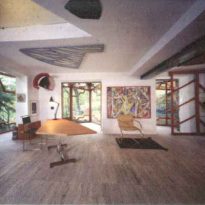
Various changes have also been made to the interior of the house: numerous walls, ceilings and roofs were cut into, creating lateral and vertical connections between the interior and exterior, making new lines of vision and changing the play of light.
From the kitchen, semicircles cut into the wall allow a view into the living room, then the veranda and finally this section of the exterior. On the upper floor, between the ceiling and the roof, conical skylights were added with the point cut off, which gives a new dimension to a space without much height.
Materials
Wood, stone and glass are the predominant elements in the composition of the spaces of the Hexenhaus.
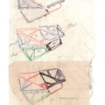
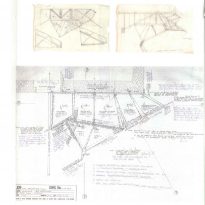
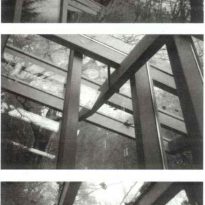
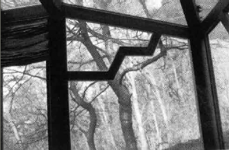
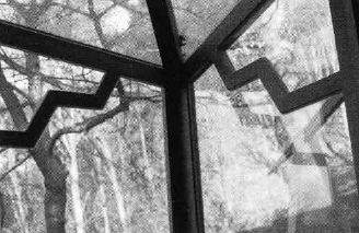
Particularly attention-grabbing are the shapes of the window frames of the veranda. This framework in the roof fits with the shape of the space, but in the façades it was applied in order to isolate the fragments, intensifying the experience of what is observed from the exterior. In other windows, they emulate the branches of trees which surround the property, “branches which move, branches which do not”.
Glass is used in different ways, for the windows as well as for some areas of the floors.
Wood has been used in numerous guises, inside as well as out, on walkways, pavilions and verandas.
