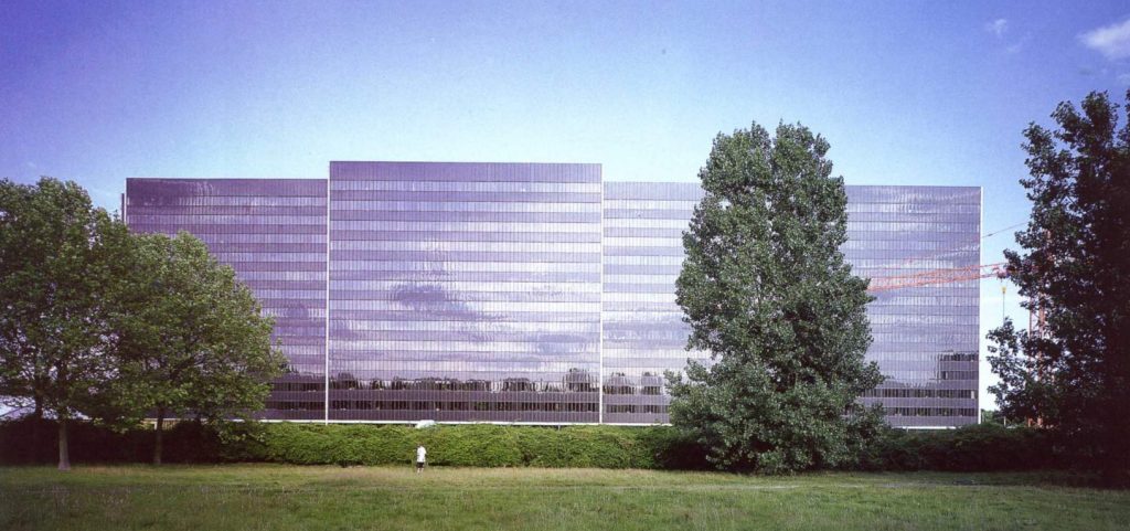
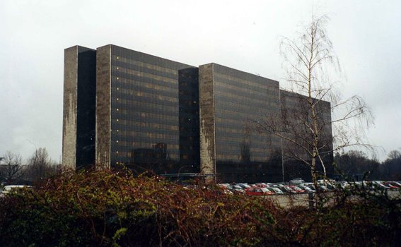
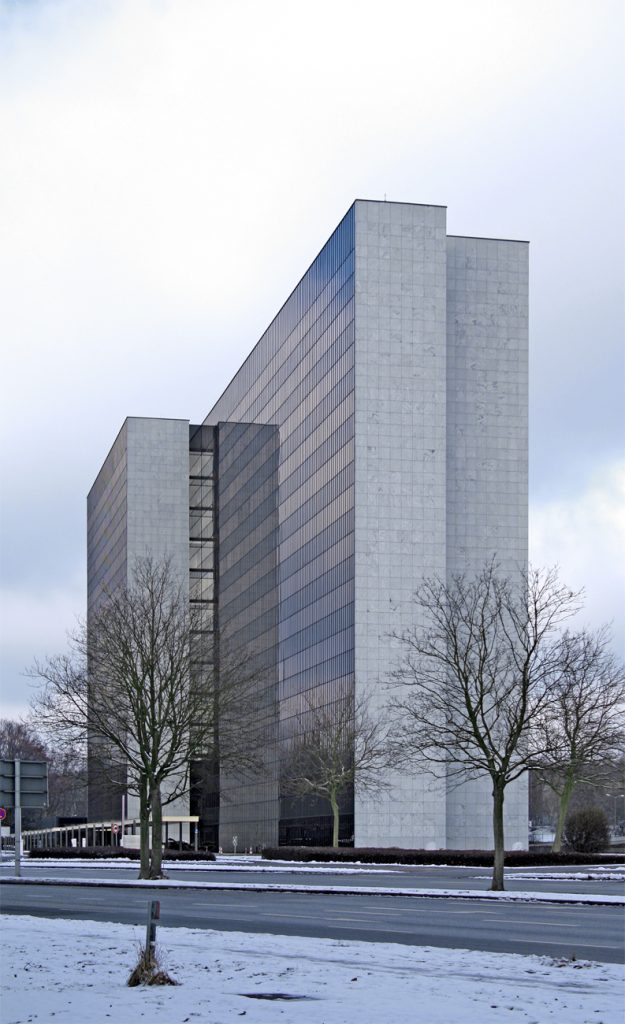
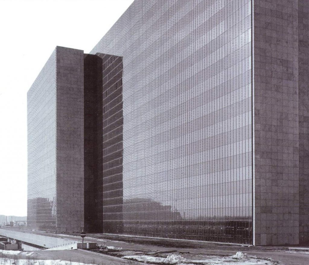
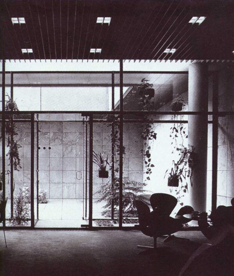
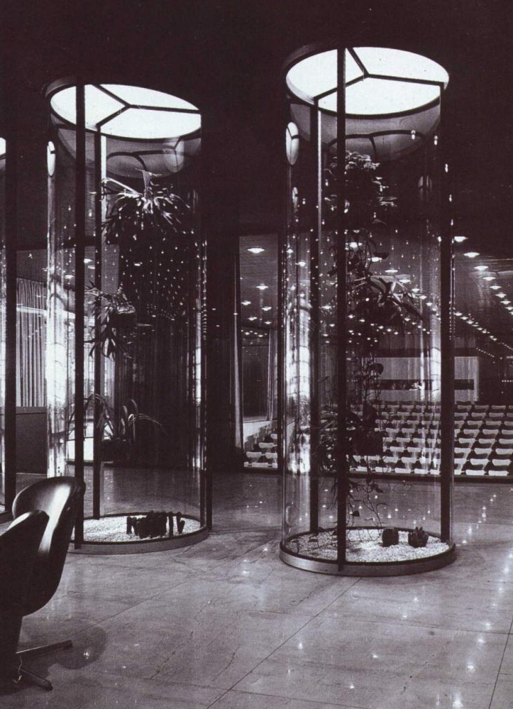
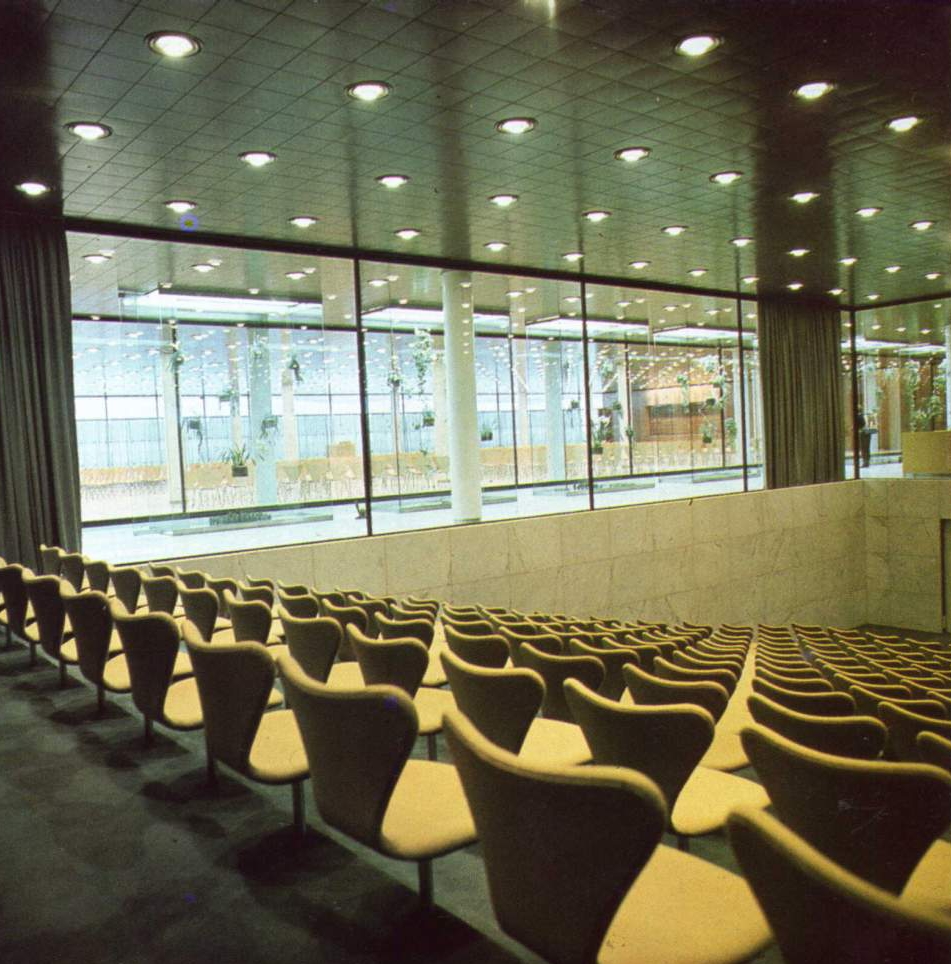
Hew Offices

Introduction
In 1963 competition calls for the construction of a new building that would be the headquarters and corporate image of the company Hew, of which four projects are selected.
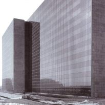
After evaluation of projects presented is chosen which Weitling Arne Jacobsen and Otto, whose proposal best represents the company’s idea of creating a building of strong and sharp features that will become a strong urban reference, with particular attention the care of the details.
Location
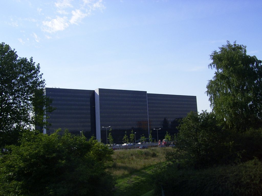
The set is closed north of the city of Hamburg, near a city park, subways and urban motorway, the longitudinal axis of the block is developed in a north-south and its height is limited by the proximity to the airport.
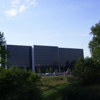
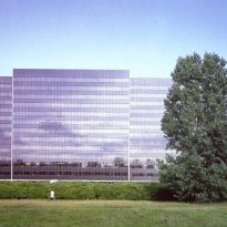
The visuals of the building are large and that although located in an urban environment that is low density, so its not about big buildings have exceptions, being next to a highway where the landscape becomes a kind of picture this building became the main reference of the place.
The location is also favored by the large number of hits featuring the area, highways, avenues and main and secondary streets where traffic is not affected at any time, in addition is also near a subway station.
Concept
The building style refers to an international style of architecture, this is used in large corporate works are constructed in different parts of the world.
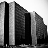
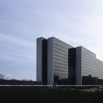
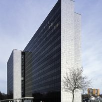
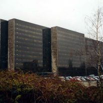
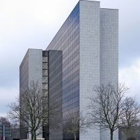
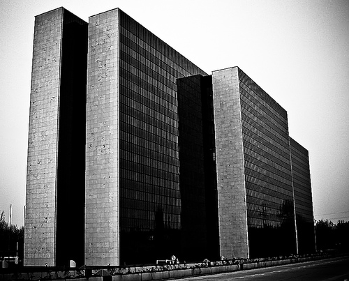
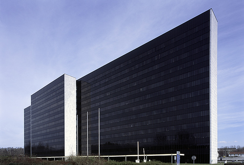
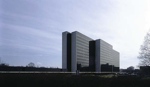
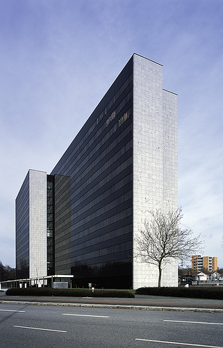
The volumes clearly indicate two directions, vertical blocks of offices, where we seek a monumental figure who set up the image of big company and that gives confidence and security, the other is the horizontal direction is seen as an extension of the great central office volumes and a more dynamic image sets to work.
The volumetrics of the building itself consists of a central block with a rectangular prism where the main activity centers and the natural extension of this that makes movement strips that provide a stronger basis to all.
Spaces
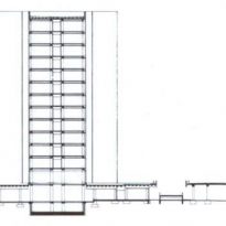
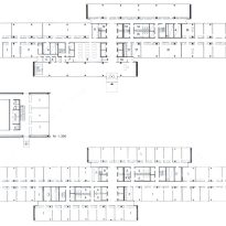
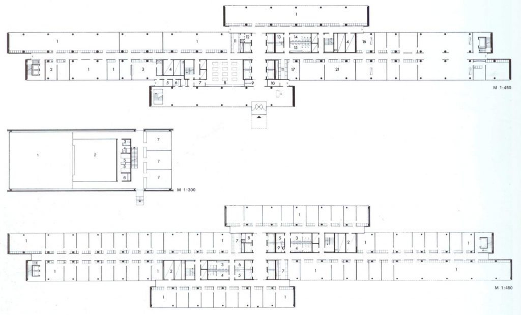
Plants and section define the dimensions and the building program.
The plants 1 program to 12th office defined internal partitions are arranged in a modulation (187.5 cm) and have a thickness of 8 cm., The office has a size smaller than 375 x 612.5 cm., all facilities were modulated to give great flexibility to the plant.
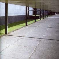
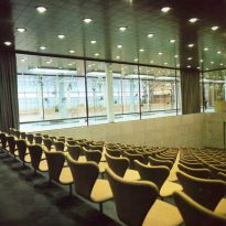
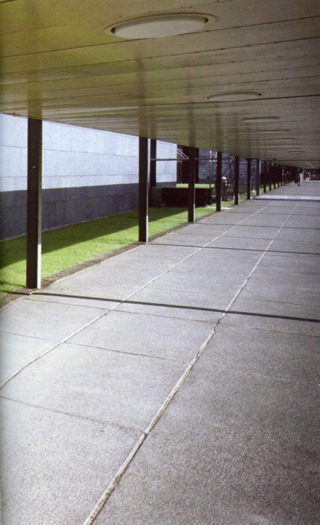
A central covered walkway leads to the main access, parking is located in the east and parallel to the tall building in the west, in a quieter area, are the social services through a him shelter from the terrace wind communicate with a city park.
The movement of both public and staff were separated, the first fall at street level while the staff are on the lower level, in the street level of service enters the building and parking permits access to the core of elevators three points. The entrances to the street level are reserved to the public and how much a nearby parking lot.
In nuclei were centralized building elevators, hoists, disposal, toilets, facilities and pneumatic lines of communication while at the ends of the block are the cores of the internal circulation.
Structure
The building was made of reinforced concrete, the longitudinal girders (reinforced concrete bars located at ground level which supports a wall and transmits the loads to isolated footings or a continuous footing) north-south are made in situ, while the transverse (east-west) are prefabricated.
The pillars are also prefabricated and to provide the building stiffer against the wind using service cores.
Materials
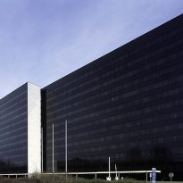
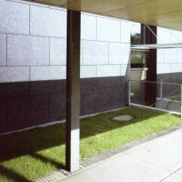
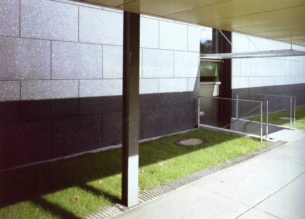
To construct the concrete used arming, while the tall building’s facade is a curtain wall fixed with metal grid. The shades are opaque and exterior coatings used baldozones granite.
