Hearst Offices

Introduction
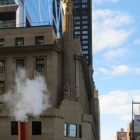
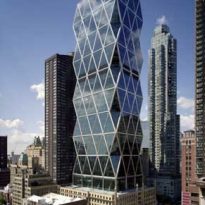
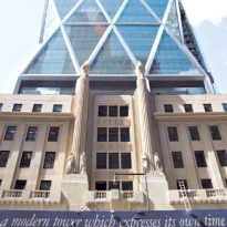
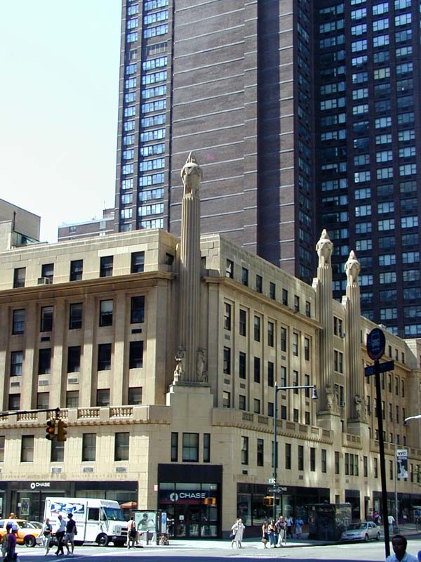
The offices of Hearst Tower is the first work of Sir Norman Foster in New York. This is the seat of the headquarters of the Hearst Publishing Group, which uses as a platform to the building assets of the corporation. His story begins in the late 20s, when William R. Hearst hired the architect Joseph Urban to design a new building for offices of his newspaper empire. The answer was a building of concrete Art Deco. Hearst expressed his desire to do, just inaugurated the headquarters of the group, the basement of a future skyscrapers but brought the Great Depression and the top floors were never built.
The building houses a number of companies in the Hearst Corporation who were scattered in various locations, leading to unite all in one place. Here the past and present are not assembled in harmony, but they collide with ferocious energy. The tower is one of the most important symbols of business confidence since the 60s in New York, where the Modern Movement was in full swing and a majority of Americans accepted the technological challenge as a sure path toward social progress.
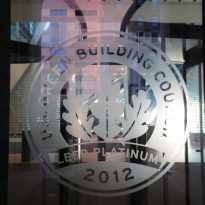
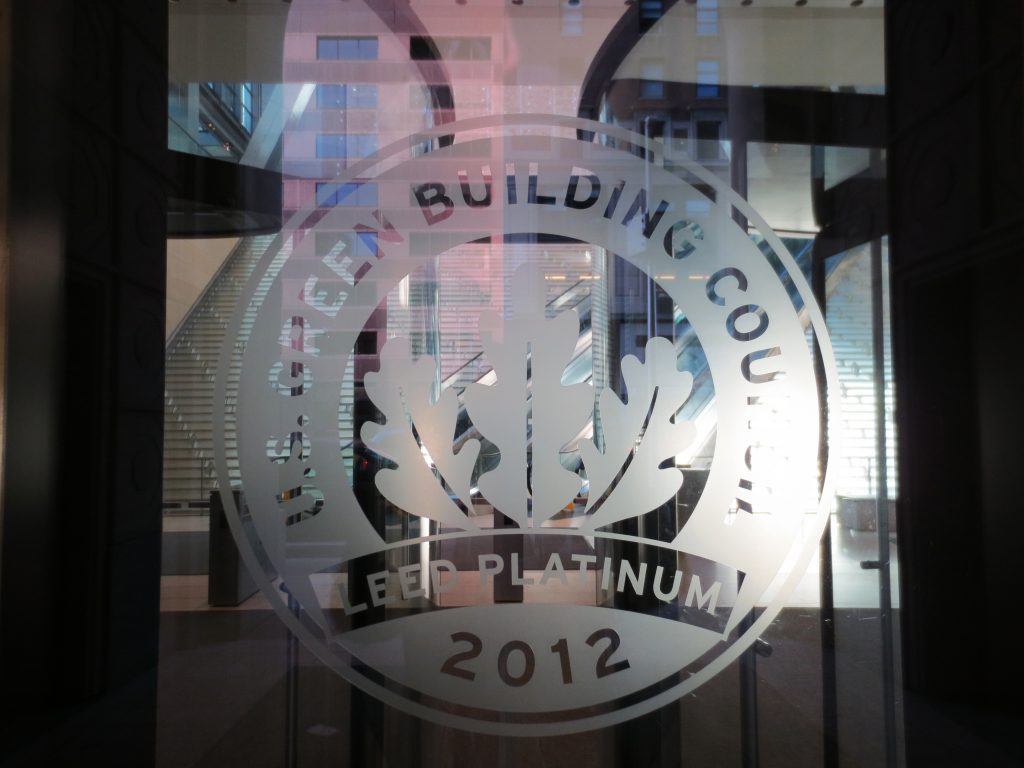
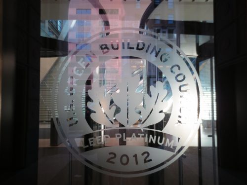
The new building is distinguished in the environment. In the U.S., green buildings are certified by the system of leadership in Energy and Environmental Design LEED Goold, created in 2000 by the Green Building Council, a coalition of leaders from the construction industry with environmental awareness. The ratings are based on a number of factors, mainly related to energy and water consumption, air quality inside, durability and the use of recyclable materials. The scoring system ranging from the rank certificate with 26 points until Platinum with 52 points. The Hearst Tower was the first skyscraper in New York in obtaining this distinction, with a rating of Gold.
Location
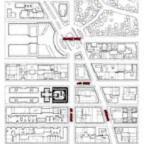
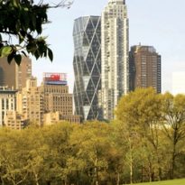
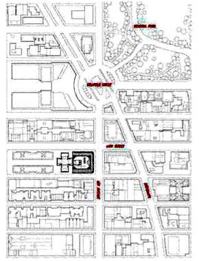
The tower is located at the corner of Eighth Avenue and 57th Street in New York, United States, in the middle of Manhattan shopping business. In the same location of some offices were operating in a Group Hearst Art Deco building that now contains the atrium of the new work.
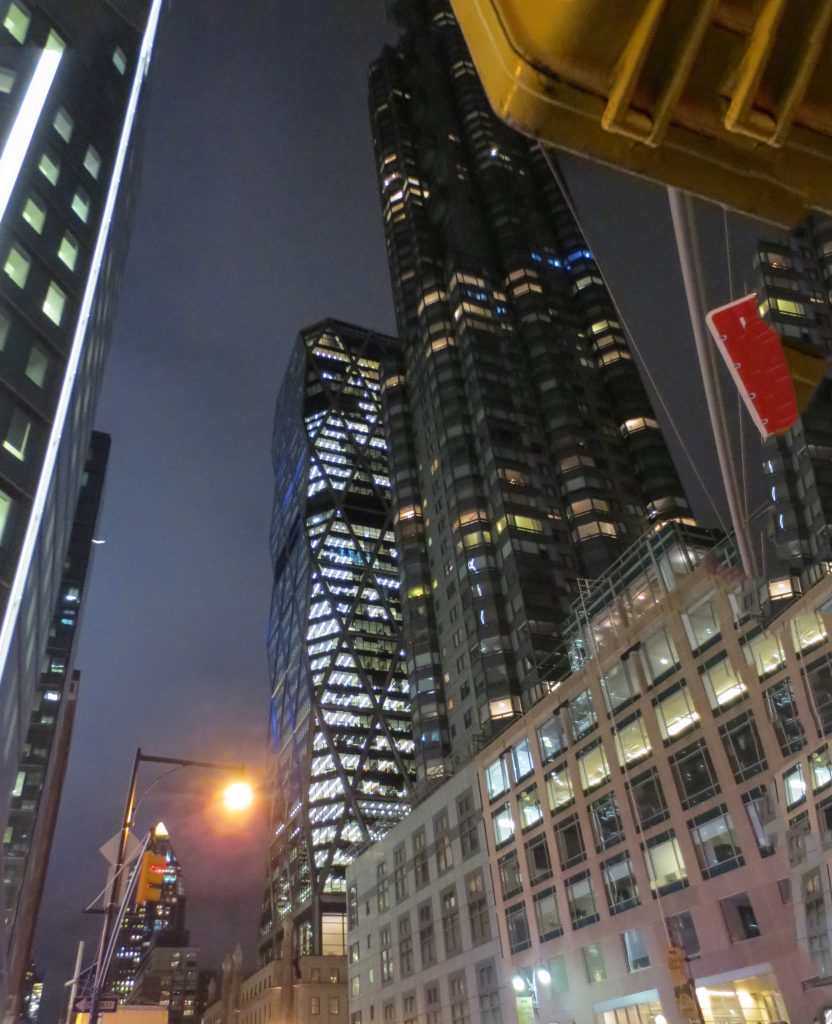
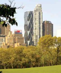
To the west, an apartment building blocks the visual and the sun.
Concept
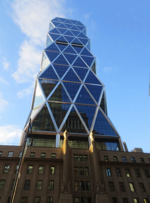
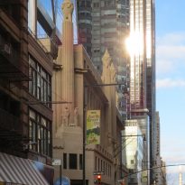
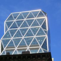
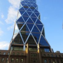
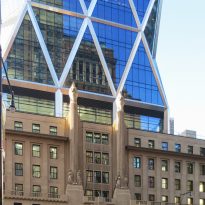
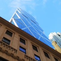
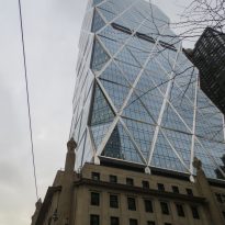
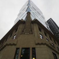
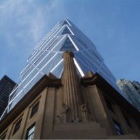
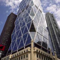
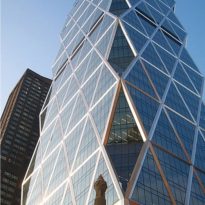
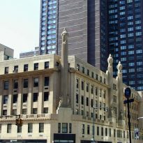
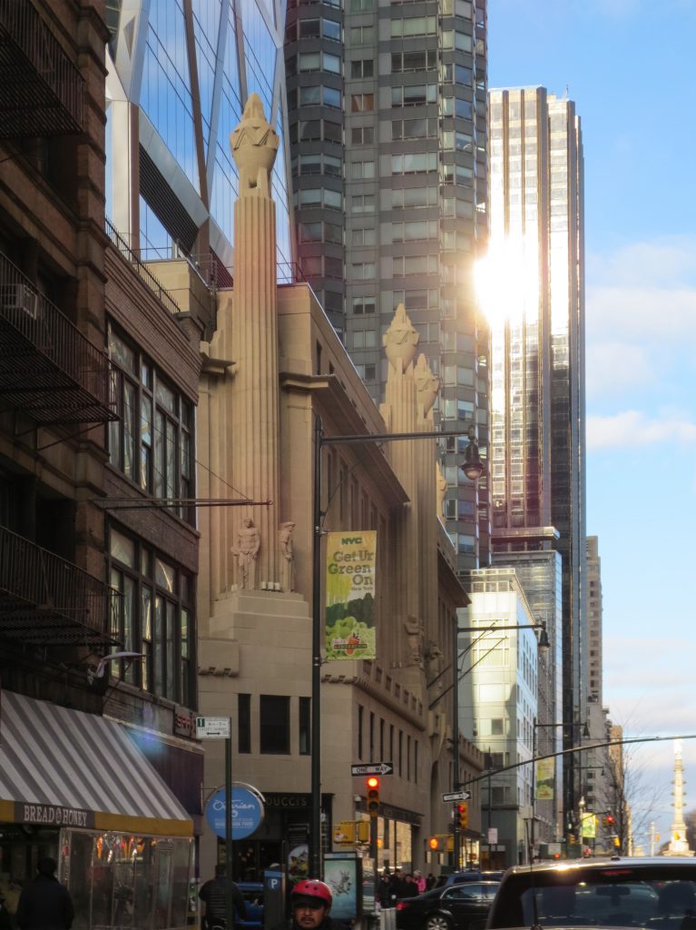
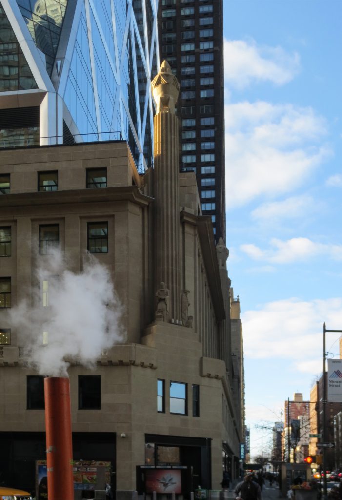
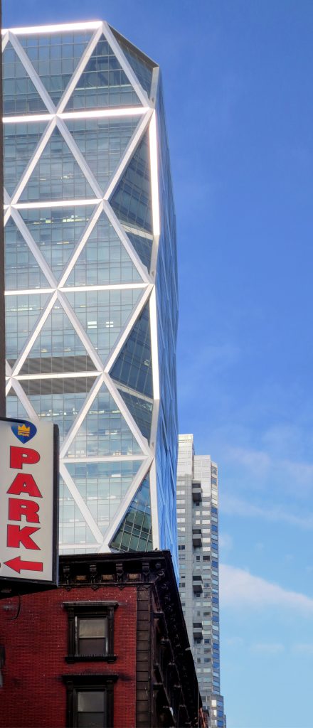
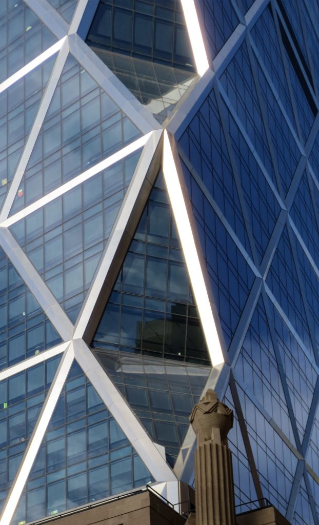
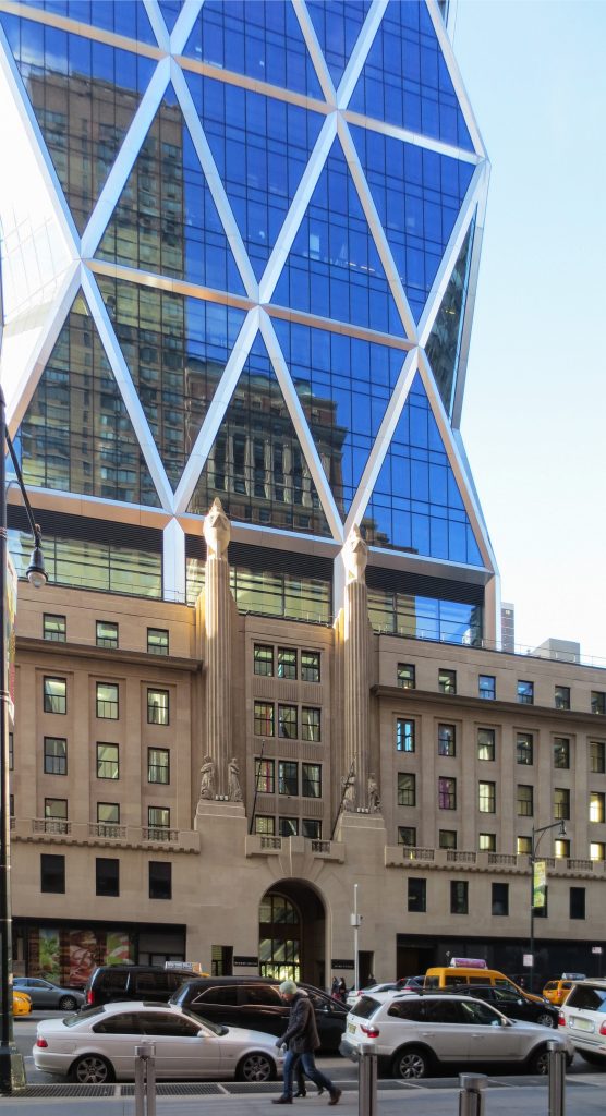
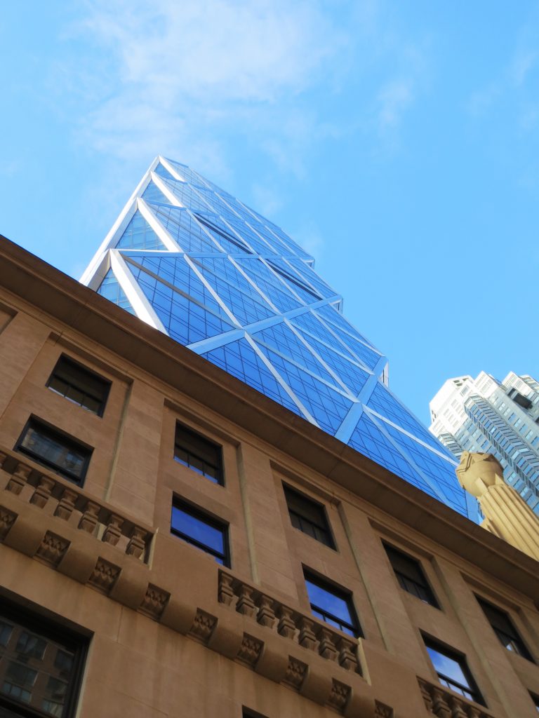
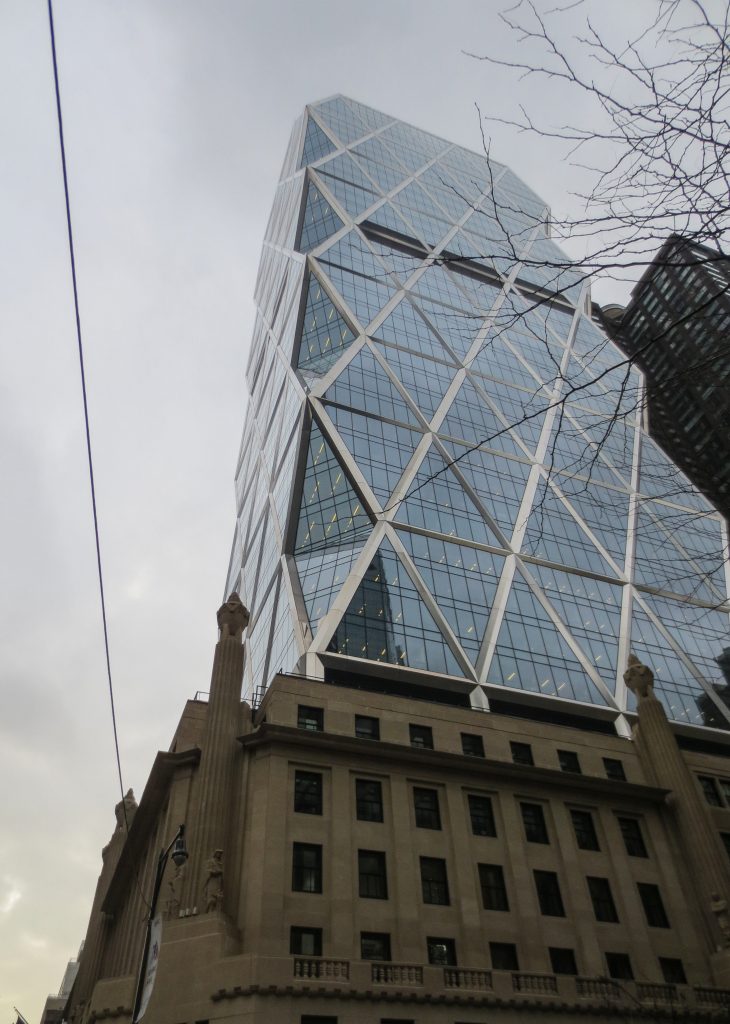
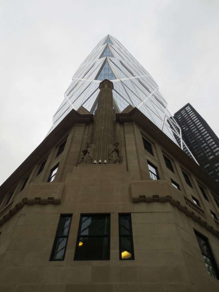
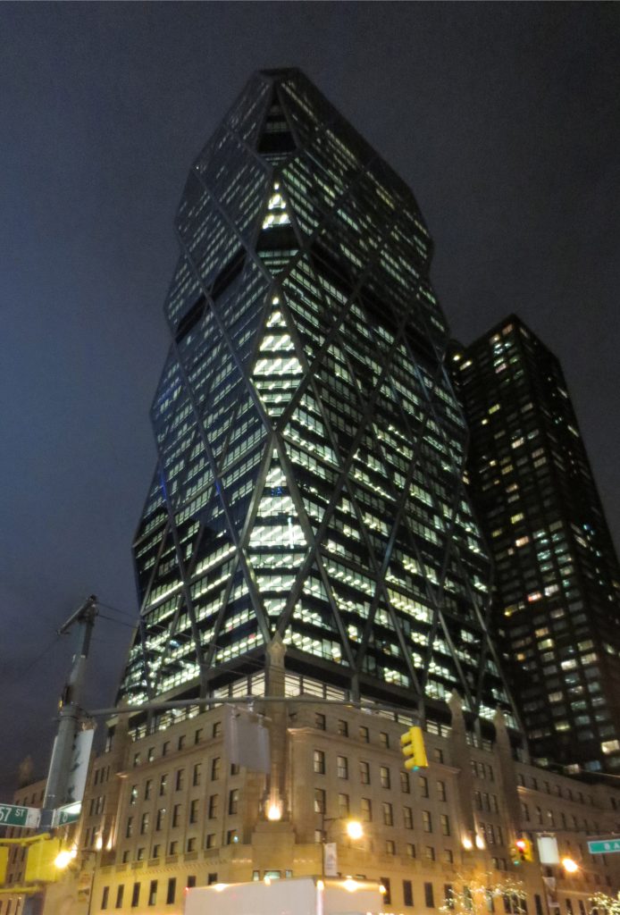
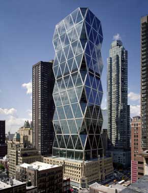
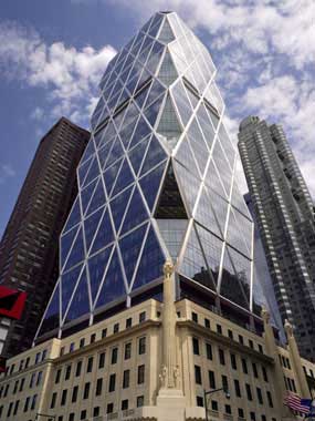
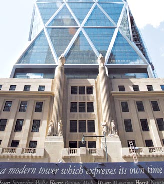
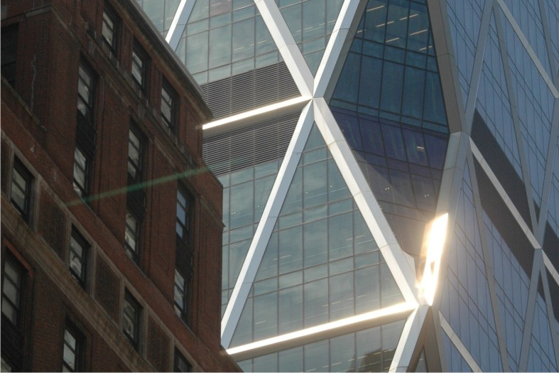
It is a glazed tower which rises from the interior of the building art deco 1928, producing a big contrast. Just left of the old building facades that were preserved intact, while the interior is emptied, leaving room for the new structure and creating an urban plaza.
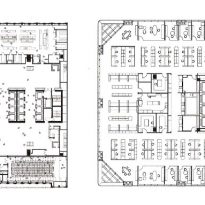
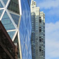
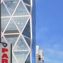
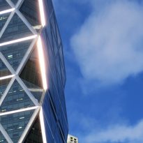
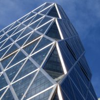
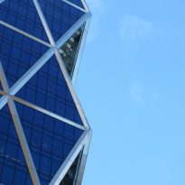
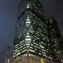
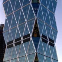
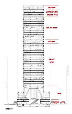
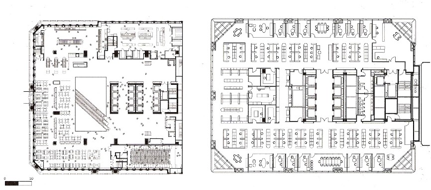
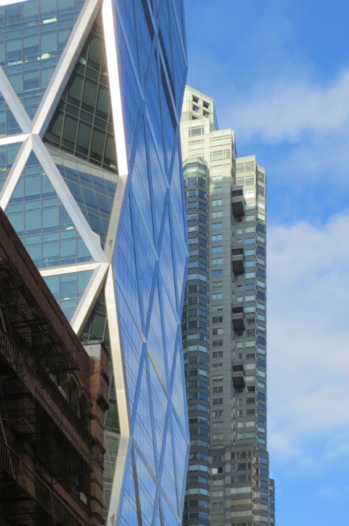
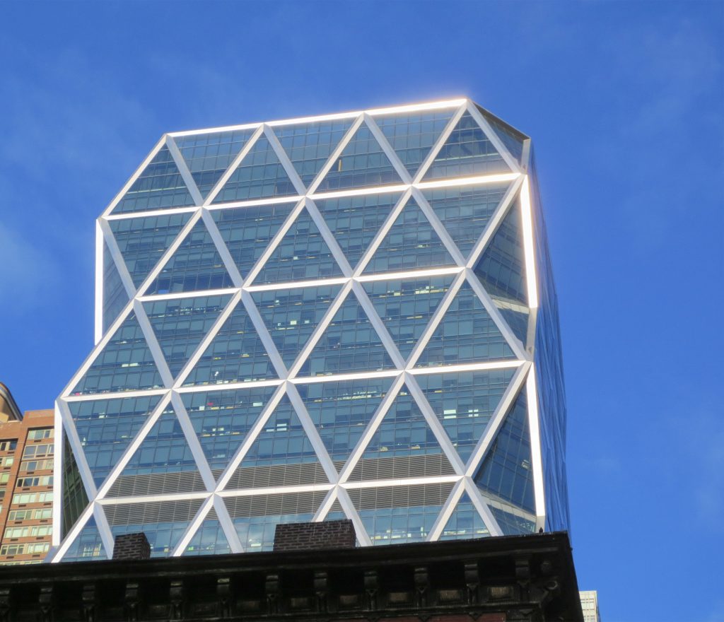
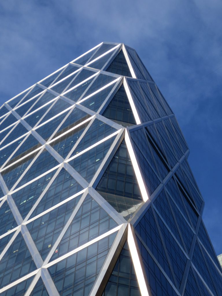
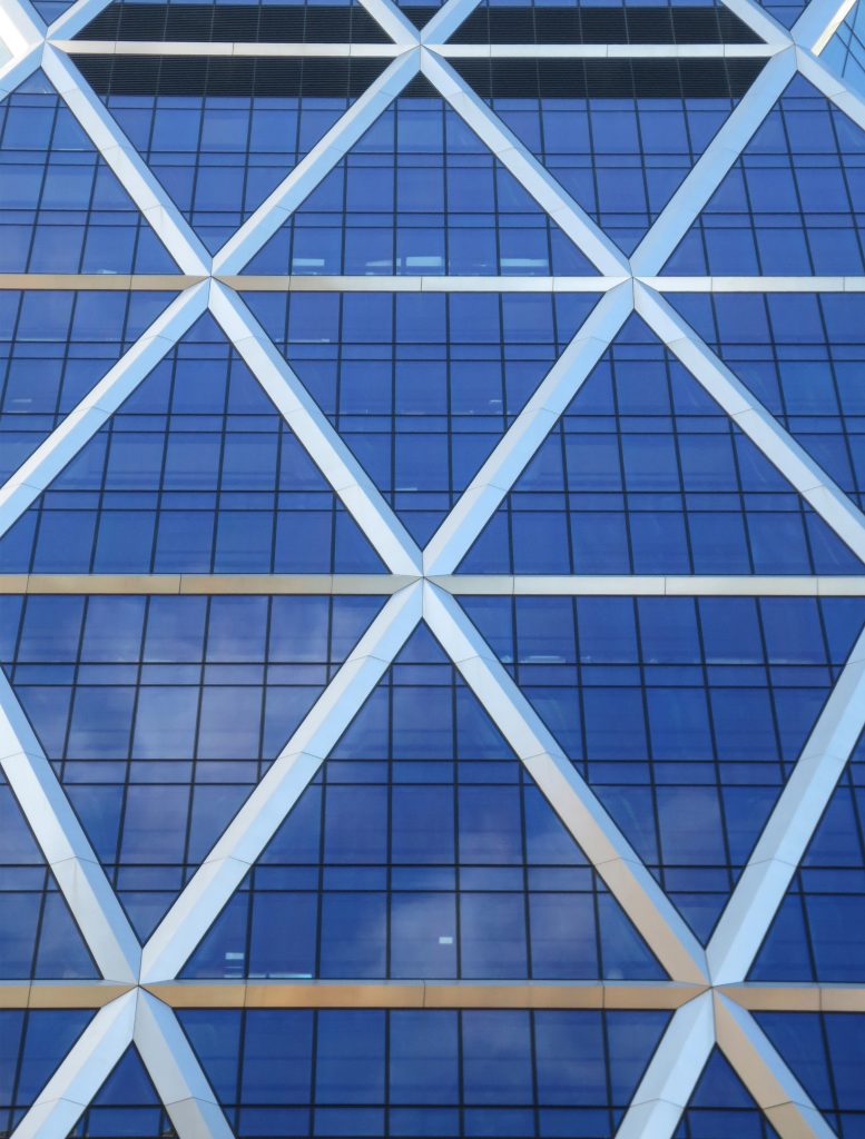
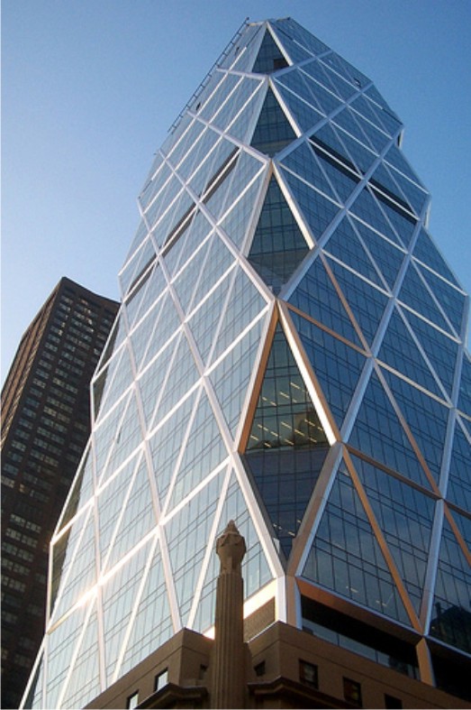
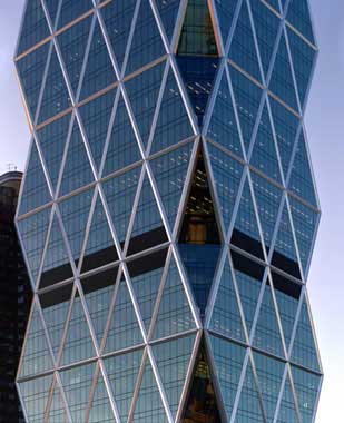
The plants of the upper floors are free. The core of elevators were located to the west, where the tower is bordered by another building. Its forms are governed by an internal structural logic. The most characteristic feature of the tower is the design of its facade in the form of diamond.
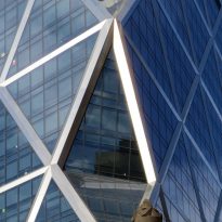
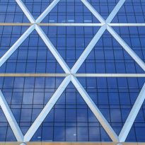
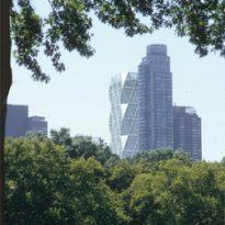
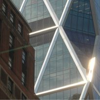
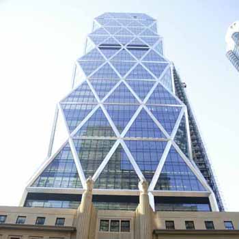
The relationship with the visual horizon is constantly changing. From the South of its very strong figure seems to arbitrarily cut crystal at the tip. When the viewer approaches, the huge triangular windows of the facade so disoriented, making it difficult to grasp the true scale of the building as each triangular window falls within the four plants functional.
Highlighted in the draft bioclimatic design.
Conception
The new building was conceived as a striking glass and steel skyscrapers that enshrines a number of milestones related to the environment and design. The Hearst Tower became true pioneer in environmental sustainability, after being declared the first offices building “green” of the City of New York.
Design Bioclimatic
The environmental care has been decisive in the design of the tower. It was projected to consume 26% less than other buildings of its features built conventionally.
With the diagonal structure has been able to save 20% of steel and at the same time achieve the same deflection and greater brightness in the interior. 20% saved represents approximately 2,000 tonnes of metal. 85% of the steel used is recycled material from the old structure.
The theme of light was particularly studied by engineers, who managed to prevent the entry of a large portion of solar radiation causing the heat used in the outer coating glass with low emissions that do not let light but not heat. Special devices with sensors suitable for that limited the use of artificial light on the basis of natural radiation.
The materials used were carefully selected. Coatings and adhesives that emit volatile organic compounds known as VOCs were banned in the work.
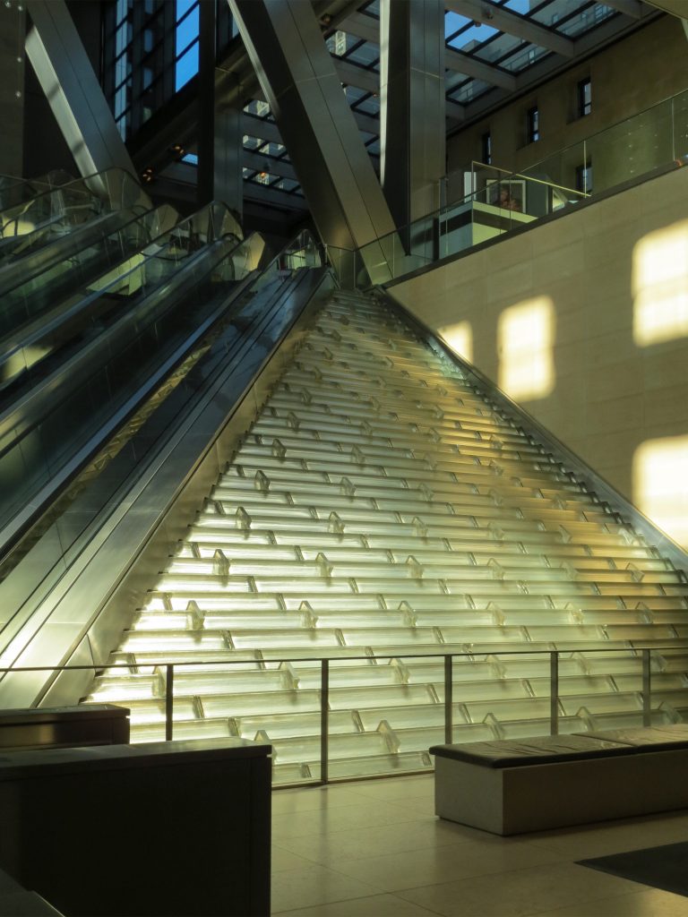
The interior houses a series of waterfalls around the stairs that collaborate in cool temperatures and ensure a comfortable microclimate on the ground floor. The soil surface emits or absorbs heat without the need for refrigeration units, as the pipeline carrying liquid hot or cold, depending on the season.
The upper floors using air conditioners with high efficiency with sensors and variable speed fans designed to conform to actual needs. The light and motion sensors turn off computers and lights when there is sufficient natural light or when employees are absent.
At the top of the tower, there is a terrace with grass designed to collect rainwater. From there, water collection is taken to the basement, reaching a tank tank with a capacity for 53 thousand liters. This reduces by 25% the amount of water discharged to the drainage system in the city. The rainwater is stored to replace the evaporated water from the air conditioning system and use it to water indoor plants and trees of the avenue.
Spaces

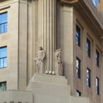
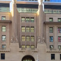
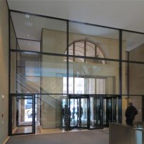
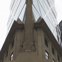
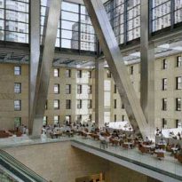
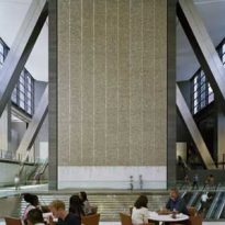
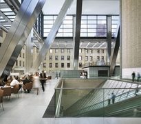
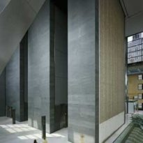
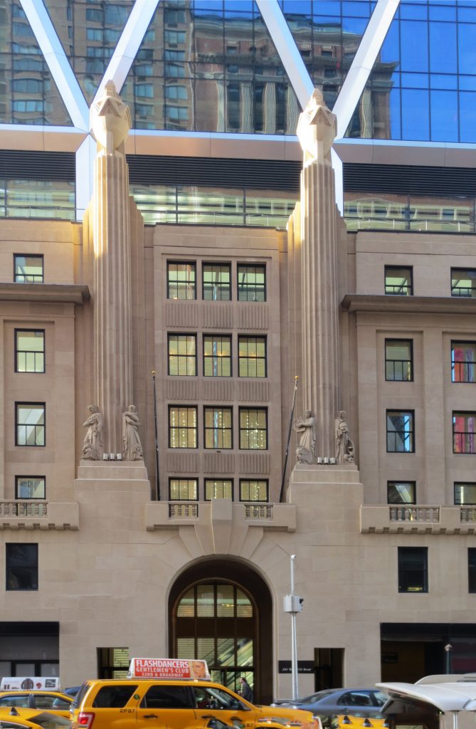
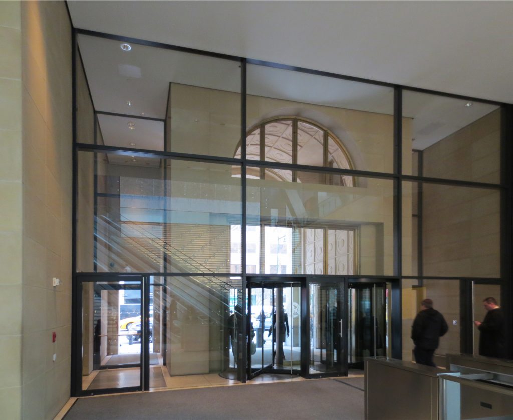
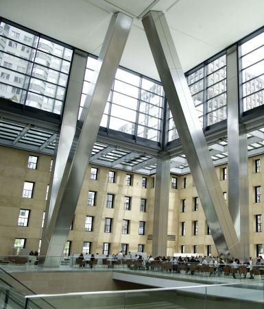
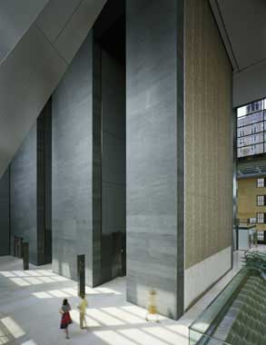
Once entered, the aggressiveness of the exterior contrasts with the interior space. While the original building facades are intact, the six-story interior creating a single space were eliminated. What was once raw concrete is now finished in a soft beige, an austere decor for this inner city square, where the difference between old and new are blurred. The basement Art Deco stands out for its structure fluted columns and statues depicting allegories of music, art, commerce and industry, framing square.
Atrium reception
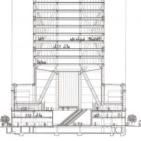
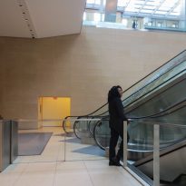
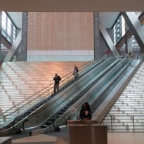
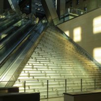
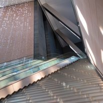
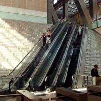
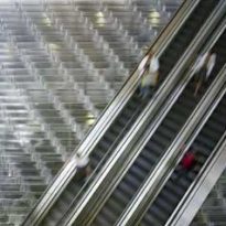
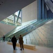
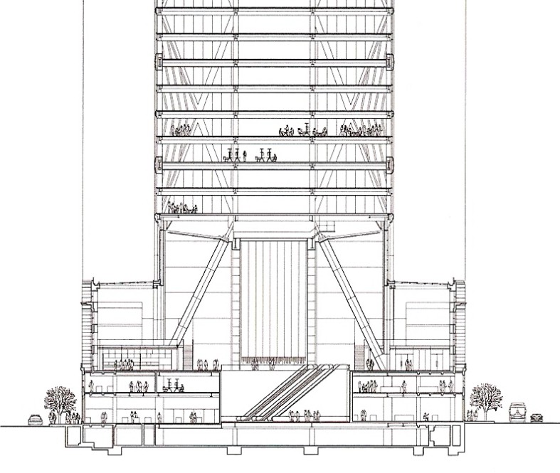
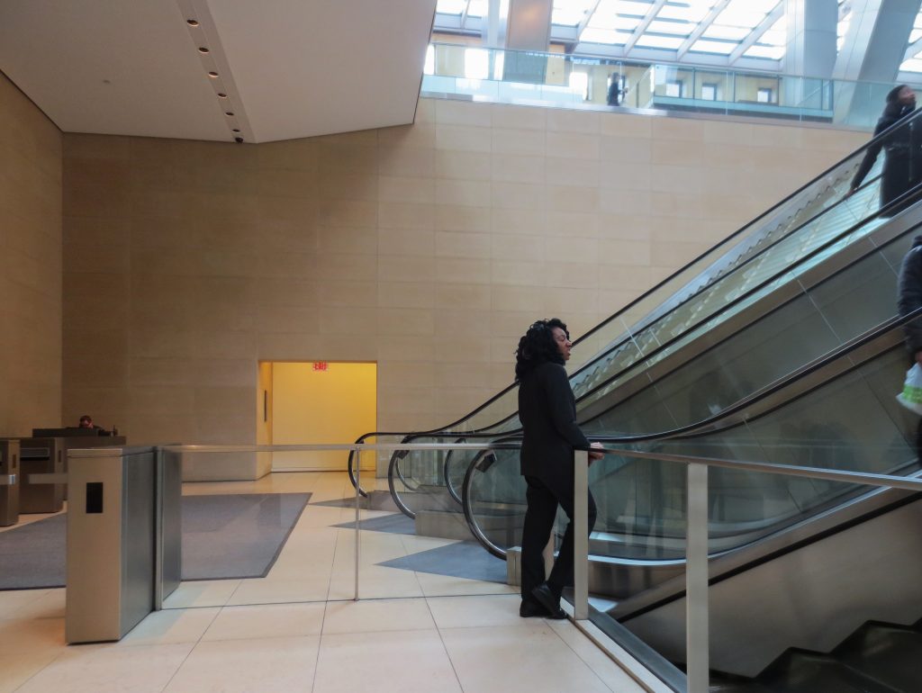
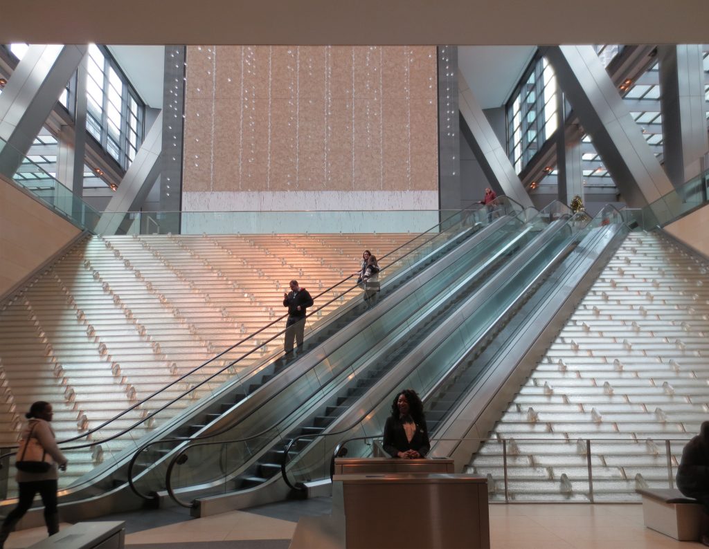
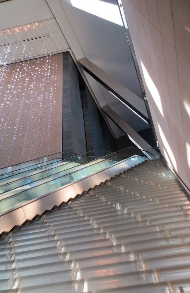
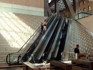
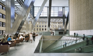
From the distribution point of view the plaza and atrium on the ground floor, three floors, leads to all other parts of the building and is flanked by an auditorium, lobby and spaces that house catering services. A spectacular waterfall recycled micro climate ensures the environment on the ground floor comfort. A pair of escalators up from the edge of the fountain to the cafeteria and exhibition hall of the second floor, where a large dark picture of Richard Long hangs on the polished black stone wall of the structure of the ladder. Natural elements and quiet atrium contrast with the bustle of the street.
Waterfall
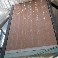
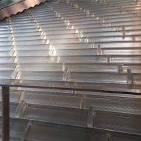
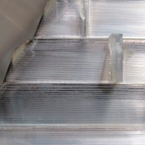
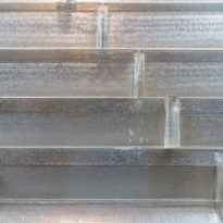
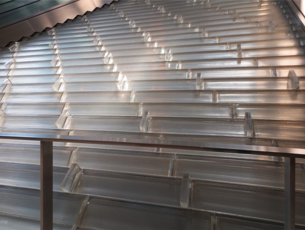
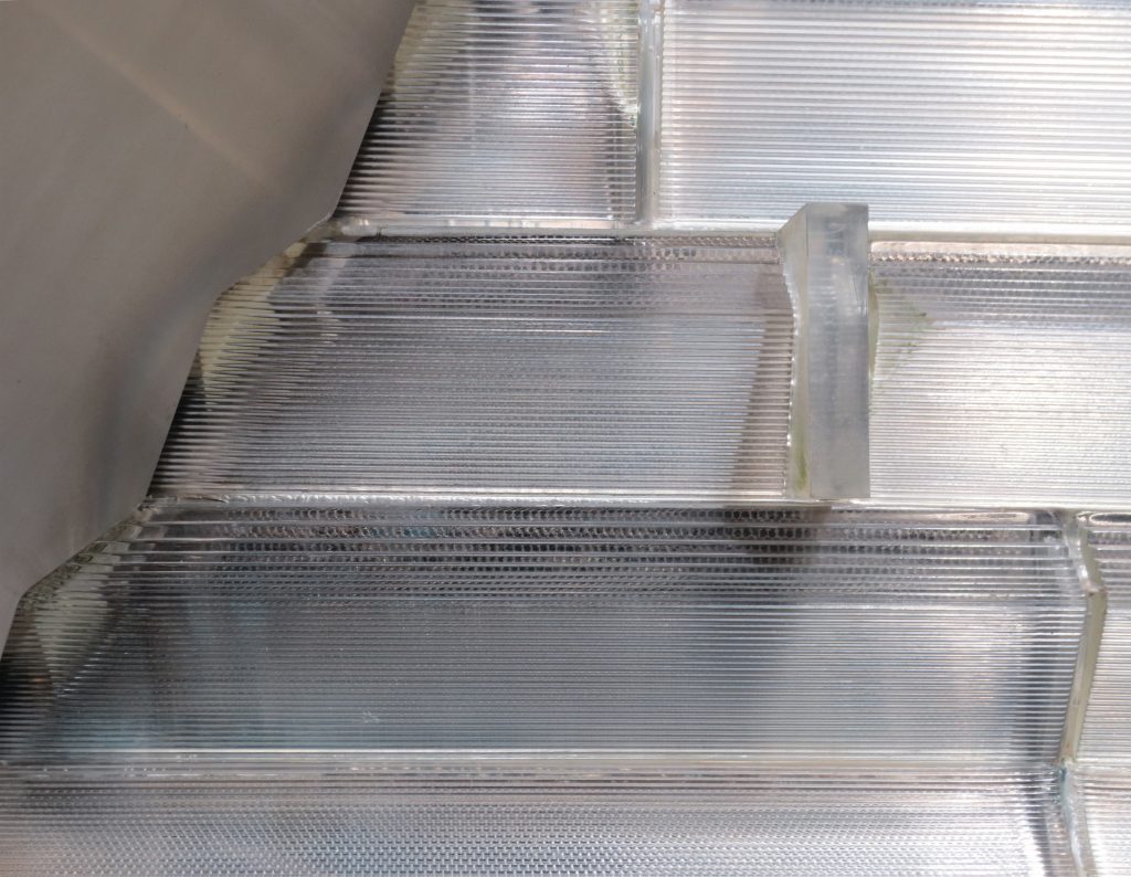
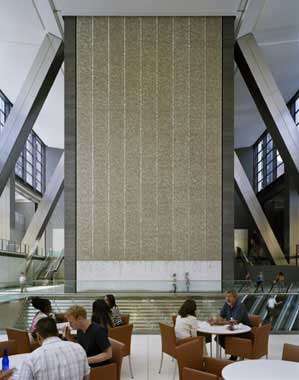
The structure of water that occupies three floors of Atrium, adjacent to the escalator was built with 50TN glass and allows the flow of filtered rainwater, collected from the roof of the tower. By recycling rainwater saves 6.4 million liters annually that would otherwise be wasted. The water cools the place in summer and moisten in winter
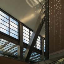
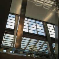
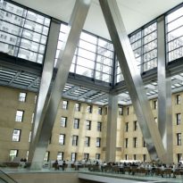
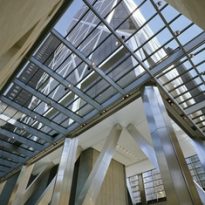
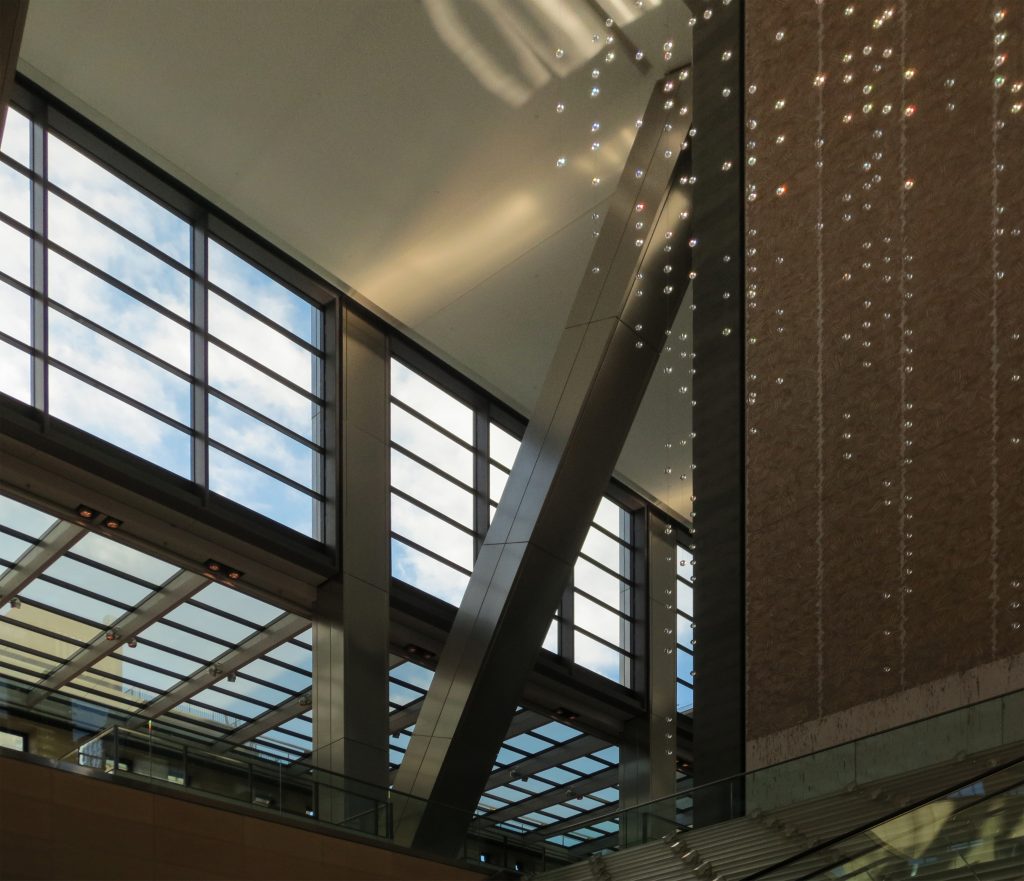
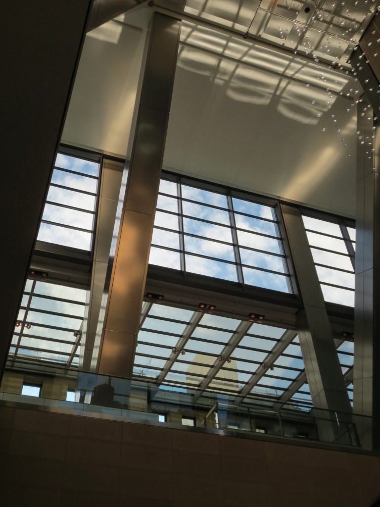
The whole court is under a glass roof, so that when the viewer looks up, has a breathtaking view. The upper levels are designed with the same clarity. By locating the elevators at the back of the tower, the ground floor is free. Similarly, most offices have panoramic north and south views.
Riverlines
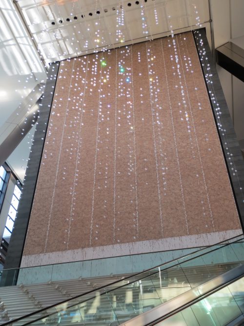
As birth waterfall in one of its sides, a stunning fresh environmental English artist Richard Long made with soil and water instead emphasizes the relationship with nature. The land comes from the Hudson river in New York and the River Avon in England. “Riverlines” consists of 9 columns of swirling prints hands and reaches 21m in height within the inner Plaza.
The lattice structure of the outer generated on each floor corners with sloping glass walls, which function as common areas for employees. On the top floor there is a canteen, offering a view to the east framed by steel beams of the structure, two stories high.
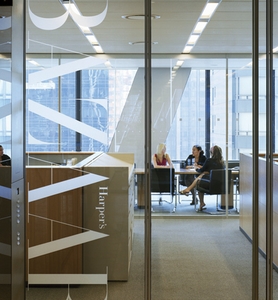
In addition to the magazine ‘The Hearst Magazine’ and corporate offices, there is also a study of ultra diffusion, a digital photo center, health center class (CLUB) open to employees at subsidized prices, a conference center executive and dining (on the 44th floor), a corporate cafeteria seats 380 (Café57) and a theater for 168 spectators.
– The CLUB:
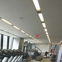
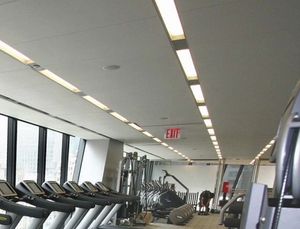
On the 14th floor gym with 836m and fully equipped is available to employees of Hearst.
– Café57:
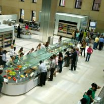
The dining area offers 380 stylishly designed seats for employees and guests.
– Josph Urban Theater:
It named after the architect of the first seat of Hearst, is a drama theater and performance space for up to 168 attendees.
– Good Housekeeping Research Institute:
Located on the 29th floor, the laboratory evaluation of consumer products Good Housekeeping magazine that since 1901 consumer products subjected to rigorous scientific testing, giving them the best products with the famous label “Good Housekeeping Promises” is located
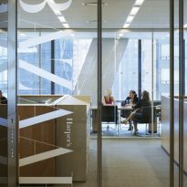
On the floor are 44 executive meeting rooms overlooking the Central Park, the Hudson River and the skyline of Midtown.
Structure
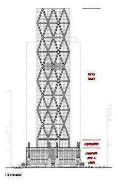
The basement has a reinforced concrete structure.
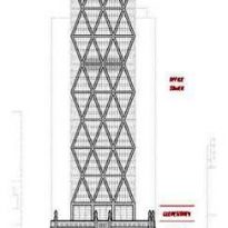
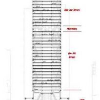
The tower is supported by a set of huge steel columns 12 that rise from the interior of the base. The structure has a triangular shape, using a diagonal diagrid that provides the same stability as a conventional structure frame. Diagrid also eliminates the vertical columns. The particular structure used allowed the lift movement of the core outside the center of the plant. The triangular frames, four stories high, used in the design gives the building its distinctive, modern and at the same time a structural efficiency higher aspect. It is the first building in North America where there are no vertical steel beams abroad.
The design is prior to the attacks of September 11th. However, it was subsequently reviewed and verified their operation under the worst conditions. The diagrid provides excellent response in case of an earthquake or bombing.
Materials
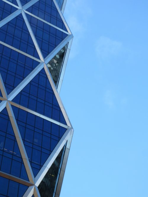
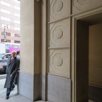
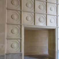
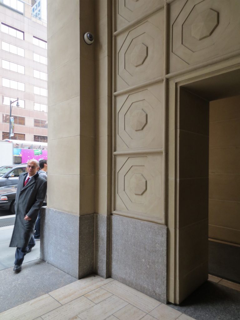
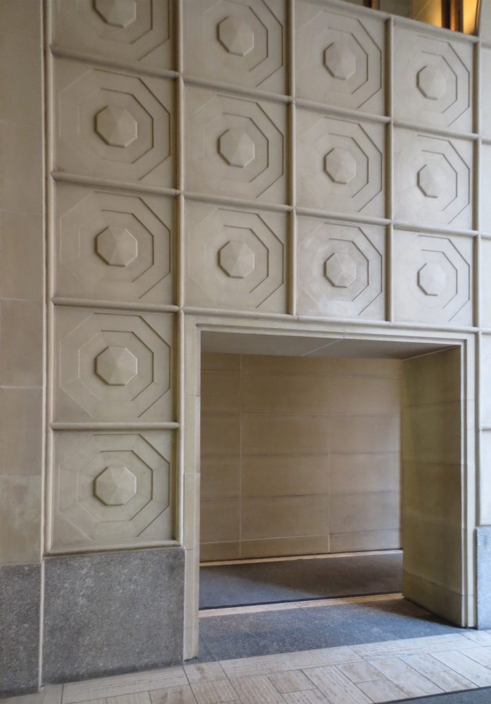
The facades of the basement are the original concrete. To restore were coated limestone. This same stone was used in soils.
The tower structure is steel, closed by a glass curtain wall. With structural system regjilla diagonally diagrid, the skyscrapers Hearst Corporation elim ino the need for approximately 2000tn steel, a savings of 20% compared to a conventional office building.
Most of the material used in its construction from the United States. The materials of foreign origin represent less than 10% of the total cost of construction.
- Original Base
The original facade of the building, used by Foster as the basis for the new tower of steel and glass, is made of cast stone, a mixture of sand and concrete. The fluted columns both identify the building, 8 elegóricas statues representing comedy, tragedy, music, industry, sports, science, and printing are incorporated.
Ecological features
- The Hearst tower is within 10% of the major US efficient buildings.
- 90% of structural steel tower contains recycled materials.
- The secluded roof rainwater, reducing by 25% the amount of water discharged to the drainage system of the city during the rains.
- The Hearst Tower was the first commercial office building in the city of New York in compost with 100% of wet food waste.
Videos
