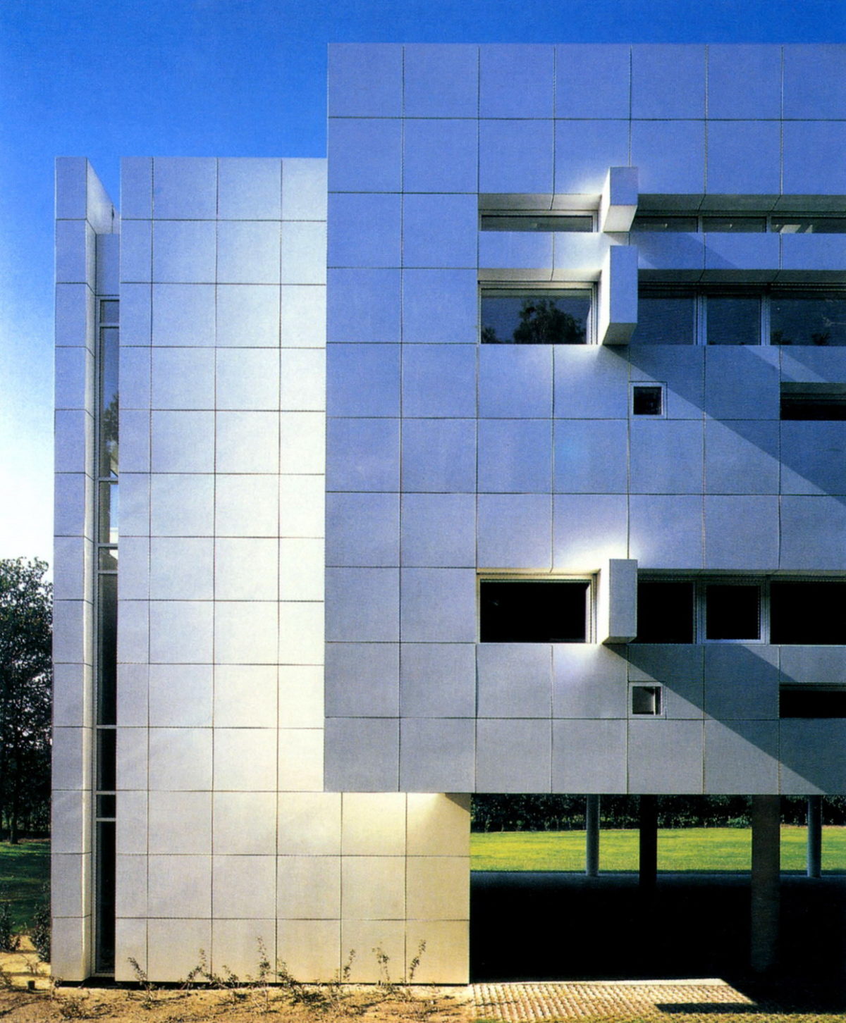
Headquarters of the Royal Dutch Paper Factory

Introduction
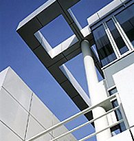
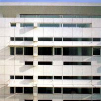
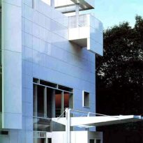
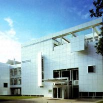
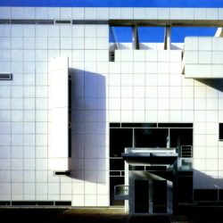
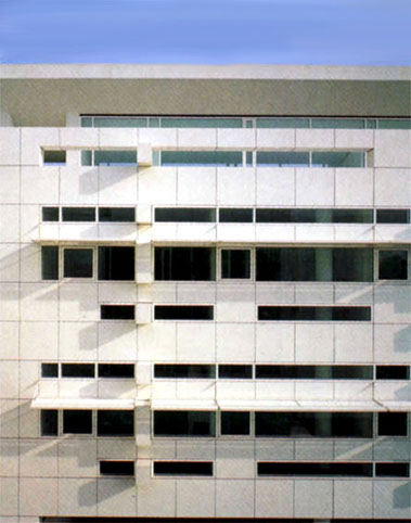
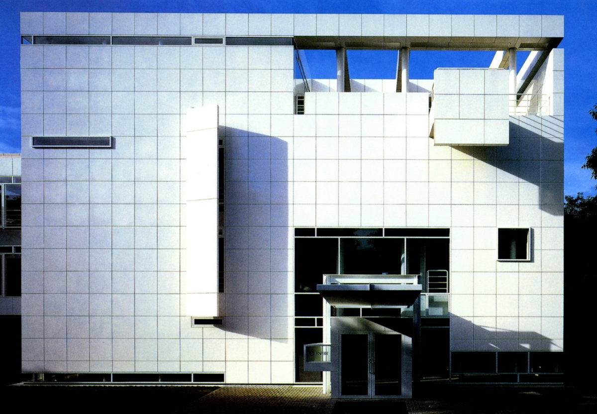
The American architect Richard Meier designed the headquarters for a major international paper with a clear rationalist style with influences of Le Corbusier.
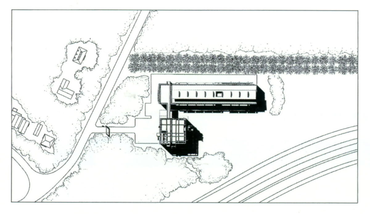
Situation
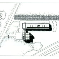
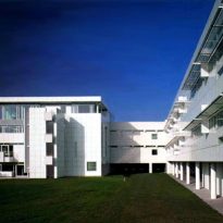
It is located in a clearing in a densely wooded area of forest.
Concept
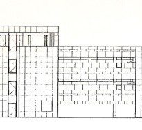
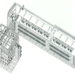
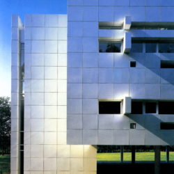
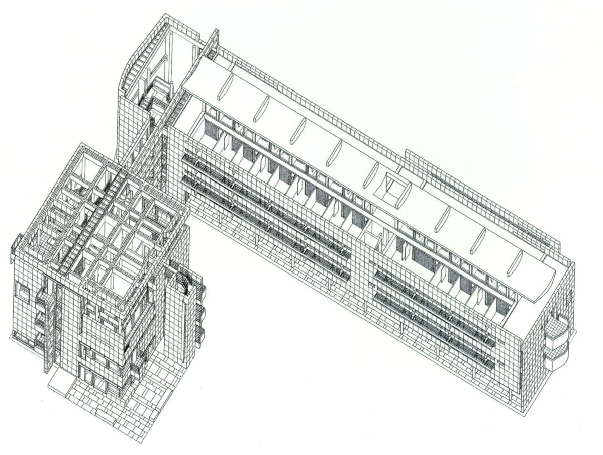
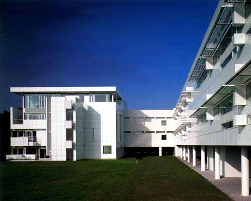
The volume of this building consists of two parts connected by a bridge, a building height of four cubic which runs the reception and a strip of two high altitudes on piles where the offices.
Spaces
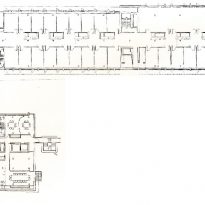
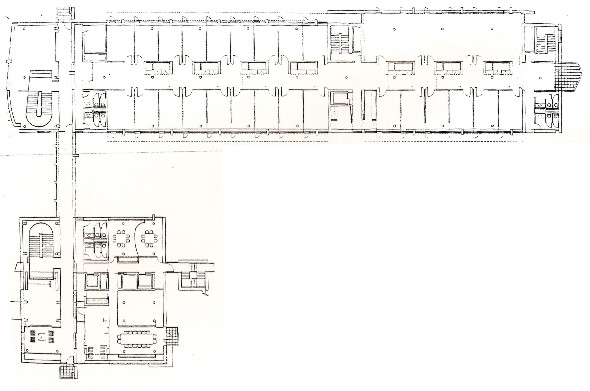
The building is organized around two crossed paths in services. The core of elevators and mechanical equipment is located in the strip that runs northeast of the building to the southeast. The interim waiting area and is in the opposite axis. This area is flanked by a wall covered with four high stone wall forms the side of the bridge that connects the two volumes of the building.
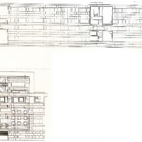
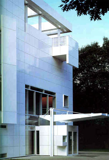
In the volume of receipt, the lower floors are occupied by the area of restaurant staff in the dining room floor with double height, and three private dining rooms on the first floor. The largest of the dining room has a private terrace to the south. On the second floor offices are located for visitors and meeting rooms. The top floor is the conference room and auditorium with capacity for 60 people.
The strip has two main revenue office with two cores stairs. Pilotis this volume between the ground covered with grass. The offices are located in strip along a movement.
