Guild House

Introduction
With a formal language that reminds public housing, the architects allude to a low budget to explain the use of a conventional structure in the construction of the Guild House (Casa Guild). The first great work of Robert Venturi combines square sash windows, features unusually large social constructions, with windows larger budget, some according to their function in relation to the street.
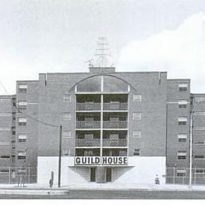
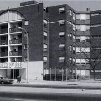
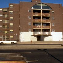
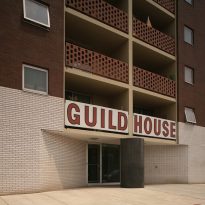
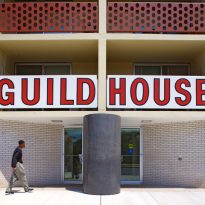
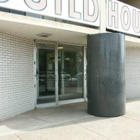
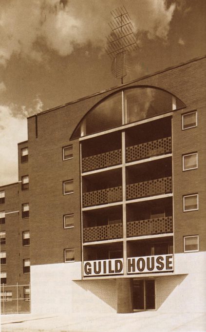
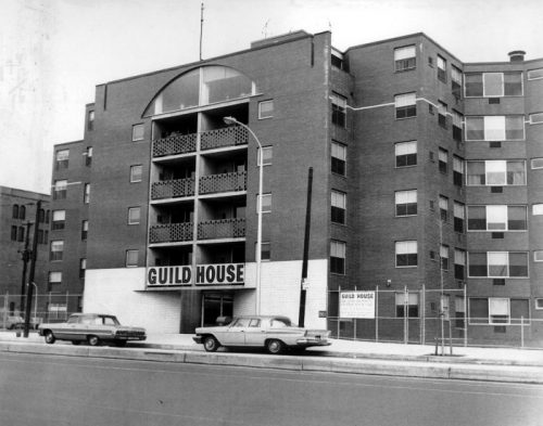
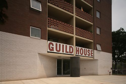
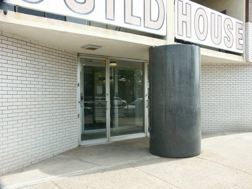
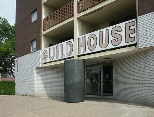
A massive column of polished granite in the middle of the entrance contrasts with the white ceramic coating that highlights the main entrance and that includes the name of the building in large letters covering the first floor balcony. At the time of its construction the building was crowned with a golden replica of a TV antenna, placed in the center of the facade, a friendly symbol to the leisure activity of older people who occupied the building and an ironic variation decorated in classical pediments of the buildings. In 2004 the Philadelphia Historic Register added it as a legacy, despite having only 40 years of existence at that time.
Location
“… The House Guild was designed not as a construction Le Le Corbusier in a park, but along a street to the sidewalk, in an ordinary urban environment such as a building opening for windows in the walls, brick instead of concrete, with a bow-shaped opening and a dual composition at its input, with a column in the center instead of a minimalist column. It also contains a nearly commercial sign in his capacity… “(Robert Venturi).
It was built on 711 Spring Garden Street, bordering the north central city of Philadelphia, Pennsylvania, United States, and commissioned by the Quaker organization Friends Gremiales del Barrio (Friends Neighborhood Guild).
Concept
This apartment building for seniors with low incomes was one of the first important works of Robert Venturi and then mate, John Rauch. The building has become an emblem of an architectural philosophy that tries to embrace both conventional classical tradition and “ugly and ordinary” cheaper and social construction.

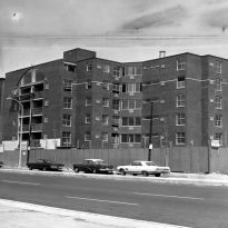
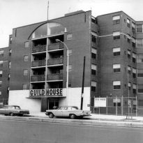
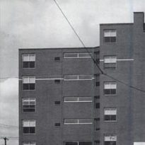
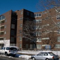
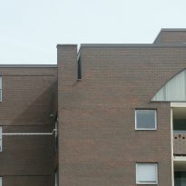
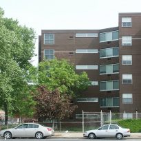
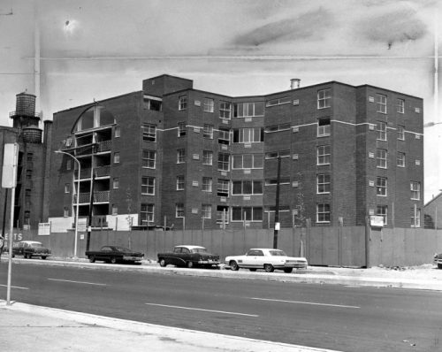
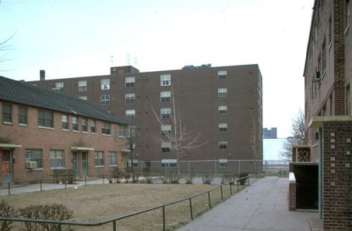
The front facade respects the line of the street as the urban layout of the city, although the building is retracted on the sides. Like the ordinary structures in this neighborhood, its facade offers an economic aspect of red bricks with conventional metal window sash. In many ways it is an “ordinary” building, for many people even “ugly”. In contrast construction fits the context, without highlighting between the architecture of the neighborhood.
The building housing apartments for seniors with low incomes, was commissioned by Quaker organization and was completed in 1963. Together with the Vanna Venturi House is considered an important and influential works of twentieth-century architecture and one of the first expressions of postmodern architecture. Guild House represents a conscious rejection of modernist ideals and was widely cited in the further development of the postmodern movement.
Venturi later explained the architecture of the Guild House in the context of his philosophy of “decorated shed”: “… In the House of Guild symbolic ornamental elements are loosely applied literally… The symbolism of the decoration becomes ugly and ordinary, with a hint of irony original heroic… and rightly shed is ugly and ordinary, but its bricks and windows are also symbolic…. ”
Description
The building’s architecture combines the historical forms with the “banal” mercantilism of the twentieth century, hiding behind its apparent vulgarity an astute intellectual agenda. Venturi wrote about it: “… the economy delivered the advanced architectural elements, but conventional. We do not resist to it… “.
Facade
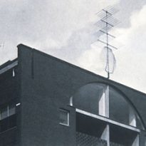
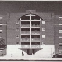
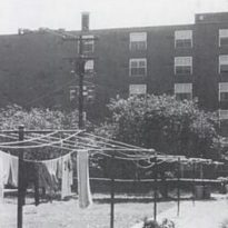
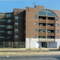
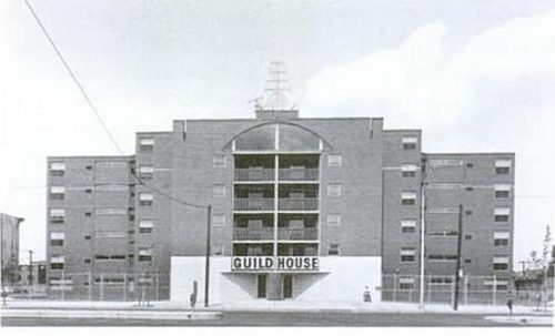
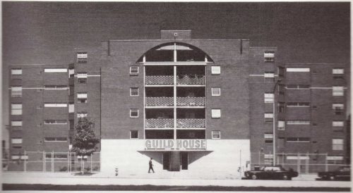
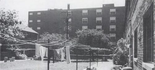
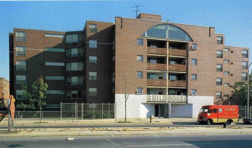
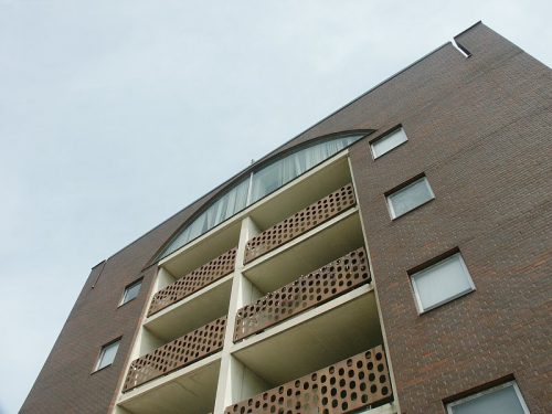
The facade facing the street is anchored by a thick column of black polished granite and crowned with a large arched window opening in the upstairs common area of the building. The rear facade is flat.
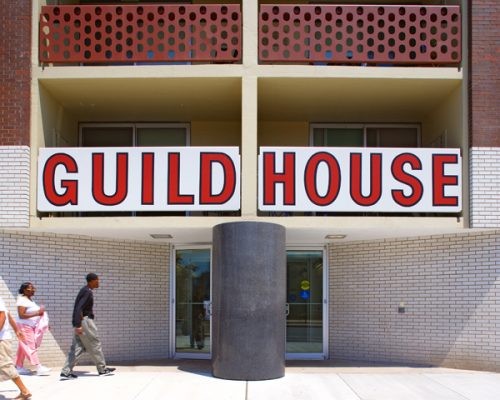
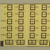
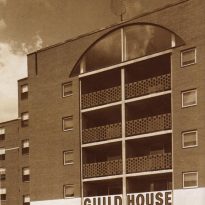
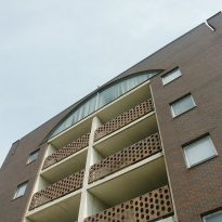
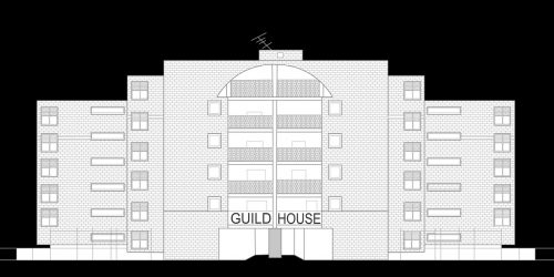
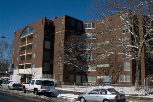
This 6-storey building with a symmetrical facade, shown in a white base coating plant, where the entrance is located and on which 4 pairs of balconies flanked by square windows open, ending in a large arched window in the top floor for the lounge. The retraction of both ends generates a staggering allows more windows sunny exposures.
Like the facades screen in some medieval cathedrals, this front deceived as to what is behind, as an example about the masonry slots, at the top, which reveal that the building is interrupted in this sector.
- Access
The entrance to the ground floor is highlighted with a coating of white bricks that also cover the balcony of the first floor balconies and a string ending on the fifth floor. In the center of the entrance a massive column of black polished granite highlights the access to the building. According Venturi, the combination of these elements provides a new and larger scale of the three juxtaposed to the other floors six plants smaller window marked by scale.
Covering the front of the balcony of the segund plant, and over access, large letters indicate the name of the building. Originally the facade was crowned with a large television antenna as abstract sculptural element representing the main pastime of its inhabitants.
Inside
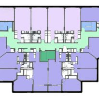
The interior spaces are defined by intricate mazes of walls that fit the complex and varied program of an apartment building and the irregular frame allowed by flat slab construction. There is a maximum internal volume and minimum aisle space, which are irregular and varied residual space, instead of the usual tunnel.
The building has 91 apartments, mostly with windows that let in outside light and street views.
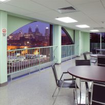
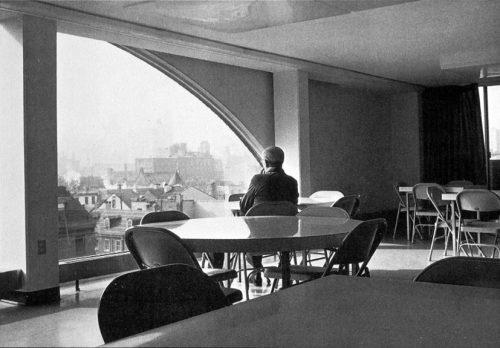
The top floor contains the living room, indicated by a big lunette window.
Structure

The structure of the Guild House was built mainly with dark bricks and flat slabs.
The stepped facade organization allows most units on southwest or southeast facing windows, giving way to sunshine and views of the street below. The open interior corridors were designed to create intimate and informal spaces.
The large round column exposed at the entrance on the street facade, accommodates and emphasizes the large opening on the ground floor, contrasting with the white brick area coating extends to the second floor.
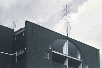
The central window on the top floor reflects the special room inside the common spatial configuration and is related to the entry below, increasing the scale and the building on the street. Its arched shape allow a large opening in the wall while being “a hole” instead of “empty” of a frame. The presence, in the original building, TV antenna on top of the shaft and beyond the finish line of the structure, strengthen the scale of the facade in the central and expresses a kind of monumentality.
Materials
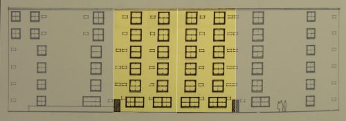
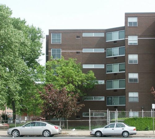
Sash windows recall the formal language of public housing, thus being “ordinary” by. At the same time, some of these windows are “normal”, some unusually large, depending on their relationship to the street. Both the main facade and rear windows were placed primarily in symmetrical patterns.
A column of black polished granite in the middle of the entrance portal contrasts with the white ceramic glaze coating. This element and the scale label “Guild House” placed on the first floor balcony clearly mark the entrance.
The architects used red clay bricks and sash windows to recall the existing public housing projects and express what they were inelegant neighboring urban structures.
The balcony railings are perforated steel plates, on the first floor painted white instead of black to create a continuity of the surface in this area despite the change in the material, since the coating on the first floor has made in white glazed brick.
TV antenna that crowned the building at the time of its completion was gold anodized aluminum.


