Guggenheim Museum in New York
Introduction
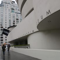
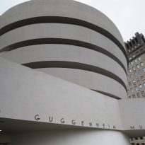
The Guggenheim museum in New York was the first of the museums created by the Solomon R. Guggenheim Foundation, dedicated to modern art. It was founded in 1937 in the Upper East Side, NY. It is the best known of all the museums within the foundation and often referred to simply as “The Guggenheim”.
At first it was called the Museum of Non-objective Art, and was founded to exhibit avant-garde art by early modernist artists such as Kadinsky and Mondrian.
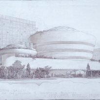
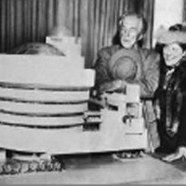
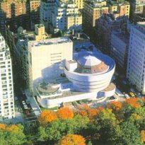
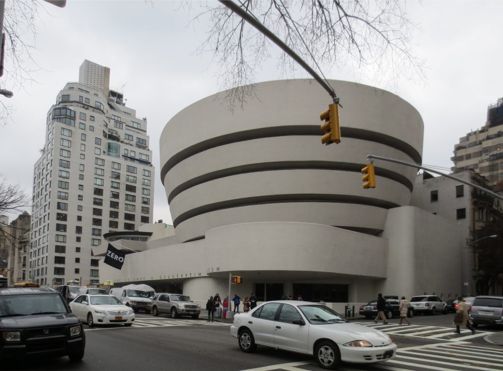
In 1959, it moved to the site it now occupies (at the corner of 89th Street and 5th Avenue, opposite Central Park), where the building designed by the architect Frank Lloyd Wright was built.
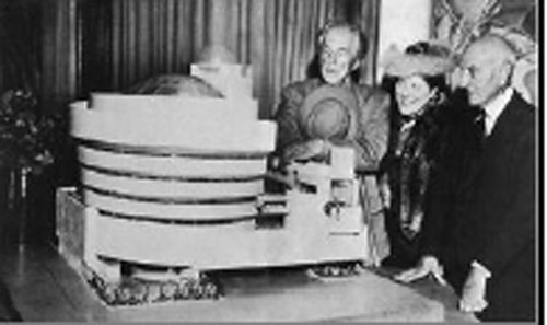
Solomon did not know who to choose as the architect for the museum, so he asked the Baroness Hilla von Rebay to select someone. She chose Wright as he was the most famous architect at that time.
The project was surrounded by complicated discussions between the architect and the client, and the city, the art world and public opinion, due to the contrast of its form against the grid of the city. During the construction works, a letter signed by a long list of artists was received by the director and administrators, in which they expressed that the inclined walls and ramp were not appropriate or adequate for the exhibition of paintings. Despite strong criticism, Guggenheim remained enthusiastic about the idea of the ascending spiral and supported the project until his death in 1949.
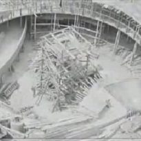
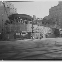
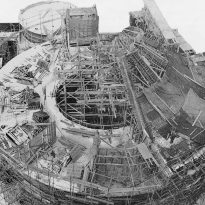
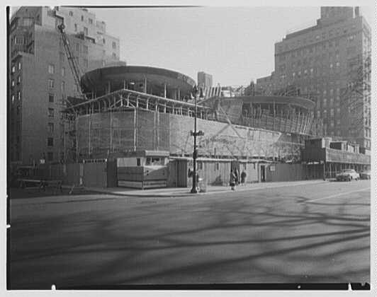
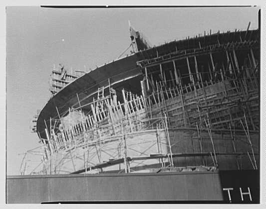
Between 1943 and 1956, the beginning of the construction suffered several setbacks, due to changes in the conditions of the site, to regulations pertaining to the construction, to changes in the museum’s programme and to the increase in costs of the construction materials. However, on the 16th August 1956, they could finally begin the earthmoving works.
Guggenheim and Wright both passed away before the construction could be completed in 1959, though when Wright died in April 1959, the construction was practically finished, with only a few final details missing. Six months later, on the 21st of October, the museum opened its doors to the public. The achievements testify not only to Wright’s architectural genius, but also to the adventurous spirit characterised by its founder, Solomon R. Guggenheim.
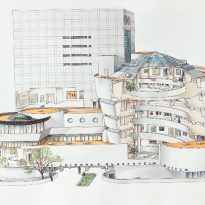
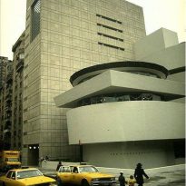
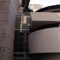
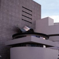
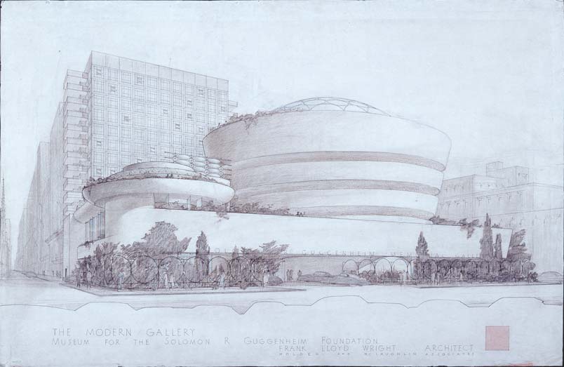
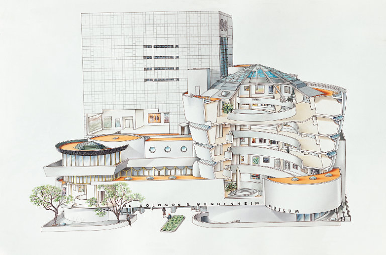
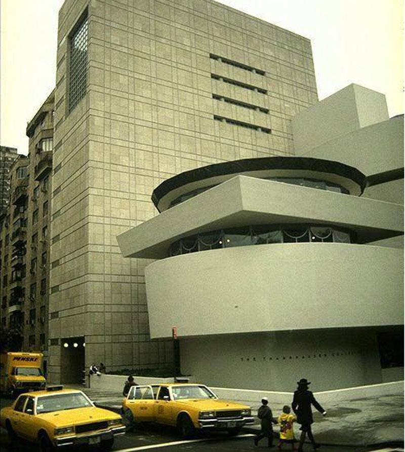
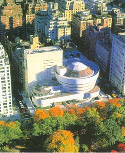
In 1992, the building was completed by the addition of a rectangular tower, higher than the original spiral. This modification from Wright’s original design generated strong controversy. Wright’s original building had proved unpopular due to criticisms levelled by artists who felt that the building overshadowed the works exhibited there and that it was difficult to appropriately hang the paintings.
Restoration
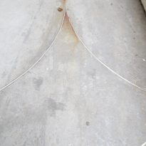
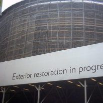
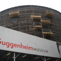
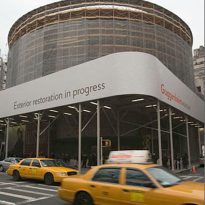
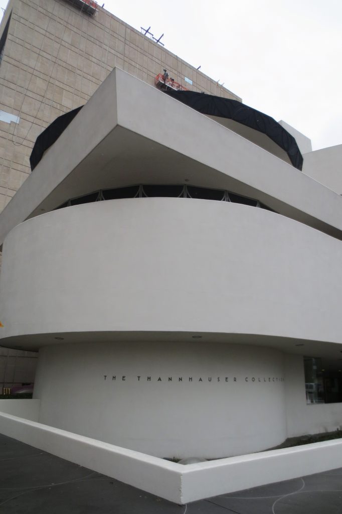
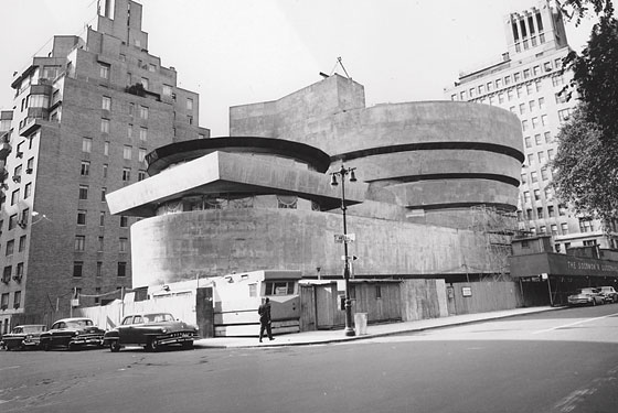
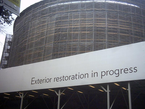
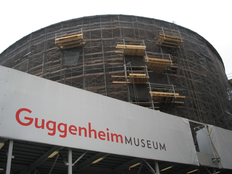
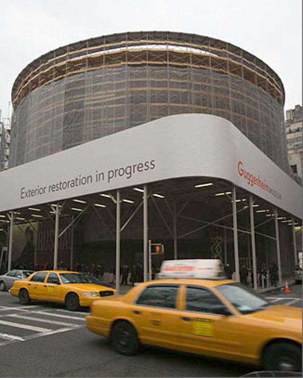
During the year 2006, visitors to the Solomon R. Guggenheim Museum had to pass under scaffolding that was necessary for the exterior restoration of the famous building. Although much admired, the famous concrete structure designed by Frank Lloyd Wright had been plagued by superficial cracks almost since its inauguration in 1959.
During 2005, the twelve coats of paint that had been applied over the previous 46 years were removed and the surface of the concrete construction revealed to allow for detailed assessment of its condition. The tracing of certain cracks took more than one year, as the experts looked for an adequate solution to repair them and ensure the building’s health for the long term. Its restoration was completed in the summer of 2008.
A group of specialists, engineers, architects and curators- had been creating models in concrete and measuring dilatation of the building’s reinforcements between the seasons of Winter and Summer in the city, which could vary between -15° and 35° respectively. Due to this very normal phenomenon of dilation and contraction of the reinforced structures, the outermost layers of the concrete had begun to break away, crack and peel in an accumulative fashion since its inauguration in 1959.
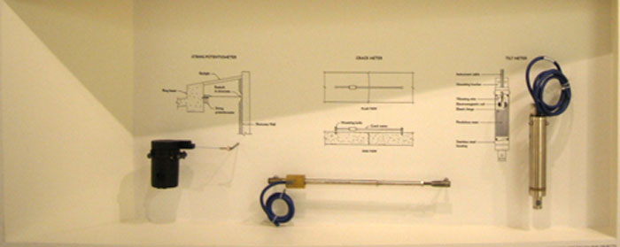
The designated team first studied the building to determine its condition and determine the best strategy for its restoration. They employed non-destructive methods of restoration, such as monitors, radars and laser scanners. The exterior façade which faces toward Central Park was one of the most eroded and was the first to begin being restored.
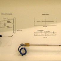
The exhibition, open to all the public who visit the museum, also demonstrates the technology used and the technical instruments for the measuring of vibrations, dilations and corrosion of reinforced structures, as well as the method used by the specialists to carry out the initial study prior to reconstruction and reparation of the damage.
Location
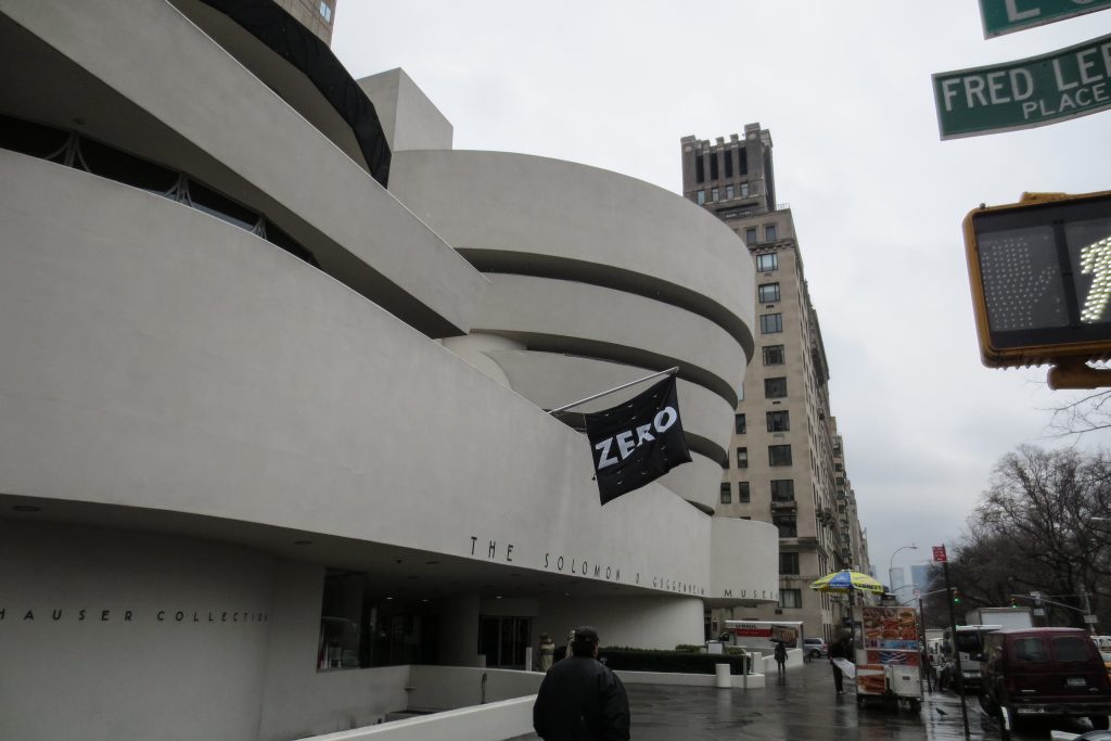
The building is found next to the east face of the famous Central Park, offering a grand visual combination to those walking through the city. Its address: 1071 Fifth Avenue (at 89th Street) New York, NY, 10128-0173, USA.
Accessibility: Metro stop 86th street (Lines 4, 5 and 6) and bus routes M1, M2, M3 and M4.
Concept
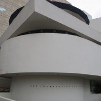
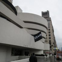
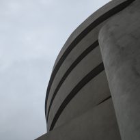
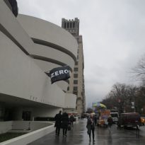
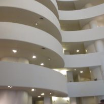
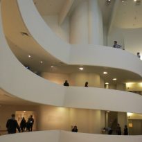
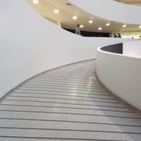
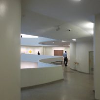
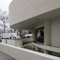
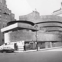
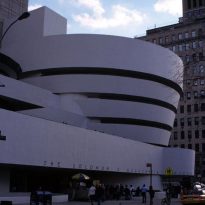
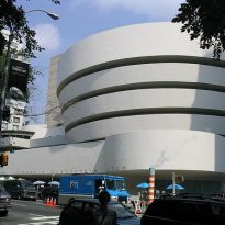
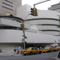
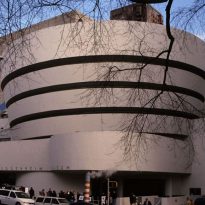
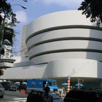
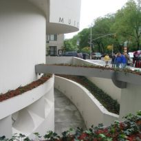
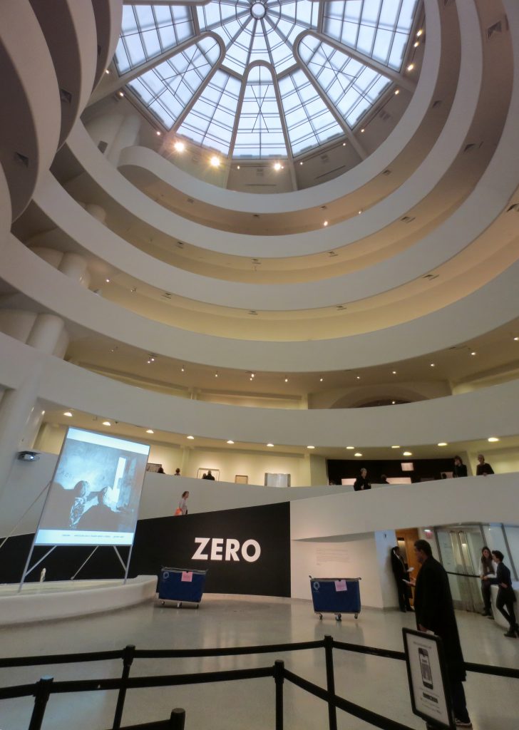
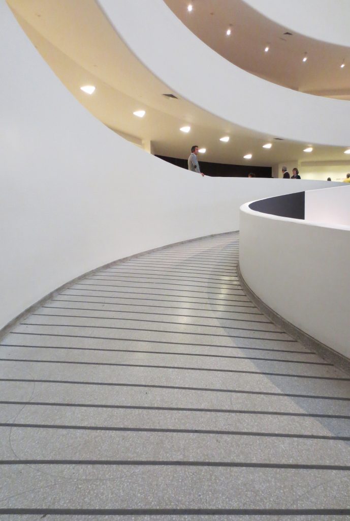
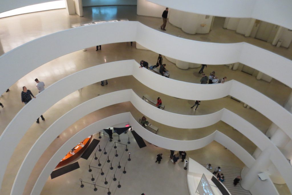
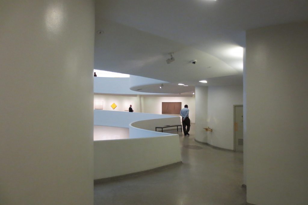
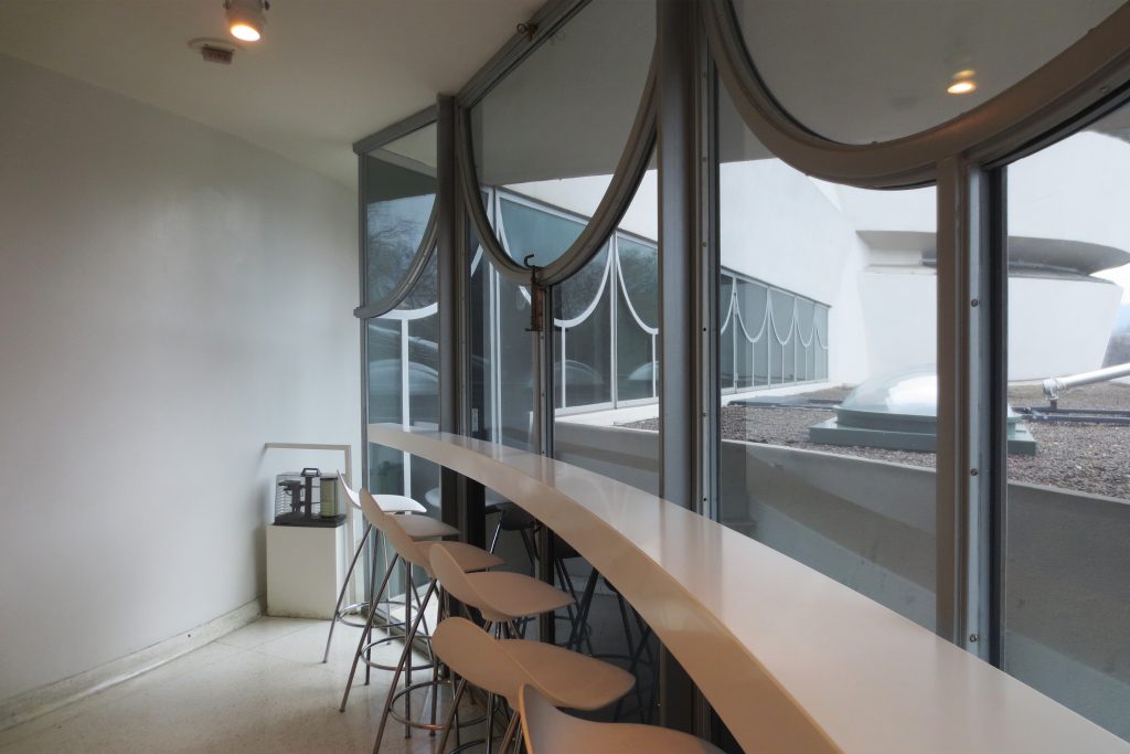
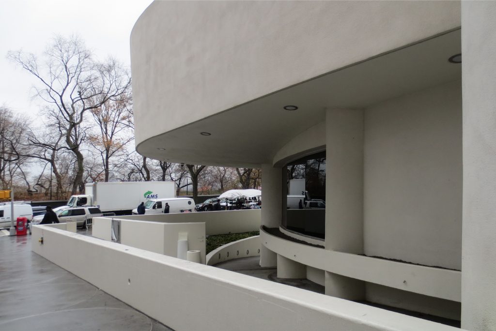
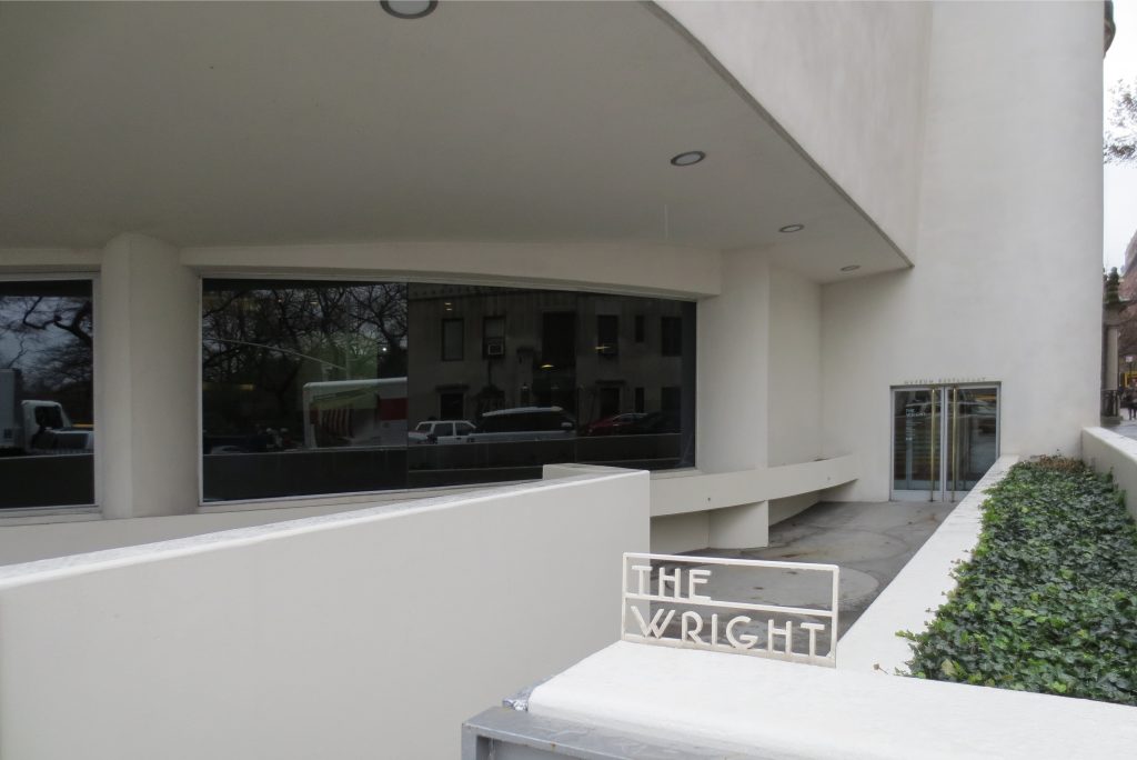
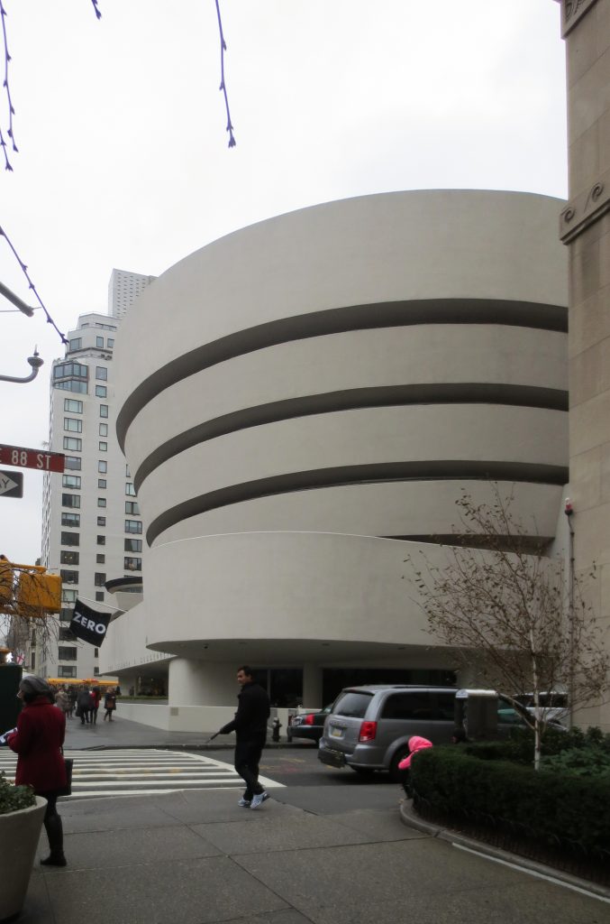
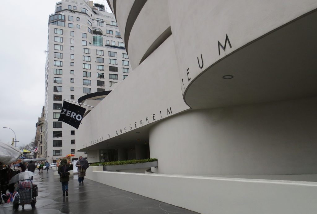
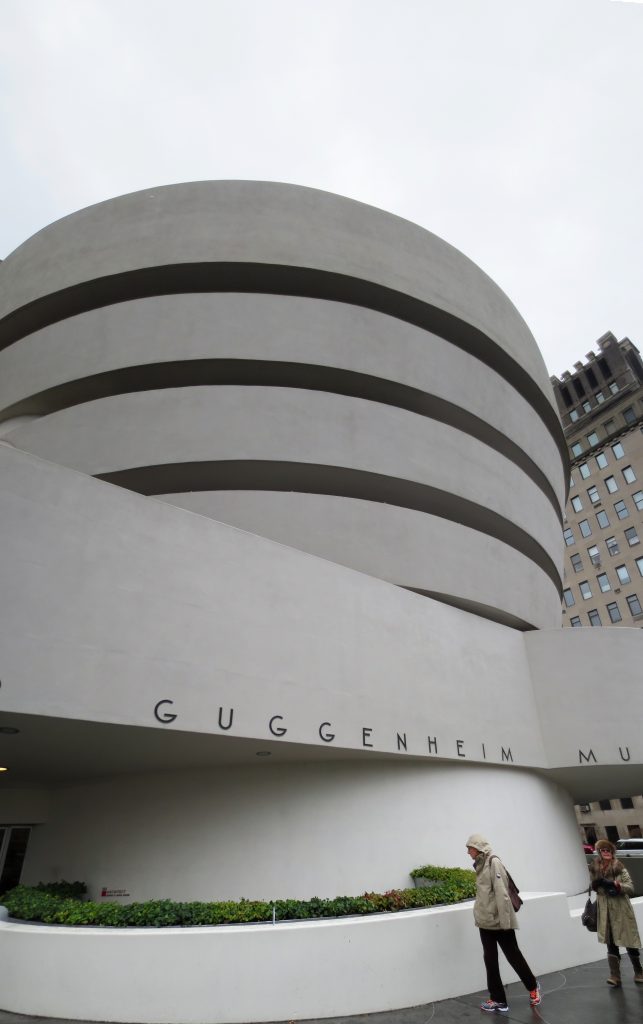
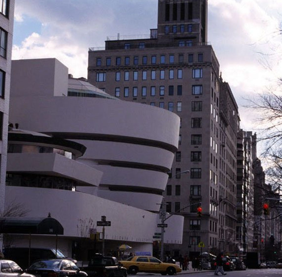
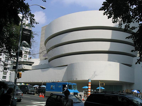
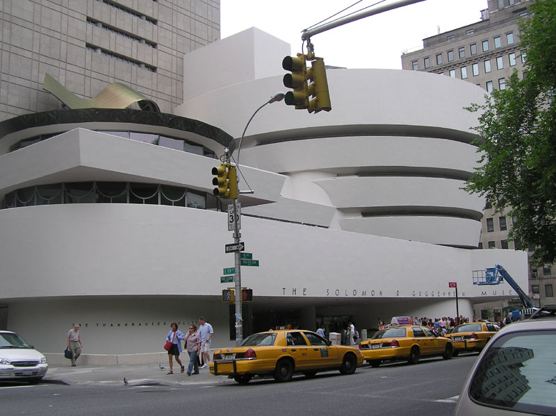
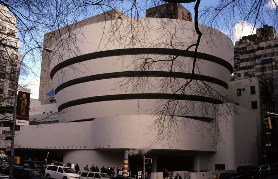
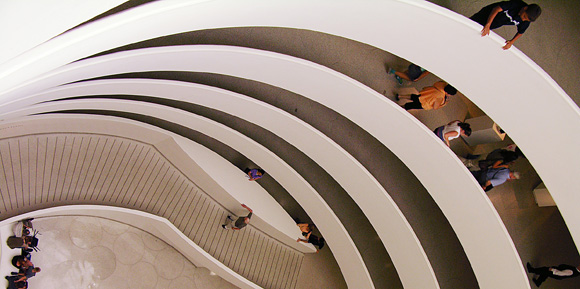
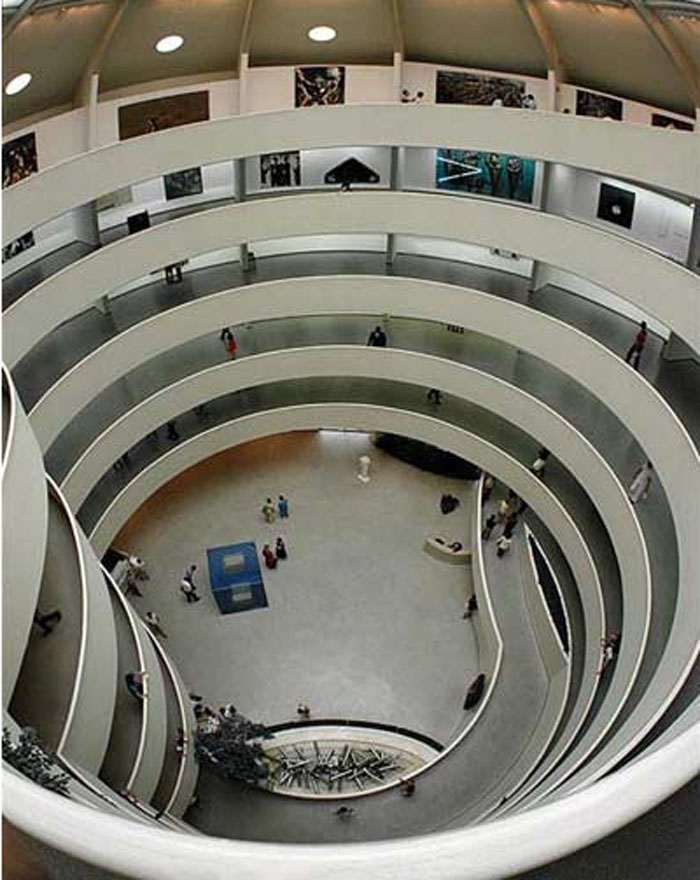
The building in itself has become a work of art. From the street, the building resembles a white ribbon rolled into a cylindrical shape, slightly wider at the top than at the base. Internally, the galleries form a spiral. As such, the visitor views the works while walking along an ascending, illuminated helical ramp, like a promenade.
It’s design was inspired by a “ziggurat”, a pyramidal, stepped and inverted Babylonian temple.
Opinion of Frank Lloyd Wright
To the question of why he preferred a ramp in place of conventional floors, Wright responded that for the museum visitor it is more enjoyable to enter a building, go up in the elevator to the upper floor of the ramp and precede descending gradually around an open atrium, always having the option to go up or down using the elevator to all levels of the ramp, to finally arrive at the end of the exhibition on the lowest level, next to the exit. Wright added that in the majority of conventional museums, the public have to traverse long exhibition galleries, and end up having to re-cross them at the end of the visit in order to reach the exit.
Why do we believe the walls of the Solomon R. Guggenheim Museum are lightly inclined toward the exterior?
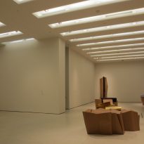
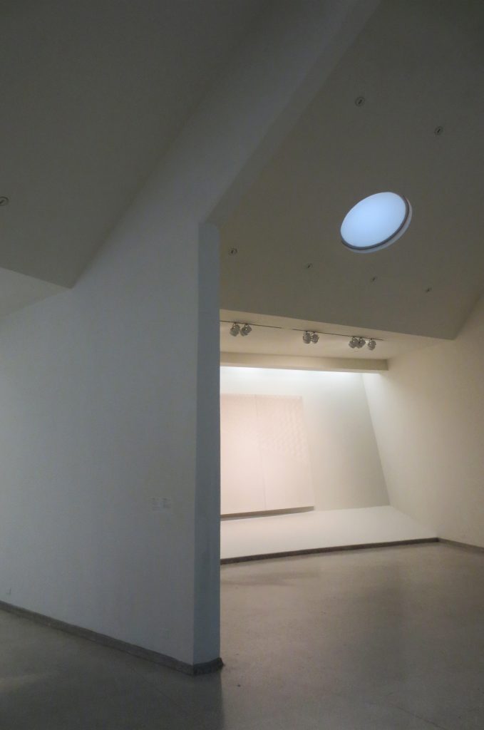
Because its founder and architect thought that the paintings placed on a smoothly inclined wall could be seen with a better perspective and would be better illuminated than if they were hung in a purely vertical position. This is the principal characteristic of the building, the hypothesis on which the project is based. It is a new idea, but can act as a precedent of great importance for the future.
Spaces
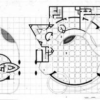
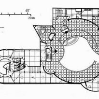
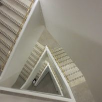
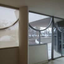
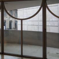
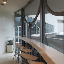
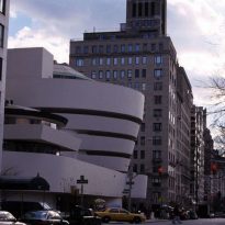
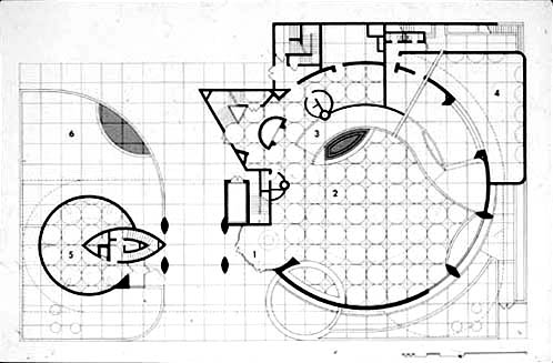
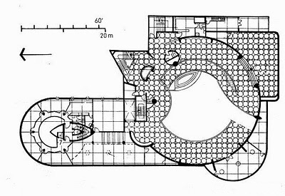
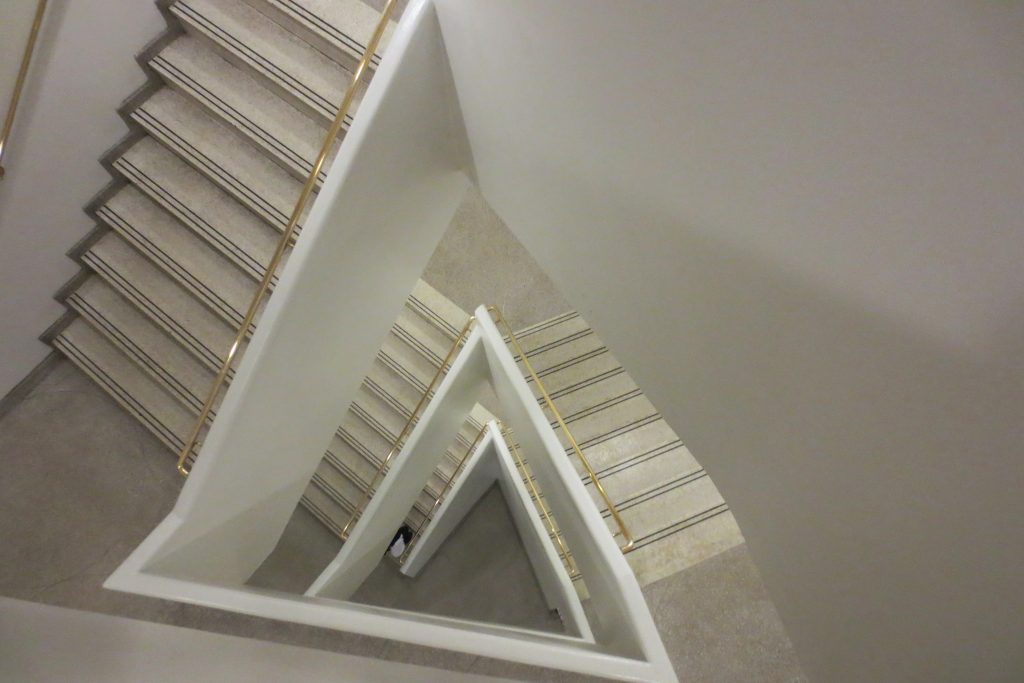
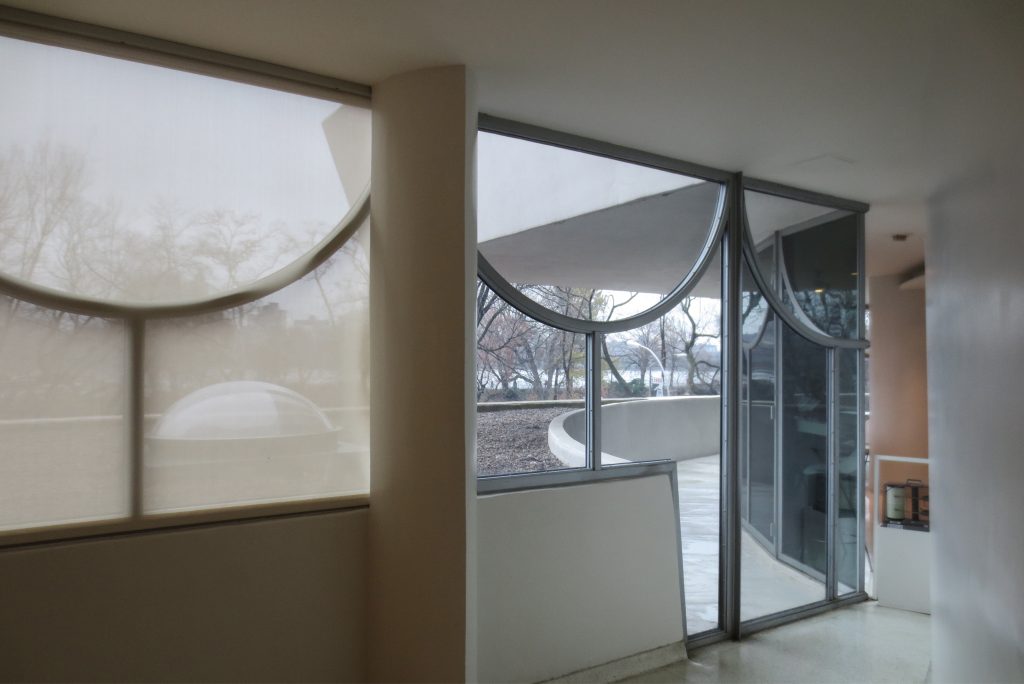
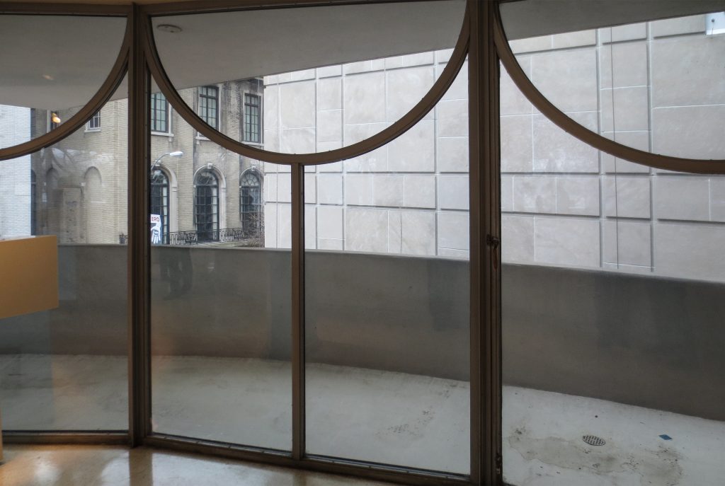
The Guggenheim Museum provides a significant contrast with its surrounding buildings due to its spiral form, emphasised by the fusion between triangles, ovals, arches, circles and squares which correspond to the concept of organic architecture used by Frank Lloyd Wright in his designs.
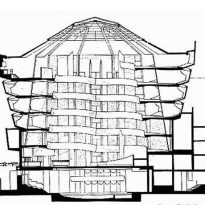
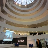
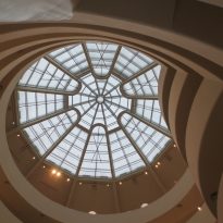
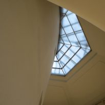
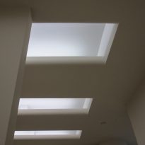
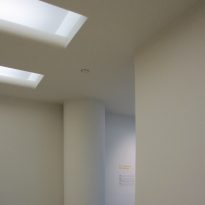
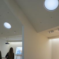
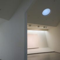
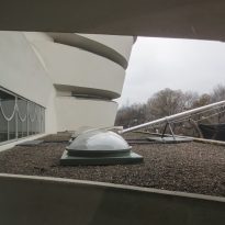
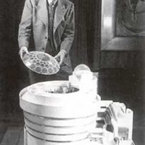
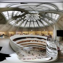
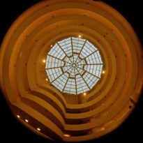
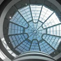
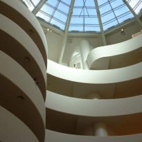
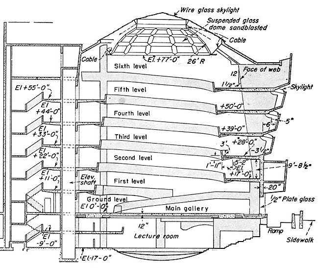
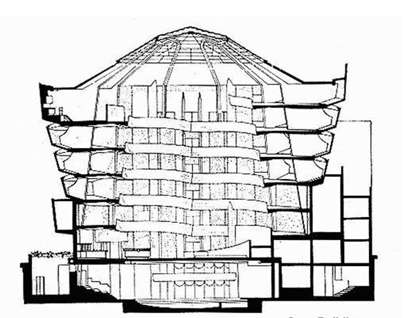
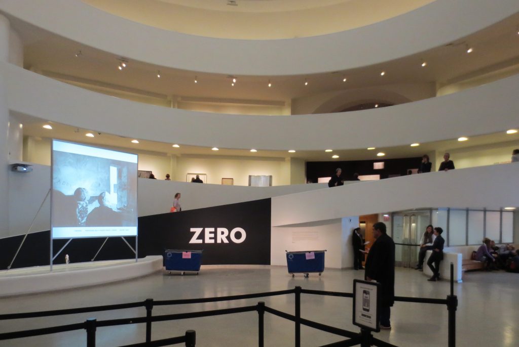
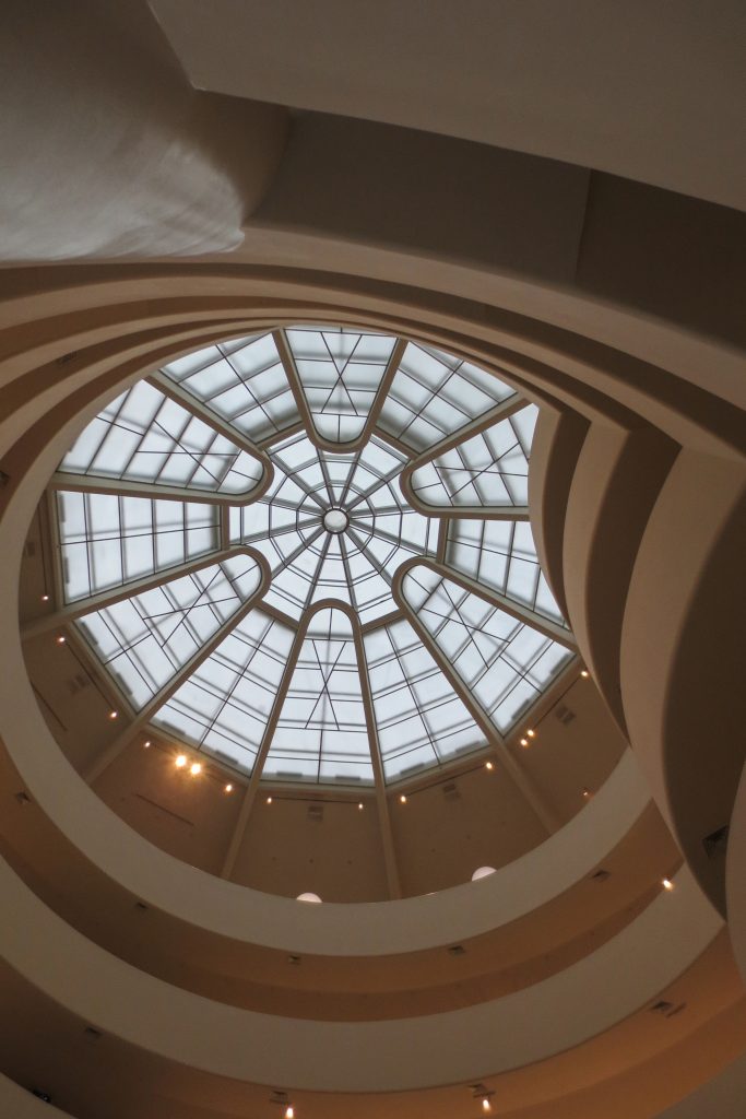
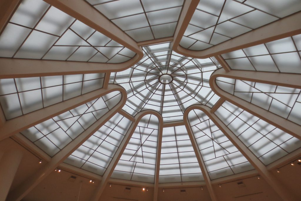
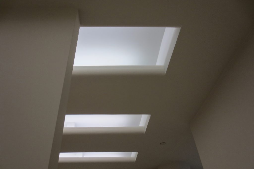
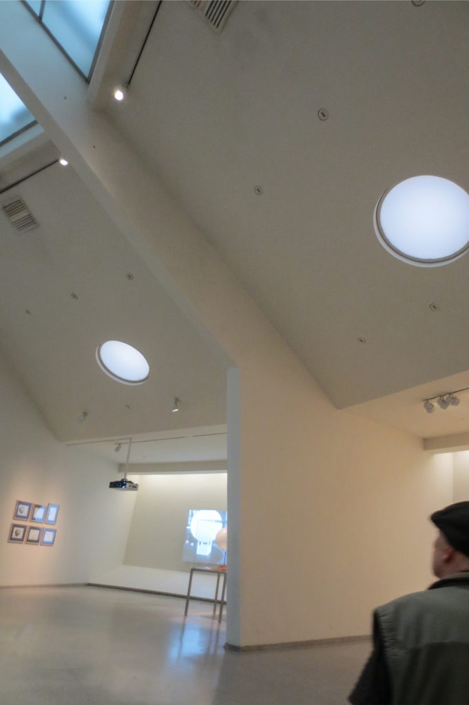
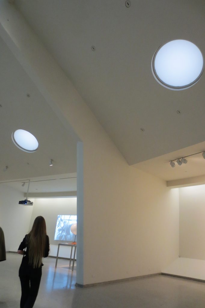
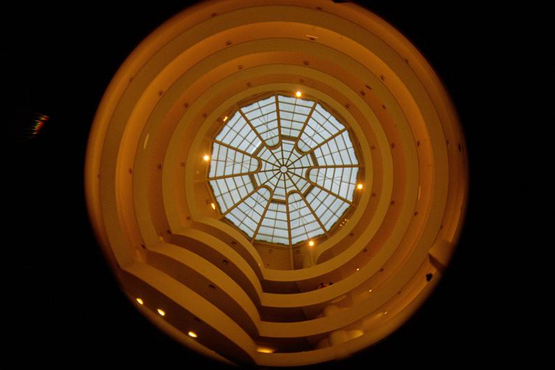
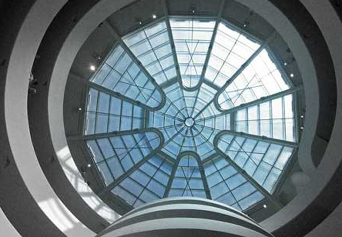
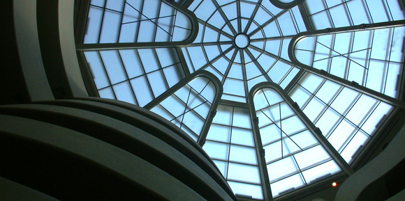
The visit begins in the elevators and slowly leads the visitors on a journey where the art works are exhibited along a spiral, illuminated by a large overhead skylight, divided in the form a citrus fruit.
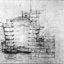
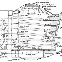
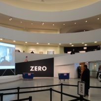
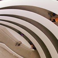
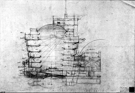
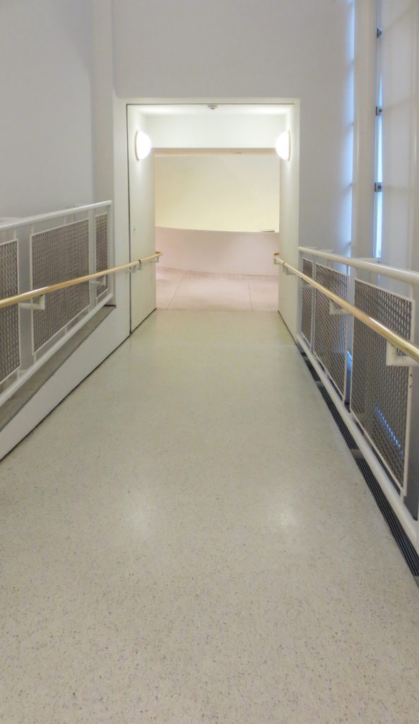
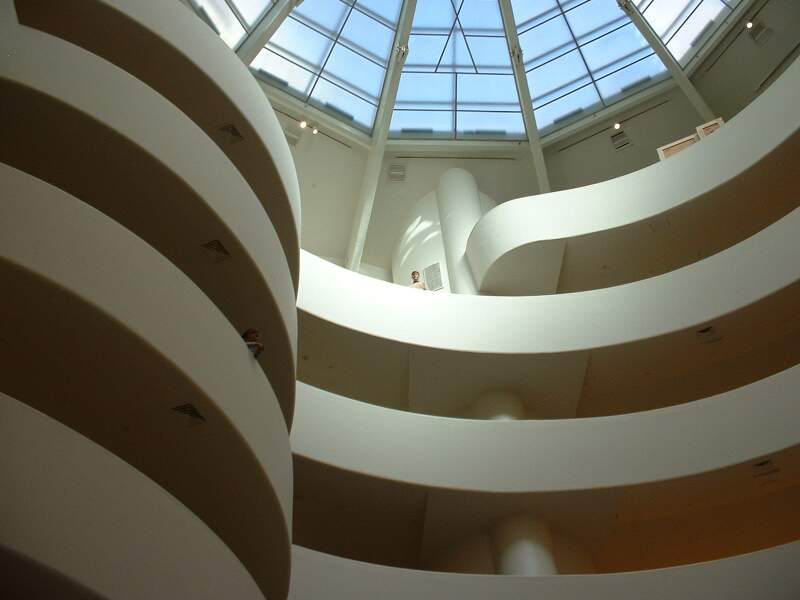
Wright leads us via elevators to the highest part of the building, so that practically without realising we descend by a smooth helical ramp while we observe the works displayed on various interconnected levels, which are almost imperceptibly differentiated between one another by a small transition space.
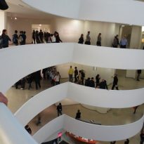
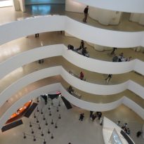
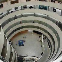
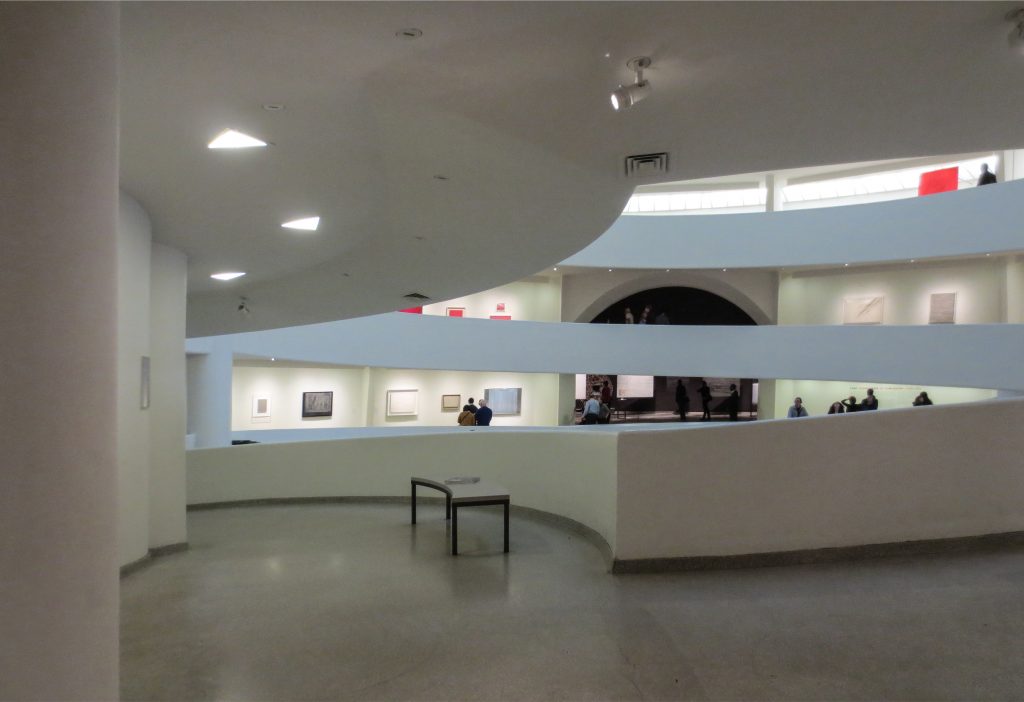
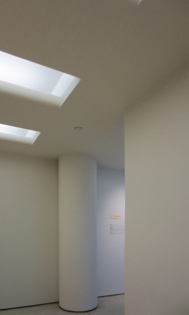
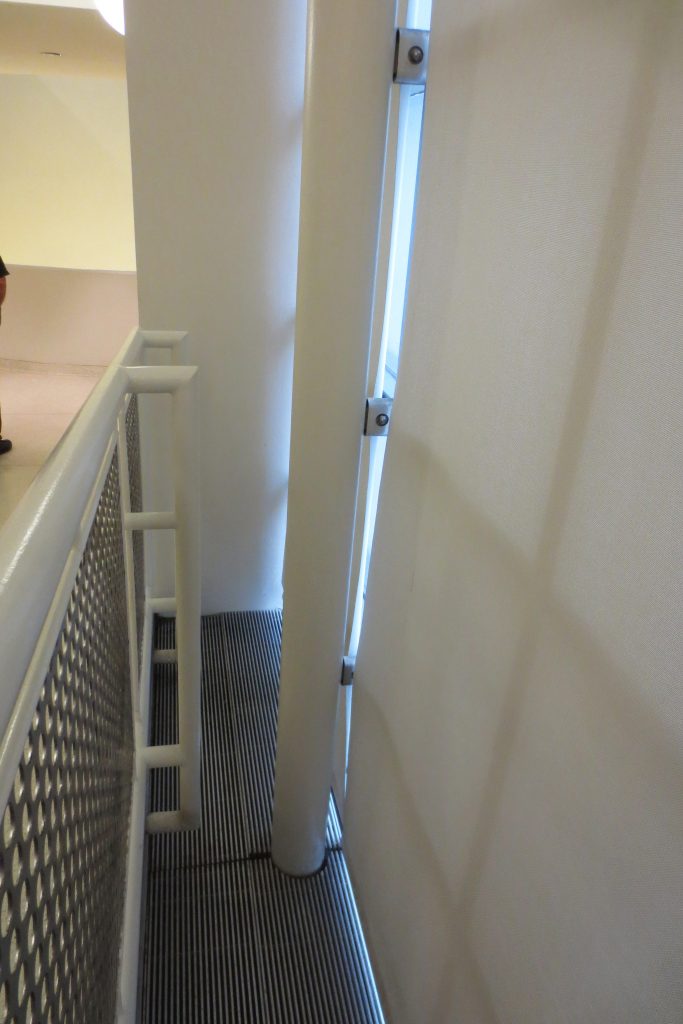
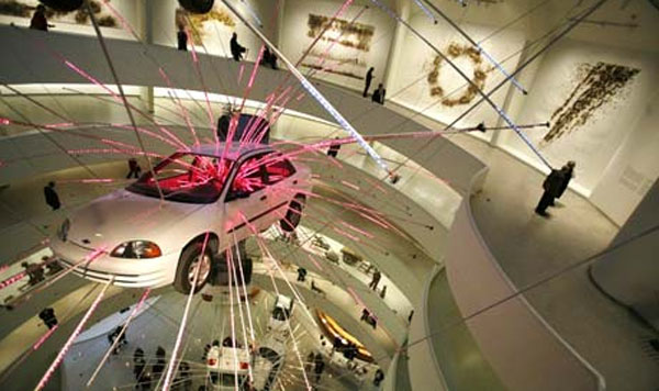
If for a moment we stop and look out toward the centre of the spiral, we gain a sense of how impressive this work is, that it reminds us of a snail, which allows us to see the centre of the round and several levels exposed as the spiral ramp descends. A more detailed observation reveals the play of subtly positioned geometric shapes, where triangles, ovals (including in the columns), arches, circles and squares take precedent.
The route around a large void encourage reflection and enjoyment of the art. The meaning of the art is communicated through the rhythms of this New York museum.
The semi-open layout of the exhibition halls allows for an overview of the entire building and part of the exhibitions from any point of the central ascending corridor. The mini-pond on the ground floor is also a highlight.
In the search for the static regularity of geometric design and in combining it with the plasticity of nature, Wright produced a vibrant building whose architecture is as refreshing now as it was forty years ago. Wright’s Guggenheim is possibly the most eloquent presentation and, without doubt, the most important of his later career.
Structure
The requirements of Wright’s design obliged the constructors to develop new constructive methods which would also be used in many of his other buildings.
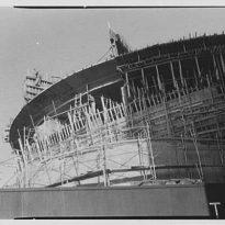
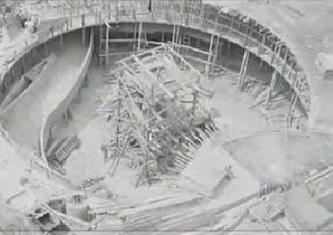
It took 7000m³ of concrete and 700 tonnes of structural steel to create the shape of the iconic “shell” of the museum. Its sinuous forms were a great headache for the contractors commissioned to develop the wood and metal formworks. After finishing some of the pieces and noting that the concrete would not flow through them naturally, they opted for the “gunite” (sprayed) concrete technique, whereby it is sprayed into the formwork rather than poured.
In total, they used three types of concrete for the different stages of the project: reinforced concrete lightened with “Lelite” for the main superstructure, lightweight reinforced concrete for the slabs and the ramp, and concrete mixed with gravel for the outer shell.
The Guggenheim’s floor slabs reach to meet lights up to 30 metres between supports and, in some cases, have cantilevers of up to eight metres. Without going any further, the main ramp where the majority of the museum’s activity takes place is anchored to a perimeter beam of 30cm and hangs 4.4 metres into the interior space.
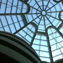
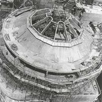
The central dome of Wright’s original design was wider and lighter, with a purely steel structure. However, the local authorities did not trust that such a structure would be able to support it and obliged the architect to reduce its diameter and incorporate reinforced concrete beams in its structure.
Materials
The main construction material was reinforced concrete.
The white paint used for the interior walls ensures the works stand out, although the need to maintain such a light tone in a city as busy as Manhattan necessitates the exterior of the building being painted regularly. Between 2005 and 2008 they had to remove the eleven layers of paint that had already been added to the exterior façade in order to be able to repaint on a solid surface that guaranteed the adhesion of the new paint.
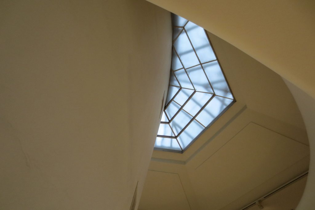
The skylight was was manufactured from a steel and glass structure.
Video
