GIBO Armani Showroom

Introduction
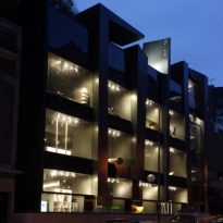
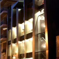
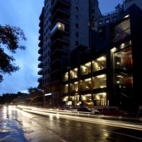
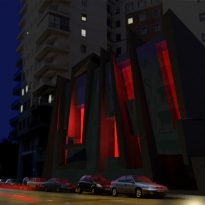
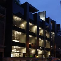
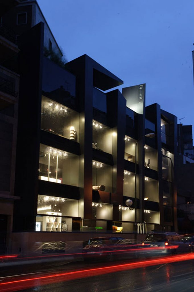
Purity, strength, expressiveness, risen from an old building that has already been amended previously, is what is presented in the face a colossal 5 stories of life and functionality.
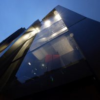
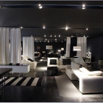
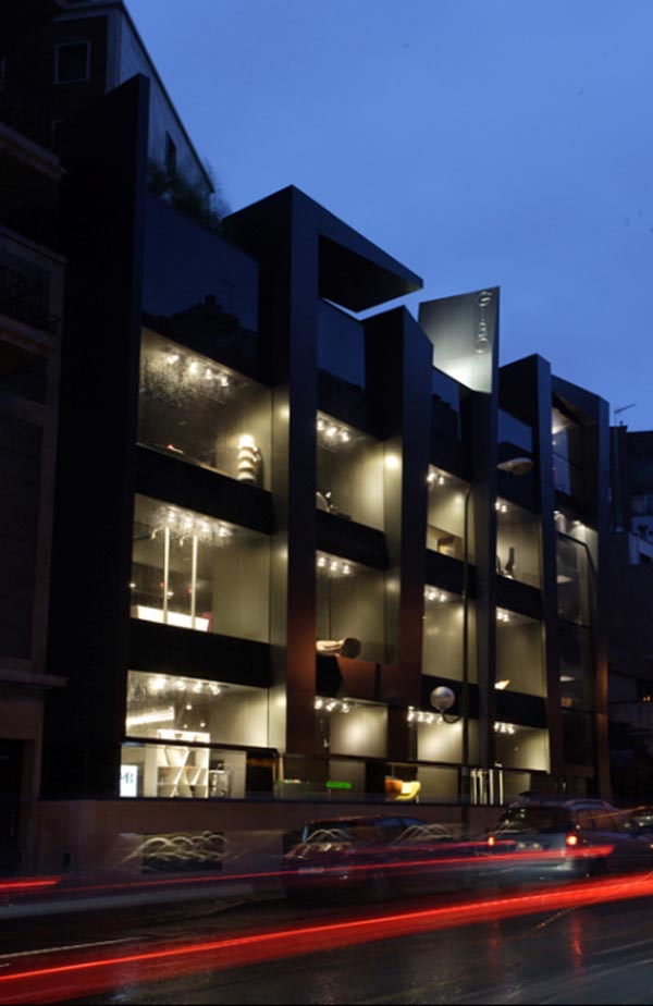
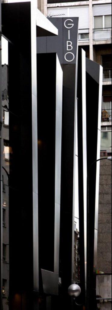
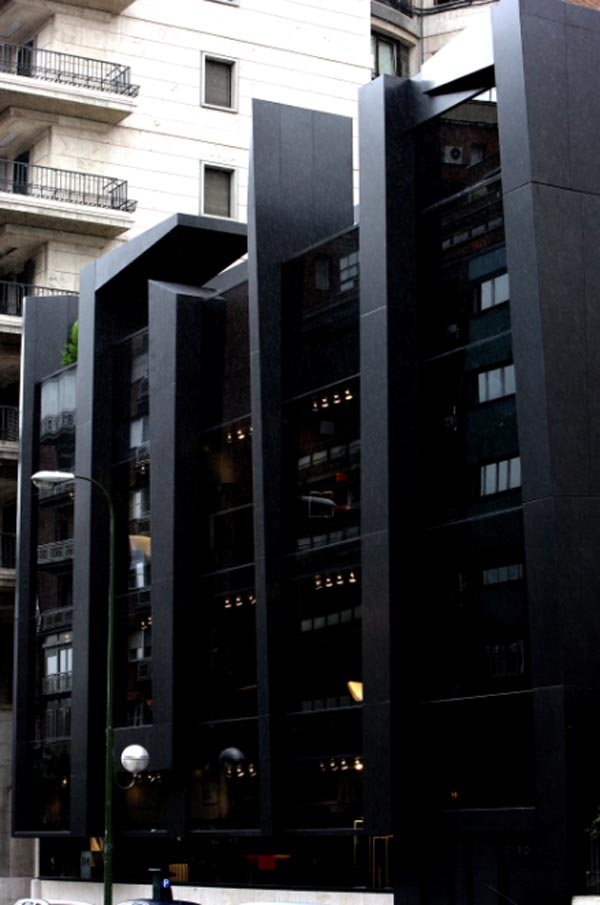
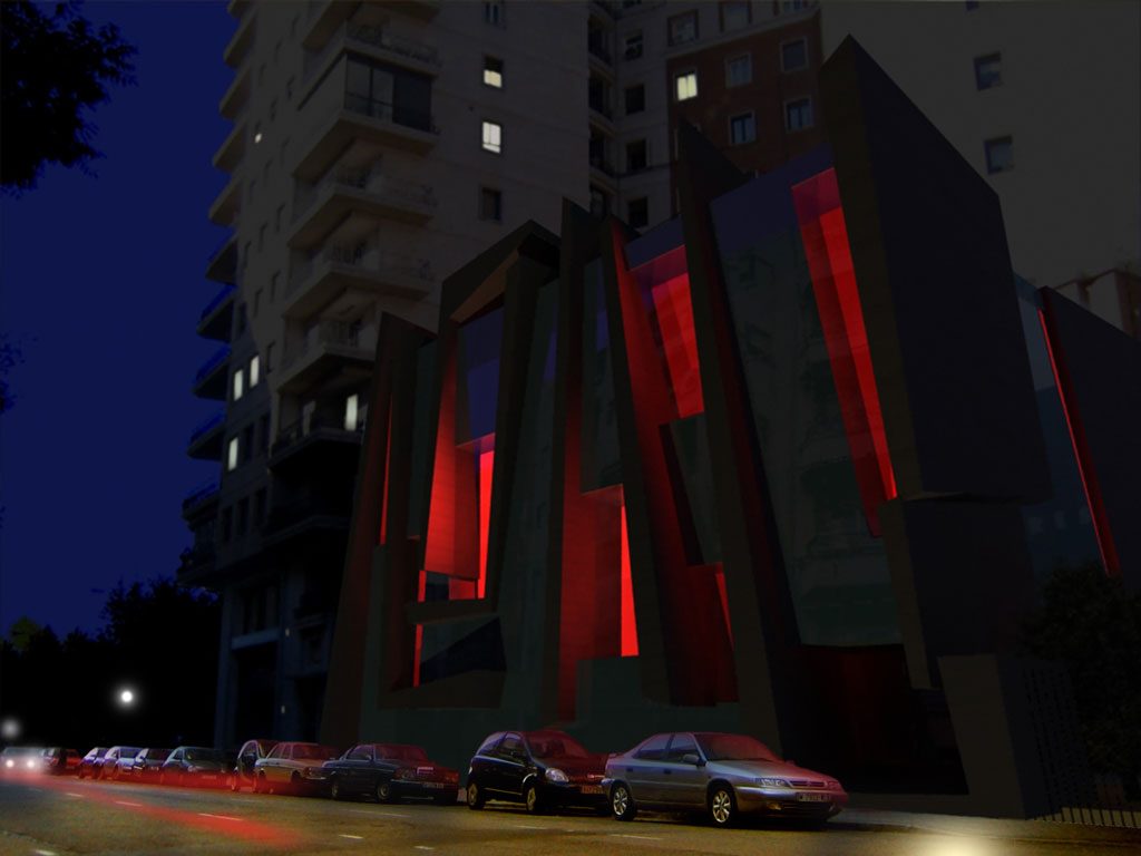
At first approach, the building suggests cutting a volume that makes up the facade, a volume that draws on a composition that is repeated in the interior. The architects fled from the conventional idea of local business into a container of neutral spaces in which the product is in a scene with the protagonist himself: sober, austere and elegant.
Location
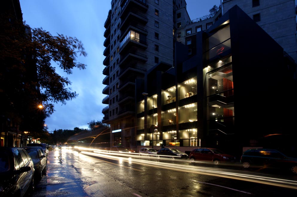
The building is located in one of the most exclusive areas of downtown Madrid, on Paseo de la Habana.
Concept
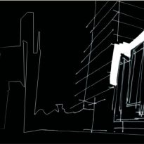
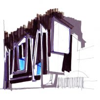
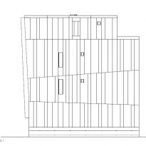
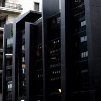
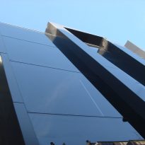
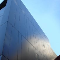
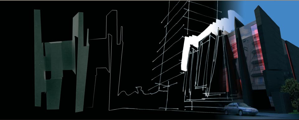
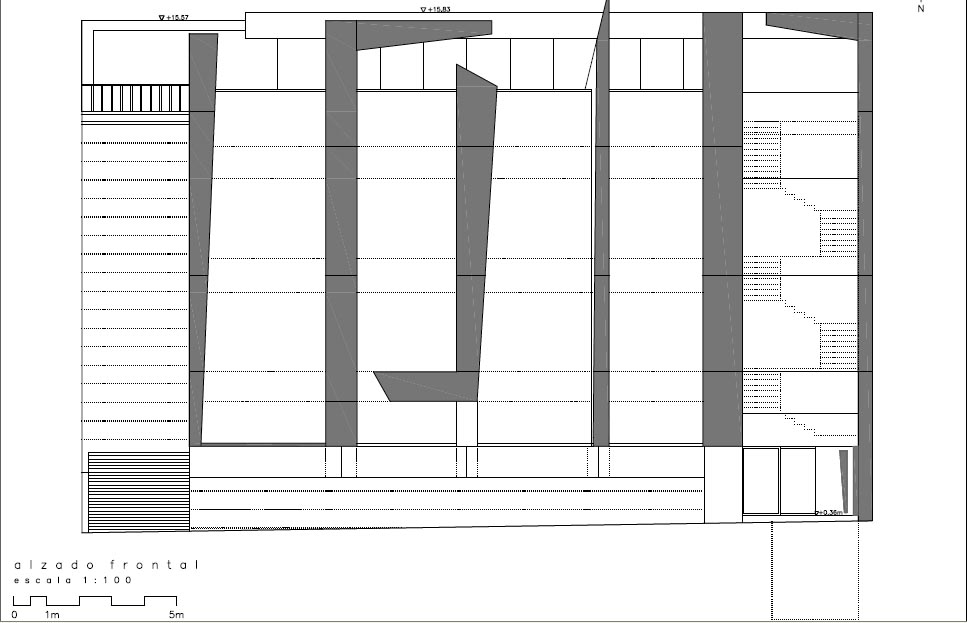
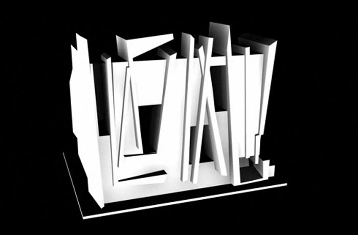
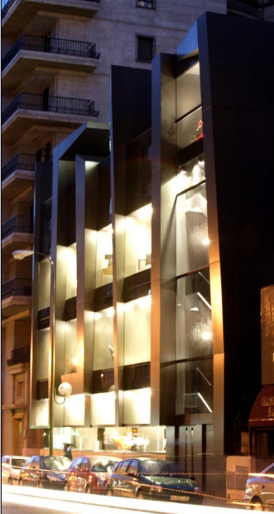
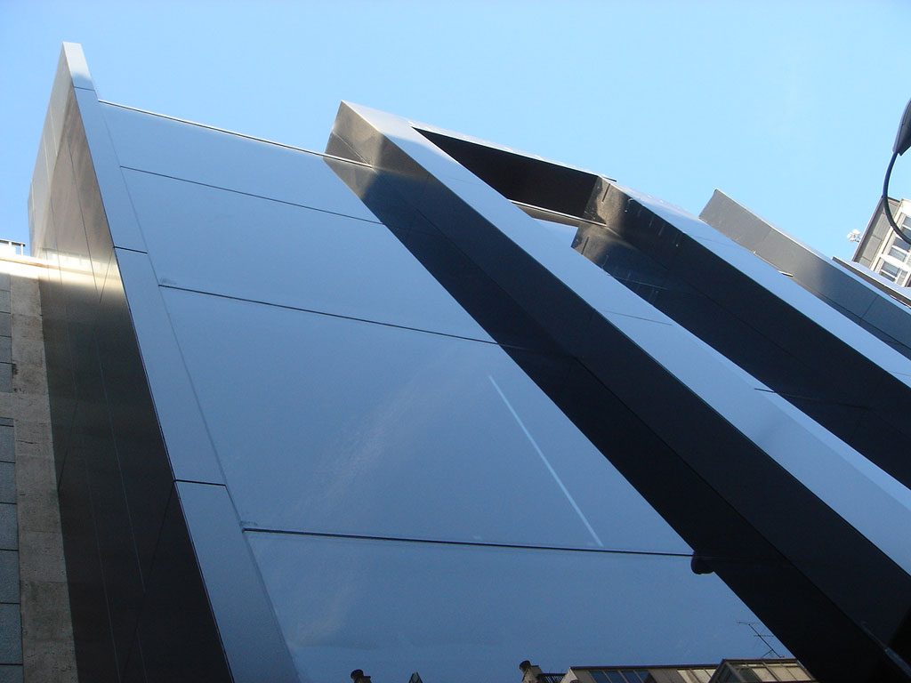
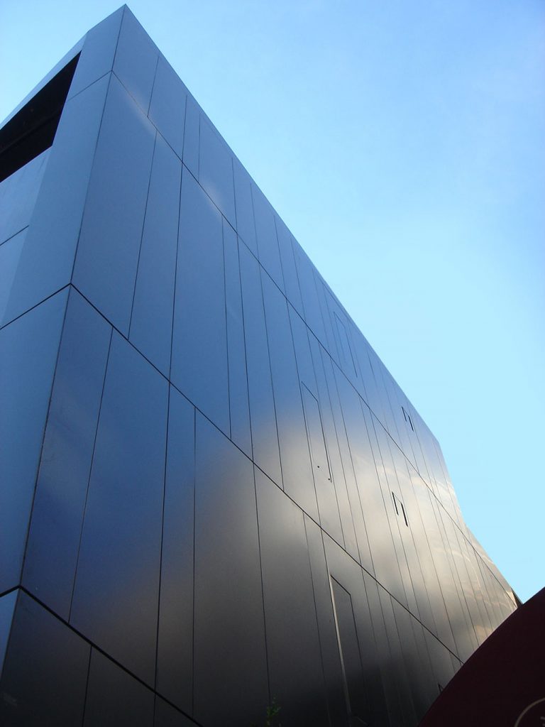
The contemporary use of the geometric shapes that form the construction of the facade is the characteristic of this project.
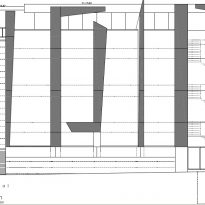
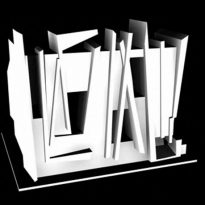
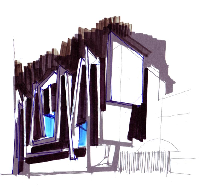
The façade also creates a further optic games, drawing people’s attention as soon as they are in front of it, showing geometries pruned away without a visual beginning or end. This unfinished quality is what leaves observers with a curious feeling.
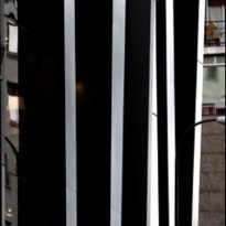
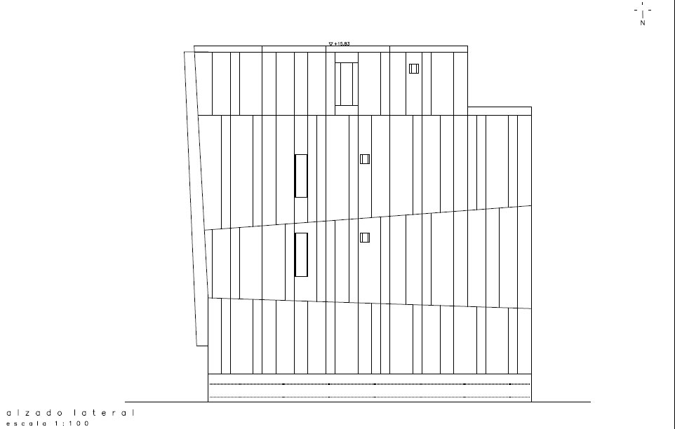
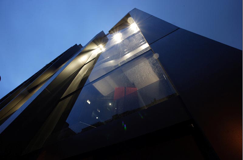
To achieve these feelings, the coating on the front of the main vertical structural elements was played upon. These are widened or narrowed from bottom toward the top, lean slightly toward the space of the street, are folded on themselves to reach the ridge of the building, etc..
This combination of actions that take these elements away from the vertical and slightly inclined, but apparently maintain the parallelism between them, is something that puzzled the architects unconsciously and at once attracted them.
Spaces
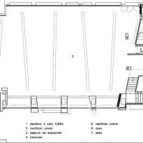
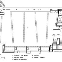
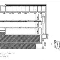
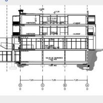
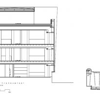
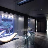
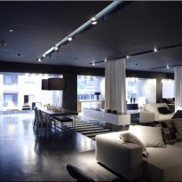
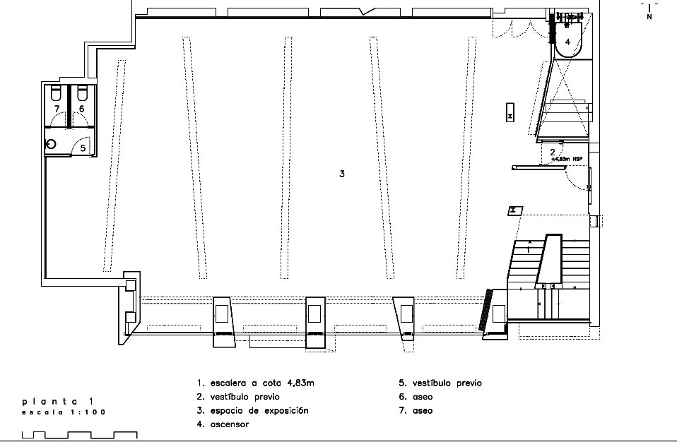
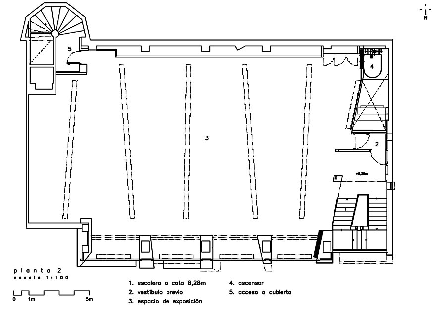
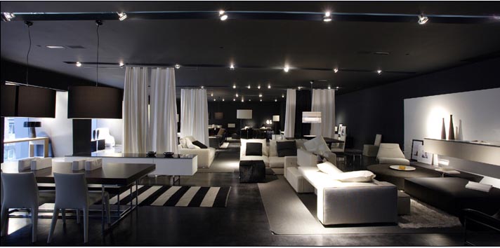
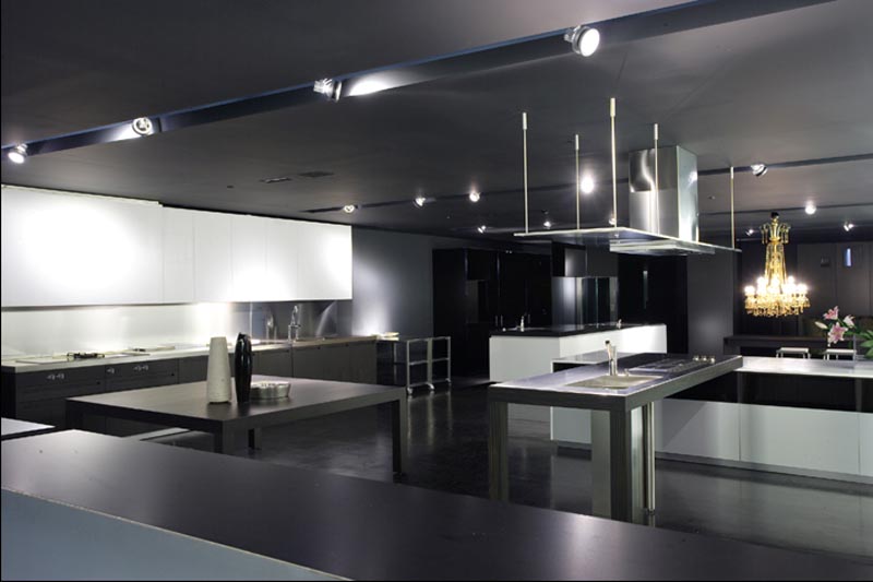
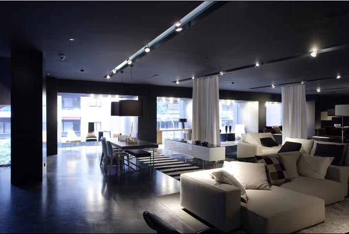
Taming the chaos and colonizing the emptiness, demolishing the inner partitions and the disassembling of the previous facade, the architects created a great showcase of a single piece that crosses the building with three floors destined to exhibition and sale. From the outside are perceived different levels which make up a single comprehensive whole.
The lower floors are intended for private management use and design, leaving the remaining for the lead role of exhibition and display.
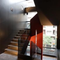
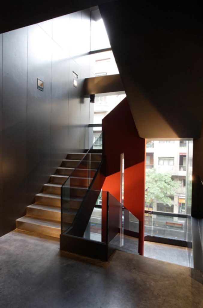
The staircase is the element that is assuming the role of sculpture in the interior, and reproducing the magnitudes of the volumes in front of a colorful cloth of red that accompanies each step, providing dynamism, purity and wealth.
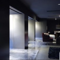
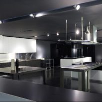
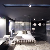
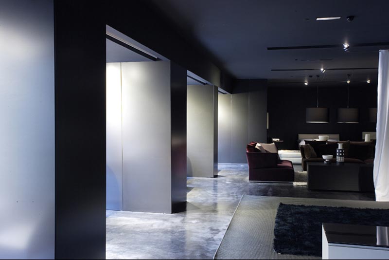
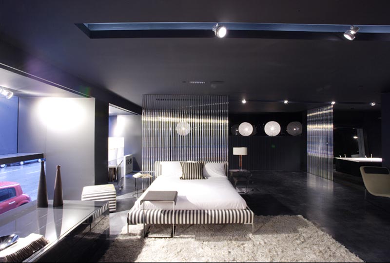
In this quest for perfection, geometric methods adopted are consistent with the initial idea, reinforced by the continuity of walls, floors, ceilings and polished floors, all finished in gray.
Structure and Materials
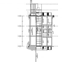
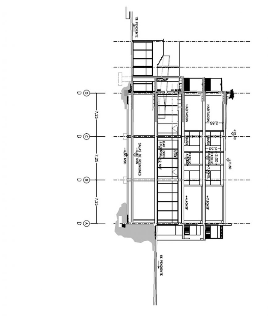
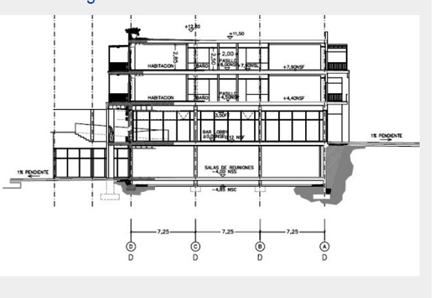
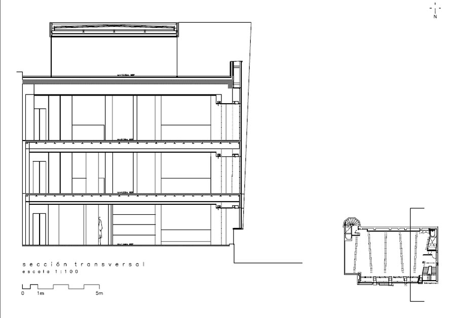
The structure is based on a grid of 7.25 meters, in light of the services and for the circulation and disappears completely when it reaches areas of exposure, resulting in open space adaptable to the user.
The purpose of the building is, as mentioned above, the creation of a whole, a unity, and this is achieved in part through the proper use of materials.
For example, using false panels that cover the front to coat the inside of the side wall of the service or the continuation of the pillars of the facade on the inside contributes to the unity of the work.
The floor of polished gray cement, no cuts to reach the stairs, climbs to the next floor without any discontinuity, resulting in one floor that develops in space.
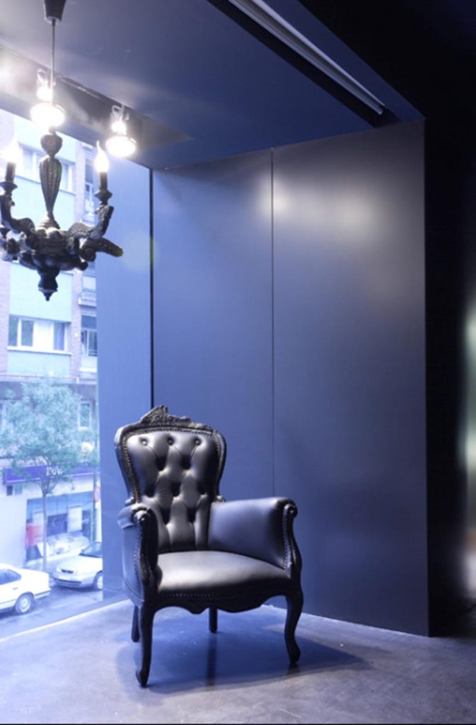
Handrails are frameless glass, like the large windows that showcase on the front.
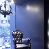
The roof, like the inside of the back wall of the building, is painted black, giving the impression of being a single plane bending, which is melted into the main facade with the pillars of the same tone.
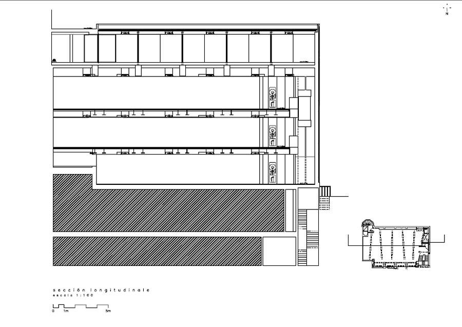
The floors have exhibition guides embedded in the ceiling from where you can put up movable partitions or other divisions when necessary. To maintain the idea of the facade on the inside these guides are slightly inclined, giving rise again to non-parallel lines that create the optical illusion that occurs as interesting sensations in the user.
