Fortabat Collection Museum
Introduction
Amalia Lacroze de Fortabat is the richest woman in Argentina. Owner of many businesses, this old woman has become a symbol of prosperity.
People say that when she was barely 19 years she went to the theater with who was her boyfriend at that time. Alfredo Fortabat, a wealthy 47 years old man, was sitting next to her. She dazzled him. During the play, this man sent to the young woman a box of fine chocolates. Two years later, fate made the couple meet again and that time it was for long.
Amalia, or “Amalita” as commonly known, began to accompany Don Alfredo in his business, and became his adviser.
Being 82 years old, the man died in a car accident. Amalita took over the business of the railways, gas, electricity, radio and TV, and the country’s largest cement factory. Shortly after her husband died, Amalita outlined “In my 4 years I have made the same as Alfredo in 40, I have doubled our fortune.”
The woman, a lover of jewelry and good life, grew a personal wealth in works of art. In her travels around the world she used to buy paintings of top artists, and gradually started a rich collection.
A few years before the end of the millennium, Fortabat started the idea of building a space where she could exhibit the works that she had been acquiring. To carry out this new dream, she chose the prominent Uruguayan architect Rafael Viñoly.
Location
The Collection Fortabat’s Museum is located in the capital of Argentina: Buenos Aires. This vast city with lots history behind it has one of the best cultural offers worldwide. His theatrical variety (plays for children, underground theater, musicals, comedy plays, recognized qualifications, etc) and entertainment of various kinds radiate in the city. At every traffic light, every corner and every place you can enjoy the talent of its artists. His loving and sociable people accompany this trend, whether in shops, outdoor fairs, or restaurants.
The city has an enormous architectural style influenced mainly by the French and by Italy to a lesser extent. But while visiting the streets, we can see different periods and styles one next to each other, hovering behind the leafy trees. This architectural diversity makes the city extremely attractive.
But as Buenos Aires can be charming by its rich diversity, it is a chaotic city. The noise in the streets and disorder are a characteristic factor. Traffic and the visual pollution can sometimes be very annoying.
However, despite these occasional setbacks, Buenos Aires is a city in constant motion that never seems to sleep. The heterogeneity and chaos seem to merge in a fascinating combination, in a city ready to be discovered and undressed by new eyes.
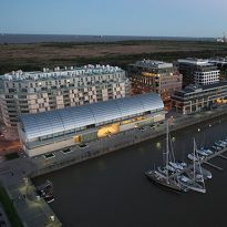
In this context arises Puerto Madero. The most recent and sophisticated neighborhood in Buenos Aires grows on the banks of the River Plate every day. Its imposing towers along with luxury hotels and residentials are the new facade of a city that is constantly being updated.
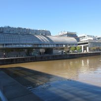
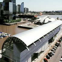
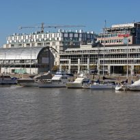
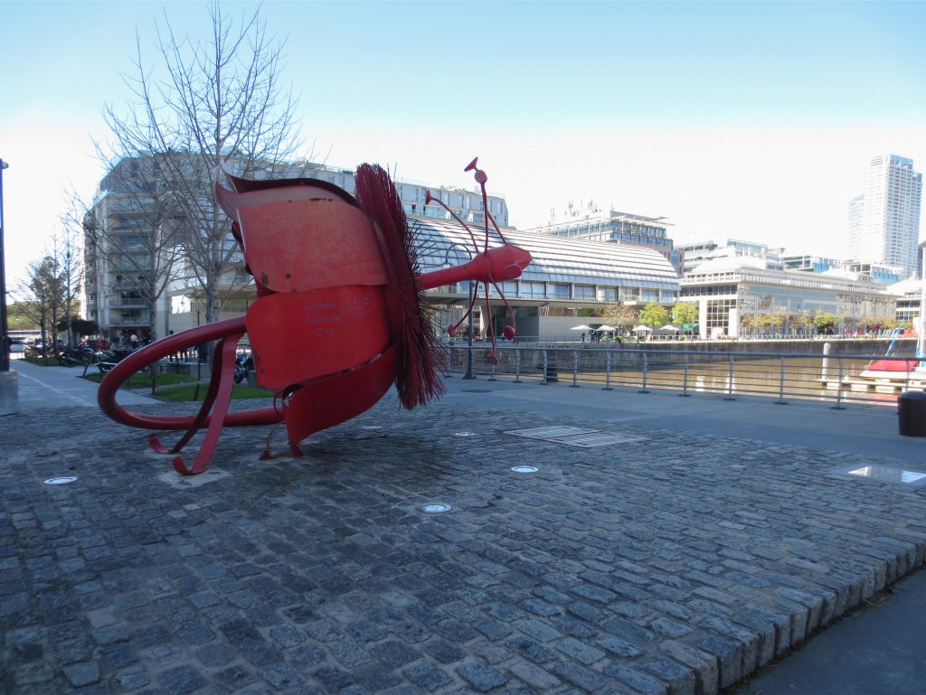
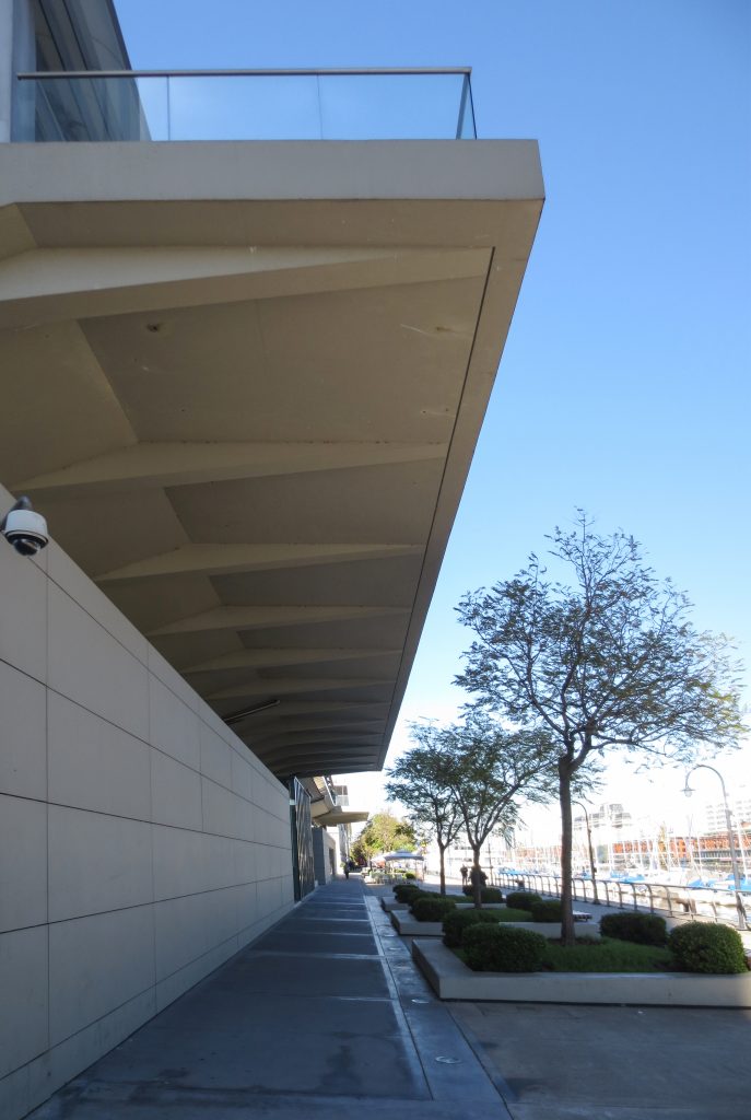
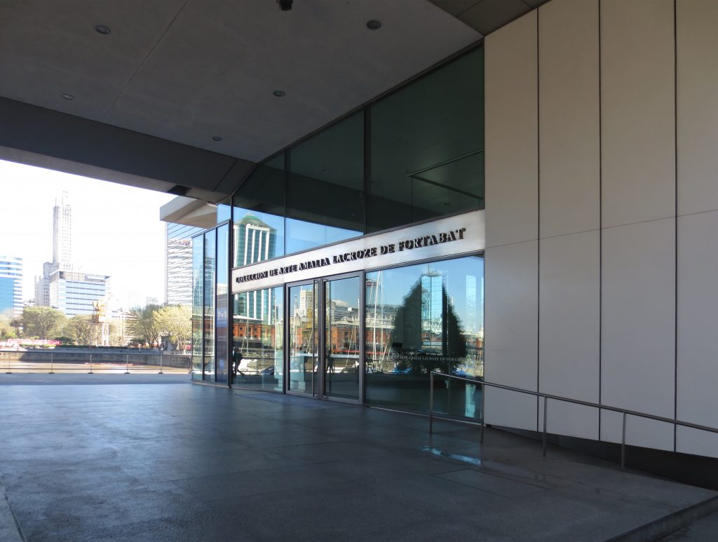
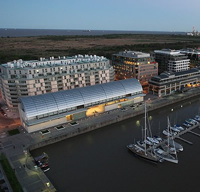
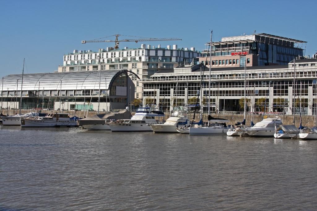
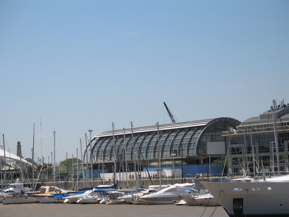
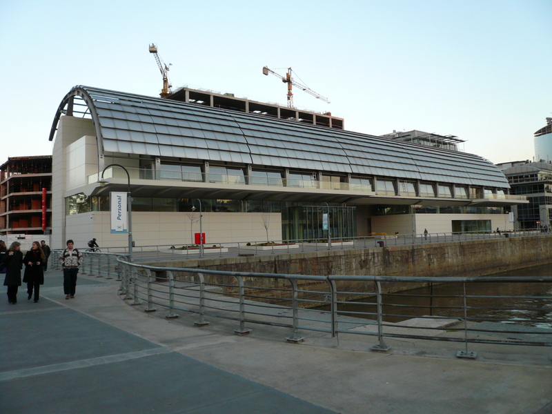
Often called by the inhabitants of Buenos Aires as “a city inside another city”, Puerto Madero is privileged as few other areas of the capital. All buildings are new or recycled, and its streets are spacious and clean. Dikes of the old harbor delimit its boundaries westward, and give the district a unique identity. On the first of these dikes is implanted Viñoly’s museum. Respecting a spacious pedestrian walkway, the work is done in an area that brings together works of reference people as Cesar Pelli, Santiago Calatrava, Phillipe Starck and soon Norman Foster too.
Concept
The museum was designed to offer the city an area of enjoyment of art. While this is an area with strong development and growing force, there is still a good lack of cultural and educational institutions there.
Viñoly’s design attempts to reflect the desire of integrating the new building in the character and scale of port docks, while striving to be an innovative response to the exhibition of works of art of such magnitude.
The operation demonstrates the extreme simplicity and a singular compositional skill. Respects layout in front of longitudinal dams and the height of the existing docks. What really the project is looking for is to maintain a constant visual connection with the city, instead of being isolated and anchored to an object itself.
At this point you can find voices in disagreement, because the idea is that the museum is “open” to the city and its skyline, and the facade to the river more consolidated and hidden (however, the river is far away and it is simply a metaphorical matter).
Spaces
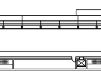
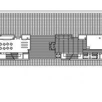
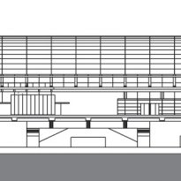
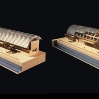
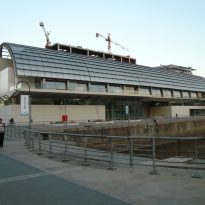
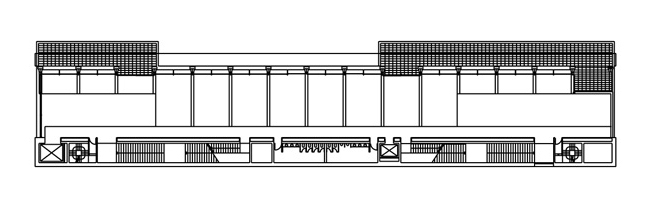
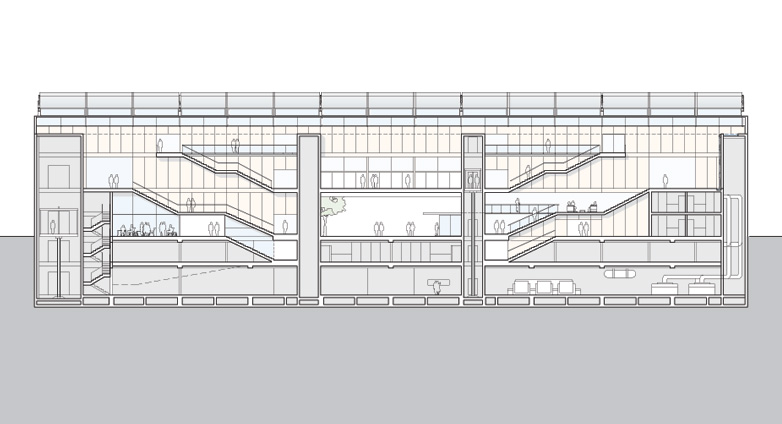
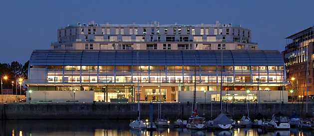
The museum is an elongated rectangular floor and has 6700m2. The smallest side is 27 meters, and 90 meters the longest. On the side of the river lies a 4 meter band that stretches and occupies a large part of the facade, used for services, circulation and support program. To the side of the dam and toward the city, the museum becomes more permeable and translucent.
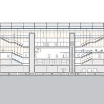
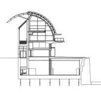
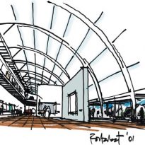
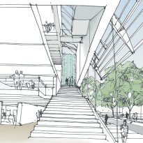
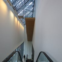
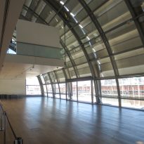
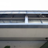
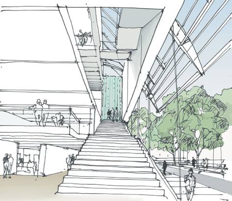
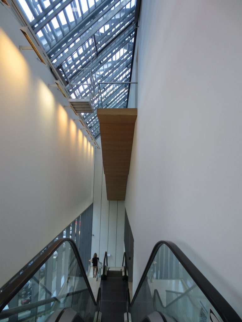
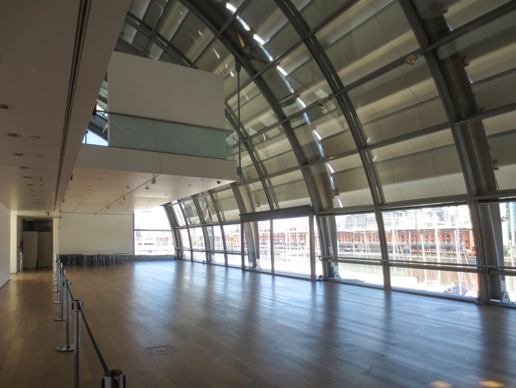
Basement galleries and secondary deposits are located in the basement. On the ground floor we can find a large lobby area, the gift shop and a restaurant. In the first and second floor we find the main exhibition halls that make a balcony above the ground floor. The second floor is shorter and more metallic, hanging from the structure.
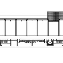
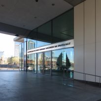
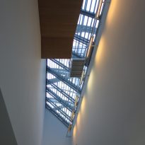
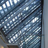
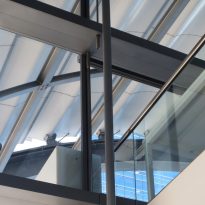
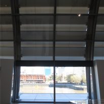
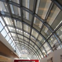
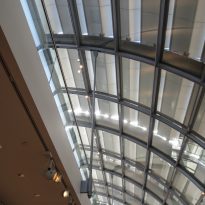
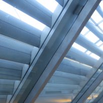
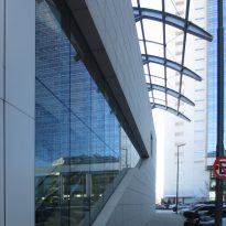
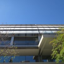
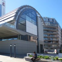
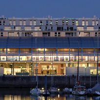
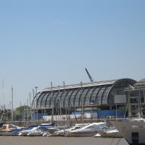
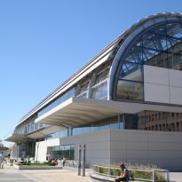
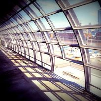
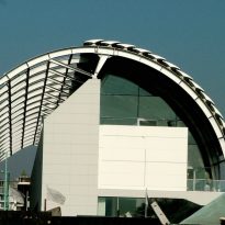
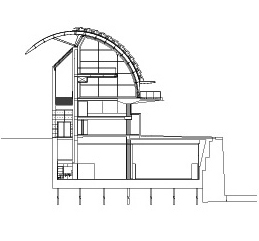
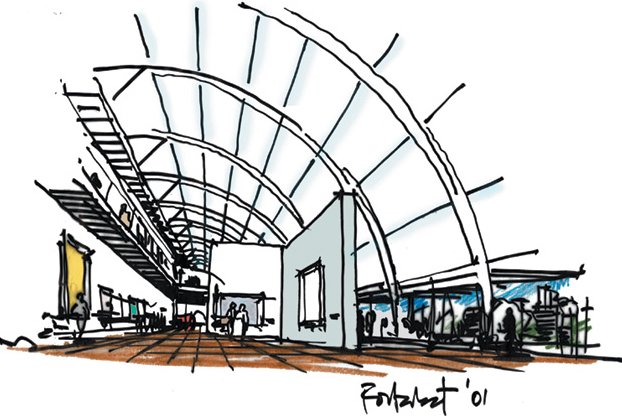
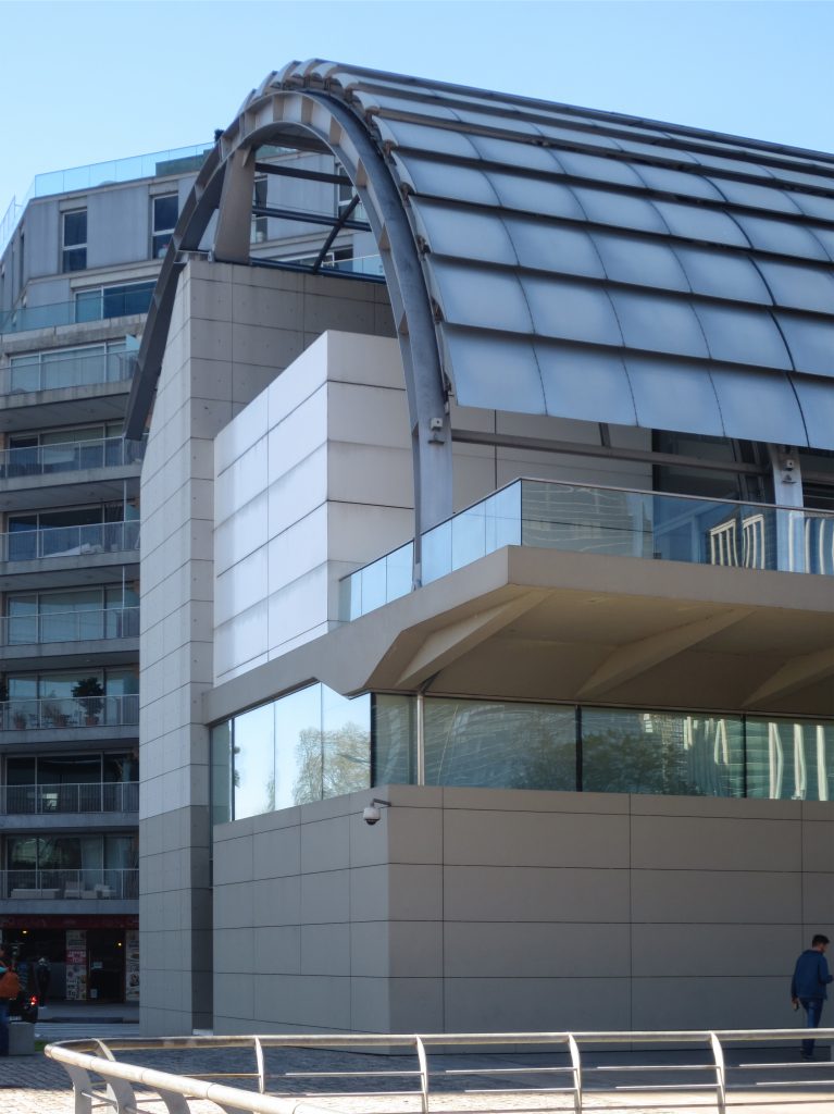
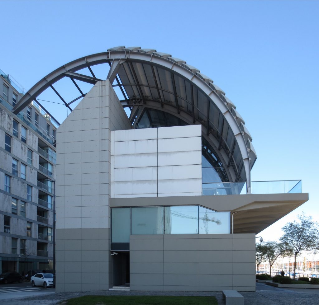
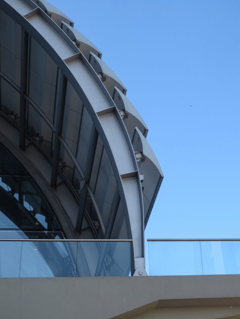
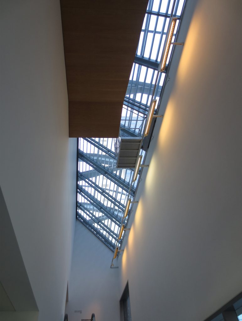
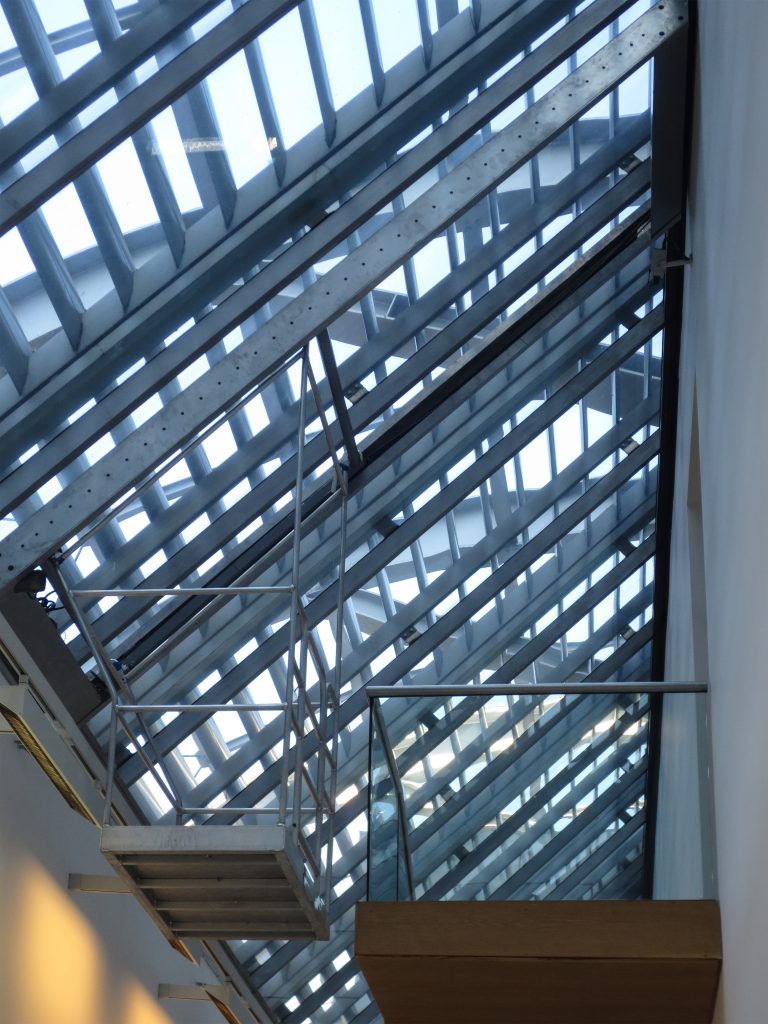
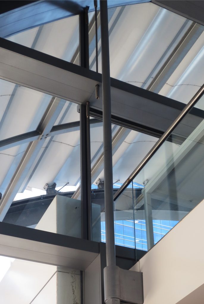
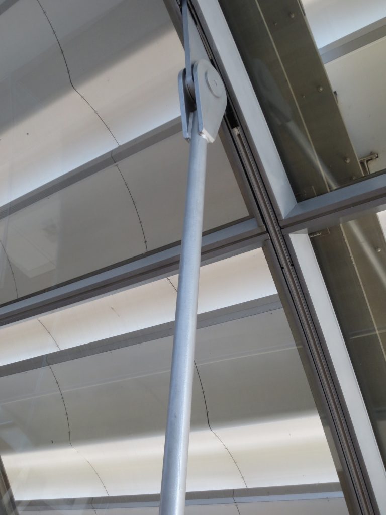
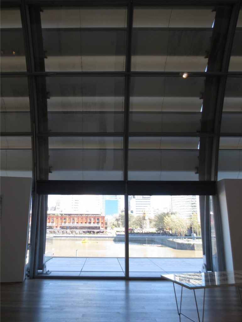
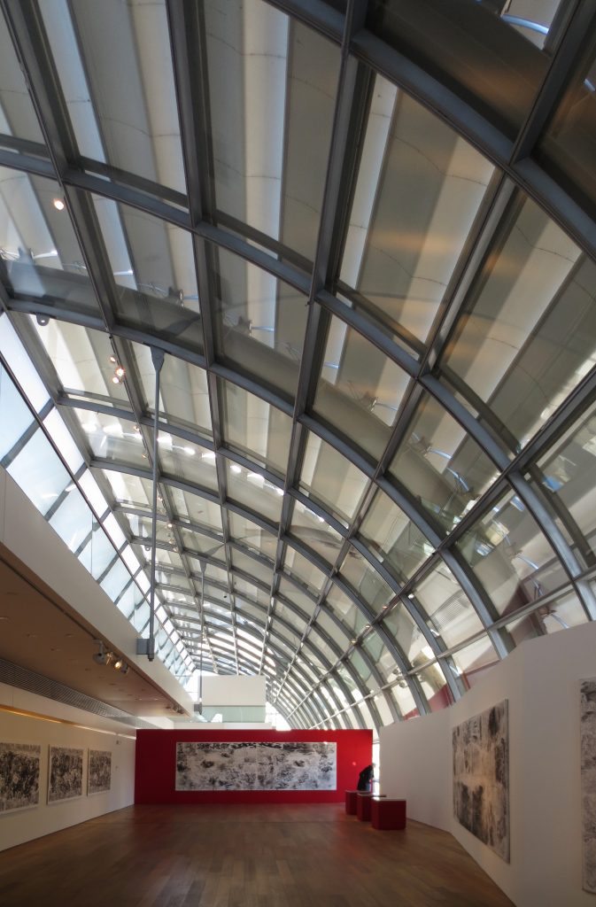
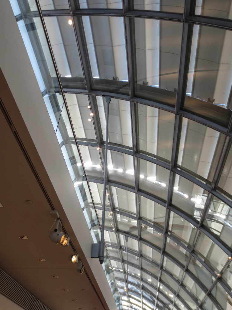
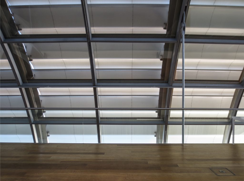
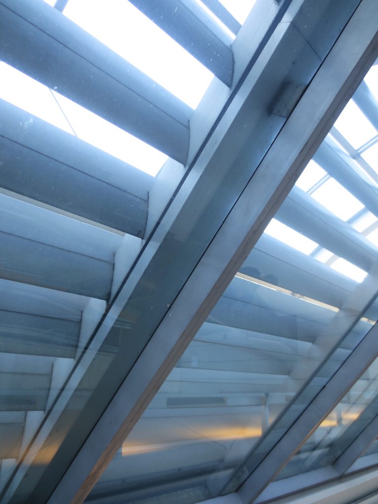
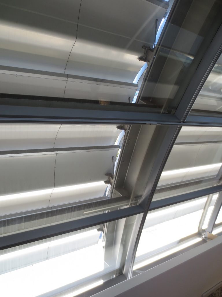
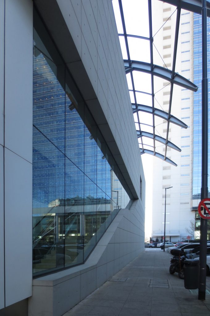
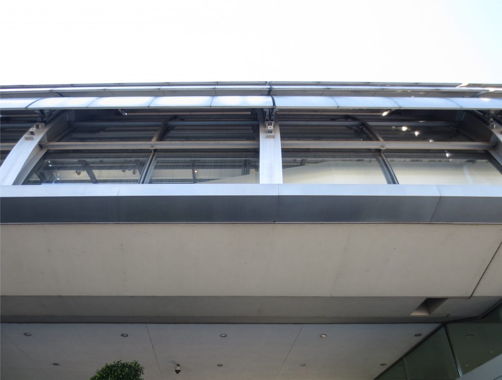
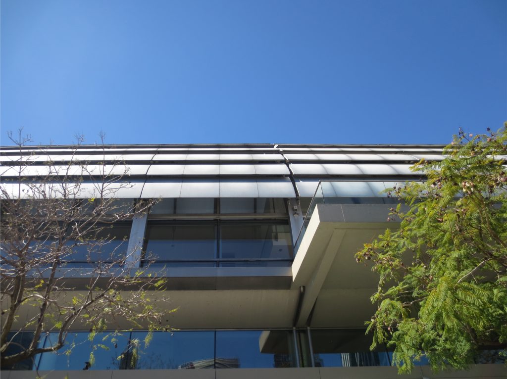
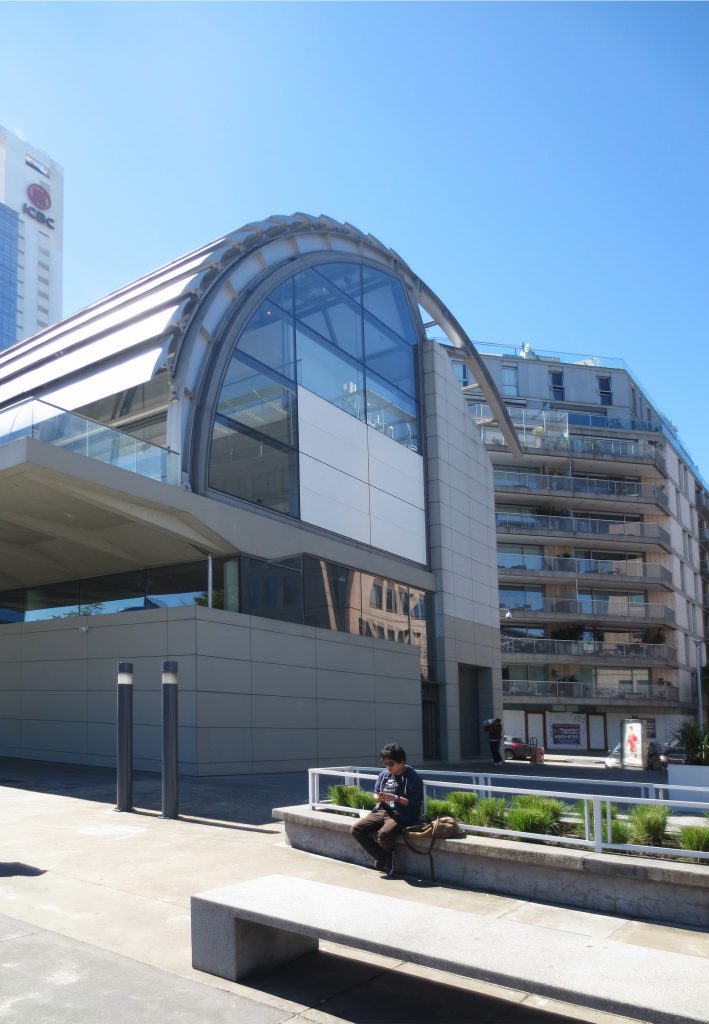
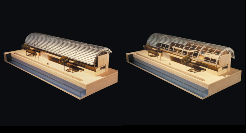
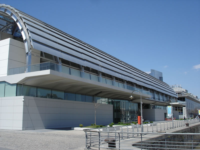
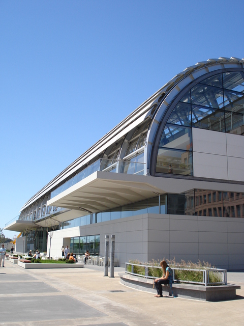
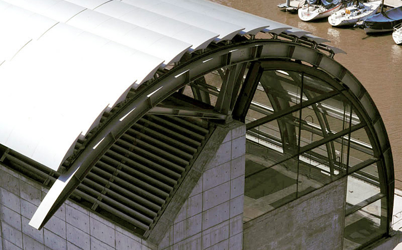
This whole body is covered by a semi-cylindrical cover glass with aluminum parasols. This system is used for dimming the light during the day and at night it can be opened so that the museum faces the city and the city can see its lighted interior.
Viñoly proposed this museum without knowing with certainty that the painting were going to be exhibited in its interior, nor the order of these pieces: “It was meant to generate large flexible spaces as big lofts.” Anyway, having been a very long process in its construction (it took almost 10 years due to financial problems and construction), the interior was changed, and Viñoly himself left the project in its final stage.
Structure
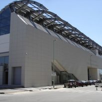
The building is austere in its overall design. The rectangle of concrete serves as back and as a structural base of one of the sides, while the other side’s loads go down through columns of circular base.
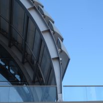
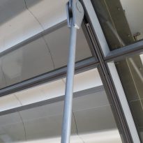
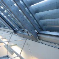
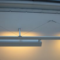
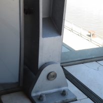
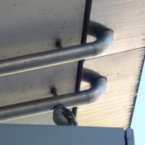
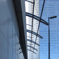
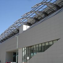
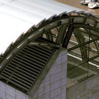
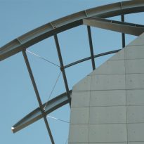
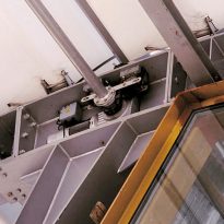
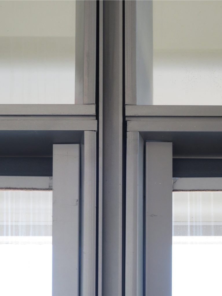
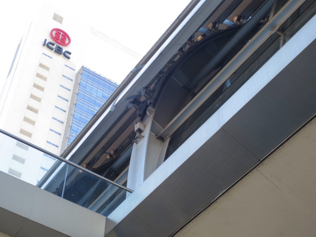
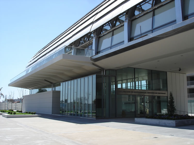
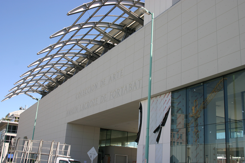
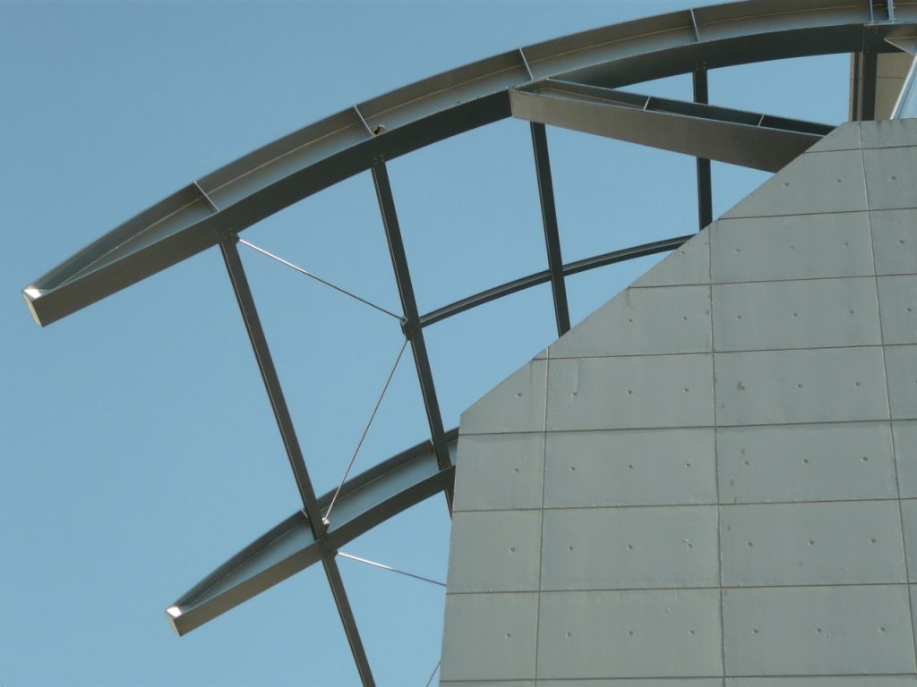
The curved cover glass was the elements that represented more complex and technological innovation. They are supported on steel ribs designed with resources from naval engineering. They allow the aluminum parasols to slip on them by rail and vary angle to avoid direct incidence of light inside the building.
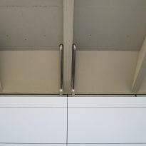
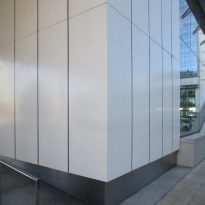
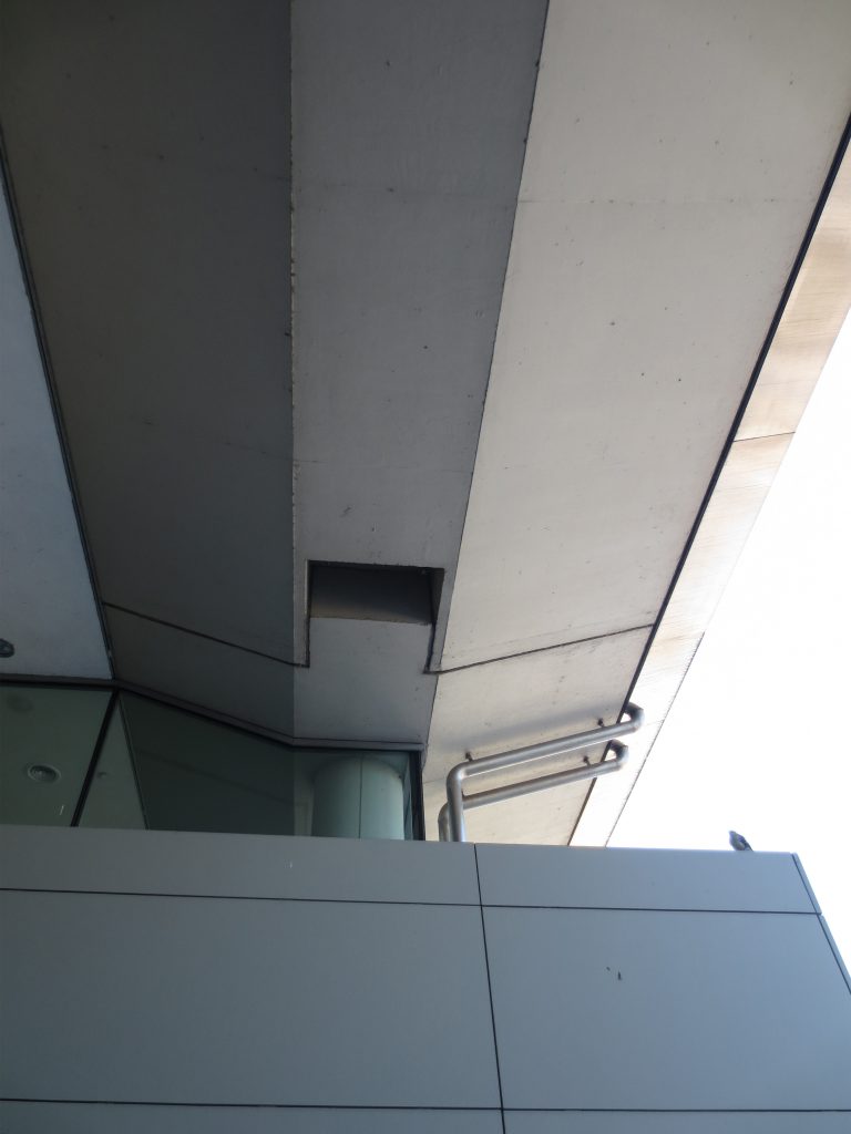
On ground floor, on the side of the dam, there are two boxes that are half-hidden by the cover. These are concrete, but do not meet any structural function.
Materials
The museum is designed with three basic materials almost entirely. The three materials are used are used to give their better results.
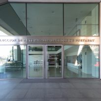
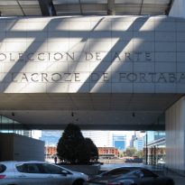
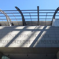
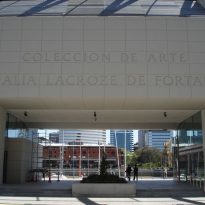
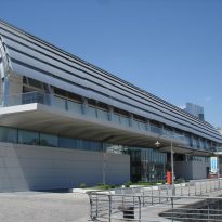
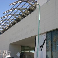
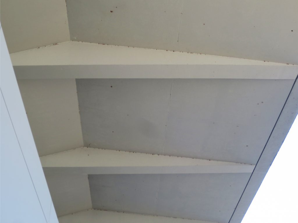
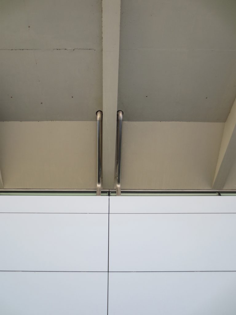
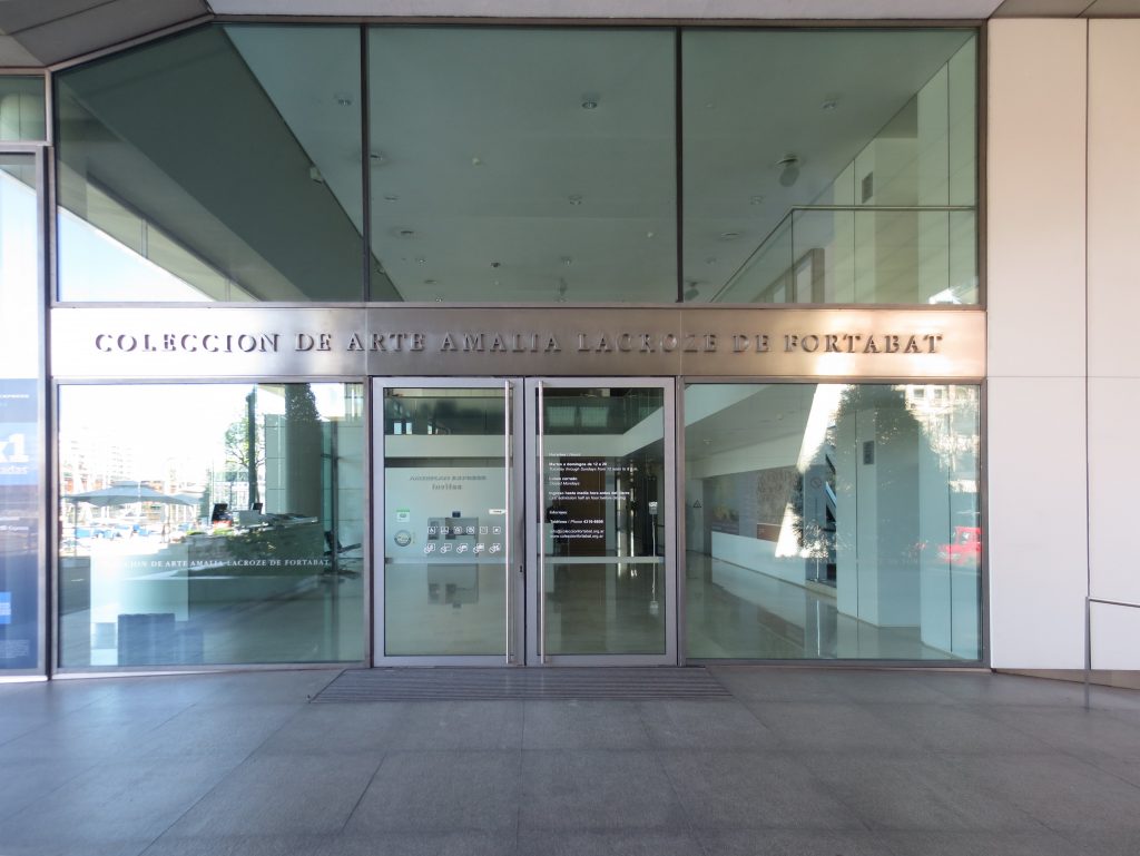
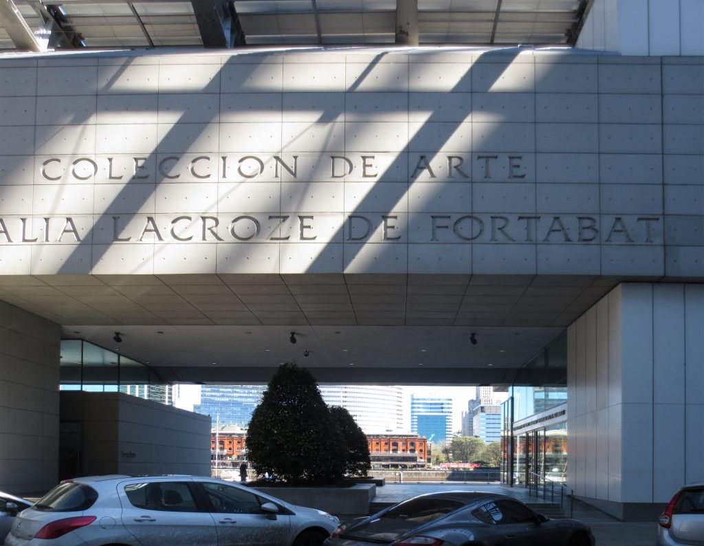
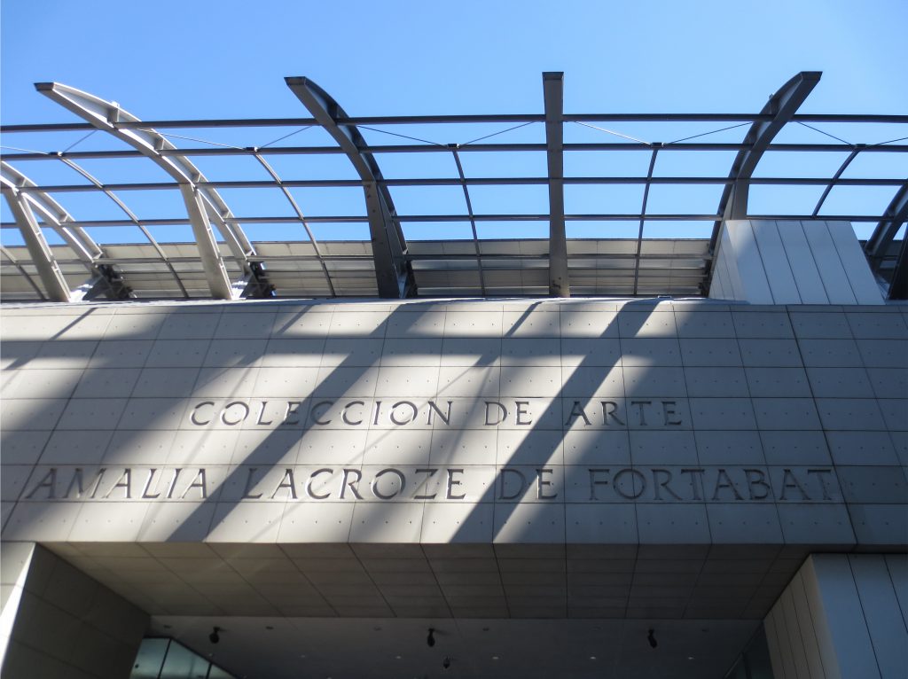
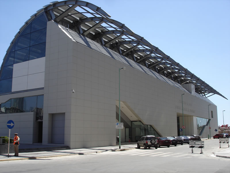
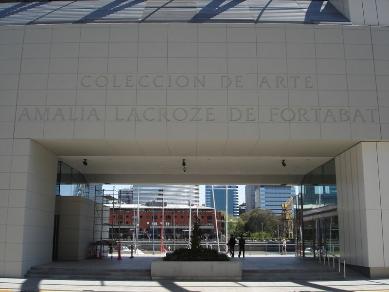
In this way, the back of the museum is made entirely of crude concrete slabs generating a well-established facade to the street. On the material you can read an engraving that distinguishes the museum with the name of the owner of the collection.
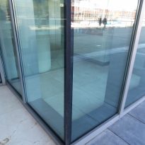
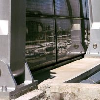
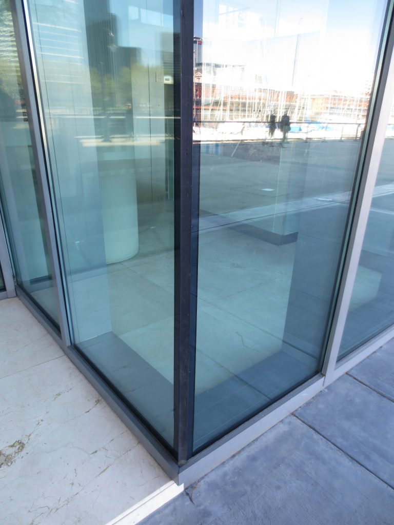
In the side of the dyke, glass and steel dominate the scene. The curved roof covers almost the entire west facade, providing character and gesture to the museum. The anodized aluminum parasols open and close, showing or hiding the pieces of glass that create the surface. They are restrained by curved steel ribs that are placed along the body of the building. It represents the technological system that makes this museum an innovative experience.
