Faculty of Medicine at the Catholic University of Chile

Introduction
In 2001, representatives of the Catholic University of Chile, commissioned architects Alejandro Aravena and Fernando Pérez Oyarzun SEREX along with the team, the project for the new medical school to be built on the campus of the university along with other existing powers.
Location
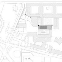
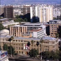
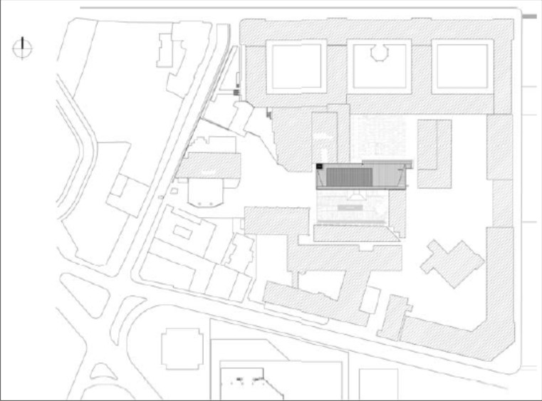
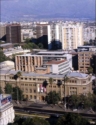
The building is located in the heart of the old campus, mediating between an order and a more recent cloisters of flags and blocks.
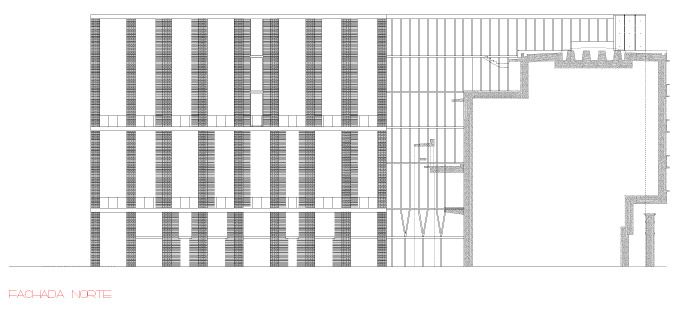
The position, at once central and border of the building, forces him to respond to different situations: to the north faces a rear face of the old cloister, a hall of two stories high with a very modest facade of masonry in the light, for the west is played with a new building at right angles, very wide, 6-storey conventional. Towards the south facing facade thousand times amended the hospital, built in the thirties and eastward, should pass in front and on top of a building facing blind.
Concept
Crimping term commonly used in jewelry, is to fit something else with firmness and gentleness simultaneously. The building of the School of Medicine, Catholic University, given its location, responding to a crimping operation architecture, both as to buildings with public spaces around him. Attention to the various pre-existing building is not, in this case, a contextualist option as a determination, almost physical, problem.
In relation to its limits and the position of the building in the field, in all cases not only had to formally mediate between different heights, architectural materials and languages, but also connect to the systems of traffic offered by each of them.
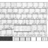
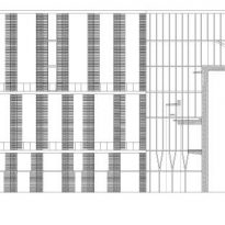
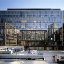
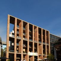
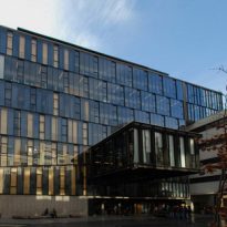
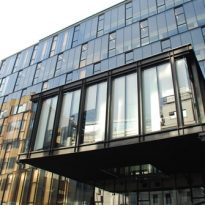
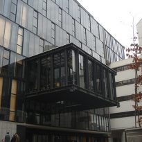
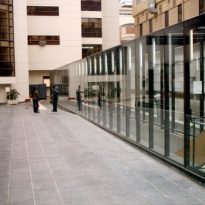
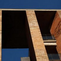
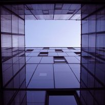
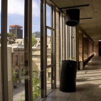
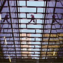
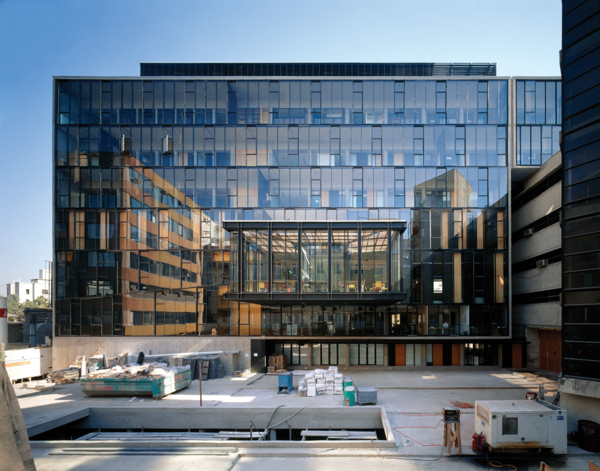
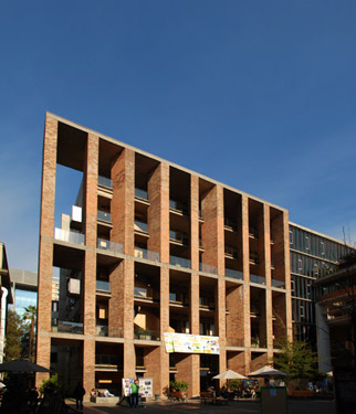
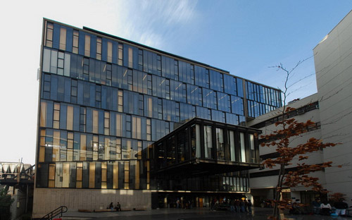
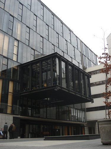
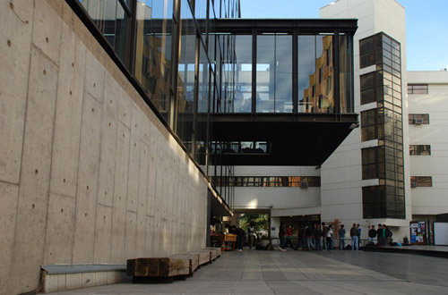
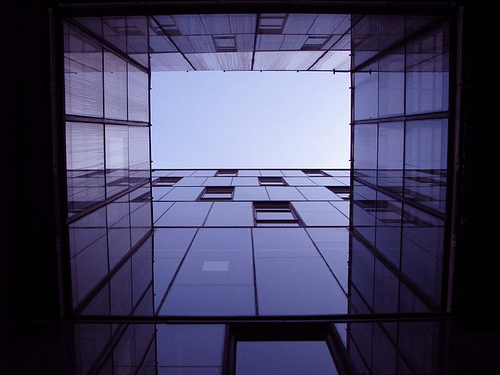
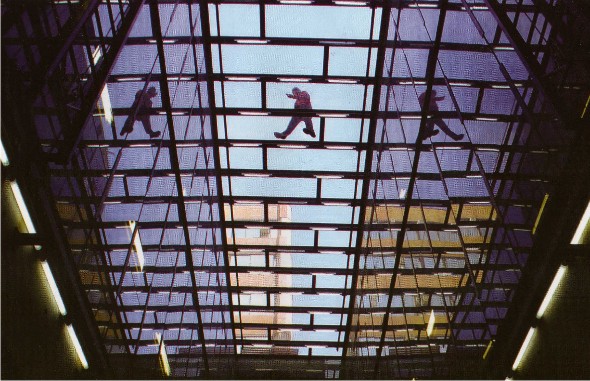
Facing these varied demands, the building, on the one hand, maintains the integrity of a slug volume and, secondly, try to respond with deference to the suggestions and demands of the environment, closing the way the missing side of the courtyard to the north and generating new one to the south. First, through a front free, regular and irregular at the same time, large ceramic coated supports. The second, through a smooth glass facade with the only crash of a cantilever, which emerges lead six meters of the building. If the north facade made of sunlight and shadows its main theme, the south, being against the light, the crystals transform into mirrors, making the reflection and texture of the mild desaplomos its leitmotif.
Spaces
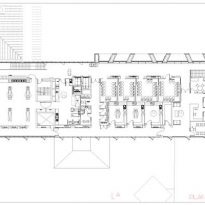
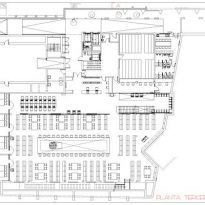
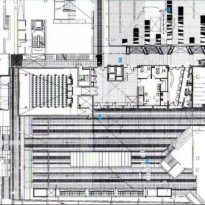
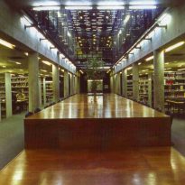
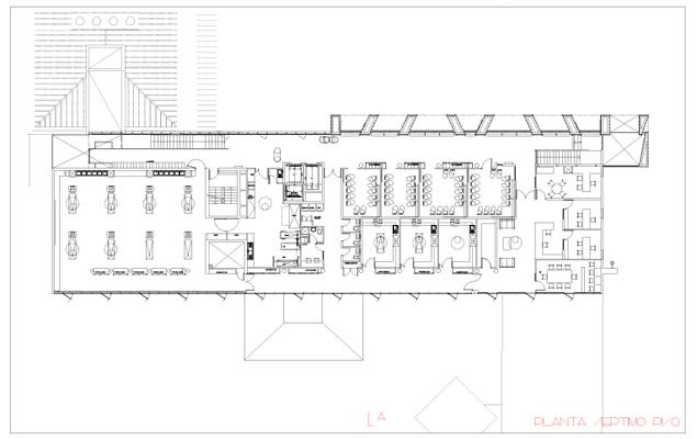
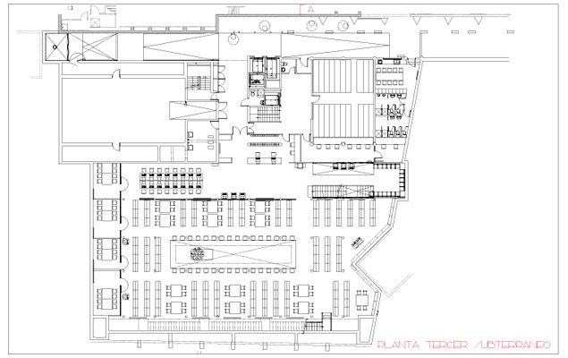
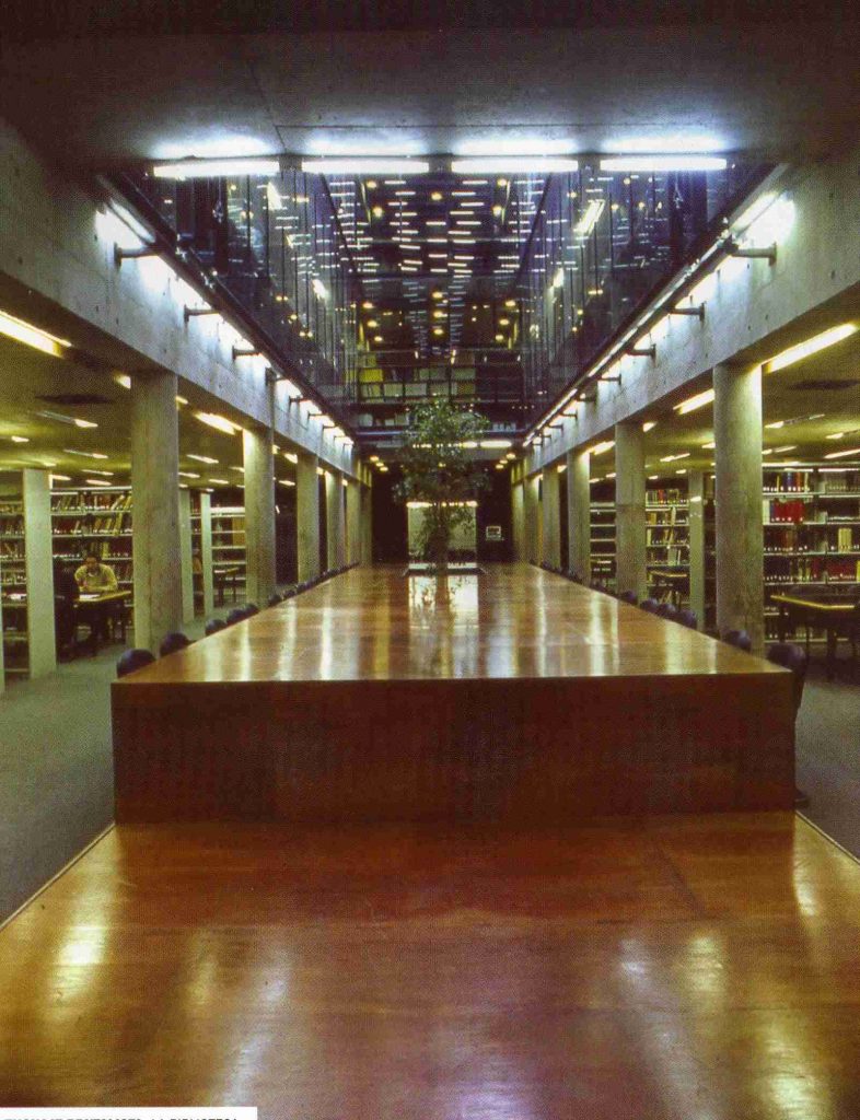
The program consists of school classrooms of many types: auditoriums, classrooms, seminar rooms, administrative offices and laboratories, including anatomy.
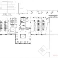
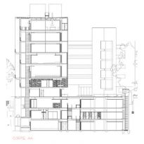
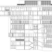
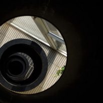
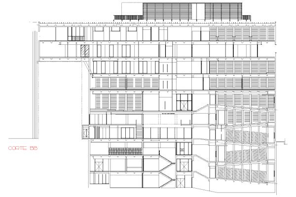
The surface forcing development required in seven plants: the five overlapping audiences are located, with its slopes in a sort of alternate interior tower.
The more public venues are located near the ground and those with less demand on the upper floors.
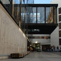
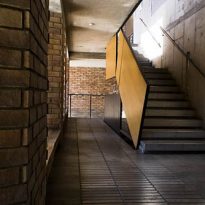
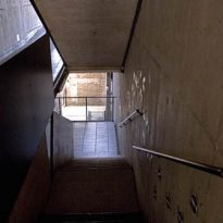
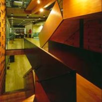
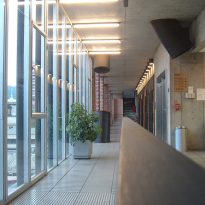
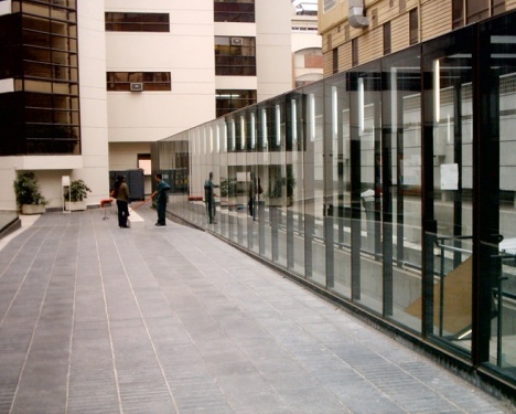
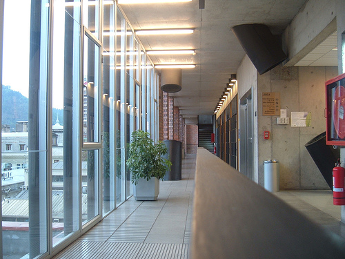
The wide circulation, open and sunny, the north facade were generated to prevent an airtight inner self, as often happens in high-rise buildings. Each has been designed as a piece of yard that had been cut and raised to endow each of these levels of expansion space be possible to recreate that particular relation inside – outside is given in the old cloisters. The changing geometry of the support built into each runner a variety of basic situations, ranging from the isolated study in a species of closed cubicles rather intimate conversation or a partner to large and student meetings between school hours, situations these all, power in training and in university life.
Structure and Materials
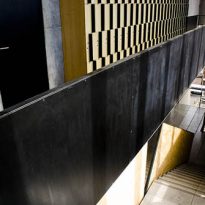
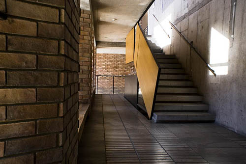
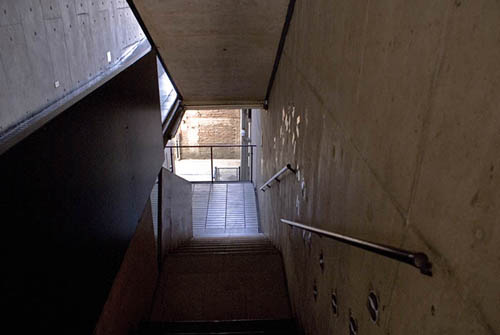
Reinforced Concrete Structure with endings in concrete, brick, wood and metal plates perforated.
