ESTEC Building – Extension
Introduction
The European Space Research and Technology Center (ESTEC) has been extended by the architect Van Eycks with an office building and a block of communal facilities including a restaurant, a library and rooms Of conferences.
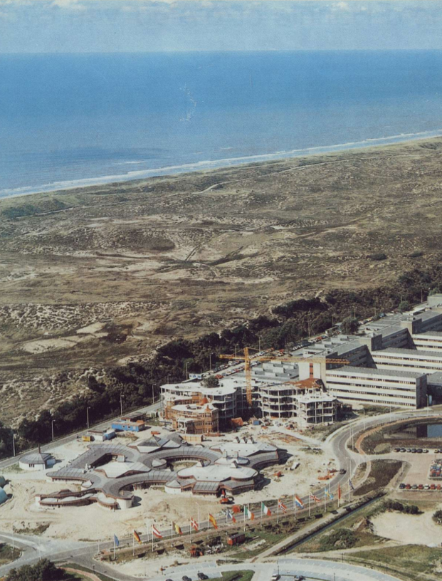
The commission for this important extension came to the architect through the director of the center, Massimo Trella, whose daughter studied architecture at the University of Rome. Van Eycks intentionally sought a formal contrast with respect to the existing structure, in addition the rectilinear character of the masses and spaces responds to the soft contours of the external environment. In this way the new building is incorporated to the dunes that extend in its surroundings.
Location
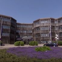
The building is situated near the dunes of the coastal town of Noordwijk-aan-Zee and tulip fields, at Keplerlaan 1, 2201 AZ Noordwijk, near Leiden, Holland and gently spreads up and down the surroundings.
Spaces
The ESTEC was housed in a series of large rectangular blocks of offices and laboratories, including the world’s largest space simulator but with no social spaces or eating facilities.
The expansion designed by Aldo van Eyck houses a restaurant, a conference center and the library of the European Space Agency’s technology center in Noordwijk. The interior spaces are among the most cheerful of modern architecture, creating an intense but fluid urban density of land occupation.
Project
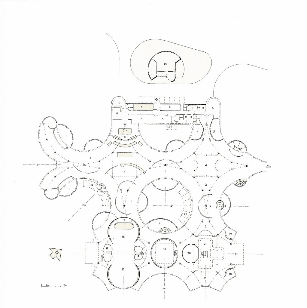
Van Eyck’s first design was for a restaurant, a library and a conference center located in a courtyard, center of the existing complex, linked to the office structure and circulation backbone that connects to the entire facility at the time it emerges from one side to create a new entrance foyer. The addition was in direct counterpoint to the orthogonal blocks of existing buildings. It consisted of an inwardly directed conference center adjacent to the circulation axis, and a series of curved dining spaces, directed outwards and unfolding with light penetrating deep into space from all directions.
This first project, although enthusiastically received in Noordwijk, did not get the approval of the executive board in Paris, largely because in making the program for ESTEC had underestimated the space needs of the facility constantly expanding. As a result, the program for the restaurant, library and conference center nearly doubled by adding a number of new office spaces, forcing the relocation of new additions to the large developing area southwest of existing buildings near From the main entrance to the complex down the road.
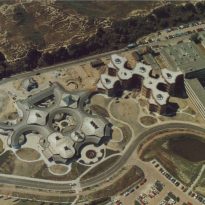
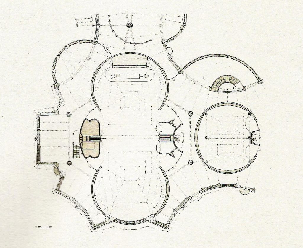
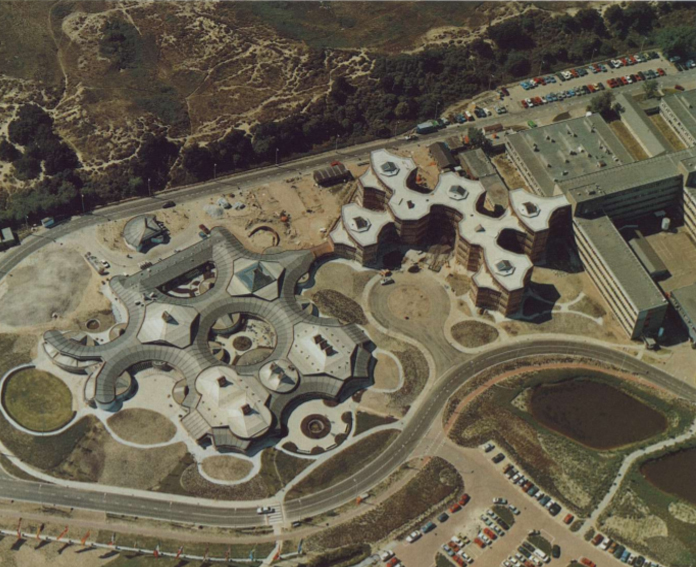
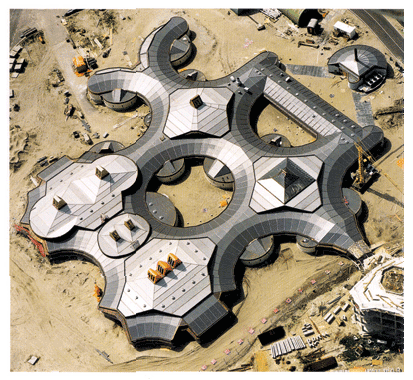
When Van Eyck saw the new site, completely different from the previous one, he proposed to start the design process again, customers asked him to preserve the spatial structure of the first scheme, with which they had agreed so much. Van Eyck agreed with the new arrangement of the now independent buildings, provided that they surrounded themselves with landscaped mounds, extending the adjacent dunes of the beach on the site. While the first design was ordered by a grid of four circles, the final design, considerably larger, was ordered by a grid of six circular voids, traversing the restaurant, with three circular holes more slightly displaced, framing the conference center and the Library, forming a grid of nine circles (3×3)
ASTEC buildings are both highly systematic and rigorous but at the same time, even with their many local symmetries, practically unrepeatable, without two spaces being exactly the same and as such provide a revealing update of the concept of “labyrinthine clarity” .
The interior shows the influence of various styles such as Art Nouveau and finnish postwar architecture, as well as the anthroposophical vision of Rudolf Steiner.
Offices
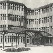
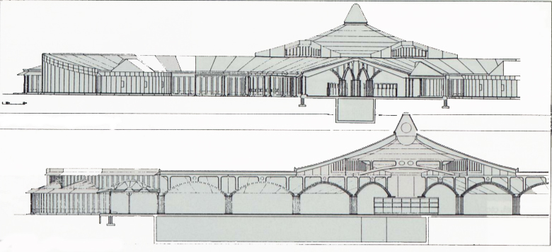
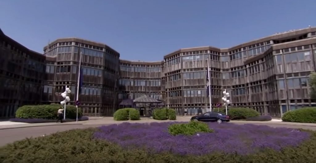
For offices Van Eyck designed seven towers, two of which house services for the other five. Located between the existing buildings and the new restaurant its heights vary from the 5 floors in the area closest to the old facilities to 3 in the area of the restaurant. These buildings are interconnected by the central circulation spaces.
In the center of the five office towers, eight concrete columns form an interior octagon and a spiral staircase rises from the floor to the roof skylight. The offices of each tower open to this central space and each floor communicates with the adjacent service towers. In his Van Eyck project he eliminates the typical dark hallways in office buildings.
On the outside, the set of vertical towers, lined with prefabricated Iroko wood panels that fit the floor-to-ceiling windows, look more like a cliff than a traditional office building. The wooden panels are topped by a copper band, coinciding with the restaurant.
Restaurant
The restaurant that is defined by an octagon with four slightly projected arms is accessed through the ground floors of the new towers. The restaurant offers a wide variety of areas, some oriented to the outside, others more intimate, some on ground floor others in height.
Structure
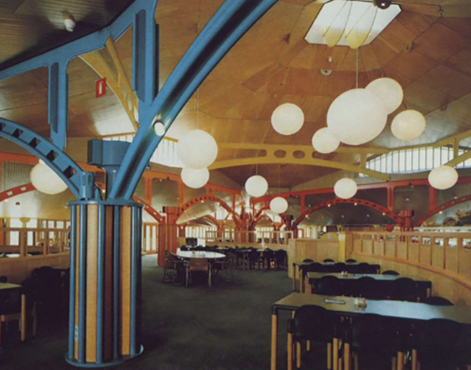
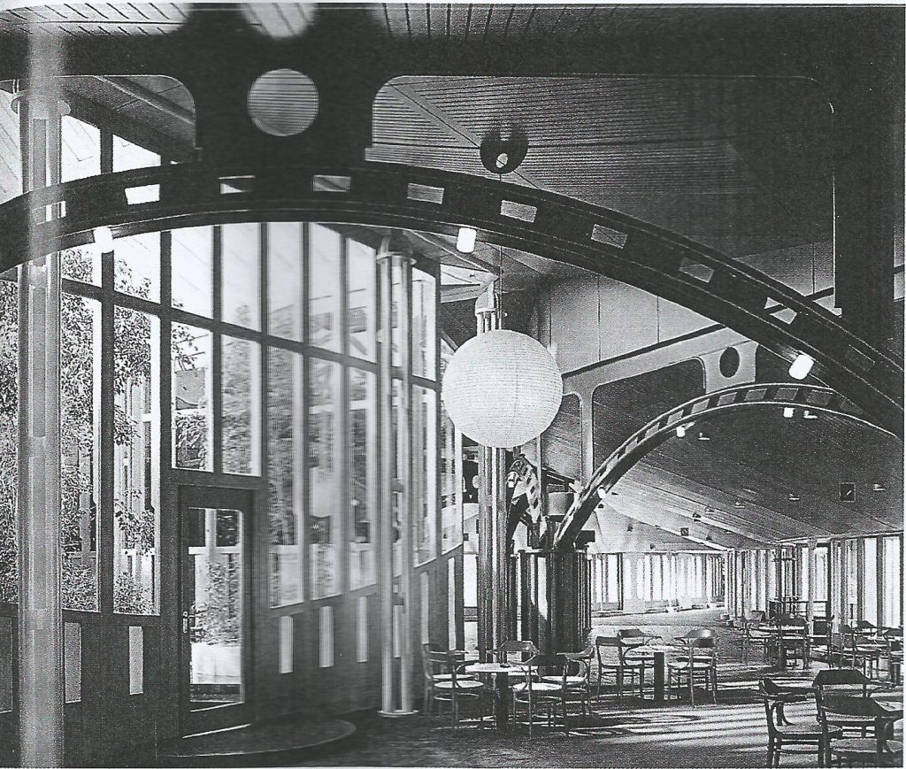
Covert beneath the gray tones of the wavy roof landscape the facilities are a colorful world of intertwined spaces. The base of the design is a family of endeconic columns and arched beams built with steel tubes that accommodate the multiplicity of curved directions and slopes of the roof. Almost no aspect of this constructive system has been left untapped, generating an organic complexity of spaces and lines of vision. This demonstrates that mathematical configurations do not necessarily produce the graphic paper aspect of structuralism, a style partially inspired by Aldo Va Eyck’s earlier work.
The circular interlaced volumes, despite being organized in a network of nine circles, do not impart any kind of symmetry or axis of movement towards the interior or the exterior, in fact quite the opposite, the volumes of arcs form what Van Eyck called “Wink at local symmetries,” which break down the scale of the great structure into clearly localized places, each in turn connecting, helping to form larger shared volumes.
Columns
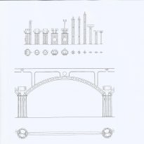
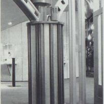
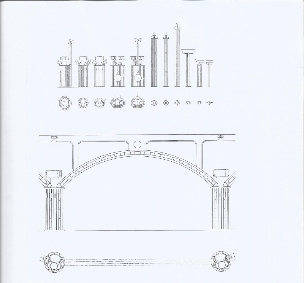
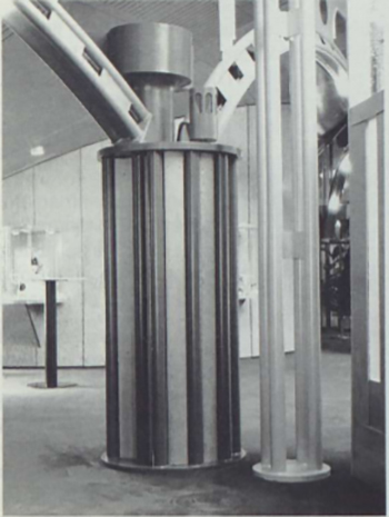
The systematic quality of the buildings begins on the smallest scale, the simple column, for which Van Eyck developed what he called the “hendecagonal order”, based on an eleven-sided geometry: “If they carry a large or small charge, they are Thick or thin, low or high, all steel columns are composed of the same 8cm tubes. Therefore the diameter of the basic component remains the same throughout the entire structure.
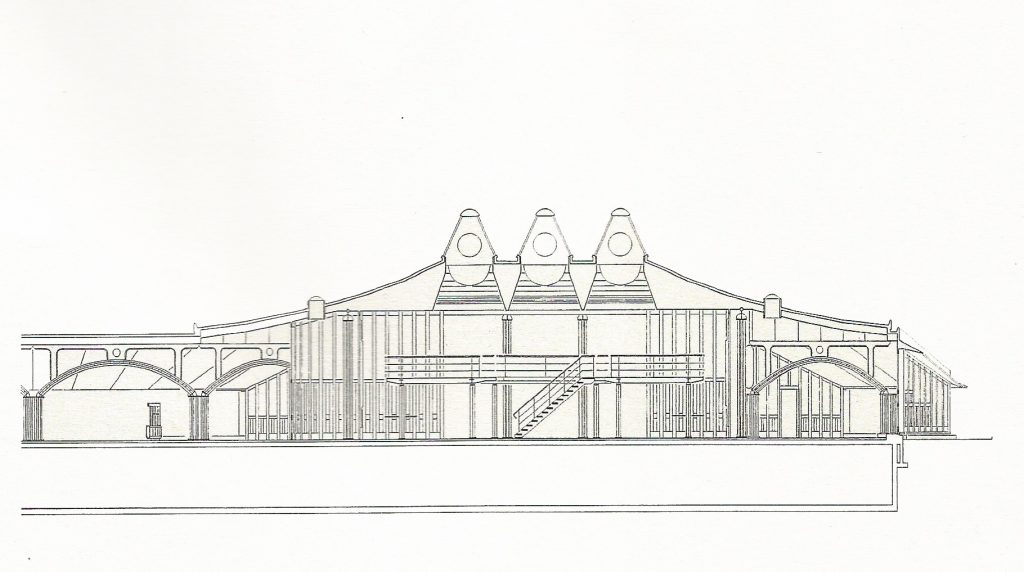
These pipes were welded to steel plates on the floor and top, at a height of 1.9, to produce the basic column of 80 cm in diameter, while the tallest and thinnest columns have additional internal reinforcements . The “full-size” columns with eleven or more tubes had plywood panels placed between the steel pipes, allowing them to house air conditioning ducts, pipes, electrical and communications cables, fire-extinguishing sprinklers, loudspeakers and Exhaust air return. These groups of columns have parallel historical precedents, being surprisingly similar to the cylindrical axes packed from the pillars of the Gothic cathedral. The columns support three levels of internal structure: the double steel tube beams along the inner edges of the circular voids, the series of steel beams forming the arc spines for the curved spaces and the lateral beams in the Square junction higher. The series of steel arches, with a light of 6 meters between column and column together with the tubes form large circular segments, with a constant of 18 meters in diameter, giving a curved shape to the interior spaces.
The metallic structures of the arches are painted in three different shades of orange, red, purple, blue, or green, reserving the yellow for the columns and beams more illuminated, around the outer edges and at the top of the higher spaces .
The only spaces not structured by columns and colored steel beams are the three oval-shaped conference rooms, which have reinforced concrete walls and the numerous small, semi-cylindrical or concave rooms that push through the convex outer walls and in The large circular voids, which have two columns hidden within the thickness of the outer wall.
Materials
With the exception of the conference rooms that for acoustic insulation were made in reinforced concrete, the rest of buildings were raised with painted steel and wood.
Roof
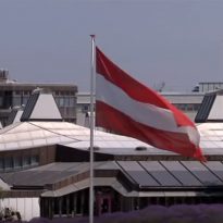
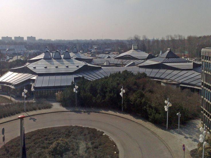
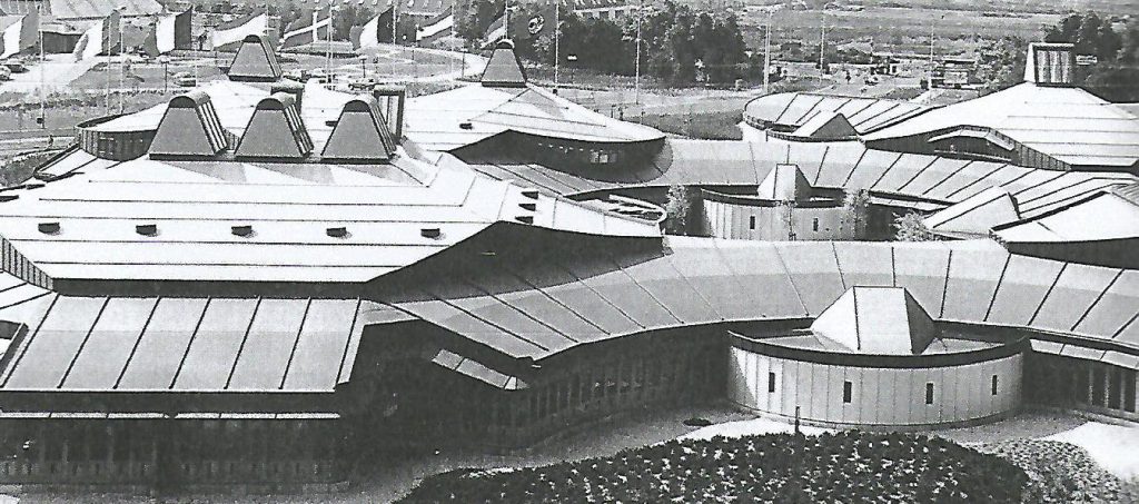
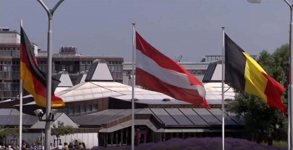
The expansive retractable roof, made of large panels of neoprene (synthetic rubber) in four shades of gray, darker on the outer edges and clearing toward the center, with seams standing between each panel, articulates the complex order of the interior spaces.
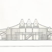
In each of the four main circulation spaces, the restaurant, winter garden, library and conference rooms, a star-shaped ceiling rises above the lower roof, each ascending towards a pyramidal shape peak Different and variable configuration of large skylights. The inside of the dynamic folding roof creates the most important element of different spaces, wood entrechapado smooth surfaces combined with other grooved, which impart a warm color to all rooms.
Floor and walls
The floor is a continuous flat surface covered with dark gray carpeting, with stone pavers on the doorways towards the exterior. In the lining of the walls, both interior and exterior, also used large wooden panels with openings for vertical windows. Iroko wood was used in the exterior.
At each level the facade of office buildings, the paneling is set forward, overlaying the front face of the lining on the bottom floor, so that the building skin pops out as it rises, allowing That the rainwater drips from the bottom of each floor instead of washing the face of the building. Van Eyck subtly accentuates this feature by placing painted metal bands of the same color as those placed in the restaurant, under each overlapping joint.
Illumination
Natural light enters the rooms through the windows on the lower edges of roofs, other higher buildings surrounding the joints between the upper and lower ceilings and skylights located in pyramid roofs.
Artificial light is provided by small lamps mounted on the bottom of the armor of the arcs, other placed in ceilings plywood and also large spherical lanterns Japanese paper hanging in a random pattern under the highest ceilings.


