Eli and Edythe Broad Art Museum
Introduction
In 2007 Michigan State University received a $28 million donation from Eli Broad and his wife, Edythe, to construct a new art museum that, originally, would have replaced the old Kresge Art Museum; a midcentury building tucked far into the campus, housing the Department of Art, Art History, and Design as well as the esteemed Kresge collection of 7,500 works dating from the Greek and Roman periods through the present day. Finally, Eli Broad decided to go in another direction, he wanted to do something more transformative, and with the endorsement of Lou Anna K. Simon, president of the University, they identified the prominent site of the 1947 Paolucci Building as the home for the new museum.
The Broad’s are devoted to philanthropy and also, they are longtime supporters of the university. In a lapse of forty years, they managed to assemble two prominent collections of contemporary and postwar artworks, and with this donation, they provided students and members of the community increased access to research and a permanent collection.
A competition was held to construct a building that included a 26,000 square feet gallery space to accommodate both permanent and temporary exhibitions. Zaha Hadid won the competition in 2008 to design the museum. This would be the architect’s first university building and her second project in the U.S. Construction began in 2010, it was a long process and the opening wash pushed forward due to material supply delays and the priority placed on involving students in opening activities.
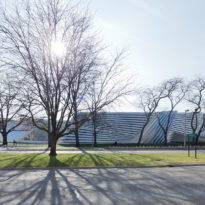
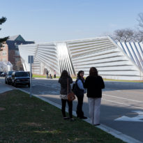
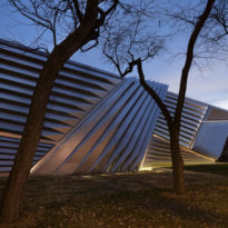
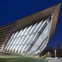
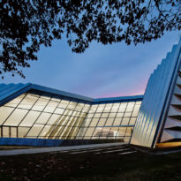
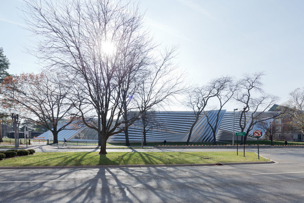
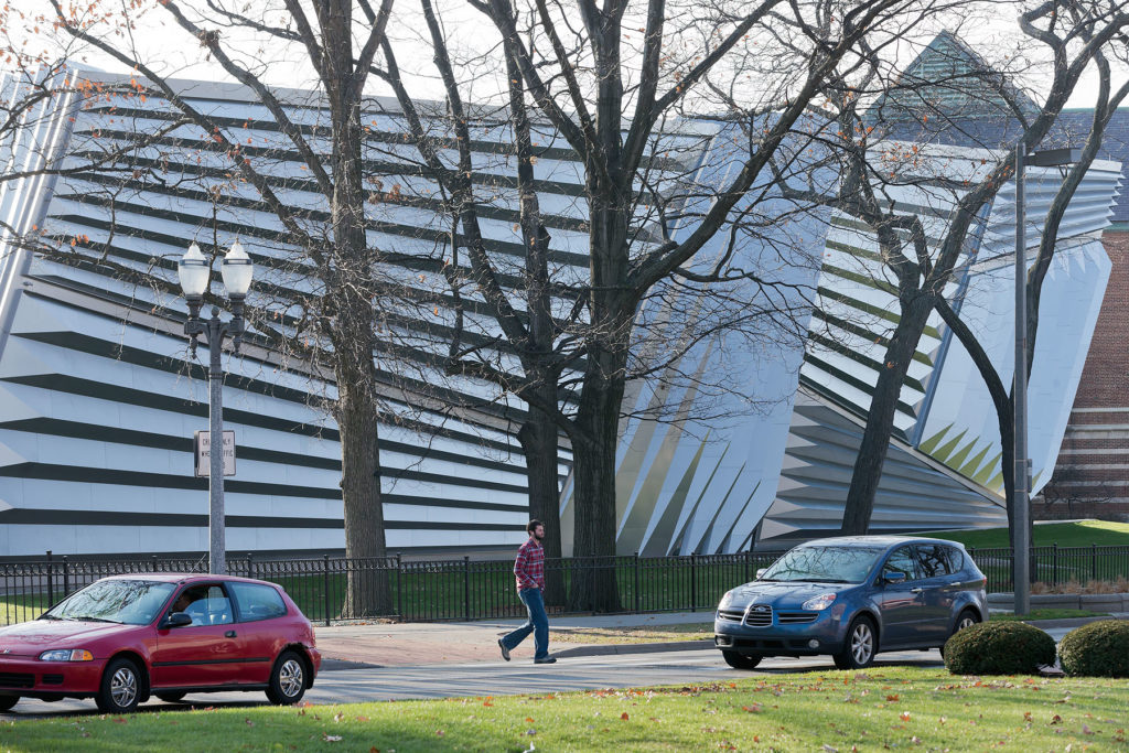
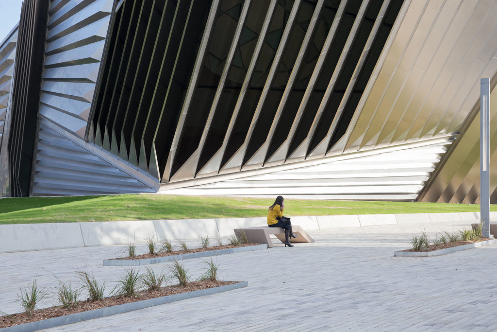
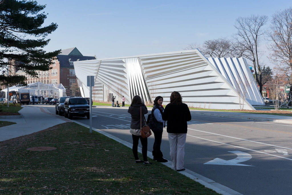
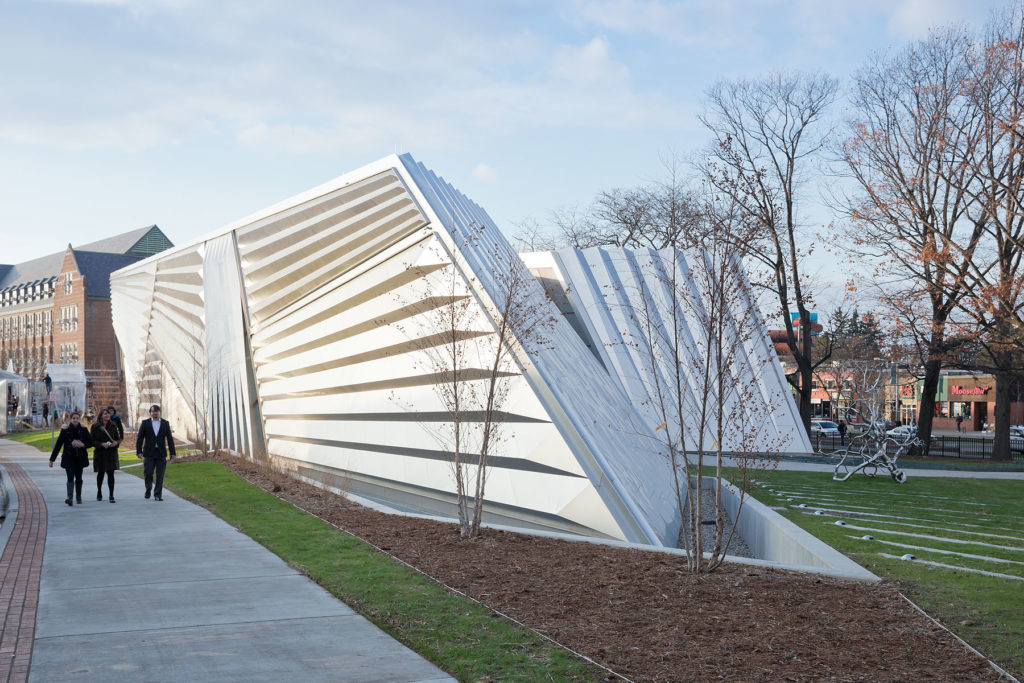
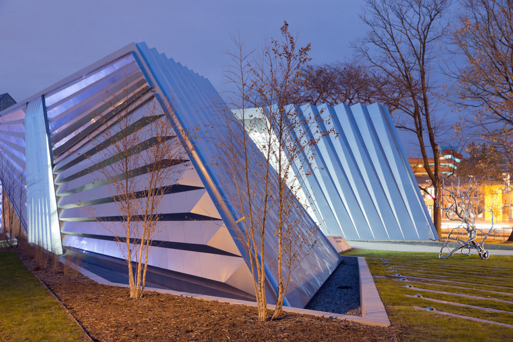
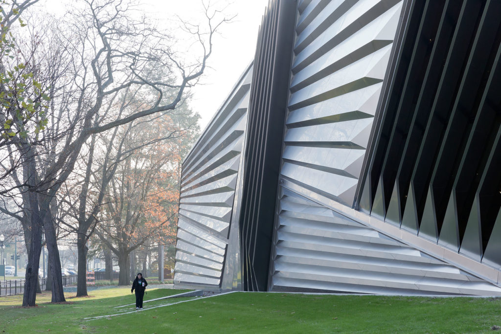
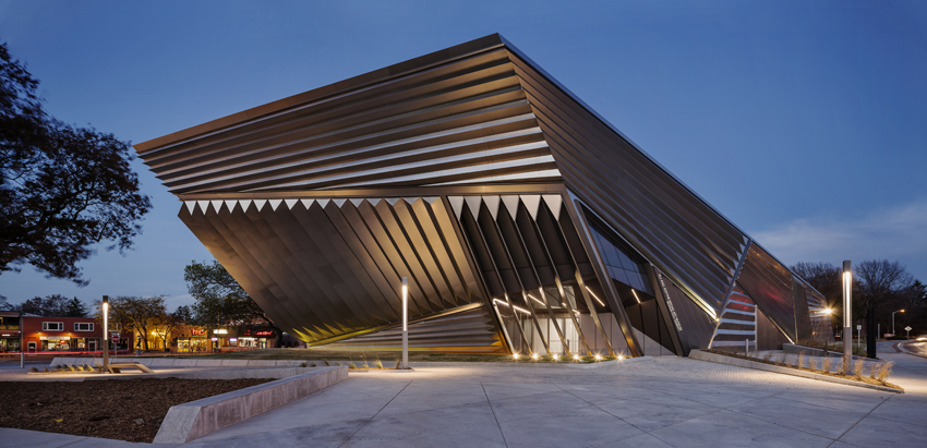
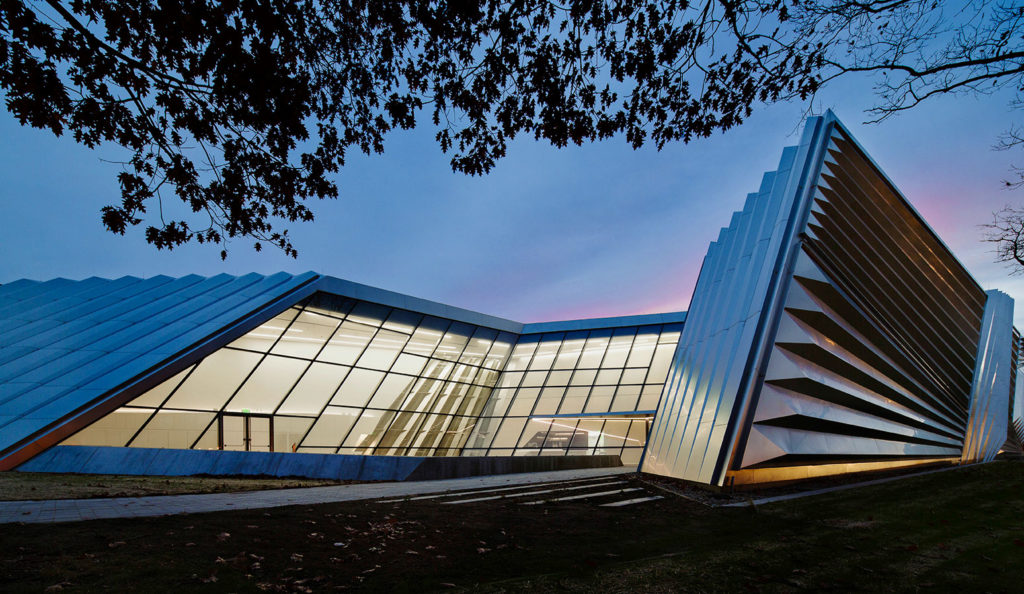
In November of 2012, the museum opened its doors for students and faculty members of Michigan State University but also for the community, functioning as a cultural hub. Echoing and extending the many circulatory and visual connections that define its surrounding landscape, Hadid managed to create a structural accentuation of important urban development boundaries and connecting lines, generating an “urban carpet” that brings together the different pathways on which people move through and around the site. The outer skin and its ever-changing appearance arouse curiosity yet never fully reveals its content.
Being that the body of the structure is deeply engaged with its surroundings, an amazing synergy between building, art, body, and perception is created, having as a “frame” the university campus.
Location
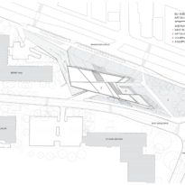
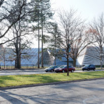
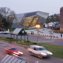
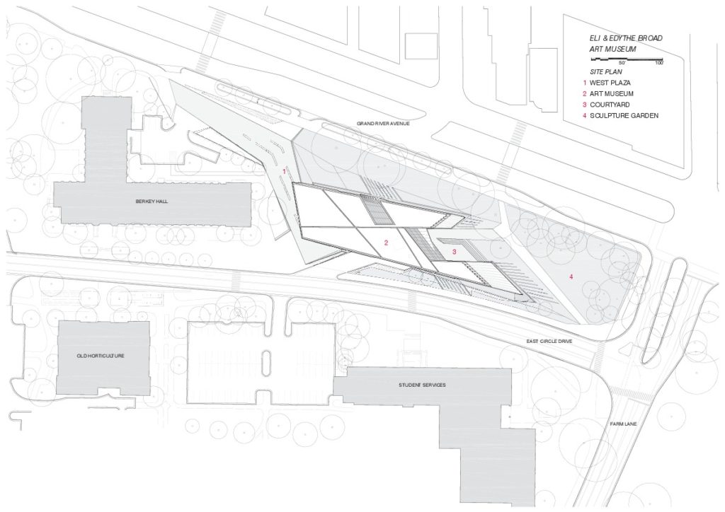
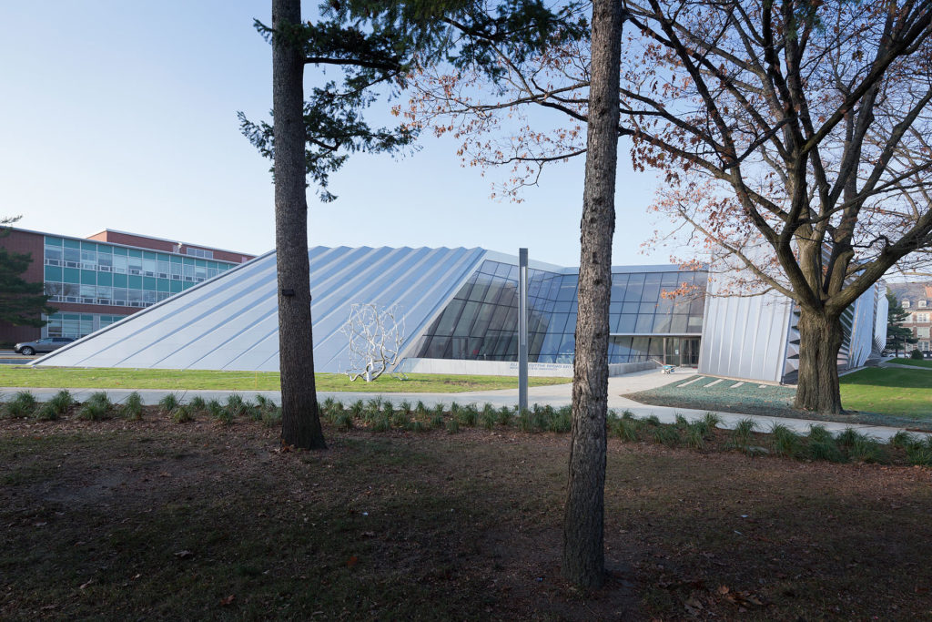
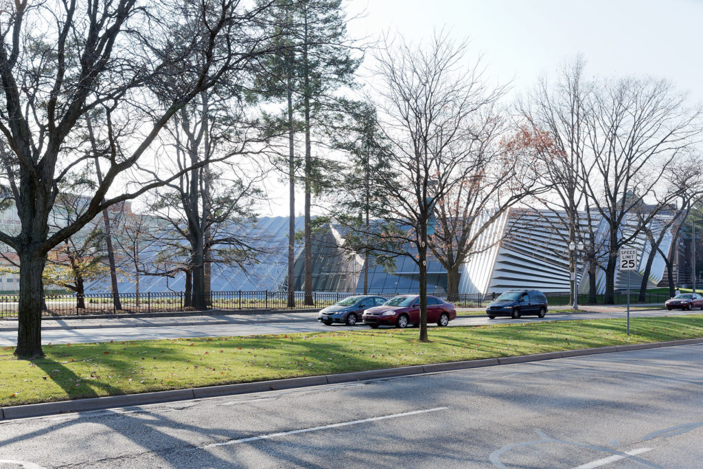
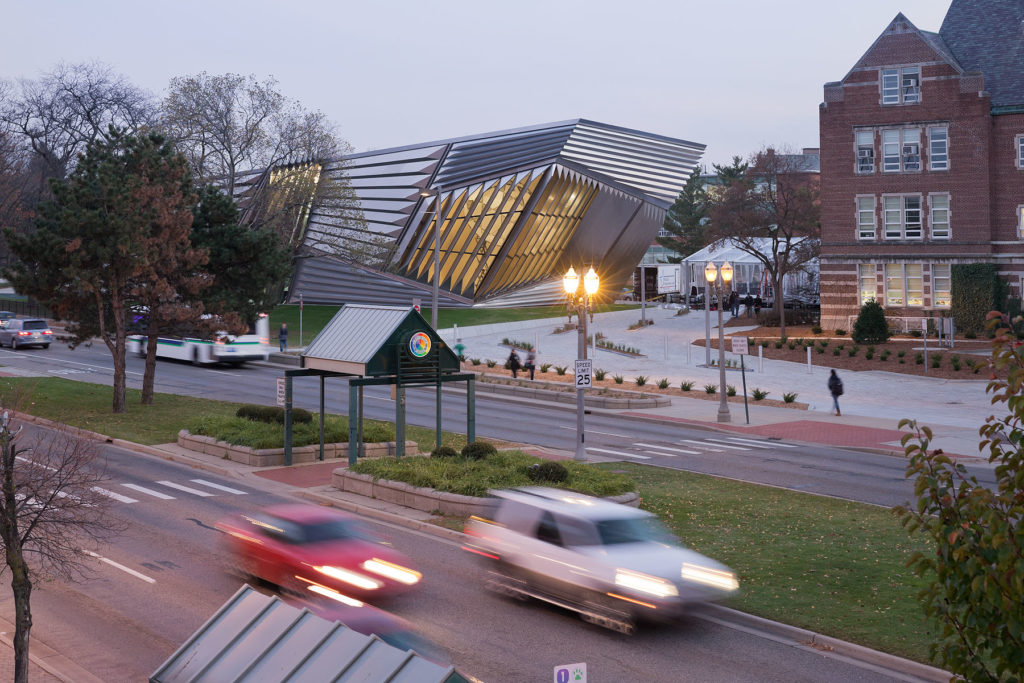
Located at the northern edge of the Michigan State University campus, the Eli and Edythe Broad Art Museum is situated in an exposed location with an active urban life, assuring visibility and encouraging community engagement. It is influenced by a set of movements along and across it. The vital street life on the northern side of Grand River Avenue and the historic heart of the university campus on the south side generate a network of paths and visual connections and an additional layer of connections that are applied to this highly frequented interface between city and campus.
Concept
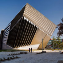
The idea of the building was generated by the different pathways and sight-lines, hoping to create a bond with its surroundings, integrating it and producing a cultural engagement. The sharp-edge structure is the result of a bast analysis of the topographic and circulatory characteristics of the area. Existing paths continue inside the museum, firmly embedding the building into the landscape.
A similar concept was used in 1997 when Rem Koolhas designed the McCormick Tribune Campus Center for the Illinois Institute of Technology. This building, such as the Eli and Edythe Broad Art Museum, is also in the heart of the campus being a new point of destiny and a gathering space for students and faculty members. Another characteristic that both of them have in common is the engaging connection with their surroundings. Existing paths and boulevards go through the IIT students center turning it into a “mini-city” and revitalizing the inherent urbanism masterplan designed by Mies van der Rohe in 1940.
Spaces
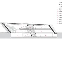
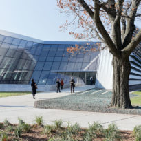
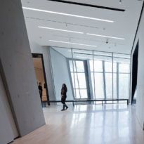
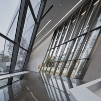
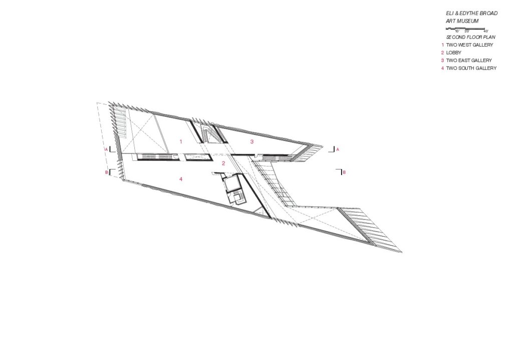
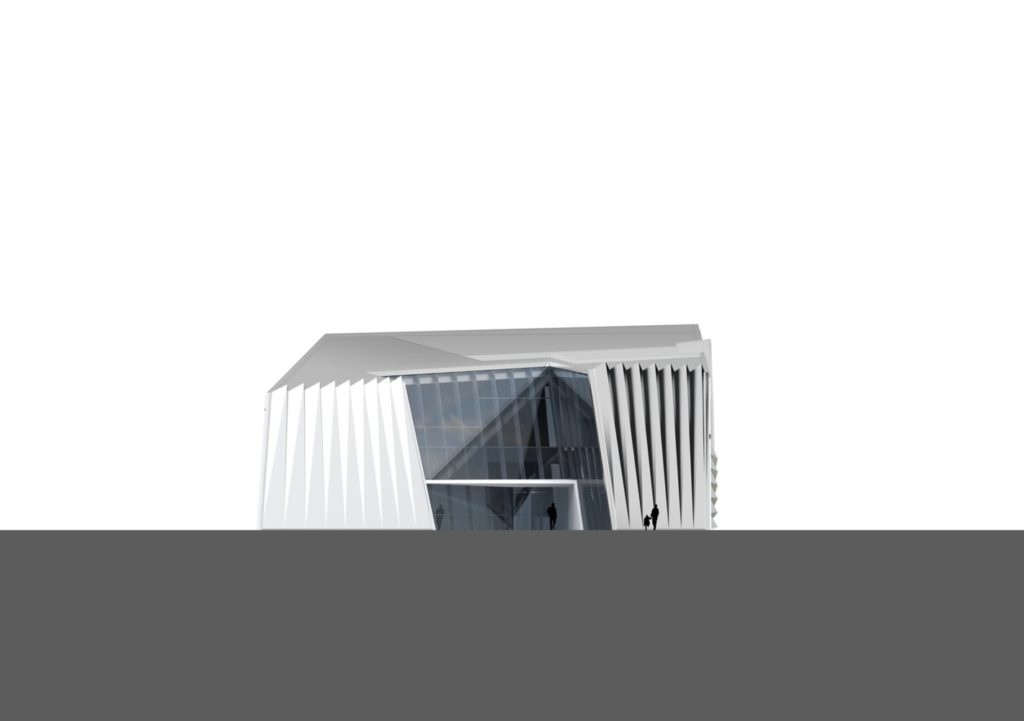
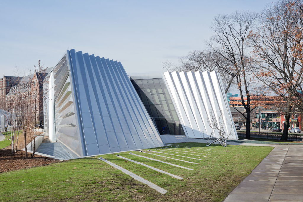
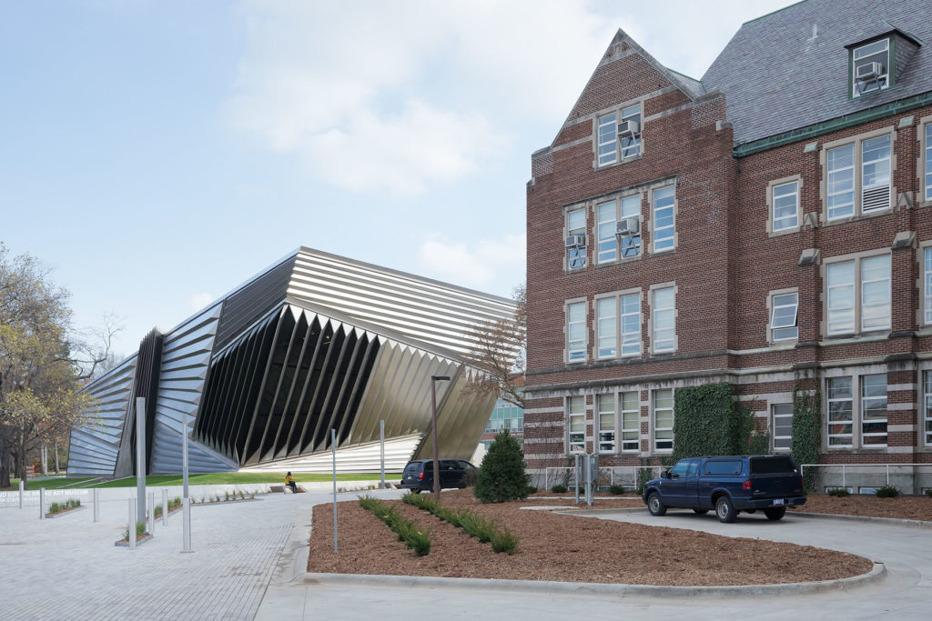
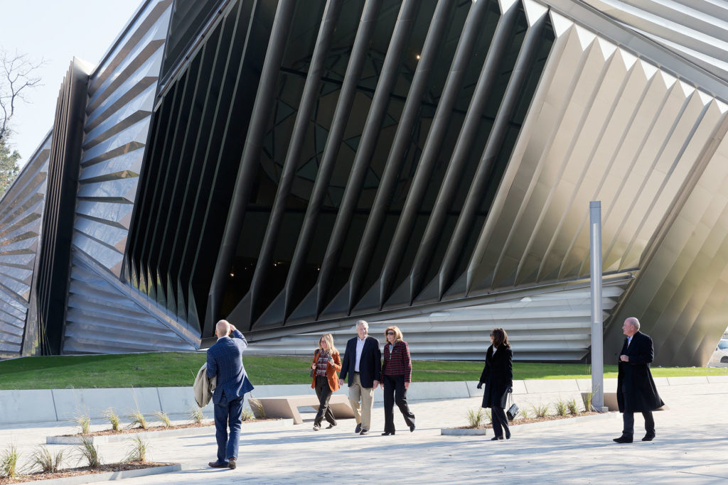
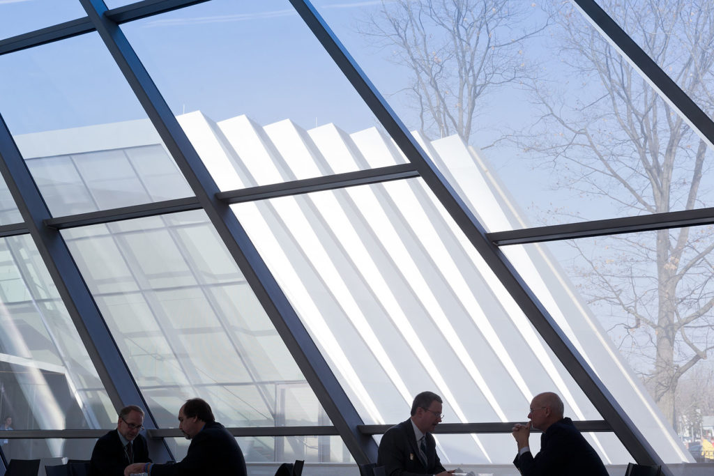
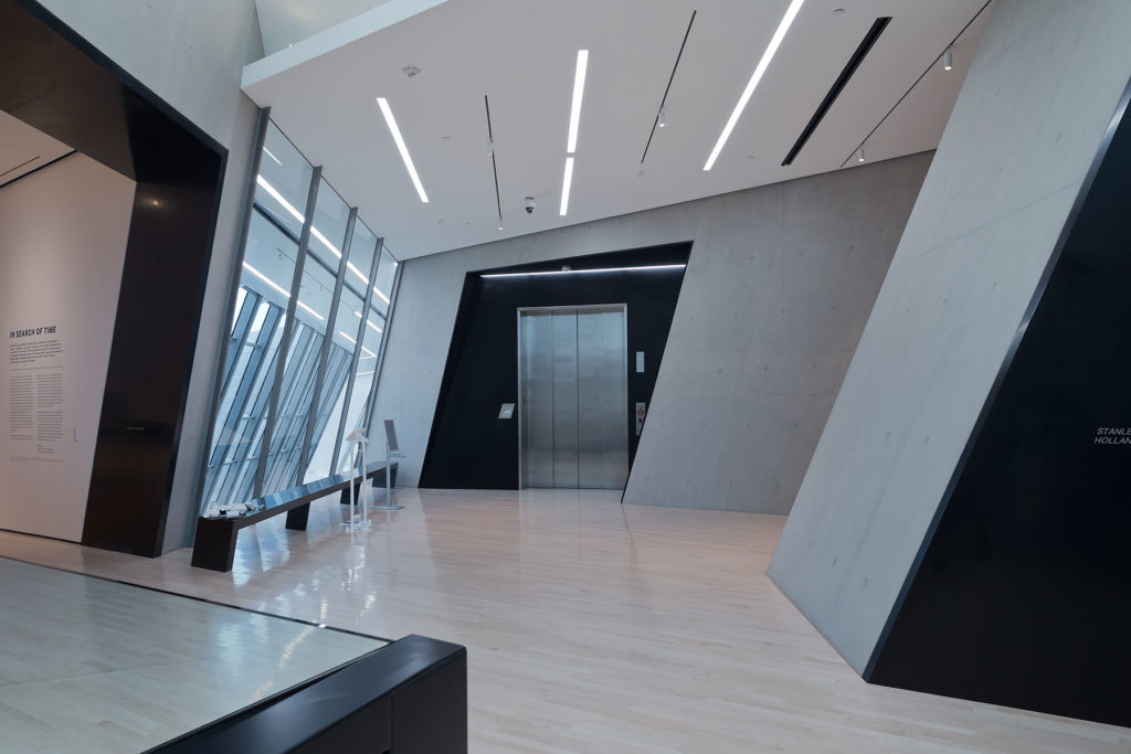
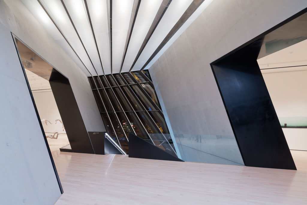
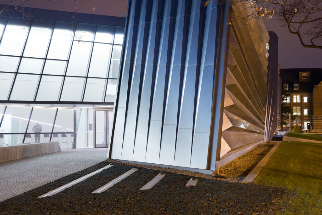
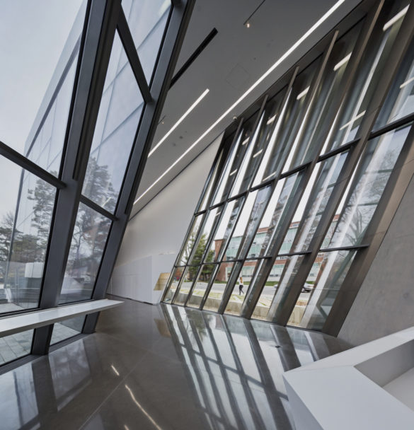
The museum has two entrances, one for the main public on the west side, entering a center hall; and another one on the east side going into the lobby, which leads to a welcoming, double-height cafe and the educational wing behind a large, tilted structural windows walls. The approach from campus generates an additional layer of connections that are applied to this highly frequented interface between city and campus.
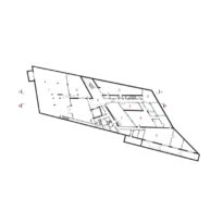
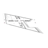
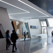
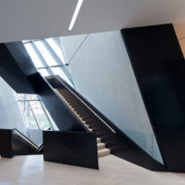
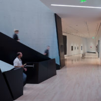
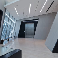
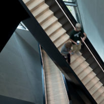
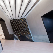
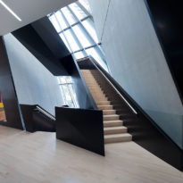
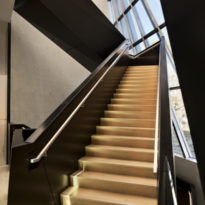
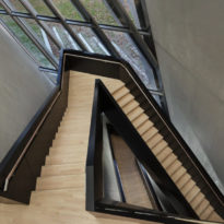
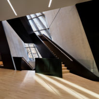
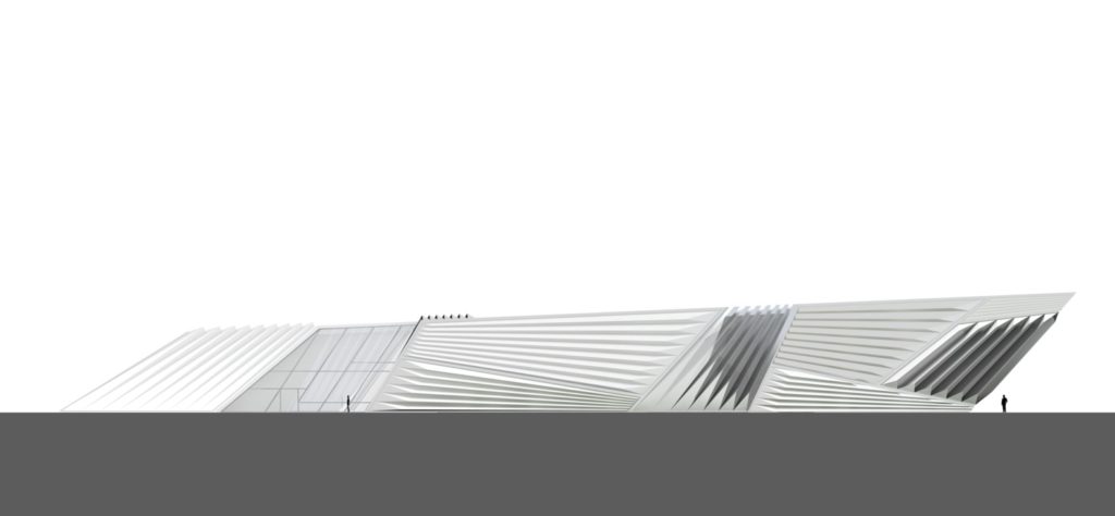
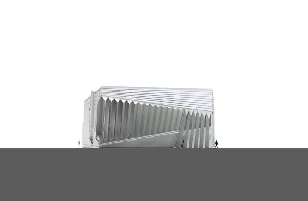
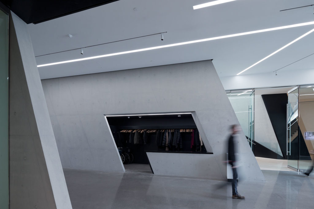
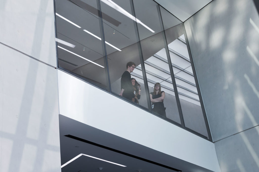
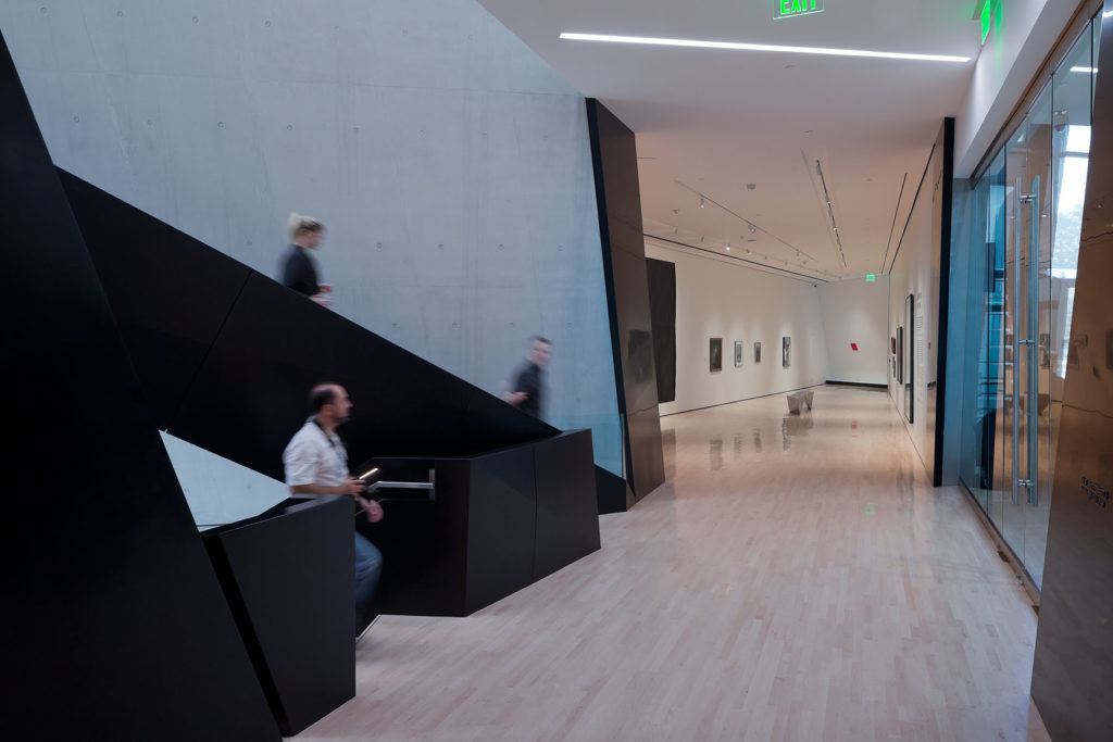
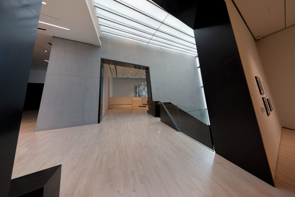
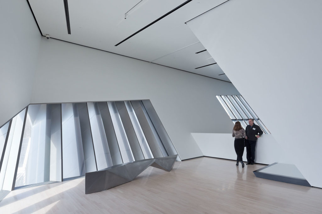
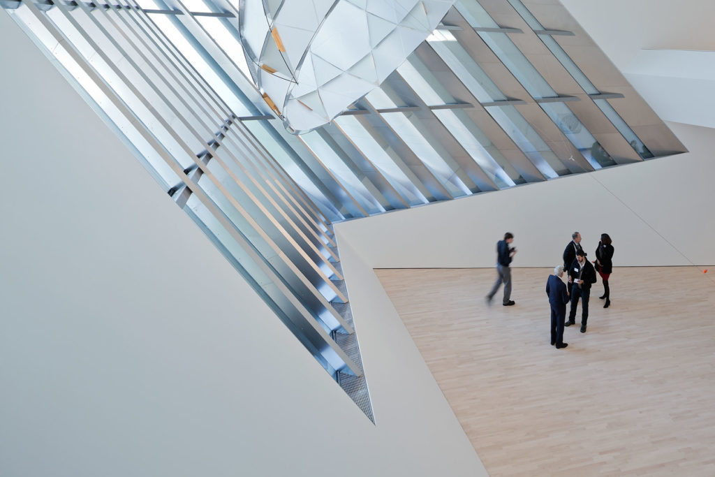
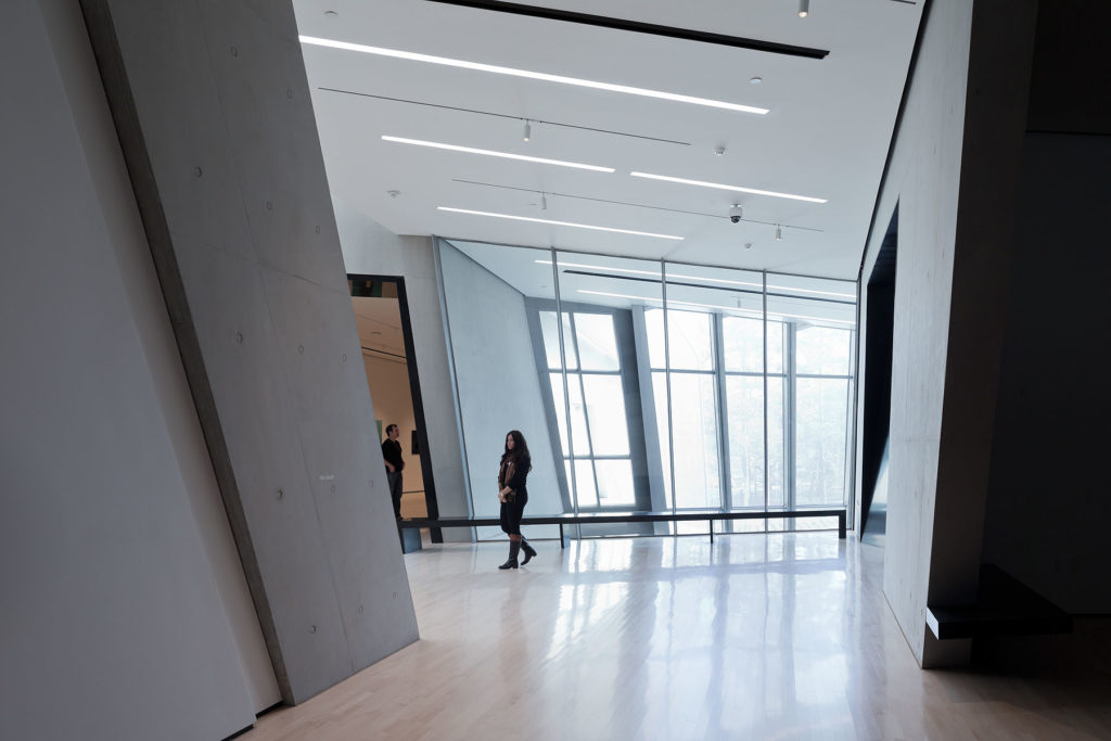
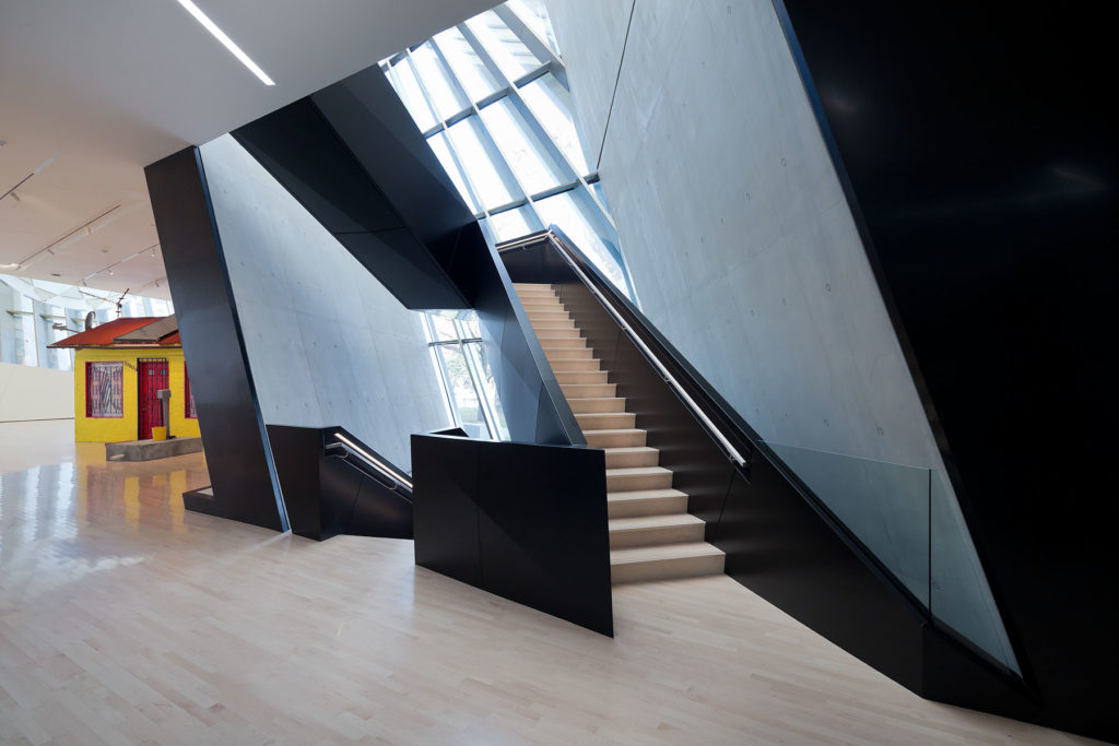
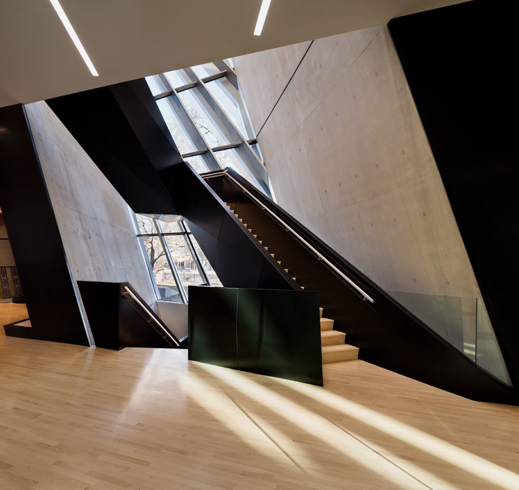
The formal composition of the museum is achieved by folding the circulation lines and visual connections that the surroundings offer and forming three-dimensional spaces that define an interior landscape. Visitors navigate the geometric spaces through a system of pathways that guide them around the site.
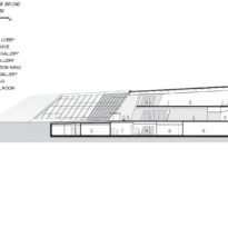
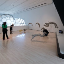
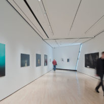
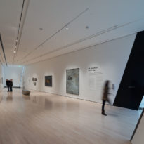
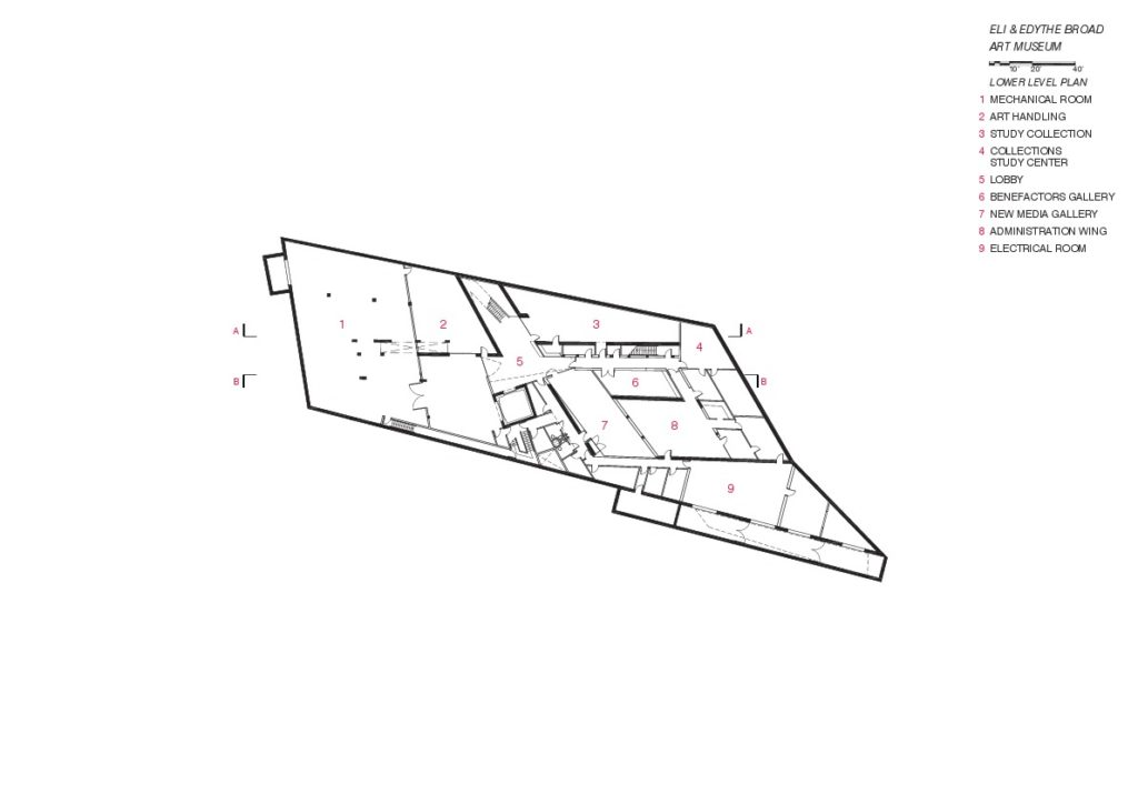
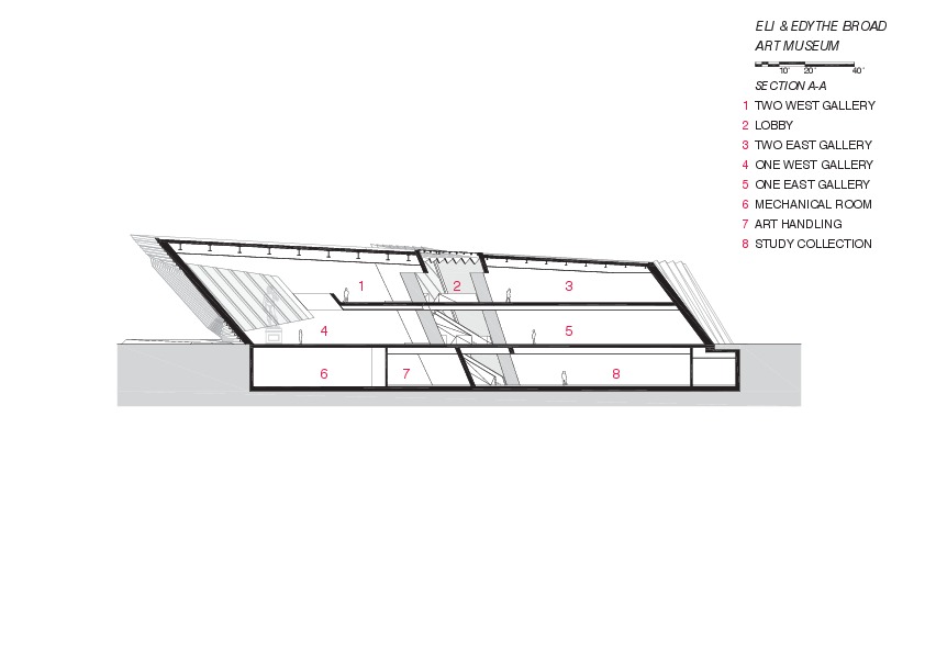
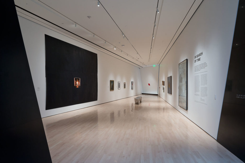
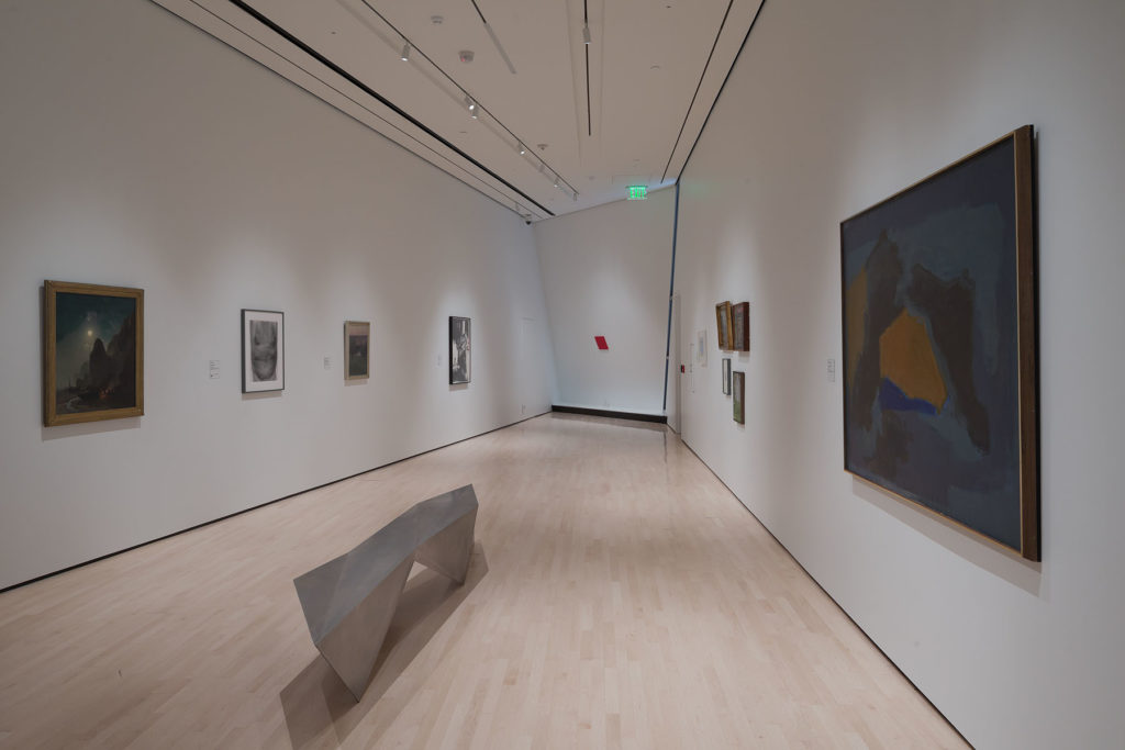
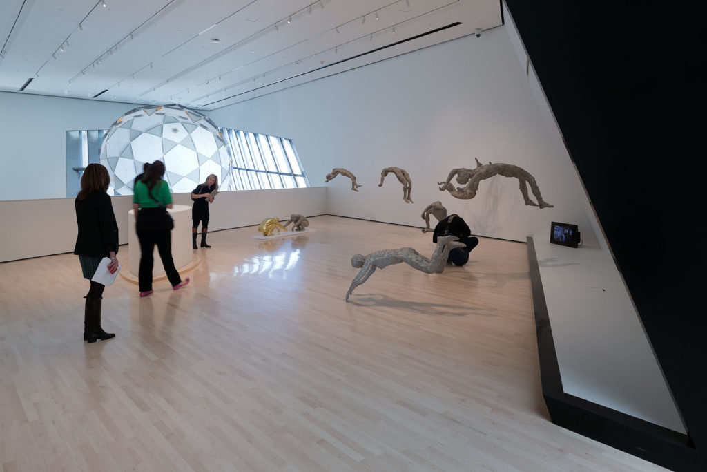
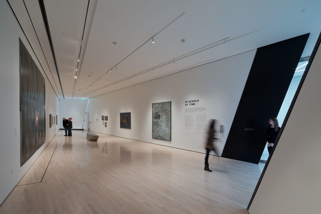
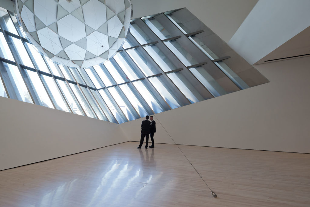
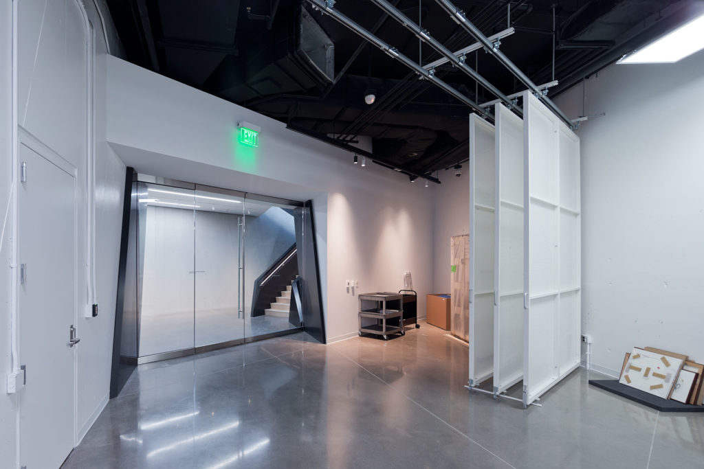
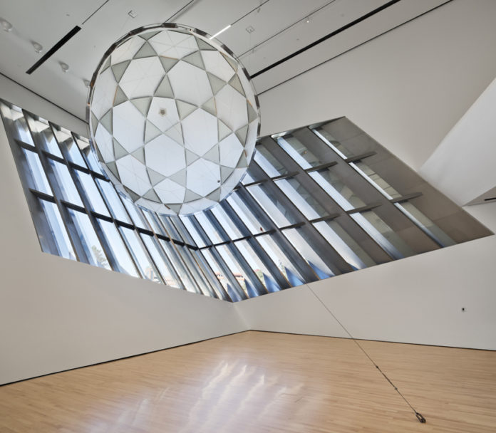
Double heights galleries are included within the museum 1600 square meters of exhibition space, which is split between three stories that include two floors above ground and one basement level. These areas offer space for special exhibitions, modern and contemporary art, new media and photography, and since the double-heights, the galleries can hold large installations.
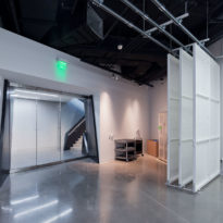
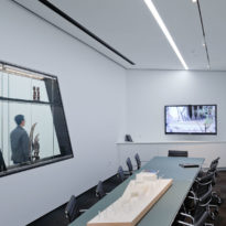
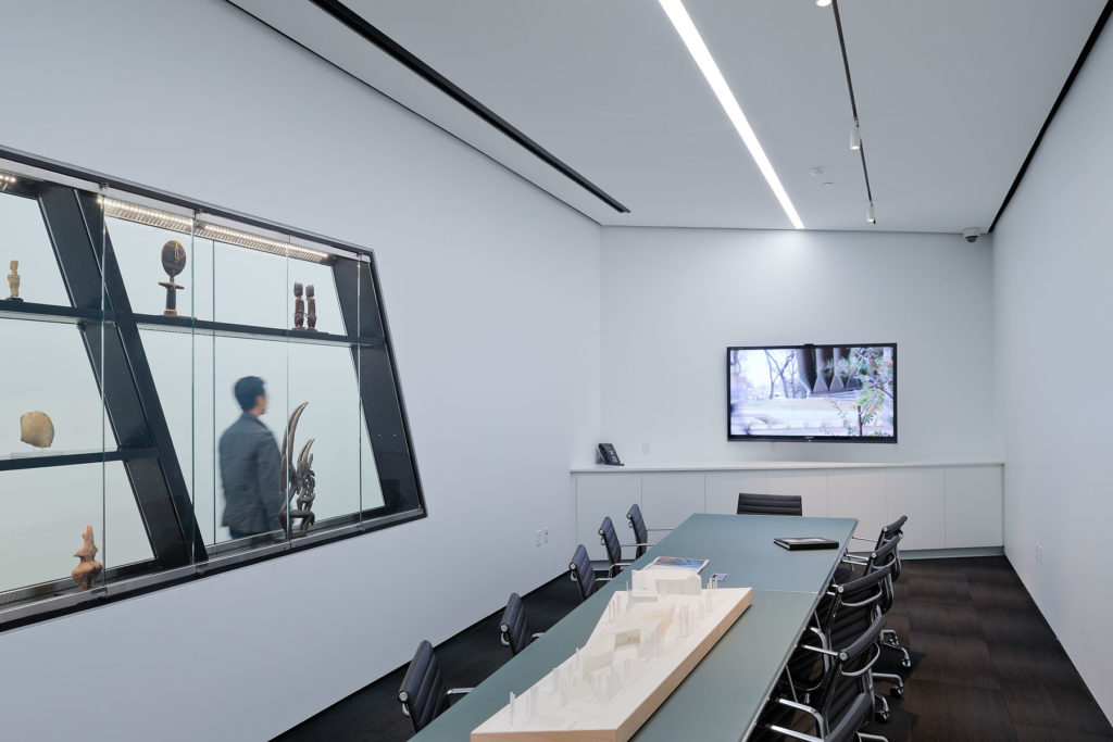
The museum includes an educational facility where lectures and seminars are held, administration offices, a café and a shop; as well as a pedestrian plaza and a sculpture garden.
Structure
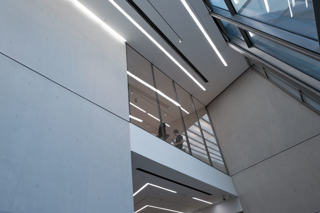
The structural solution for this irregular building design relied on a mixture of steel and concrete. Load-bearing walls of silky-smooth concrete were used where possible, which provides thermal mass and minimizes vibration within the large gallery areas. Additional steel framing was used for the non-structural cladding system and in areas where large column-free spaces were required.
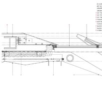
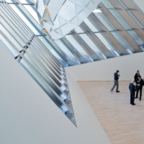
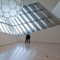
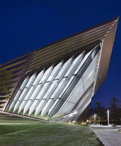
In a certain area of the museum, the roof spans 13 m across using cellular steel beams, this allows transferring services within the structure of the floor. Similarly, in the north-west corner a large double-aspect window set at an incline is framed in 10 m steel cantilevers and supported by adapted steel trusses above.
Materials
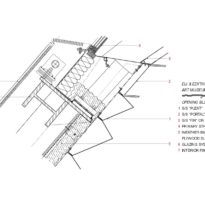
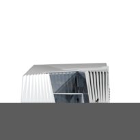
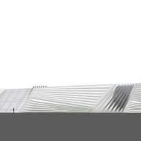
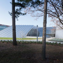
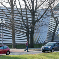
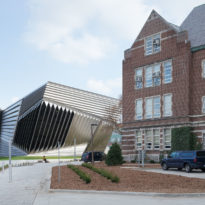
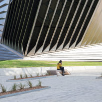
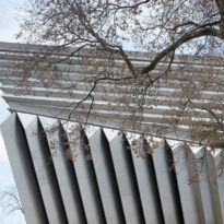
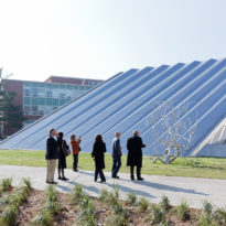
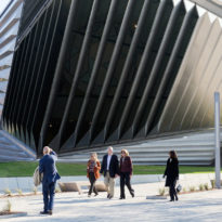
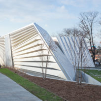
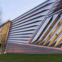
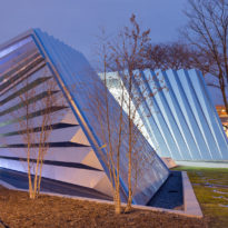
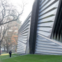
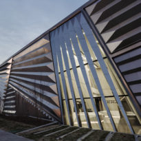
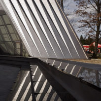
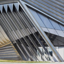
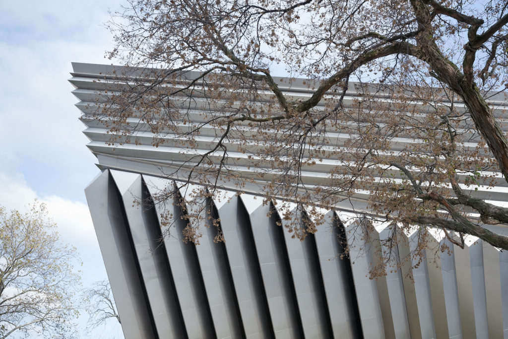
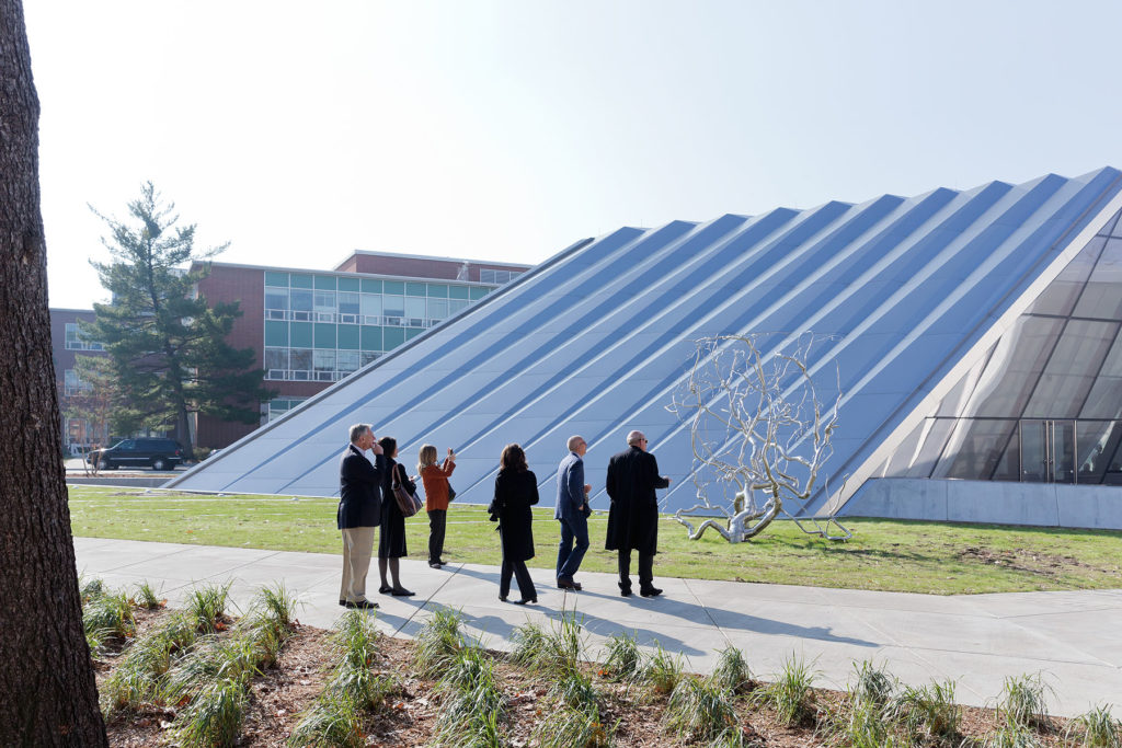
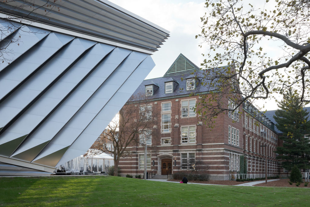
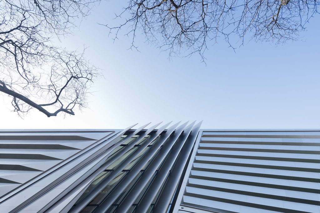
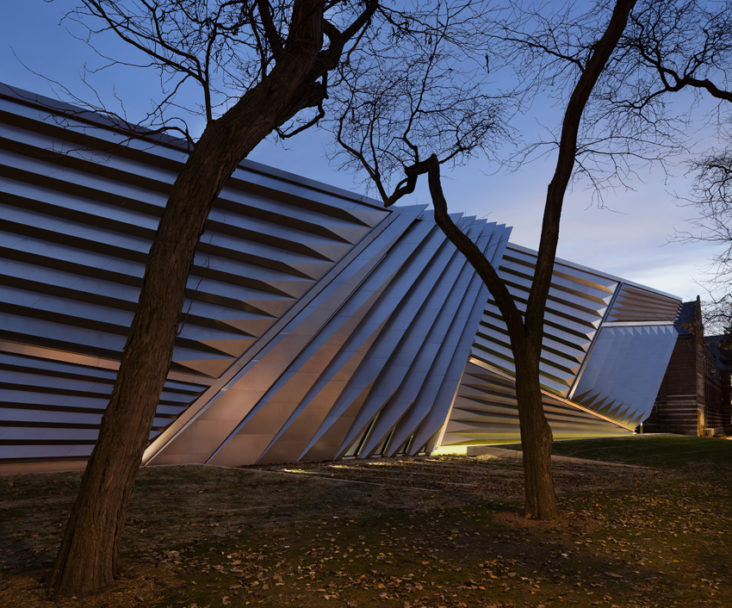
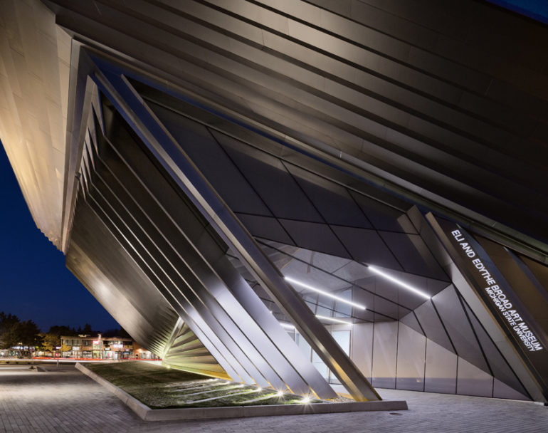
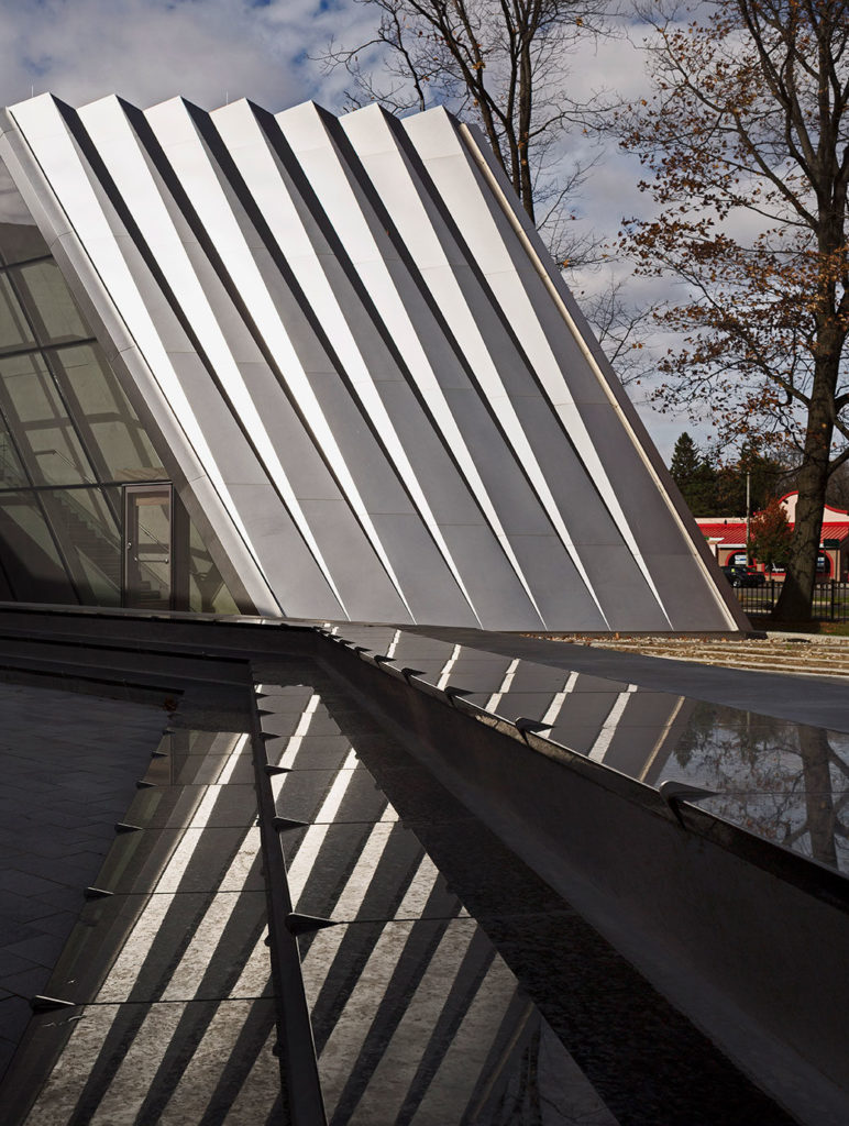
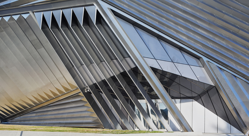
The outer skin of the Broad Art Museum is made of expressively folded stainless steel elements and glass, formulating a striking contrast to the neo-gothic traditional red brick university buildings on campus.
