Educatorium

Introduction
The Educatorium is the first phase of a long-term study conducted by OMA Architects to modernize and develop the Campus of the University of Utrecht, east of the city. Conducted over 14 years, the plan aims to transform the development of activities in the existing building, 1960, for a campus based on the American model community. The word was a made up name Educatorium intended to connote a learning center, and a place to promote higher education. It was the first project for a university for both OMA and to the architect Rem Koolhaas. These facilities house shared activities of 14 faculties and many research institutes, creating a major new center for meeting and exchange.
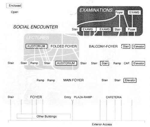
Understood as the encapsulation of the entire university experience in one building, Koolhaas and OMA team Educatorium conceptualized as a factory for learning in both the traditional formalistic approach as for the casual student or student exchanges. The Educatorium was specifically designed so that the processes of socialization, learning and exams tangling into each other, blurring the boundaries between lounges, classrooms and hallways, so there is a constant redefinition of what it means to learn in a social environment.
Program
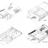
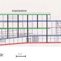
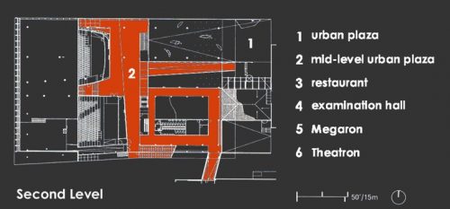
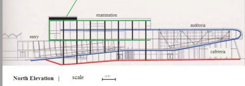
If a diagram of the center is observed, it is seen that the building size and complexity is a little deep structure, ie, all the big spaces are accessed in six levels deep. The building has three functional “attractions”, auditoriums, the examination room and the cafeteria, each of which is associated with a greater social movement space. The Educatorium reads like a radically innovative building on its most superficial level, a synthetic landscape, with a conservative depth. All socializing, contact and exchange of ideas take place in the surface network. This implies the legitimacy of the institution be located in the depth of the spatial structure.
The two key metaphors of “synthetic landscape” and “learning workshop” reflect the ways in which field relations of the landscape have been imported into the factory to develop the building.
Location
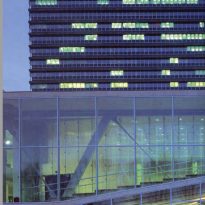
The building is conceived as a new center of gravity for the Uithof University Campus, east of Utrecht, Netherlands. It occupies a corner site on the edge of the field. It is bordered by four different environments, north vegetable boundary, south borders a tower 17m high, the Transitorium 2 east the Transitorium 1 longitudinal block 2 levels aimed at classroom and on the west by a pedestrian promenade.
Concept
The building is conceived as an effort to generate forms of social encounters. The spatial structure is designed to act primarily as a network in which individuals, ie, students are free to discover their own access and navigate through the building. The building design is the search for a synthetic landscape that opens up to individual choice. Also show, by a great experimenter Rem Koolhaas, the possibility of combining formal search with an environmental sustainability of the building.
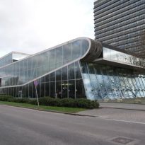
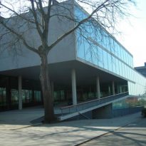
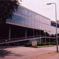
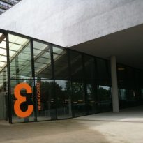
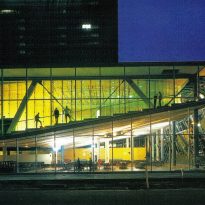
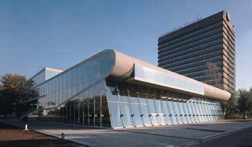
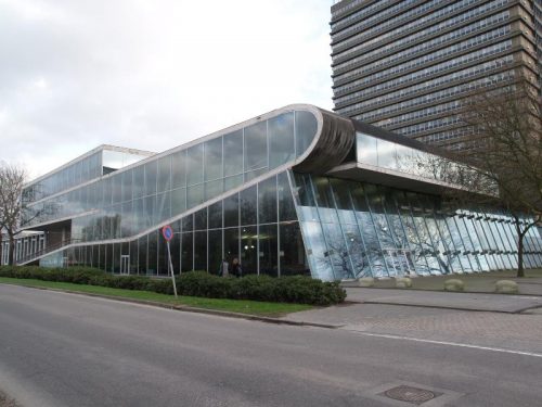
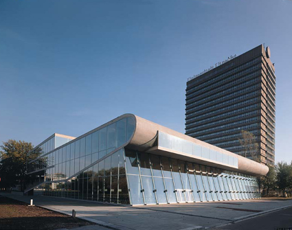
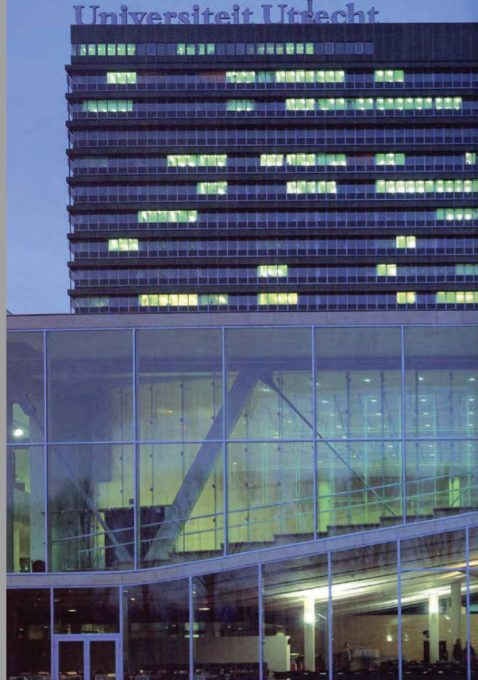
The Educatorium Utrecht joins the two existing buildings, built in the sixties, with a hybrid architecture of glass and steel, divided by a strip of cement whose lines reflect the path of student life and determine the different functional spaces. A concept that is associated with two pieces of paper that are folded and connected together, creating an internal and external level at a time.
Description

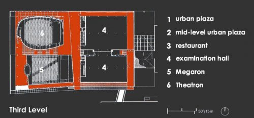
The building spans 11,000 m2 and includes two auditoriums 400 and 500 seating people, three rooms for exams, some study rooms and a dining room for 950 people.
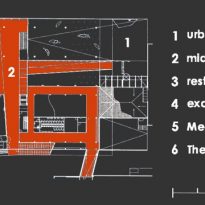
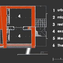
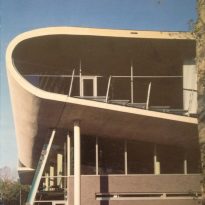
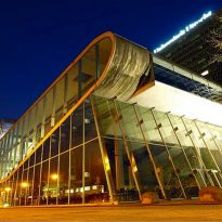
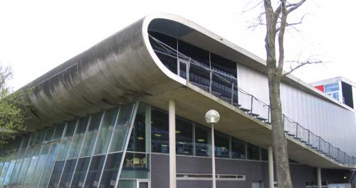
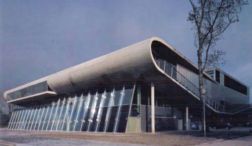
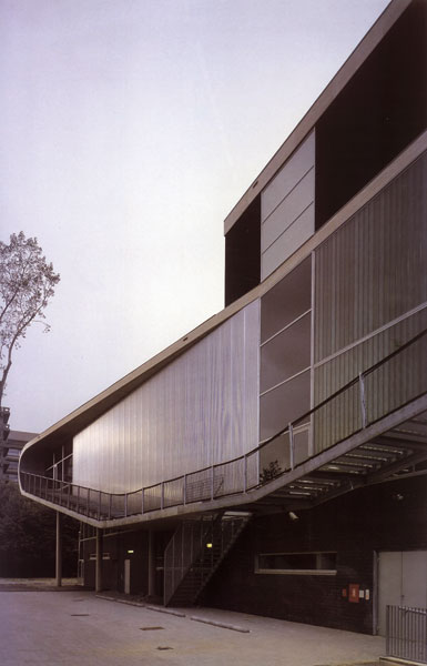
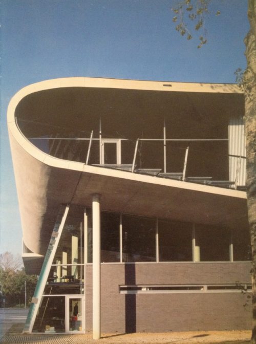
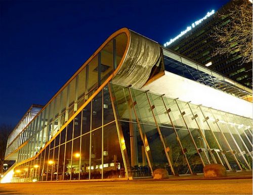
The Educatorium occupies a corner and adjoins low already existing building on its east end. Like a rolling wave, the ground floor is raised through the building and back to create a bulge along the west facade. Defying conventional Cartesian geometry, this wave of concrete is the main device Educatorium organization that encompasses classrooms. The exam rooms are developed in a more conventional manner. Around these large static volumes, two runners cruciform intersection define the principal axes of movement.
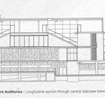
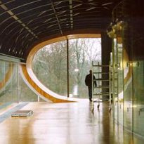
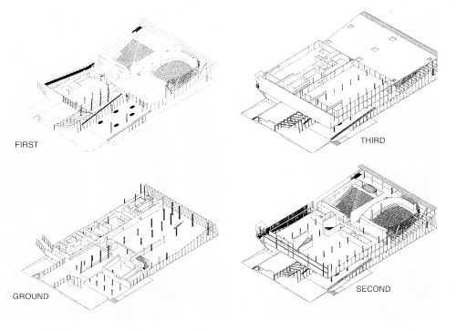
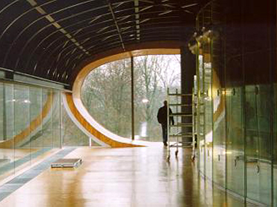
Educatorium design conceptualized as two planes that are folded, protects, and blocking each other. In section the two planes appear fighting each other, a rigid plane and the other fluid a suggestion as to the programmatic, spatial, and social juxtapositions happening within. In both cases the concrete slabs of the floor arises a sense of fluidity, some more obvious than others, the floor becomes a wall or ceiling, in one motion. The plastic nature of the concrete evokes a soft, airy quality that enriches the sense of openness and variability in the building, as a network of interconnected pathways.
Spaces
The Educatorium, 11.000m2 built, consists of two planes that fold to accommodate a number of different programs, including an outdoor plaza, bike parking, two conference halls with 400 and 500 seats, a cafe with 900 seats, exam rooms, reception and connection to the two existing campus buildings. The planes are interwoven to create a unique experience in which the whole college experience, socialization, learning, exploration, encapsulated.
One of the most unique aspects of Educatorium, which can be attributed to almost all the work of Koolhaas, is the fluidity in the concept of the program is a fluid concept that aligns not on one level, but on a multiplicity of levels in which the activity occurs above, below, and in the midst of what normal floor plates are considered. Indeed, classrooms, lounges, meeting rooms and general areas are located so trading floor plates Educatorium rising from the ground floor along the rest of the building.
- Cafeteria

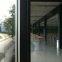
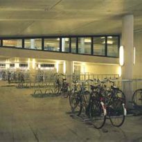
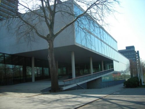
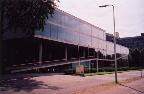
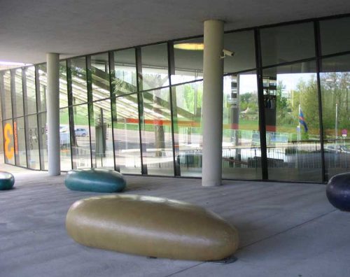
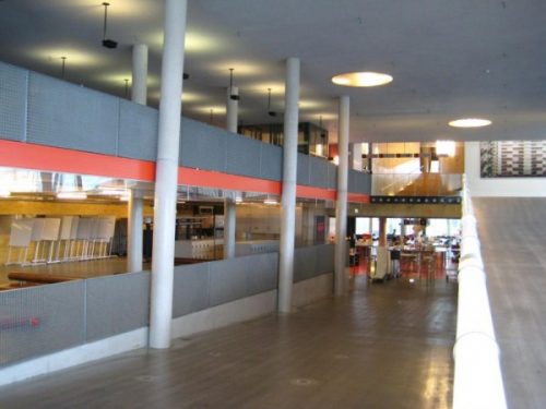
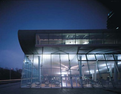
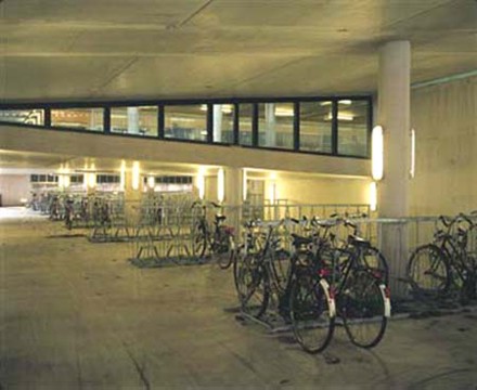
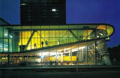
The cafe is located under the floor of the auditorium. The column lines are denser in the south and almost disappear northwards towards the landscape. Designed to accommodate up to 1,000 people, 900 seated, the sloping roof placed together with “random” columns generates a series of “places” in the great room. Below the entrance ramp bicycles are parked.
Throughout the building, the north end is openly while the south end is closed more. This difference is expressed through the materials and different degrees of opacity and translucency of environments.
- Auditoriums
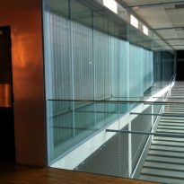
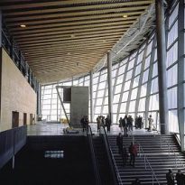
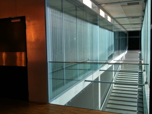
The two halls are accessed through the large entrance ramp area. Facing north side, the largest auditorium seats 500, is open to the view of the botanical gardens. Two curved walls enclose the room, one solid, another glass. Laminated holographic film that switches between transparent or translucent, depending on the viewer’s point of view, the glass wall acts as a manufactured cloud, or alternatively getting light obscuring the view to the outside while providing a privacy screen for the internal.
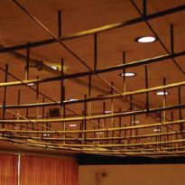
The second 400-seat auditorium is located on south area. Covering the resulting gap between two solid walls, the dense structure of the roof is made of a series of I-beams which create a steel surface.
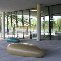
At this level a semi-covered area is located, with striking forms of “rocks” that students used to sit, a place to chat, study or think.
- Exam rooms
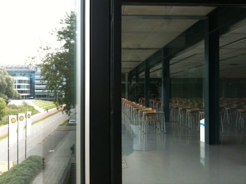
Above the entrance lobby, the two storey block that houses exam rooms is located. While they were planned specifically for mass screening, allow various configurations of furniture and use.
Circulation
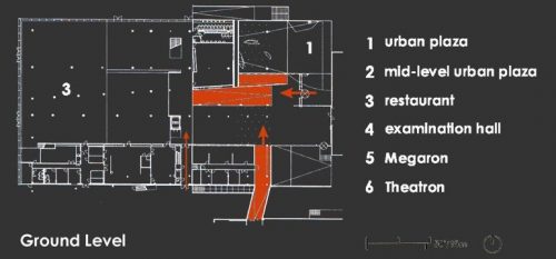

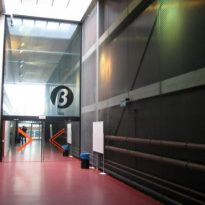
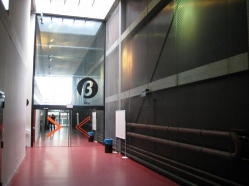
Circulation in the Educatorium is organized around a cross formed by two runners, subdividing each floor into quadrants that function as primary connectors. A second set of paths allows the building to function as a network. By merging the areas of “pause” in circulation, larger open territories are generated as part of the strategy for elimination of borders in favor of more subtle techniques of separation or inclusion.
Features
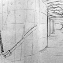
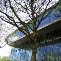
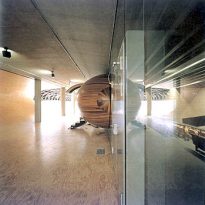
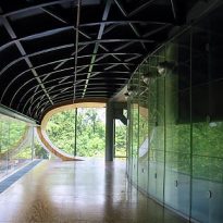
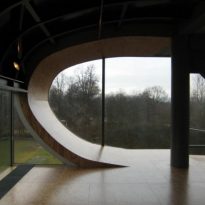
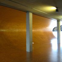
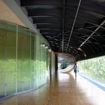
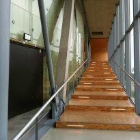
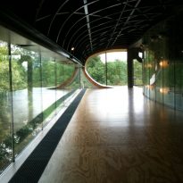
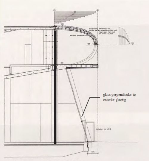
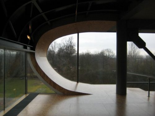
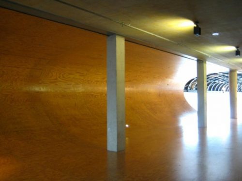
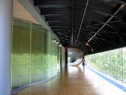
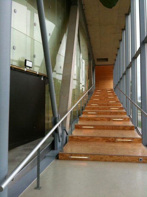
The main distinguishing feature of this building is the concrete floor that wraps around the structure and becomes the roof of the building. The inside of the curve is finished with wooden slats and offers a warm atmosphere for students to get together and sit around the curved track becomes wall and ceiling.
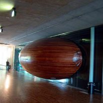
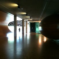
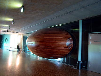
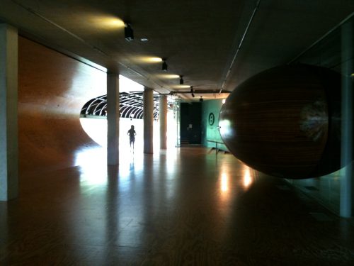
Another interesting feature is the egg-shaped cabin used for audiovisual pass. The exterior was clad in the same wood of the curve track.
Structure
The starting point of the design are two leaves that fold and interlock. The concrete slab is treated as a malleable surface that allows optimal setting for each program.
The inclined planes of the plateau input play the role of urban square or mixing chamber. Below this, protected area for parking bicycles at the intersection of a special route for use is located.
Downstairs, the column density in the cafeteria area decreases towards the north, until only two columns holding upstairs. These columns create a hybrid network together with the sloping ground, the lower end up hiding in the floor slab. The deformation of the space creates this change in the density of columns.
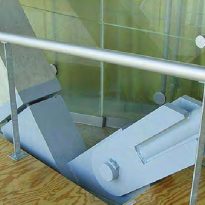
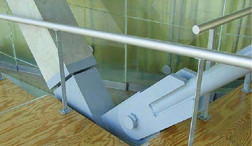
On the roof of the largest auditorium, reinforcement steel bars protruding from the concrete slab. The dissociation of the two materials allows each material to work with maximum efficiency, the concrete slabs 20cm thick covering 21 metros.It´s needed an external steel framework to help hold the concrete and remove the stress that would be created at the bottom.
Cantilevered area exams are supported by large beams on the ceiling. The concrete floor slabs are supported by beams vierendeel carga.la enduring all the same wood curved track.
Technology

To study the sustainability of the project, Koolhaas has enjoyed the cooperation of the architect Cristophe Cornubert (WCO) that specializes in sustainable alternatives for the disposal of materials harmful to the environment.
The two architects have done a building that wants to reduce energy consumption and emission of carbon dioxide, and to provide good indoor thermal and visual conditions through control of natural lighting and heating-air conditioning.
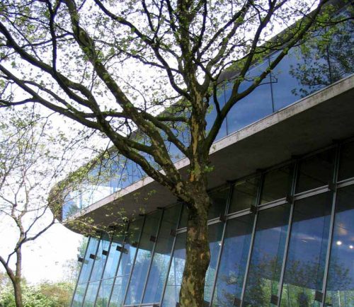
To minimize the spread and use of energy in the north and west facades, there have been some large areas of glass insulators that guarantee a perfect effect of solar radiation, thereby allowing the accumulation of heat and the greenhouse effect saving electricity for lighting.
In the study rooms, the lighting system is the ideal natural result of the use of windows for low vision and high windows for lighting. The latter led to the rays of light-colored roof that reflects light and power to the reading tables.
In summer, this facade, which is fully glazed, is shaded by large trees, while the south has a mixed system of semi-screens that allow light to filter in a different way depending on the internal usage.
The building’s heating system uses cogeneration facility directly from college and uses the underground heat which also uses the boiler water supply.
For air conditioning uses a passive ventilation system that uses the phenomenon of night cooling and heat capacity of the mass of the building without having to use additional mechanical systems.
The flow of air inside the building is obtained with a balanced ventilation system is based on traveling through the soil and cable outlets air of self-adjustment.
Arcade coverage theaters, conference rooms, generated by the curve of the tape sectioned cement building, is interesting not only from a compositional point of view but also from the approach of building sustainable extradós her is covered with Grass that guarantees a greater thermal and acoustic insulation of interiors and offers a pleasant green landscape to the study rooms that are on it.
The choice of leaving the structure of cement in sight and the use of a smaller amount of this material, with a thickness of 20 cm instead of 60 cm, provide an aesthetics of the building and confirm that sustainable construction can be synonymous Good architecture.
Although they are not accessible to students, roof gardens are used to hold rainwater in an effort to reduce waste water load while providing a color palette for the building.
Related Books
Video


