Denver Art Museum

Introduction
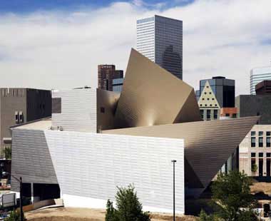
Extension of the Denver Art Museum was given by Daniel Libeskind. It is the first architect’s design to be built in the United States.
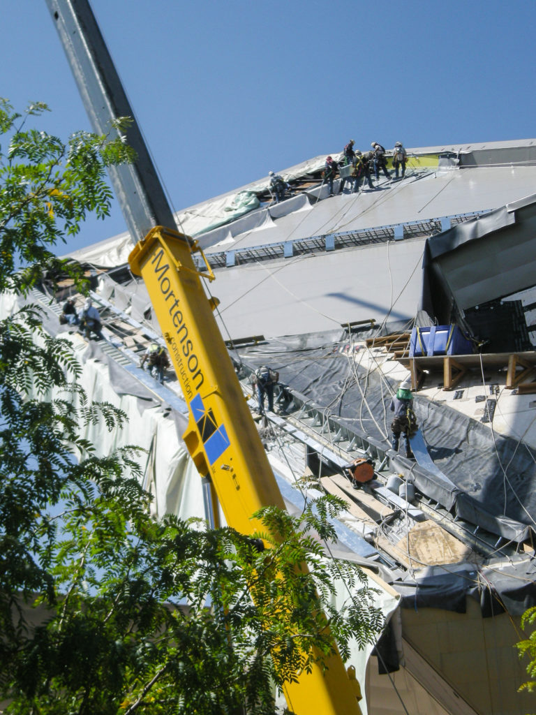
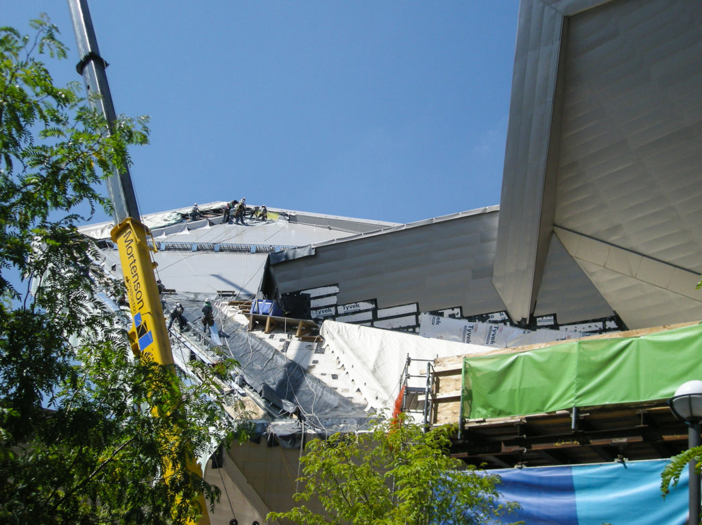
Collaborated in building the firm Davis Partnership Architects and construction MA Mortenson Company that has been in charge of projects such as the Pepsi Center and the Walt Disney Concert Hall in Los Angeles.
Extension’s role is to expand the existing museum. Seven levels of the building, designed by Italian architect Gio Ponti, the work was performed biggest expansion in its last thirty years.
The history of the museum dates back to 1893, when a group of artists founded the Denver club whose purpose was to sponsor lectures and exhibitions. 23 years after the Artist’s Club was renamed as the Denver Art Association, later to become the Denver Art Museum. In 1932 the city of Denver gave some galleries in the museum just finished the City and County Building. In 1948 the museum acquired a land to build a new headquarters, but had great difficulty in finding funds, and the building was not completed until 1954. Once again, during the 60s, the seat was small and in 1971 opened a new wing, designed by Italian architect Gio Ponti and local architect James Sudler. The influx of many works and the presence of an ever-required in the twenty-first century to build a new wing, designed in this case by Daniel Libeskind.
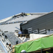
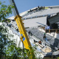
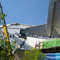
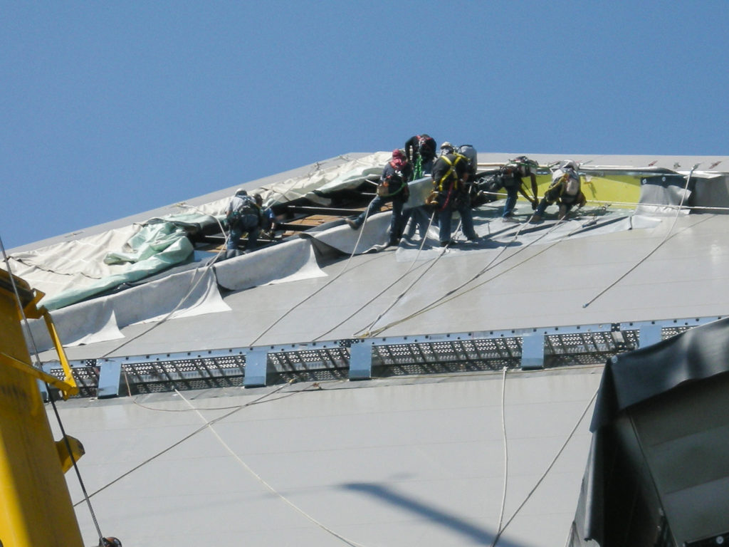
Work began on April 9, 2003 with the celebration of the laying of the first stone, and were completed in 2006 with a total cost of more than 62 million dollars.
With an area of 13,564 m2, the new building Frederic C. Hamilton almost double the space from the host to several special collections never before been displayed on a permanent basis to provide the opportunity to make other national and international events and programs.
The new spaces are designed to showcase collections of design, architecture and art of Oceania.
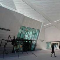
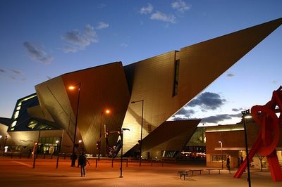
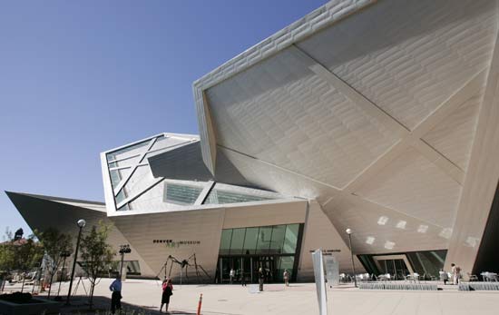
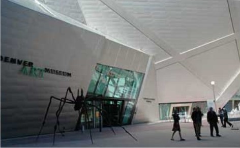
Opposite the entrance to the new building was placed a giant bronze spider by sculptor Louise Bourgeois.
Situation
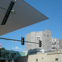
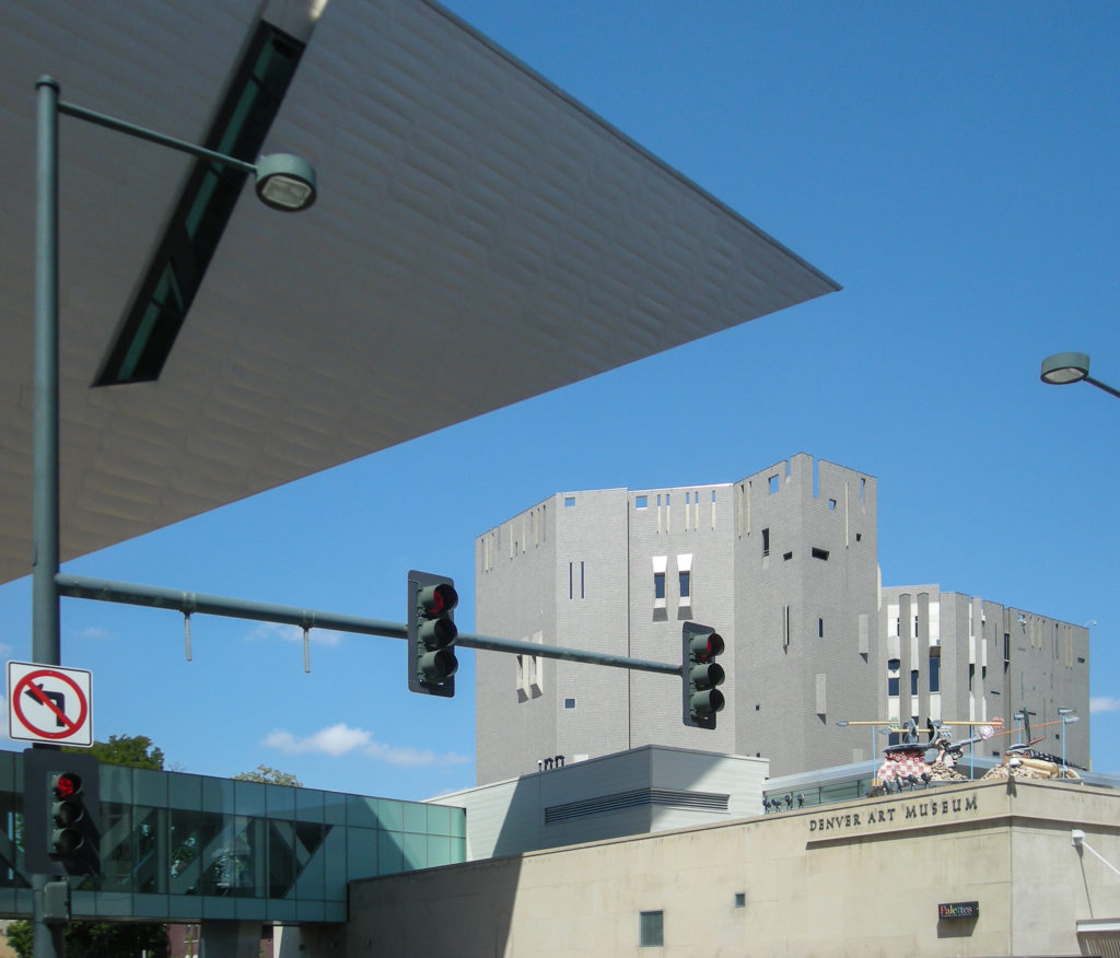
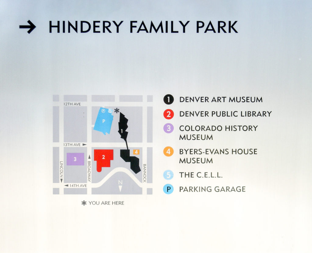
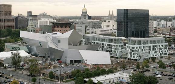
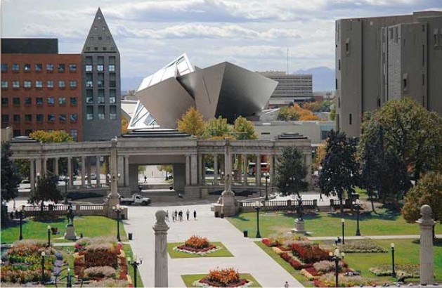
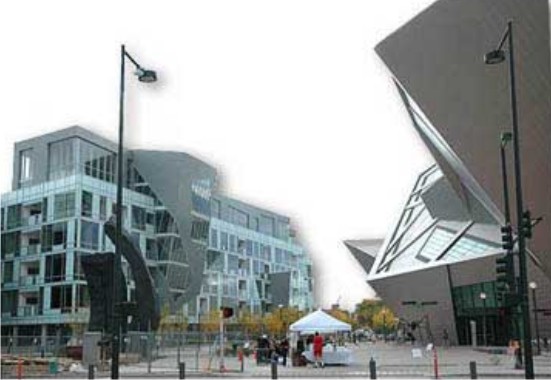
The new building is located directly south of the twin towers of the original building, and adjacent to the Denver Public Library, designed by Michael Graves.
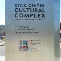
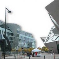
Is the core of the new cultural district of the city. The entrance is opposite the new plaza that links the Civic Center in Golden Triangle, a neighborhood of villas, before scorned, which is currently being converted into a fashionable neighborhood.
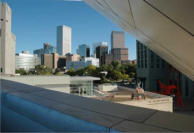
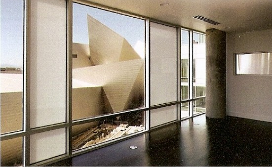
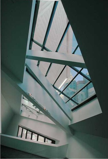
From the inside, visitors can see the mountains and the city of Denver.
Meaning
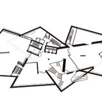
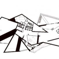
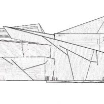
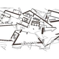
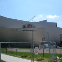
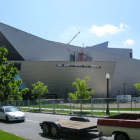
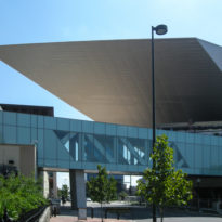
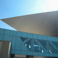
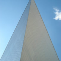
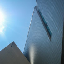
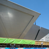
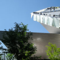
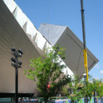
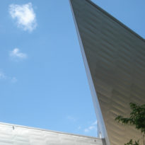
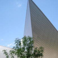
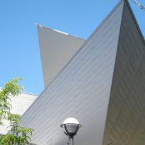
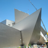
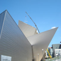
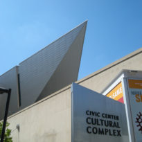
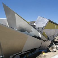
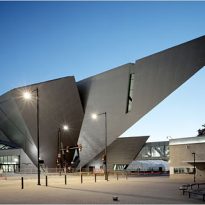
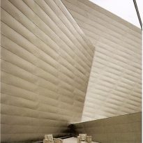
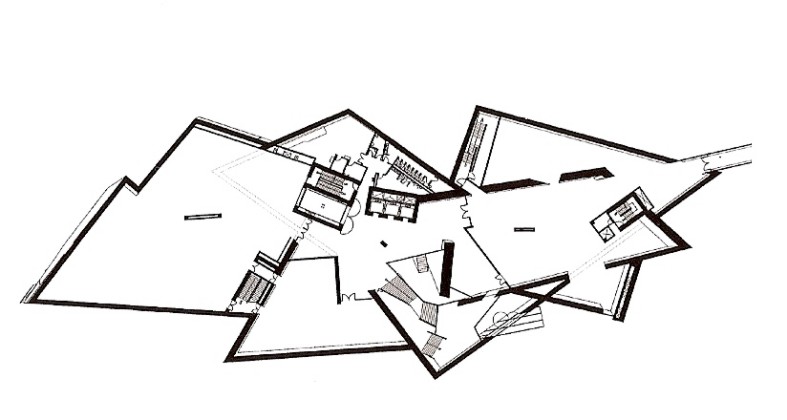
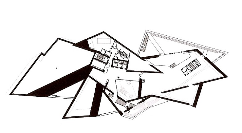
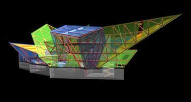
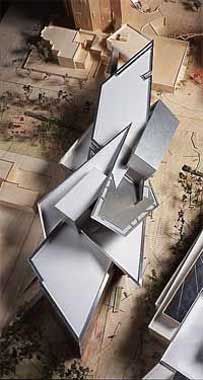
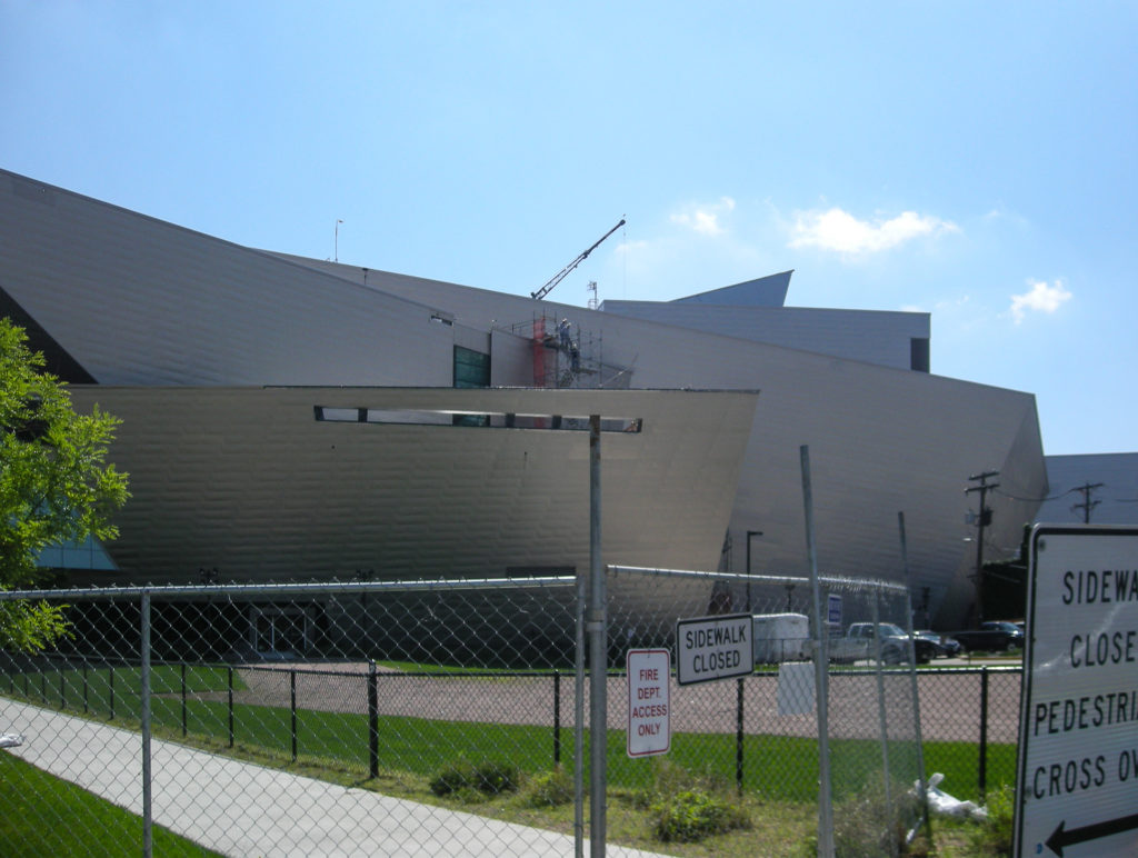
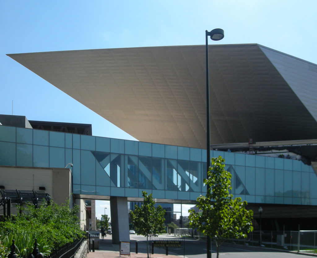
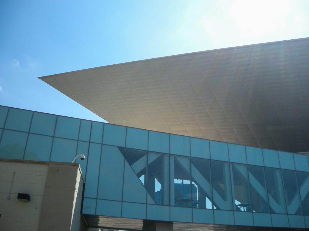
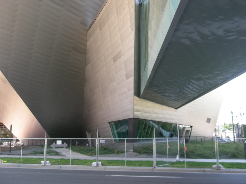
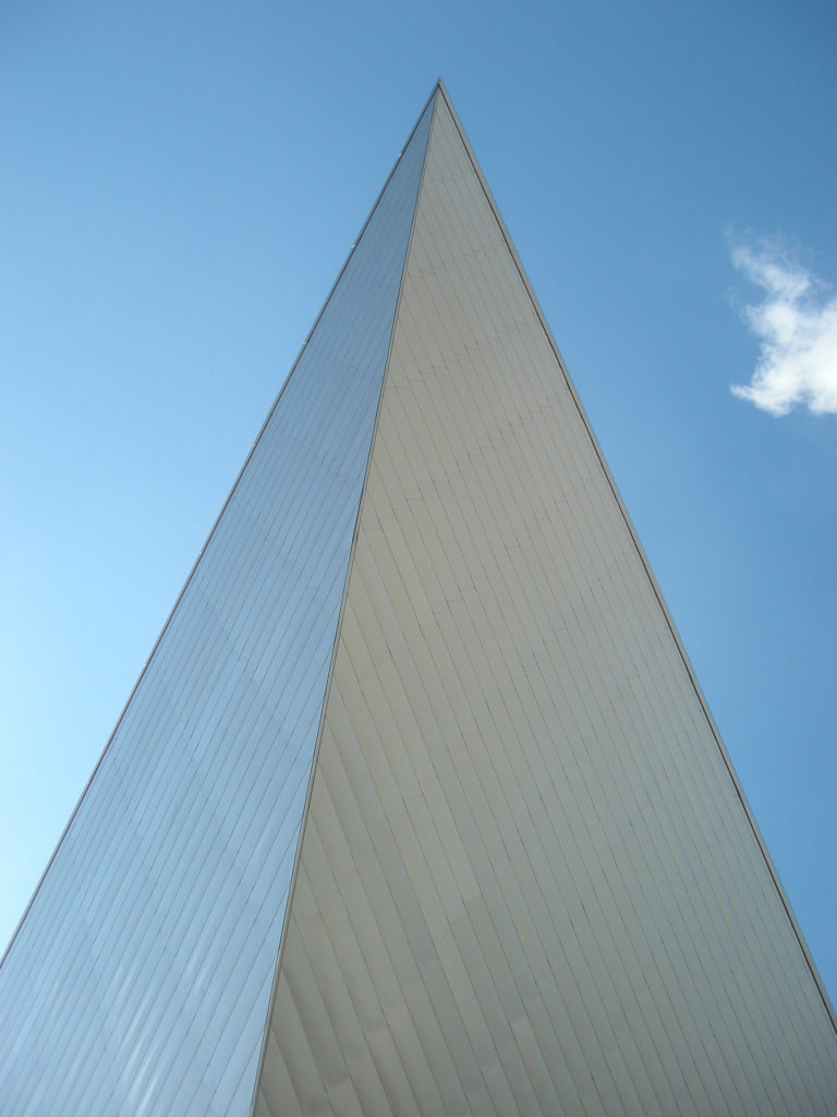
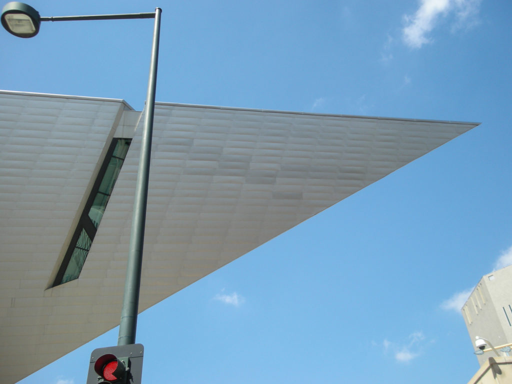
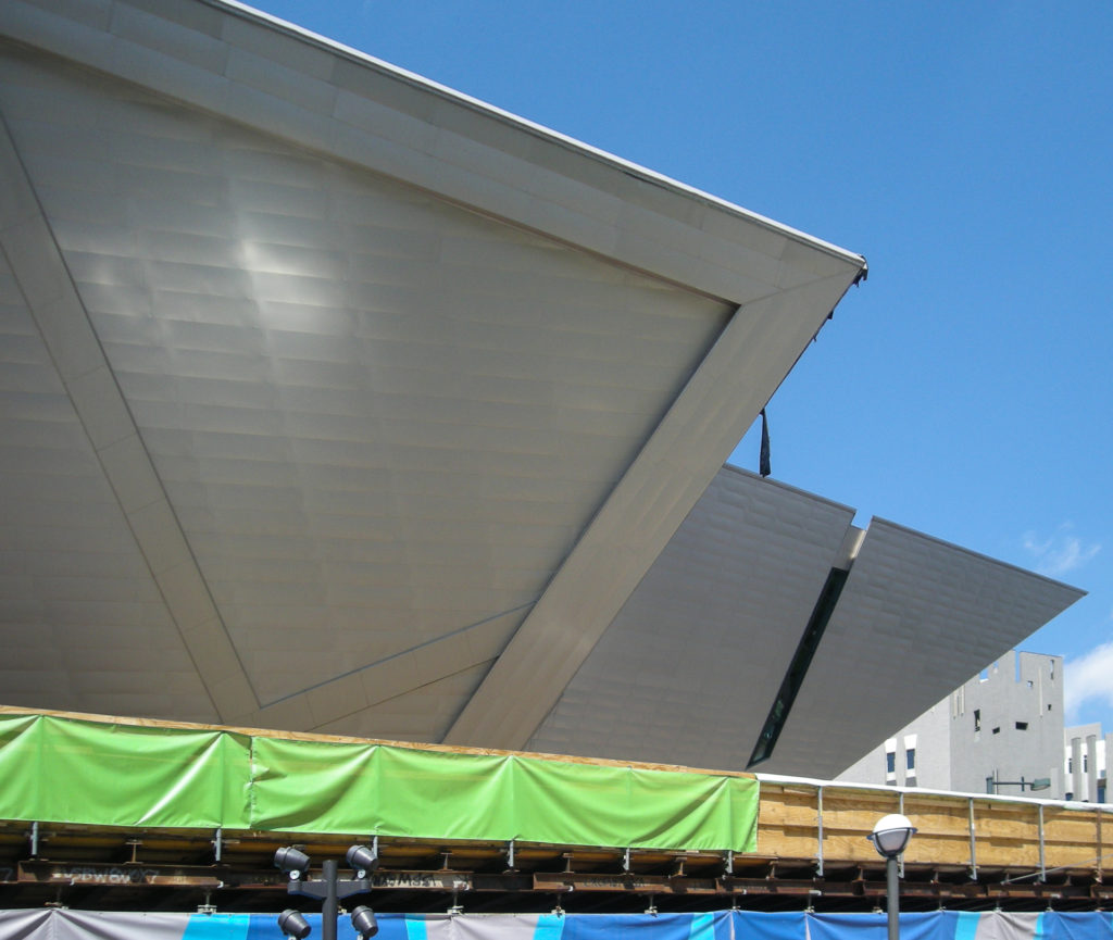
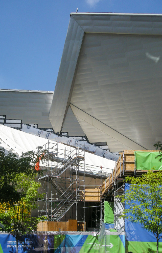
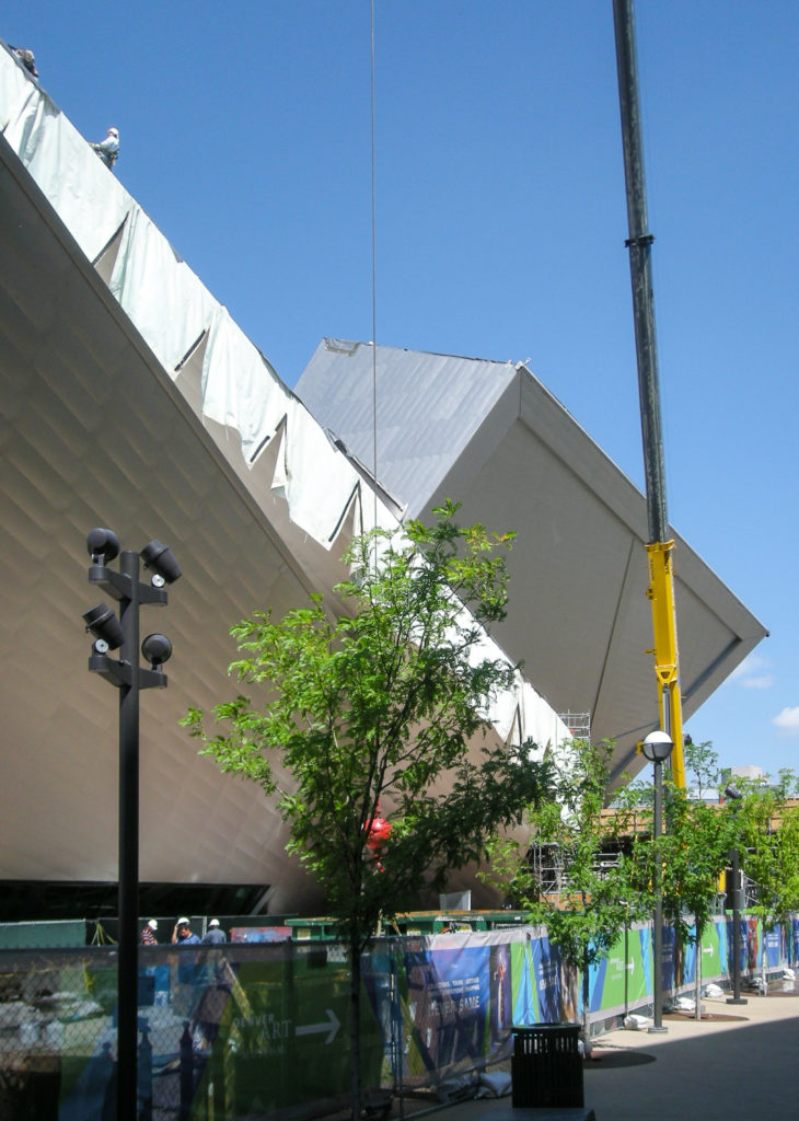
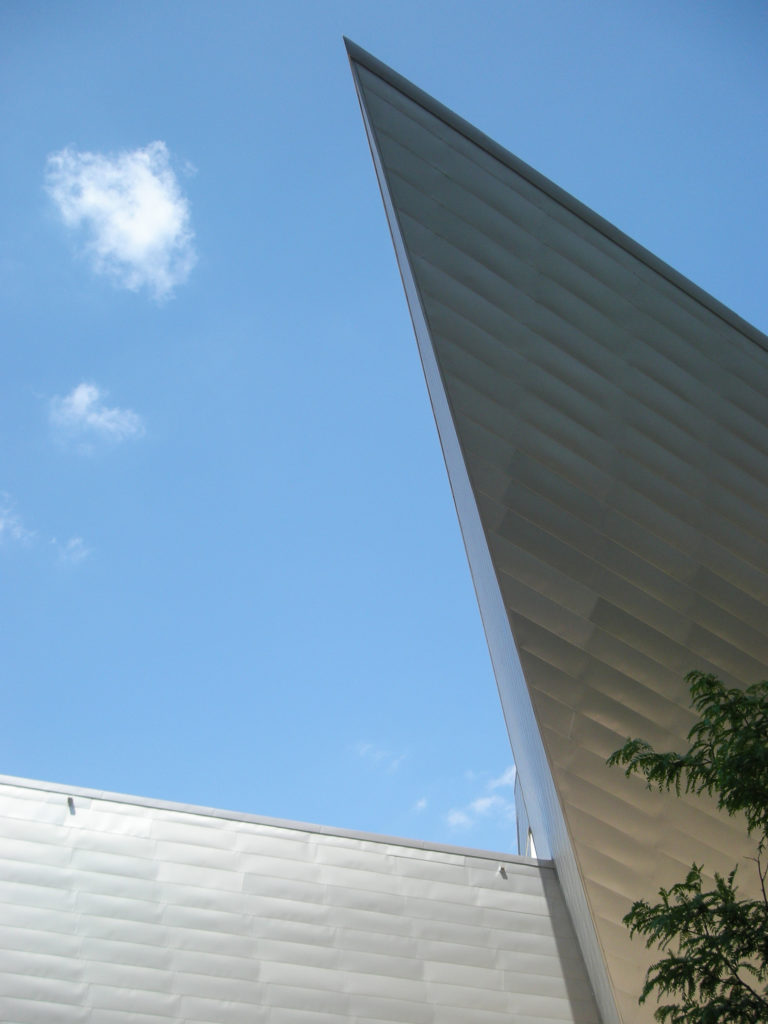
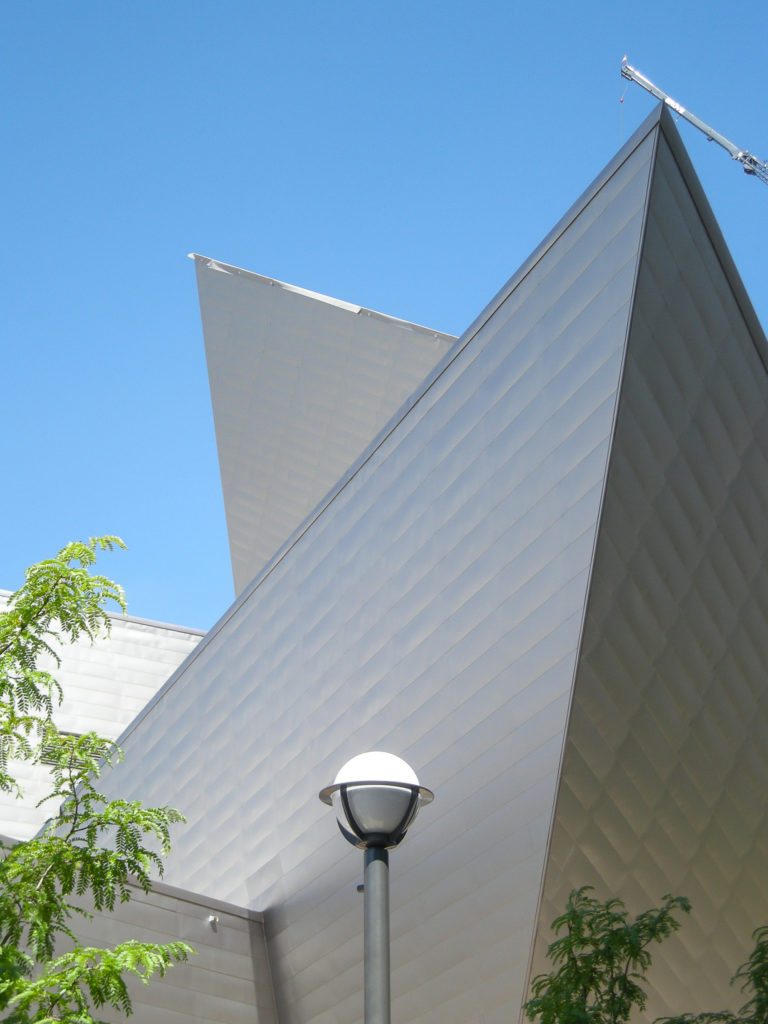
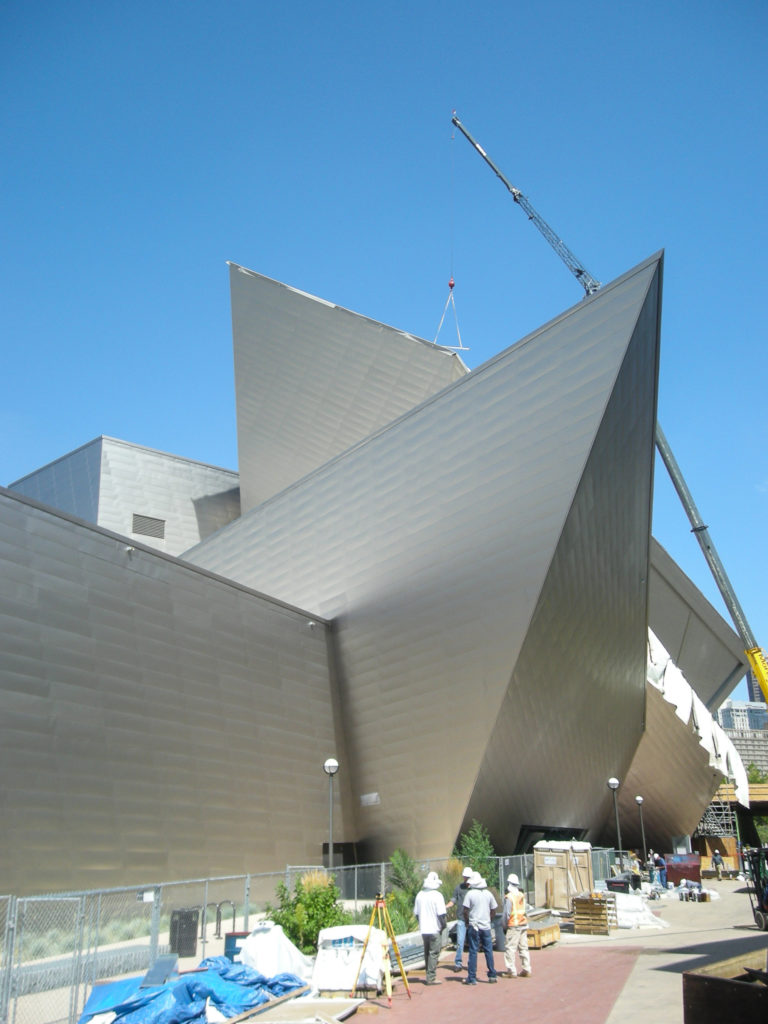
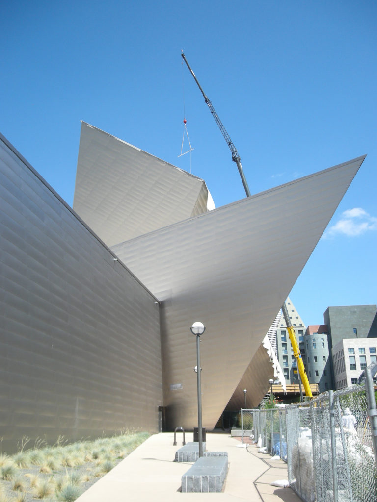
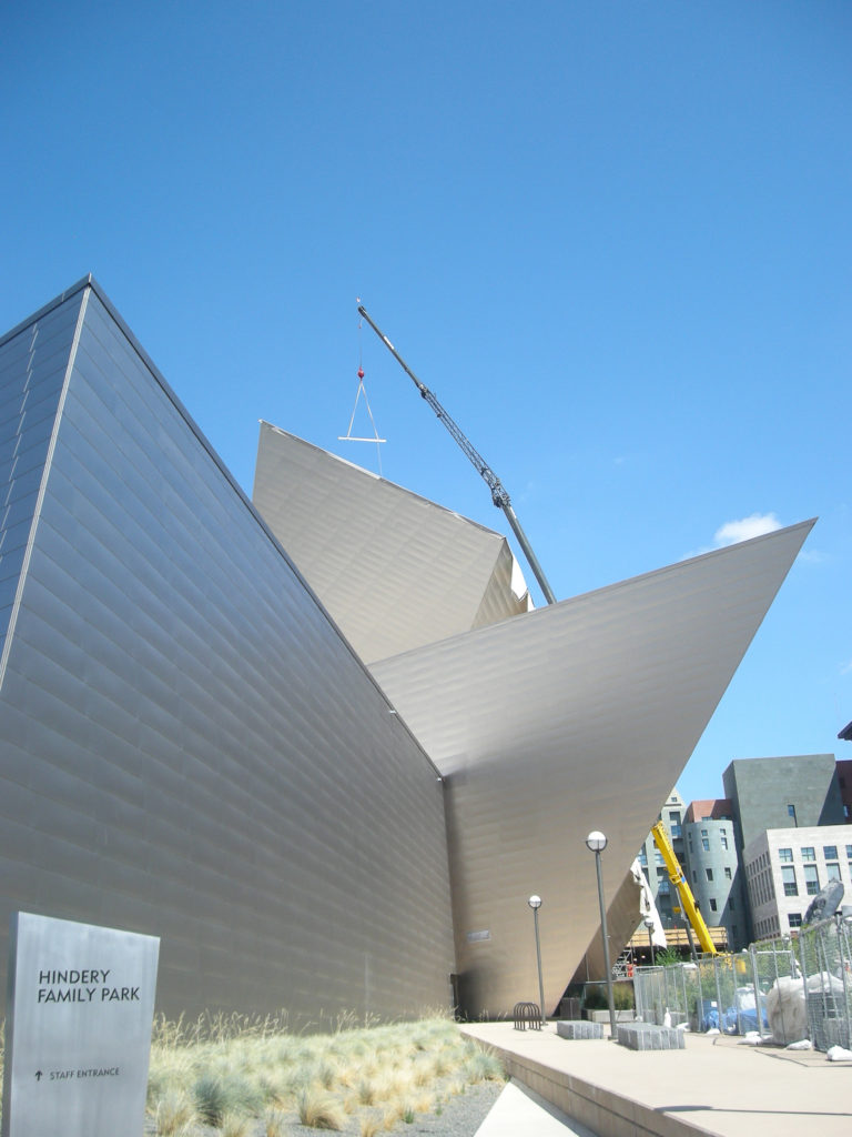
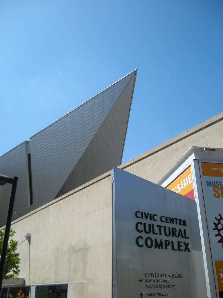
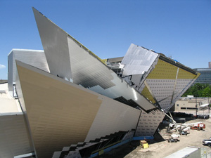
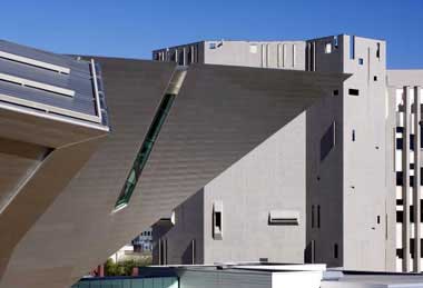
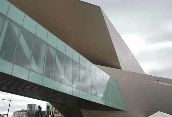
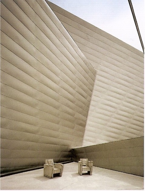
The museum consists of a series of interlocking rectangles. This is an aggressive form of geometric design, pure and irregular, glass and titanium, reflecting the peaks and rock crystal from the nearby mountains. A volume overhang crosses the street to link the structure of the Gio Ponti building by a bridge of steel and glass.
The aim of the designers has been to prevent the rebuilding of ideas already on the existing structure, pointing to a building that also communicate outside the particularity of its content, in which art and architecture are the real protagonists.
The project is designed as a single building, but as part of a composition of public spaces, monuments and gateways in the development of this part of the city, which contributes to the relationship with neighboring buildings. Museums, shops and a loft-type apartment complex, also designed by Libeskind encourage the public square.
The most striking feature of the museum is the triangular shape of a corner that is fired out of the street toward the old Gio Ponti building.
Other forms are deployed out into the square, partially covering the entrance. But the generality of the exterior lies in how it changes its appearance when looking in different directions. Fragments of a peak can guess outstanding between the towers of the city. From another angle, the structure seems static and has the appearance of búnquer. At night, the building tends to give a visually achatarse strange sense of stillness.
At the base of the building, is an approach that does not differentiate inside and outside, but a union and creates a synergy between the container and its contents.
It also has great attention to all the functions necessary to ensure maximum comfort to the visitors, also given the special characteristics of the city of Denver, subject to continuous changes in climate, temperature and lighting.
Spaces
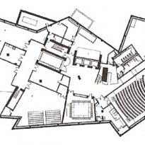
The new structure provides the main entrance to the complex and exhibition hall will be marked by the access that leads to the other new areas, such as the cafeteria, an auditorium for 280 people, bookstore and other shops.
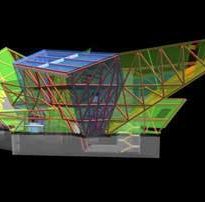
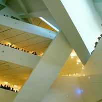
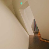
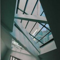
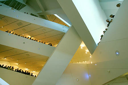
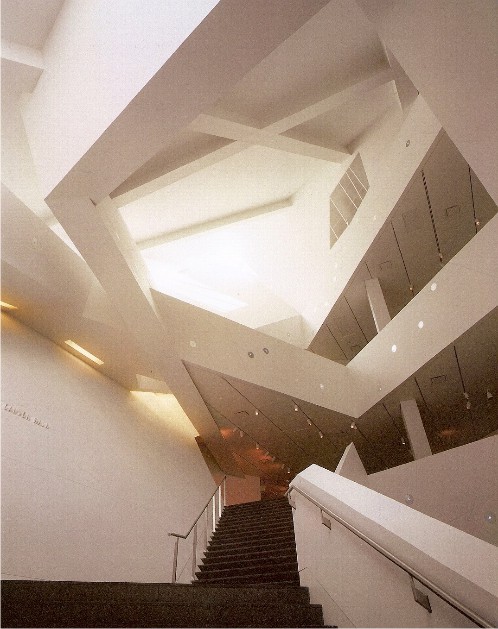
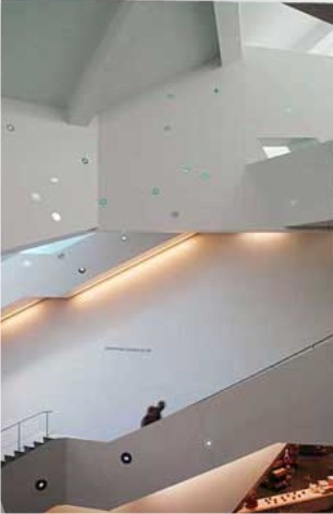
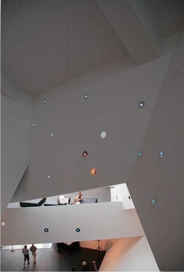
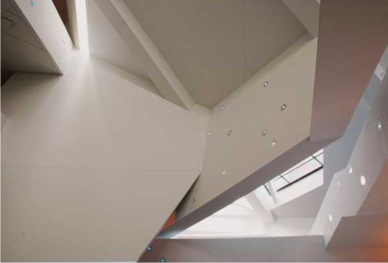
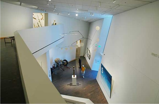
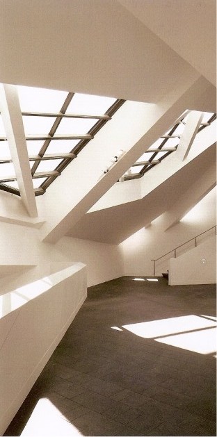
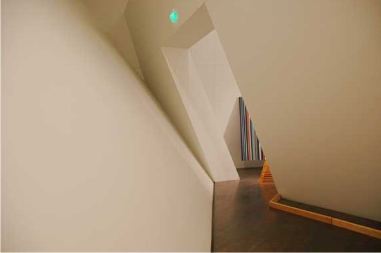
The project promotes the energy available directly upwards. The hall takes a height of four levels. Highlights its sloping walls and a staircase esperial moving along the walls, through which you access to the exhibition galleries. As it stands, the stairs are narrow and becomes more intimate. Pieces of light entering through skylights where the walls are ready intersect. Above beams intersect in the area to prevent the walls of a tumble. The planes intercepted and produce complex geometries such spaces peculiar characteristic of an attic.
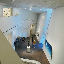
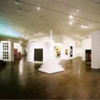
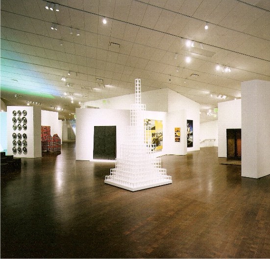
The main areas of this expansion are three: the Gallagher Family Gallery on the first floor for temporary exhibitions, the second floor of the Anschutz Gallery for contemporary art collections and Martin & McCormick Gallery, also on the second level is where art Contemporary Native American.
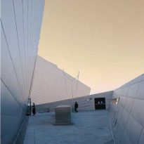
The exhibition also includes areas of green outdoor sculpture show.
They are part of the expansion, a bridge 31 meters above the building to communicate with Hamilton, a parking lot for 965 cars and an area of residential and commercial uses surrounding the building of 25,000 square meters.
Materials
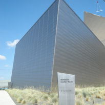
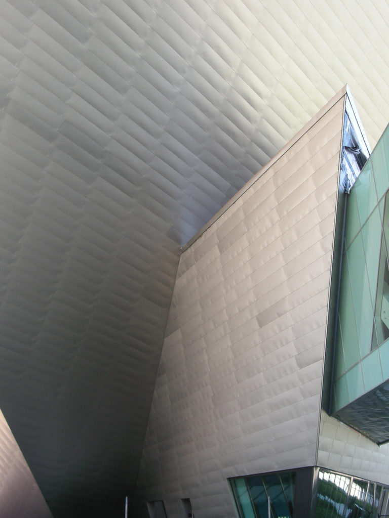
The structure is steel and concrete. For the siding was chosen titanium and granite, thus looking for a dialectical relationship with the other elements of the context: monuments, public spaces, infrastructure.
In 2740 the building was used tons of steel, 21,368 square feet of titanium and 5658 cubic meters of concrete.
Video
