De Young Museum

Introduction
The de Young Museum was originally created as the Fine Arts Building and built as an extension to the pavilion California Midwinter International Exposition of 1894 in Golden Gate Park San Francisco, California. The president of the organizing committee of the exhibition was H.de Michael Young, co-founder of the San Francisco Chronicle, for whom the museum is named. It is usually called simply “The Young”.
The first collections of the museum grew as Young’s eclectic tastes over the years acquired a wide range of paintings and objects, mainly from South Pacifici. Eleven years after its opening, the great earthquake of 1906 caused significant damage in the building Winter Solstice, Midwinter Hall, forcing a half year closing for repairs.
Soon the museum needed new space to better serve its growing audience. Michael Young said planning for the building that would serve as a nucleus for future installations of the de Young Museum throughout the twentieth century.
The old museum was a bulky structure decorated with ornaments made of concrete, which began to fall and be dangerous, being finally eliminated in 1949. In 1989 the original building was completely destroyed by the Loma Prieta earthquake, his remains were finally demolished in 2002.
Through the years, de Young Museum has changed, with adjustments and additions. The most recent restoration was completed in 2005 and conducted by the Swiss architects Herzog & de Meuron
Location
The de Young Museum is located at 50 Hagiwara Tea Garden Drive in Golden Gate Park, San Francisco USA. Golden Gate Park has an area of 4.12 km long and 1 mile wide. Configured as a rectangle is the third most visited city park in the U.S., after the Central Park and Lincoln Park in Chicago
Concept
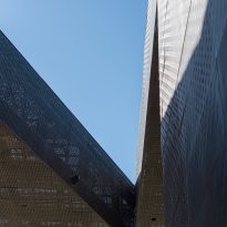
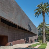
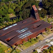
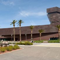
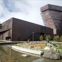
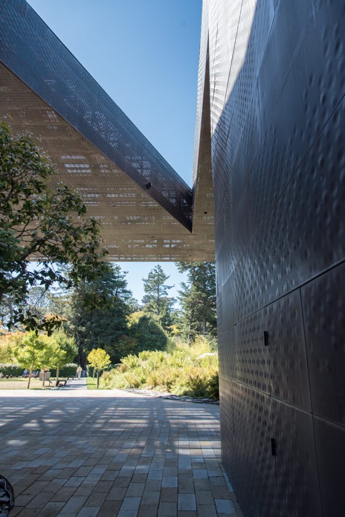
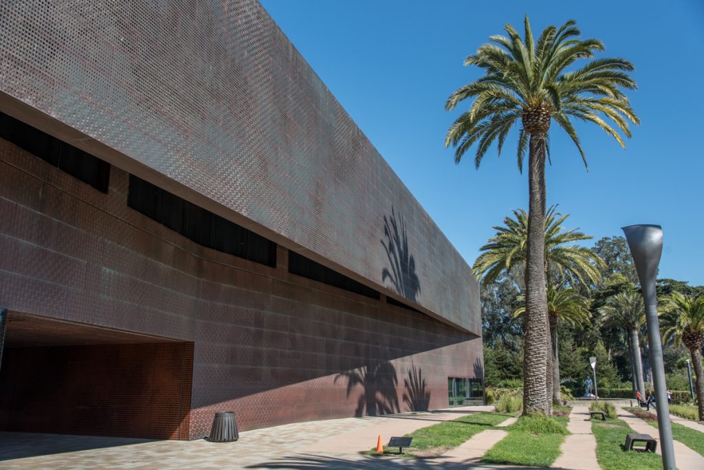
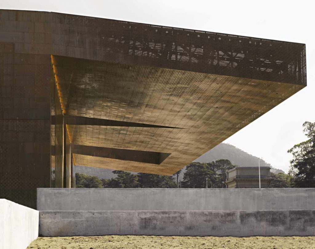
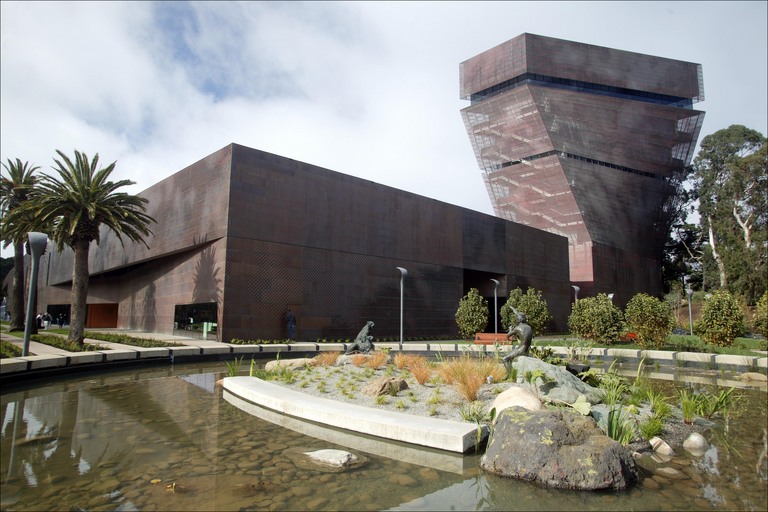
The goal of the redesign was the combination of natural light and materials, including copper façade that oxidizes over time and mixed with the natural environment. Unlike the old museum, the new design consists of a bold structure that attracts attention and becomes part of the exhibition as well as the art it contains.
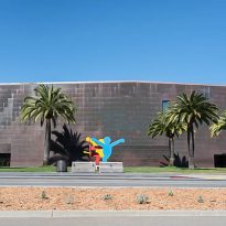
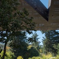
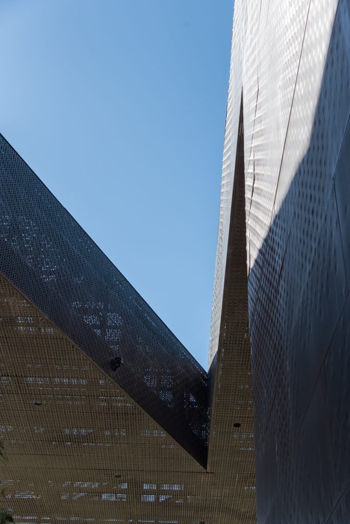
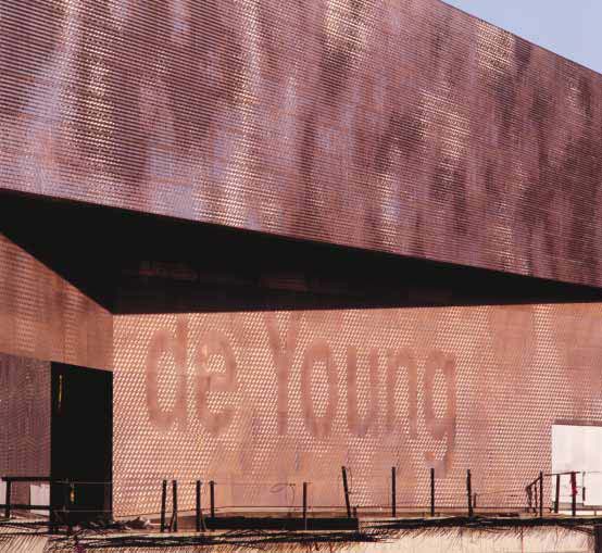
The desire of architects to have a building that is mixed with the park, led them to wrap it with a copper skin texture which was subsequently modeled with pictures and patterns that represent the lights that filter through the canopy of park.
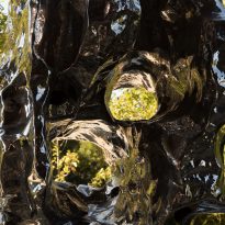
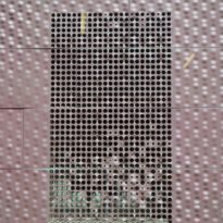
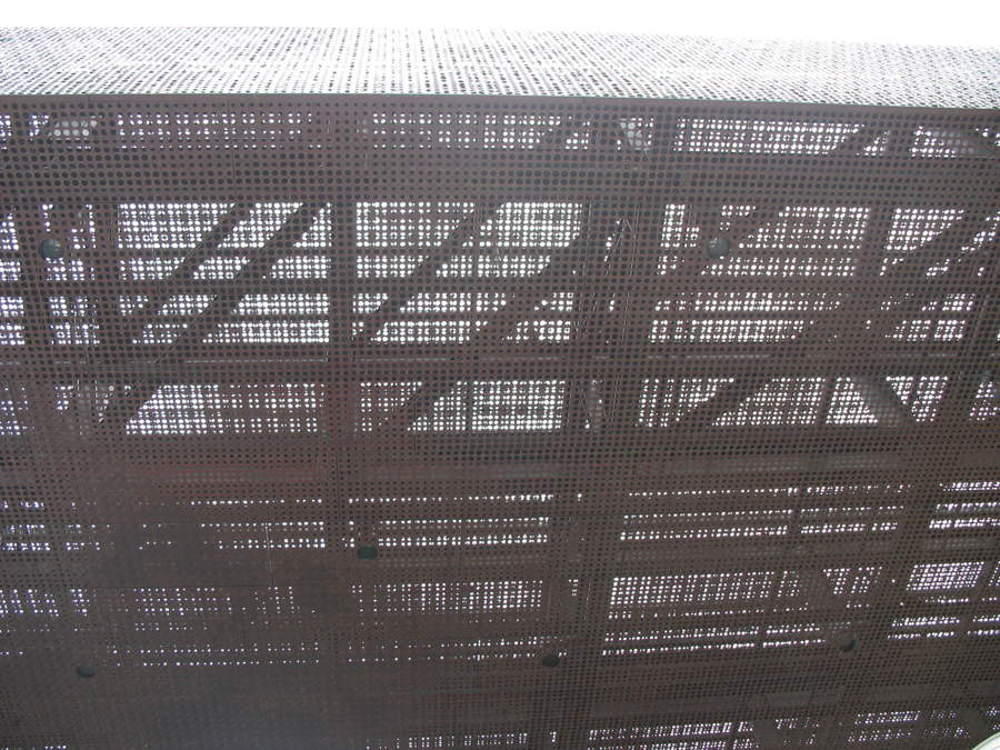
The photos are turned into abstract patterns embossed in a “dimples and pimples” with varying degrees of depth, which were stamped in copper panels that camouflage the structure.
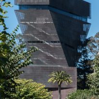
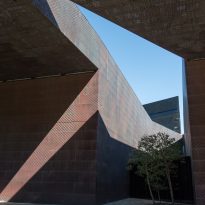
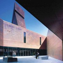
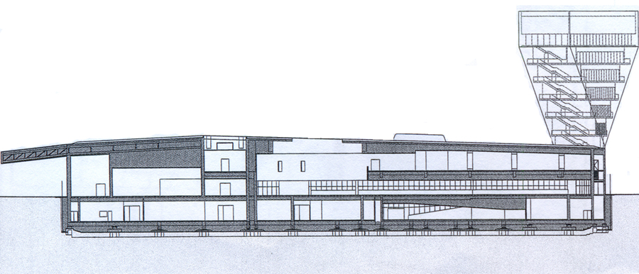
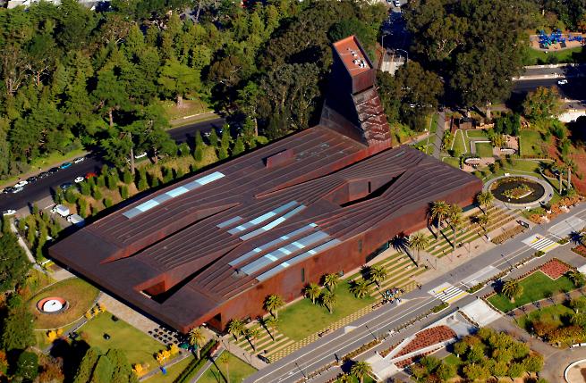
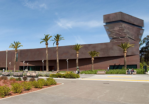
The design becomes a monument on the horizon, with a tower 45 meters high with a dramatic shift in its center, from the ground to the sky, making a bold statement, both near and far and a monument honoring distinguished modern history exhibits.
Inspiration
In their design concept, the architects were influenced by the sight of a windmill collapsed wood and copper found in the near Ocean Beach, to walk through the Golden Gate Park to get an impression of the environment in which they had to build the new museum
Environment
The landscape was designed to create a pleasant and functional, allowing visitors to enjoy a climate of welcome to California.
The large windows of the tape erased the boundary between the interior of the museum and the lush greenery outside. Its four tickets to the public follow the natural forms of the park’s trails, welcoming visitors from all directions.
Exterior
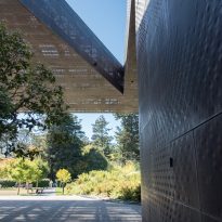
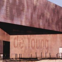
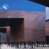
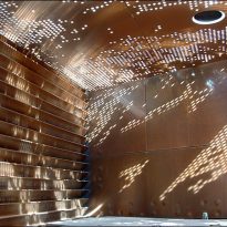
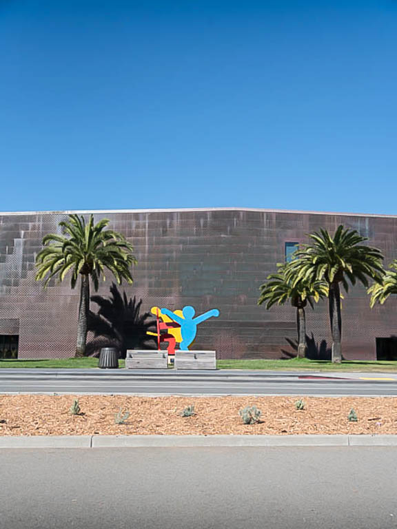
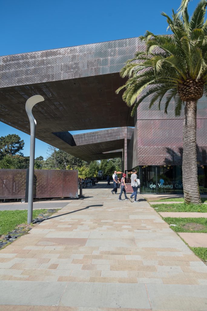
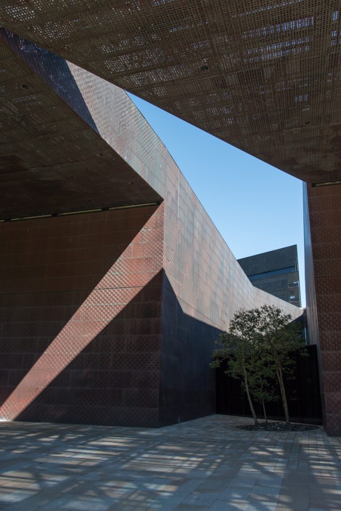
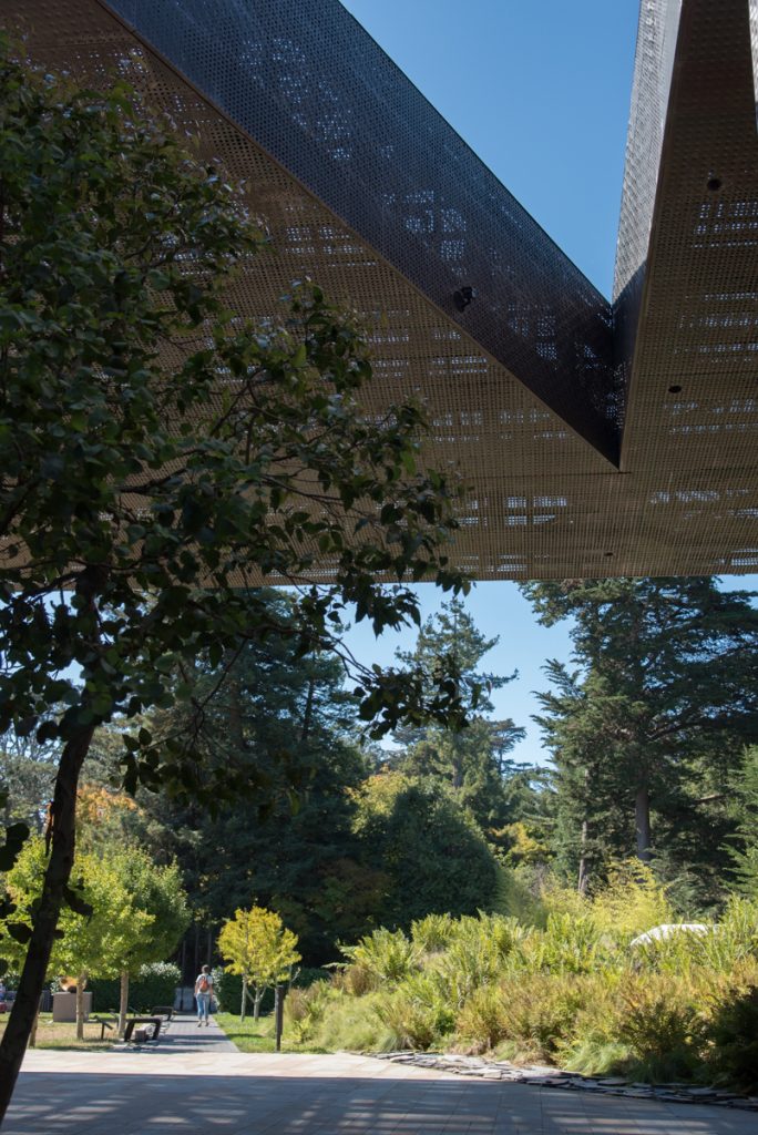
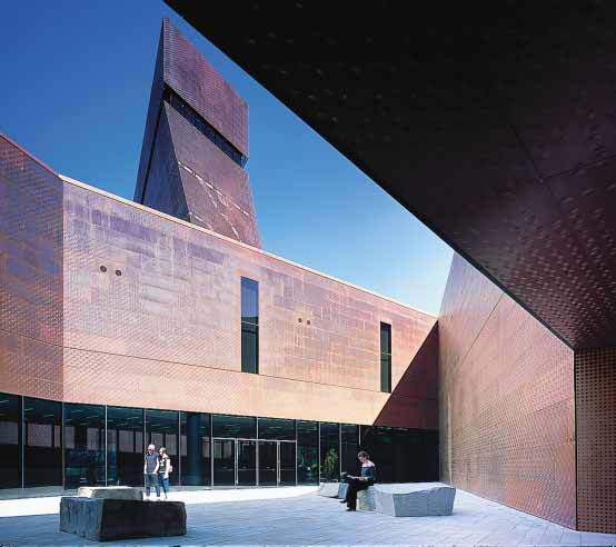
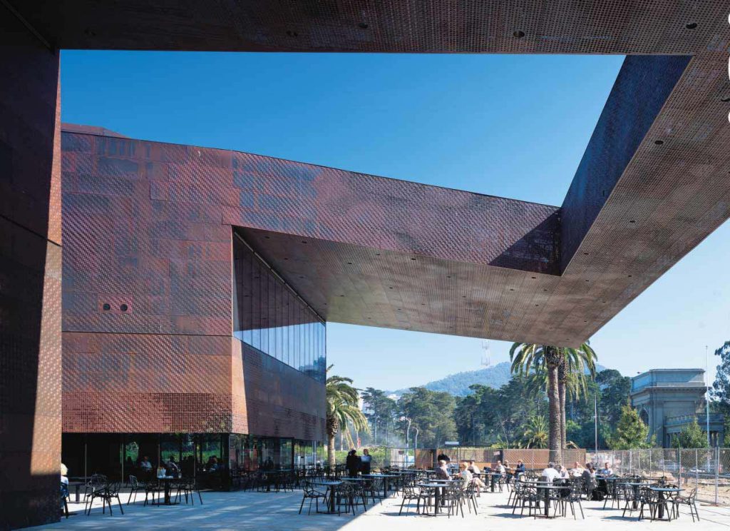
The dramatic copper façade of the building is perforated and textured to replicate the sensation caused by the light filtering through the treetops, creating an artistic abstraction that is consistent with the woodland environment. The copper skin, chosen for its quality can be modified by oxidation, it shall, in time, a patina that will blend gracefully into the natural environment.

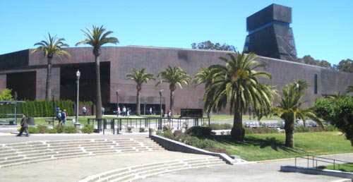
The northeast corner of the building has a 45 meter tower, which rises up in a spiral from the ground floor and aligns at the top of the street network of Richmond and Sunset neighborhoods surrounding the park. An observatory open to the public offering panoramic views of the Bay Area
Landscape design
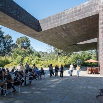
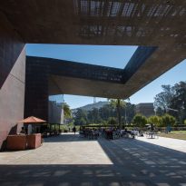
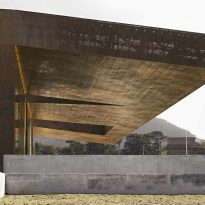
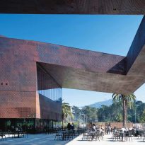
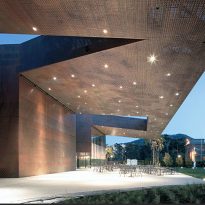
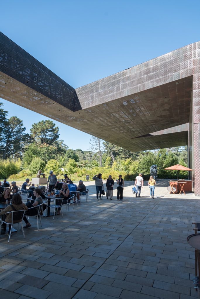
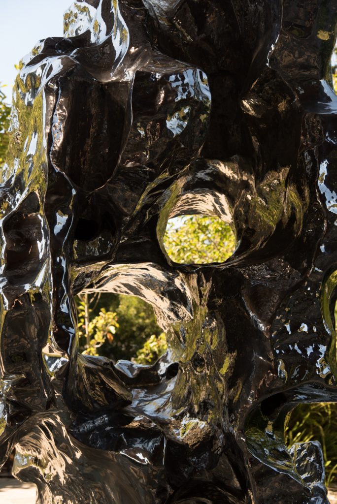
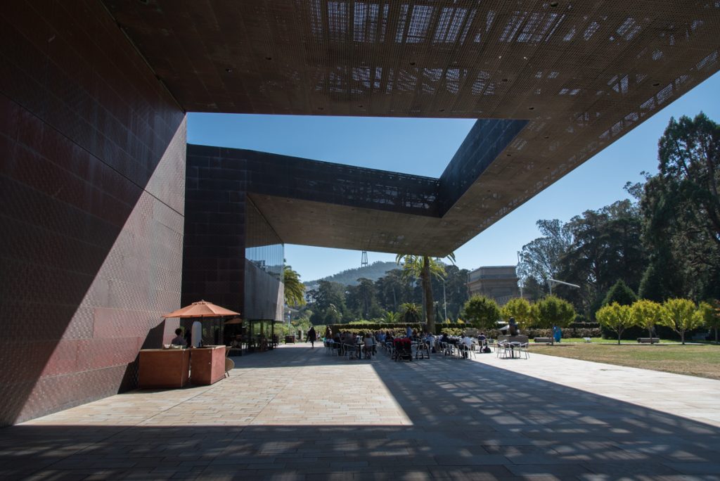
The outdoor environment of the new de Young Museum has a public garden sculptures, a terrace under an overhanging roof, a special children’s garden with a landscape that creates a direct relationship between the building and its surroundings by its four sides.
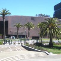
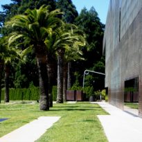
The landscape design incorporates historical elements of the old Young, including sculptures of sphinxes that have remained standing since the museum opened in the nineteenth century, the Pool of Enchantment and the original palm trees, as well as sandstone, redwood, the ferns and other plants and related materials, by creating a museum permeable, open and welcoming to the public.
The long, soft mound where the building recalls the original topography of sand dunes. The dunes have long since disappeared and given the lush greenery of the park, even hard to imagine. However, sand and earth which exists below the surface created by man. Tons of sand were taken during excavation to build the new museum.
Description
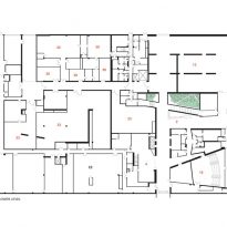
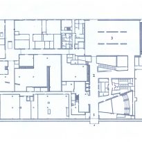
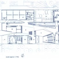
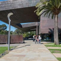
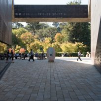
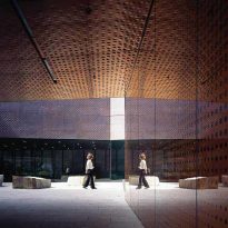
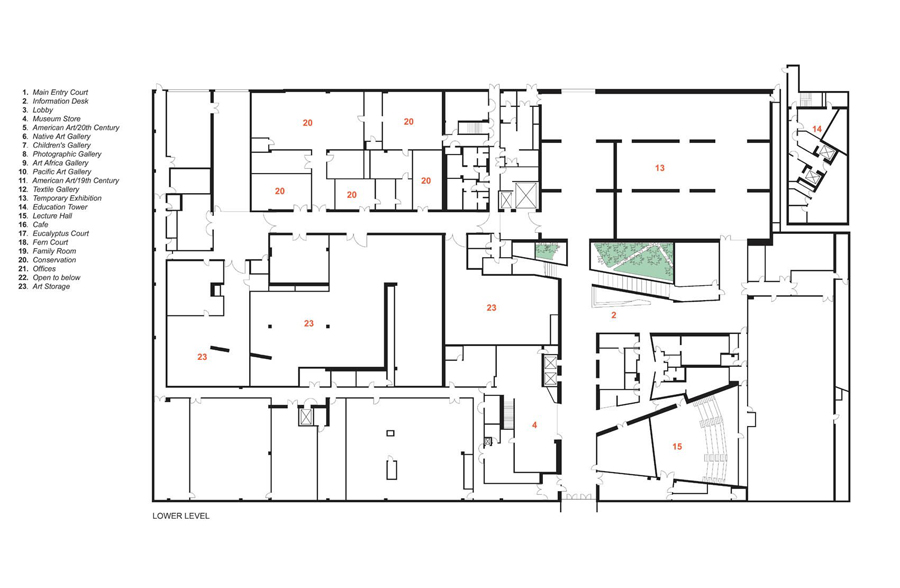
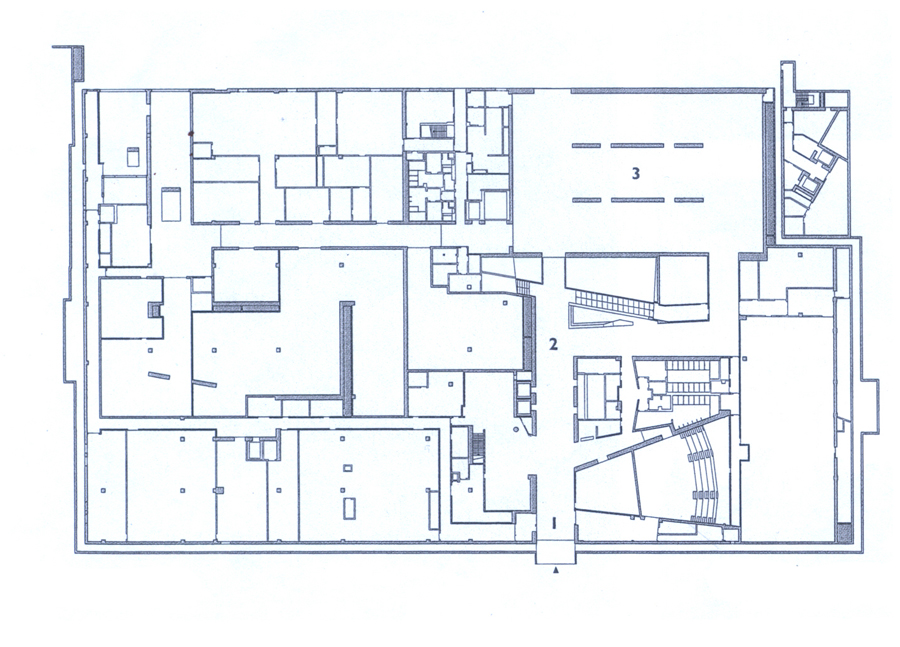
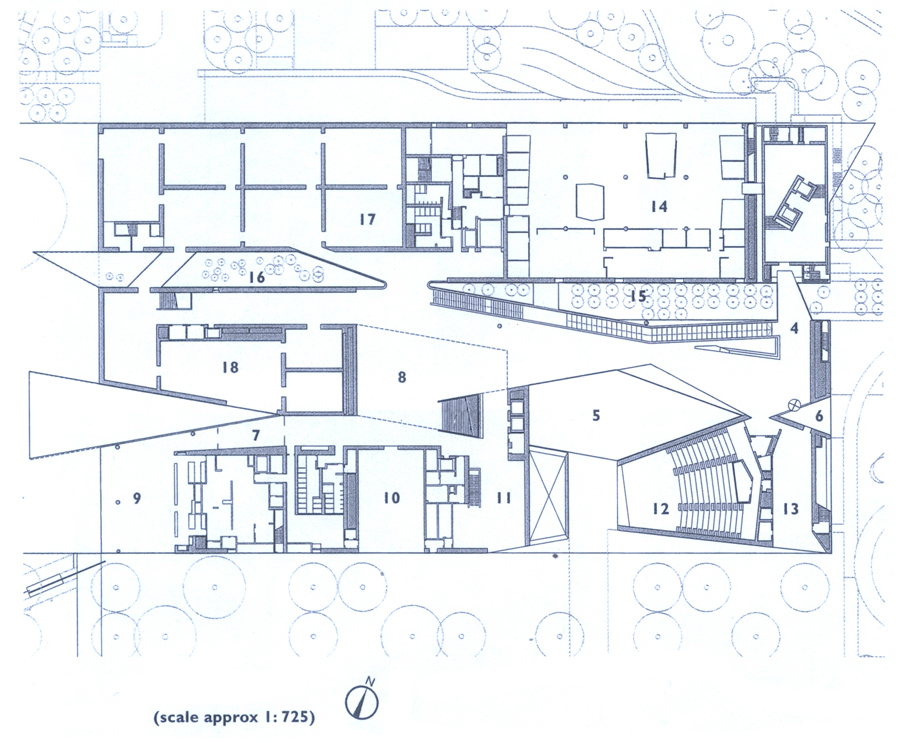
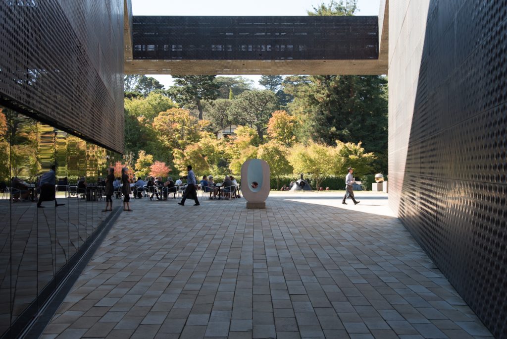
The main entrance is a gap of 9 meters driving through a copper covered walkway to a central courtyard giving access to an elegant living room with Italian sandstone floors where you can access some of the many exhibition halls of the museum. The sophisticated use by architects drawings combined with parallelograms and triangles are obtained spaces full of life and fluidity.
A long staircase leads visitors from the lower to the ground floor and glazed walkways leading to the numerous gardens and terraces of the museum. Other stairs lead to the exhibition halls on the second floor.
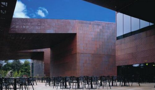
In the southwest corner down the sloping roof ends in a projection that protrudes on the cafe terrace. The terrace merges with the Barbro Osher Sculpture Garden, which shades beyond the Japanese Tea Garden.
In the northeast corner tower commemorates that rose above the old building. Two structures link the museum in its narrow place, between the Music Concourse and the John F. Kennedy Memorial Drive to the large park surrounding it.
From the promenade between the Music Concourse and the facade of the museum, the viewer sees the palm trees on a continuous carpet of grass. But as you approach the entrance, addresses a series of narrow stone pathways that appear to connect the areas on both sides of the walkway. Banks are set intermittently on the roads.
Spaces
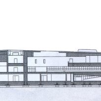
The new de Young Museum is composed of a building with three levels dedicated to the exhibition of works of art and a 9-story tower dedicated to education. The building has exhibition galleries, auditorium, laboratory of conservation-restoration and public spaces.
Distribution
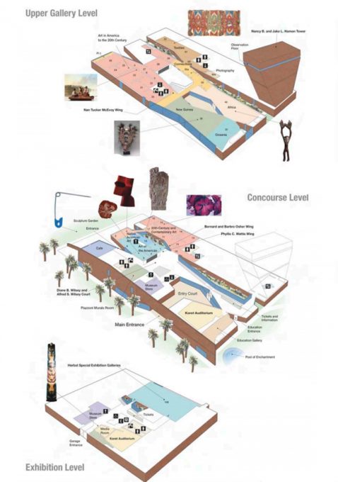
Building
- Building Size: 27,220 meters square
- Permanent Exhibition Halls Area: 6,800 square meters
- Temporary exhibitions Salas Area: 1,115 square feet
- Other areas of art exhibitions: 1,022 square feet
- Educational areas: 1,858 square feet
- Conservation facilities: 1,226 sqm
Landscape around
- Sculpture Garden: 3,252 square feet
- Children’s Garden: 4413 meters square
- Entry Patio: 102 square meters
Services for visitors
- Museum shop: 362 square meters
- Cafe: 344 square meters
- Auditorium / Hall of reading: 362 square meters
- Observation Tower: 232 square meters
Structure
In the structure of the building have been used 2323 tons of structural steel, 2,500 tons of rebar, 1134 tons of rebars and 1,500 tons of reinforced concrete.
Seismic system
The insulation system of the base of the foundation allows a horizontal displacement of 3′-0 “during a possible earthquake.
Materials
Known for his experimentation with materials in their designs, Herzog & de Meuron have contributed to a modern structure that together with the original features remain, function successfully as a museum and become a monument of its kind as it was at the time the original museum.
The choice of natural materials for its construction allows the design to become part of the land it occupies.
The Museum has been constructed with warm materials and natural as copper, stone, wood and glass, making the new de Young Museum to mix and complements the surrounding natural environment.
Interior

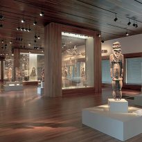
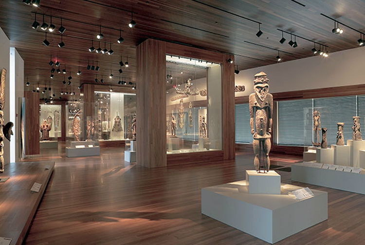
Inside, hardwood floors sustainable production of eucalyptus and finishes create a warm atmosphere that accompanies visitors from one room to another.
The layout of the HVAC system improves indoor air quality and energy efficiency. The combined use of natural and artificial light provides optimum comfort for the display of art as well as energy saving
Facade
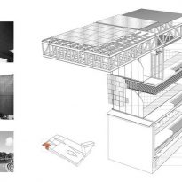
The skin of the facade required 431,000 kg of copper, 136,000 kg of glass and 7,200 copper panels of which no two are alike, were drilled and punched individually and facade covering 18.000m2. Other copper 13.000m2 covered the roof.
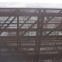
Perforated panels, used where the air intake or exhaust were needed, have been drilled with holes of different sizes that are orthogonal patterns. Although non-perforated leather construction gives an airy transparency, sunlight creates a continuous effect on the walls waving motion passed. The designers were green metal corrosion as a natural ecological cycle in line with the park.
Video
