Condé Nast Cafeteria

Introduction
Condé Nast The Gehry project instructs the cafeteria for its new corporate headquarters for its prestige and its spatial searching, in regard to the design if the program ceases to work freely Gehry to perform work within its style.
The only guidelines imposed by the program are in relation to the amount and function of the design space as well as the capabilities of these, and the cafeteria had to respond satisfactorily to the demand that occurs during the hours where employees have their downtime.
Location
The cafeteria is located in the new corporate headquarters in the Condé Nast building was designed by Fox & Fowle, is located at number 4 Times Square in New York in downtown Manhattan, the commercial point of reference of the city.
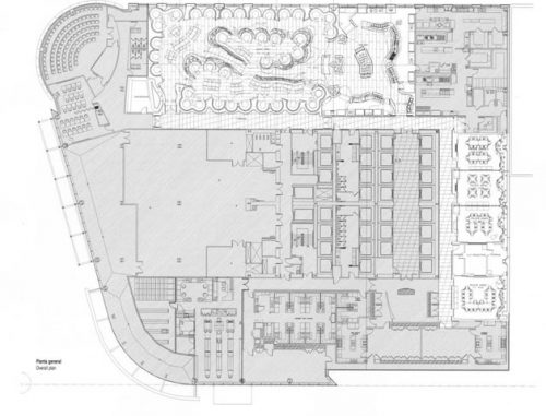
The cafeteria is located on the fourth floor of the building, occupying approximately one-third of the plant. The rest of the floor with offices and an auditorium at one end, the environment is clearly corporate confectionery with a completely different picture to that presented here.
Access to the cafeteria is through a corridor that surrounds the space that acts as a mediator between the environment and the central space through this corridor can be access from multiple points.
Concept
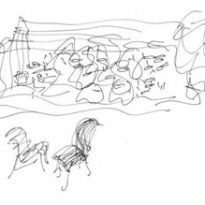
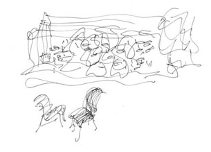
There is no doubt that Gehry is an architect can build anything, which is why it sought to give a new approach to the idea of what a cafe should be a corporate building.
He looks with a more than positive that the space changes shape the culture of the company, firstly into the struggle for food and then enter a free open banquet formalisms.
Gehry has an informality that fosters friendship, casual encounters, also encourages the romance in their search thaws the cold social climate that is usually generated in such spaces.
Spaces
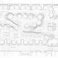
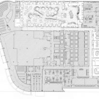
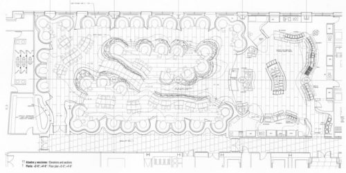
The cafeteria has space for 260 people, including a main dining room, a private office and four feeders.
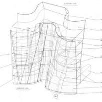
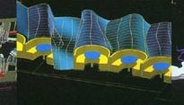
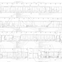
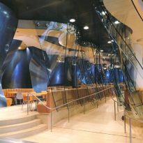
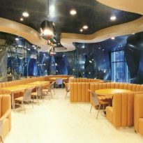
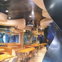
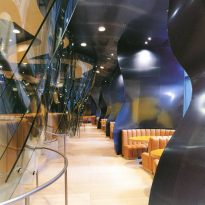
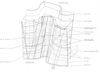
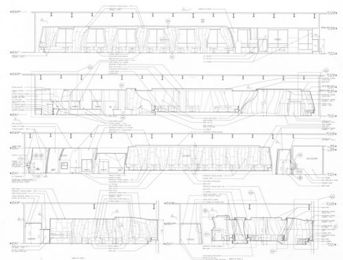
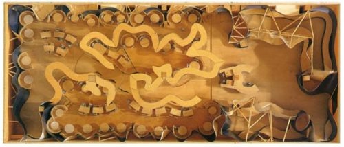
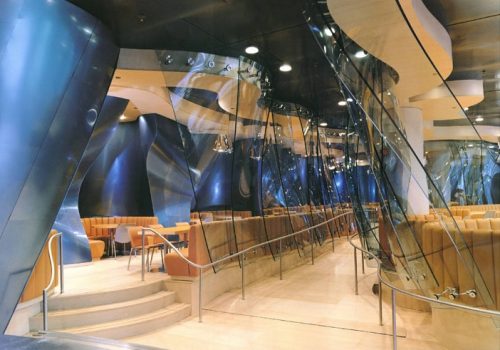
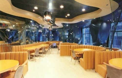
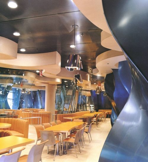
The main dining room is arranged so that it can provide a variety of seating arrangements creating an atmosphere that is both intimate and open, custom designed to accommodate a number of booths from 4 to 6 people. Each cabin is distributed along the perimeter walls. The walls undulate in response to the geometry and overall configuration of the booths.
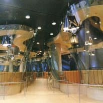
Other additional cabins are on a raised platform enclosed by curved translucent panels in the center of the main dining room, all over this place are distributed loose tables with chairs, all designed in this study.
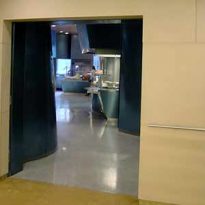
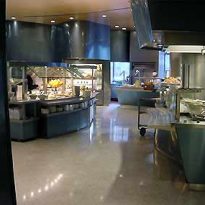
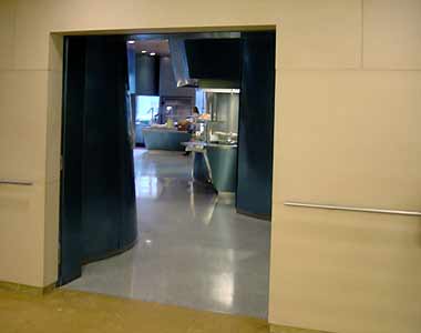
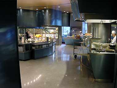
The office (servery), is adjacent to the main dining area is a fully equipped facility where it offers a functional whole range of dishes available there.
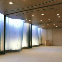
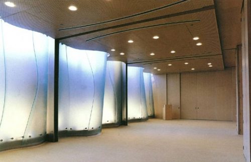
The four private dining rooms are located at the same level as the principal and the office, but make individual and separate spaces for lunches and special presentations. Curved translucent panels articulated the east wall of each room, providing natural light to all these.
These kitchens are equipped with audiovisual equipment due to its use for special occasions, three of these canteens have movable partitions, allowing a variety of spatial configurations according to the occasion and necessity.
Structure and Materials
Structurally, the architect had no concern and that we only considered the design of space on an existing building.
The walls of the main dining room booths are covered with perforated panels that include a blue titanium acoustic insulation to absorb the sound in the place.
The curved panels of clear glass are reserved, the floor is a plywood-finished ash, while the roof is covered like the walls of blue titanium perforated panels, making tuning.
The office has curved stainless steel countertops finish “angel hair”, the walls and canopies of blue titanium, floor and ceiling of ash wood. All these materials are to enhance the sculptural and aesthetic character of the main dining room.
The four private dining rooms have walls, floor and ceiling ash plywood with clear glass panels.
