Church in Marco de Canavezes

Introduction
The Santa Maria Church in Marco de Canavezes is part of an overall complex that forms a parish center. The decision to choose as the architect Siza’s particular choice of Hyginus Nuno father who trusted fully in this architect to develop this very ambitious project.
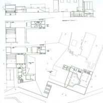
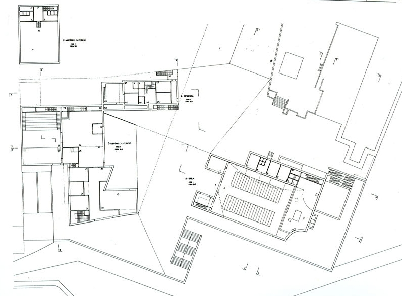
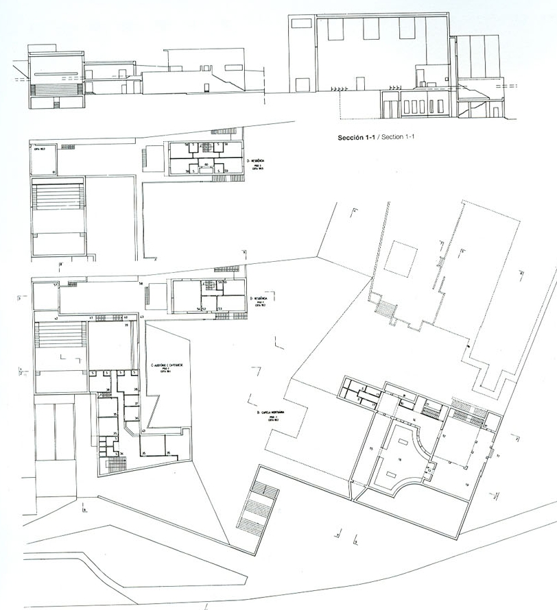
The program for this rural parish comprises three buildings of two floors:
- Church and Chapel Funeral Home.
- Auditorium and Sunday School.
- Housing pastor.
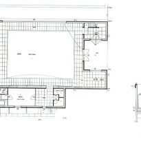
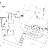
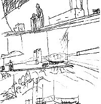
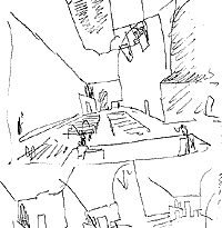
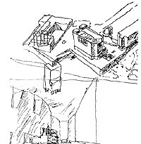
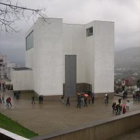
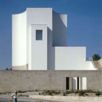
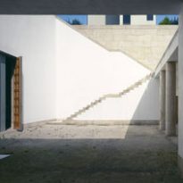
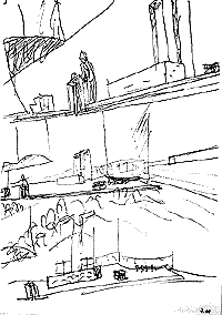
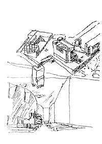
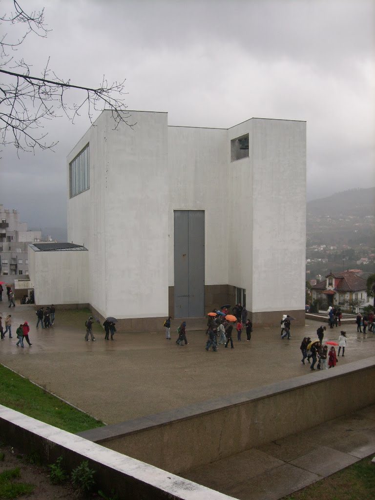
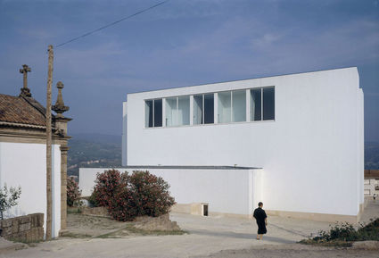
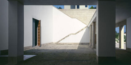
The new buildings are arranged around a central courtyard, a ceremonial space located opposite the entrance of the church. In the plan proposed by Siza the church plays a central role ensures that the entire complex shall be consistent with the scale of pre-existing buildings nearby.
Location
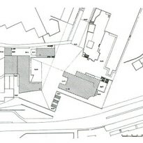
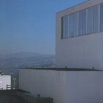
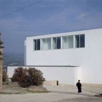
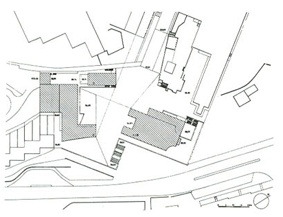
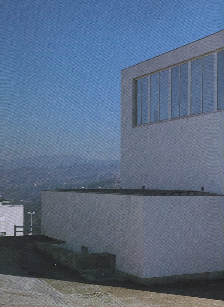
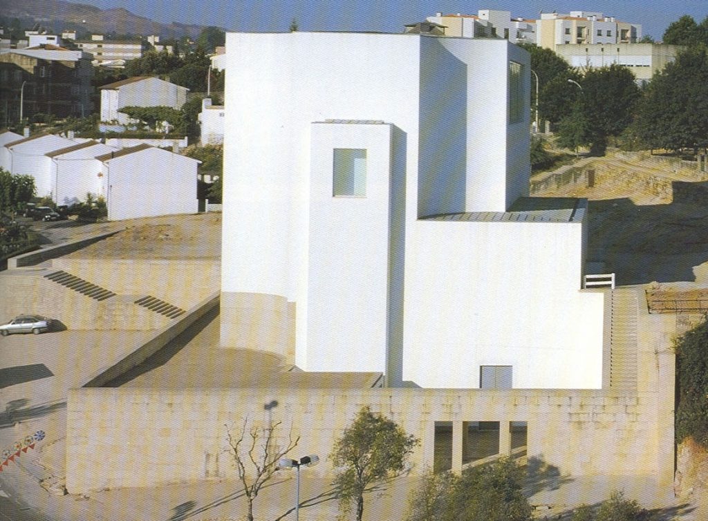
The church is located in a village of rural characteristics in extremely difficult terrain, topographically complex: a hill surrounded by its main access road, which passes in front and laterally.
There is another access, located on the opposite side to a different dimension, so the architect had to shape this field completely slipped.
According to the same Siza was very helpful the presence of a very beautiful building but not geometrically precise, it was the only solid element in its area, the building stands behind the hill where the church and therefore the analysis topography, sought to relate much to this volume, which is very notable, placing the church at right angles, taking the hill in a symmetrical way.
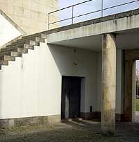
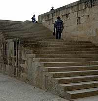
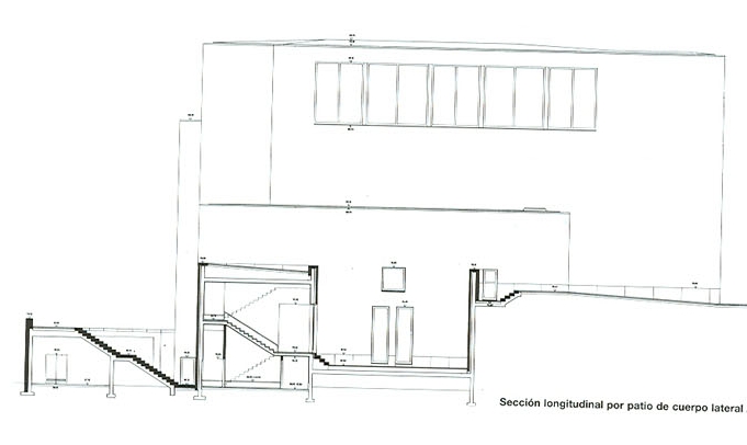
You can access the raised platform in the courtyard of the church via a ramp from the east or a ladder from the west, both approaches are consistent with the disposition of city streets.
There is also a shortcut to the funeral chapel from adjacent land, owned by the Holy House of Mercy.
Concept
The architect takes as its fundamental premise for this project sees the debate he raised on the area of the church. He said the major issues affecting the space liturgy of the church are in a period of instability or uncertainty.
Siza note the existence of a first phase in which the preponderant in most of the projects is a sense of unity of the assembly with the celebrants and good visibility: called as a democratic space and the solutions were tending toward an amphitheater.
The responses to the changes that dominated council was considering the church as an auditorium, which according Siza lose some of this makes the atmosphere inside the churches, from their point of view can not lose all that generated these historic buildings.
He opted for a longitudinal plan, which has much to do with the feeling of losing something of what was to have been maturing for centuries. As for the expression of the church did not address in a special way this type of project: building a church, religion, spirituality…. No, the church was designed from what really is the space of a church and everything else (atmosphere, spirituality, etc..) came from there.
Spaces
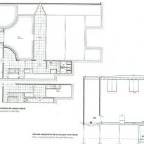
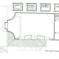
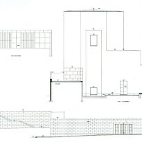
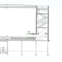
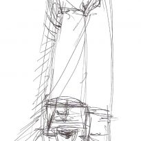
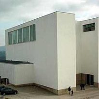
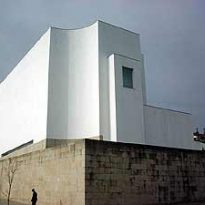
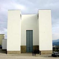
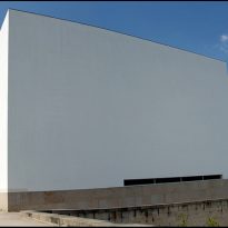
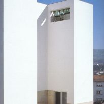
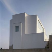
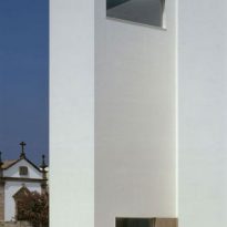
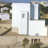
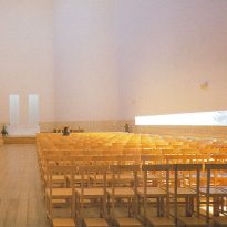
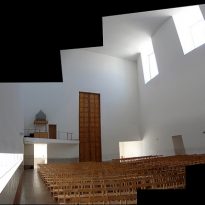
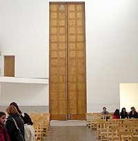
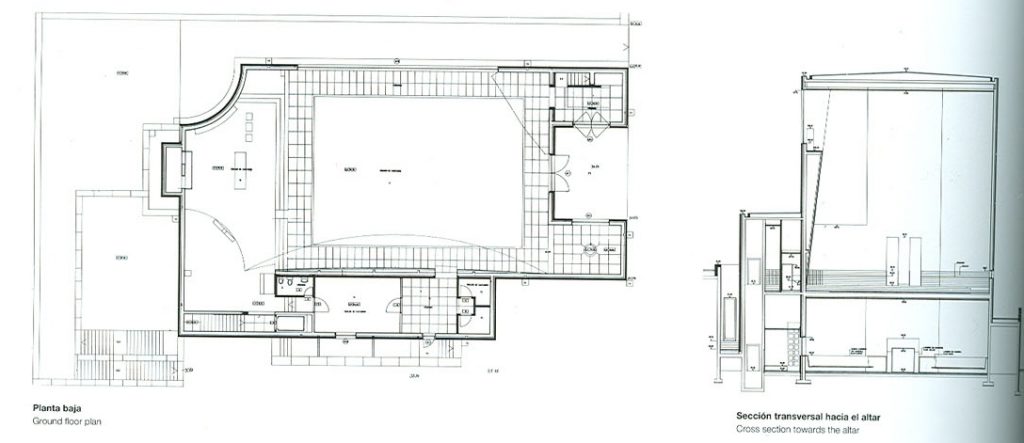
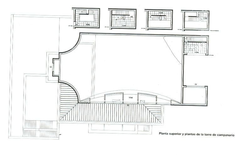
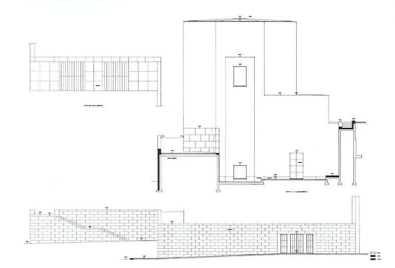
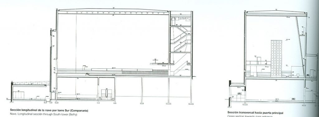
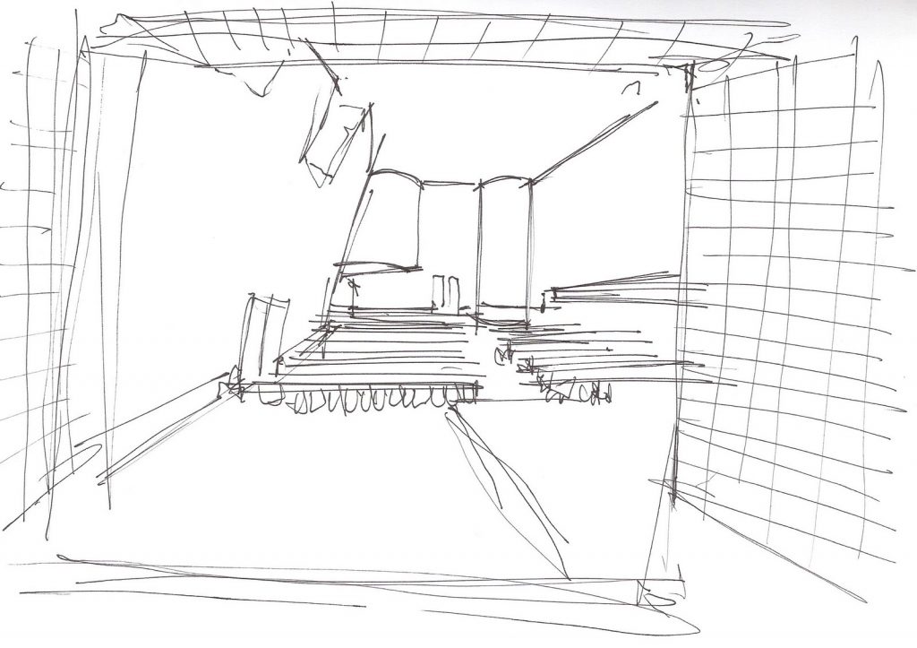
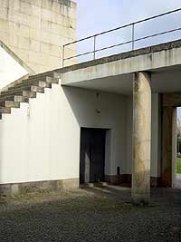
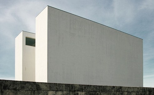
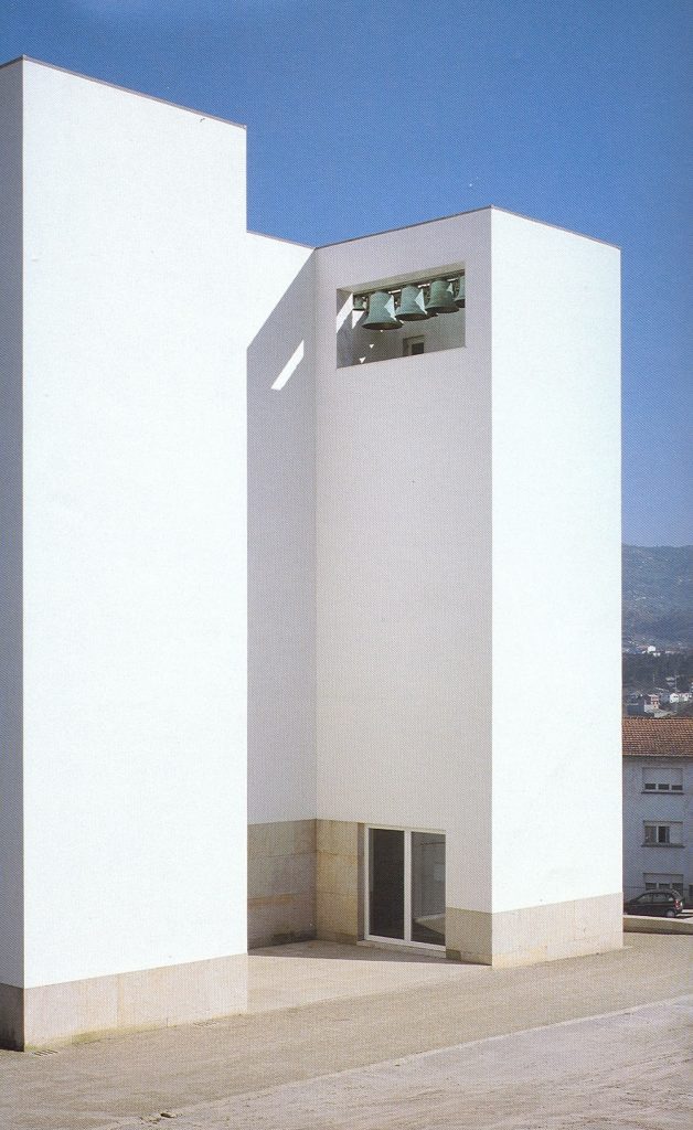
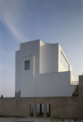
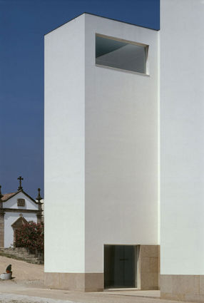
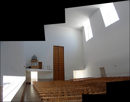
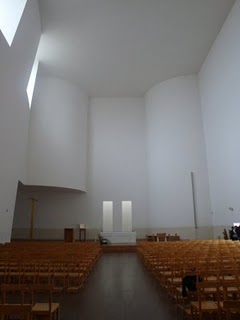
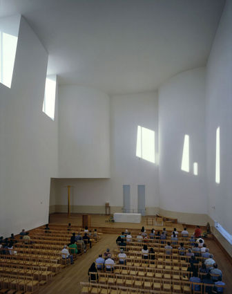
The plan of the church is a rectangular vessel of 30 meters. long, 16.5 meters. wide and 16.5 meters. tall, with main entrance located at the southwest corner, the facade is divided into three sections with two towers that protrude from the plane where the front door is located.
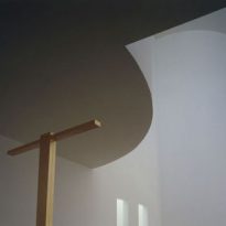
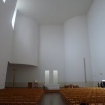
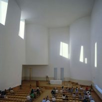
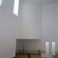
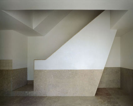
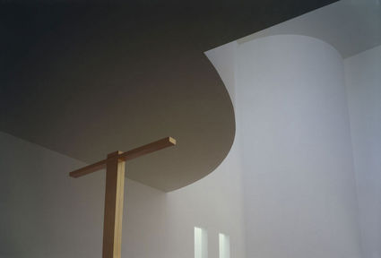
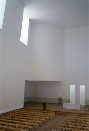
The altar, which emphasizes the erosion of the inner corners of the nave, rises 45 cm. above the level of the ship, extending laterally under these convex forms and maintaining a minimum ceiling height of five meters.
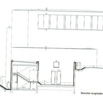
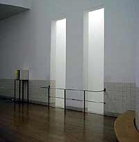
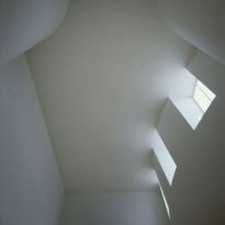
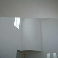
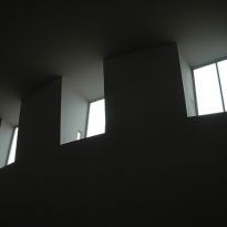
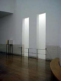
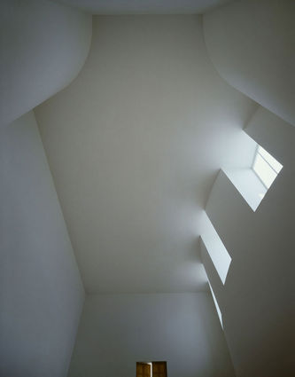
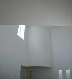
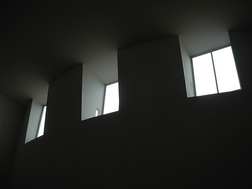
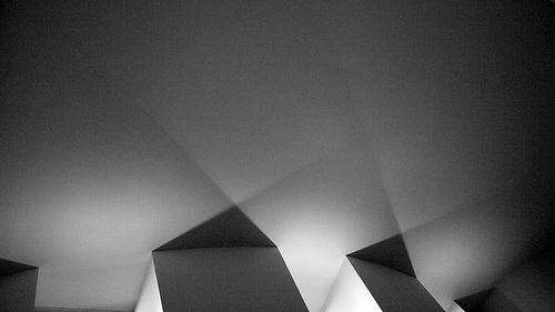
The main hall can accommodate 400 people, divided by a central corridor 3 m wide receives light from outside through three holes located on the curved ceiling in the north-west wall, a continuous horizontal cut crossing the south-east wall and a skylight located behind the altar that also illuminates the funeral chapel that is located below.
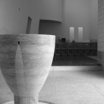
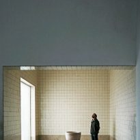
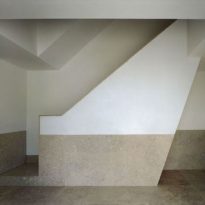
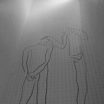
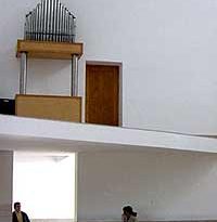
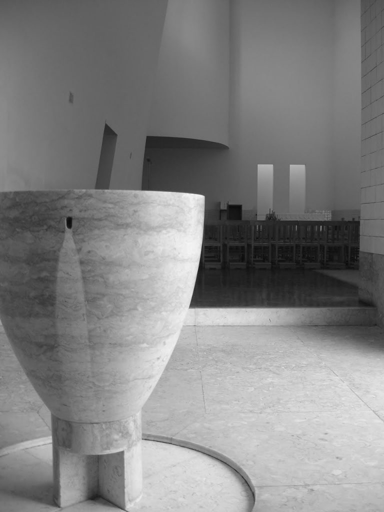
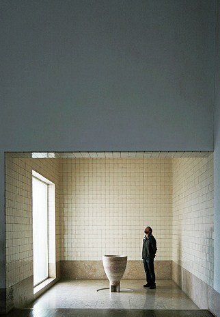
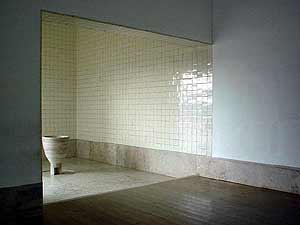
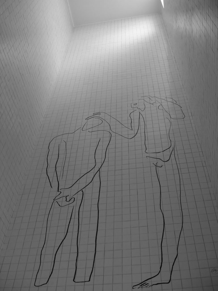
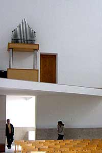
The baptistery has one of the two bodies that are ahead of the main facade, the other body functions as the side entrance lobby to the church, with the staircase to the organ and bells. On one side of the ship subsidiary has a rectangular shape, with the lateral extension of the altar, the sacristy, registration and confessionals, a staircase and an elevator connecting these areas with the chapel in the basement.
Structure and Materials
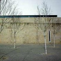
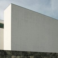
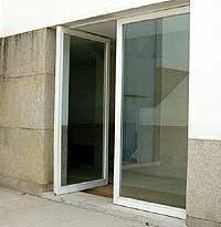
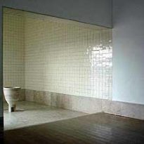
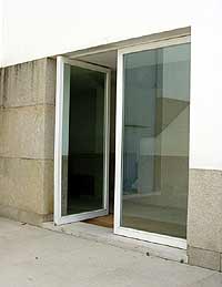
Are typical materials used by Siza, the exterior walls of whitewashed concrete, interior walls and ceiling are covered with stucco, marble tiles in the baptistery, large glass panels to symbolize the transparency of the church.
The floors are wood, granite and marble, the roof is constructed with sheets of zinc, used local building techniques to reduce costs, Siza design each object in the church and his signature appears on every detail.
