Central Saint Giles

Introduction
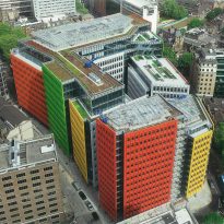
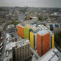
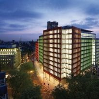
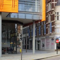
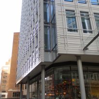
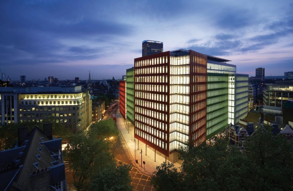
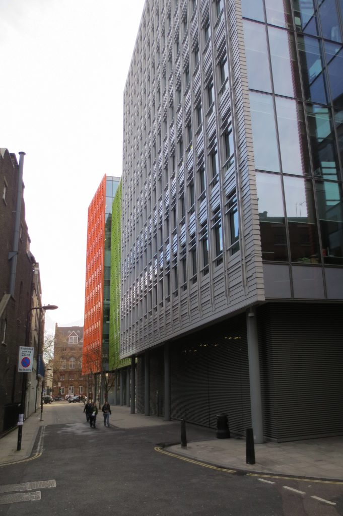
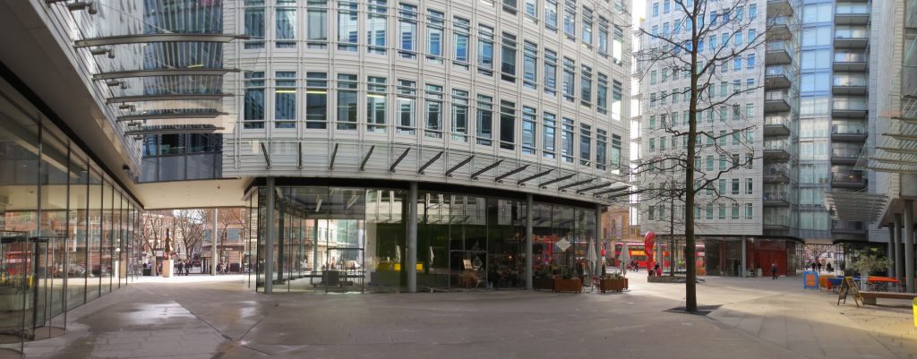
Central St Giles building is a mixed-use complex located in the center of London, by the Italian architect Renzo Piano, this being his first completed project in the United Kingdom (completed in 2010), who soon after would add the Shard in the same English capital.
The project has served to reinvigorate an area of the city that had fallen into decay in previous decades and that has happened in little more than ten years to become one of the most desirable zip codes, largely thanks to the Italian architect project that has attracted the area to companies like NBCUniversal, MindShare and Google, along with a lot of restaurants, services and improvements of public roads in the form of vegetation and lighting.
Location
The location of the project was one of the biggest challenges to overcome during the design process.
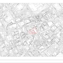
The site is located on a complex urban fabric comprised of modern medieval streets, buildings and more traditional, particularly in the lot where the 50s a government building occupied for years by the ministry of defense and was brought down on the rose 2007 to realize the project of Renzo Piano.
The exact address is 1 to 13 St. Giles High Street, although the resort also has street frontage Earnshall Street, Bucknall Street, and Dyott Street, in London, UK.
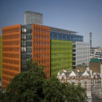
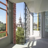
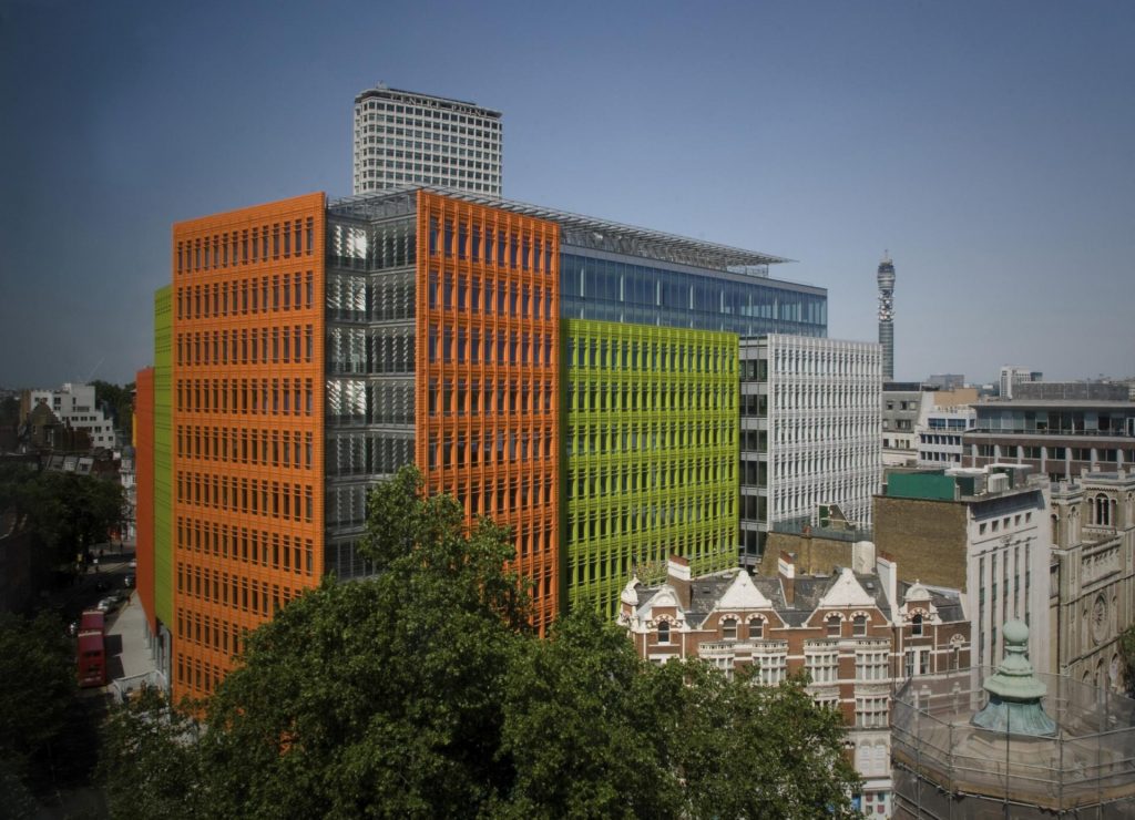
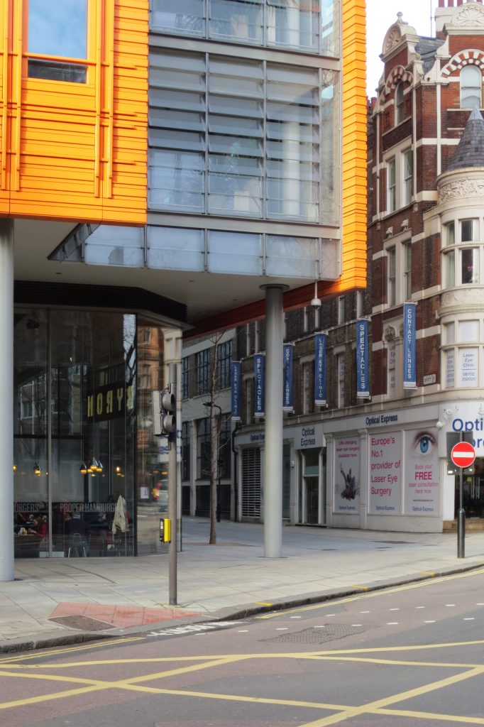
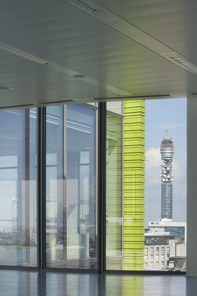
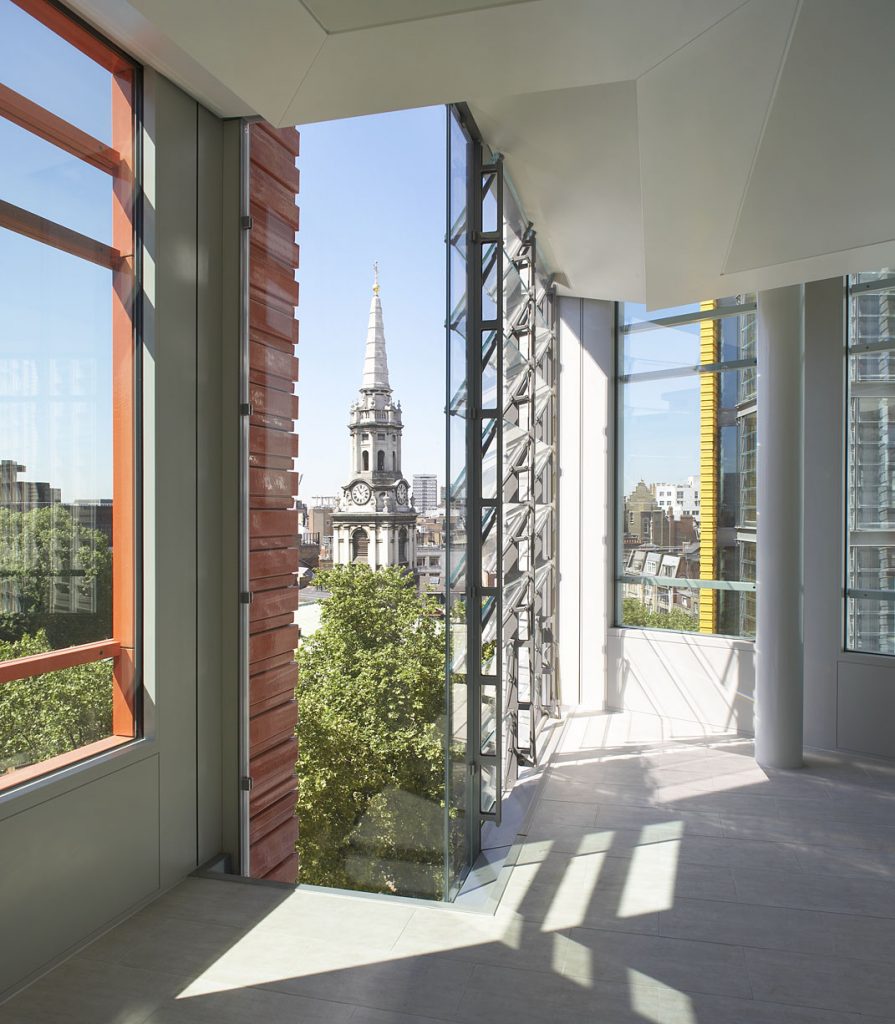
In its immediate surroundings you can find other structures of interest include Centre Point tower of the 60 or Giles-in-the-Fields church in the eighteenth century.
Concept
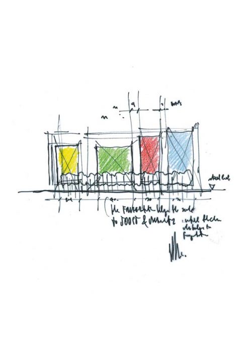
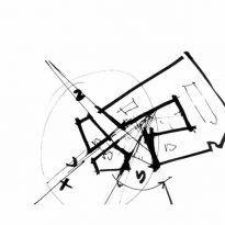
The concept of the project arises from a direct response to place and environment. Almost like a game of opposing the new project takes decisions opposite to its predecessor in almost every aspect in question.
The aim of the new project was not only energize the neighborhood which is economically attracting big brands and companies, but also “heal” the area to urban and architectural level, leaving breathing to public spaces and bringing the architecture to a more human and friendly scale that would make nice street rather inhospitable places.
To achieve this objective the study of Piano focused on three basic strategies :
Public Space Interior
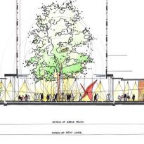
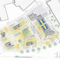
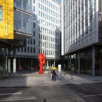
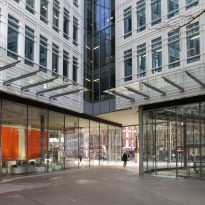
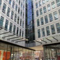
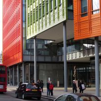
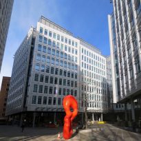
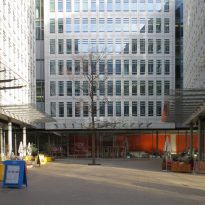
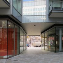
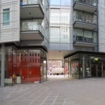
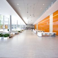
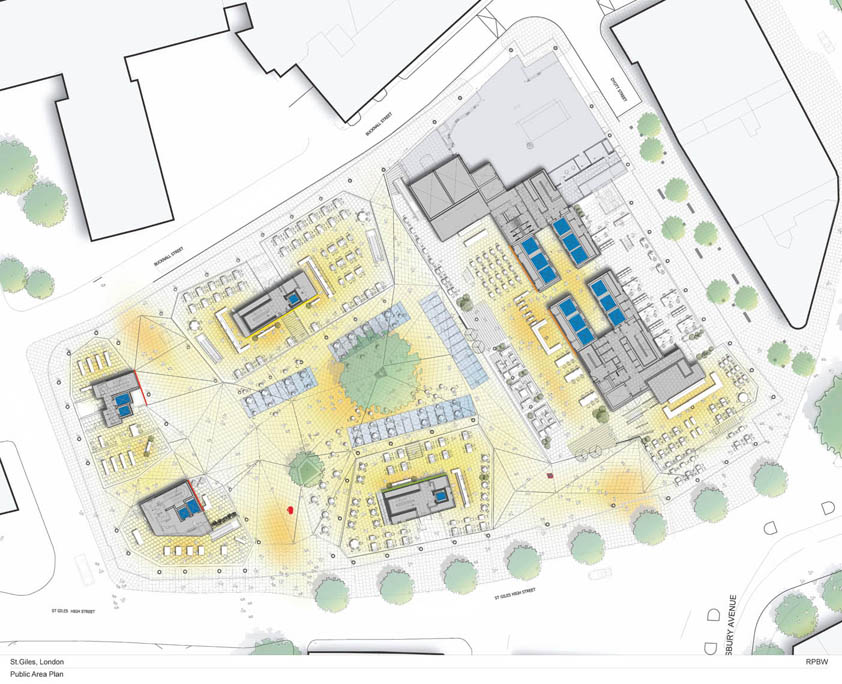
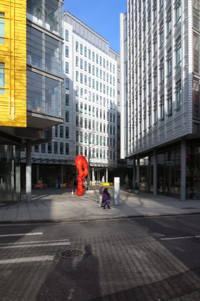
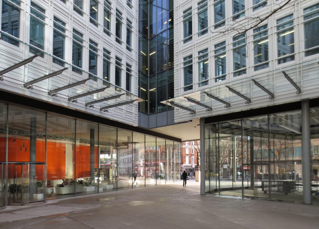
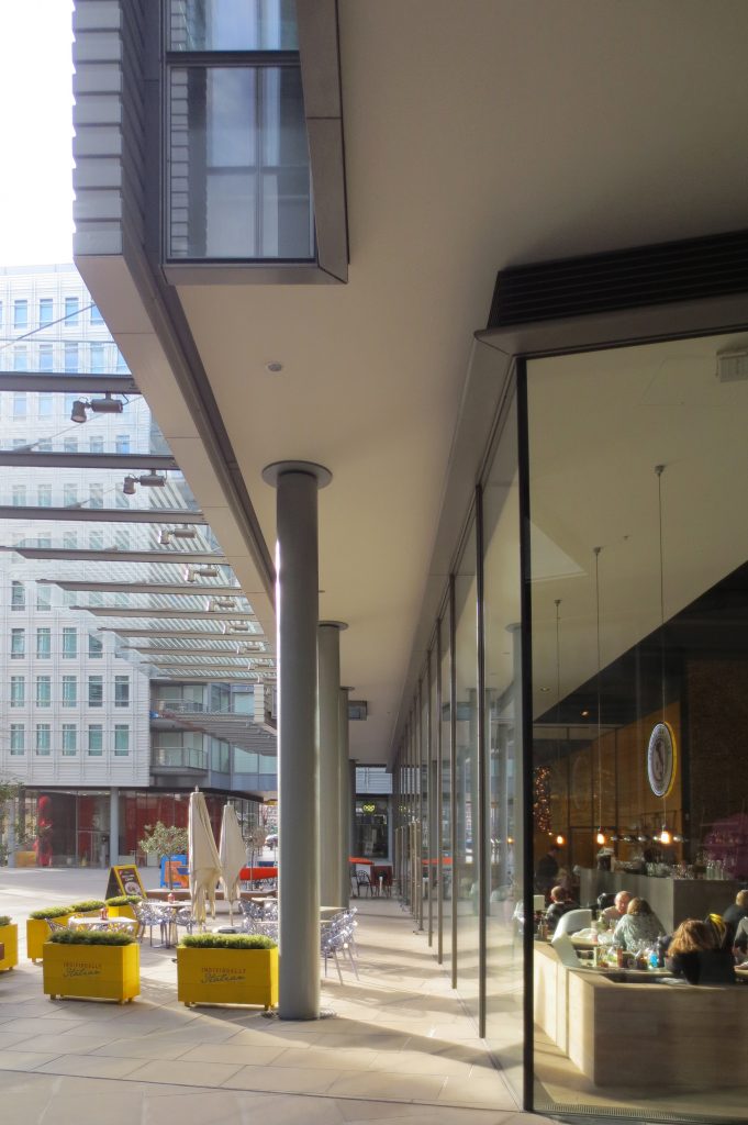
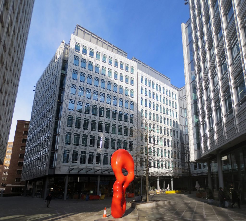
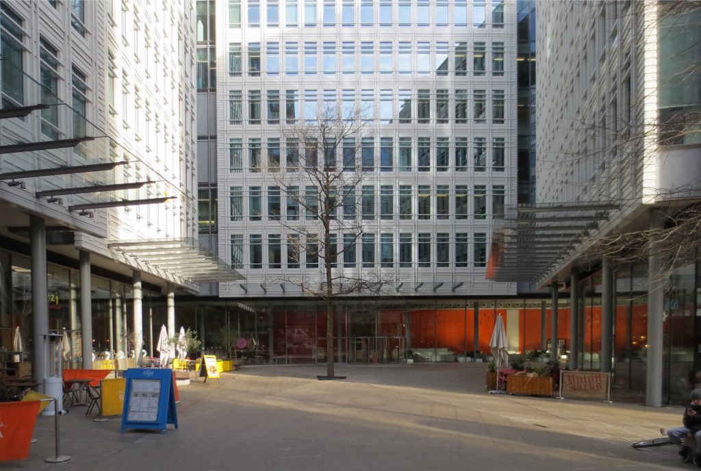
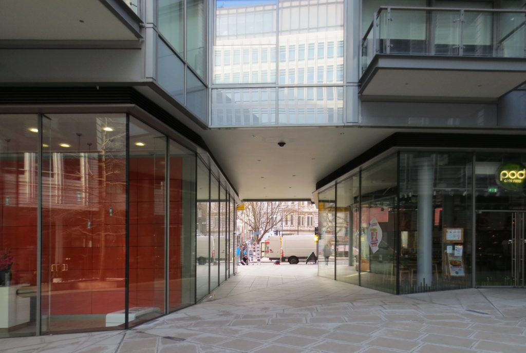
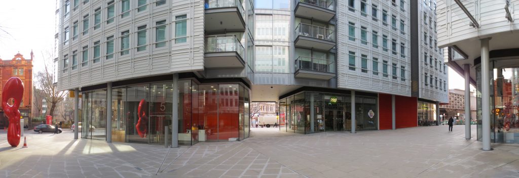
First the government building formerly occupied its place was a kind of fortress with a large courtyard that was hidden from the street and I could only access the staff would work there. The new draft maintains the concept of development around an inner square, but very unlike in the previous case opens to the public at numerous points on the ground floor making it part of the public space.
Relations & Ladders
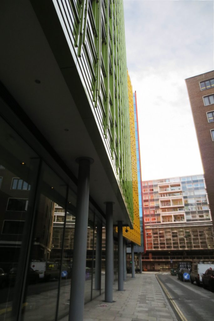
Second were fully taken into account the scale of the project and the relationship with the surrounding structures, both in plan and elevation.
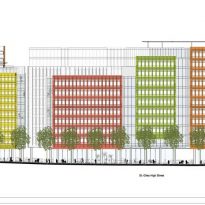
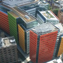
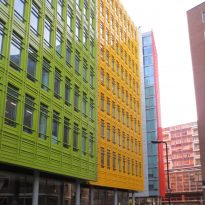
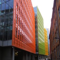
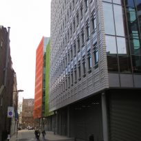
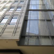
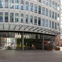
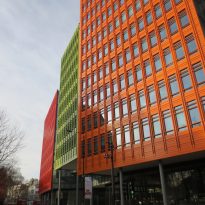
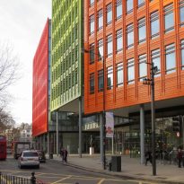
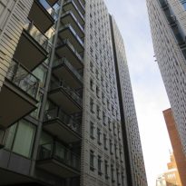
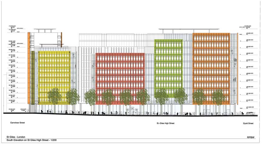
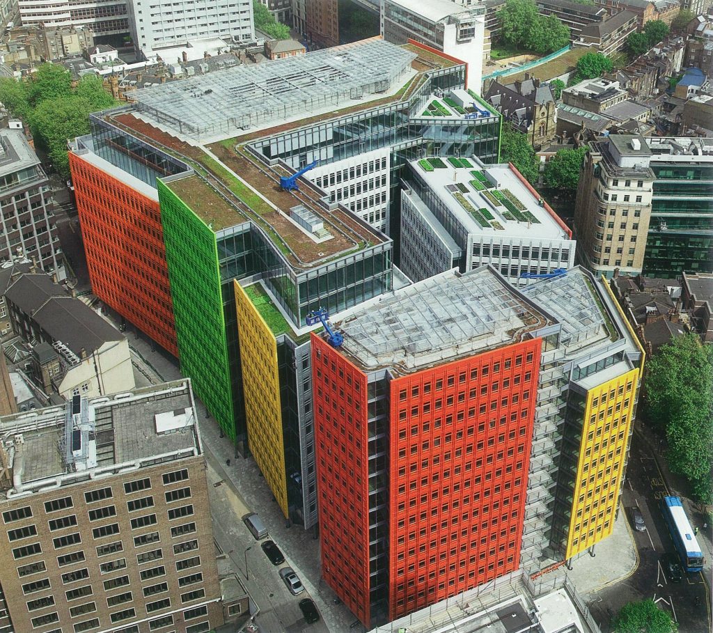
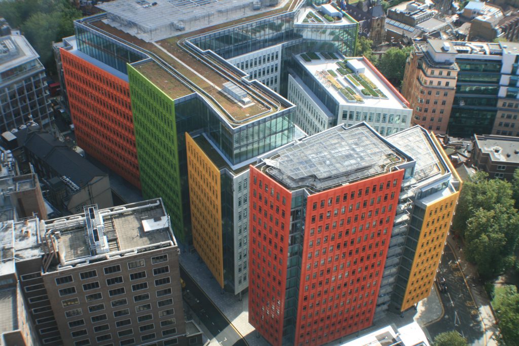
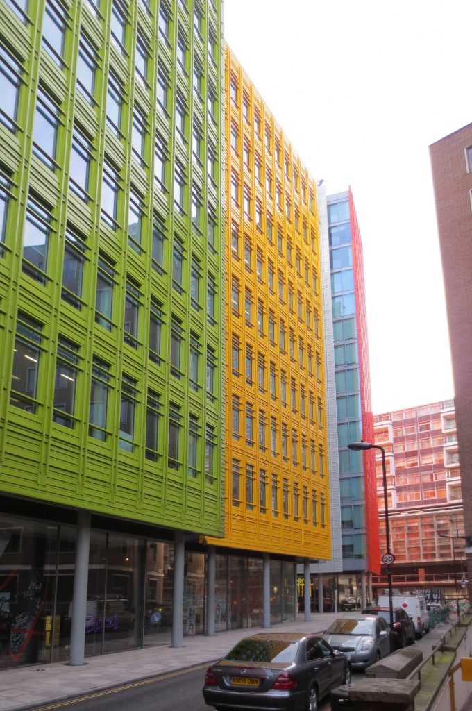
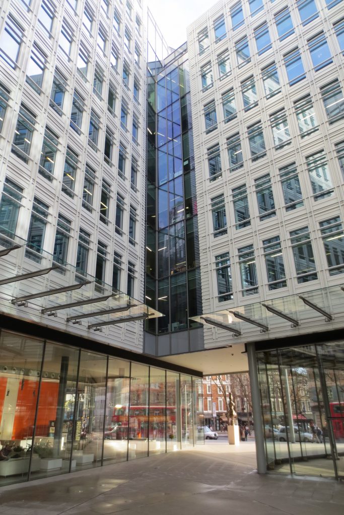
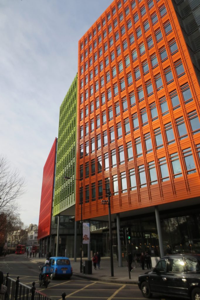
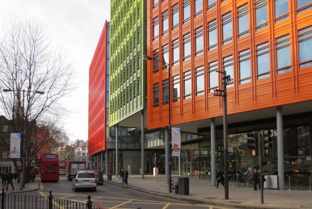
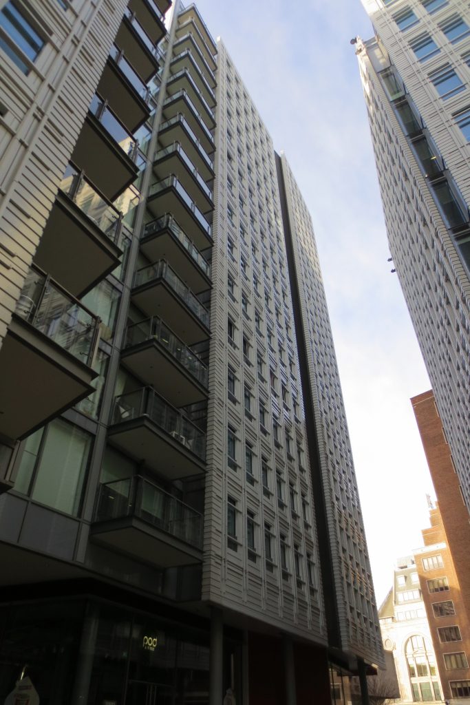
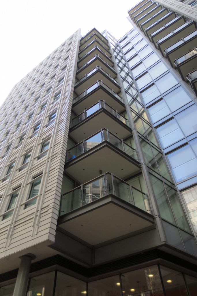
Thus the complex changes height constantly generating a stepped cornice makes visually confused with a number of smaller buildings placed next to each other instead of a uniform mass.
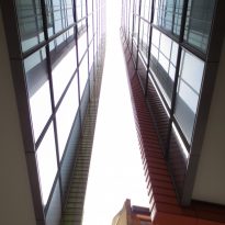
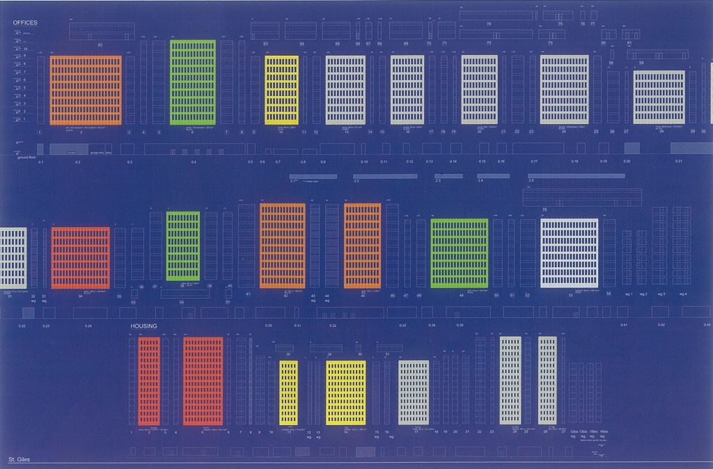
In the same vein every 13 facades that make the project has a different orientation, which not only helps break the uniformity from the visual point of view but also at the level of natural light and reflections.
All changes of height and orientation have been carefully studied in terms of the structures to which each part of the facade and the pre-existing faces with which it interacts.
Color
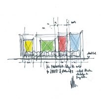
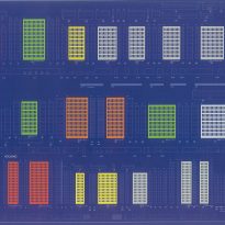
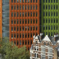
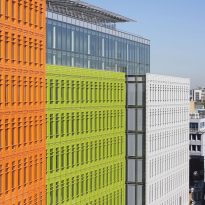
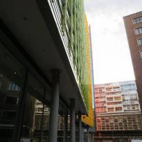
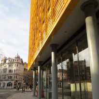
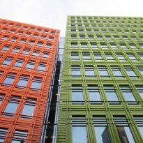
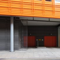
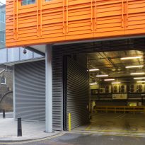
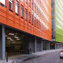
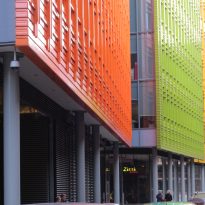
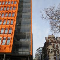
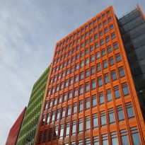
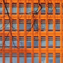
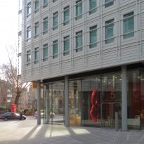
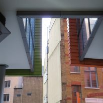
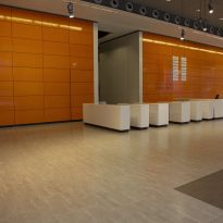
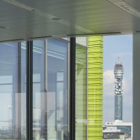
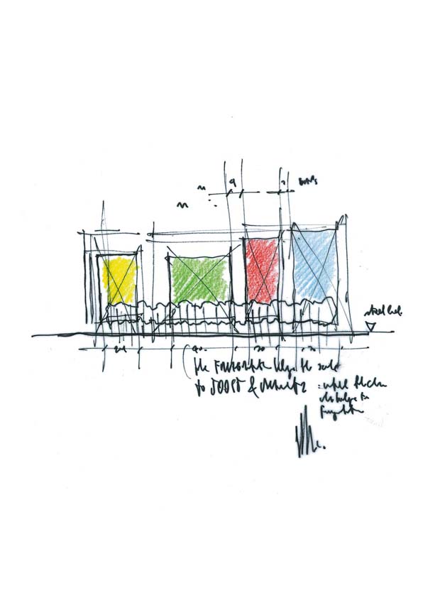
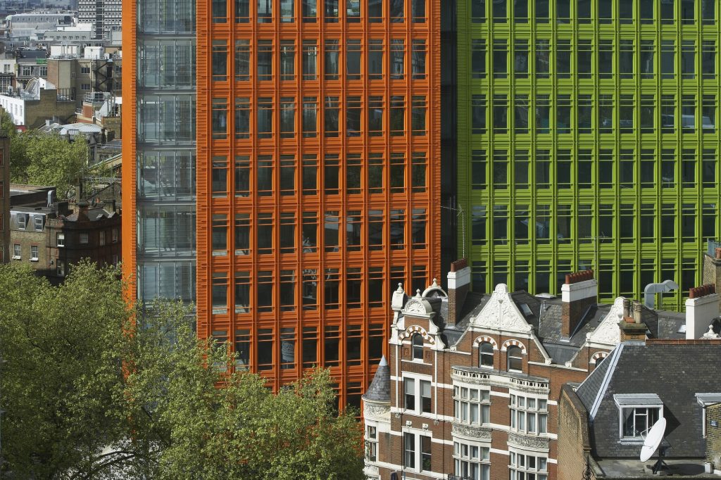
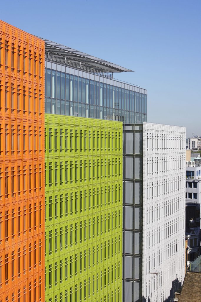
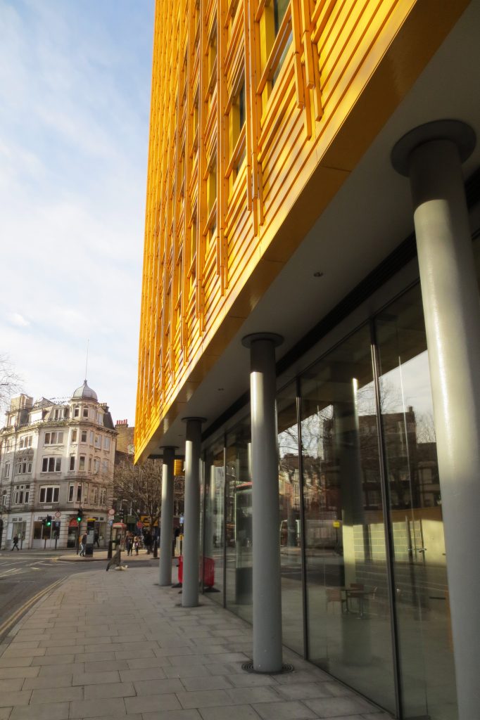
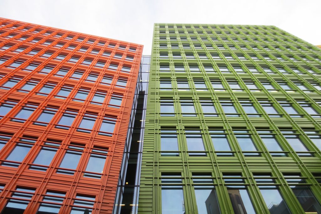
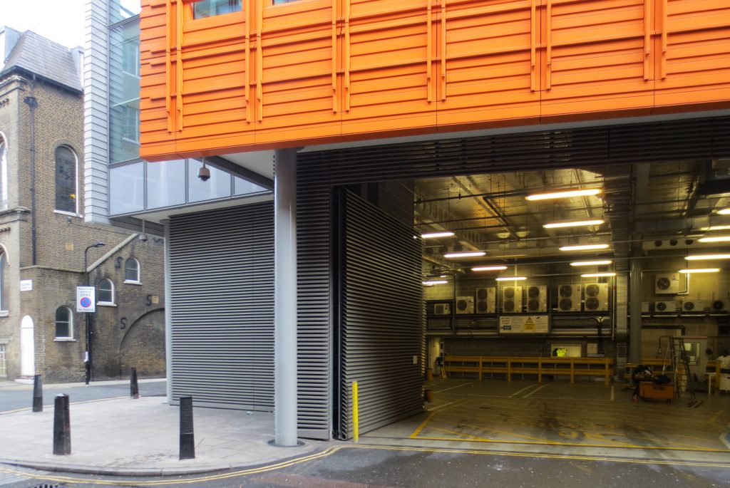
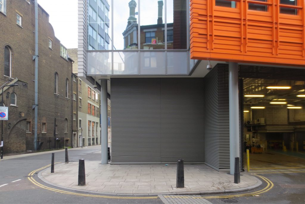
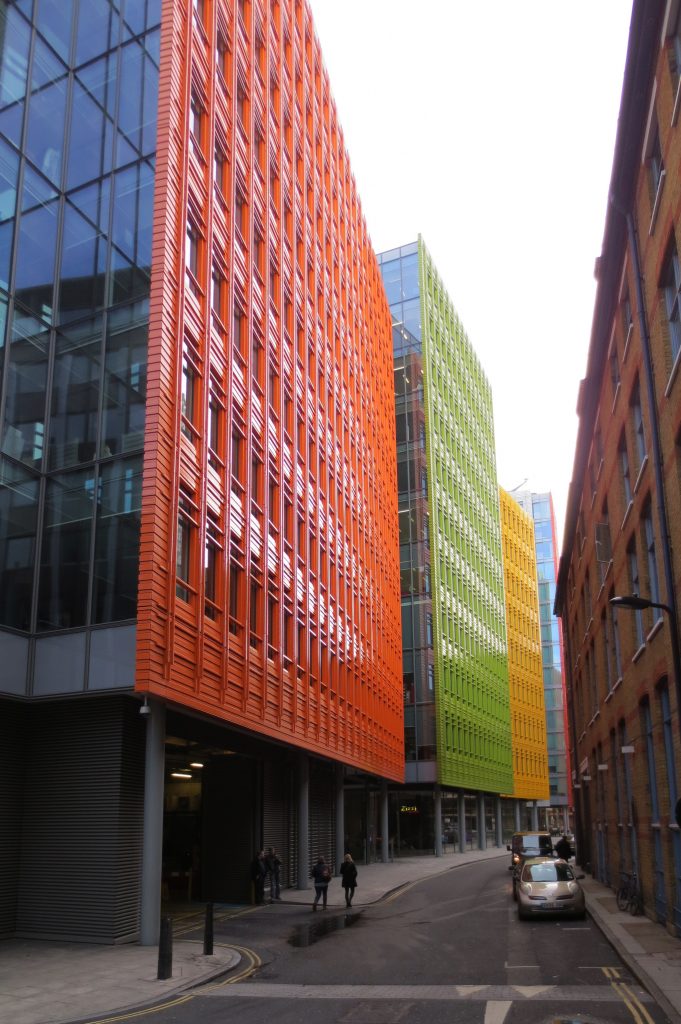
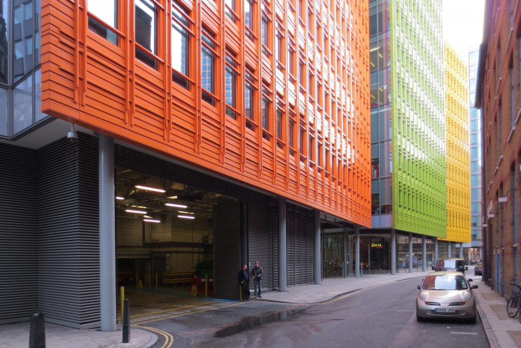
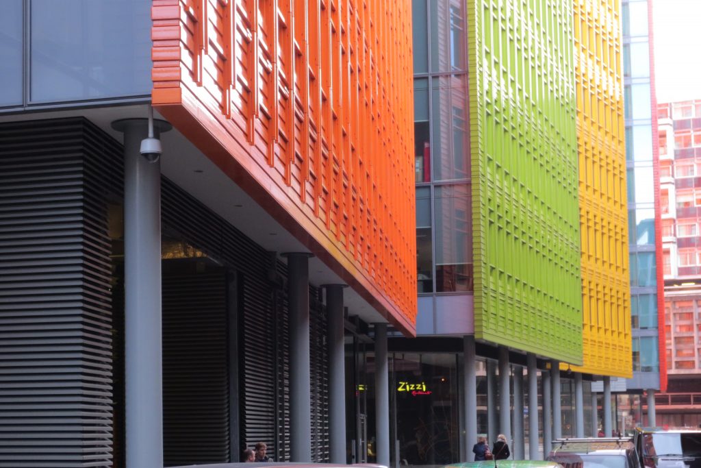
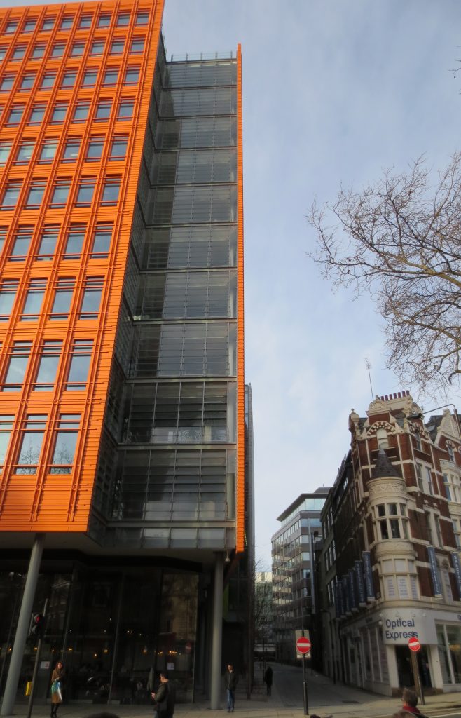
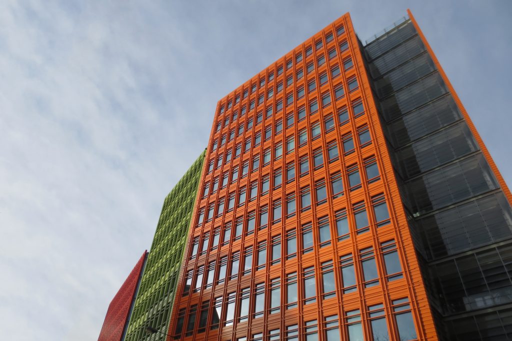
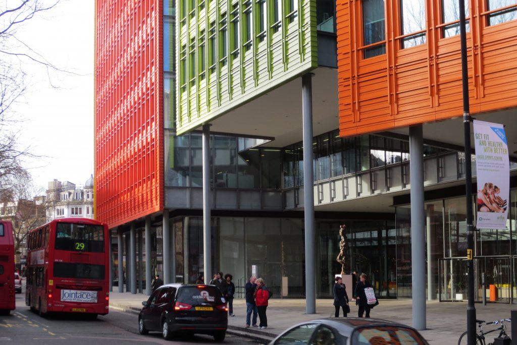
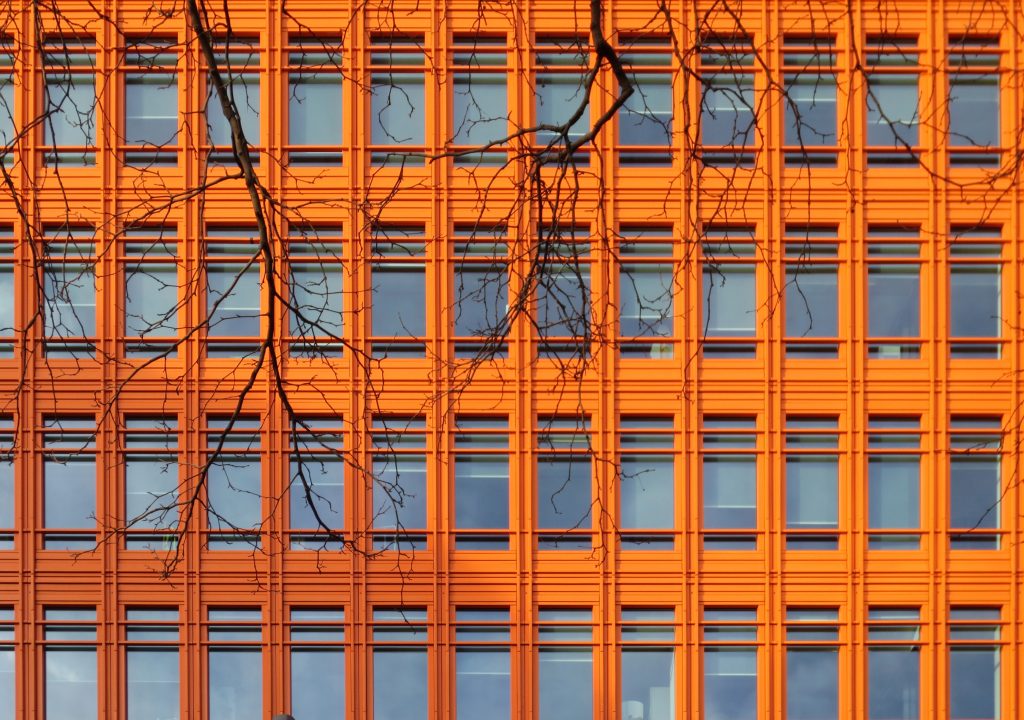
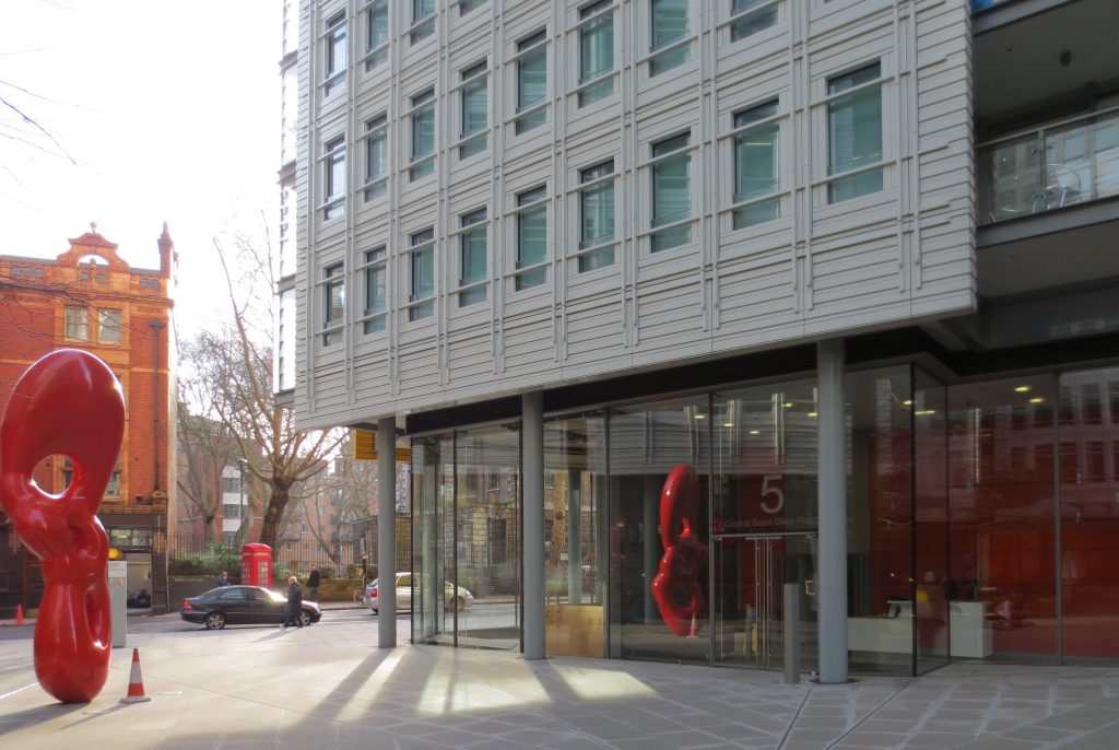
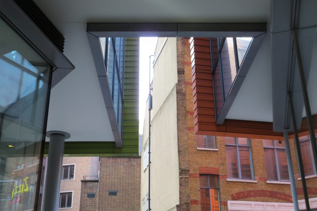
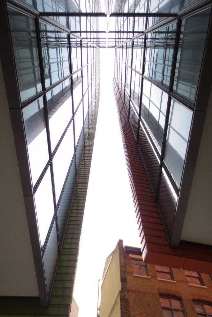
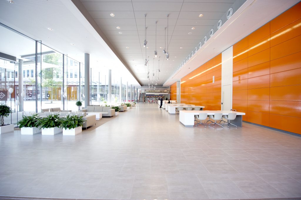
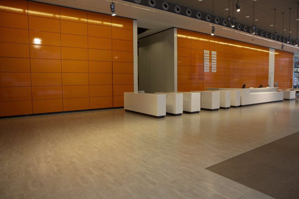
Finally was introduced in the project a touch of color to your image ends up giving more feature. These finishes help to reinforce the previous point deshomogeneizar the project and give a touch of joy, becomes as the architect says “a surprise in the city.”
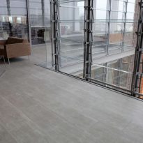
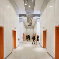
Inside however, the facades facing the central plaza have been finished in light gray light colors to promote the site and the property and overlook them.
Many have considered this strategy as risky or even wrong, but the fact is that the public has embraced the project with great success, and given the difficult task of urban and social reconstruction project that had a touch of color to “on leave” from environment and say “here’s something new going on, something good” seems to have been the right decision at the end of the day.
Of course all these concepts accompanied by the most advanced studies in energy conservation and natural resource uptake that have finished being worth the rating of “Excellent” on the BREEAM scale. 80% of the energy is obtained through biomass burners, while the water recovered from the cooling tower is used for toilets and green roofs absorb rainwater sewer easing the burden of the area.
Spaces
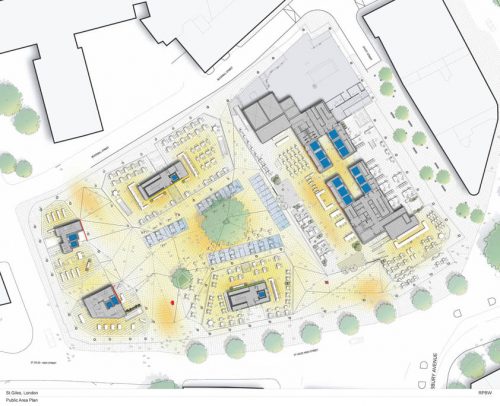
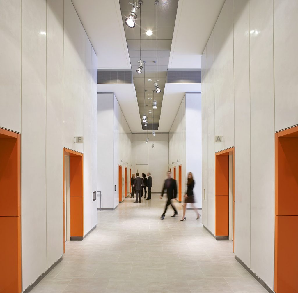
The building is a great example of mixed-use, housing dwellings, both upscale and low-cost as well as offices and shops.
The project has a total of 66,090 square meters divided into two blocks, one linear and one U-shaped, organized around a central plaza.
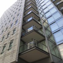
On the west side is the housing block to a height of 15 floors. In total 109 apartments, 53 of which have been designated as “low cost”.
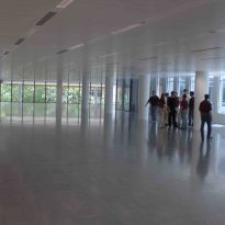
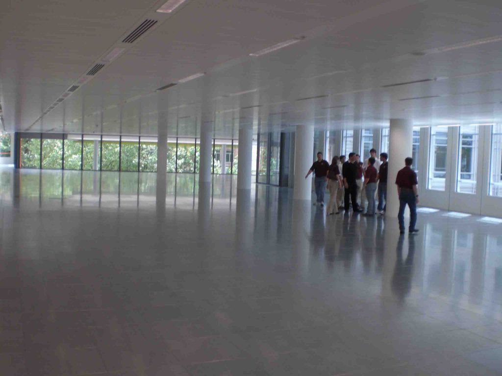
On the opposite side is the office block, lower height (11 floors) but with a higher pro ground surface up to a total of 37,625 square meters of office space available in units of 4,000 square meters each, without doubt the largest open spaces available in this area of the city, which has helped to attract large companies that previously did not consider this neighborhood to settle to be limited by the small size of the available offices in the area.
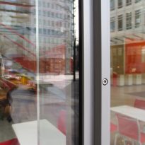
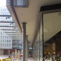
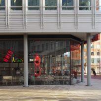
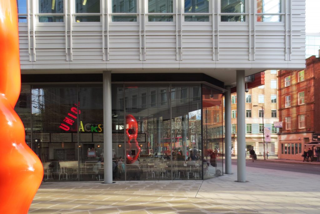
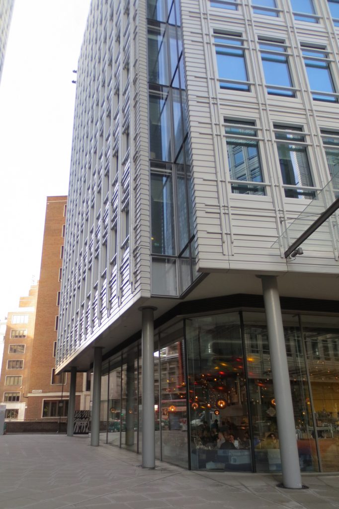
At street level under both blocks and both oriented toward the street and towards the inner square are 2,276 square meters of commercial premises to date have been mainly occupied by restaurants.
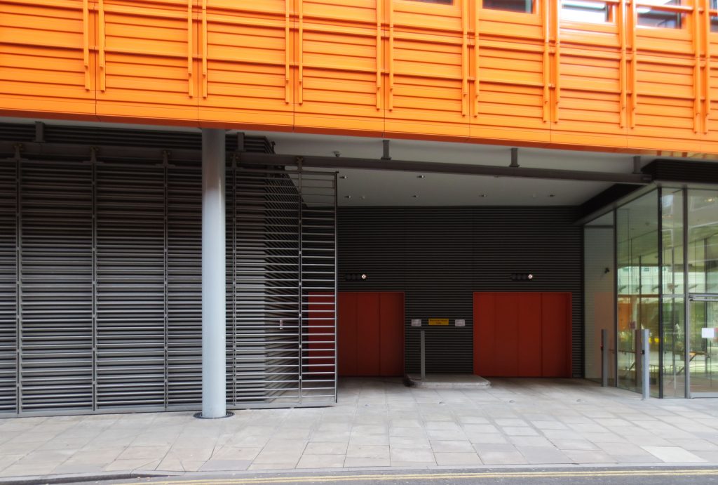
The resort also has some anecdotal 10 parking places, not inadvertently but by the desire to promote public transport and powers many subway stations and bus and that are literally less than a block away.
Structure
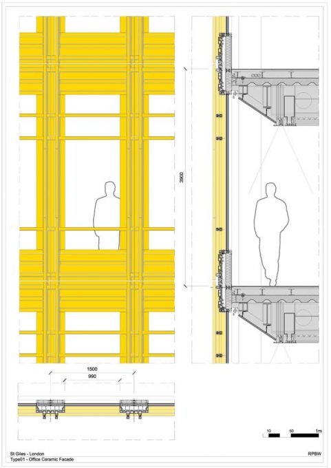
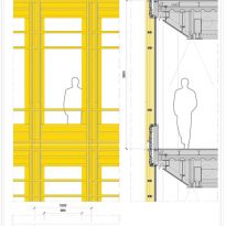
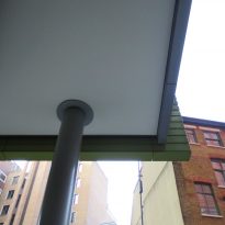
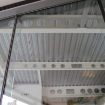
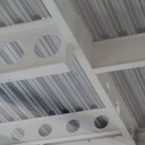
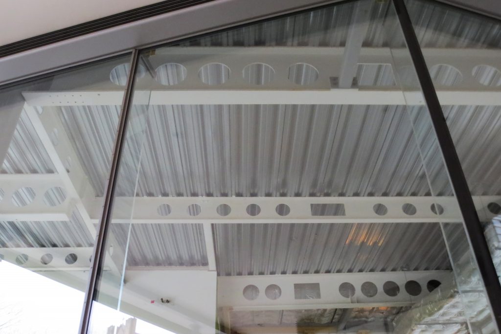
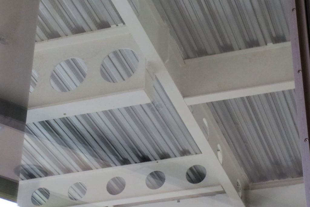
The structure consists of pillars of reinforced concrete that support composite slabs by beams honeycombed steel on which a corrugated sheet which in turn serves permanent formwork and on which a layer of concrete mass poured rests.
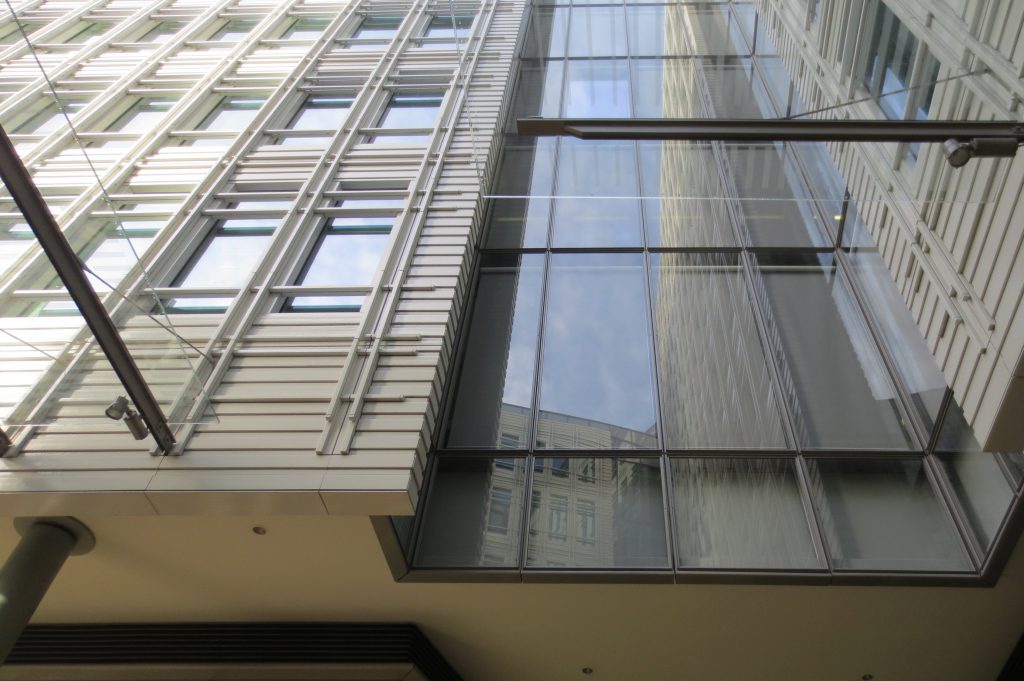
The facade of precast panels is secured to the edge of the floor being suspended and anchored by these points along its entire length.
Materials
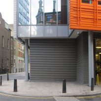
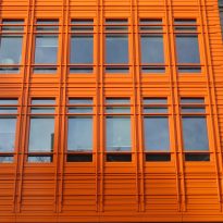
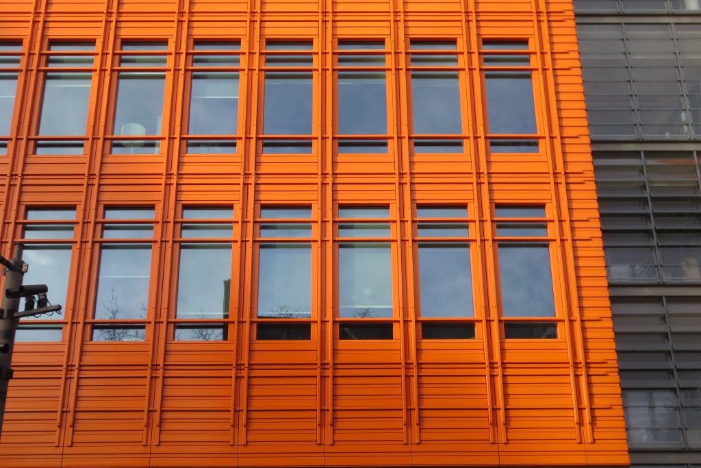
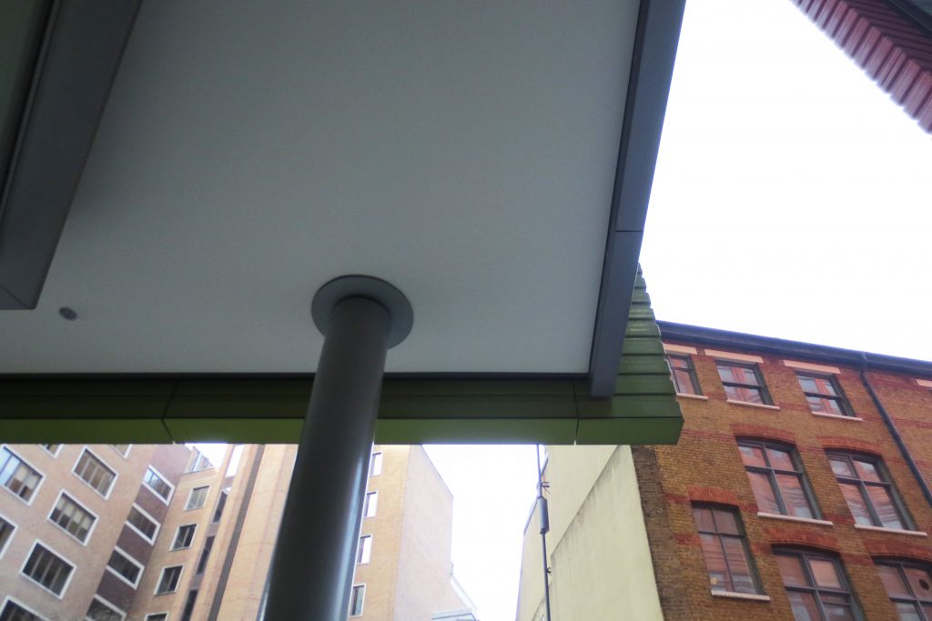
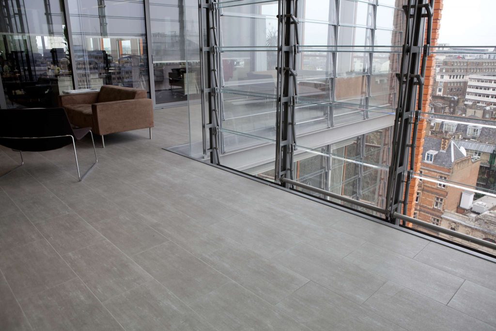
The predominant materials of the project are the reinforced concrete and steel, both the structure and the woodwork, glass on the facades and especially the tinted terracotta gives identity to the project.
The ceramic pieces were manufactured in Germany and is not expected to require some cleaning and its color may not fail over time and the elements.
