Casa del Fascio

Introduction
When we think about countries that lived under the totalitarian regimes and the architecture that was built during years that we think back to a neoclassical style that was to bring this long-sought stability and taxation by governments. But What happens however when this is the totalitarian regime in the cradle of classical architecture?
The party promised the revival of fascist Italy and with it all the Italians, that his race was superior and unique, and so on. Therefore, it seems a good time to, in this revival of the country and race, start to break away from its historical legacy, as this is the one who had “killed” the country, and that he had “reborn” to Unlike other countries that sought by the memory of the neoclassical style that was the Roman Empire.
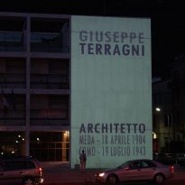
Impose its law to achieve success with the party needed not only offices in major cities but also in smaller towns. One such venue is found in the town of Como to the project Manager Giuseppe Terragni House Fascia should be an example of stability, security and superiority, leaving the Italian people very clear that the party was who had the power and all the answers.
Location
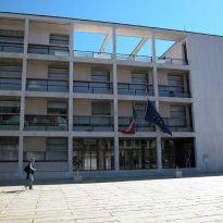
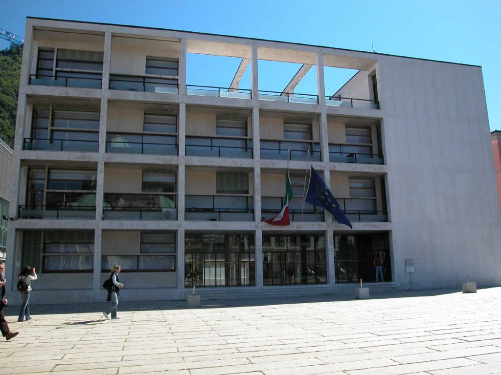
Fascist party headquarters designed by Terragni is at the heart of the historic town of Como, about fifty miles north of Milan.
The exact address is the number 4 of the Piazza del Popolo
Concept and Spaces
Fascia House is a building with a strong symbolic. Recall that in a country with a historical burden can be as important as Italy Terragni was not only an advocate of the modern movement, but also ensures that this and the classical tradition were not irreconcilable, but on the contrary, should be combined.
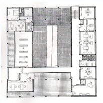
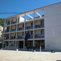
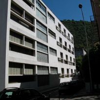
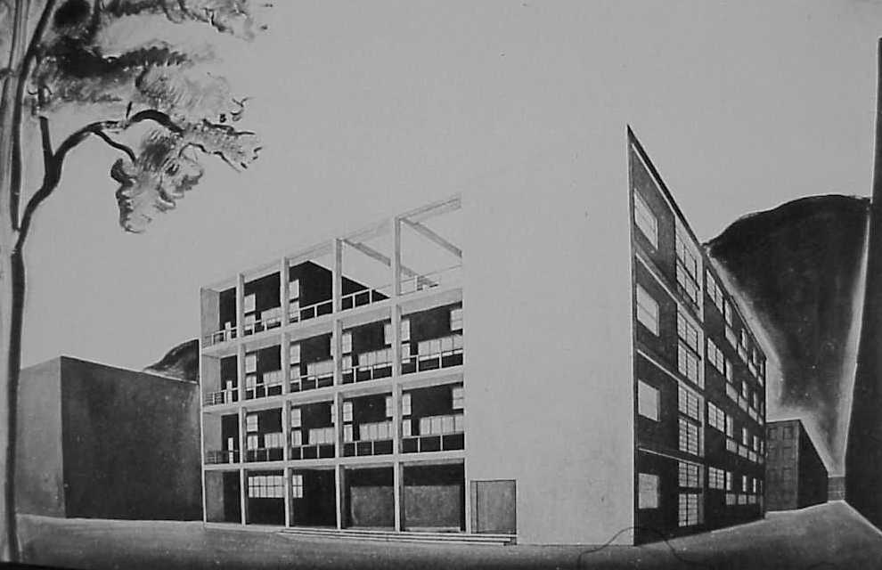
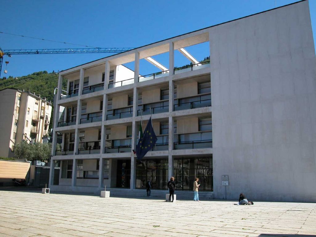
The building is half as perfect cube of side 33 meters at the base and 16.5 meters in height.
Proportion of the subjects were carefully studied by modern architects as Le Corbusier, but do not forget that were also of vital importance in the Greek and Roman architecture. Since the definition of the volume that we see Terragni seeks rapprochement between classical and modern.
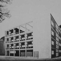
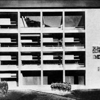
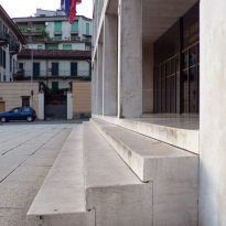
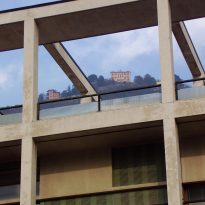
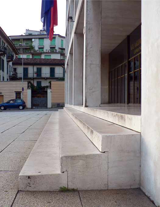
To access the building’s front facade has a 3-step staircase that extends along the entire entry. Once saved, we are on a porch above the entrance. The staircase and the porch perimeter (in the Greek) or front (for Roman) were two characteristic features of classical temples.
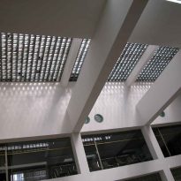
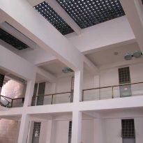
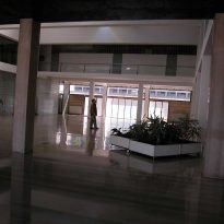
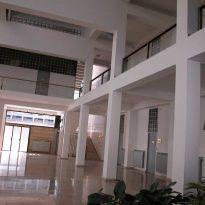
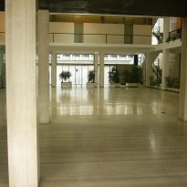
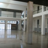
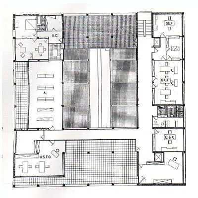
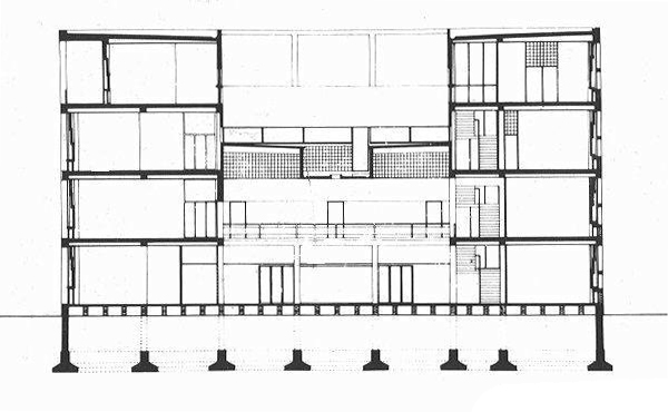
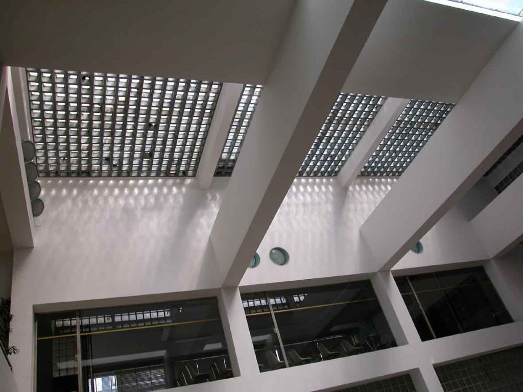
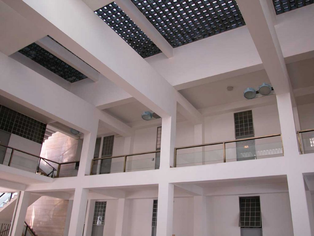
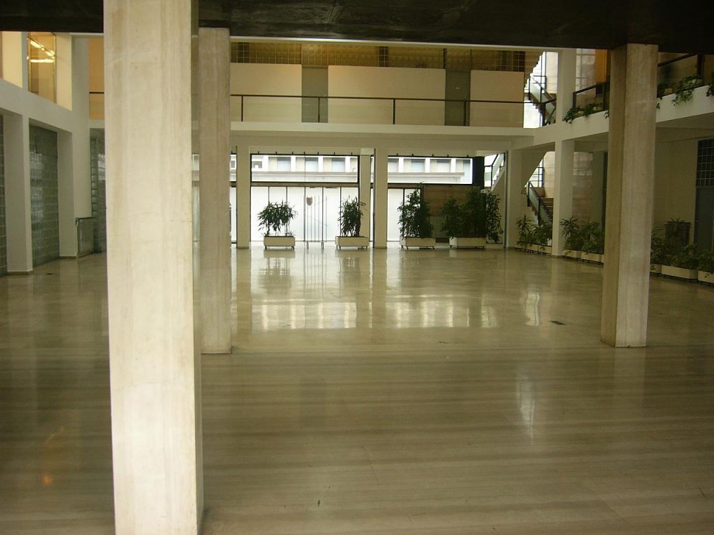
Once inside we found that in the bucket was empty at its center, leading to an atrium with a glass cover at the height of the second floor. This space should be used for organizing events, reading speeches, etc.. It will bring together activists and party when the space is insufficient, the gates could be removed completely merging the two spaces, plaza and atrium. Around the atrium are located, forming a passageway in the form of “U” for individual rooms, offices, etc.
This plant reminds us a bit, albeit on a smaller scale, which had the Roman Forums, with a large central area where special occasions were celebrated, surrounded by a perimeter spaces collected. Or why not also to plants of basilicas or cathedrals.
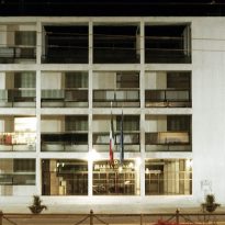
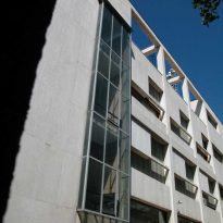
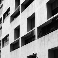
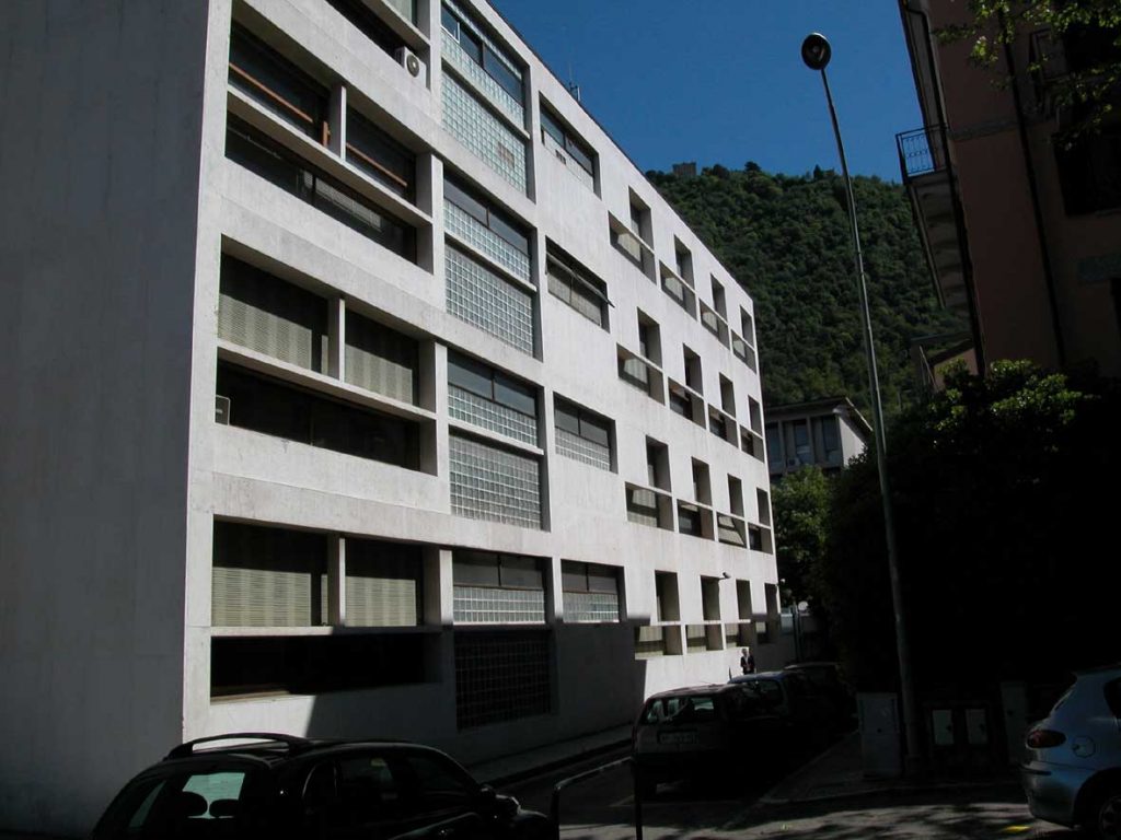
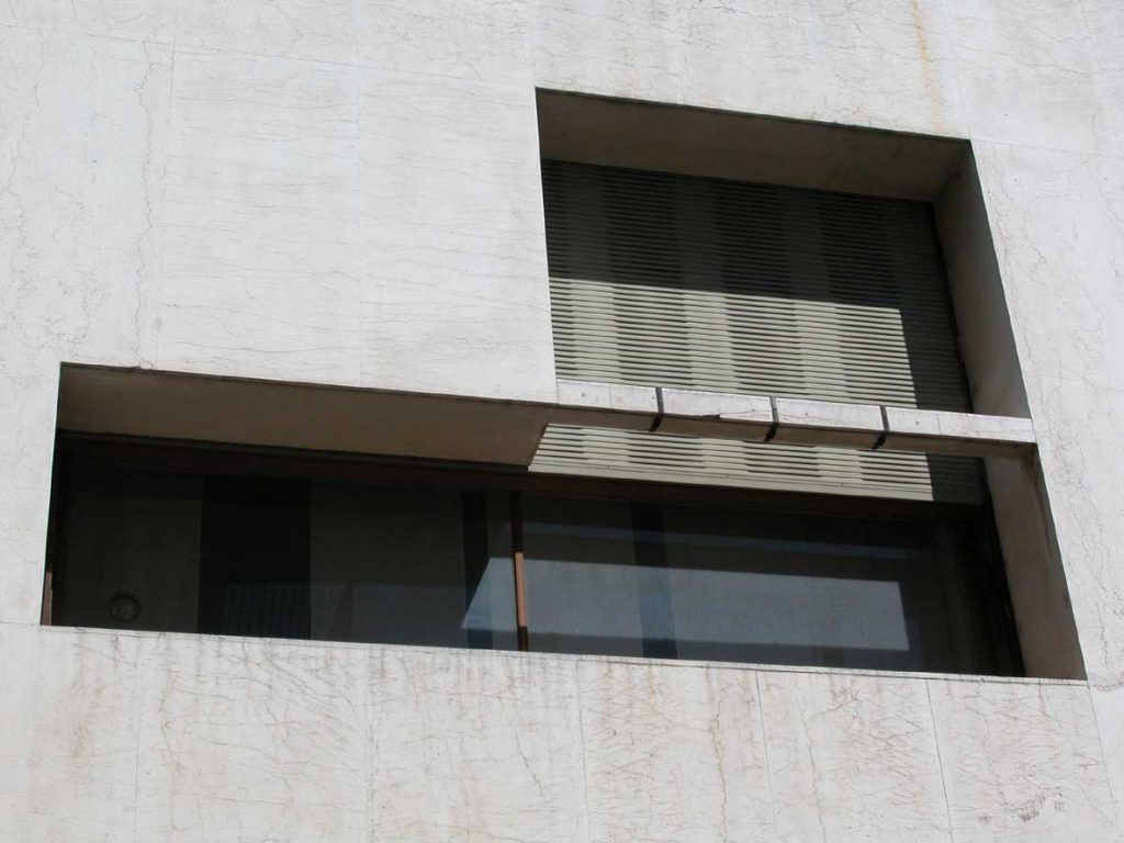
The proportions of the facades are studied from math as I have said, but the relationship between modern and classic is not here. Terragni was forced to break his perfect grid in the main facade with a cloth blind to be used to display advertising of the game (something very typical of the Russian avant-garde) and wanted to take this tax to line the plane of white marble, the same which contracted in the temples.
This demonstrates that the proposed Terragni is a modern building without a doubt, but that in turn can not forget the tradition of the country. Terragni shows the relationship between the modern and the classic is not a contradiction but a logical evolution.
Structure
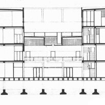
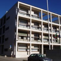
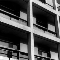
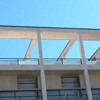
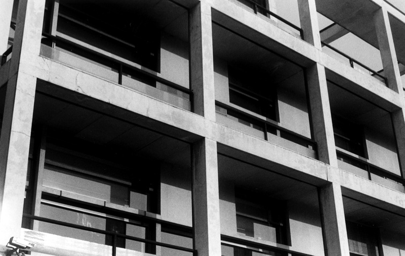
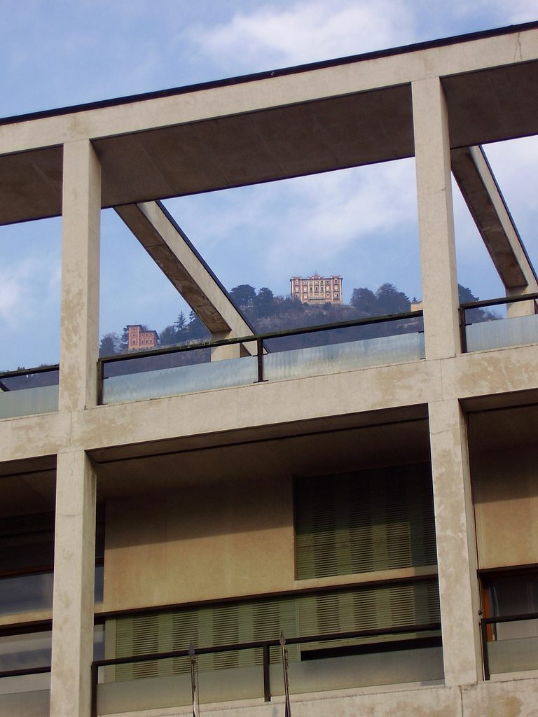
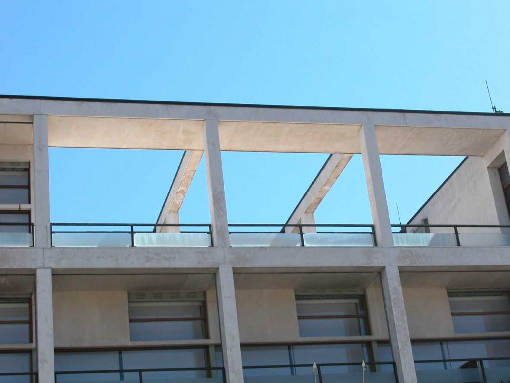
Terragni able to streamline the structure to the maximum. Maya creates a portal of reinforced concrete, but not only spreads the grid for both directions of the horizontal plane, but it does in the three directions of space, as if the cube is the volume of the building were broken down in turn into smaller cubes.
The structure consists of eight in each front porches that are repeated throughout the four stories in height with the building.
Materials
Terragni main materials used were few, but all selected with a symbolic purpose as well as troubleshoot, of course, the practical aspects of daily use of the building.
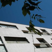
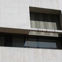
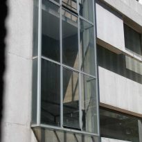
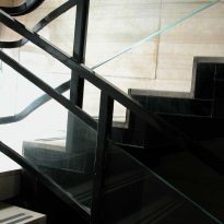
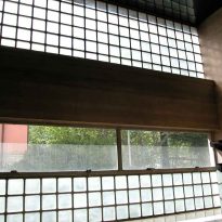
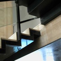
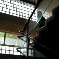
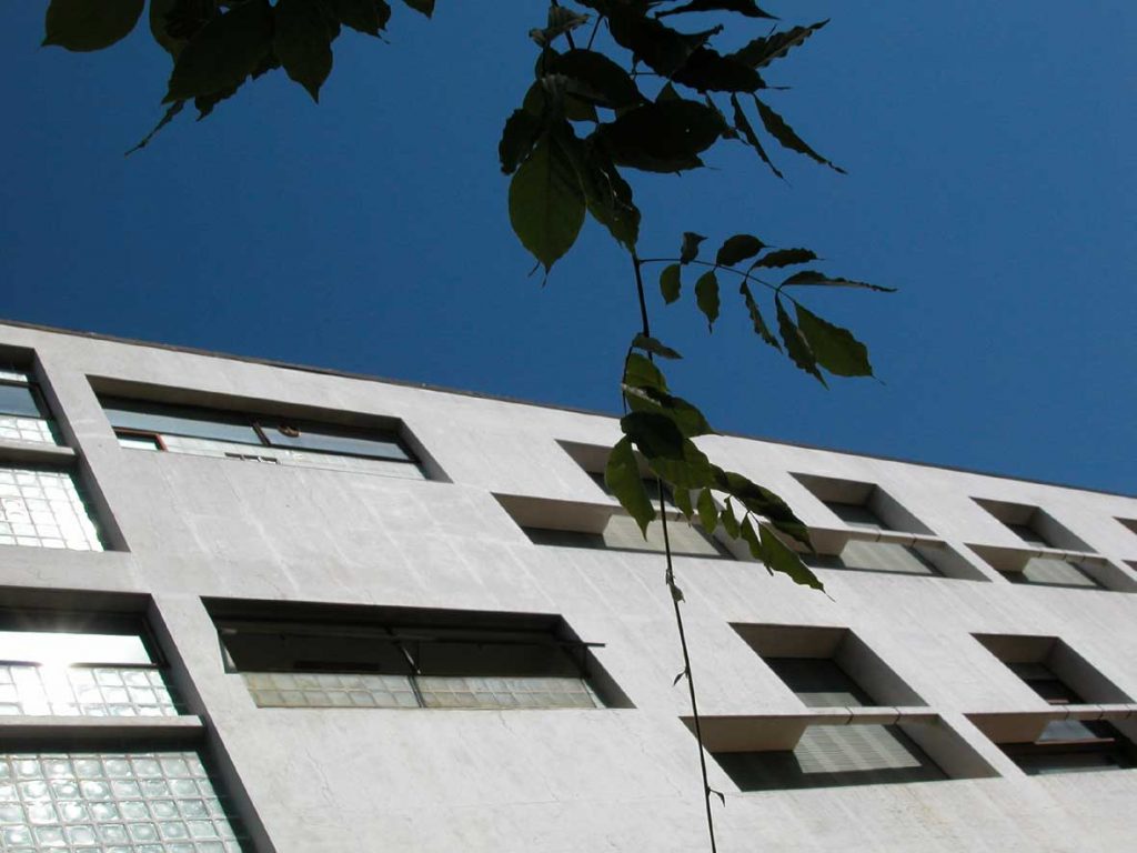
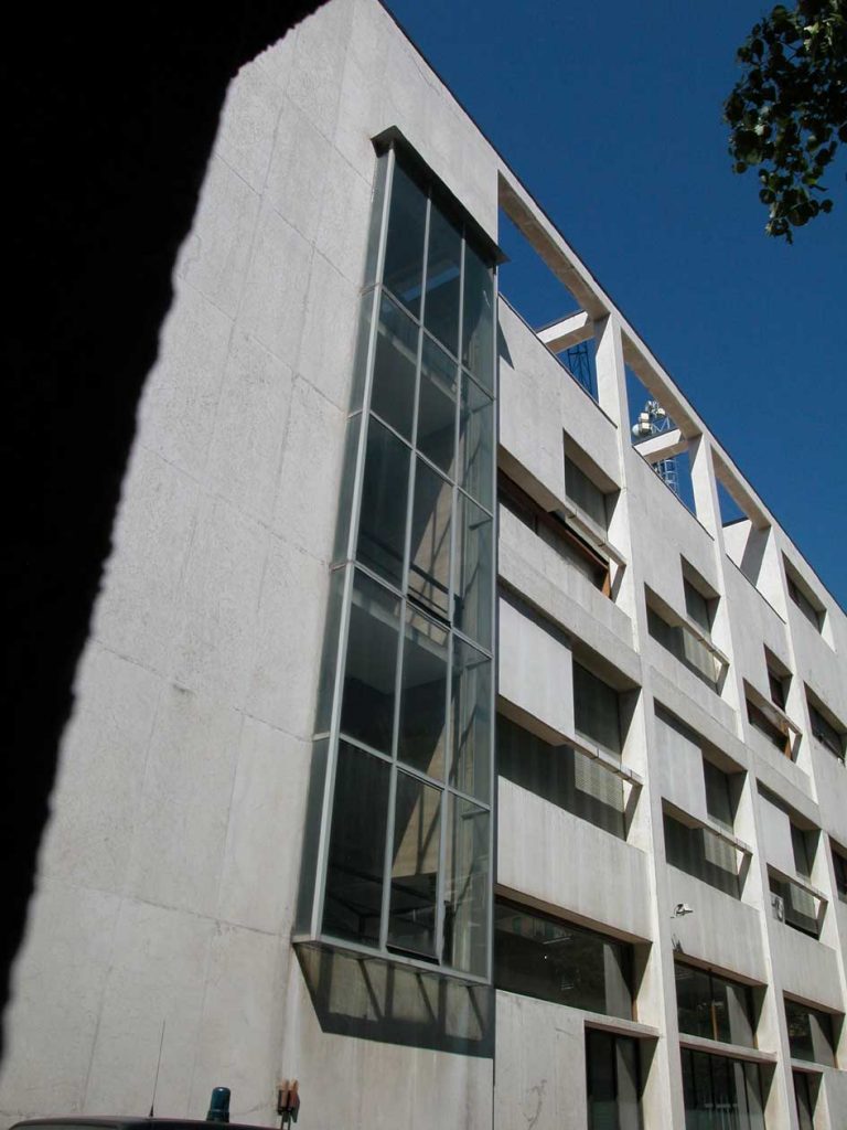
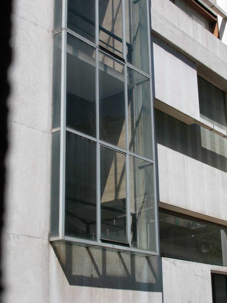
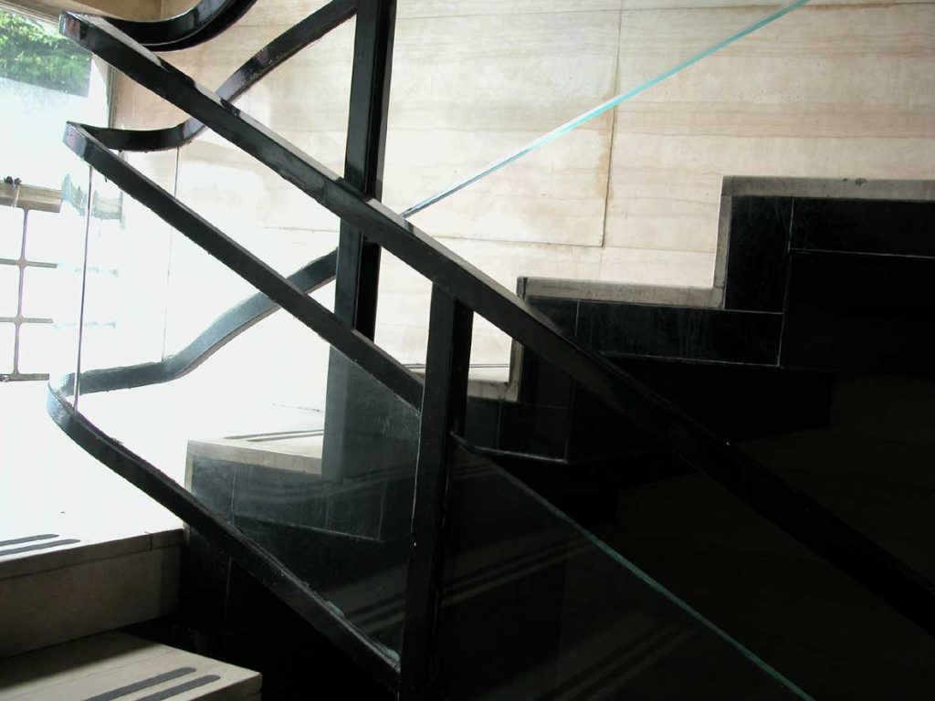
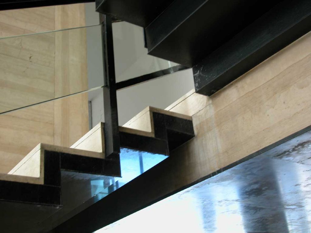
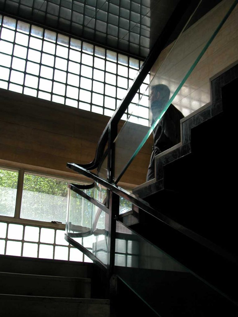
The structure is of reinforced concrete as a whole. Walls and floors are lined with marble of different treatments. Abundant glass enclosures, giving the feeling of transparency that the building blend with the outside, making this place a fortress of power “accessible” to everyone.
