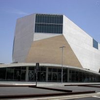
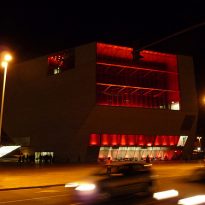
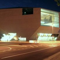
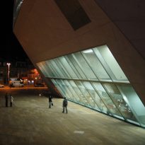
Casa da Musica in Porto

Introduction
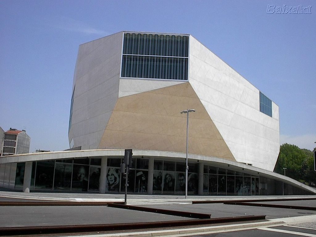
In 1999 it was announced that Porto and Rotterdam would be named the European Capital of Culture in 2001. In view of this great event, a contest was held from 5 renowned private, to construct a building for culture, a symbol of the city area. A Portuguese design a building for the Dutch city, while a Dutch architect working in the city of Portugal. In this way, Alvaro Siza was asked to work on Dutch soil, while the winner was recognized for Oporto and controversial architect Rem Koolhaas.
The project had several drawbacks: since weather issues to financial and constructive, so could not open until 2005, with a concert by Lou Reed and Cla. Despite this, and after some controversy, the building was accepted almost unanimously, and the disadvantages were in the past.
Location
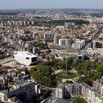
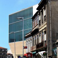
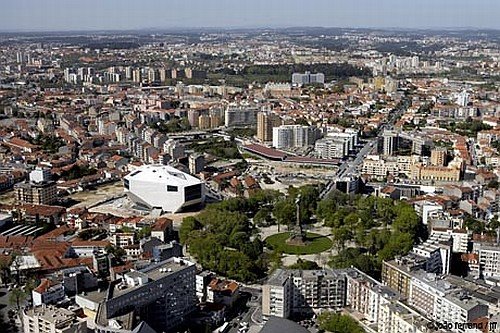
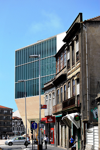
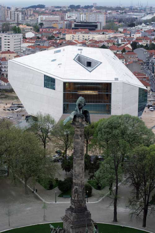
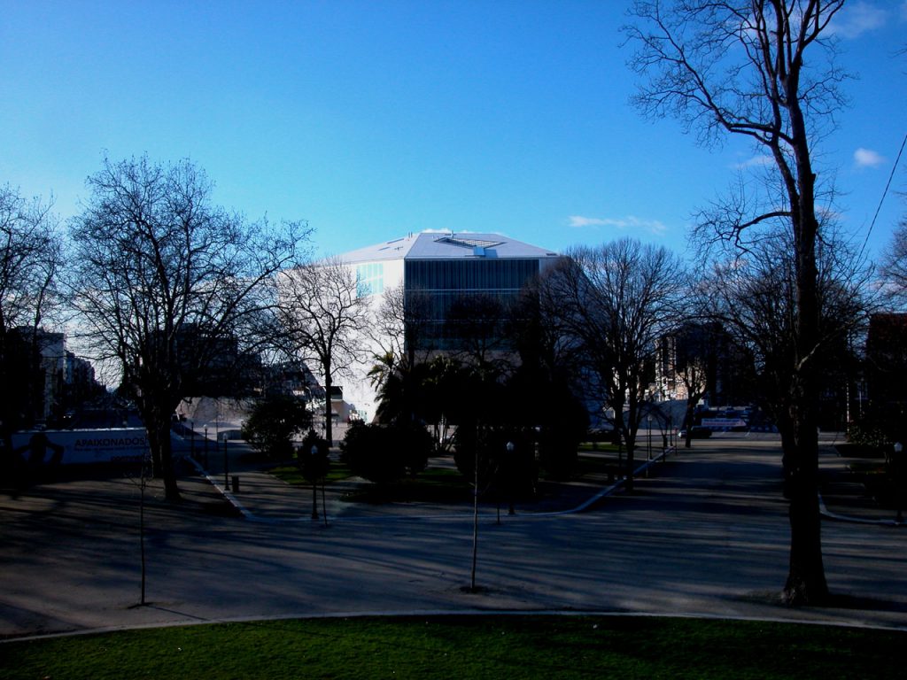
The project is located in a very busy area of town. A corner surrounded by two major streets and Boavista roundabout on its narrow side, with a circular crown plaza. This location is the link between the historical city and a neighborhood of working people. Due to this location, and added to the scale of the project, it should respond not only to architectural and functional, but also on an urban scale.
Oporto is the second largest Portuguese city, located behind the country’s capital, Lisbon. Its production of olive oil, as well as its renowned wine they put in this position of privilege, of great relevance within the economic role of Portugal. Its location on the north-west and facing the Atlantic Ocean make this city a gateway to the country as well as a link with Europe.
In this country, which was discussed among its rich history behind him and needed leap into modernity, where Koolhaas is creating his work Casa da Musica.
Concept
The design process of this building is unique and unconventional. The idea came originally for another purpose:
On the occasion of meeting the needs of the client a unique, OMA designed a house with a very radical concept. This house was conceived as a succession of open spaces, yet isolated, for each particular member of the family. The spaces would be communicated visually from certain points, but only to be found in a large fitness center designed as a large tunnel.
Missing just two weeks to close, Koolhaas realized that using the same concepts as for this house, meet the requirements set for the contest of Oporto.
The first major approach was that the Casa da Musica was behaving like a living organism within the city. Always open and giving citizens, not just open during sporadic events.
The second approach was to achieve a greater connection between the audience and the artist, breaking down the barriers that are often generated and divided from each other. Breaking this myth and to establish a closer relationship between the two.
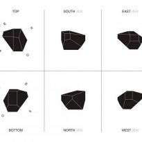
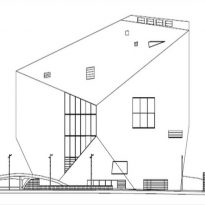
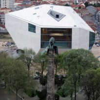
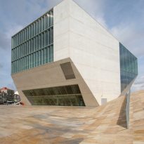
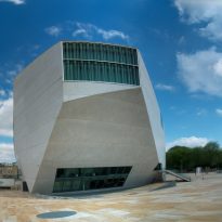
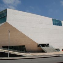
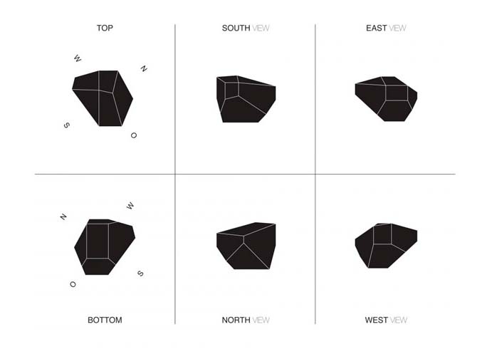
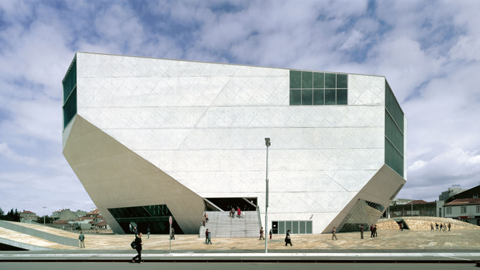
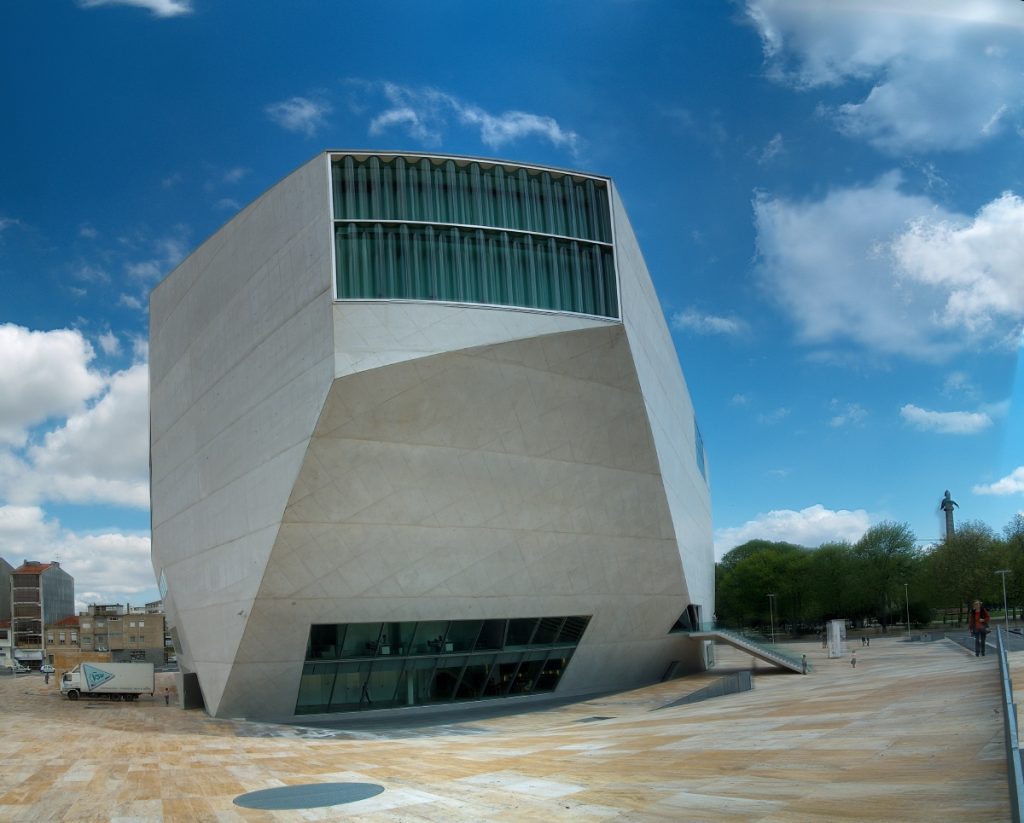
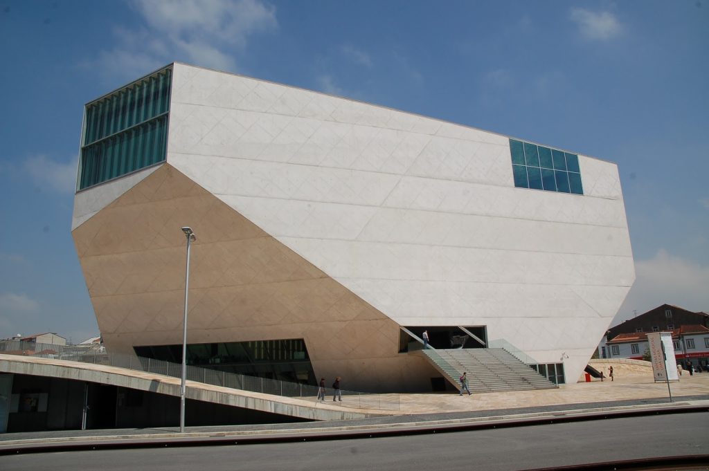
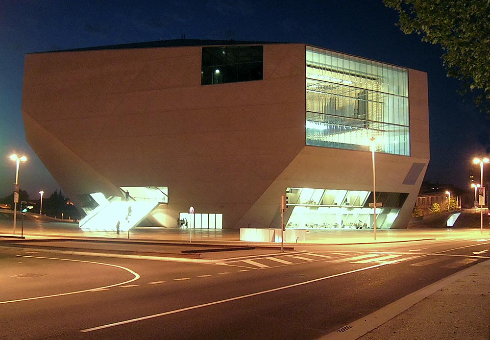
With this great “shoebox” fully transformed Koolhass believed to generate continuity and crisis longed to achieve. A blunt and heavy, which was the symbol of dialogue between the old and new, between public and artists, between two models of different cities.
And to achieve an even greater impact, this intervention would not rest on the remains of a forgotten city, but also to reinvent and re-convert land use, contributing once again to the city that was submerged.
Spaces
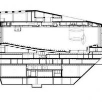
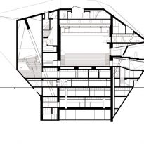
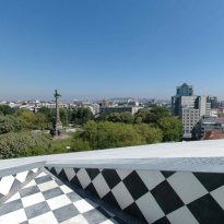
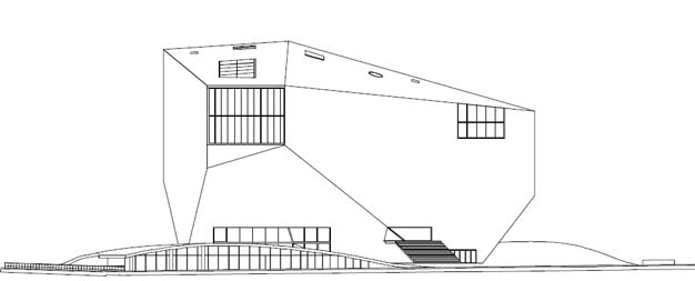
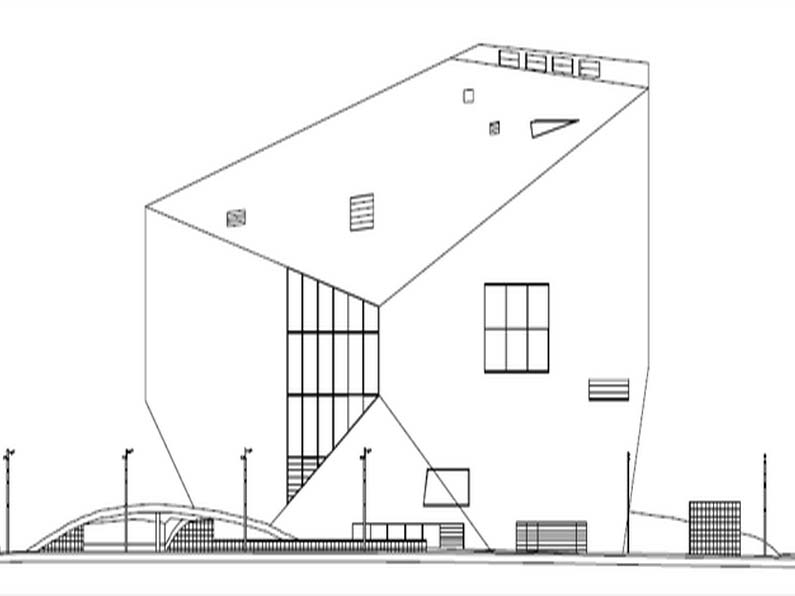
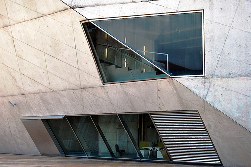
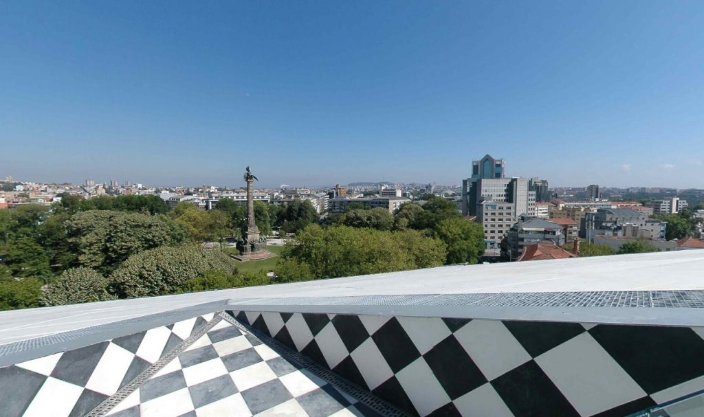
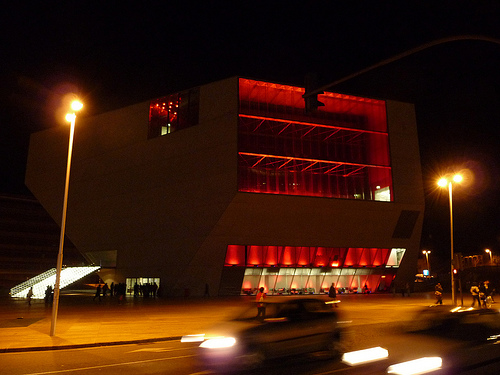
The first contribution of the Casa da Musica is the innovative relationship arises between the interior and exterior. While this volume is rather closed, the intention is to maximize the link with the outside through the visuals. In this way, always invites the visitor in relation to their surroundings and can see the city and even the sky and sea.
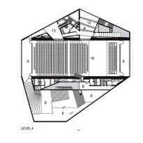
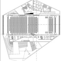
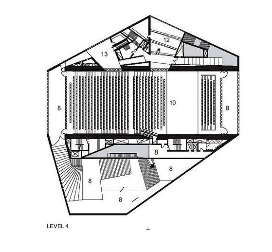
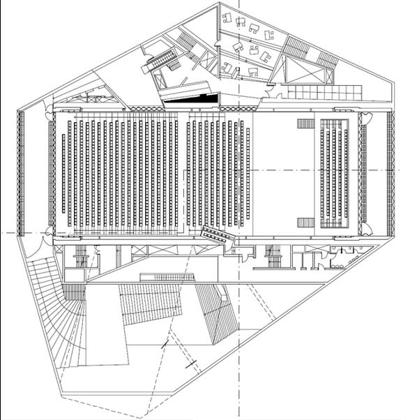
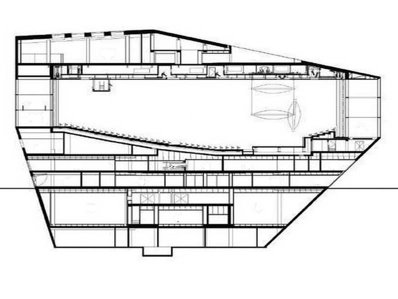
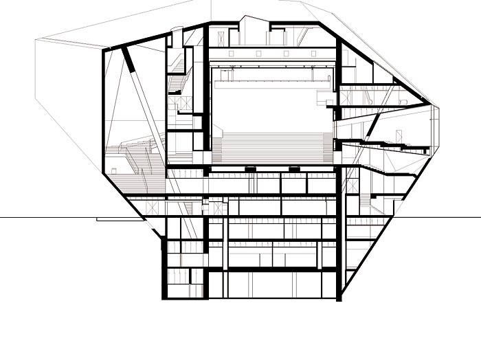
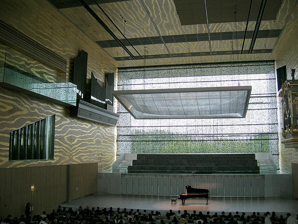
The particular manner of the work comes at the beginning of the definition of the two largest auditoriums. Although the architect did not want to have the same morphology as the traditional rectangular boxes, after consultations with experts and conducting various studies, they concluded that this sound was the best resolution. Provided these two parts, the cast was able to take the rest of the program.
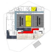
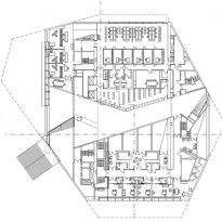
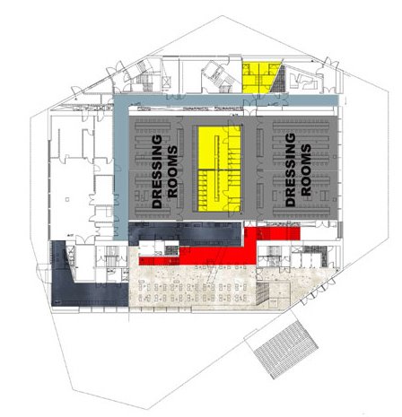
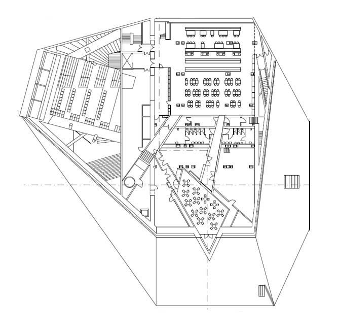
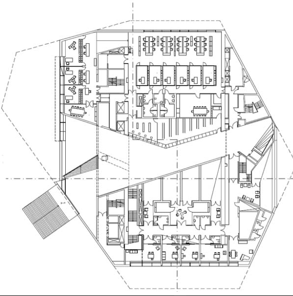
During the design process, other spaces were created or were the result of the bizarre morphology. Each of these spaces “surplus” was assigned a role, and they all serve as a secondary function of the auditoriums. That is why there is a restaurant with terrace, a bar, rehearsal rooms, recording studios, press room, and others.
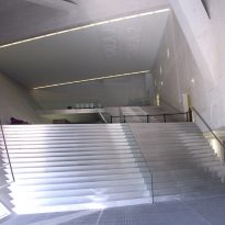
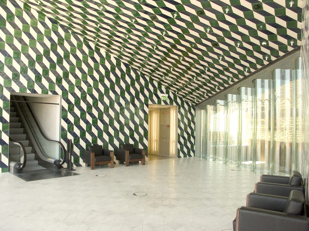
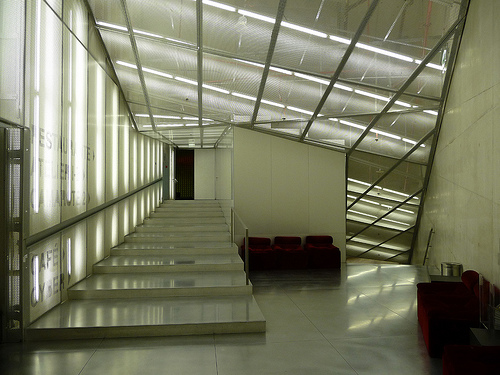
In contrast to any cultural center of this kind, the work of Koolhaas we noted in the first instance, it has no space for a foyer or lobby. Instead they will see a succession of spaces through the functional areas, or even mutate and become part of them.
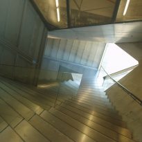
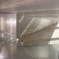
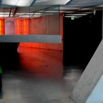
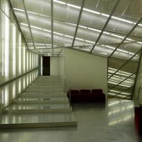
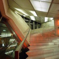
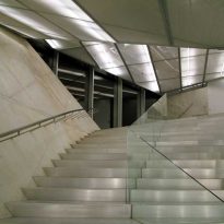
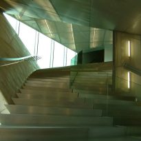
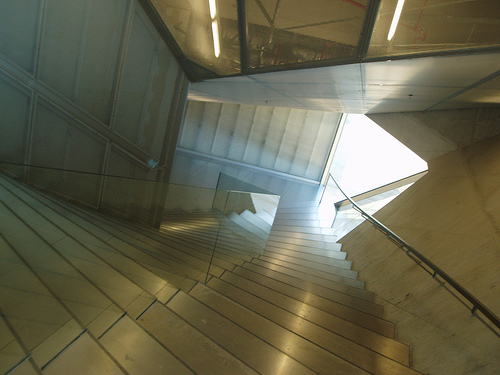
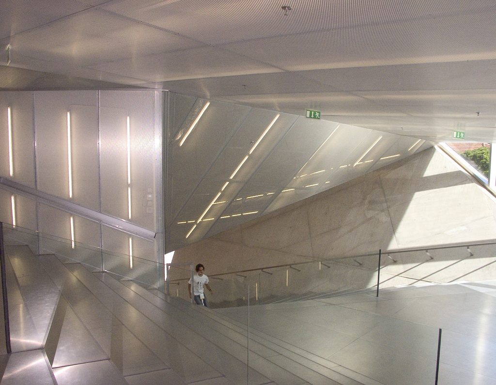
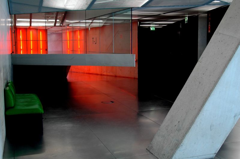
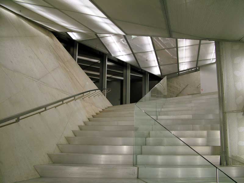
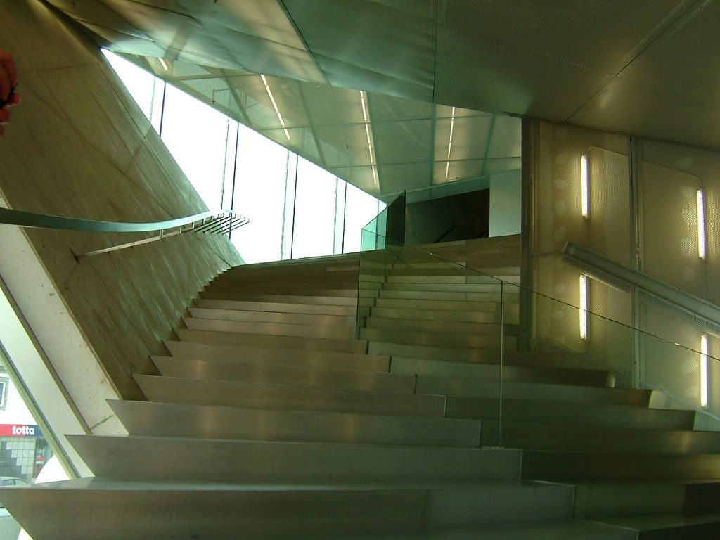
The route is uncertain and unclear. With staircases that appear from nowhere and get lost in what seems to be another completely different, angular hallways with walls that end in the opposite direction; narrow tunnel with ramps that amount to the unknown, etc.. Invited to tour the building is constantly being surprised and expect the unexpected.
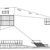
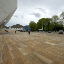
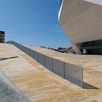
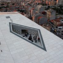
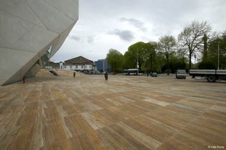
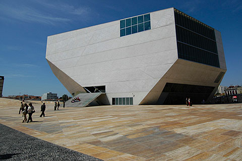
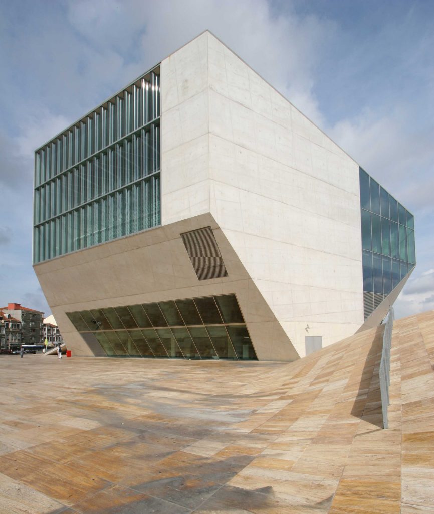
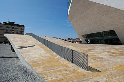
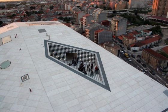
Not only the building has a diamond-shaped at least strange, but the author is also responsible for the dry place in which it supports have similar characteristics. Playing with the topography and creating a series of reliefs, takes the lower portion of land that holds the diamond music, and works with the public space. So of communing with the notion that a cultural institution should not only serve a portion of the population, and a large minority is that you can access them frequently.
Structure
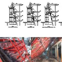
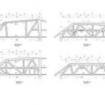
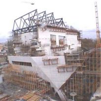
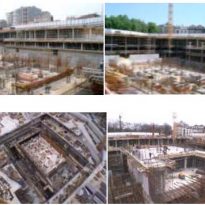
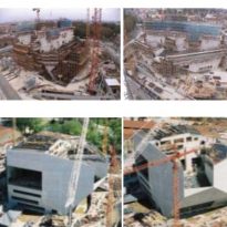
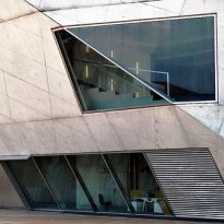
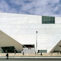
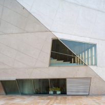
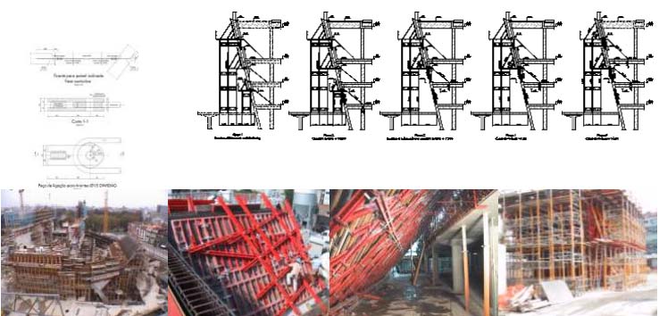
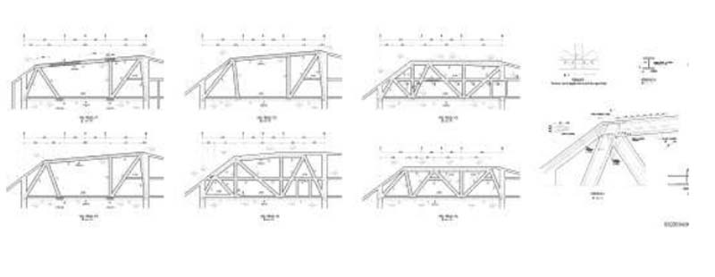
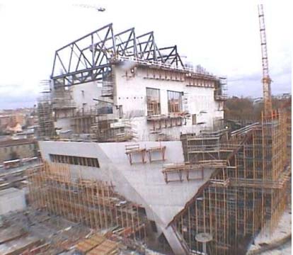
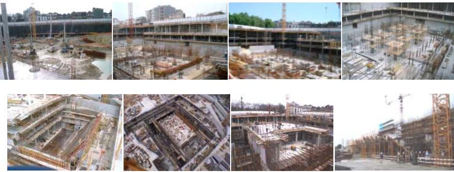
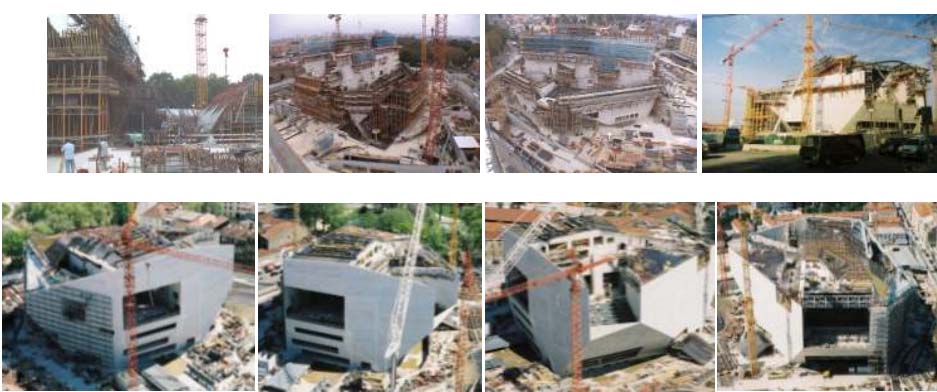
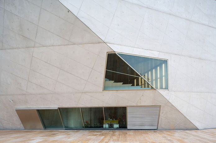
The project required a clever answer for structural resolution. Visually and spatially defined by its faceted exterior, as if the author had broken through the interior space and small pieces placed inside it. That is why the exterior walls are 40cms thick shell and act as a discharge of tension. Even these walls down to the basement in the same way and buried, covering the services and space for smaller rooms.
The audience is more “floating” in the midst of large, isolated from the outside walls for noise issues. Rests on pillars facing the circulation throughout the building.
Materials
The diversity of raw materials and the fact that even today are still producing top quality manufactured material, Koolhaas gave reason to seek an alternative use.
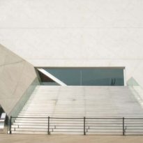
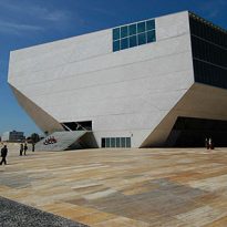
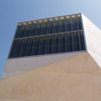
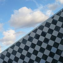
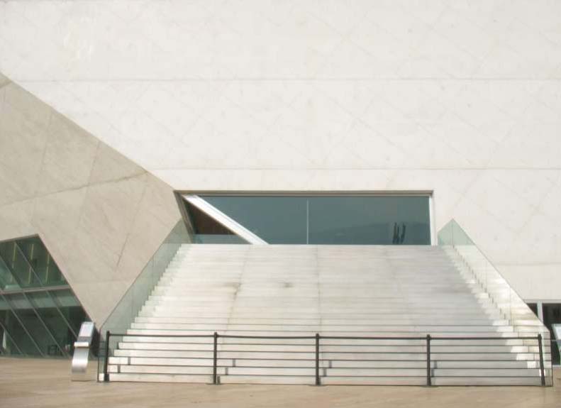
After six months of tests, one reaches the desired result of color and texture of the walls inclined. Portuguese mixing Portland cement with a particular blue sandstone which eventually emblanquecía, is finishing the exterior concrete walls.
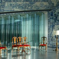
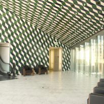
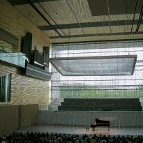
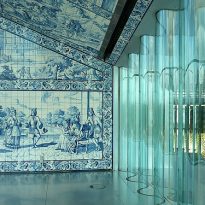
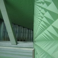
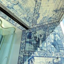
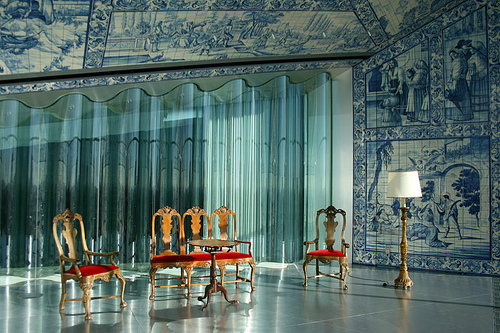
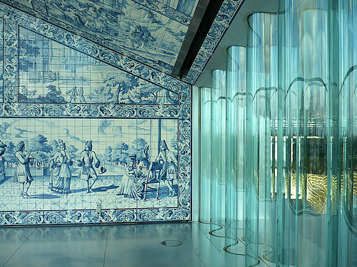
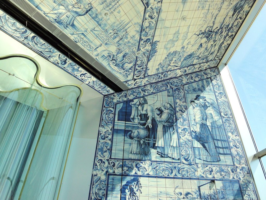
But unlike the image austere exterior, the interior is fed by various colors and textures. Each space is defined in a unique manner, with a special detail at its termination. Variety of colors, the balance between natural light and artificial light, quirky mosaics and furniture characteristic of Portugal are the stage that we can find inside.
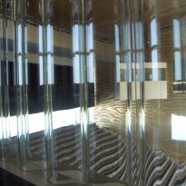
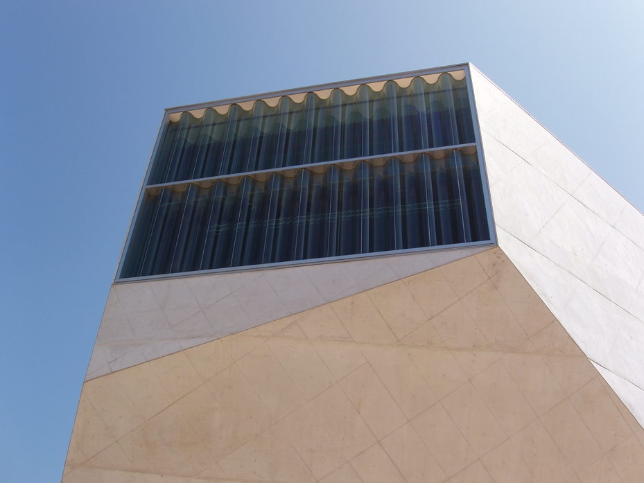
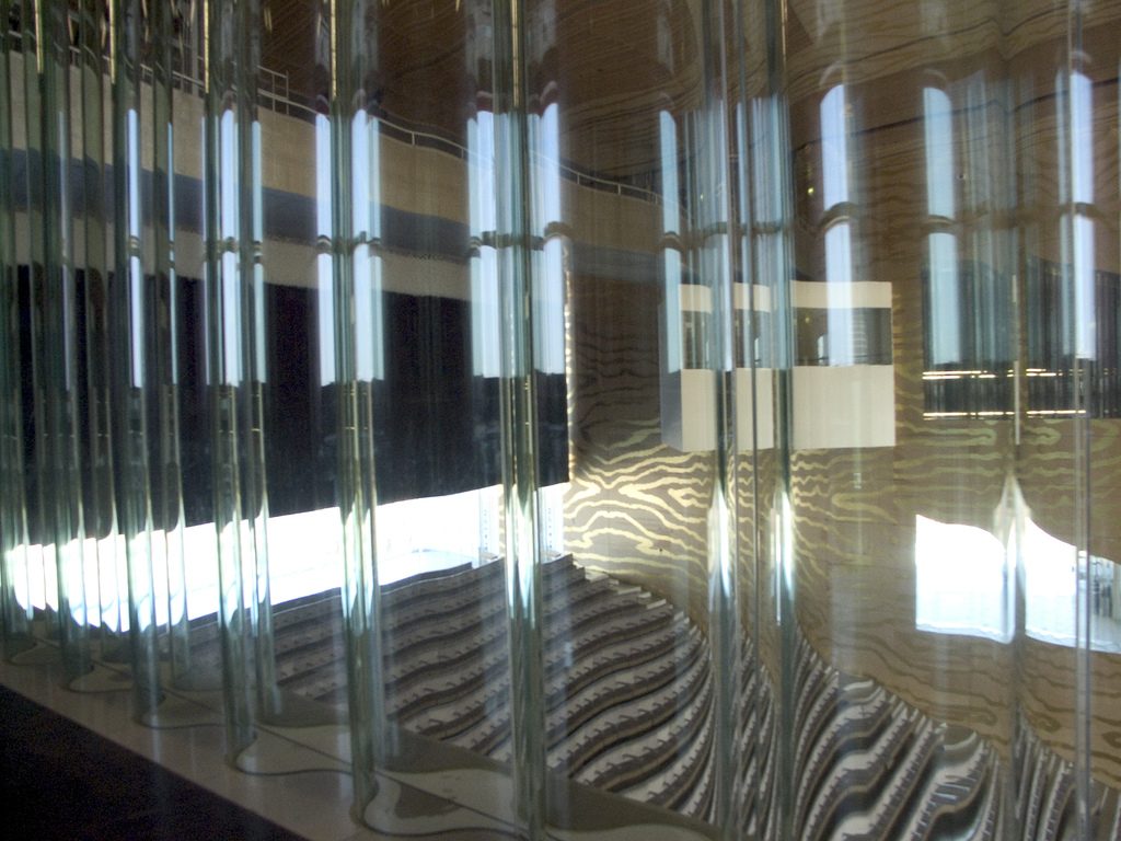
Another great feature is that both audiences are partly glazed side, responding to the search for the direct relationship between the audience and the artist, and also benefit from natural light and view the city from inside the room. But that decision is not easy, because the glass is not a good material for the acoustics of a room this size. That is why we adopted the use of wavy glass, thus favoring a reflection of the sound without the loss of it.
Finally, dry place in which the giant 23000m2 rests is made of travertine.
