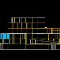
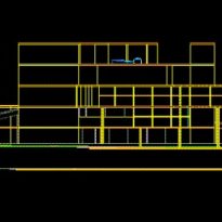
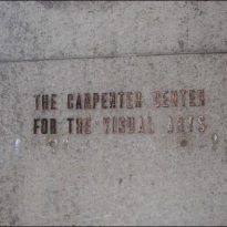
Carpenter Center for the Visual Arts
Introduction
Le Corbusier’s ideas crystallize in grand form on the UN headquarters in New York, developed by Wallace Harrison, but of which Le Corbusier will always claim paternity. Carpenter Center for the Visual Arts can be regarded as the only work of yours truly on American soil, a very unfair compensation for an architect repeatedly propositioned by the United States.
In 1913 and fascinated by the images of U.S. industry, Le Corbusier did not succeed in his first trip in 1935, and left with orders to return after his vain attempt to impose a “reconstruction cell” in New York.
A determined Le Corbusier takes the opportunity offered in 1959, thanks to the mediation of Josep Lluis Sert, who would then follow up the work to construct a building for the Faculty of Arts at Harvard University. He is aware that it represents his only opportunity to present his experience in a final architectural and plastic synthesis in the U.S.
Situation
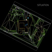
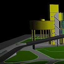
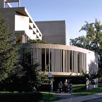
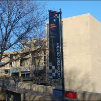
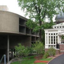
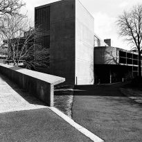
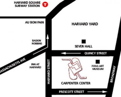
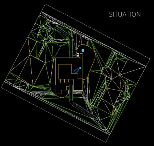
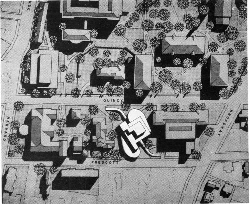
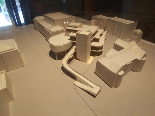
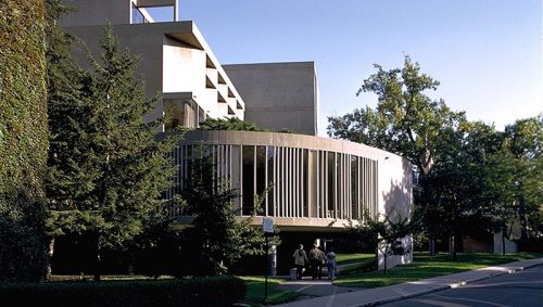
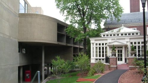
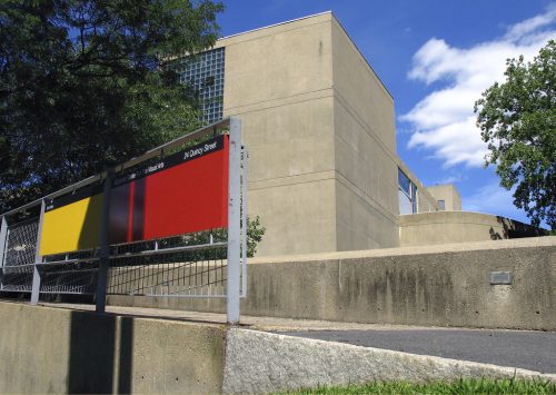
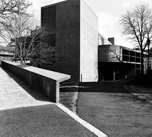
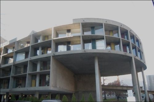
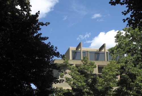
The Carpenter Center was built in the city of Cambridge, a few meters from the brick buildings of Harvard Yard, between neoclassical Fogg Museum and the Faculty Club, on land located between Prescott and 15th streets and not at all predisposed for a monument that Le Corbusier thought seemed inappropriate at first sight.
Concept
Le Corbusier was inspired by all the architectural and plastic themes from 1945 and began some initial investigations like the Domino.
Project

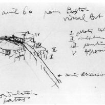
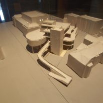
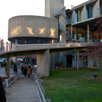
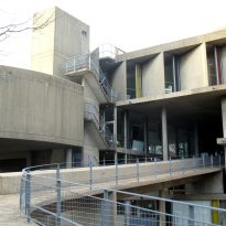
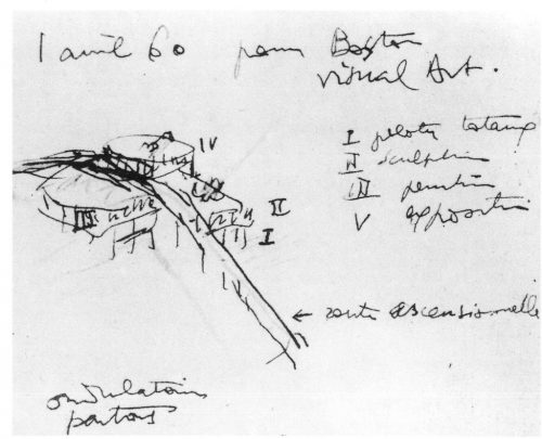
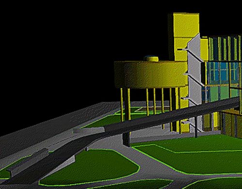
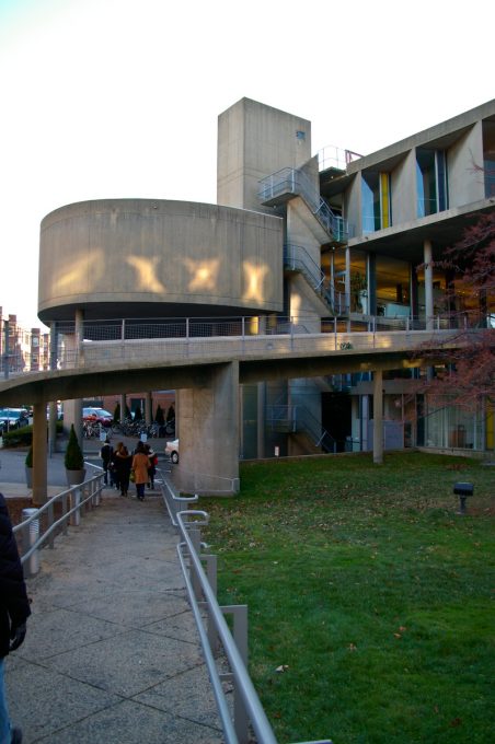
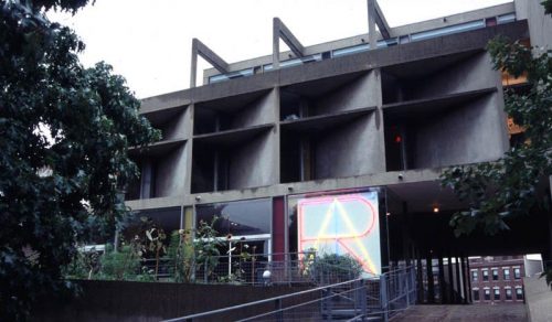
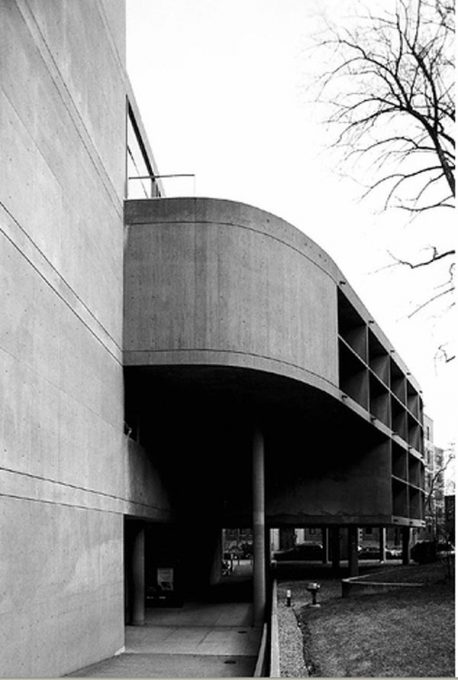
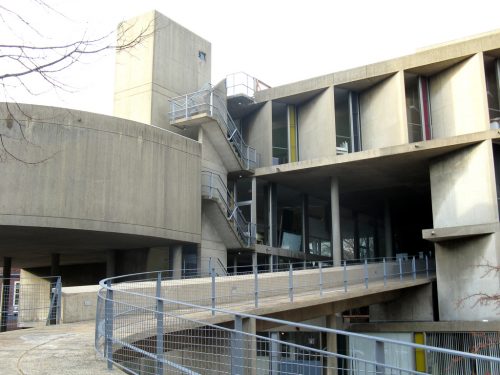
From the outset, Le Corbusier designed Carpenter Center as an architectural promenade that connects the two streets through a volume and uses flexible forms encountered in the study of the painter. In a first outline, designed with the young Chilean architect Guillen Jullian de la Fuente, the model of the ramp of the walk was a spiral. The final version consists of a thin concrete surface in the form of an “S” joining the streets and running through the center of a large site, where passersby can see the studies.
Description
The building can be compared with the Millowners Association Building in Ahmedabad, formed of blocks of various heights in an open plan, wrapped in a marquee and accessible by a ramp-sculpture.
Carpenter Center explores several solutions designed from the marquee skyscraper in Algiers and used a two-part plan in the form of a “lung” that recalls a figure presented in 1925 in “Urbanisme”.
Spaces
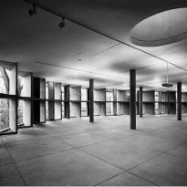
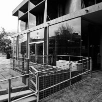
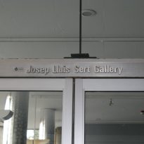
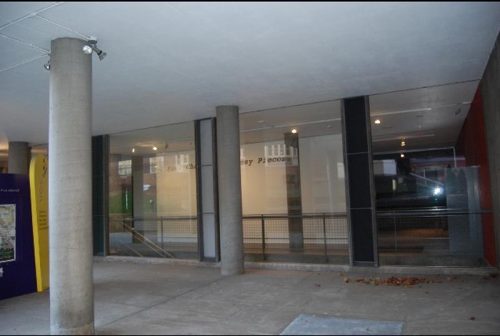
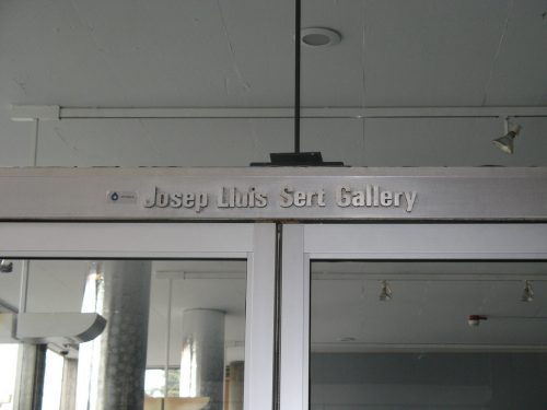
The Carpenter Center for Visual Arts (CCVA) houses the Department of Visual and Environmental Sert Gallery on the third floor, the Main Gallery at the ground level, and the Harvard Film Archive.
- The Sert Gallery at the top of the ramp, features the work of contemporary artists.
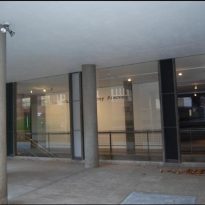
- The main gallery on the street is home to a variety of exhibits to support the curriculum of the Department.
- The Carpenter Center is also home to the Harvard Film Archive, which leads the public through a unique program of experimental films and rare classics.
According to its role as a center for visual arts, the building embodies a “synthèse des arts majeurs” such as painting, sculpture and architecture.
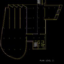
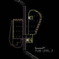
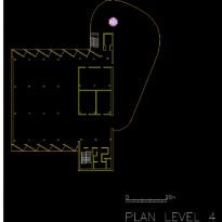
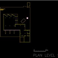
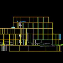
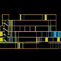
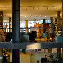
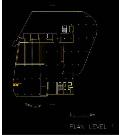
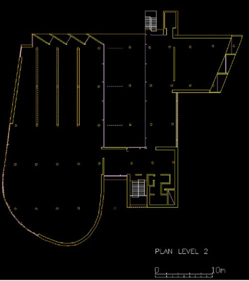
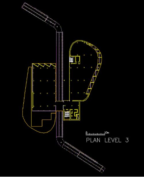
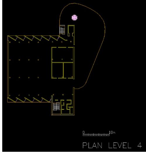
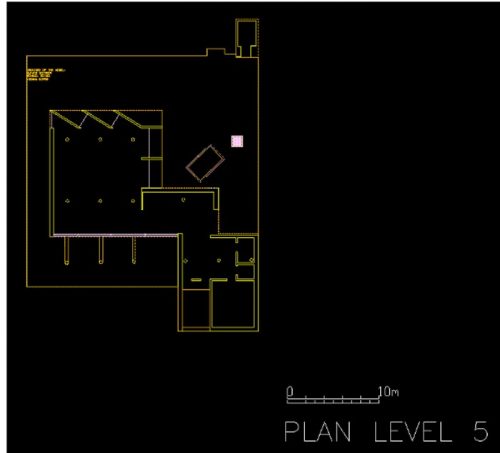
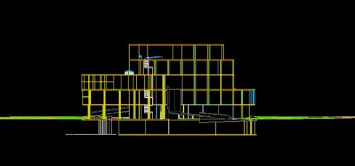
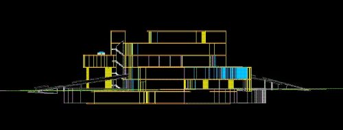
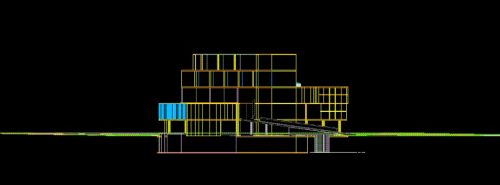
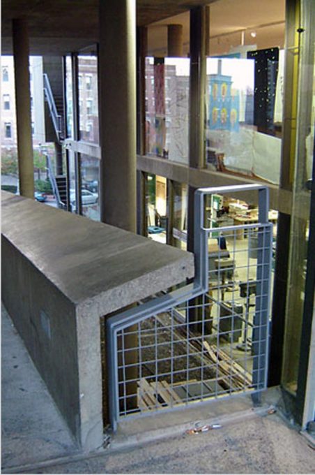
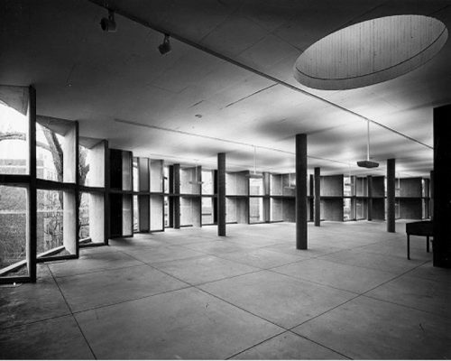
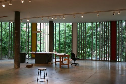
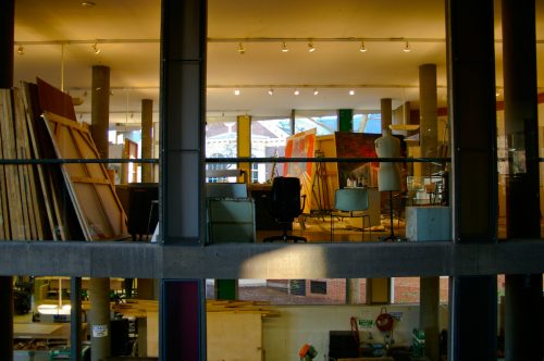
The five levels of the building and the role of flexible work spaces for painting, drawing and sculpture, and the path through the heart of the public construction encourages movement and provides views of the works, making visible the creative process through the design of buildings.
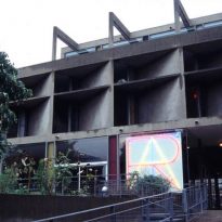
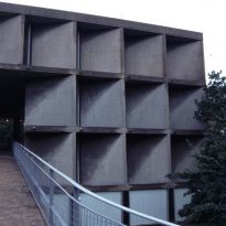
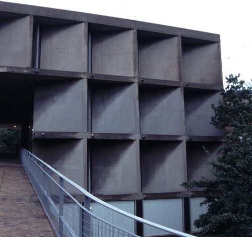
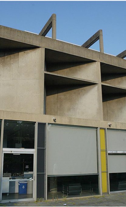
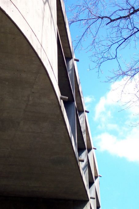
The functional similarities of the floors, the free movement of sculptural expression, ambiguities between figure and background, and between mass and space are associated with the Carpenter Center later works: the brise-soleil oblique are similar to those of Chandigarh and the ramp into the building recalls the Millworkers’ Association.
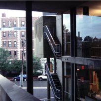
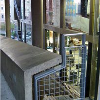
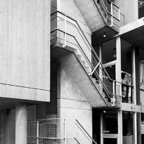
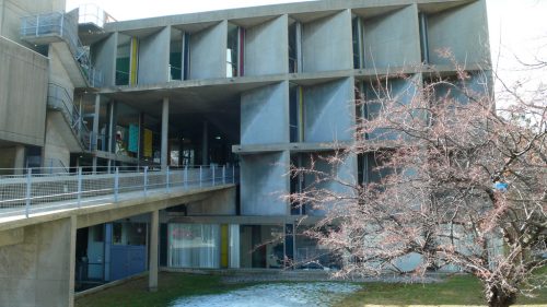
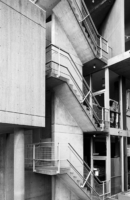
The ramp allows the inspection of architectural elements of Le Corbusier and the activities of the workshops within the building.
Structure
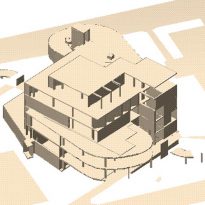
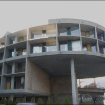
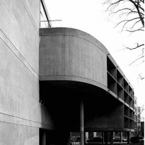
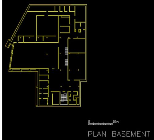
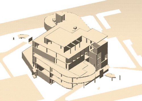
The central nucleus is a cubical volume that ends in curved workshoops at each end of the diagonals.
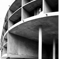
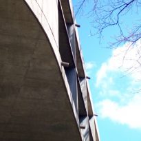
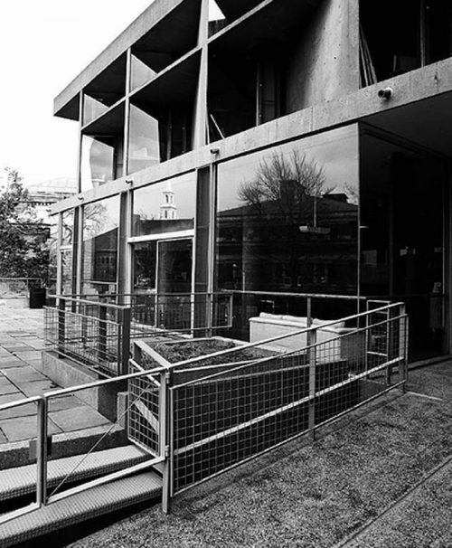
The set is crossed by an S-shaped ramp that rises from one of the streets and descends toward the other. The Carpenter Center boldly breaks with orthogonal geometry of its neo-Georgian environment.
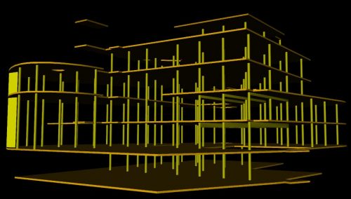
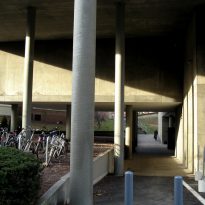
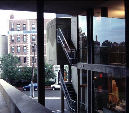
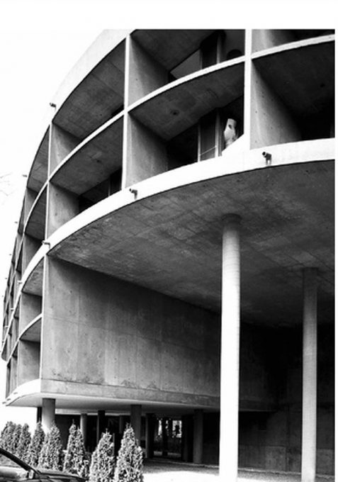
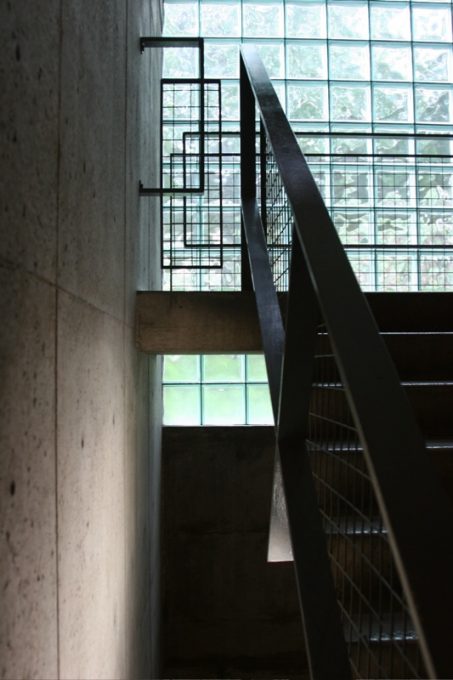
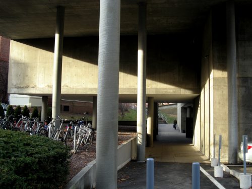
The layers and levels enter and exit the inner cluster concrete pillars. The pillars support the maximum projections and create interpenetrations fo the exterior and interior, as well as sequences of spaces bound by the incline of the promenade.
Le Corbusier used each step of the design process to test new ideas and to purify the old. He used the Carpenter Center to investigate the pillars and beams before establishing a smooth solution of forged and cylindrical pilllars of different sizes in the skeleton structure.
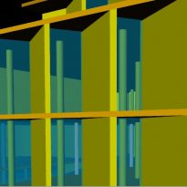
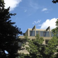
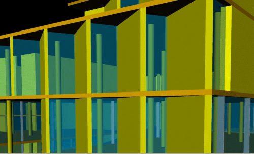
The ondulatoires and brise-soleil did not mixed well in the windows, so he decided to separate them. After testing the brise soleil – like airplane wings – on balconies, the architect returned to the solution found in [[Chandigarh]] and Ahmedabad,[[Villa Shodhan]], where concrete panels were placed diagonally or perpendicular to the edge of the building, but this time he used windows. Heating and ventilation were embedded in the floor, which was combined with pivoting vents to allow the passage of air.
Materials
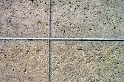
Sert, who worked with Le Corbusier 1928 to 1930, helps to answer critics who accuse him of using concrete rather than “crude” but “brutal.” By using a rendering smooth surfaces in many parts of the building, claims to have found “the key to the solution for reinforced concrete”
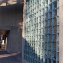
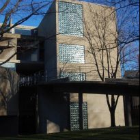
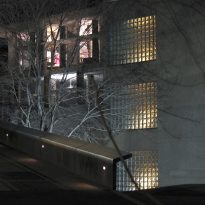
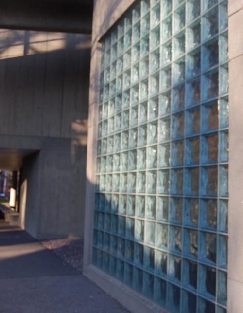
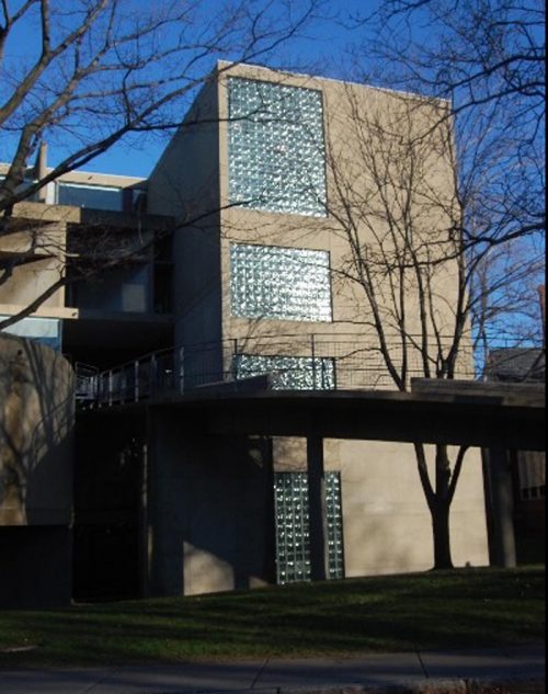
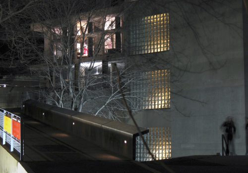
In Cambridge, the crystals appear in the third and fifth floors while the brise-soleil did in the fourth
Elements
Carpenter Center of the holes were mainly four types:
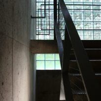
- Full glass floor to ceiling (pans de verre)
- brise-soleil (which were also conceptual relatives of the walls)
- ondulatoires (which gave the best definition of a hole, just like a wall in some places discontinuous)
- aérateurs courses (the final version leaves pivoting vertical racks including insects).
Overall this was a grammar of the facade that was the updated version of Le Corbusier by its principle of free facade of the twenties. The idea was that each of the elements to serve a specific function, and that each embody and symbolize the
function.

