Burda Museum

Introduction
Burda Museum began to be managed in 2002, when the collector of 68 years, Frieder Burda, decided it was time to share their acquisitions.
Bearing in mind the geographical destination for the location of their collection, as well as the type of building that needs to do, travel to the United States. There he was to meet directly with those who wanted it to be the architect who plan and implement the challenge.
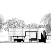
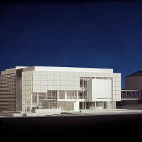
Six weeks later, Richard Meier designed the draft that his was looking for. A museum for little more than 900m2, which is related to its immediate context and seemed to fit exactly the requirements.
Location
The museum is located on Avenue Lichtentaler Allee, in the city of Baden-Baden, southwest Germany. This city spa that emerge in the middle of the German black forest is distinguished by features peculiar to the traditional German. Lacking the coarseness and bruteza Teutons, Baden-Baden leaves look like a calm and quiet city. It has become a space for rest and relaxation, as well as recognized for its health centers and physical therapy.
But its most relevant aspect is the exclusive and distinguished cultural offering, despite being a smaller area. Its museums, theaters, casino, race track, and exhibition centers, make this place unique. It houses the largest theater in the country.
Reflects the importance of aesthetics and care can be seen with the naked eye in its streets and squares tended to perfection, as in its stores at a high level.
Concept
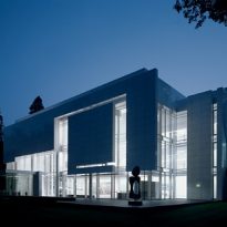
Richard Meier defines his own work as “a jewel in the park, and is perhaps the best possible synthesis. Both the architect, as the man who commissioned it were more than satisfied with the final product.
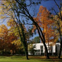
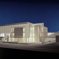
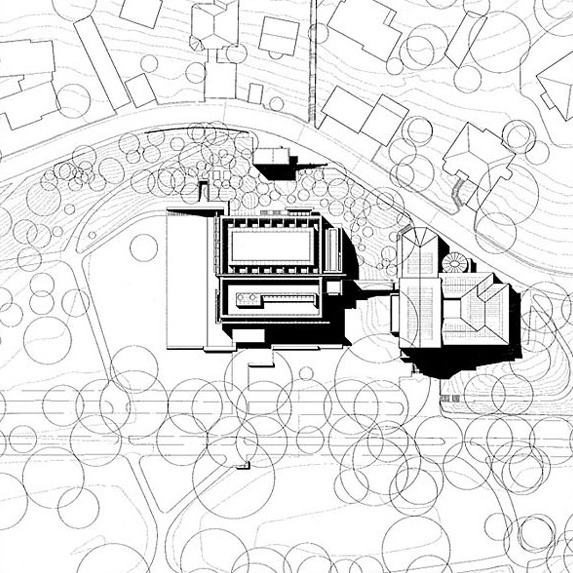
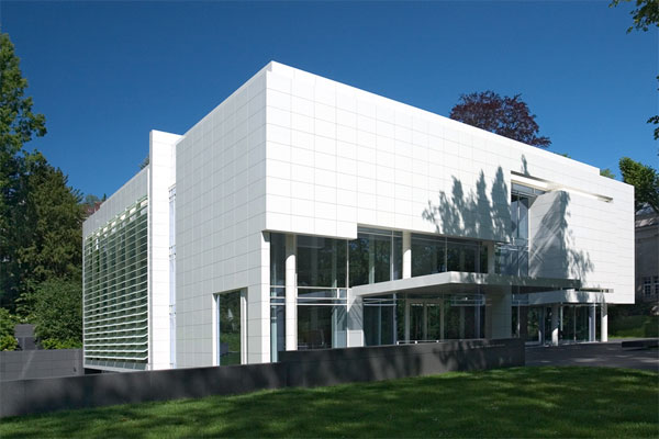
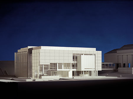
With the hallmark of the American architect, the museum succeeds in harmony with both the park surrounding it, as well as the museum which is located next to hers.
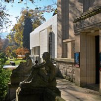
At first, Meier had to the relationship that the new museum would have with the old Kunsthalle, a state art gallery in a neoclassical style. His answer was as simple as this.
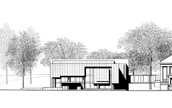
The new museum located at the side of the already existing. Would not exceed the height of its neighbor, and work with the same color as the Kunsthalle. As if this were not enough, this same thought fit with the architect, an advocate and lover of purity and white color represents the vast majority of his works.
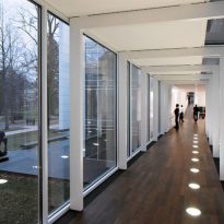
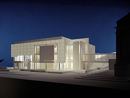
All these decisions supported the concept of not overshadow the museum was already a landmark in the city. Rather, his idea was that both bodies could complement and nurture each other. And to strengthen the coherence, a bridge project that would communicate transparently. Decision emphasized that the German authorities as “an example of a complex interaction between private and public, committed to art.”
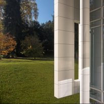
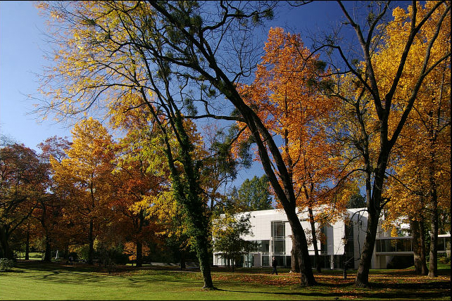
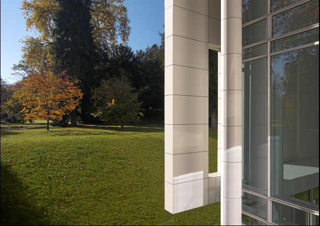
The second challenge was to identify the image that the museum would, and his link with the surrounding park. Meier responded with a building that is in harmony lies between the majestic trees of the park. Existing roads and new ones that I make access to it is something almost natural.
The museum is simple in its lines, geometry, and of modest scale. However, your final image looks like a picture in itself. By managing elements, creating a composition with depth and shape. It uses natural light, reflections, colors, and textures and building materials. And creates the impression that each part has its raison d’être, and that, as Alberti said, nothing could be added or removed from the building without it affected their harmony.
Spaces
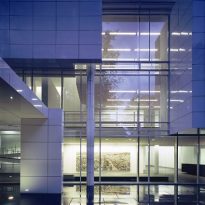
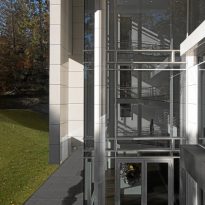
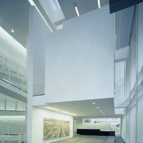
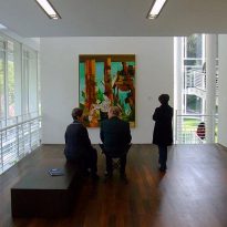
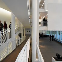
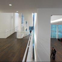
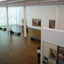
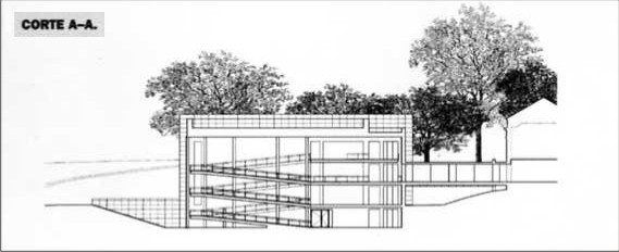
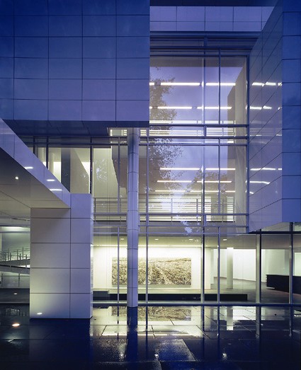
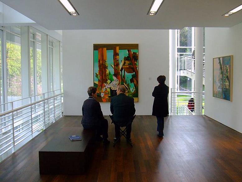
The building finishes discovered once inside. You appear to have each of the decisions taken at the time of projection. Everything is in its precise angle. Glazed panels overlap with white aluminum. Ramps zigzag through subtly lobby. The paintings seem exposed to the majestic reflection of light.
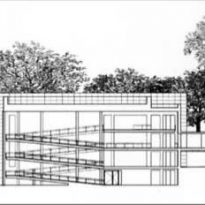
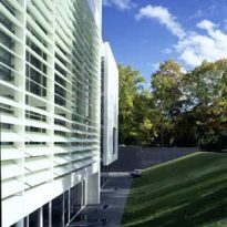
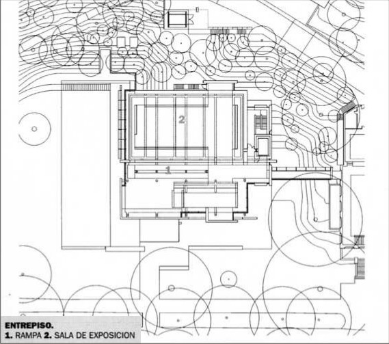
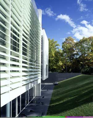
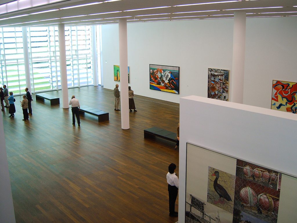
The two major exhibition halls are designed to allow the entry of light from the sides and top. Parasols regulate horizontal part of the facades, while playing with the slides. A series of skylights, light floods the floor. All this makes the visitor never loses consciousness of the park around it and enjoy the green irregularities surrounding it, as if they were placed there carefully. Meanwhile, two bodies of water ready on the South side and east side this exalt relationship with nature, which is the real protagonist of this work. Even the movement of ramps that connect each of the three levels that make the viewer is always accompanied by the green from the hills on the ground floor to the tops of the trees are from the upper deck.
Structure
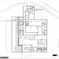
The structural simplicity and clarity of Meier’s buildings has been a constant throughout his career. Given the resolution of their plants, the structure is more a compositional element, as are the circular, the wall, and materiality.
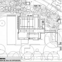
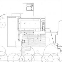
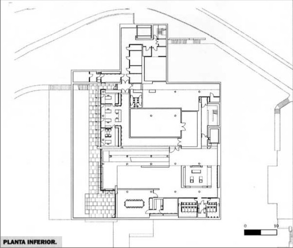
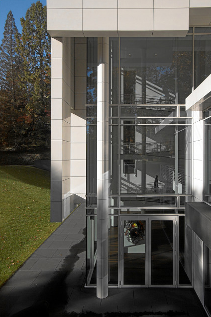
On the floor of the Burda Museum, which is almost rectangular, the structure once again plays a secondary role. While the architect recognizes its necessity, conceals within the set without denying it, but not exposed in its entirety. Away from the shell, it makes this semi-hidden behind the white sheets of aluminum or umbrellas.
In this case the structure is solved by means of columns of circular section, located throughout the plant in a modular fashion. Grid through a clear, Meier columns available only where they are needed, and generates a plant as free as possible, holding back the search for higher incomes of natural light.
Materials
To be consulted by the use of white in all its works almost obsessively so, Meier answered with the simplicity that surrounds his thinking: “The white is all colors.” This consistency between their vision and execution of their actions has marked his career and led him to become the youngest architect to obtain the Pritzker Prize.
We could believe that it is simply a whim of the architect, but to justify their actions in this project, Meier said “The white stands for the colors our perception of nature: the white allows me to perceive the ideas of architecture and the relationship between opacity and transparency, the difference between flat and linear elements, and clarifies the ideas between the skin of the building and its interior. ”
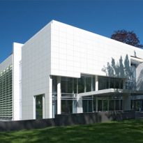
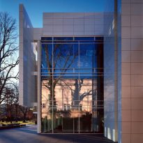
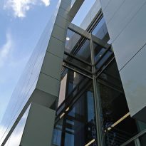
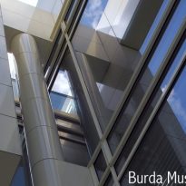
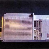
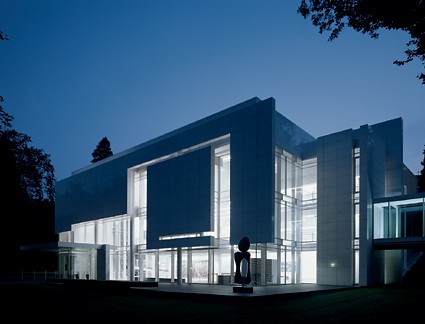
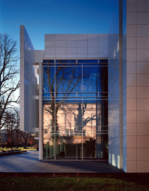
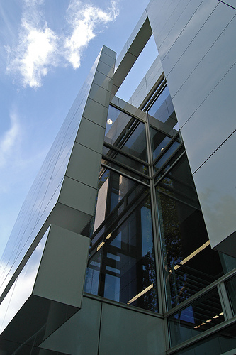
With these concepts, should not be surprised that Meier re-use materials that identify it. The white rectangular aluminum plates make up the closed parts of the facade (the abstract), while the rest is covered by glass cloth (openings). Clear evidence that light is the most versatile building materials and bookmark.
Portions translucent in the museum are large, like a second skin that surrounds the building. The glass panels not only allow the admission of natural light but also reflects the trees and the existing museum with him. But to avoid the pieces of art in its interior damage, and that visitors are overwhelmed by so much light, use horizontal metal umbrellas, which regulate the entry of light, and make every day the museum looks different.
In its interior, the museum has smoothed cement floors and dark wood. The inner walls are also white, so that they reflect the light and even the shadows.
