Building in Michaelerplatz

Introduction
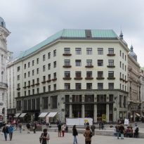
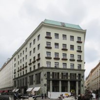
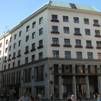
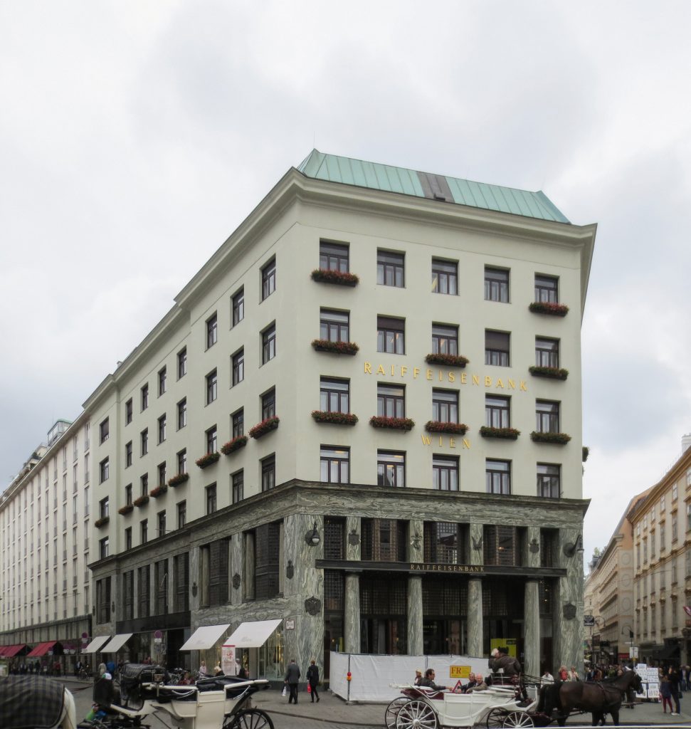
This building is one of the most famous of Adolf Loos and the first made with mixed uses, such as building housing plurifamiliar, and shop. The project was commissioned by the firm Goldman & Salatsch tailors who were once again the “patron” of Loos and occupy the lower three floors of the building with one of its largest stores.
This is one of the first modern buildings in Vienna.
Like everything again caused great controversy among the public, in a city like Vienna and entered only in the twentieth century did not appreciate the work of Loos and delete it or chicken litter.
The controversy came to a point where the authorities temporarily suspended the work in 1910 and it was not until some changes introduced Loos advised by Otto Wagner that allowed him to resume and complete the work.
Today the building of the Michaeleplatz is one of the icons of the city of Vienna and is considered one of the first buildings of the European continent.
Situation
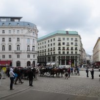
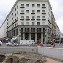
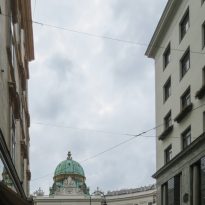
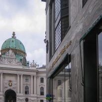
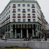
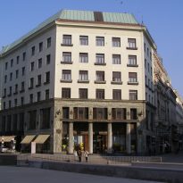
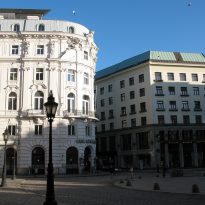
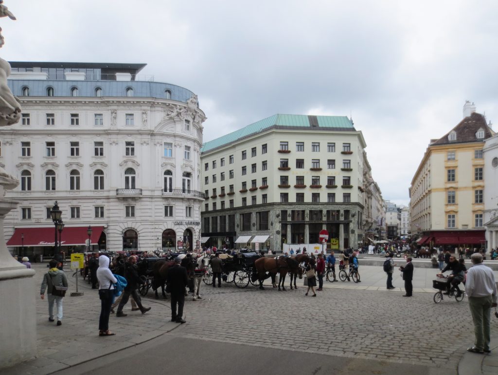
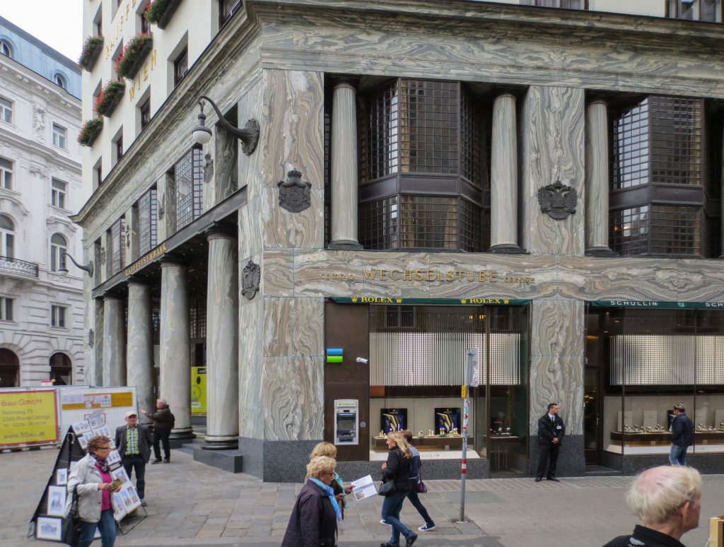
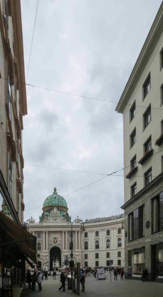
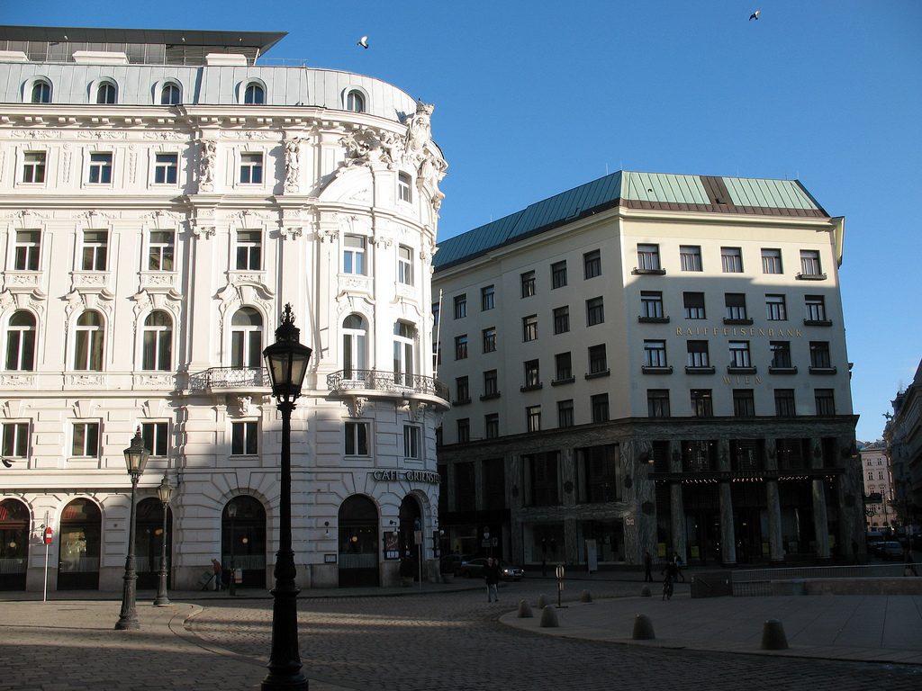
The building is located at number 3 of the Michaelerplatz in a plot bordering the road for three of its sides, one to the square and the other two to the streets Herreng and Kolhmarkt, in the center of accompanied by Austrian capital and other buildings of historical significance but historicist architectural styles.
Meaning
Loos for the two uses that should be the building were incompatible. That is why we decided to create two completely different parts and even opposed, juxtaposing one above the other without any continuity.
Loos, as reflected in one of its most important texts: Ornament and Crime, was a staunch opponent of the overly ornate architecture that was built in Vienna of his time and that is another concept that is well reflected in this building.
Since Loos designed the building as two independent parts juxtaposed unrelated to what we think is more correct to also explain separately.
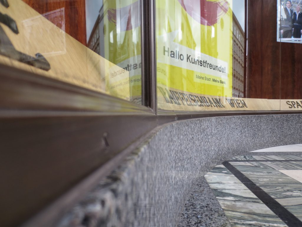
The idea of designing Loos uses two separate buildings reaches the point where the commercial use of dark socket has its own auction ledge, as if the rest of the building was added later.
Trade
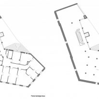
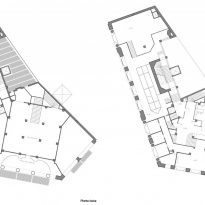
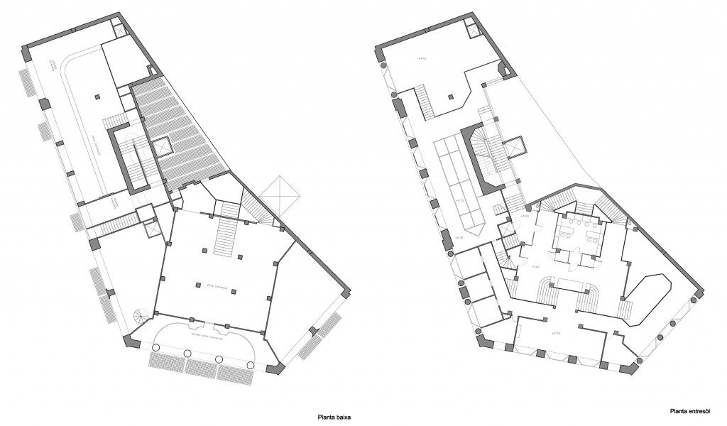
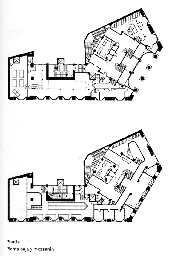
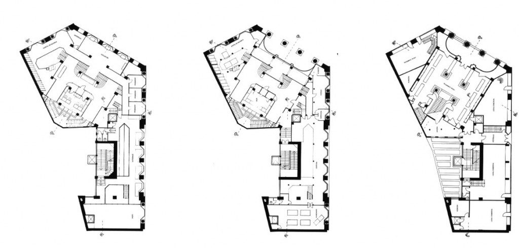
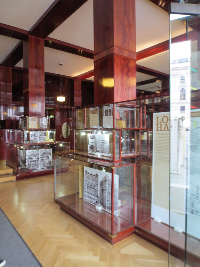
The plants involved in the trade deal three levels below as solid base and noble.
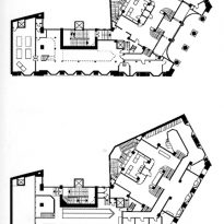
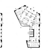
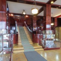
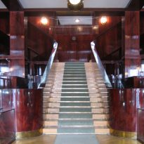
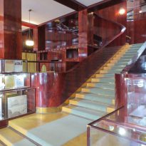
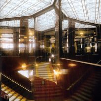
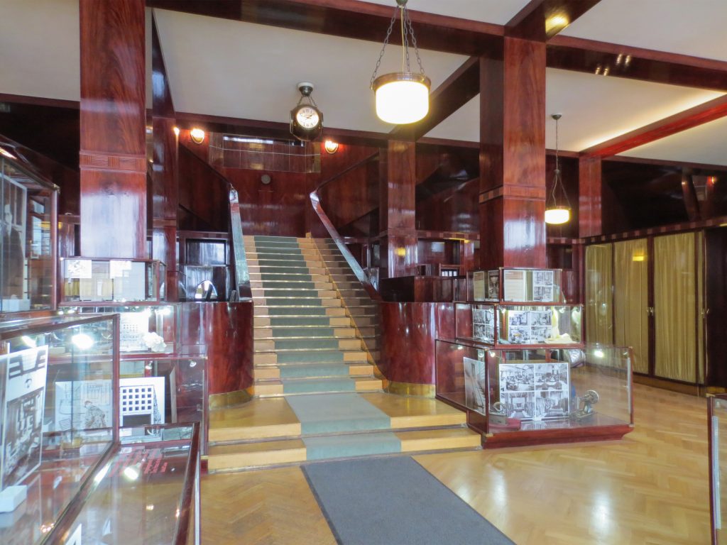
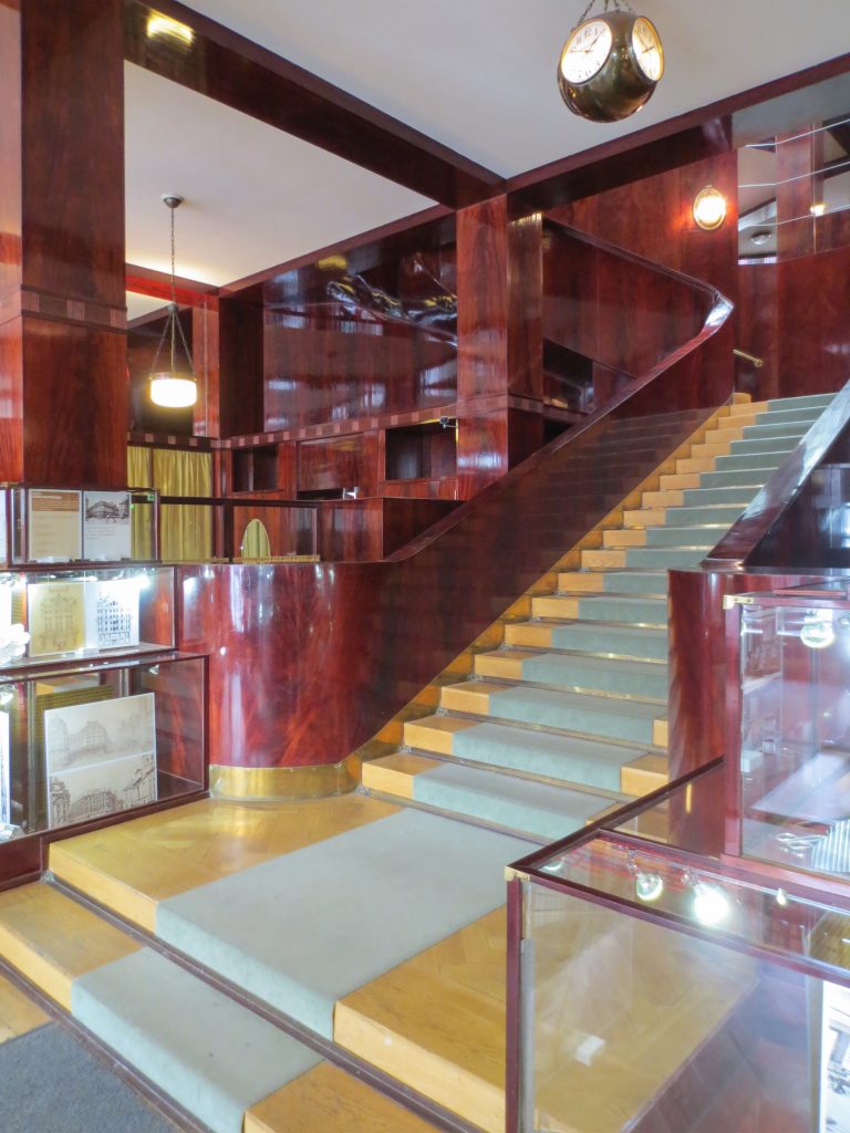
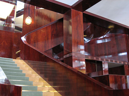
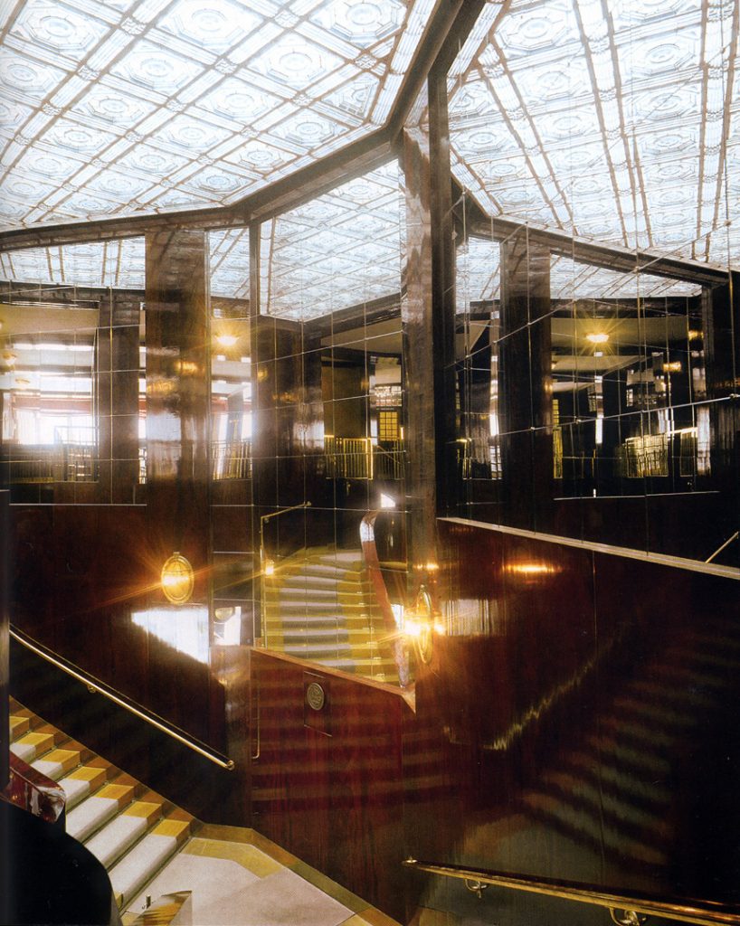
In the vast interior spaces are related to different heights. Something that always aspired Loos projecting spaces not only in plants but in both section and thus making a great understanding of the three dimensions of space and not the two that are limited to the traditional designs.
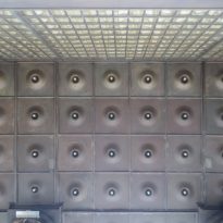
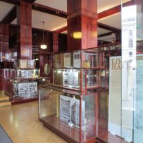
The spaces are not separated by the necessity of bearing walls but they do so by pillars that are in turn linked together by jácenas out that the ceiling of the plane. Beyond pose a problem Loos used this to divide the spaces virtually even placing false beams stressed that the uses of each area. And it’s not forget that in the works of the plant’s roof Loos is as important as the plant floor as the first in general we were much more clear its intentions to the second.
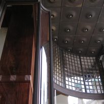
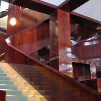
Even the building’s interior surfaces are coated with materials such as wood processing, but in areas with shapes and textures as possible abstract, avoiding excessive ornamentation.
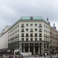
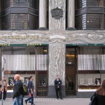
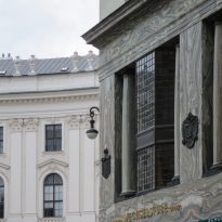
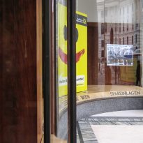
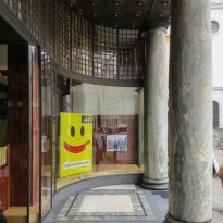
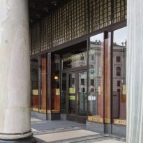
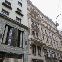
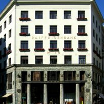
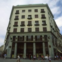
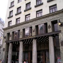
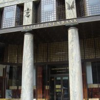
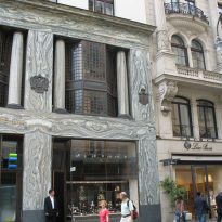
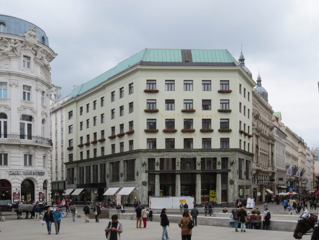
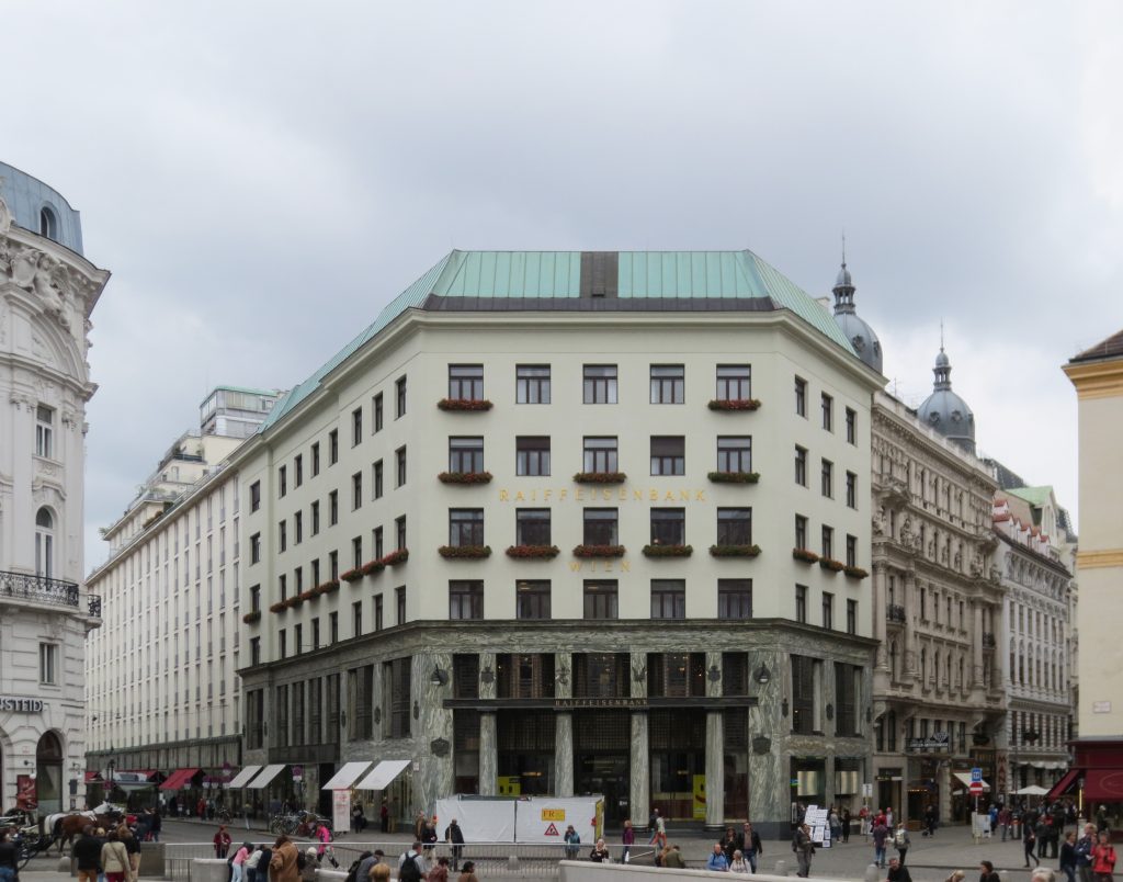
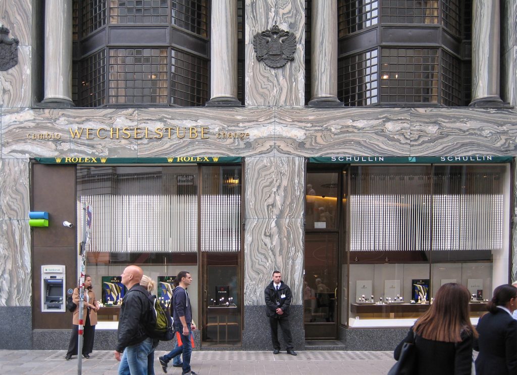
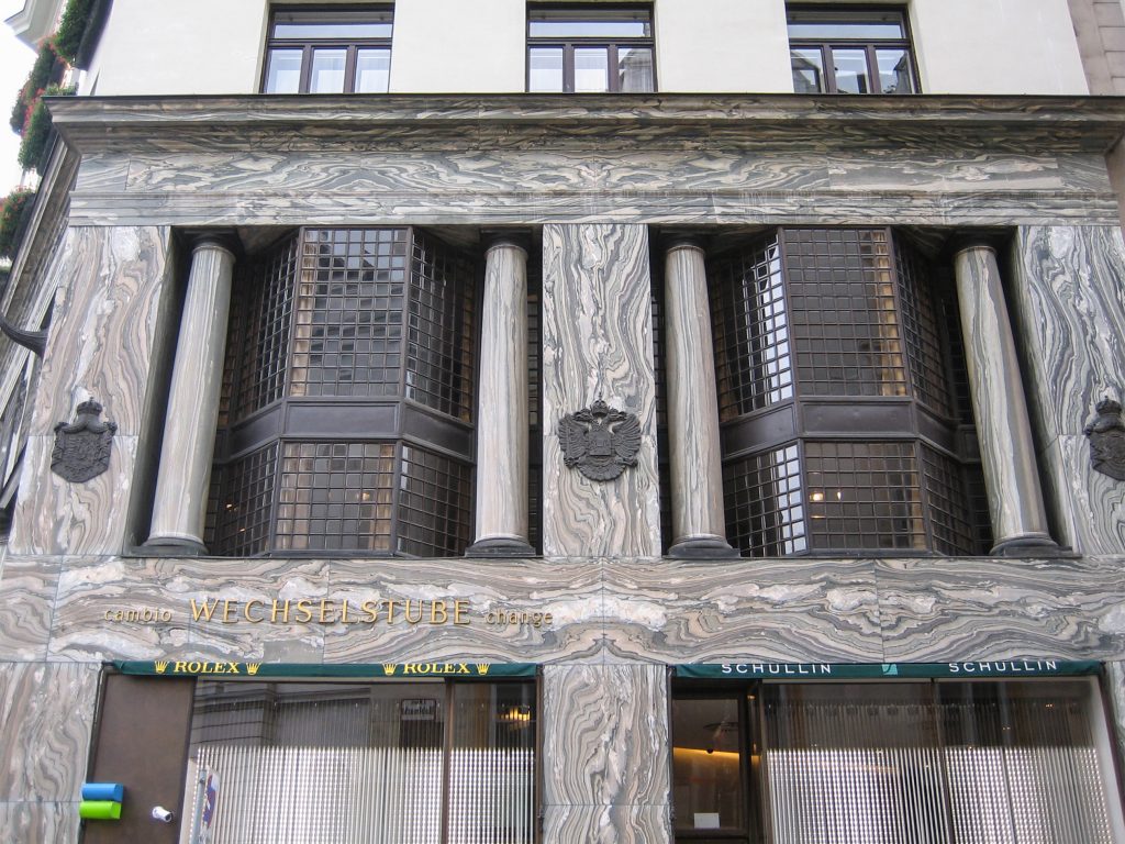
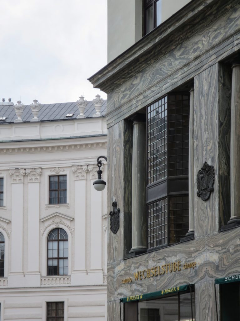
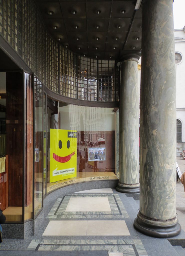
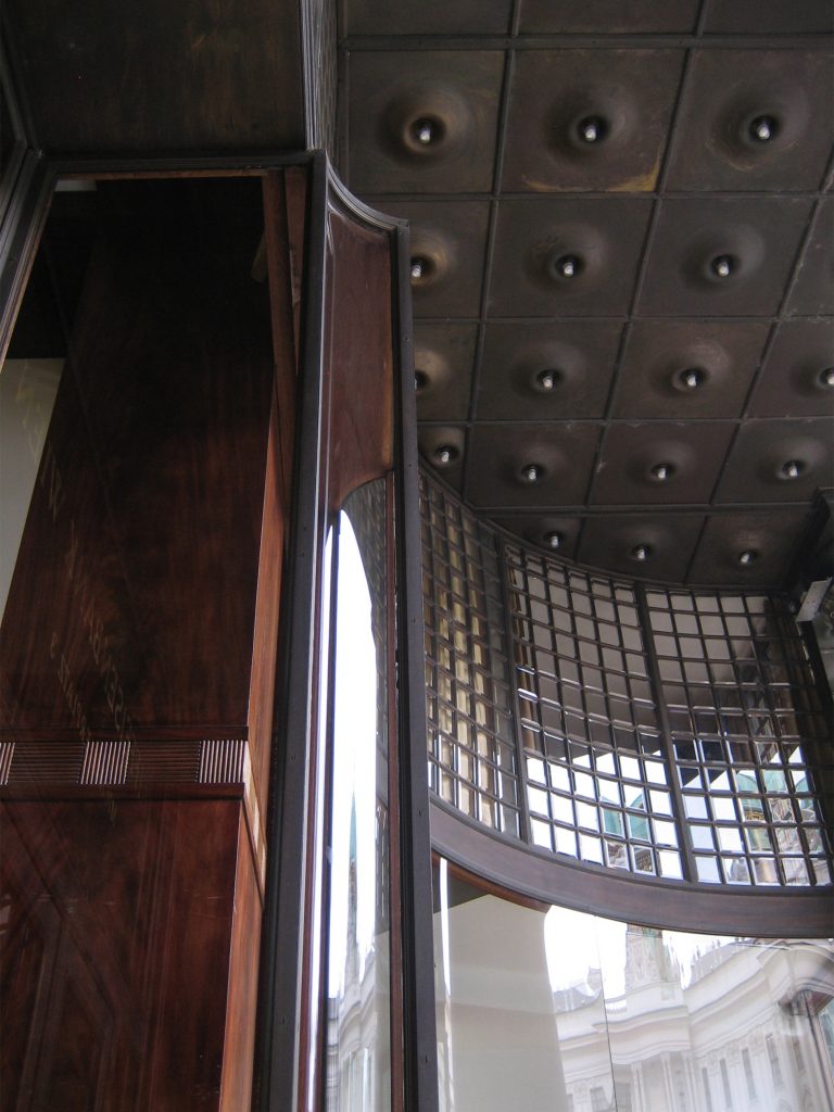
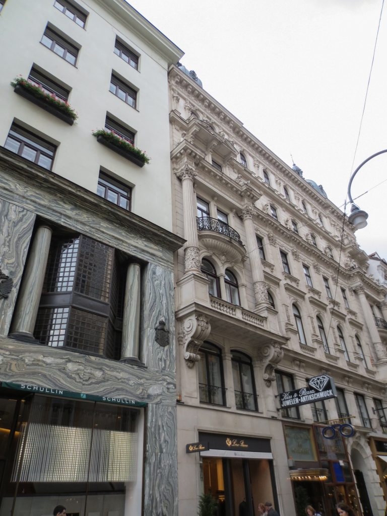
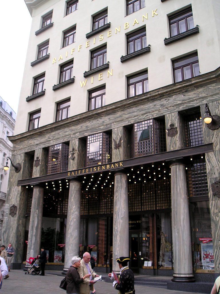
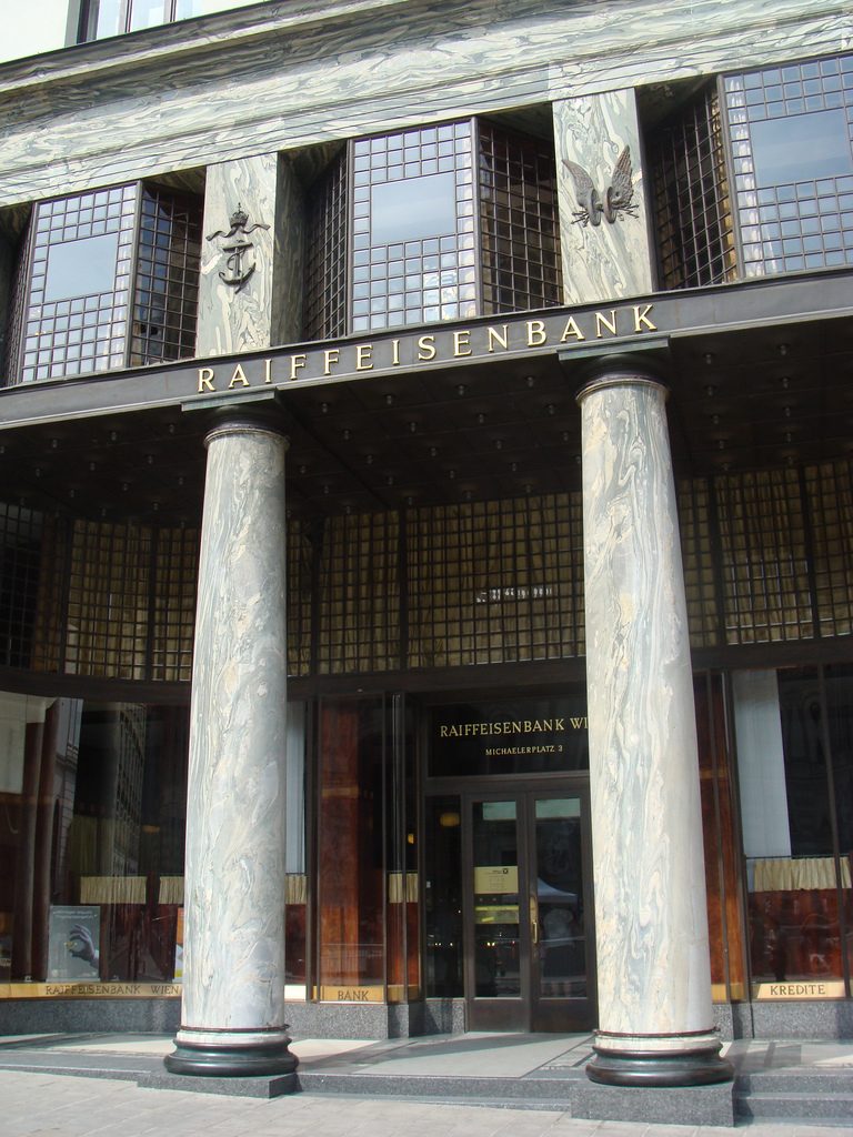
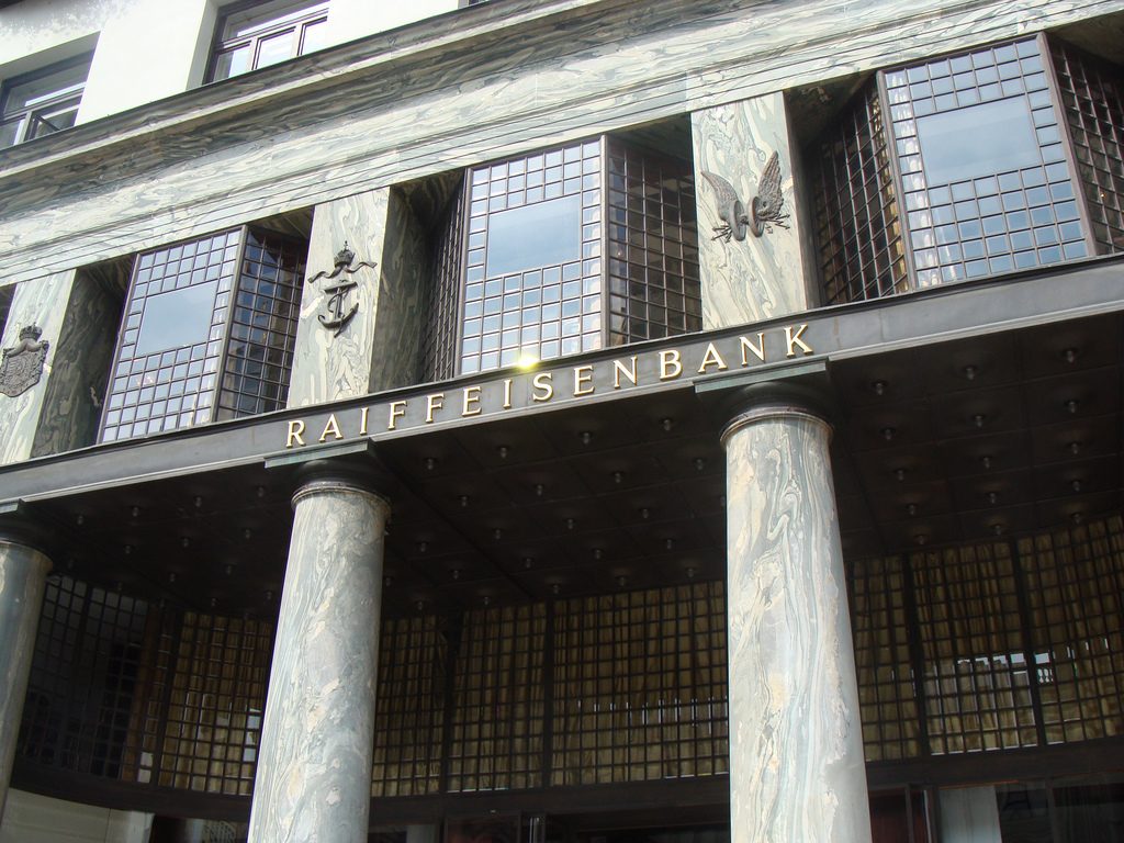
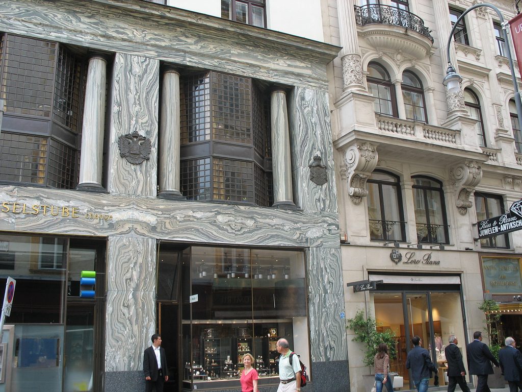
The facade of the three plants socket is undoubtedly one of the points of interest within the project. Architectural discourse is that it far exceeds the impression that one can have the first time the notes.
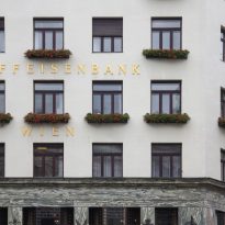
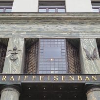
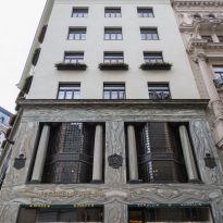
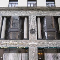
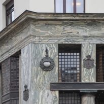
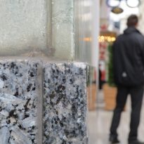
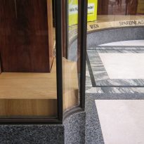
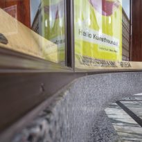
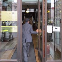
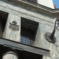
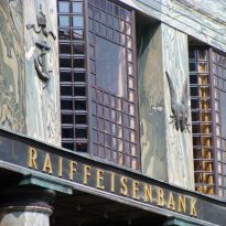
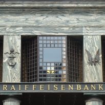
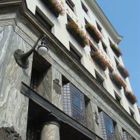
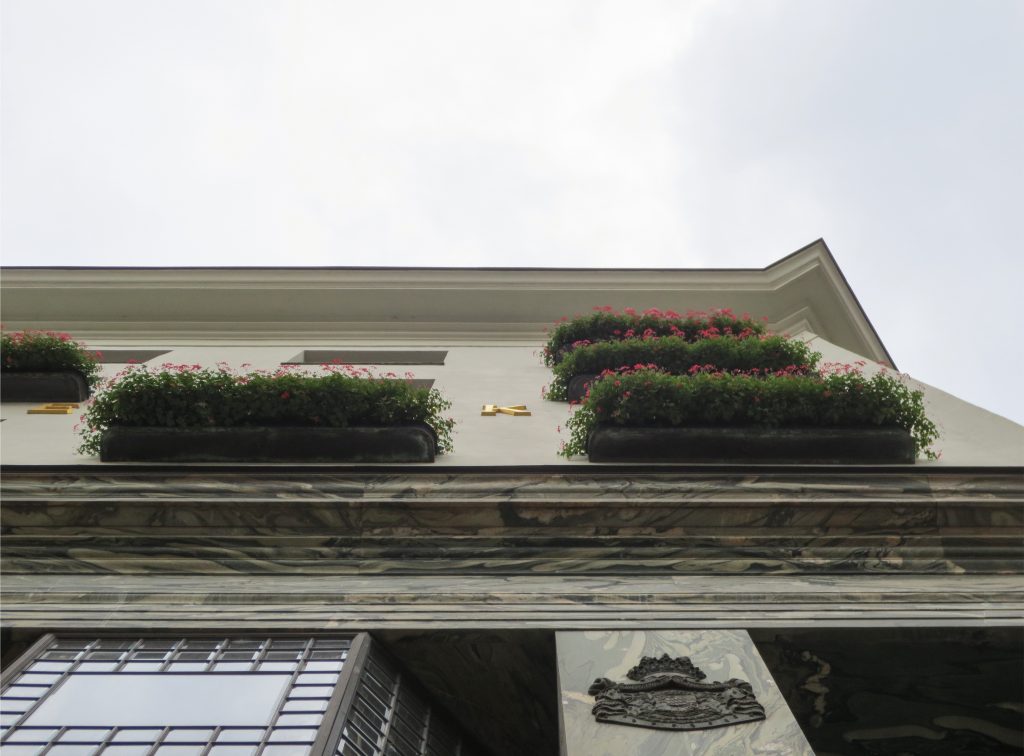
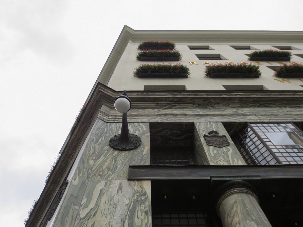
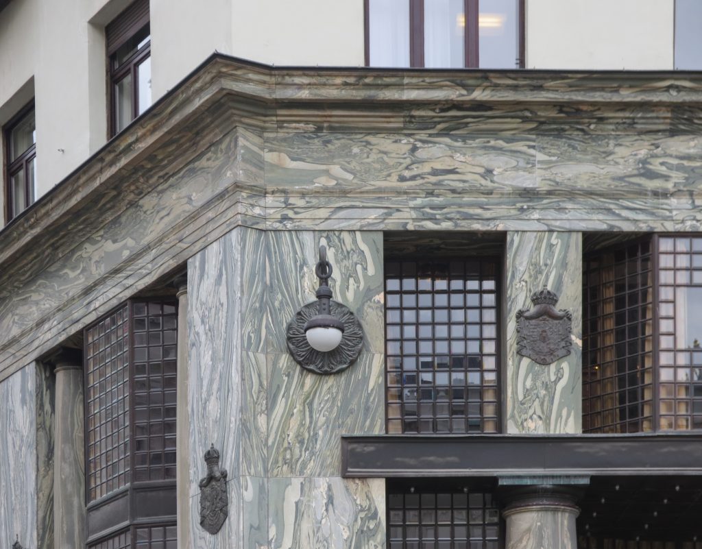
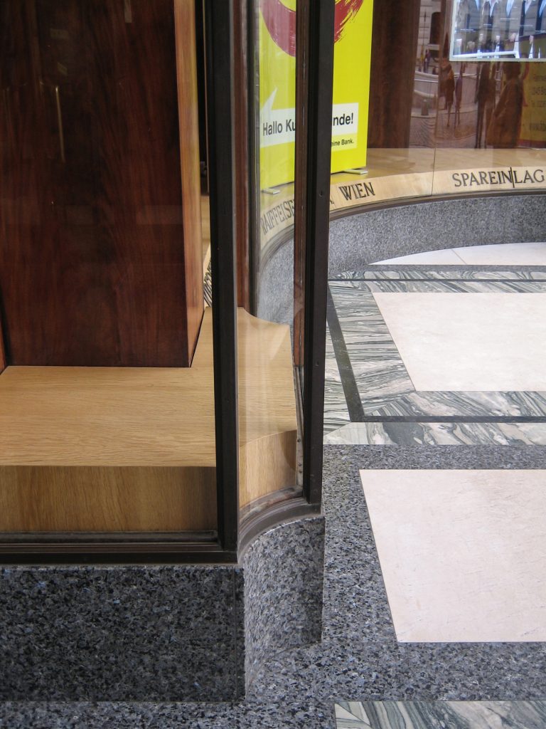
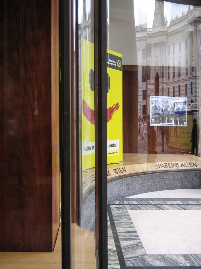
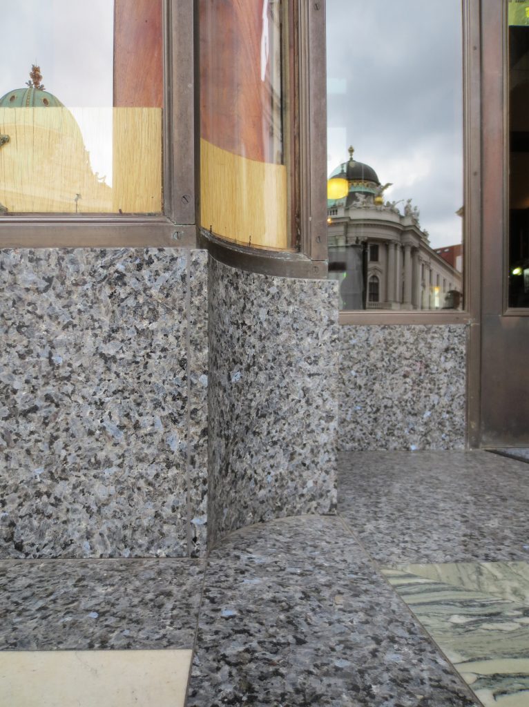
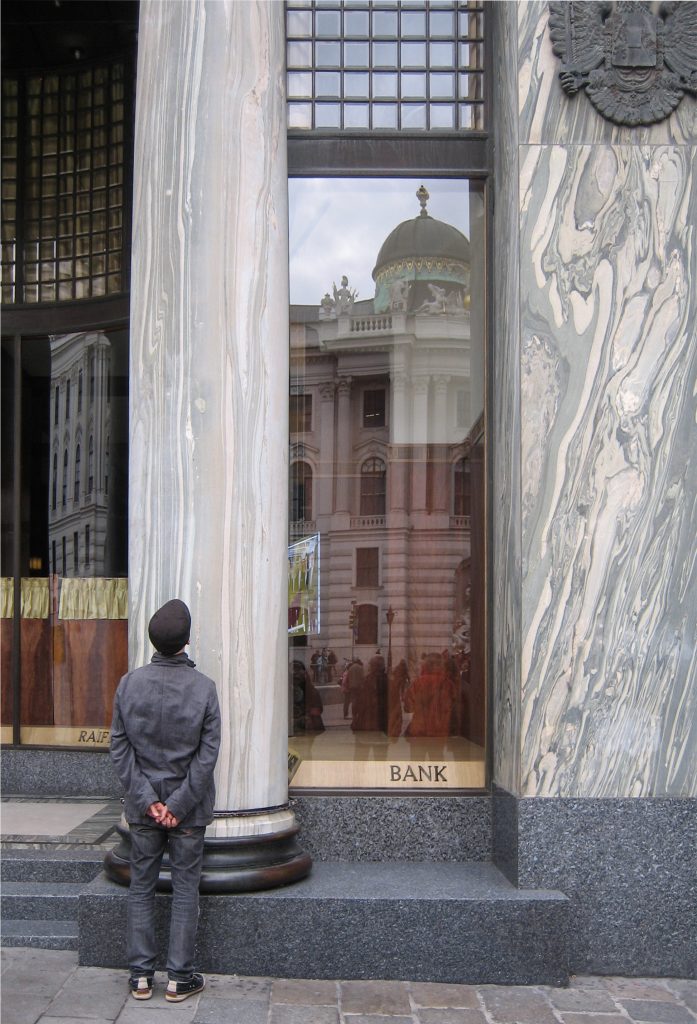
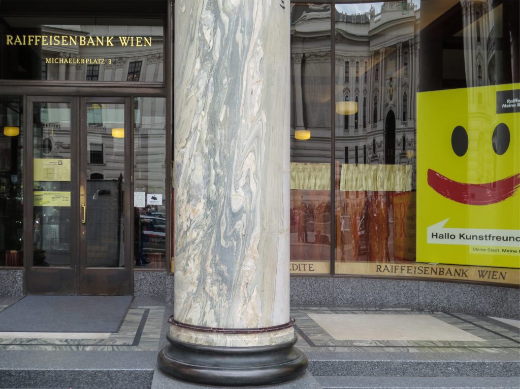
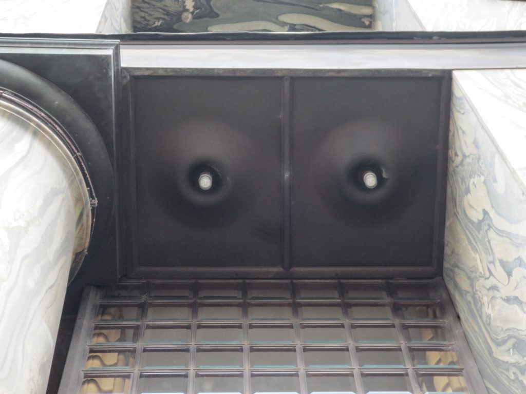
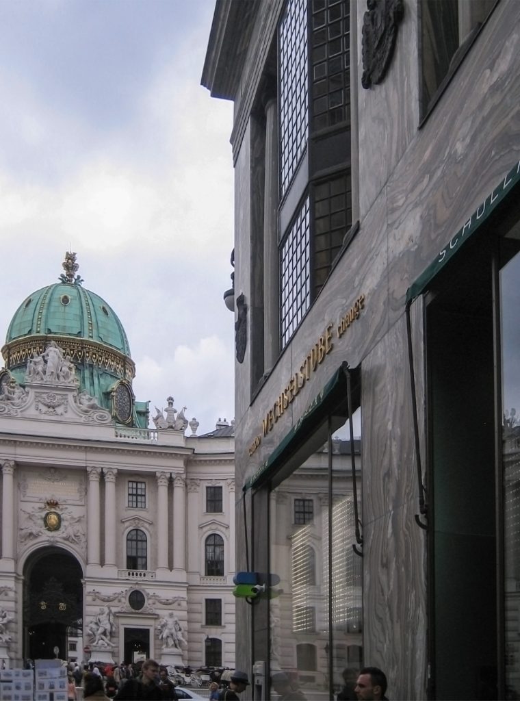
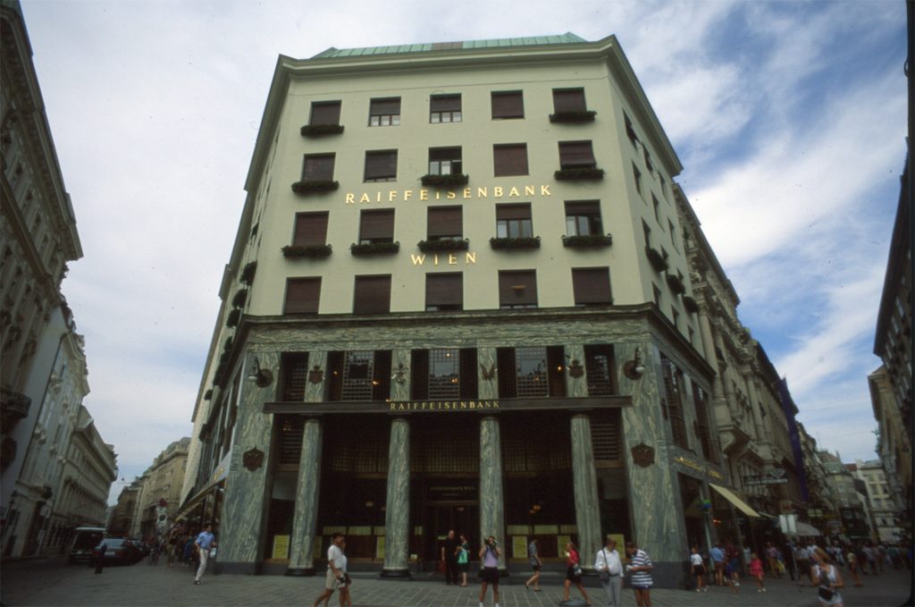
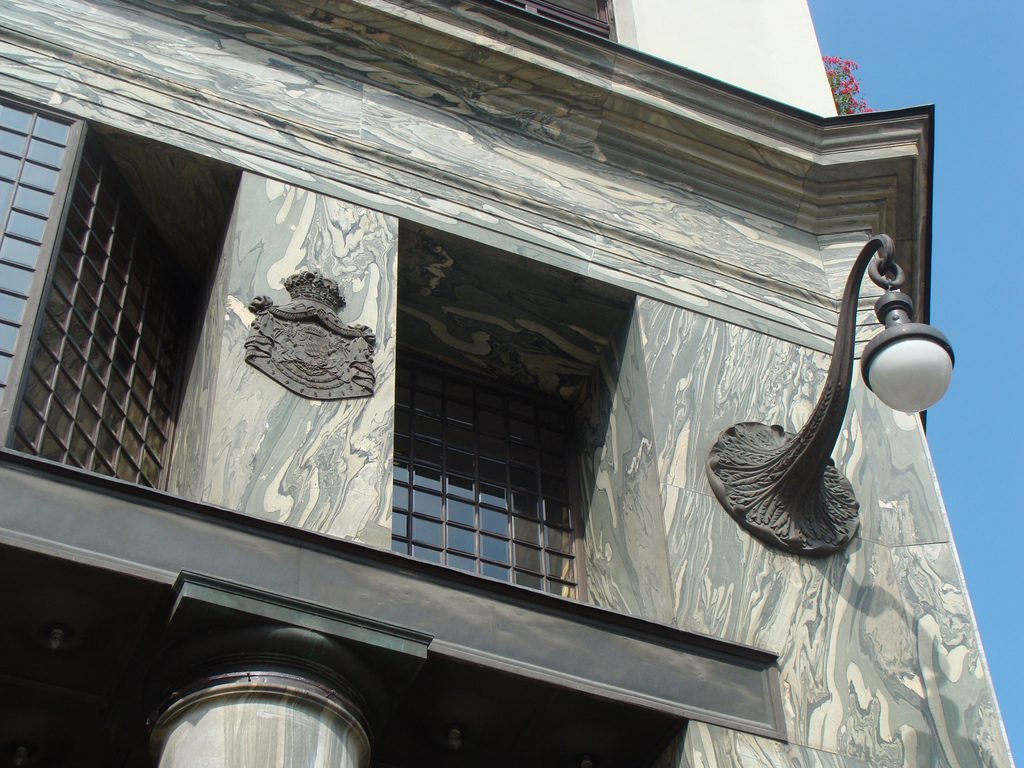
Recourse to forms of marble, with excellent care placed on its internal forms, to achieve a facade with minimal ornament, but not so cold and inhospitable. Remember that this is a commercial area where what matters is to attract the public and not espantarlo dead with cold surfaces. The only ornament that is placed in front of this section are the bronze shields of the firm that occupies the site, the name and street lamps that illuminate the street. All of them attached to a building previously done and not as part of the design.
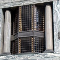
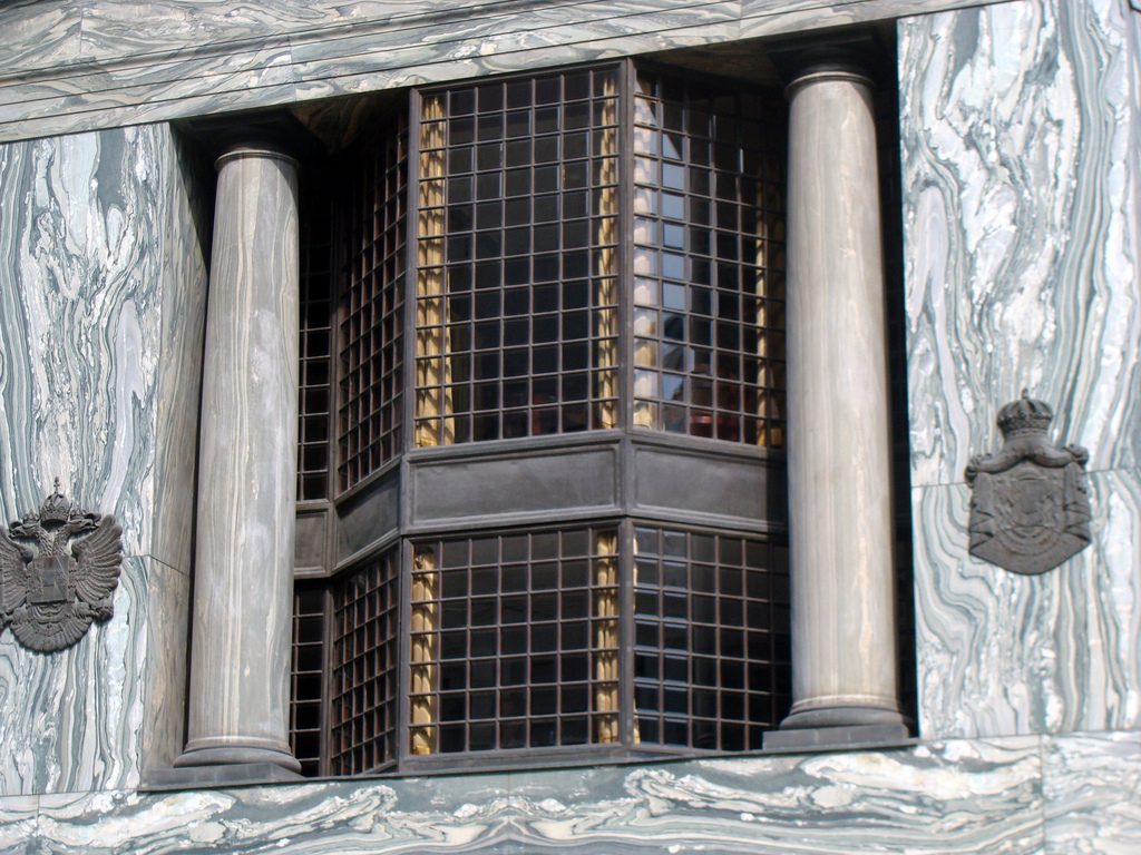
After his trip to Chicago where Loos discovers the principles of modern architecture and skyscrapers of the architect wants to adopt new forms of movement is even difficult in Vienna where he lived. But the wanted called as the first modern in Europe and that is a thought that also reflected the facade. The windows on that podium places are not the result of chance, but a copy, a nod to one of the buildings that fascinates him most during his trip, the Reliance Building.
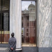
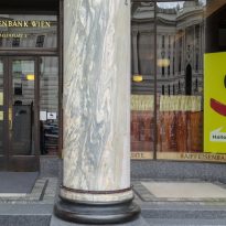
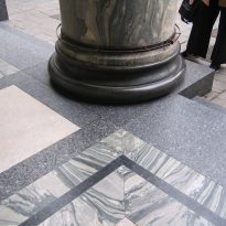
Loos is also aware that you can not be modern in absolute terms, can only be on to something modern and therefore knows that the windows will not have any modern sense alone. That is why the environment fits the classic that we can imagine two Doric columns. These columns in front, like those of the entry is solely to create contrast, do not assume any role that could be important as well not be present.
Housing
In the four upper floors dedicated to housing, we will focus on outer space, on the facade.
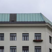
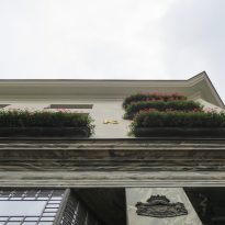
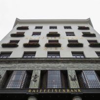
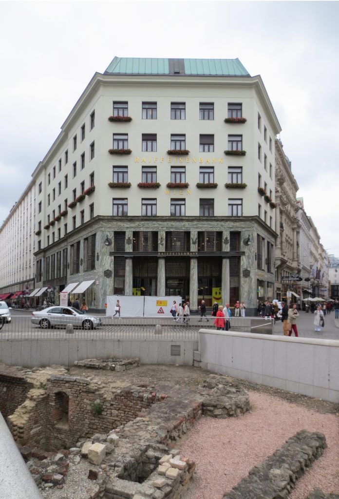
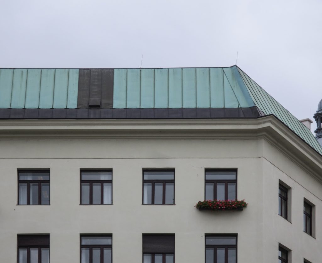
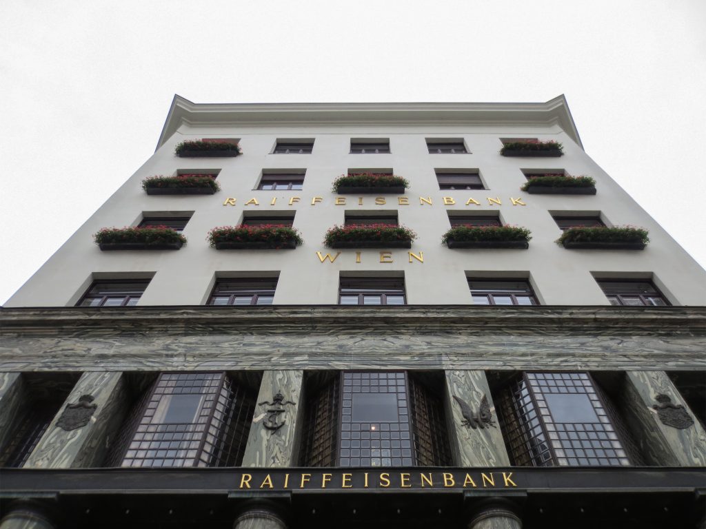
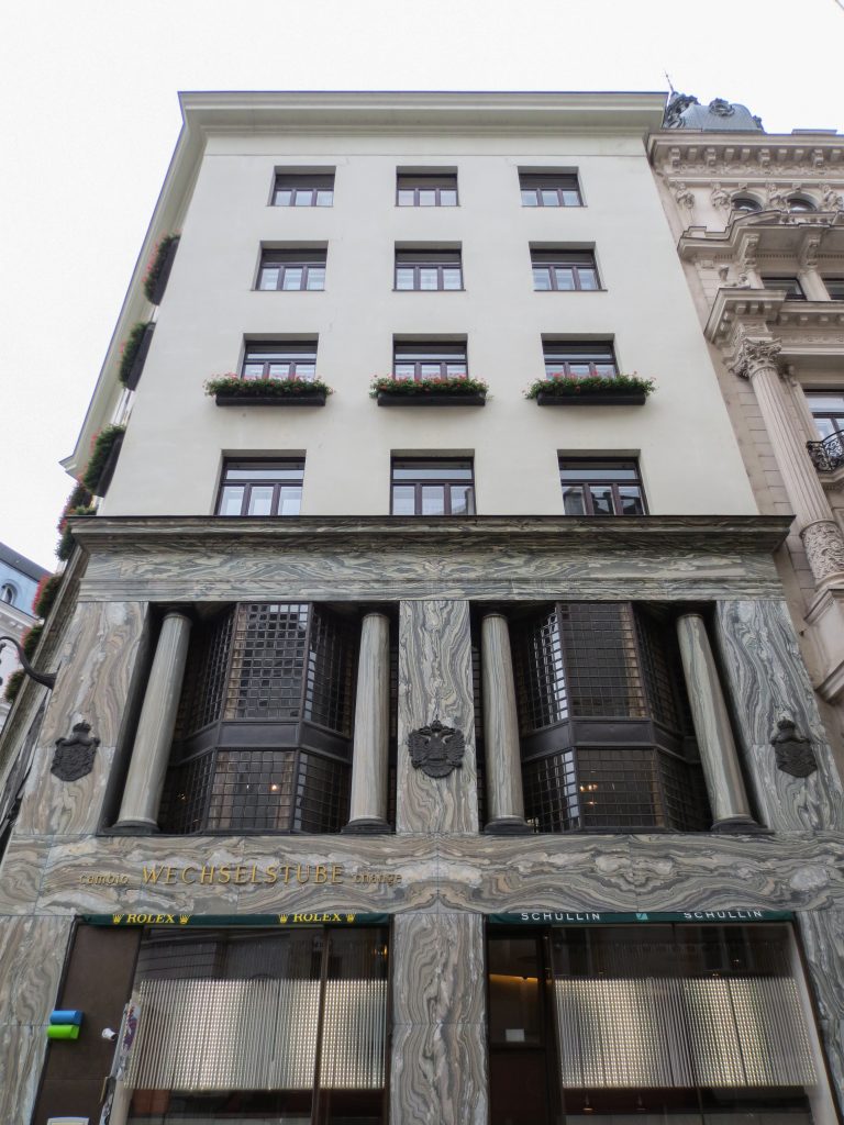
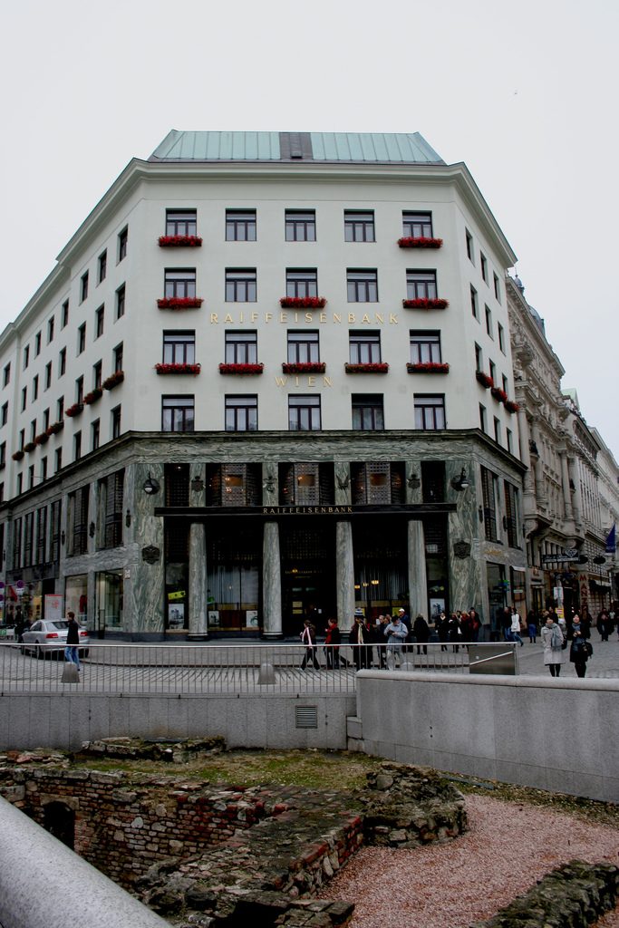
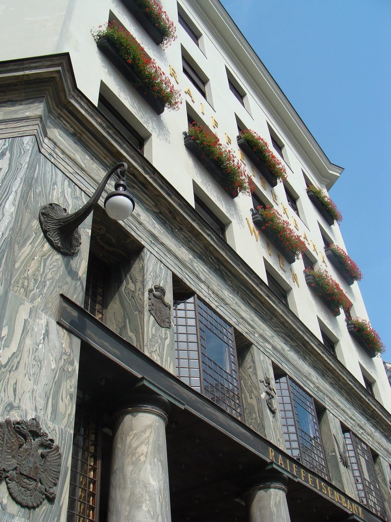
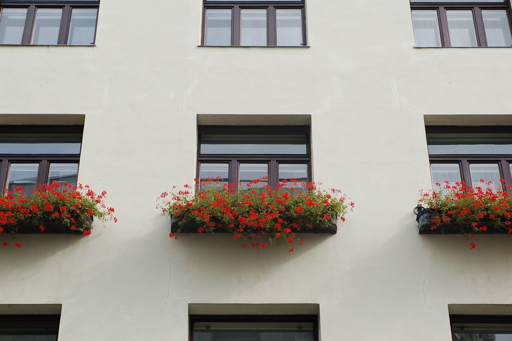
As we have said the four plants are located above the three-commerce juxtaposition, without keeping any relationship with the former. We could even say that not to maintain a kind of relationship creates opposite. Loos again seeks contrast, this time from the hand of the color black as the tone of the base compared to almost white tone of the upper floors do not doubt one where it ends and where the other begins.
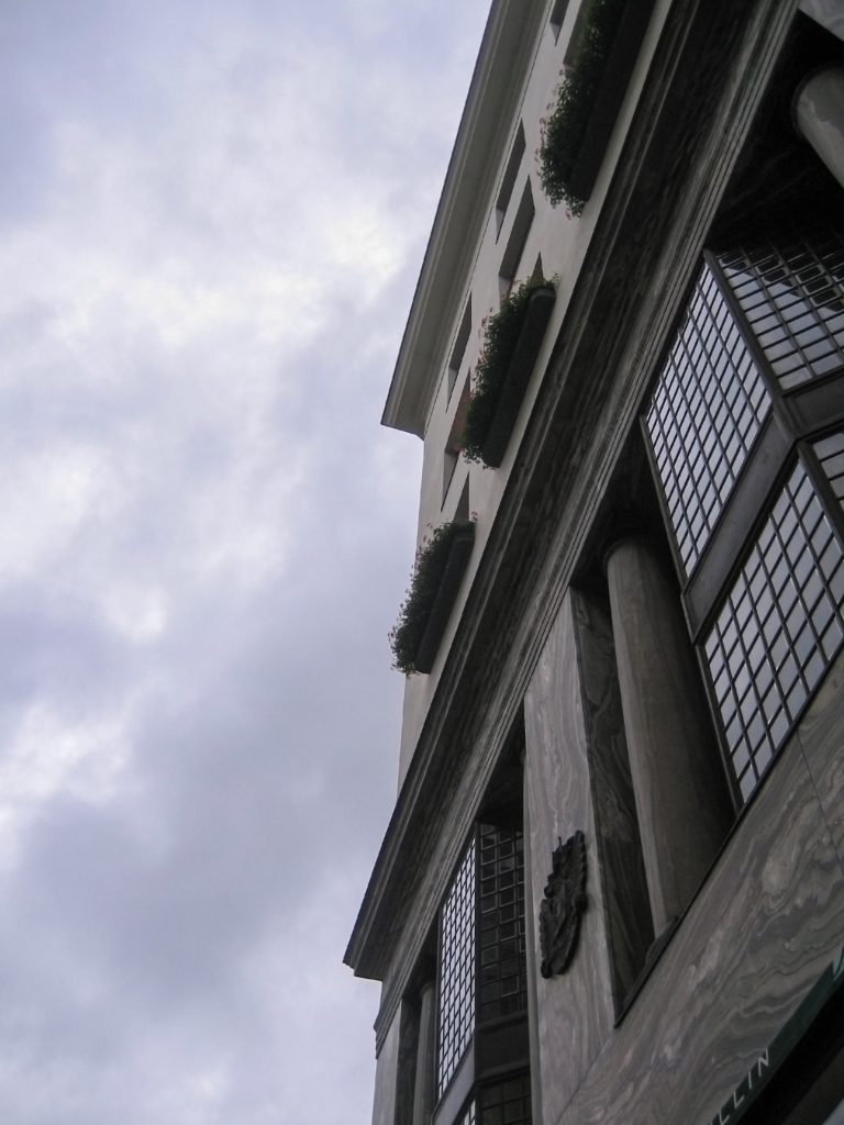
This could mean that the facade ornamentation beyond placed in the background “does not exist.” Loos discusses the facade as a perfect plan and uniform practices for which some openings almost orthogonal grid square on a perfect place for the windows and allow light to enter the houses.
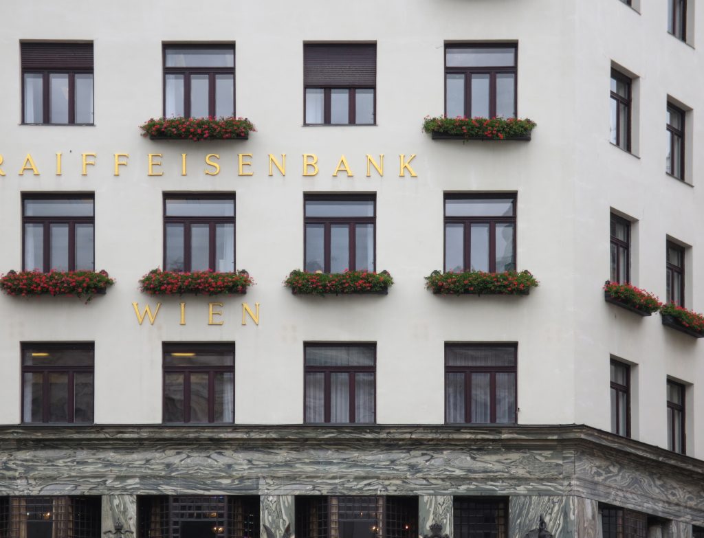
The finish does not transmit anything (or at least not those that were transmitted to convey the facades of the time) and all openings equal and uniform, without any hierarchy not help create the message.
Within the window openings are divided once again all in the same manner, and without distinction as in front as a perfect orthogonal grid.
The result would compare it to one of these models made entirely in white to only aim to show that the forms and often called models or working models of concept.
We might think that the building is unfinished, that the work was abandoned, or that the manufacturers were forced to finish as possible due to lack of budget. But nothing could be further from reality, particularly in this facade is conceived and planned in advance by someone who knew perfectly the image and the impact.
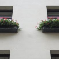
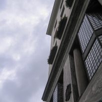
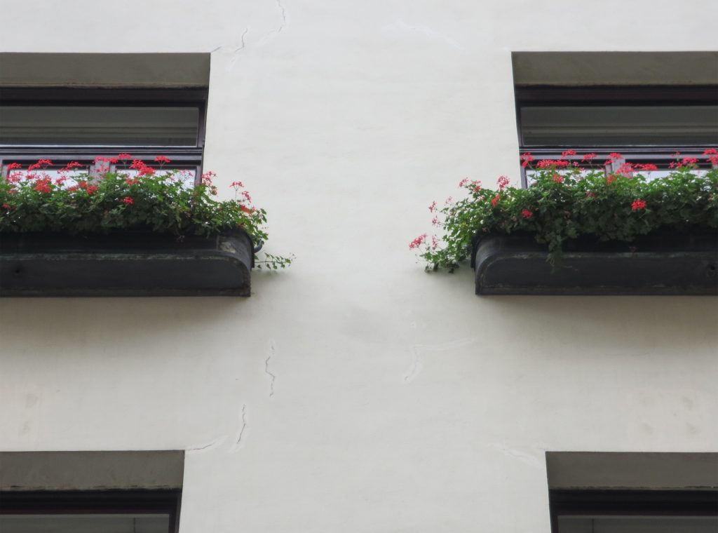
Someone who could blame their gardens that were placed in some of the openings contradict all the above description, and do. And that did not exist in the garden project Loos, but was forced to put them when the council forced him to suspend the work was considered an aberration and a crime within the architecture kept recharged at the time in Vienna. That’s when another big name in the history of architecture, Otto Wagner, Loos advised the placement of the planters were ensuring that the lesser evil, which would be the least affected and that its design would allow it to obtain permission from the council for build.
Spaces
It comprises four floors of houses in the upper three floors and commercial on the bottom.
Loos for these two uses were incompatible and therefore there is no link between them. Both uses are separated from him and façade but also in the interior, where users can access both services separately.
The draft used to scale the ‘Raumplan’ or ‘Flat Space’, by designing the plant in three dimensions. This fact is reflected in the above three floors dedicated to trade where the possibility of linking visual and spatial areas was higher.
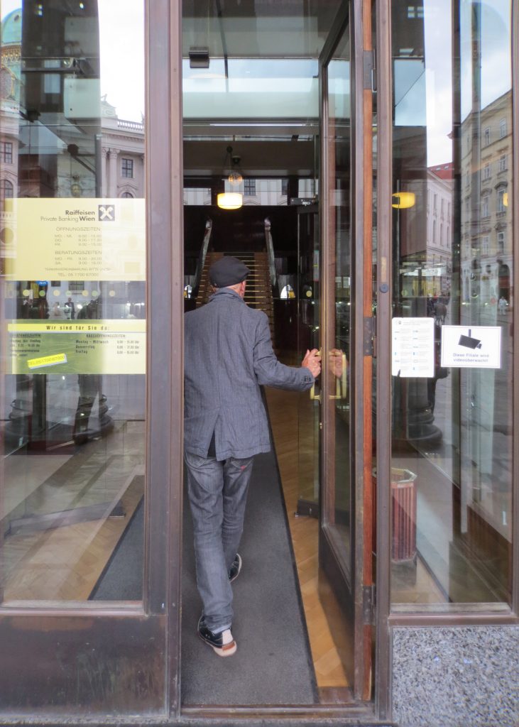
While the three floors were occupied by the commercial firm tailors Salatsch & Goldman, who also commissioned the building to Loos, now occupying the headquarters of a bank.
Structure
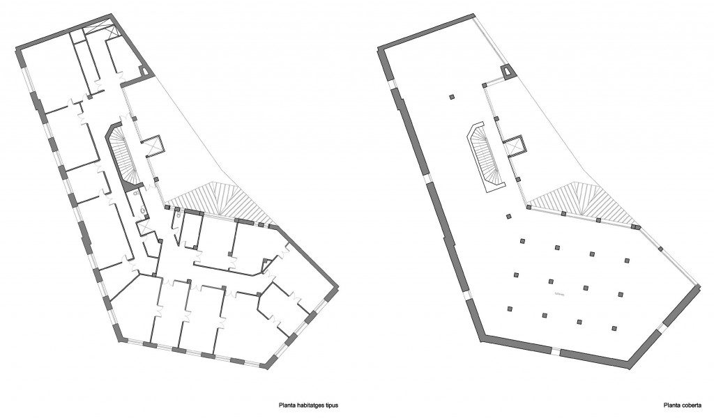
Loos wanted to give all the flexibility of interior spaces, we opted for a structure of reinforced concrete and non-bearing walls that could easily be redesigned as necessary.
The reinforced concrete construction allows large lights and flexible interior space. The marble pillars of the entrance and the other two facades are not bearing.
Materials
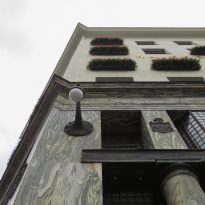
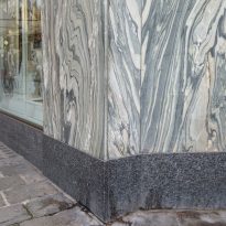
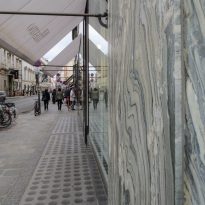
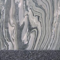
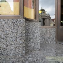
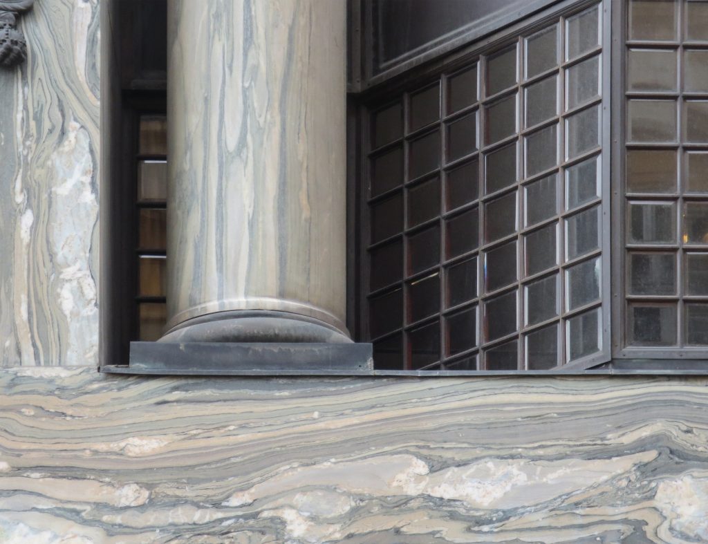
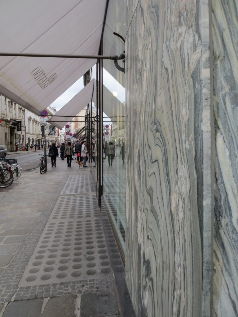
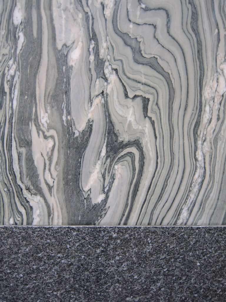
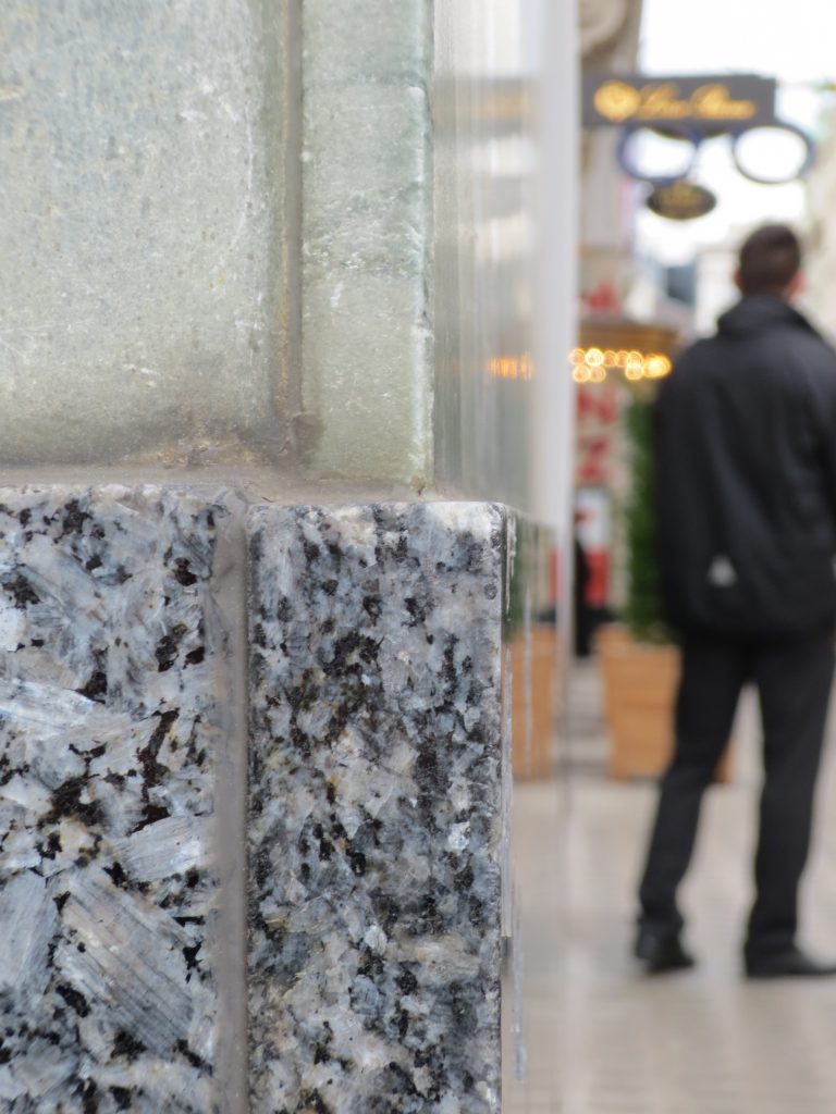
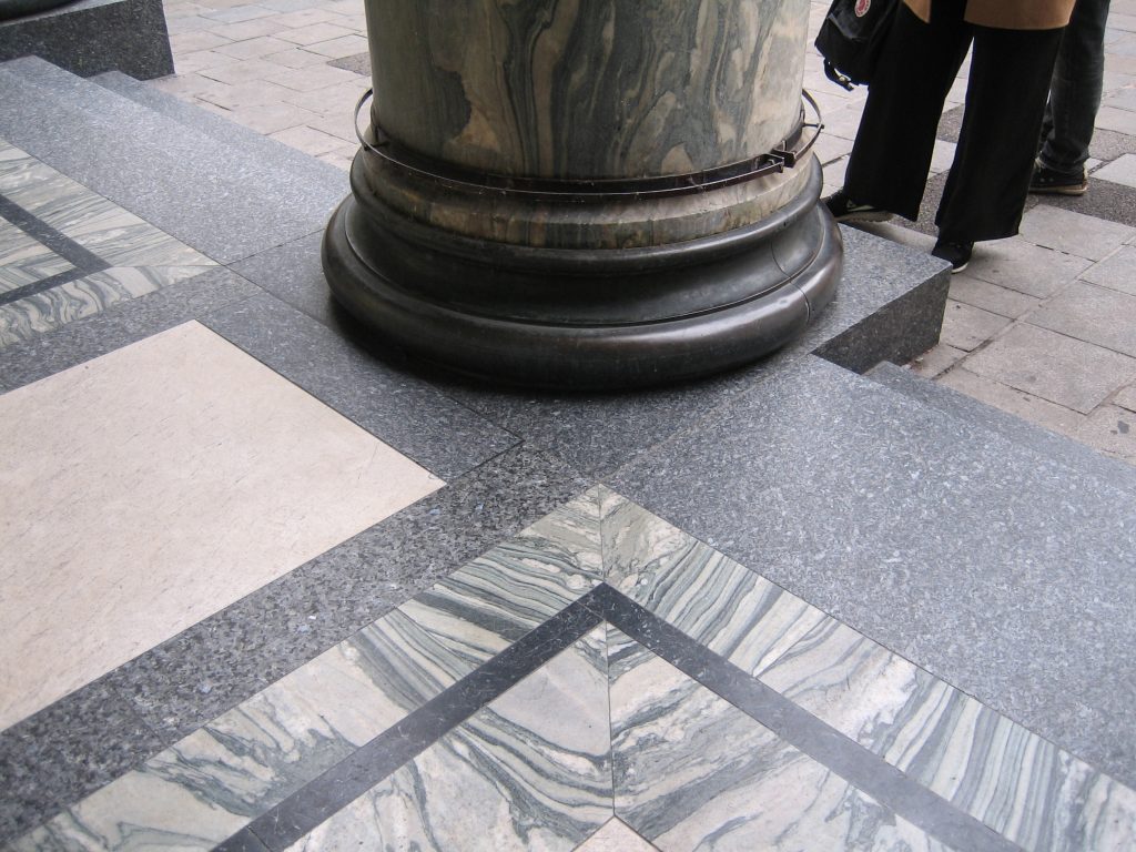
In the commercial area the building is covered with marble Cipolino of Euboea (Greece). In contrast, housing facilities are provided only for a smooth plaster.
After the fall of Rome quarries were forgotten, and the medieval and renaissance could only work with the material removed from the buildings of the Romans. It took many years until rediscovering Euböa in the quarries, and therefore the house of Michaelerplatz will be the first large building with the marble, the finest and most splendid of all types of marble as the Loos.
Loos marble always worked with great care because it knew its inherent characteristics to perfection. At the front of the Michaeleplatz as we can see the pieces of marble create perfect symmetry with its veins clear, that effect is achieved by cutting a block of marble in the opening half and two.
